Designing a start-up airline website
Overview 🔎
The worldwide passenger numbers estimated 4.5 billion of people flew annually in 2021. There is an average of 9,728 planes carrying 1,270,406 passengers in the sky at any given time. People are always traveling and buying a flight to their favorite destinations, even in uncertain times in 2021. The flight booking process is a complex task that should be quick, easy and intuitive.
I received the brief pre-defined as the client is a start-up airline and they’re looking to create an online experience based on a deep understanding of their target users.
The project was created during the UX Design course in the UX Design Institute (UXDI) and Glasgow Caledonian University
Project Goal
Design a new website that is fast, easy and intuitive, specifically on the flight booking process: how users search for and select fights online. The end goal is to design and build a prototype that can be tested with users, along with a detailed set of wireframes.
My role
Solo UX Designer, User researcher
Tools
Sketch, Figma, Miro, InVision, Survey Monkey
DESIGN PROCESS

RESEARCH
I built a research plan and implemented that plan using a variety of qualitative and quantitative methods, such as competitive benchmark, online survey, user interviews, usability testing, card sorting, A/B testing, in order to get better understanding of the problem.
Online survey & User Interviews
I generated an online survey and conducted user interviews to learn more about the goals, context and pain points of the potential customers in the booking process.
What did I find?
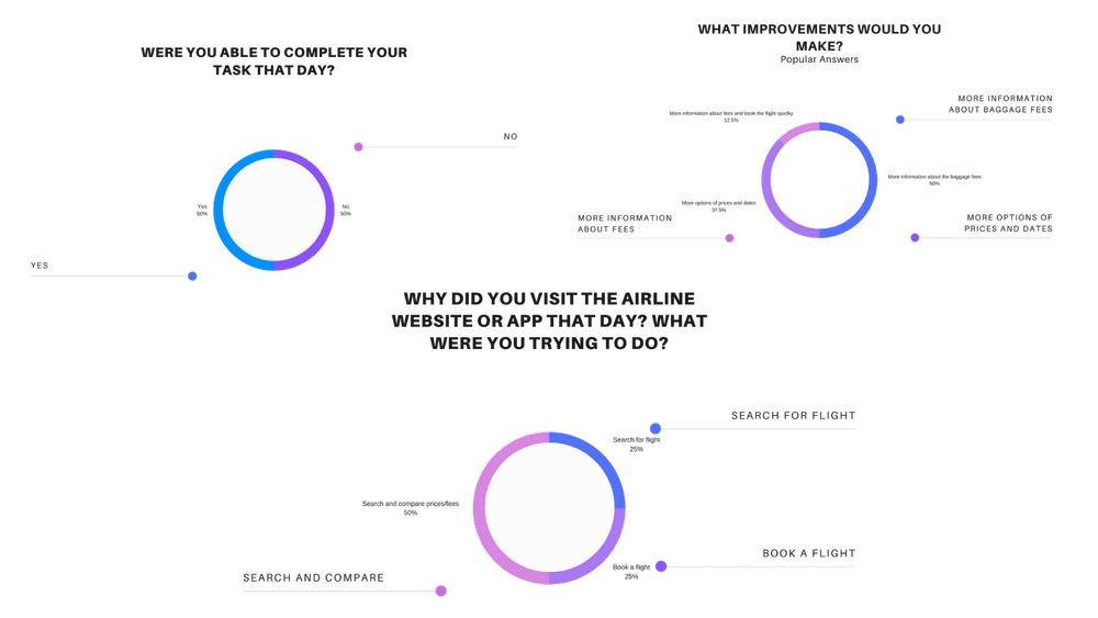
The main goal of potential customers when visiting an airline's website is compare prices/fees before booking a flight. 50% visit the airline's websites or apps to search and compare prices/rates and 25% visit the airline's website for a booking a flight.
50% failed to complete their the task during the booking process.
The customers feels that the abuse of advertisements, pop-ups and discounts on the Airlines websites are solely for the purpose of obtaining money from customers. Customers like to see the basic information and one thing at a time, and not an excess of information.
50% of the customers would like more clarity about the baggage fees and 37,5% want to see more options of prices and dates in the booking process.
Usability Test & A/B Testing
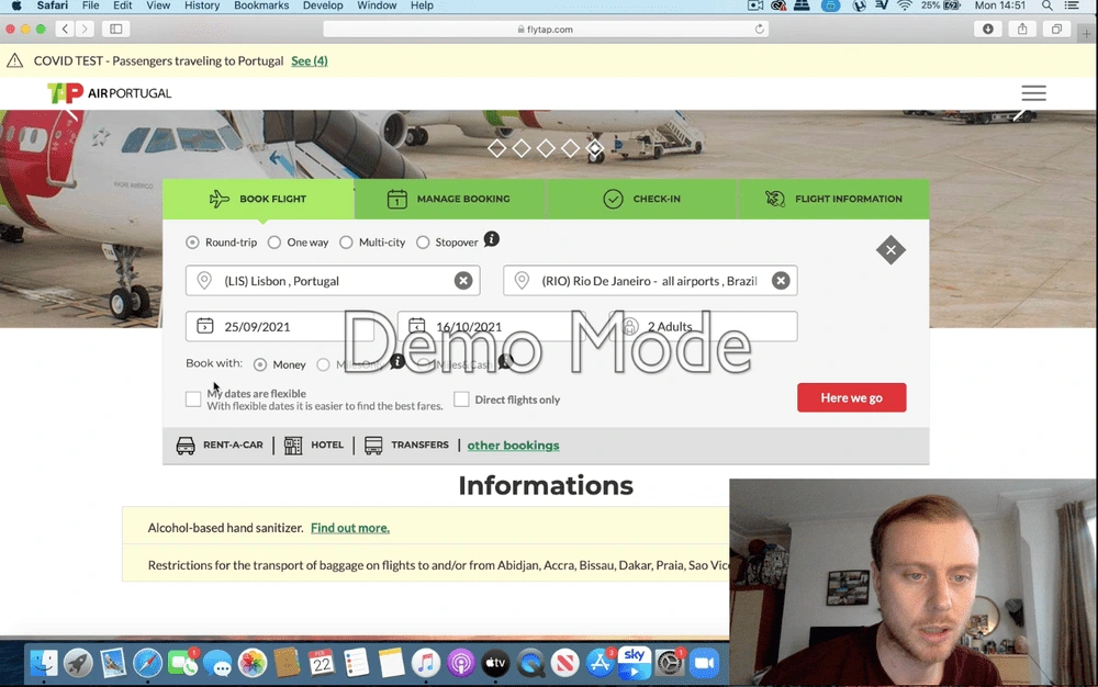
I conducted a usability testing in a A/B testing format to gain insights on how the participants would interact and behavior during the booking process. The participants were asked to complete the same trip booking on two different websites.
What did I find?
The customer liked that the website offers the option to change the flight date if necessary in the booking page. They find necessary the price information comparing with different dates if they decide to change the dates for better price. One of the customer said 'It is a big plus'.
A button with the word “select" on the fares options would help the customers to complete their goal quickly.
A different colour for the button “search flight" says it would be useful and more visual.
The users prefer to select the dates using the calendar, they admit it is familiar and similar with other devices and it is easier and they like to know the exact day of the week they are traveling on.
The customers feels frustrated after confirming the booking and clicked on return to change only the second flight, but the website forces them to start the booking process from the beginning.
The customers find suspicious the ‘recommend' booking refers to the premium fare. The customer feels this is based on prices and making profit and less about the customers needs.
ANALYSE
Affinity Diagram
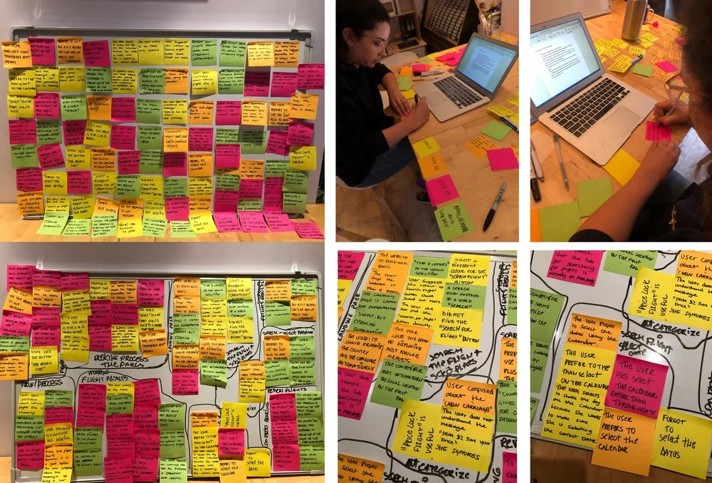
I reviewed all of the research from my previous work and created an affinity diagram to represent what I learned on the structure on qualitative research data. This work helped further the analysis and design decisions in the project.
Customer Journey Map
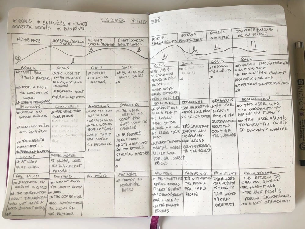
A customer journey map is a technique to understand the possible issues of the platform and identify some find areas where we need to improve the design.
DESIGN
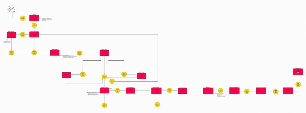
User Flow
At this phase of designing the solution, I start by creating a user flow in order to fix the issues I have uncovered during the research, which are highlighted in the affinity diagram and customer journey map. In this project, I focused on one flow, that is, one primary use case to understand how users will flow through the design.
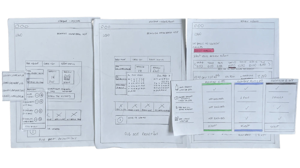
Interaction design for desktop
I continued the design process and sketched the screens and screen states for users flowing through the desktop booking process. In subsequent projects, I converted these sketches into a prototype and wireframes.
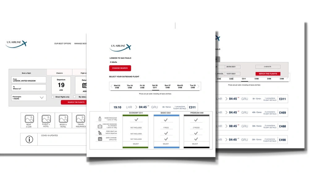
Medium fidelity prototype
After sketching out the basic screens, I created an interactive mid-fidelity prototype in Sketch and performed usability tests to validate my design.
What did I learn?
I have learnt many things on this project.
The research part was definitely the most enjoyable and interesting part for me in this project. I believe my background in Journalism helped to conduct the usability test and observe the users when they interactive with the website. Unfortunately, I did this project during the lockdown due to Covid, I didn't have the opportunity to conduct more usability test that I would have liked to do.
It was my first UX project and I used Skecth, Figma, Miro, Monkey Survey. Although I wanted to learn how to use all available platforms. I learned that it is better to prioritise the platform that works best for the project. For example, I used Sketch and Figma on this project, in hindsight I would have used just one of the platforms as it can be a bit messy to put the project together across both platforms. it was definitely a learning point that I will take with me when doing future projects.
If you have any comments I’d love to hear from you!
Like this project
Posted Nov 12, 2022
Design a new website that is fast, easy and intuitive, specifically on the flight booking process: how users search for and select fights online
Likes
0
Views
8
