UI/UX Case Study | The Cosmic App
Aligning the Stars: A User-Centered Design Approach to an Astrology App"
The Cosmic 2023
What is The Cosmic?
The Cosmic is an innovative online platform that offers a fresh perspective on spirituality. With its captivating content that promotes self-growth and exploration, the platform provides a distinctive approach to astrology and personal development.
Why?
There has been a notable increase in the interest and practice of astrology and self-discovery in recent years. A 2020 study by the International Psychological Association 2019 found that the use of alternative therapies, including astrology and spiritual practices, had increased over the past decade. The rise of social media and the internet has also contributed to the popularity of astrology and self-discovery.
Problem
The potential problem with astrology apps in terms of UX is that they can be overwhelming and difficult to navigate. Many astrology apps offer a lot of information, which can be confusing for users who are not familiar with astrology. Additionally, some apps may use complicated language or concepts that are difficult to understand for the average user.
Solution
Creating The Cosmic app, which offers personalized horoscopes and self-discovery insights with a user-centered design approach, is aimed at providing users with an engaging and satisfying experience that will keep them coming back for more. To achieve this goal, it is crucial for The Cosmic app to ensure that its interactions are accurate and reliable and presented in a user-friendly way that is easy for users to understand.
The app must be intuitive and user-friendly, with clear navigation and easy-to-read information.
My role
Research & UI/UX Design
DESIGN PROCESS
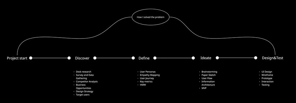
Discover Phase
Design Strategy ⟶ Business Opportunities ⟶ Competitor Analysis ⟶ User Research
Design Strategy
The first step is to establish a design strategy. This involves identifying the business goals and objectives of the app, technological constraints, and critical success factors to ensure the app's success in a competitive market. Understanding the target audience and their needs is also crucial, as well as determining the features and services that will meet those needs.
The goals and objectives of the app:
Personalization: Design the app in a way that allows users to personalise their experience. For example, horoscope readings based on the user's birth chart, or allow users to create and save custom profiles with their birth data and astrological preferences.
Clear Navigation: Ensure that the app has clear and intuitive navigation. Users should be able to easily find the information or features they are looking for, whether it's reading their daily horoscope, getting a birth chart interpretation, or booking a personalised consultation.
Visual Appeal: Astrology is often associated with visual elements like star charts and zodiac symbols. Incorporate these elements into the app's design to make it visually appealing and easy on the eyes. However, make sure to balance the visuals with clear and legible text, so that the app is both aesthetically pleasing and easy to read.
Accessibility: This includes features like adjustable font sizes, text-to-speech options, and high-contrast themes for users with visual impairments. Making the app accessible to everyone can help to broaden its appeal and increase its user base.
Target users
The target audience for The Cosmic app include:
People between the age group 20 to 50.
Older adults (age 50+) who have a lifelong interest in astrology and use it as a tool for self-reflection and understanding.
People from diverse backgrounds and cultures who have an interest in exploring astrology as a means of self-discovery and personal growth.
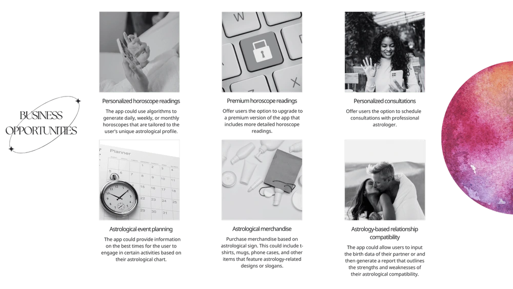
Business Opportunities
According to my initial desk research, the app could potentially offer a variety of premium features and services, such as consultations, premium horoscope readings, and astrological merchandise. There are six additional potential products and services that the app could offer:
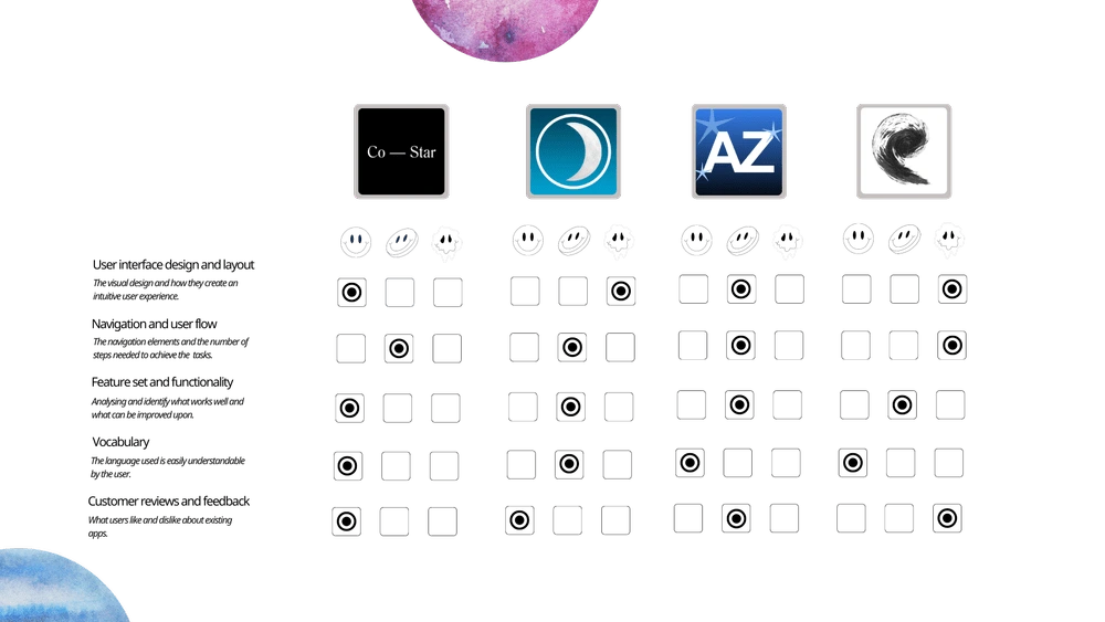
Competitor Analysis
Competitive analysis helps me to understand the competitive landscape of the market by studying competitors' products. Additionally, I gained insight into user expectations, industry standards, and best practices.
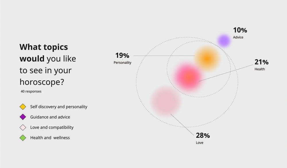
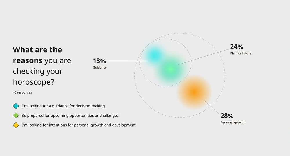
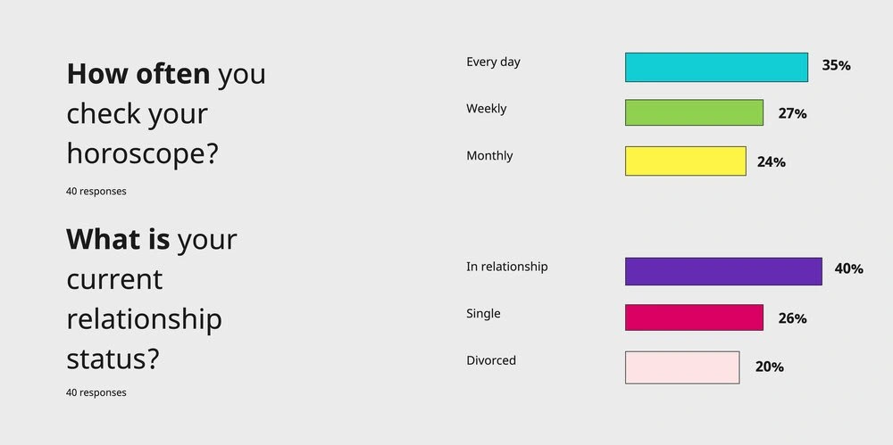
Questionnaire Survey
Before proceeding to create user personas, I need to first understand the target audience better. This survey provided valuable insights into users' preferences, and context, which are essential in designing an app or website that meets their expectations.
User Interviews
I conducted user interviews to understand the needs, behaviours, and attitudes of the target audience in order to design and development the app. This valuable information can be used to identify problems, opportunities, and areas for improvement, and to ensure that the final product or service meets the needs of the users and addresses their pain points.
Why I conducted directed and remote one-to-one interview with 8+ participants?
To build empathy with the users and develop a better understanding of their pain points and frustrations.
Validate my assumptions and make changes to the design as necessary.
To clarify design decisions and ensure that I am on the right track.
The valuable information collected can be used in the development of user personas
Interview questions
What motivated you to start using astrology apps?
How often do you check your horoscope or use astrology apps?
What are the most important features you look for in an astrology app?
Have you used any other astrology apps before? If so, what did you like and dislike about them?
What are some of the biggest challenges or frustrations you face when using astrology apps?
How do you typically use astrology information in your daily life?
What kind of astrology information or services do you wish were available in an app?
What is your experience with astrology and do you feel knowledgeable in this area?
Would you be willing to pay for premium features or services in an astrology app? If so, what kind of features or services would you expect to receive?
How do you think an astrology app can help you in your personal growth or decision-making process?
“It would be great if the app could provide insights into my personality, strengths, and weaknesses based on my birth chart. One of the biggest challenges I face when using astrology apps is that the information provided is often too generic.”
“The astrology app I’m using bombards me with too many notifications and messages. I feel overwhelmed and would prefer to have more control over the frequency and type of notifications.”
“ I would like to have access to more in-depth analysis of my birth chart, including the positioning of planets and how they affect different areas of my life such as career, relationships, and finances”
“I may be willing to pay for premium features or services if the app could provide more detailed and personalized readings, such as daily or weekly forecasts, compatibility analysis with friends or partners, and personalized astrological advice for important life decisions. ”
Define Phase
Affinity Mapping ⟶ User Personas ⟶ Empathy Map ⟶ How Might We
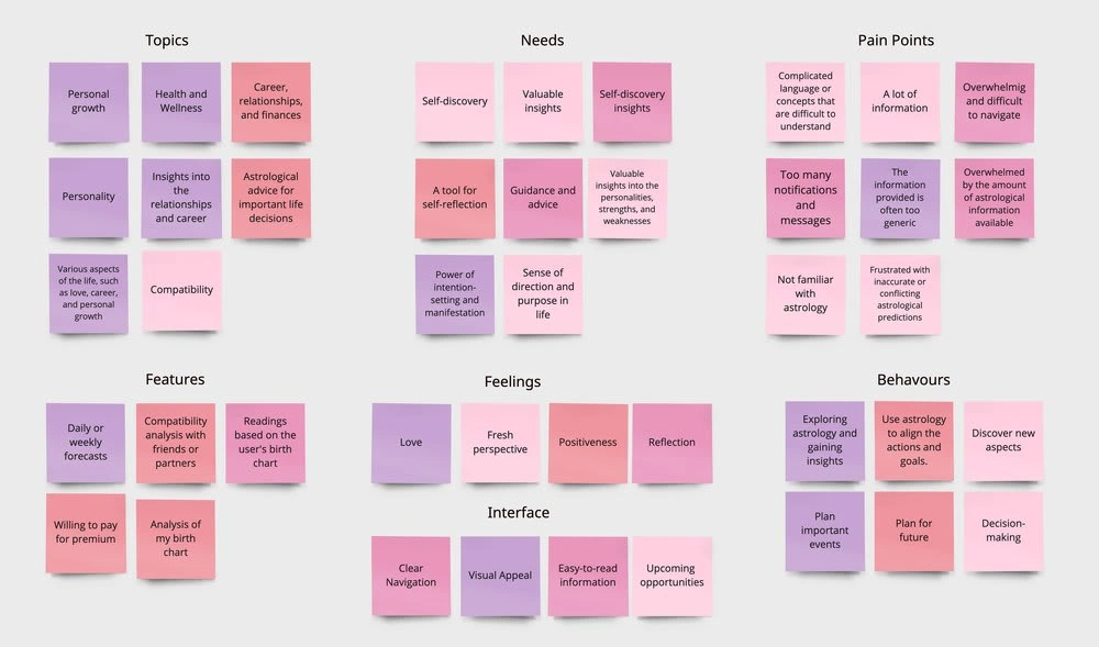
Affinity Mapping
In the Define phase, I focus on prioritizing features and functionalities of a product based on user needs and preferences. This helps ensure that the design process remains user-centered.
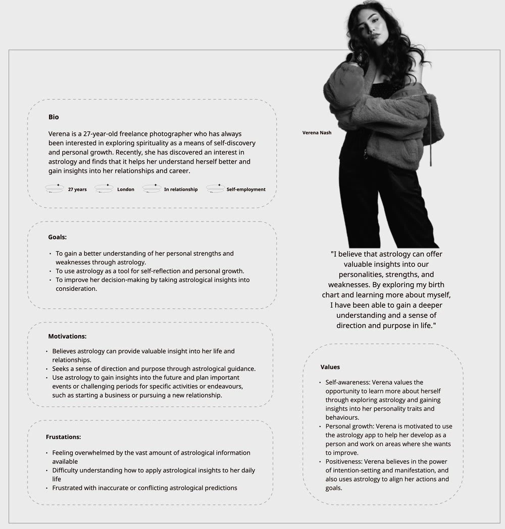
User Personas
"Verena Nash" is a user persona created based on a specific set of attitudes, goals, and frustrations expressed by interviewees. The purpose of creating this persona is to gain a deeper understanding of the target audience's behavioral patterns and to design a user-centered product that meets their needs.
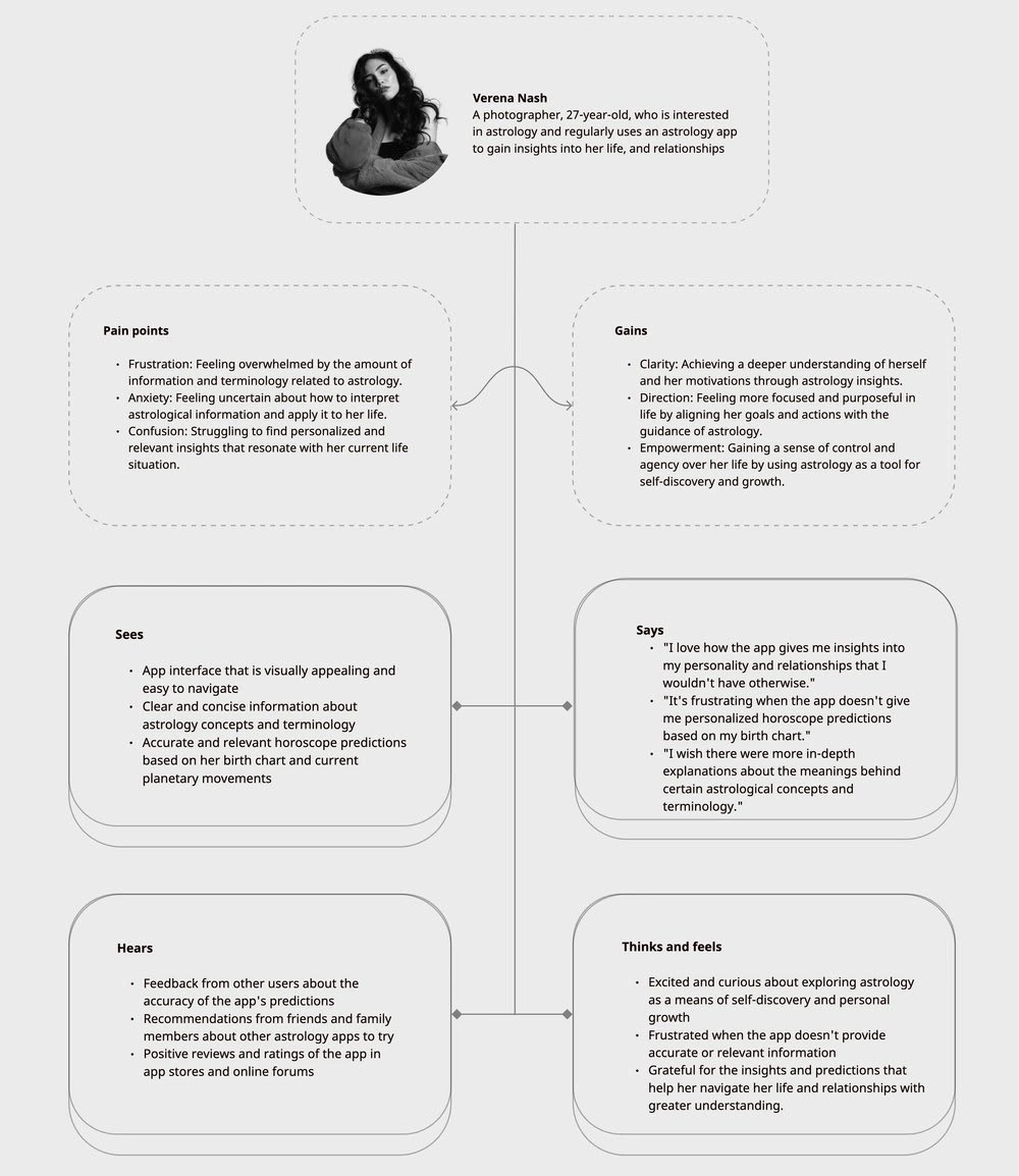
Empathy Map
After creating user personas and conducting an affinity mapping, an empathy map is a useful tool to gain a deeper understanding of the user's emotional state, gain and pain points.
Brainstorming
At this stage, before starting to design the app, I focus on identifying the problems and challenges that need to be solved. How Might We (HMW) is a brainstorming technique used to generate potential solutions for design challenges.
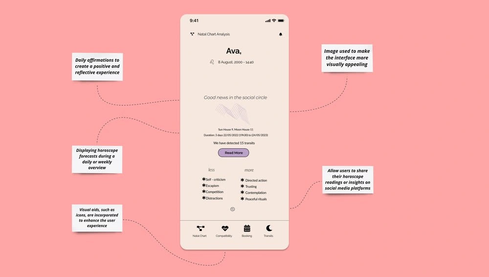
1. How might I design the astrology app to provide users with a positive and reflective experience, while also offering fresh perspectives that are easy to understand?Potential solution: Use clear and concise language in the app's interface and content, avoiding jargon or complex terms that may be difficult to understand for some users. Additionally, incorporating interactive and engaging features such as personalised horoscope readings based on the user's birth chart, daily affirmations, and guided meditations could help create a positive and reflective experience.
2. How might I present the topics of personality, career, relationships, and finances without overwhelming and difficult navigation for users?
Potential solution: Organise the topics into separate sections or tabs within the app, with clear and concise headings. Each section could provide a brief introduction to the topic and offer users the option to dive deeper if they choose.
3. How might I design a feature for compatibility analysis with friends or partners?
Potential solution: Create a questionnaire that both parties can use to generate a compatibility score. The feature should also provide personalized insights and tips for improving the relationship based on the compatibility score.
4. How might I generate interest among users to purchase a premium account?
Potential solution: Offer exclusive content or features that are only available to premium users. This could include personalised horoscope readings, more in-depth compatibility analysis, ad-free experience, early access to new features, or discounted rates for premium services
5. How might I design an app interface that is visually appealing and easy to navigate?
Potential solution: Use a colour scheme that is calming and soothing to the eyes, such as shades of blue, purple, or green. The font used should be clear and easy to read, with appropriate spacing and sizing. Images can also be used to make the interface more visually appealing, such as using astrological symbols, zodiac signs, or celestial images.
6. How might I display the horoscope forecasts?
Potential solution: Display horoscope forecasts could be to have a daily or weekly overview with concise and easily understandable language. Visual aids such as icons, symbols or images could also be incorporated to enhance the user experience.
7. How might I integrate social features to enable users to share their astrology insights and connect with others?
Potential solution: Allow users to share their horoscope readings or insights on social media platforms like Instagram, or Twitter. In terms of design, the app could use social media-inspired features such as emojis, hashtags, and user profiles to make the experience more engaging and personalised.
8. How might I ensure the success of the app's design?
Conduct user research and testing to validate the needs and preferences of the target audience.
Incorporate feedback from users during the design and development process.
Monitor app analytics to track user behaviour and identify areas for improvement.
Continuously iterate and improve the design based on user feedback and app analytics.
Ideate
Paper Sketch ⟶ Task Flow ⟶ User Flow ⟶ Information Architecture
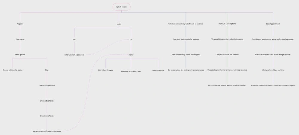
User Flow
It is crucial in the design process as it ensures a seamless and logical navigation experience for app users. By visualising the user flow, potential pain points can be identified and addressed, resulting in an improved user experience.
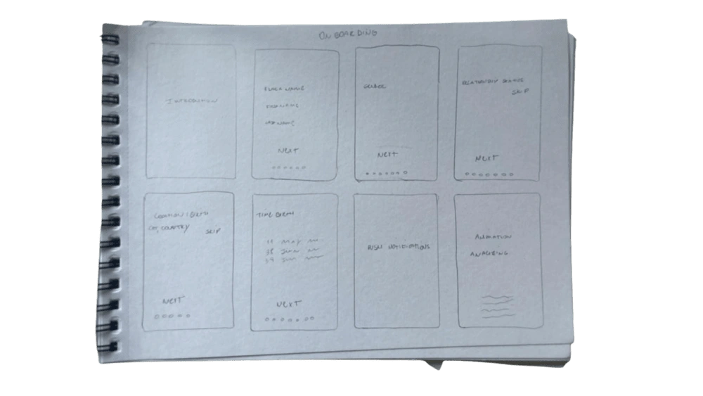
Before starting the design process in Figma, I prefer to sketch out ideas and flows on paper. This allows me to brainstorm and evaluate potential solutions based on user needs and the product research conducted.
My initial draft looks like this:
Design & Test
UI Design ⟶ Prototype ⟶ Interaction ⟶ Usability Test
Design System
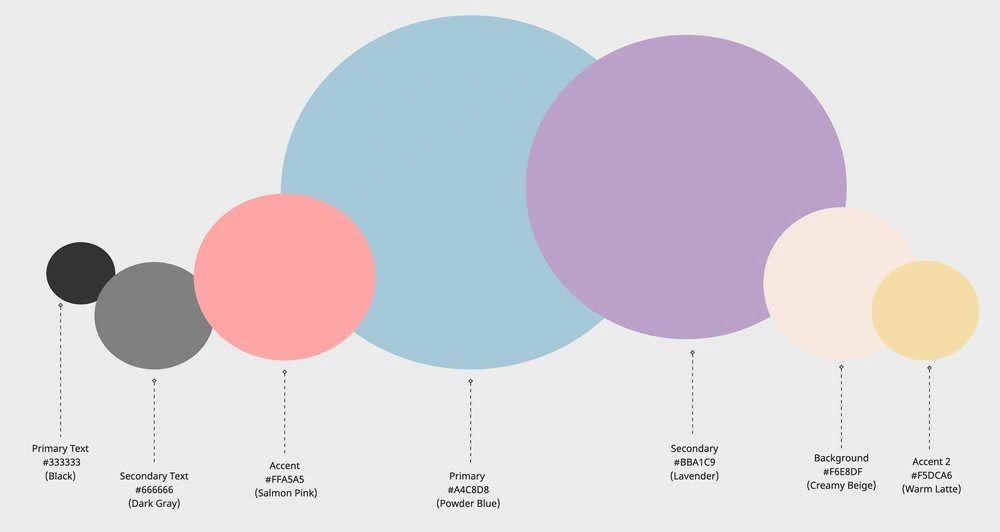
The design system of the app, based on these colours and extensive research, aims to create a visually appealing and harmonious user experience. The design system also includes fonts, sizes, and primary buttons. Here, I will explain a bit about the design system's colour scheme and the reasoning behind the choice of colours in the design system.
Colours:
Primary Colour: #A4C8D8 (Powder Blue) is used as the primary colour, creating a sense of tranquility and serenity. It serves as the foundation for the app's visual elements.
Secondary Colour: #BBA1C9 (Lavender) complements the primary colour and adds a touch of elegance and sophistication to the design system.
Accent Colour 1: #FFA5A5 (Salmon Pink) provides a delicate and vibrant accent, drawing attention to important elements or calls to action within the app.
Accent Colour 2: #F5DCA6 (Warm Latte) adds warmth and richness to the palette, offering a grounding and comforting presence.
Background Colour: #F6E8DF (Creamy Beige) creates a soft and inviting backdrop, allowing other colours to shine and enhancing the overall warmth and comfort of the app.
By utilising this colour palette, the design system creates a cohesive and visually pleasing experience for users. The combination of Powder Blue, Lavender, Salmon Pink, Warm Latte, and Creamy Beige evokes a sense of calmness, elegance, and comfort, enhancing the overall astrological journey within the app.
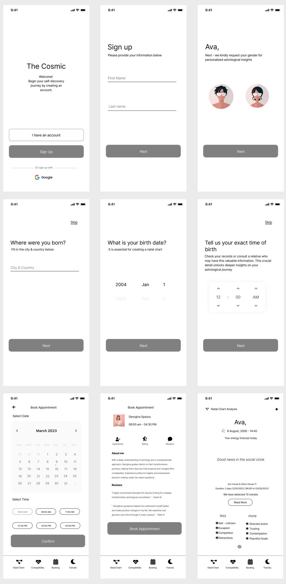
Low Fidelity
Low fidelity design is important as an initial step in the design process before moving on to medium and high fidelity. It allows for quick iteration, focusing on the structure and functionality of the user interface. Low fidelity designs are low cost and time-efficient, helping to validate ideas and identify potential issues early on.
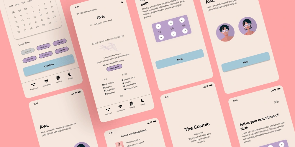
Medium-High Fidelity
Medium and high fidelity designs provide more detailed and refined representations of the user interface. They allow for explaining solutions, validating and testing user interactions, and measuring the success of the app. These stages also enable the development of visual aesthetics, typography, colour schemes, and finer design details.
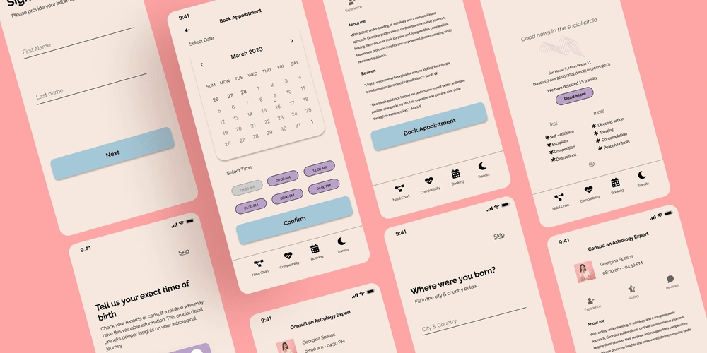
SOLUTIONS
Sign up & Sign in
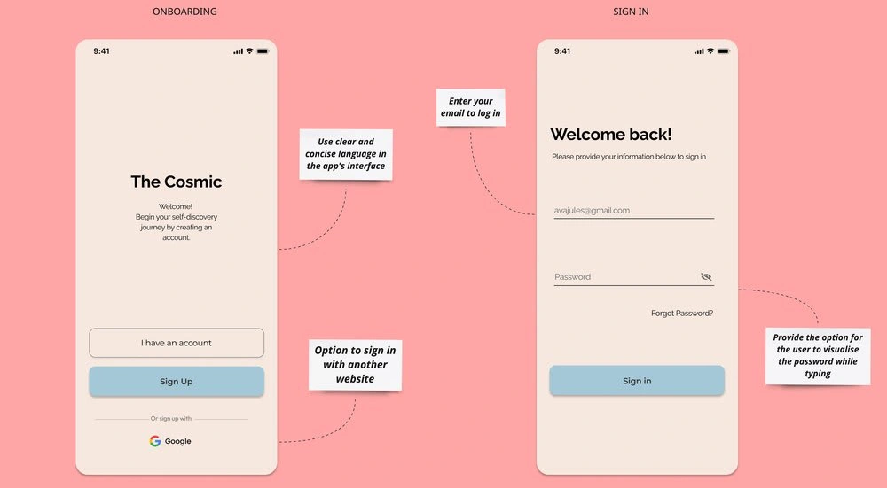
I have chosen to incorporate these options into the registration process to make it as easy and swift as possible. This includes using clear call-to-action buttons, streamlining form design, and integrating social media options. For example, many users prefer to establish accounts using platforms like Google, rather than registering directly on the website. To address this preference and reduce any inconvenience, I have made these decisions for the app.
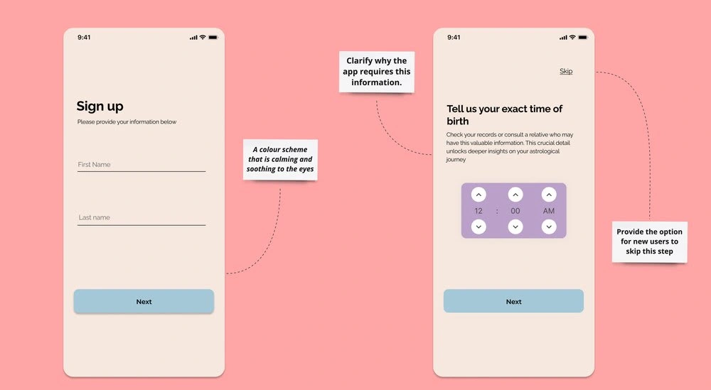
Familiarity and Connection
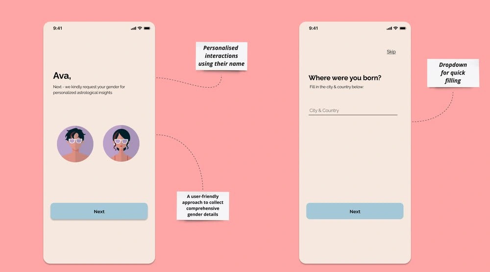
Personalisation with a user's name is important in app because it creates a sense of familiarity and connection. By using the user's name throughout the app, it helps create a welcoming and engaging environment, fostering a positive relationship between the user and the app. This personal touch can lead to increased user satisfaction, loyalty, and overall app engagement.
Home
The home screen provides a visually appealing and intuitive interface, enabling users to access key features and information. The layout is organised to prioritise the most relevant content, including daily horoscope, personalised recommendations, and astrological events.
Below, you can explore more details about the home screen and my design decisions.
Book Appointment
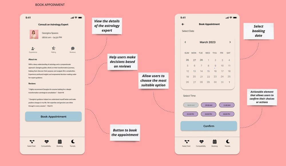
The book appointment page is designed to facilitate the process for users to schedule consultations with astrologers. The design ensures that the available slots are easily visible and selectable, allowing users to choose the most suitable option for their needs. Additionally, the page includes features such as astrologer profiles, ratings, and reviews to help users make informed decisions.
Usability Test (Outgoing)
The next step is to test and validate the design decisions.
Like this project
Posted Jun 2, 2023
Aligning the Stars: A User-Centered Design Approach to an Astrology App
Likes
0
Views
42
