Scaling a learning & school management platform during pandemic

Marvel Faseun


Edves is an EdTech platform that digitizes learning and helps school administrators, teachers and parents collaborate to deliver quality education to learners. It automates school operations to save time and helps Teacher-Parents engagement on learning outcomes of the kids in Primary and Secondary (k-12) Schools.
Content
Summary (TL;DR)
In this product design case study, I was approached by Edves, an EdTech platform, to redesign and expand its existing platform to meet the increased demand for online learning caused by the Covid-19 pandemic. The platform had a steep learning curve, tedious navigation, and a dated user interface, resulting in a high churn rate and low adoption by new users. The main challenge was to elevate the user experience across all user types within a short time frame of three months and a limited budget.
To address this challenge, I adopted a competitor analysis approach to gather insights and save time. I also conducted surveys, heuristic evaluations, and semi-structured interviews to understand user pain points and prioritize design solutions. Based on the research, I identified three key areas for improvement: welcoming visual language, simpler language and navigation, and personalization for schools. I created wireframes and iterated on high-fidelity designs, but encountered a problem with the visual language not resonating with younger students. To fix this, I added a solution hypothesis to develop a unique visual language for different user types, using age-appropriate illustrations and gamifying the student experience.
Despite time and budget constraints, I was able to create a scalable solution that improved the user experience and addressed the pain points of Edves' users. Although there were additional opportunities that could have been explored with more resources, the final design achieved the project's goals.
Background
In early 2020, Covid-19 brought a sudden lifestyle change to almost everybody in the world. Very few industries had contingencies in place for transition into a fully remote experience. Schools in third-world countries had to play catch with online learning as it was something most schools had never adopted pre-pandemic.
It was the perfect opportunity for an Education Technology(EdTech) platform like Edves, which had a working EdTech solution that integrated well with traditional methods of learning and curriculum in Nigerian and African schools as a whole.
I was approached by Edves to help build on the experiences they have acquired in the African EdTech space over a period of 4 years. The goal was for me to redesign and expand on the current platform, to elevate the experience of existing users and to also acquire new users whose demand for online learning has risen drastically since the start of the Covid-19 lockdown.
Problem
Edves has been around for around 4 years and has been plagued by design and technical debt because enough effort was not put in place to craft a good user experience when it started. Often, there are user complaints of how tedious it is to navigate through the platform, especially as a new user and how below par the visuals were compared to its competitors.
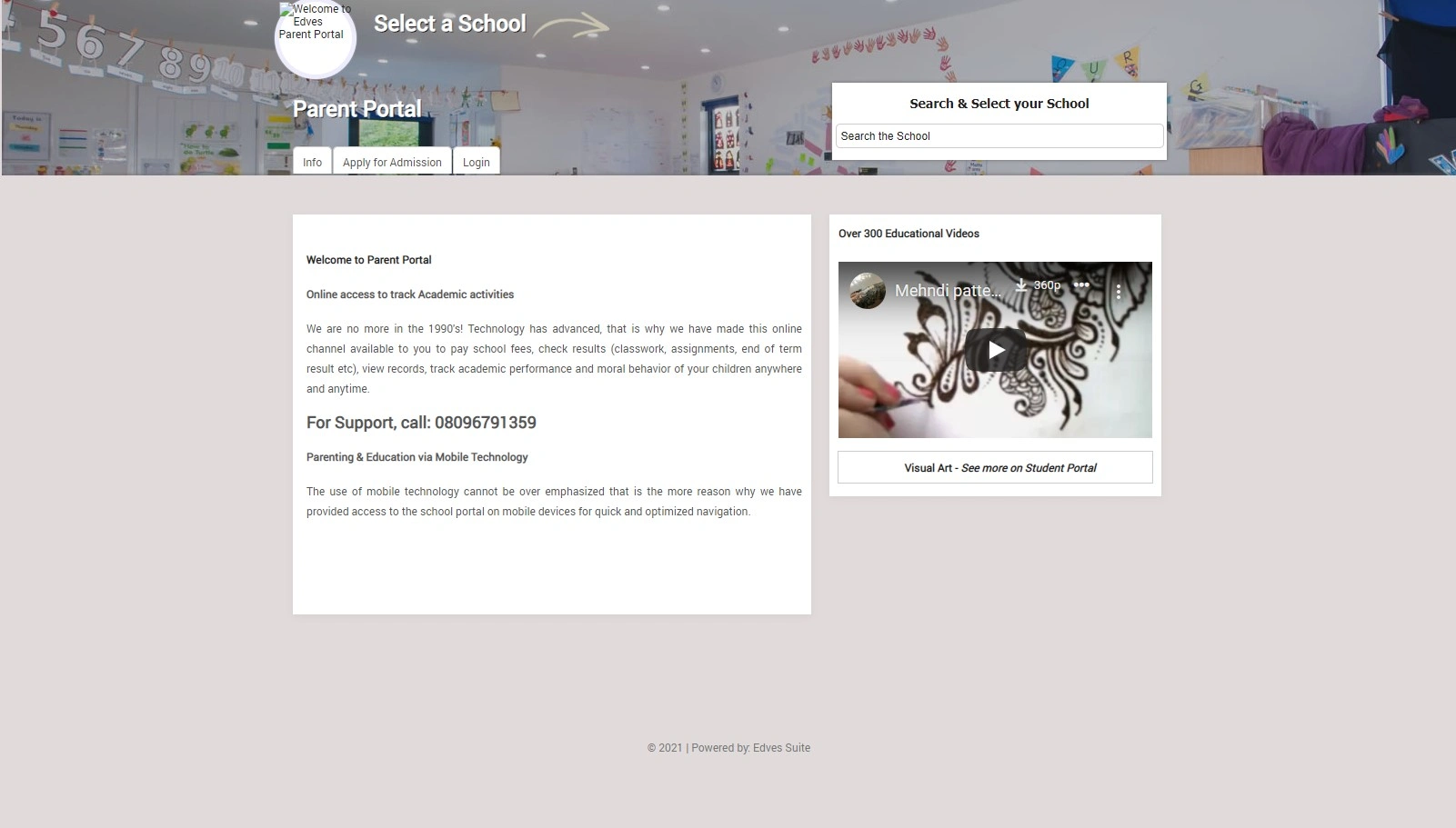
The old Edves interface
Knowing the users
Edves had a complex user type and hierarchy structure that used the platform for various reasons. Some of these user types had sub-types that also needed unique design solutions. The need to address the unique needs of Edves' various user types was one of the main challenges. In other to better understand the users, I had to carry out different research types to understand their pain points and how they interact with the platform.
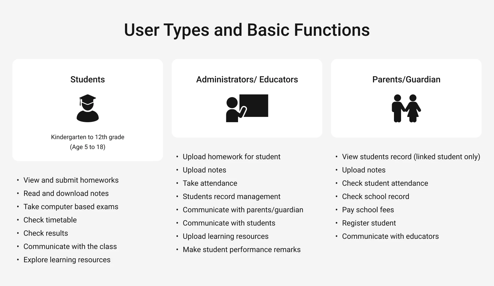
All user types and their roles
The challenge
"How do I elevate the user experience across all user types on the platform within a short time frame of 3 months and a limited budget?"
I had a really short time frame to come up with a web and mobile solution that addresses the problems the platform is facing. This tight time frame was because of our goal to take advantage of the demand that came with the pandemic.
One quick realization I came to was that making different designs for each user group that uniquely elevates the experience positively was going to be time-consuming and the final solution will be way out of budget.
We needed a solution that can be implemented fast and has a solid foundation that can be built upon subsequently.
Competitor analysis; A major strategy
"Since I had a limited time & budget for research and one of the major goals was scalability, I spent a considerable amount of time learning from competitors, majorly Byju's and Google Classroom"
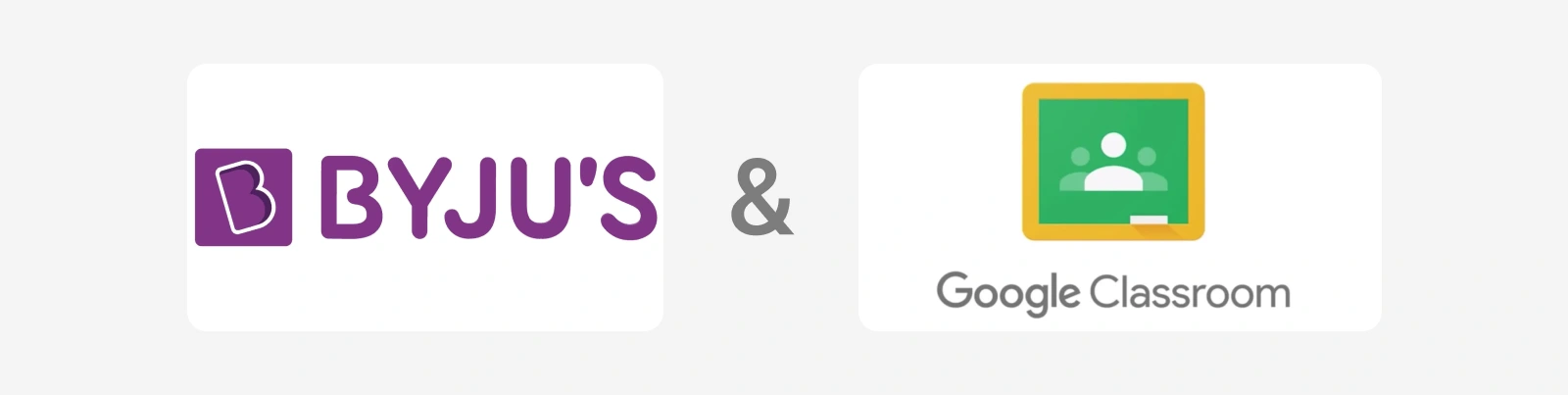
Byju's and Google Classroom are some of the major competitors I learned from to give me a head start in the research process.
Competitor analysis was a major strategy I utilized because of the constraints of the project. "Since I had a limited time & budget for research and one of the major goals was scalability, I spent a considerable amount of time learning from competitors, majorly Byju's and Google Classroom"
This approach proved effective as it gave me a head start in the research process and saved me a considerable amount of time.
Surveys
To keep things moving as fast as possible, one of the methods I adopted to understand the platform and user pain points was to conduct an online survey. The goal was to get enough information to synthesise some solutions that can be quickly tested and refined.
A survey was sent out to major stakeholders, customer-facing employees and users to find out their pain points about the platform. The goal was to consolidate the feedback and rank these pain points to provide an actionable list of prioritized design solutions.
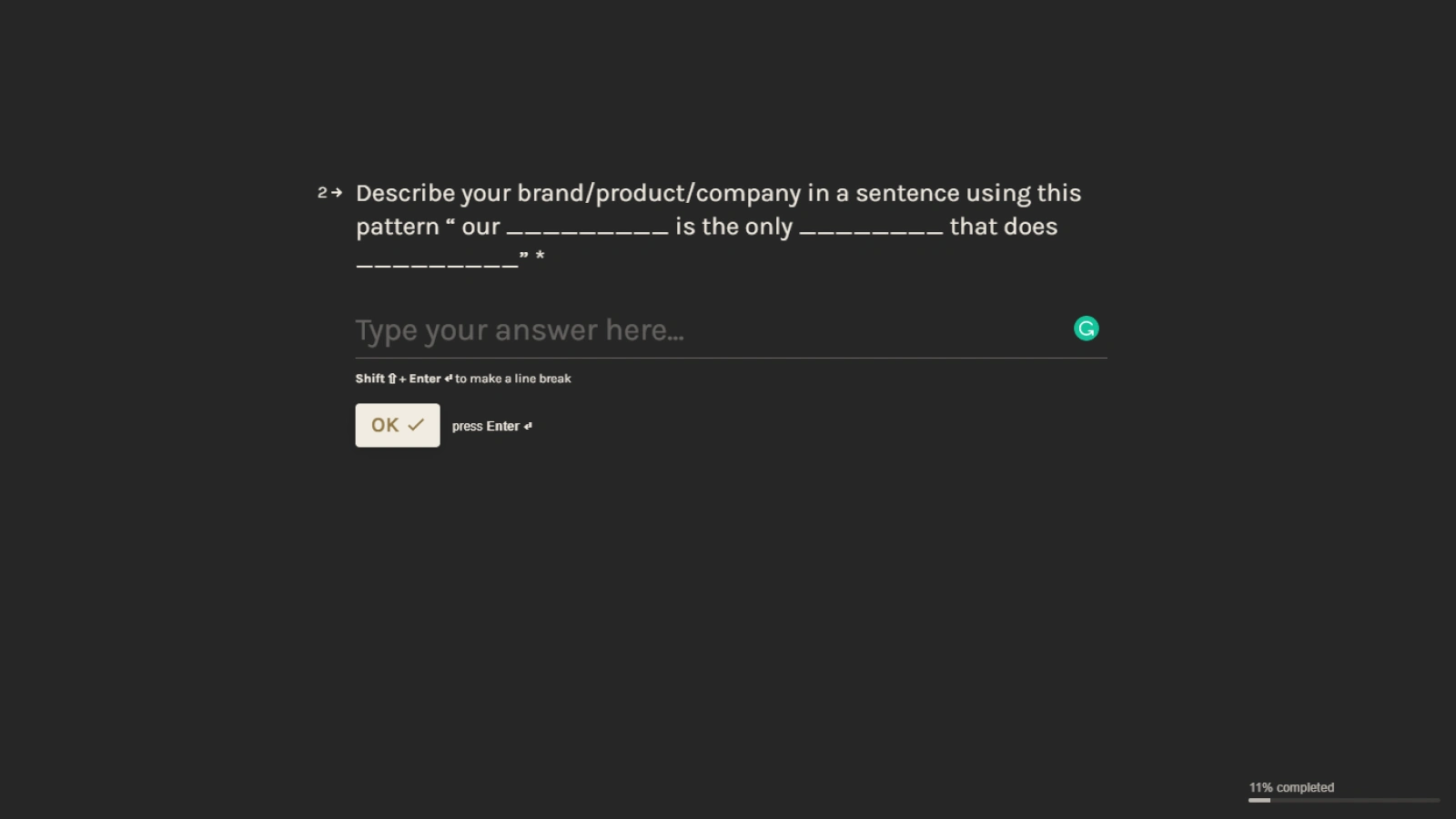
Typeform used for survey
Heuristic Evaluation
To support the surveys, I carried out an in-depth heuristic evaluation on all pages of the platform to identify usability problems in the user interface design.
I modelled my heuristics according to Jakob Nielsen's 10 general principles for interaction designThis severity of each evaluation principle was documented for each major page of the platform to help prioritise what needs to be addressed. Each evaluation I made came with a recommendation that represented an opportunity for what can be improved from a usability standpoint.
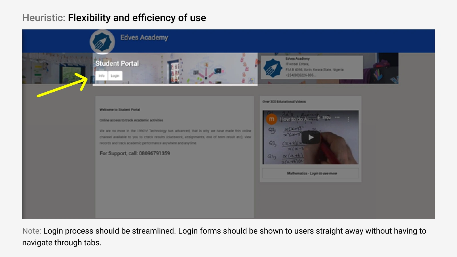
Heuristic evaluation of the student portal login page with a note suggesting an opportunity for improvement
Interviews
I also conducted a semi-structured interview on Zoom with 5 people that has a working knowledge of the Edves platform and has been interacting with the platform for at least a year. These interviews gave important insights into how people interacted with the platform and their pain points when using the platform.
Solution hypothesis
From my research, I was able to prioritise 3 actionable steps to drive my design solution.
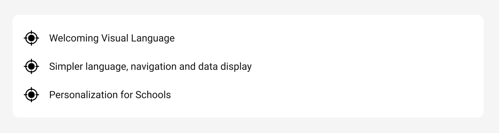
Three areas to focus on to drive my design solution
The combination of the competitor analysis, data analyzed from the survey, heuristic evaluation and semi-structured interview gave enough insight for me to form some solution hypothesis that attempts to solve the problems in alignment with business goals.
From the consolidation of all research data, I prioritized 3 areas where changes can be made for drastic improvements. These changes were meant to be tested and refined as quickly as possible before passing them on to development.
Welcoming Visual Language - How can we build a platform with a visual language that appeals to each category of user that will be in contact with this platform?
Visual language should be customizable and change depending on the category of user i.e. parent, student, or teacher.
Simpler language, navigation and data display: How do we simplify the learning curve for first-time/inexperienced users?
-School-like terms should be used for easy understanding
- Simple charts and data visualization methods should be used
- Information should be presented based on currency and urgency
Personalisation for Schools: How can we make the experience of each school unique and in-brand on the Edves platform?
- Create overall customisable colours
- Create unique illustrations depending on the colours
Design iteration
At this point, I had enough data to start visualising what the solution will look like. I aligned my proposed solution with the stakeholders, I then proceeded to start designing the solutions starting with the wireframes to quickly test and validate my ideas and solution hypothesis.
With these wireframes, I was able to validate ideas and flow iteratively before making the hi-fi designs.
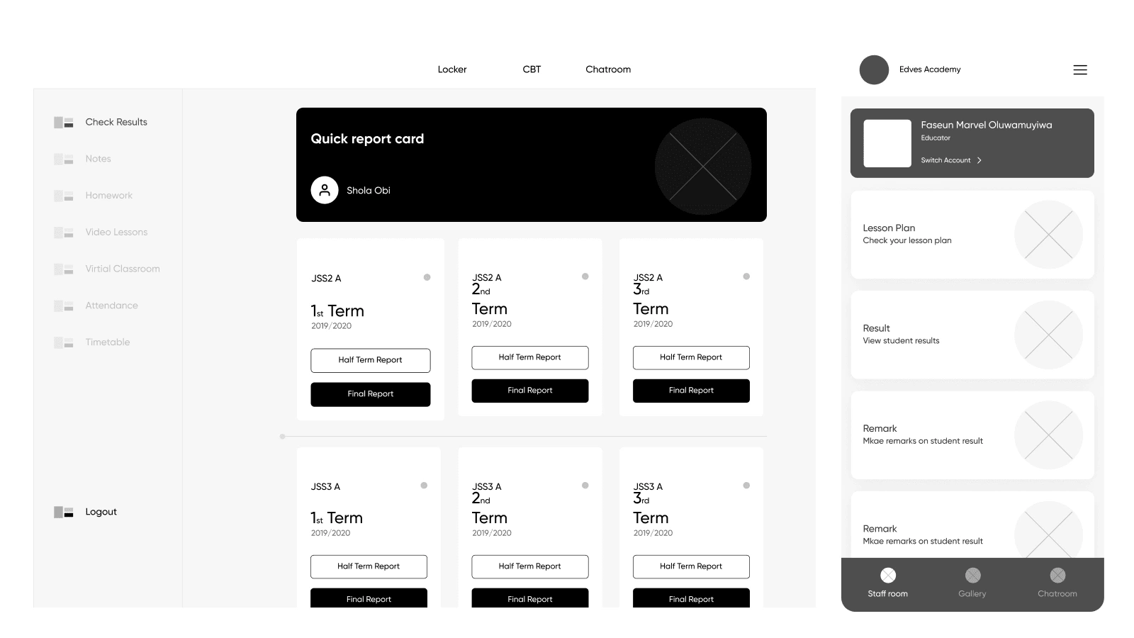
Left: Web portal wireframe, Right: Mobile wireframe
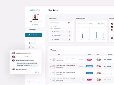
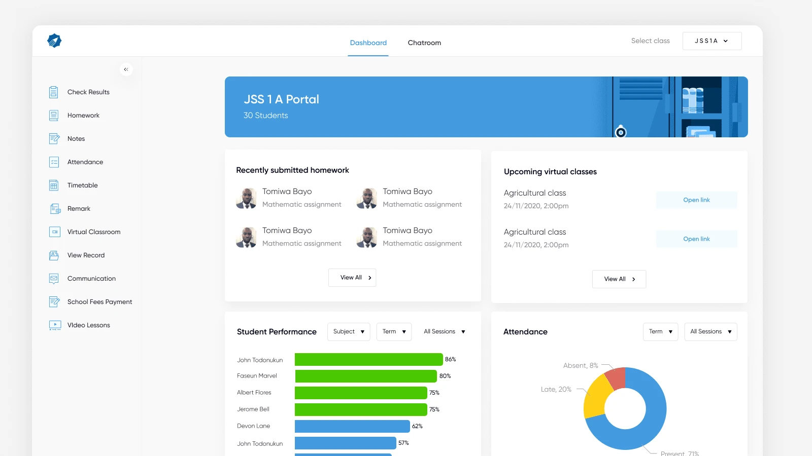
Creating High Fidelity Designs
After iterating upon the wireframes extensively and I was confident in the solution that I was creating, I then proceeded to start designing the high-fidelity version of those wireframes. I was continuously iterating and improving the high-fidelity designs based on feedback. About halfway into the hi-fi designs, I noticed a pattern of feedback that always came up, especially with the younger audience.

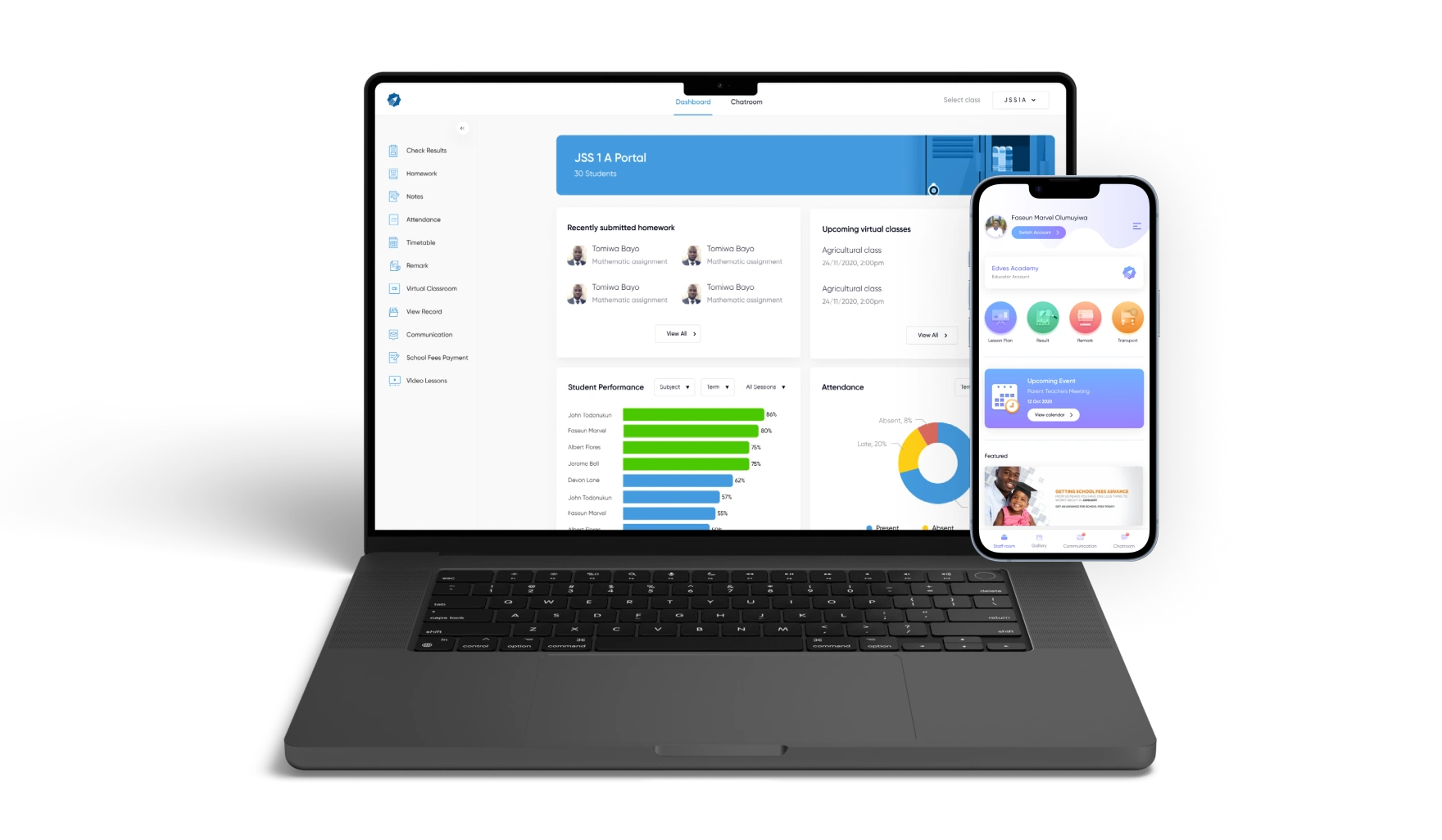
Educators' dashboard high-fidelity design
Issues from testing
Even though iteration during the wireframing stage cut out many of the possible problems, we discovered a huge problem with the visual language when testing the hi-fi designs.
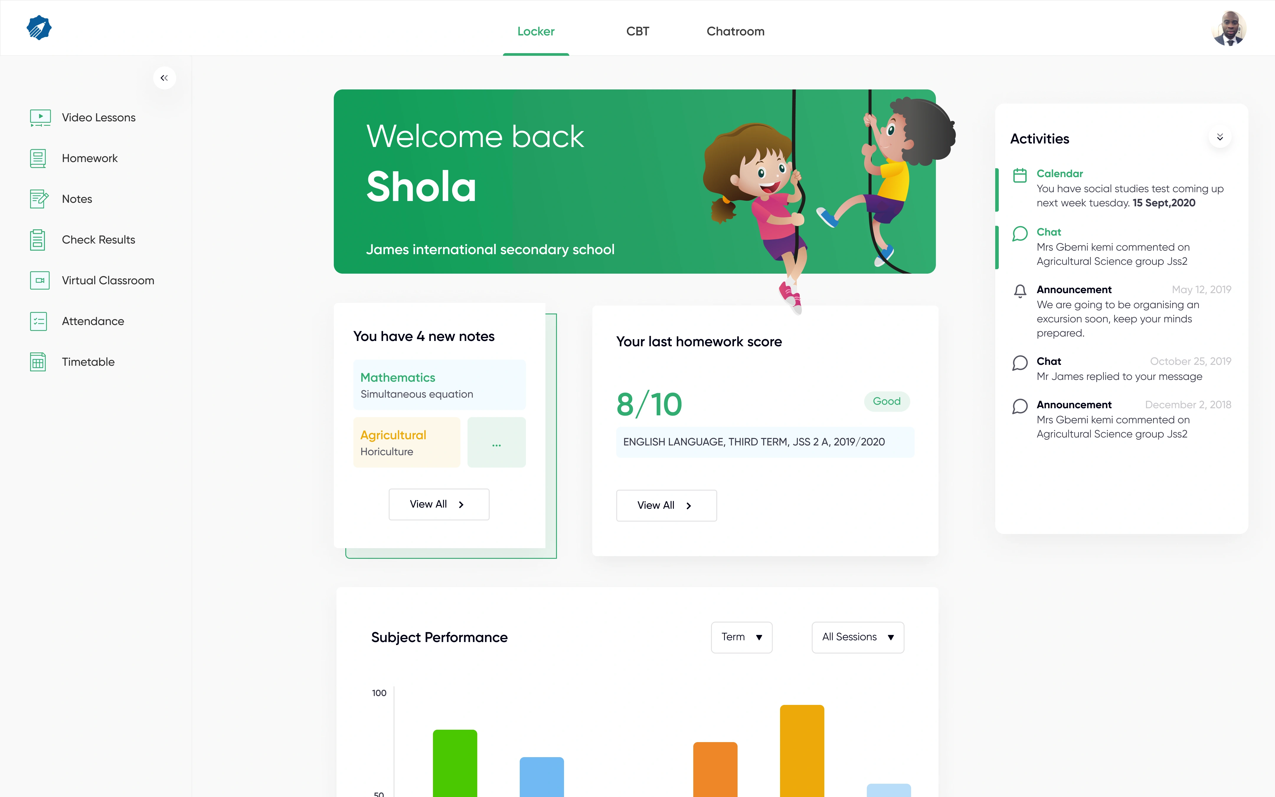
Younger students thought the design seemed overly serious and boring
When testing the high-fidelity designs with real users, especially younger students, we discovered a huge problem with the visual language. They just could not relate to the overly-serious design. This in turn lowered the appeal of the design to a younger audience. In a space where we really needed to capture the attention of students, this was not acceptable.
In a bid to save time and work within the budget, I made the mistake of making the assumption that we can apply a one-size-fits-all visual language for all user types which turned out to be a wrong assumption.
Unique Visual Language for different user types
To fix the problem of the boring visual language for younger students, I added another actionable solution hypothesis that will work within our timeframe and budget.
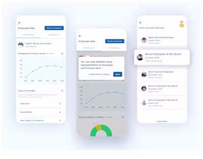
Younger students will see illustrations tailored to kids
Unique Visual Language for different user types - How do we make sure the platform appeals to its different users and also encourages visitation from users, especially for Students?
- Use age-appropriate illustrations depending on the user category
- Gamify student part of the platform for appeal and fun
- Simplify flow and reduce the number of clicks to achieve results.
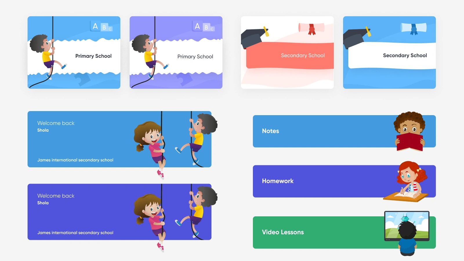
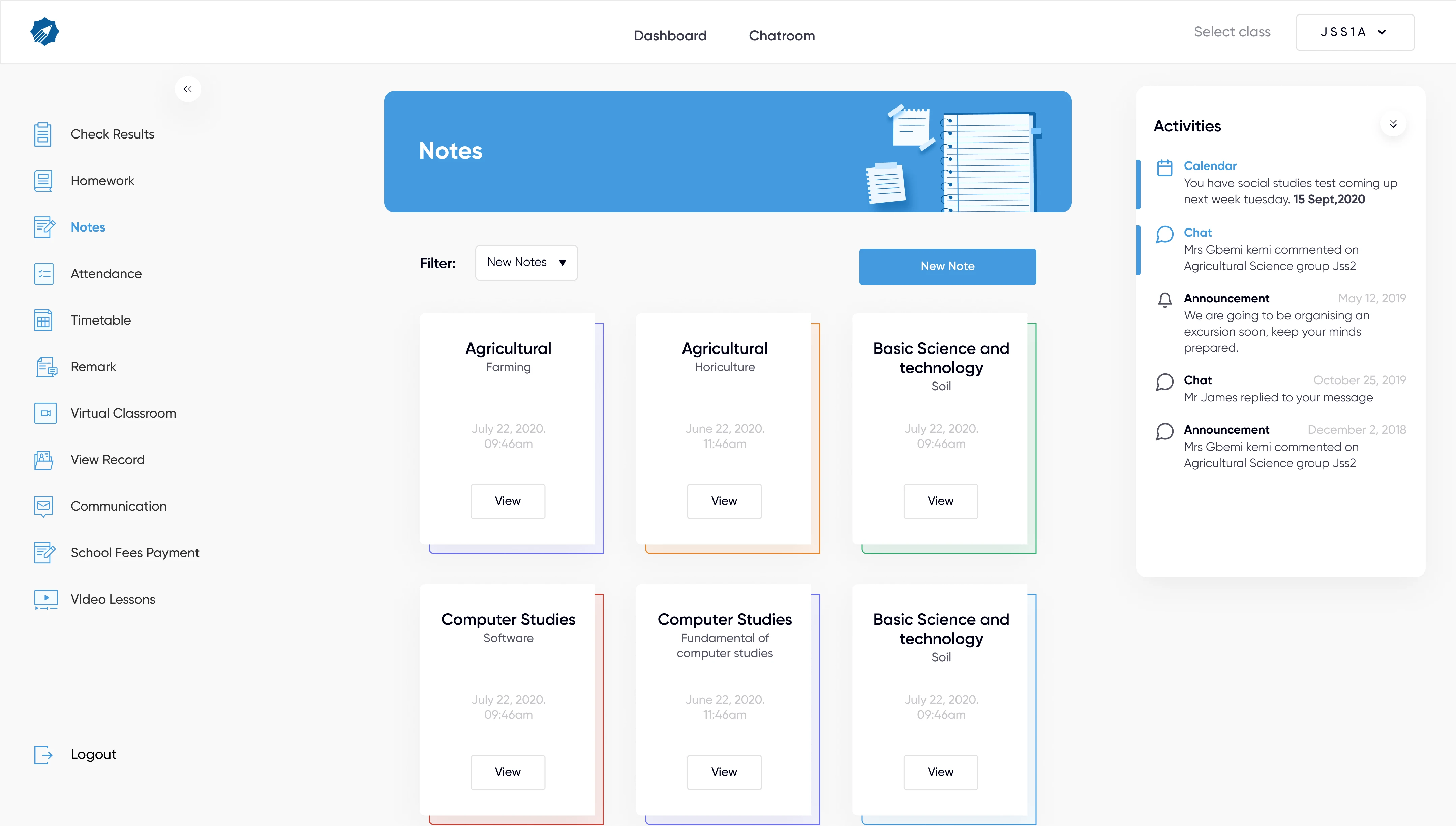
Unique visual language designed for different user types
Due to time and budget constraints, I leveraged free online illustration resources and adjusted them to fit the design.
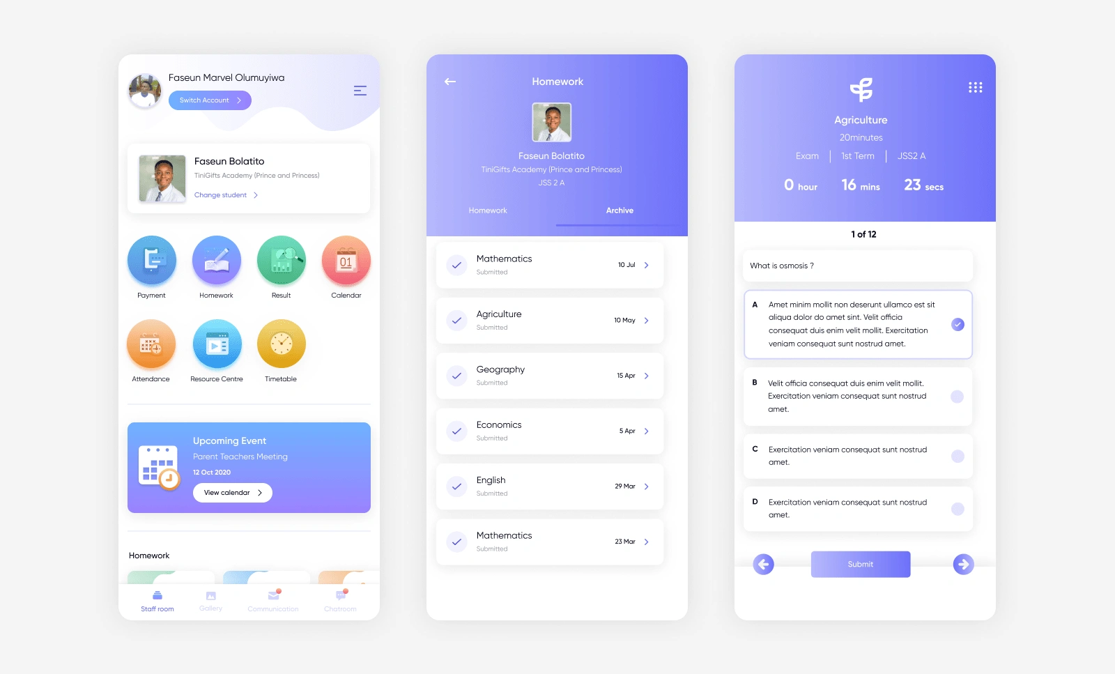
Final designs
Getting to the final design required lots of iterations, but overall, I was able to come up with a solution that works within the time and budget constraints of the project.
UI screens and illustrations designed for Edves
Like this project
Posted Aug 3, 2023
Edves is an EdTech platform that digitizes learning and help school administrators, teachers and parents collaborate to deliver quality education to learners. …
Likes
0
Views
9
Clients
Edves