Doctor Care Anywhere Booking Redesign
Janelle tamayo
Doctor Care Anywhere
Patients can now book a GP appointment before they sign up.
TL;DR
DCA’s onboarding was registration-first: 42 minutes of forms before patients could see a single appointment slot, and only 0.892% finished. I led the UX and strategy to move booking in front of registration, tested the riskiest assumption with 30 patients, aligned four pushback teams around one patient-centred argument, and shipped a widget now live to 100% of DCA’s direct-to-consumer patients.
Book before you register. A foundational re-sequencing of the patient journey, shipped at scale.
Doctor Care Anywhere needed to grow direct-to-consumer revenue six times over in a year
Doctor Care Anywhere is one of the UK's largest private telehealth providers, with most patients arriving through an employer or insurer. The direct-to-consumer side, people paying for their own appointment, was small: £250k in 2025 against a £1.5m target for 2026. I was the only designer on the booking experience.
£250k in 2025. £1.5m target for 2026. A six-fold jump in a year.
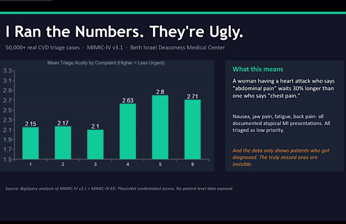
Fewer than 9 in every 1,000 patients who started onboarding ever finished
Over 90 days, 46,395 people started onboarding and 414 finished, a 0.892% conversion rate. The first step lost 13% of patients before they submitted anything. Verification at the end converted 414 of the 37,227 who reached it. That is where the funnel died.
46,395 in. 414 out. 0.892% conversion.
Patients spent 42 minutes registering before they could see a single appointment slot
Two problems sat on top of each other. Registration came before booking, so patients could not see available times without an account. And sign-up plus onboarding took around 42 minutes. Someone with an acute concern had to spend that time on faith, with no proof a slot existed.
42 minutes to register. Zero slots visible until the end.
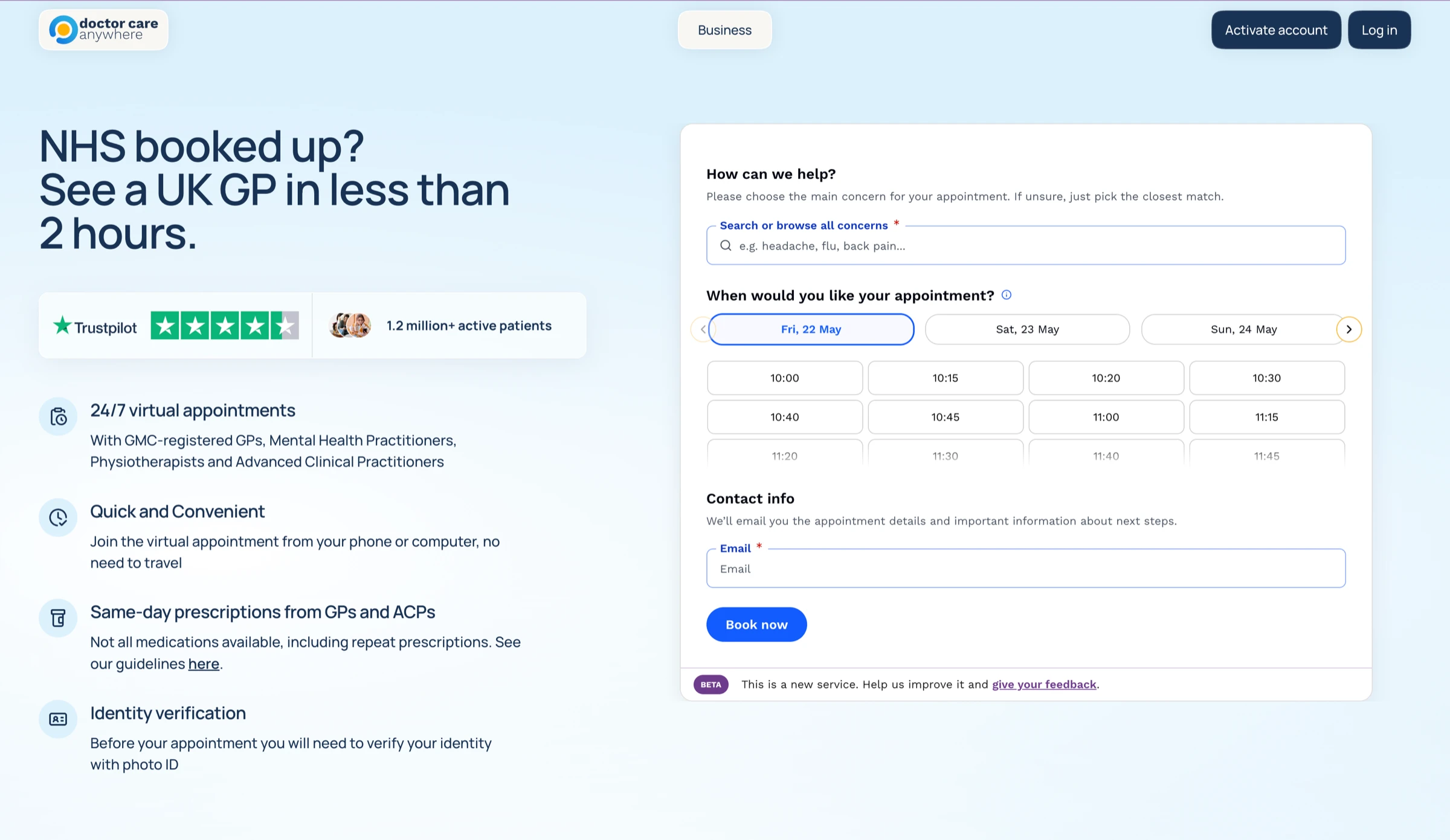
I put booking in front of registration so patients see real availability first
The fix followed from one insight: people will not invest effort before they see value. So I built the flow to show real slots first, then let patients pick a concern, pick a time, and create an account last. An available slot is reassurance.
Four teams pushed back, and each one had a different reason
Clinical, marketing, engineering and some PMs all had objections, and not as one wall. I took each concern back to the patient rather than negotiating team by team.
Clinical questioned how clinician types were described. I used their own wording.
Marketing wanted the widget to fit their landing page, so I embedded it there.
Engineering flagged the cost of re-sequencing payment, identity and accounts.
Some PMs noted the platform was built account-first, breaking a core assumption.
I split the work into two phases so a foundational system change was shippable
Engineering and the PMs were right that the platform could not flip overnight, so I scoped honestly. Phase one simplified sign-up: fewer fields, postcode lookup, a working mobile journey. Phase two introduced book-before-registration.
I tested the riskiest assumption first: would registration friction make people quit?
The strategy rested on a guess: that patients would tolerate ID checks and account creation if they came after choosing a slot. I ran an unmoderated test with 30 D2C-matched participants, with abandonment offered as an answer option. The test was built to find friction.
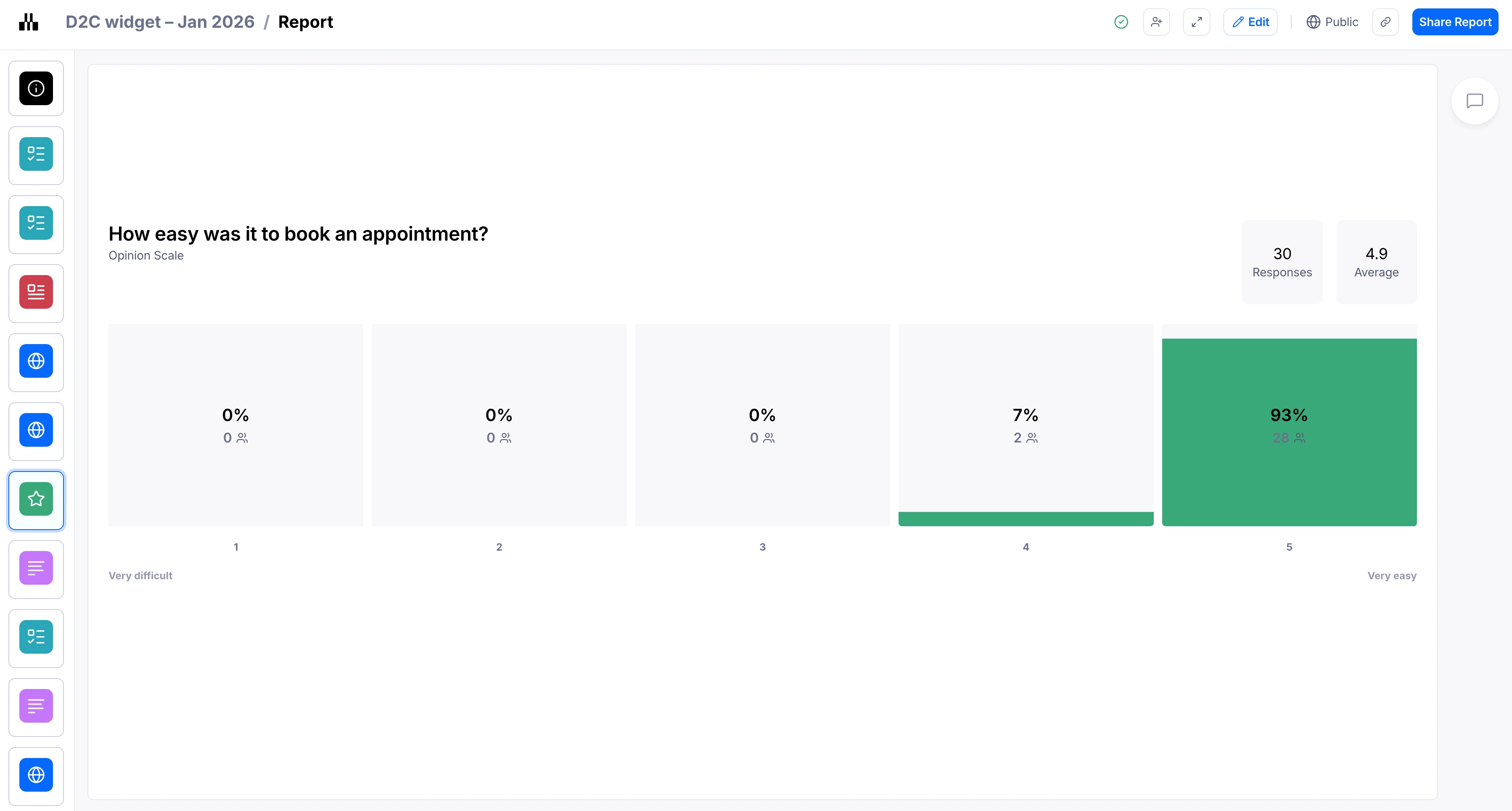
Leadership feared users would search, find nothing, and leave
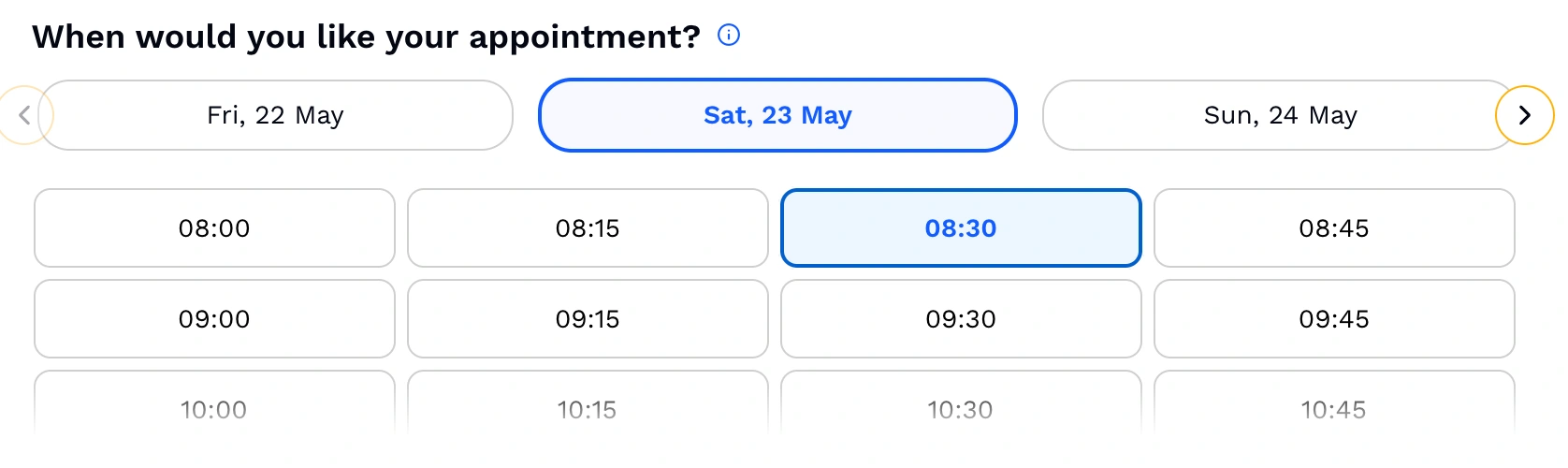
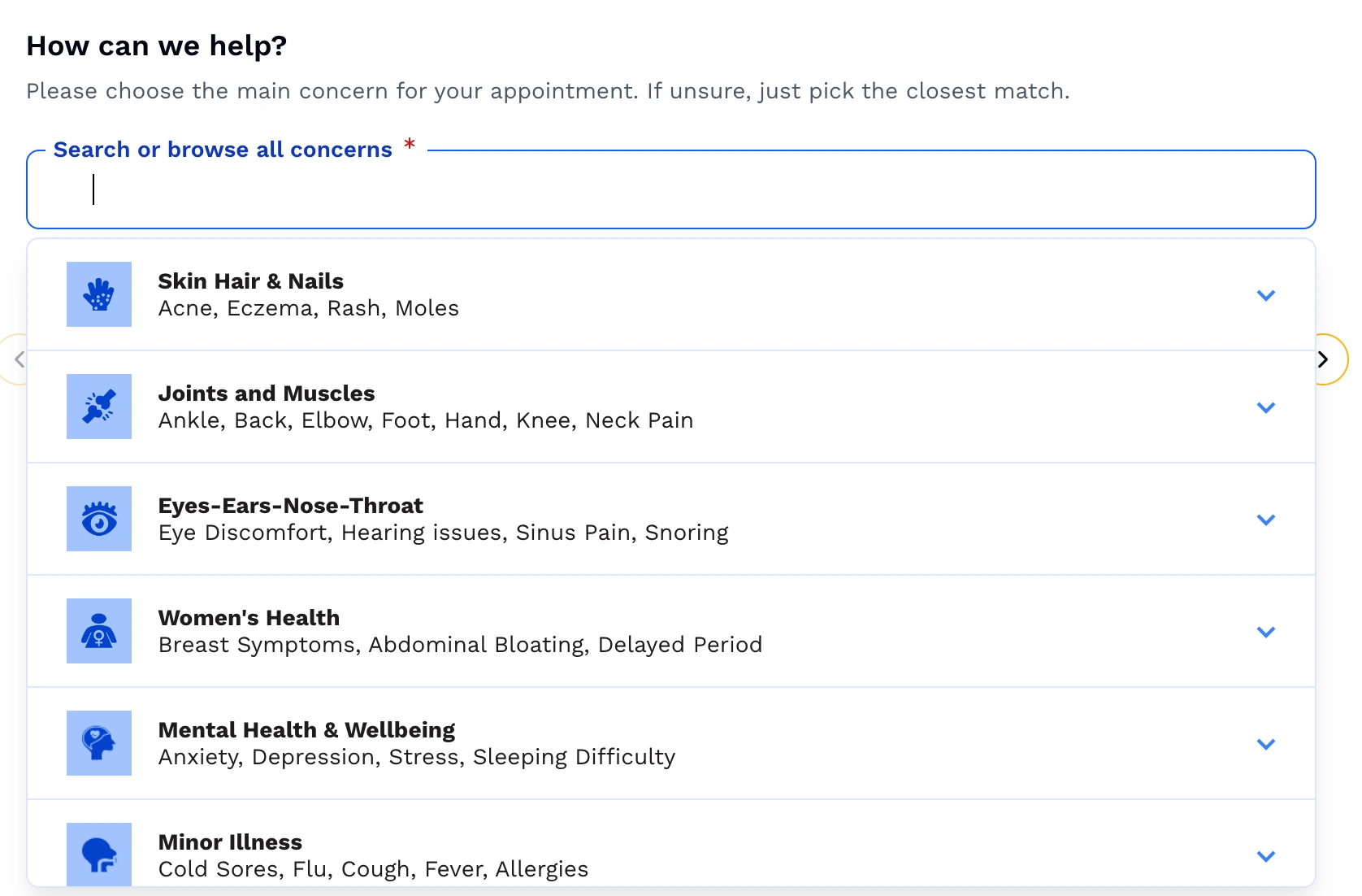
One executive concern was specific: a hundred users type a symptom, get nothing, and abandon. I tested it. They did not leave. When search failed, users reformulated once or twice then browsed, with no drop-off. The picker shipped with search and browse together and plain-language categories.
The widget is live to 100% of Doctor Care Anywhere's D2C patients
Phase two shipped. Book-before-registration is the live experience for every D2C patient. The widget is embedded in the marketing landing page, the booking flow runs before any account exists, and a calendar grid shows bookable slots up front.
Before: a 0.892% conversion rate and 42 minutes to book. The redesign set out to cut sign-up to one minute.
A real patient booked in five minutes, then hit a wall after her appointment
After launch, a patient named Erin was interviewed. She finished her booking in about five minutes, while at work, and found the clinician profiles reassuring. Her frustration came later: no GP notes arrived and follow-up was unclear. The booking front door works. What comes after it does not.
It was really easy, about five minutes. The frustrating part came after.
What I learned and where this goes next
The widget solved its scoped problem, and showed me where the next ones sit.
A 0.892% baseline made every objection easier to overturn. A broken number argues for you.
The four teams did not need defeating. One patient-centred argument turned four positions into one.
Phasing made a foundational system change shippable at all.
I would push earlier for a measured post-launch figure. The before-state is documented; the after deserves the same rigour.
The next bottleneck is not booking. It is notes, follow-up and refunds, where value leaks now.
Also designed at Doctor Care Anywhere
The booking widget was one of several design projects across the same year.
SignatureRx pharmacy migration. Designed patient communication for DCA's pharmacy provider switch, including a 6-month dual-provider view of prescriptions, a clearer status table, and aligned terminology across the app. Prescription-related support calls dropped from 20% to 11.3% of PX volume after launch, freeing the team to focus on other patient queries.
Health Assessments Journey. Created, piloted, and iterated an in-app health assessment flow integrating with two partner health companies. Dynamic content and answer piping route patients by preference, including the GLP-1 path.
GLP-1 medication research. UX research on the weight-management prescription journey. Tested a compressed 11-screen intake against a 20+ screen version split into sections with dynamic content and answer piping.
Onfido Studio retry. Designing the patient retry flow on Onfido's new identity verification SDK. Currently in discovery. Targets the 20% of verifications routed to manual review today, where patients wait up to 24 hours; the new flow lets them self-correct in minutes.
Like this project
Posted Jun 5, 2026
Restructured patient booking process, improving conversion from 0.892% to a more efficient system upfront.