Landing Page Redesign for an AI Quote Generator

Landing Page Redesign for Quotka - An AI Quote Generation Service
Strategic UX & UI revamp for higher conversions and a smoother quoting journey
Project Overview:
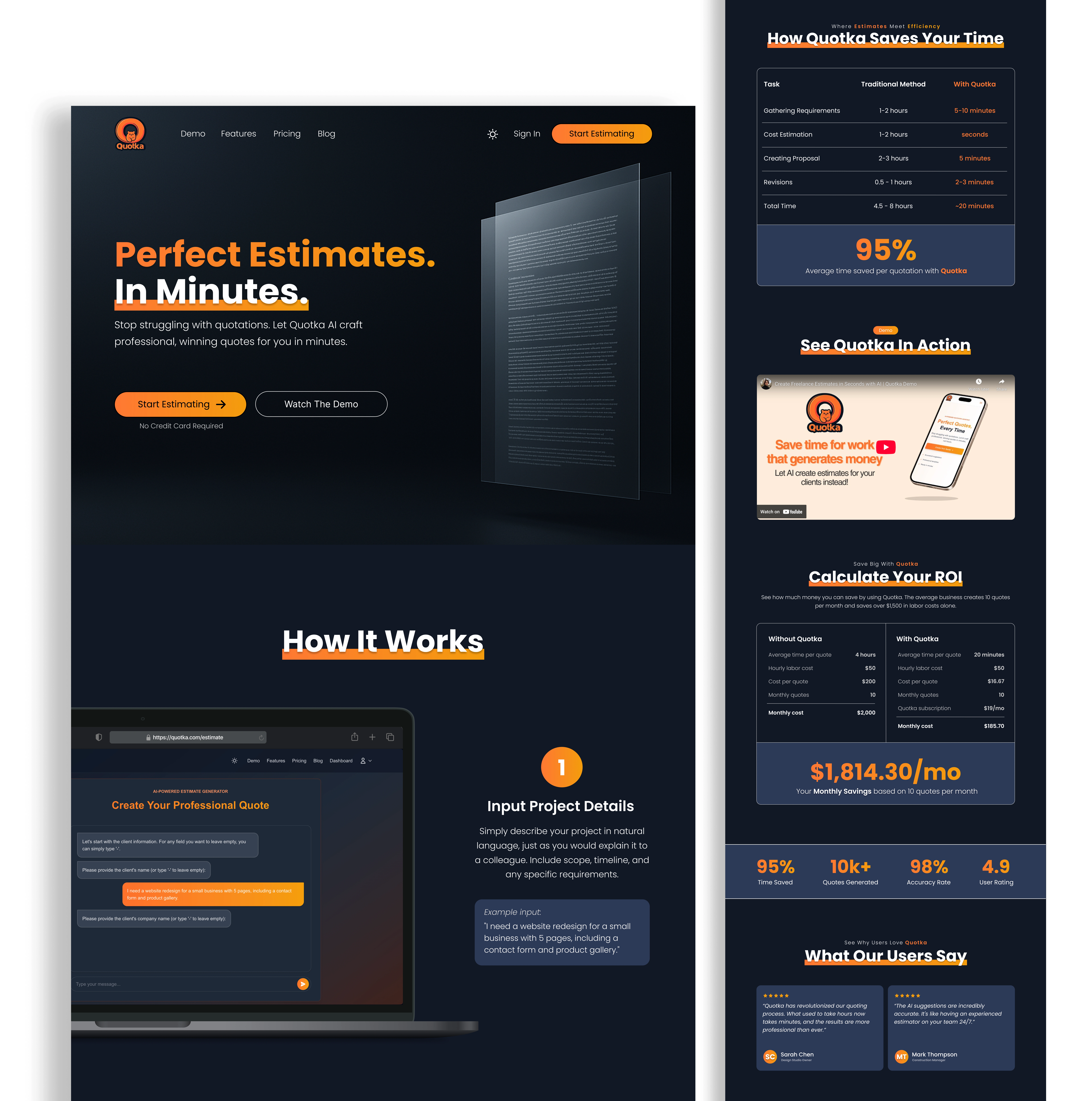
Quotka is an AI-powered tool that helps freelancers and small businesses generate professional quotes fast. I redesigned their landing page with a focus on clarity, trust, and conversions. Using Figma, I restructured the layout, improved content flow, and crafted a more modern, engaging visual experience that better communicates Quotka’s value. (Full breakdown below)
Hero Section Animation

Landing Page Redesign (Dark Mode)
Key Enhancements Breakdown
Conversion-Focused Structure
Clear primary CTA button in the navbar improves action visibility.
Secondary CTA added in the hero for hesitant users.
CTAs strategically placed at key points (after “Why Choose Quotka”, in pricing section, and after FAQ sections) to ensure consistent conversion opportunities.
Messaging, Hierarchy & Content Flow
Hero section copy rewritten for clarity and personalization, with improved spacing and better hierarchy between title, subtext, and CTA buttons.
“How It Works” section is now paired with real UI screens to build trust.
Section titles are concise, benefit-driven, and guide users logically.
Visual Design, Typography & Consistency
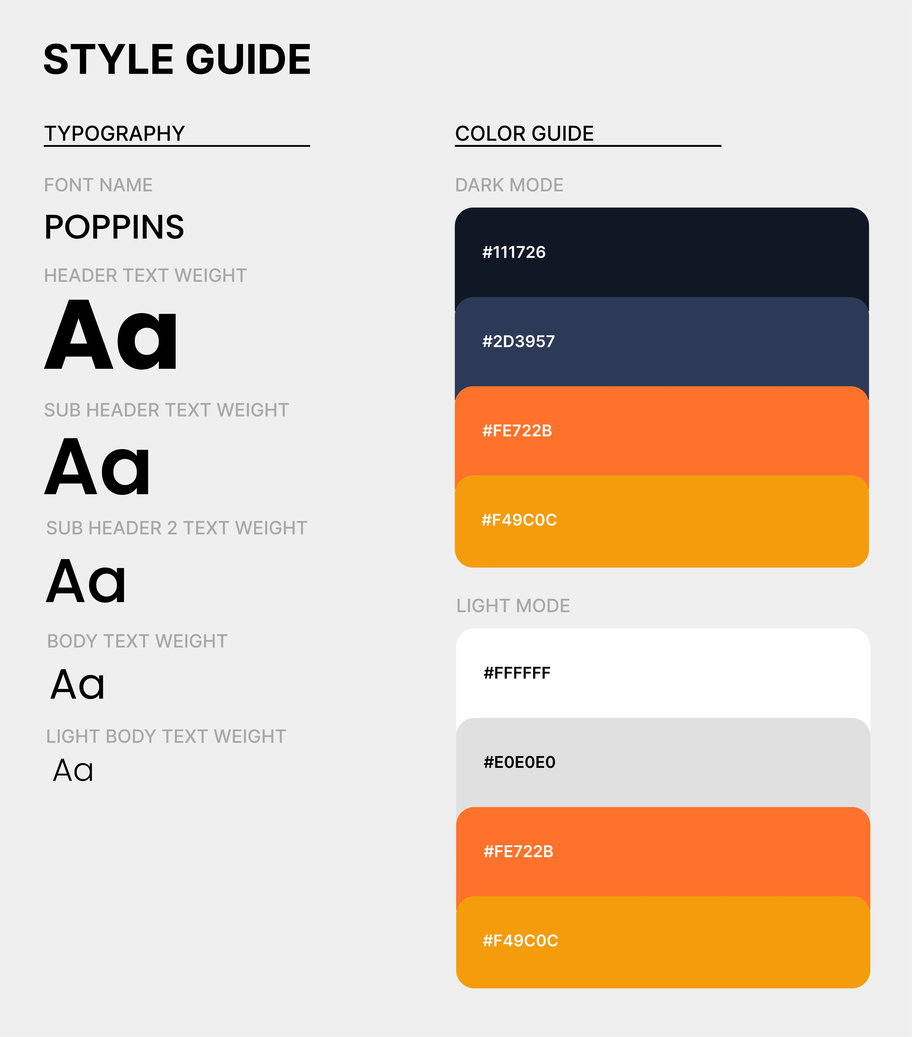
Brand fonts, sizes, and spacing are now rhythmically consistent.
Use of brand orange is intentional, drawing focus and guiding interaction.
Dark and light mode pages are polished with consistent backgrounds, cards, and content blocks, creating visual depth and reducing distraction.
Visual Clarity & Communication
Product screenshots and UI mockups help illustrate the platform’s capabilities with real, recognizable use cases.
A sleek floating digital document adds depth and credibility to the hero section while maintaining room for headline legibility.
UX Enhancements
Pricing cards now show clearer plan differences and visual hierarchy.
Stats, testimonials, and ROI section are redesigned to boost credibility and add momentum towards conversion.
The ROI Calculation and Time Saving sections were visually clarified, aligning their layout with the brand theme and increasing readability.
Final Touches
A playful brand mascot in the footer adds charm and memorability without overwhelming the CTA.
All content blocks have intentional margining, padding, spacing, and layout refinements for easy visibility and more breathing room.
Final Result & Impact
A visually engaging, clearly structured landing page that’s easier to navigate, trust, and convert on, helping Quotka’s product connect with solopreneurs and small teams faster.
Before & After (Light & Dark) Preview Link:

Landing Page Redesign (Light Mode)

Style Guide
Like this project
Posted Apr 19, 2025
Redesigned Quotka’s landing page for improved structure, clearer messaging, better visuals and brand consistency, and stronger CTAs to drive more conversions.
Likes
1
Views
16
Timeline
Apr 1, 2025 - Apr 5, 2025


