Plenty - Children's Protein Milk :: Behance
Overview
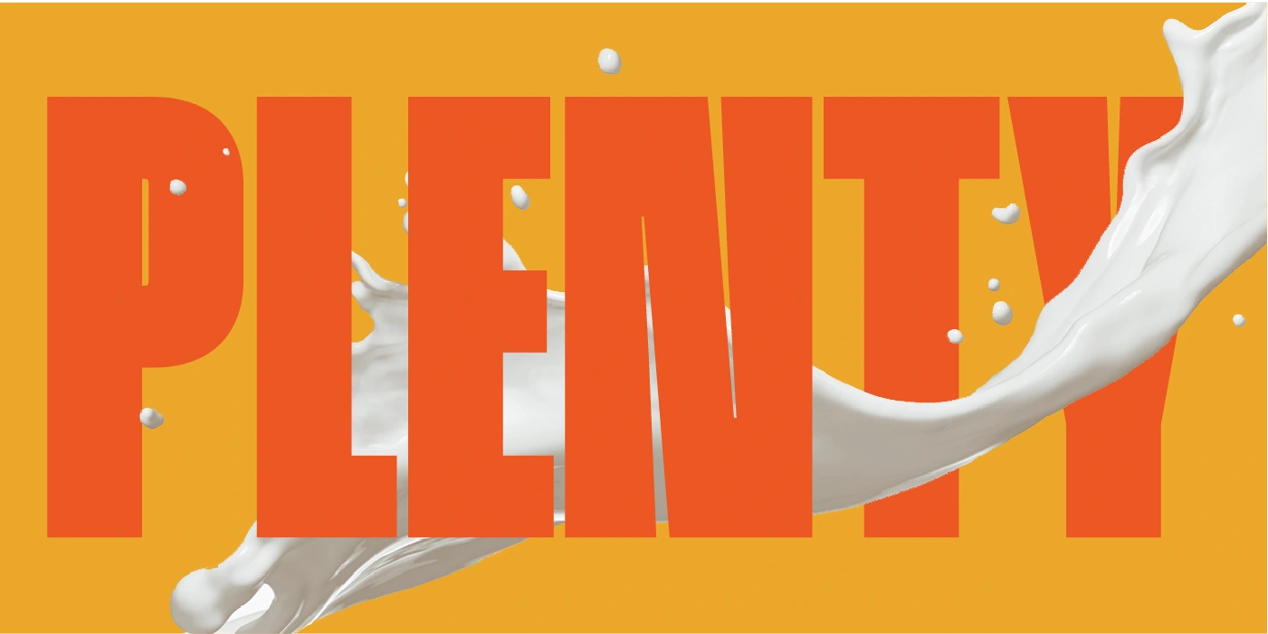
Introducing Plenty, a refreshing protein milk brand designed specifically for kids! Our case study dives into how we’ve revitalized the often-stale world of protein milk, transforming it into an exciting and joyful experience for young consumers. With fruit-inspired flavors and vibrant packaging, Plenty is here to ensure that kids get the protein they need while enjoying every sip.
The Vision
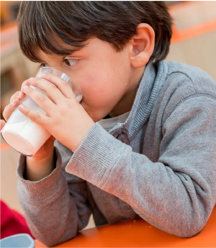
At Plenty, we believe that protein milk can be both nutritious and fun. Our mission is to engage children who need extra protein in their diets by offering a product that excites their taste buds and brings joy back to drinking milk. We aim to create a brand that parents can trust while making healthy choices appealing to their children.
Thought Process
Identifying the Challenge
In our research, we found that traditional protein milk products often cater to infants and lack appeal for older kids. The packaging is often dull, and flavors are limited, leading to disinterest among young consumers. We set out to change this by understanding the needs and preferences of our target audience.
Understanding the Audience
Kids crave vibrant flavors and playful experiences. They want products that make them feel empowered and excited. We focused on creating a product that not only meets their nutritional needs but also fits into their active lifestyles.
Design Process
Brand Identity
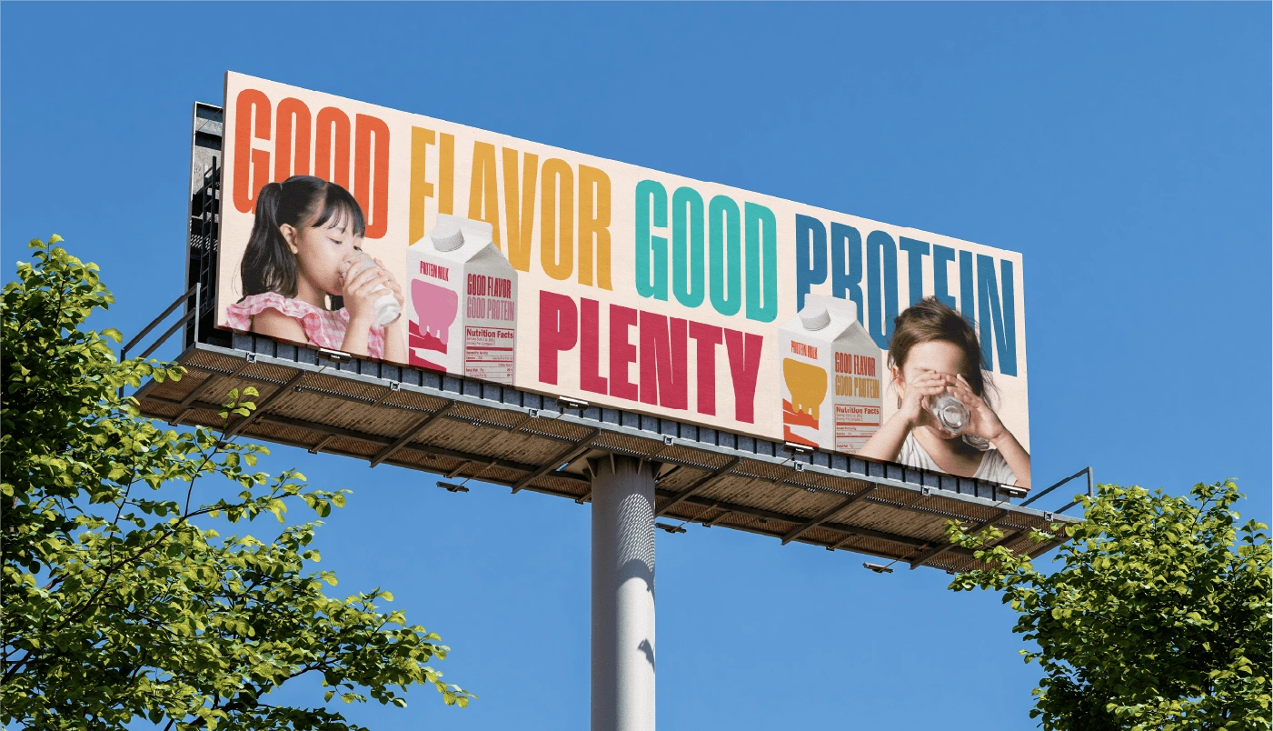
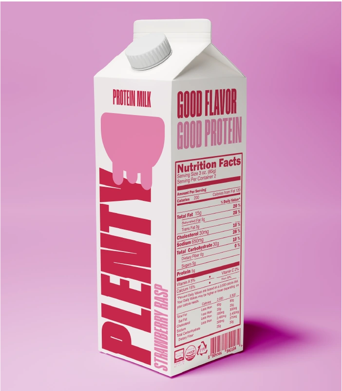
Our design process began with crafting a bold and playful brand identity. We developed a colorful logo and energetic typography that resonates with kids. The goal was to create a visual language that feels fun and inviting, setting the stage for a delightful drinking experience.


Flavor Exploration
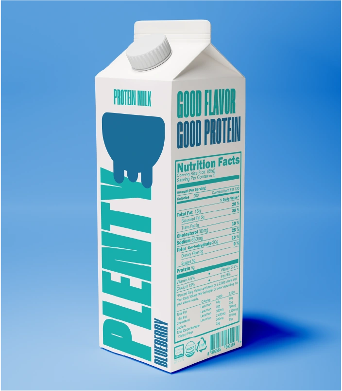
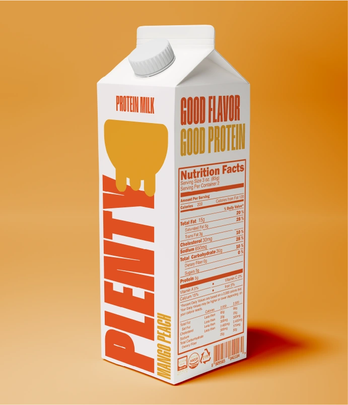
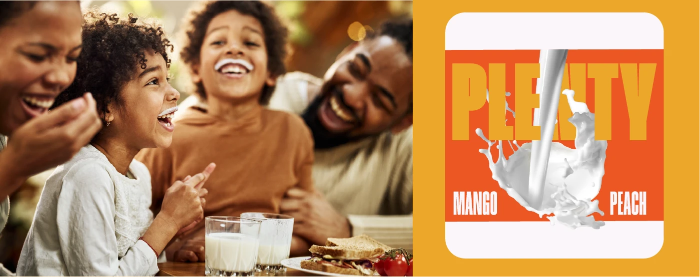
Plenty is all about fresh, fruit-inspired flavors that kids love. We experimented with a variety of combinations—like strawberry banana, mango peach, and berry blast—to create a lineup that is both delicious and appealing. Each flavor was designed to spark curiosity and excitement, encouraging kids to try them all.
Engaging Packaging
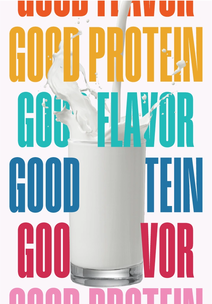
We knew packaging would play a crucial role in attracting our young audience. Our containers feature bright colors and playful illustrations that depict fun characters and fruity adventures, making the product feel like a treat. Each package tells a story, inviting kids to join in on the fun while promoting the benefits of protein.
The Result
Plenty is not just a milk brand; it's a celebration of nutrition and joy. Our case study highlights how we’ve successfully transformed protein milk into a vibrant, kid-friendly product that stands out on the shelves. With plenty of flavors and a playful brand identity, we’re making protein intake fun and accessible for growing kids.
Conclusion
With Plenty, we’re reshaping the narrative around protein milk. This case study showcases the power of engaging design, innovative flavors, and a deep understanding of our audience’s needs. Join us in making healthy choices exciting and enjoyable for kids everywhere—because there’s always Plenty to celebrate!

Like this project
Posted Sep 30, 2024
Our mission is to engage children who need extra protein in their diets by offering a product that excites their taste buds and brings joy back to drinking milk

