Built with Jitter
First2Pay • Landing Page Design in Just 4 Days
Project Overview:
First2Pay is a leading financial services platform dedicated to helping users achieve financial success through tailored solutions. The goal of this redesign was to enhance user experience, improve navigation, and modernize the brand’s visual identity to better reflect its commitment to innovation and customer-centric services.
With a comprehensive UX strategy and a data-driven approach, we transformed First2Pay into a more intuitive, engaging, and conversion-focused platform.
Showcase
Research & Discovery
To ensure the redesign aligned with both business and user needs, we conducted thorough research:
✅ Stakeholder Interviews – Gathered insights from key decision-makers to understand their vision, goals, and technical requirements.
✅ User Surveys & Interviews – Collected feedback from real users to identify pain points, usability challenges, and desired improvements.
✅ Competitive Analysis – Analyzed competitor platforms to identify best practices and opportunities for differentiation.
Key Findings:
• Users struggled with complex navigation and unclear service offerings.
• The visual design lacked modernity and trust signals expected in financial platforms.
• The conversion flow needed optimization for higher engagement and lead generation.
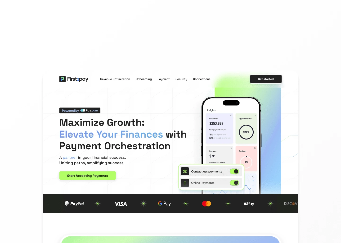
Hero
UX Strategy
Using research insights, we crafted a UX strategy focused on clarity, efficiency, and engagement:
✅ User Personas – Developed detailed personas representing First2Pay’s core user base, ensuring the redesign catered to real customer needs.
✅ User Journeys – Mapped out user interactions to optimize the flow of information and reduce friction in achieving key actions.
✅ Site Architecture – Reorganized the structure to make navigation more intuitive and content easier to find.3. Wireframing and Prototyping:
Low-Fidelity Wireframes: Developed initial wireframes to outline the basic structure and layout of key pages.
High-Fidelity Prototypes: Created interactive prototypes using Figma to simulate the final design and facilitate user testing.
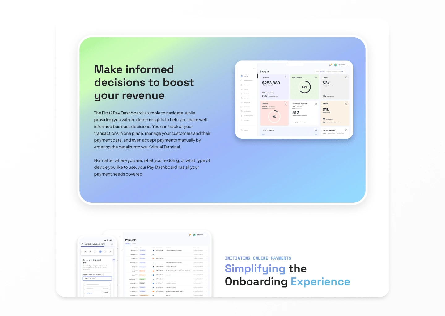
Interface
Wireframing & Prototyping
Before diving into design, we created wireframes and prototypes to test usability early:
✅ Low-Fidelity Wireframes – Outlined the core structure and layout of key pages, focusing on usability.
✅ High-Fidelity Prototypes – Created interactive Figma prototypes to simulate real user interactions and facilitate user testing.
User Testing Insights:
• The redesigned homepage hierarchy improved clarity on First2Pay’s services.
• Navigation simplifications reduced user confusion and improved content discoverability.
• Stronger CTAs (Call-to-Actions) increased engagement in early prototype testing.
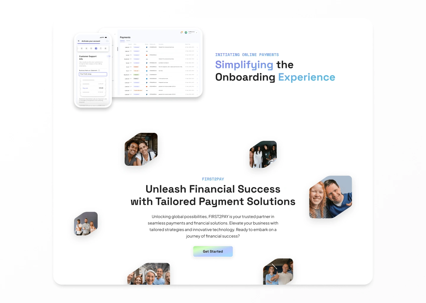
Features
Visual & UI Design
To modernize the platform and build trust, we established a refined, cohesive design system:
✅ Design System – Standardized typography, color palette, UI components, and iconography for a polished, professional look.
✅ Brand Alignment – Introduced trust-building visual elements, improved content readability, and enhanced service differentiation.
✅ Mobile Optimization – Ensured the design performed flawlessly on all devices, improving accessibility and engagement.
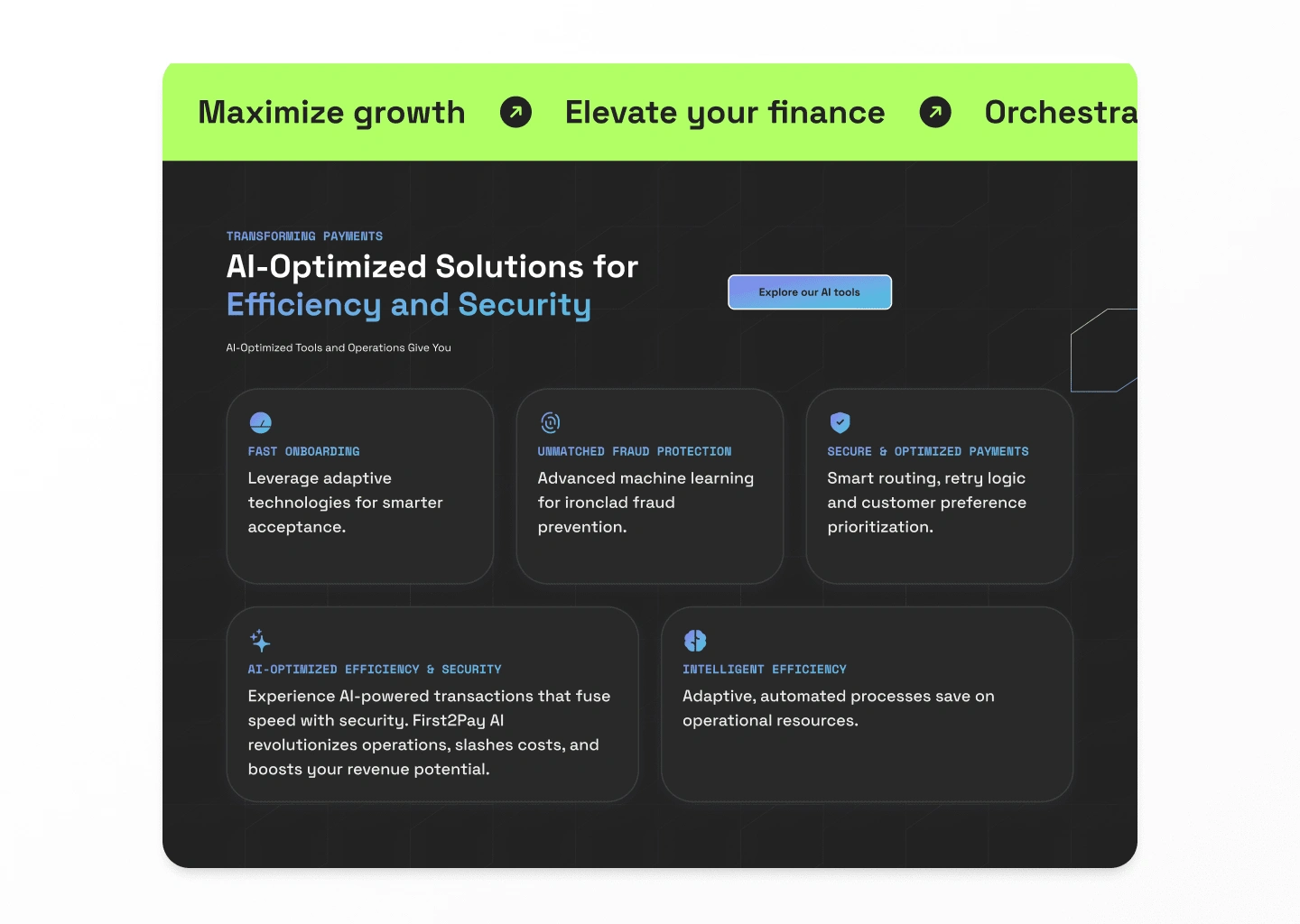
Bento Grid
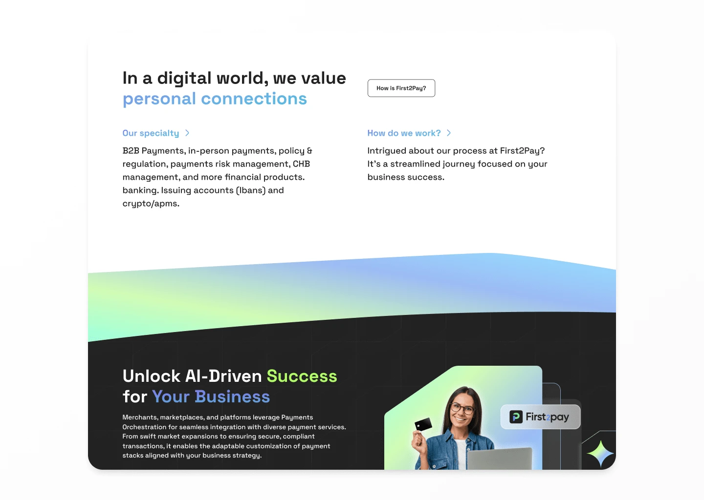
Usability Testing & Iteration
To validate the effectiveness of the new design, we conducted extensive usability testing:
✅ Prototype Testing – Real users interacted with the clickable prototype, providing insights on ease of use and clarity.
✅ Feedback-Driven Iterations – Adjusted key sections based on usability feedback, ensuring an optimal user experience before launch.
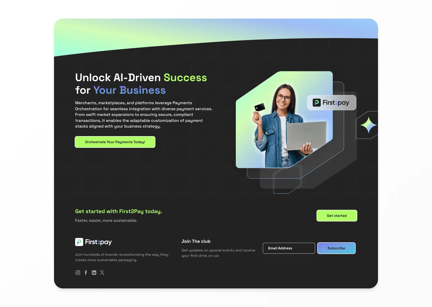
Footer
Major Improvements Post-Testing:
• Improved conversion flow for smoother customer acquisition.
• Adjusted button placements & CTAs for better engagement.
• Enhanced dashboard experience for returning users.
Development & Launch
To bring the vision to life, we built the redesigned platform using Webflow, ensuring:
✅ High-performance page speed & responsiveness
✅ Seamless CMS integration for easy content updates
✅ Scalable infrastructure for future enhancements
Post-Launch Optimization
After launch, we tracked performance metrics to gauge success:
✅ Soft Launch – Released to a small audience for real-world feedback.
✅ KPI Monitoring – Tracked user engagement, conversion rates, and bounce rates.
✅ Continuous Improvement – Used analytics & user behavior data to refine the platform further.
Outcome & Results
The redesign significantly improved user experience, brand perception, and conversion performance.
📈 Higher engagement – More users exploring services & completing key actions.
⚡ Improved site speed & performance – Faster load times enhanced usability.
🎯 Stronger conversions – Optimized flows led to higher consultation requests & lead generation.
This project underscored the power of user-centered design, iterative testing, and strategic UX/UI enhancements in transforming digital financial services.
Like this project
4
Posted Sep 17, 2024
Streamlined and optimized First2Pay’s landing page and mobile design in record time, improving usability and onboarding experience.
Likes
4
Views
247
Timeline
Apr 9, 2024 - Apr 12, 2024
Clients

Pay


