MyKeep web-app: A Visual Second-Brain App
Vinay Juneja
Development of mykeep.space : A Visual Second Brain App Built With @anything
MyKeep is a visual workspace for saving links, screenshots, notes, videos, to-dos, and ideas into one calm dashboard. I built it with @anything to explore how far an AI app builder can go beyond a simple prototype and become a real web app with authentication, workspaces, tags, search, filters, bulk actions, URL previews, accessibility improvements, and paid access.
The Idea
The idea for MyKeep came from a simple problem: we save useful things every day, but most of them disappear.
A link goes into bookmarks. A screenshot stays in downloads. A note lives inside a notes app. A video link gets lost in a chat. A design reference sits inside a random folder. Over time, everything becomes scattered.
The problem was not saving. The problem was remembering, finding, and reusing what was saved.
I wanted to build a product that felt like a calm visual memory. Not a heavy productivity tool. Not a complicated database. Not another folder system that requires too much planning.
The goal was to make saving feel fast and finding feel natural.
The problem
Most digital-saving tools sit at two extremes.
Browser bookmarks are fast, but they are not visual. They become long lists of text, and the original context disappears.
Productivity tools are powerful, but they often require too much setup. Users have to create folders, pages, databases, labels, templates, and systems before the product becomes useful.
I wanted MyKeep to sit in the middle.
It needed to be:
Fast enough for daily saving
Visual enough for inspiration and references
Structured enough for real organization
Simple enough to not feel like work
Flexible enough for links, notes, images, videos, and to-dos
The core question was:
How can someone save anything important into one place and rediscover it later without feeling overwhelmed?
The solution
MyKeep became a visual second-brain app built around one main idea:
Capture first. Organize later.
Users can save different types of content into one dashboard and then organize them using workspaces, tags, search, filters, and bulk actions.
The app includes:
User authentication
All Items view
Workspace views
Workspace item counts
Link saving
Note saving
Image and screenshot saving
Video saving
To-do saving
URL preview cards
Content-type filters
Search
Tags
Bulk selection
Move actions
Delete actions
Paid lifetime access
The goal was not to make the product feature-heavy. The goal was to give users enough control without making the interface feel complicated.
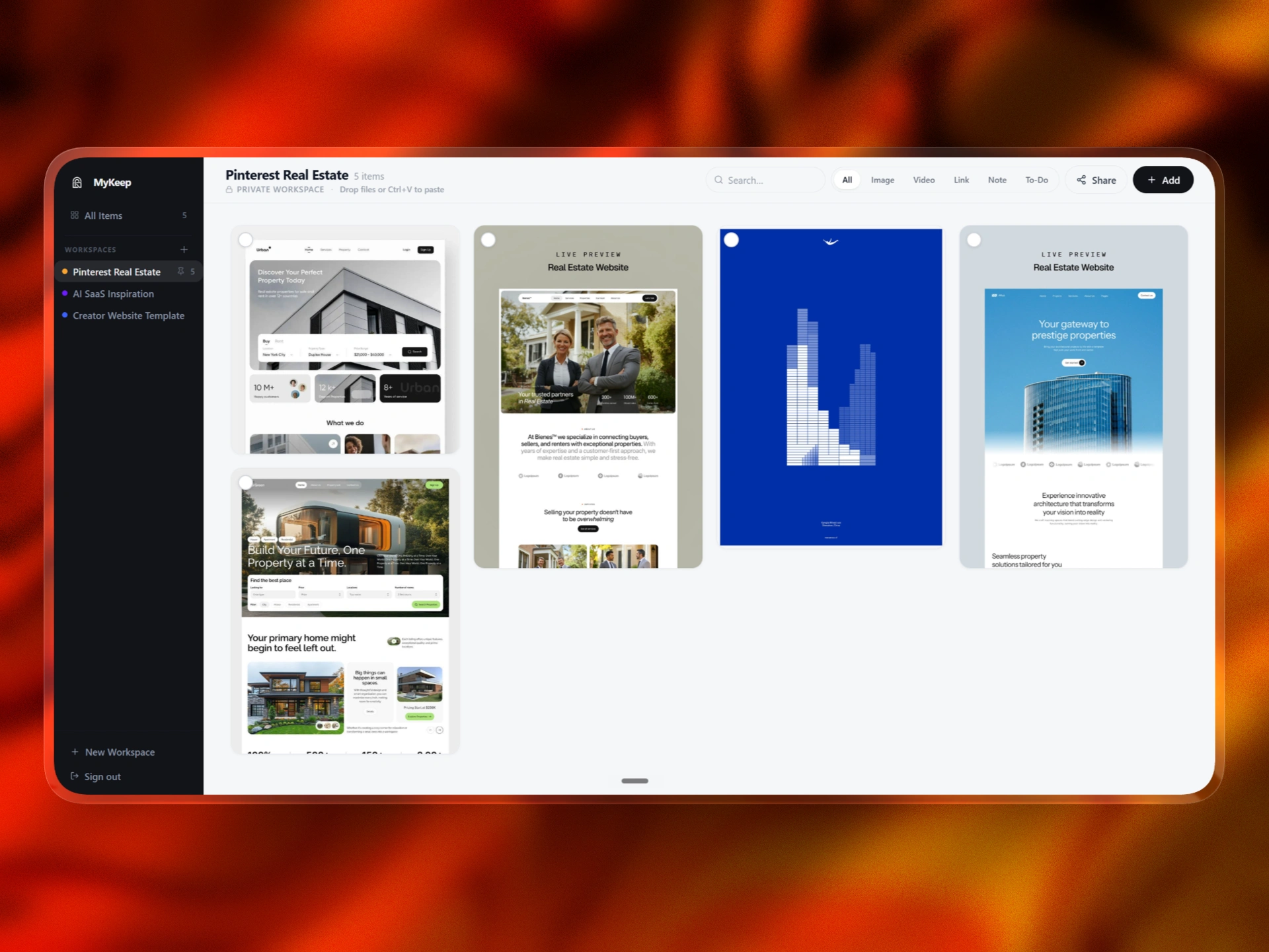
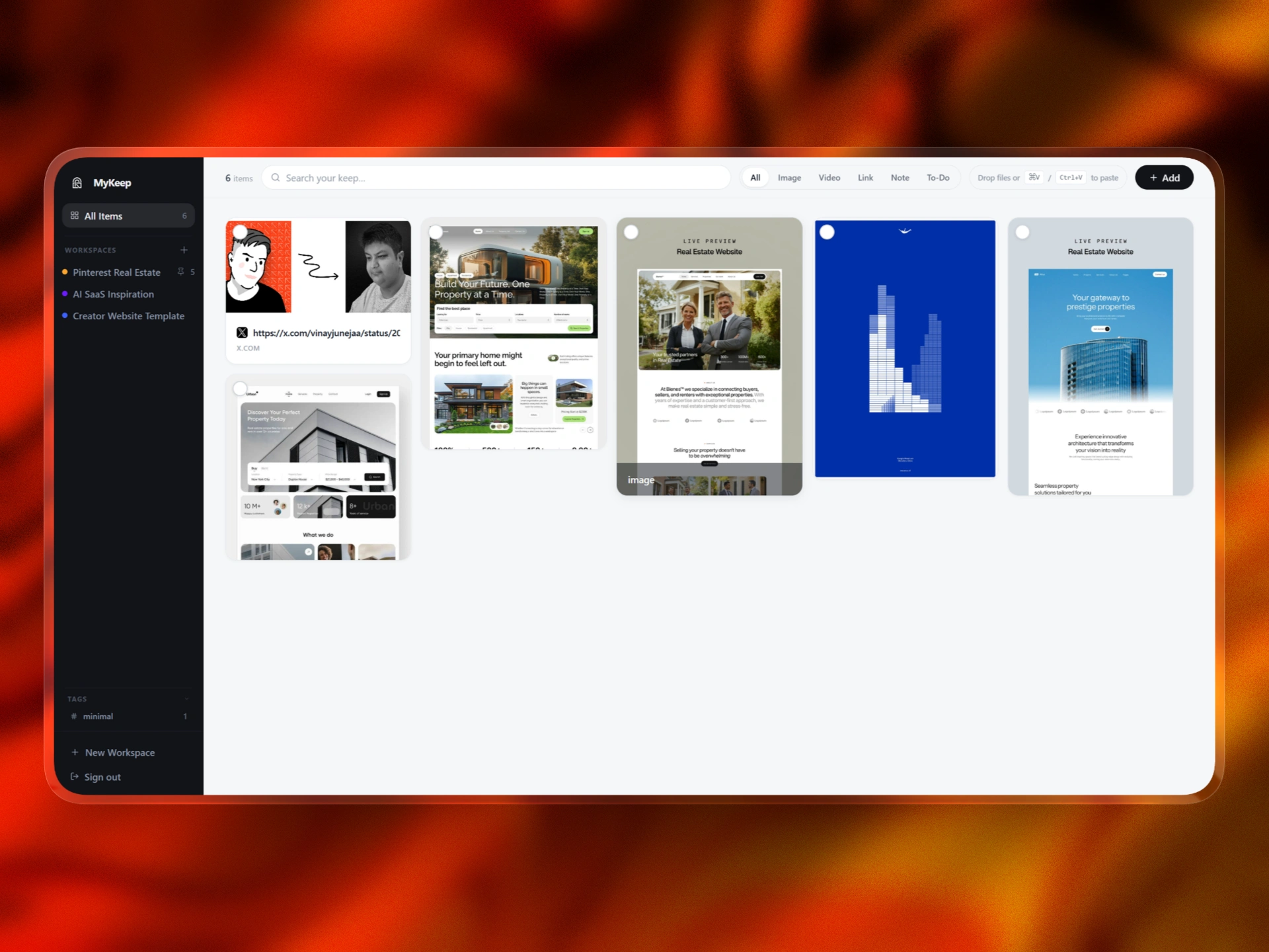
Designing the dashboard
The dashboard is the heart of MyKeep.
I wanted it to feel like a quiet visual canvas instead of a traditional productivity dashboard. A rigid table or list would not work because MyKeep handles different types of content.
A screenshot needs space.
A note needs readability.
A link needs context.
A to-do needs action.
A video needs recognition.
A saved reference needs to be visually scannable.
That is why the app uses a masonry-style grid. Different cards can have different heights, while still feeling like part of one organized system.
This made the dashboard feel more natural and closer to how people visually remember things.
Core functionality
MyKeep was designed to support multiple ways of saving and managing information.
The main functionality includes:
All Items works as the global library. It shows everything saved across the user’s account, no matter which workspace it belongs to.
This is important because users often want one place where they can see everything without thinking about folders.
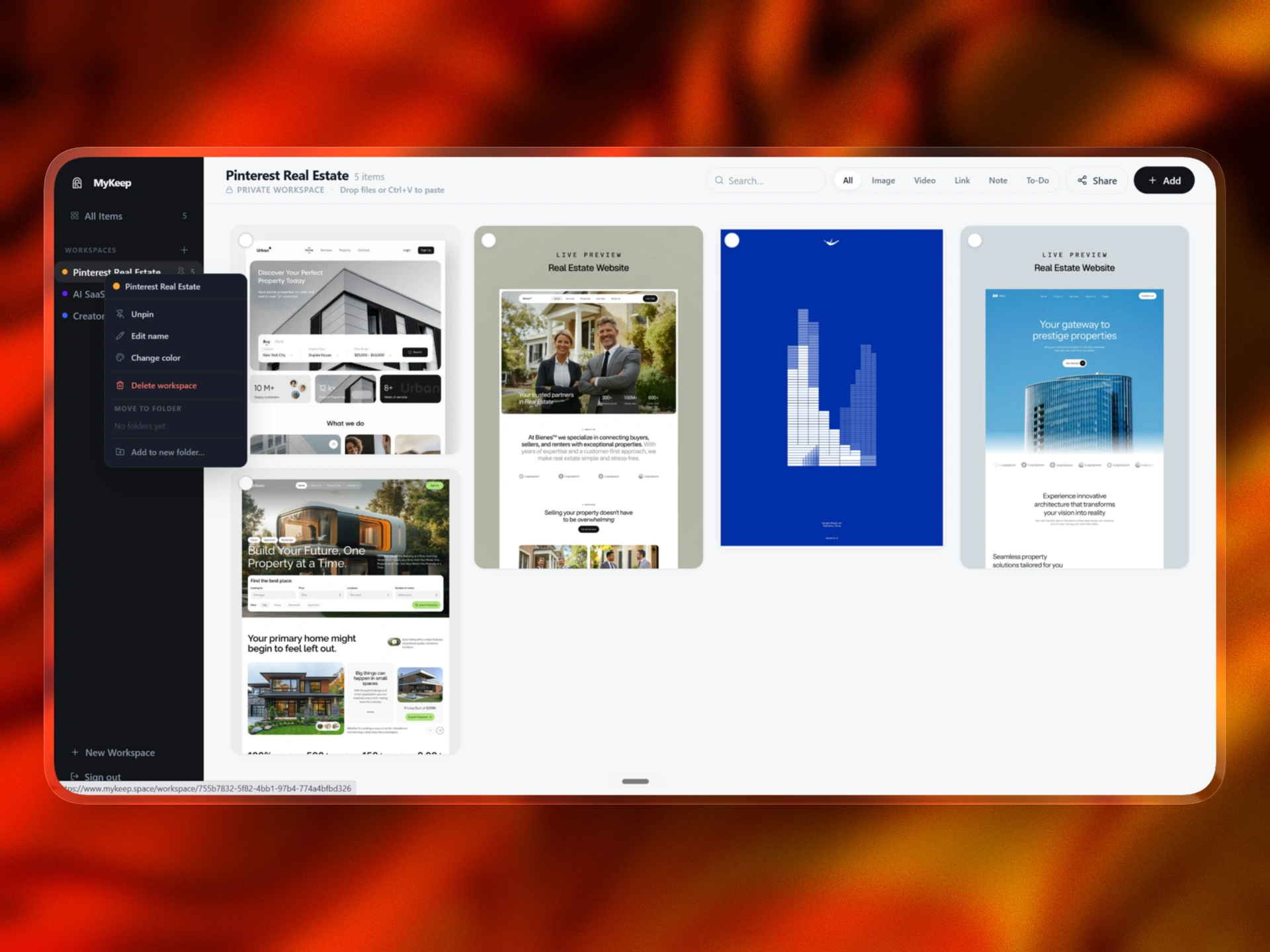
Workspaces
Workspaces allow users to separate saved items by project, topic, client, idea, or personal category.
A workspace can be used for:
Design inspiration
Product research
Client references
Reading lists
Visual moodboards
Videos to watch
Personal notes
Project assets
Each workspace shows an item count so the user immediately understands how much content is inside.
Search
Search is always available because finding is just as important as saving. Users can search saved content instead of manually browsing through every card.
Filters
The top filters let users quickly narrow the dashboard by content type:
All
Image
Video
Link
Note
To-Do
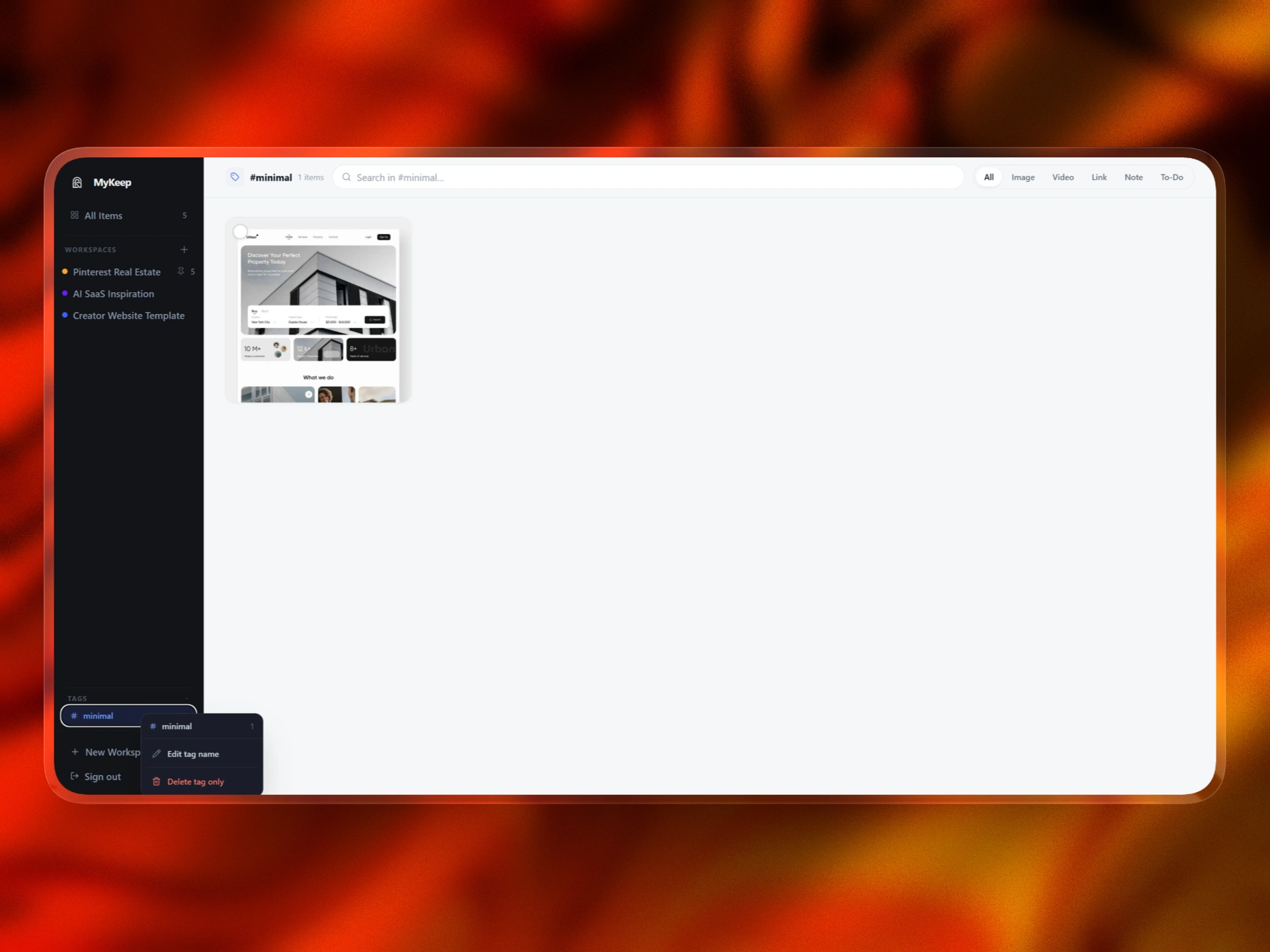
Tags
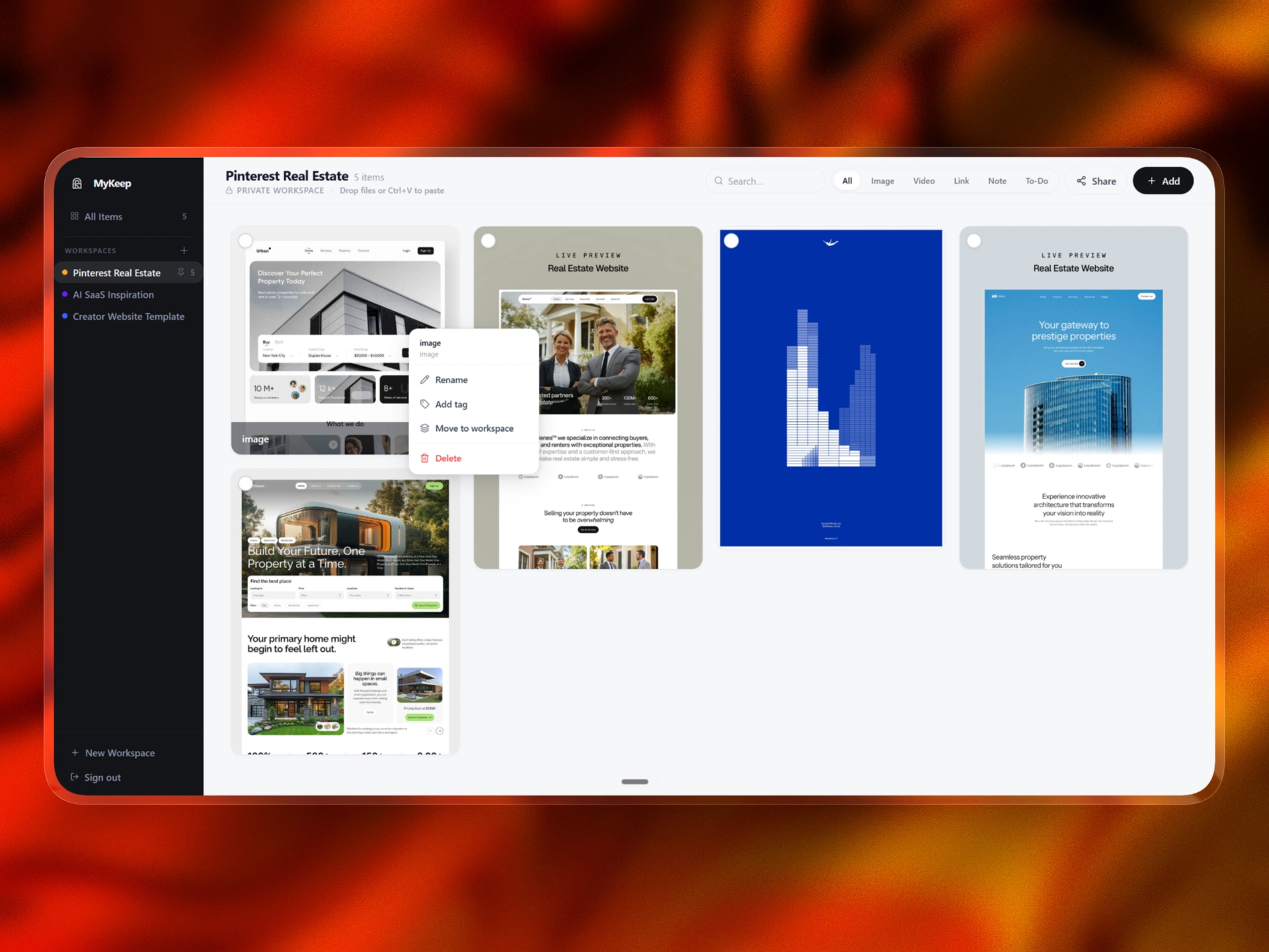
Tags create a second layer of organization. A single item can belong to a workspace but still have tags for themes, styles, clients, or categories.
Bulk actions
Users can select one or multiple items and perform actions like:
Move
Tag
Delete
Create or move into a workspace
This makes MyKeep feel like a real workspace, not just a static gallery.
UX decisions
The biggest UX challenge was balancing flexibility with calmness.
A visual saving app can become messy very quickly. If every action is visible all the time, the app starts feeling like a full task manager. I wanted MyKeep to stay focused.
The UX system follows a simple rule:
Show primary actions all the time.
Show contextual actions only when needed.
Primary actions include:
Search
Filters
Add
Workspace navigation
Contextual actions include:
Move
Tag
Delete
Selection actions
Item management
This keeps the dashboard clean while still giving users enough power when they need it.
When nothing is selected, the interface stays calm.
When an item is selected, the app becomes action-oriented. The floating action bar appears, and the user can organize without opening a separate management screen.
This small interaction made the app feel much more usable.
Making All Items and workspaces work correctly
One of the most important product decisions was separating All Items from workspaces.
All Items needed to show every saved item across the account.
A workspace needed to show only the items inside that specific workspace.
This sounds simple, but it affects the whole app.
Search needs to respect the current view.
Counts need to update correctly.
Moving an item needs to update both views.
Deleting an item needs to remove it from the correct place.
Tags need to keep working across saved items.
Bulk actions need to know which items are selected.
The solution was to treat the product as three connected systems:
All Items is the global source.
Workspaces are focused filtered views.
Tags are a flexible organization layer.
Once this model was clear, the product became much easier to build and refine inside @anything.
Accessibility and clarity
Accessibility was an important part of the build because a visual dashboard only works if users can clearly understand what is interactive.
I focused on:
Readable text contrast
Clear active states
Clear selected states
Visible unchecked checkboxes
Strong selected-card borders
Readable buttons
Better hover states
Clear workspace counts
Simple filter active states
Accessible empty states
Useful error states
Large enough click targets
Reduced visual noise
One specific improvement was the selection UI. The unchecked checkbox needed to stay visible against the card background, and the selected state needed to be obvious. I adjusted the visual treatment so selected cards show a strong border and selected checkmark, while unselected items still clearly show that they can be selected.
This made the workspace easier to understand and reduced confusion around bulk actions.

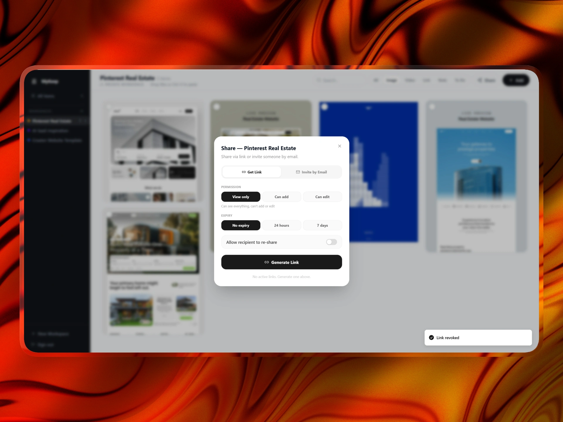
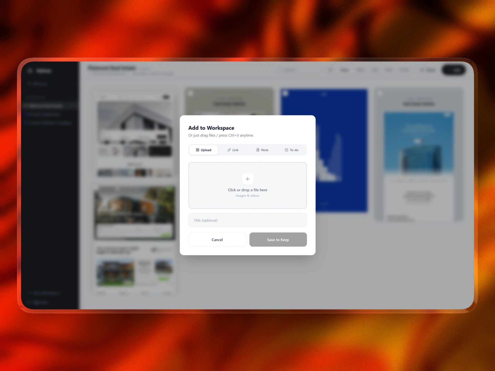
URL previews and card clarity
Saved links are a major part of MyKeep, but plain URLs are hard to recognize later.
A useful saved link needs context.
That is why URL preview cards were important. A link card should show:
Title
Domain
Preview image when available
Short description when available
Content type
This helps the user recognize what they saved without opening every link again.
The same thinking applies to other content types. A note should feel like a note. A to-do should feel actionable. An image should stay visual. A video should be recognizable.
Every card type needed its own behavior while still fitting into the same design system.
Building with @anything
I built MyKeep using @anything, but the process was not just one prompt.
The app had to be guided in clear modules.
First, I focused on the app structure:
Authentication
Protected dashboard
User-specific data
Sidebar navigation
All Items view
Workspace views
Then I focused on the content system:
Links
Notes
Images
Videos
To-dos
URL previews
Content filters
Then I focused on organization:
Workspaces
Counts
Tags
Search
Move
Delete
Bulk selection
Then I focused on product polish:
Masonry layout
Selected item states
Clear checkboxes
Floating action bar
Empty states
Responsive layout
Readable cards
Then I focused on monetization:
Paid access page
Polar checkout
Lifetime payment positioning
Dashboard access after purchase
This modular approach made the build more controllable. Instead of asking Anything.com to generate one huge app at once, I used it like a product builder and refined one layer at a time.
Privacy and user trust
Privacy was also an important part of the product direction because MyKeep is built around personal saved material.
Users may save links, private notes, screenshots, client references, research, ideas, videos, and unfinished thoughts. That means the app cannot feel like a public gallery or social feed. It needs to feel personal, private, and safe.
I designed MyKeep around a private-first experience.
Each user has their own protected account. Saved items belong to that user, and the dashboard is not publicly visible by default. Workspaces are treated as personal collections unless the user intentionally chooses to share something.
The goal was to make the product feel like a private visual vault.
Privacy considerations included:
User authentication
Protected dashboard access
User-specific saved items
Private workspaces by default
No public feed
No social discovery layer
No unnecessary collaboration features
Clear ownership of saved content
Paid access tied to the authenticated user
Sensitive payment keys kept out of the frontend
This mattered because MyKeep is not only storing polished bookmarks. It can store messy thoughts, private research, screenshots, early ideas, client references, and personal inspiration.
The product needed to respect that.
A big UX decision was to avoid making MyKeep feel like a social platform. There are no public likes, follower counts, or discovery feeds. The focus stays on the user’s own saved material.
The privacy principle was simple:
What you save should feel like yours.
That helped shape the tone of the product. MyKeep is calm, private, and personal by default.
Final outcome
MyKeep became a functional visual workspace for saving and organizing digital material.
Users can:
Save links
Save screenshots
Save notes
Save videos
Save to-dos
Create workspaces
View all saved items
Search saved content
Filter by content type
Tag items
Select multiple cards
Move items
Delete items
See item counts
Use a clean masonry dashboard
Access the product through a paid flow
The product is intentionally focused.
It is not trying to replace Notion.
It is not trying to become a full task manager.
It is not trying to become a team collaboration suite.
It is not trying to become a generic productivity tool.
It is built around one clear job:
Help people keep digital things they care about in one calm, visual place.
Like this project
Posted May 12, 2026
Built MyKeep , a visual second-brain web app for saving links, screenshots, etc into one calm dashboard with workspaces, tags, search, filters, URL previews.
Likes
1
Views
7
Timeline
May 2, 2026 - May 12, 2026