How I Redesigned the Lyft's Co-Founder new Startup: Tribe Chat
David Felipe
How I Helped the Co-Founder of Lyft with His New Project: Redesigning Tribe from Scratch
The Tribe redesign wasn’t just about making things look better—it was about making the whole experience smoother, more intuitive, and actually fun to use.
A lot of things felt clunky, from joining groups to navigating chats, so we cleaned up the UX, fixed visual inconsistencies, and built a more scalable design system. Mobile interactions got a serious upgrade, and we even added some gamification elements to keep things engaging. Now, everything just flows better, looks more polished, and makes Tribe feel like the community-driven app it was meant to be. 🚀
But before we begin: What is Tribe, and what makes it different?
Tribe is a place where small, private communities come together to chat about the things they care about—whether it’s geopolitics, gaming, or anything else, without all the noise. Unlike other platforms where anyone can join and the quality of conversations gets lost, Tribe makes sure people are actually there for the right reasons. You can only join a group after answering some questions, keeping things focused and fun.
Would you invite the guy who never talks to your party?
That's exactly what Tribe thinks.
What makes Tribe stand out? It’s all about specialized groups that actually care about the topics they’re discussing. No big crowds here—just people who are passionate and know their stuff. Plus, Tribe keeps things fresh with gamification features like trivia and challenges to keep the community engaged. It’s all about competing, learning, and sharing knowledge with like-minded people.
Want a place to talk about football? Love the Premier League? Still remember Rivaldo's bicycle kick against Valencia? Tribe is your spot.
Find Specific Tribes
Step 1: UX Research – Learning from the Competition
Before jumping into the redesign, I put on my detective hat and did some serious research on other closed-community apps and niche forums. I wasn’t just looking at what they did well—I wanted to see where they struggled so Tribe could fill the gaps. So, I dove deep into Discord, Reddit, Geneva, and WhatsApp to understand their strengths and weaknesses.
Discord – Originally built for gamers, Discord is a real-time chat app where communities (servers) have different channels for discussions, voice chats, and bots. It’s highly interactive and keeps users engaged.
✅ High engagement, feels alive
❌ Overwhelming UI, too chaotic
Reddit – A massive forum platform where communities (subreddits) are organized by topics. Users upvote or downvote posts, keeping the best discussions visible.
✅ Great discussion quality, strong moderation
❌ Not private, some toxic communities
Geneva – A newer platform designed specifically for private communities. It offers structured discussions in a clean, modern interface, positioned as a more organized alternative to Discord.
✅ Clean design, built for communities
❌ Low user activity, feels empty
WhatsApp – A messaging app that people often repurpose for group discussions, even though it wasn’t designed for that.
✅ Familiar, easy to use
❌ No structure, messages get lost
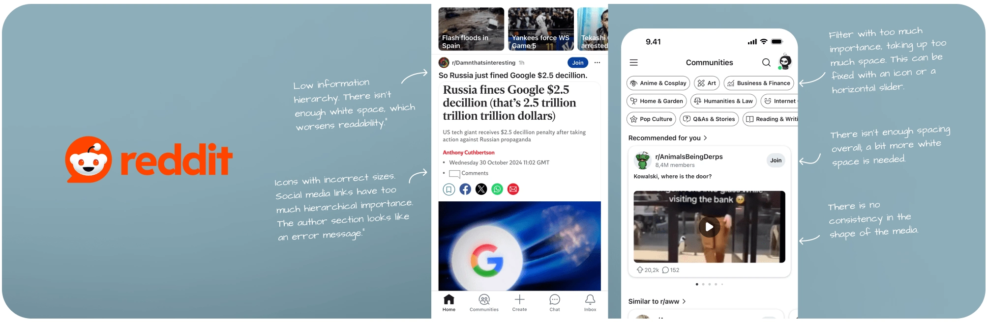
Reddit study
Then, I created a detailed document with notes on features I loved, and others that I felt didn’t add much value. I noted things like 'clean design' or 'good community engagement,' and also highlighted areas where apps fell short.
Armed with this data, I put all the good stuff into one big list of adjectives and mapped them on a scale from 'bad' to 'good.' It helped me understand what works, what doesn’t, and what Tribe could totally own. If they are big apps doing things wrong... why we can't be like much bigger?
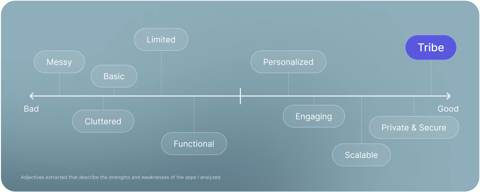
Competition Research
The next step was to imagine who would be attracted to Tribe. With the help of AI tools and some data (because who doesn’t love a good AI-powered deep dive?), I created a study of the ideal user persona. Here’s a peek at who they are:
🧑🏽 20-40 years old – They’re in the golden age of knowing how to use technology, but still remember the joy of flipping through a real magazine. They care a lot about the UI.
💻 Tech-savvy – They’ve probably built their own PC, but they’re also fluent in emojis. They know their way around the web like it’s their second home.
🔒 Value privacy – These users wouldn’t even share their Wi-Fi password unless absolutely necessary. They’re all about keeping things locked down and secure.
🔍 Interested in niche topics – Whether they’re into gaming, tech, or obscure conspiracy theories, they love deep, meaningful discussions with people who actually get it.This persona helped me fine-tune Tribe’s design, ensuring it’s tailored for those who want a cozy, distraction-free space to chat with people who won’t judge them for their weird interests.
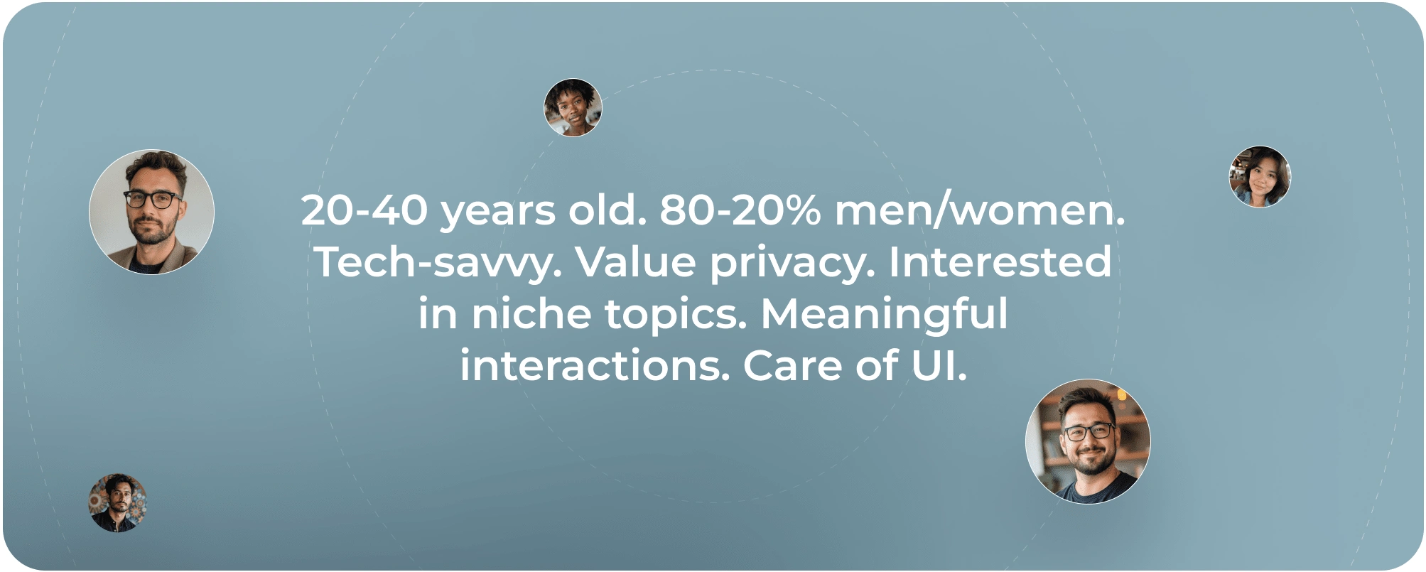
User Persona
With all this data, we’ll focus the app’s design on simplicity—big images take center stage, bold titles stand out, and a clean layout ensures that content remains the star.
The Problem: A Design That Didn’t Measure Up
Here’s a spoiler: Tribe’s design already existed. Well… kind of. It was there, but with a flawed design that made it harder to use and didn’t showcase its full potential. In fact, some basic design principles weren’t even followed.
What do I mean? Well… let me show you.
Current Designs
The challenge is clear: upgrading Tribe’s entire look and feel. Not just with a new branding or design system, but by crafting a whole new experience. Challenge accepted.
A crucial element: The text input field in chats.
As you can see in the image below, the old design didn’t have a proper hierarchy. What’s the most important part of a text field? Exactly, the text field itself (point for you). But here, the “Hold to talk” feature gets all the attention because it’s highlighted in purple—yet it’s a feature that’s barely used. It doesn’t make sense to give it that much importance. A better approach is to move the “talk” icon inside the button, saving space. Once the user starts typing, that icon disappears and turns into an "X," allowing them to quickly clear the text.
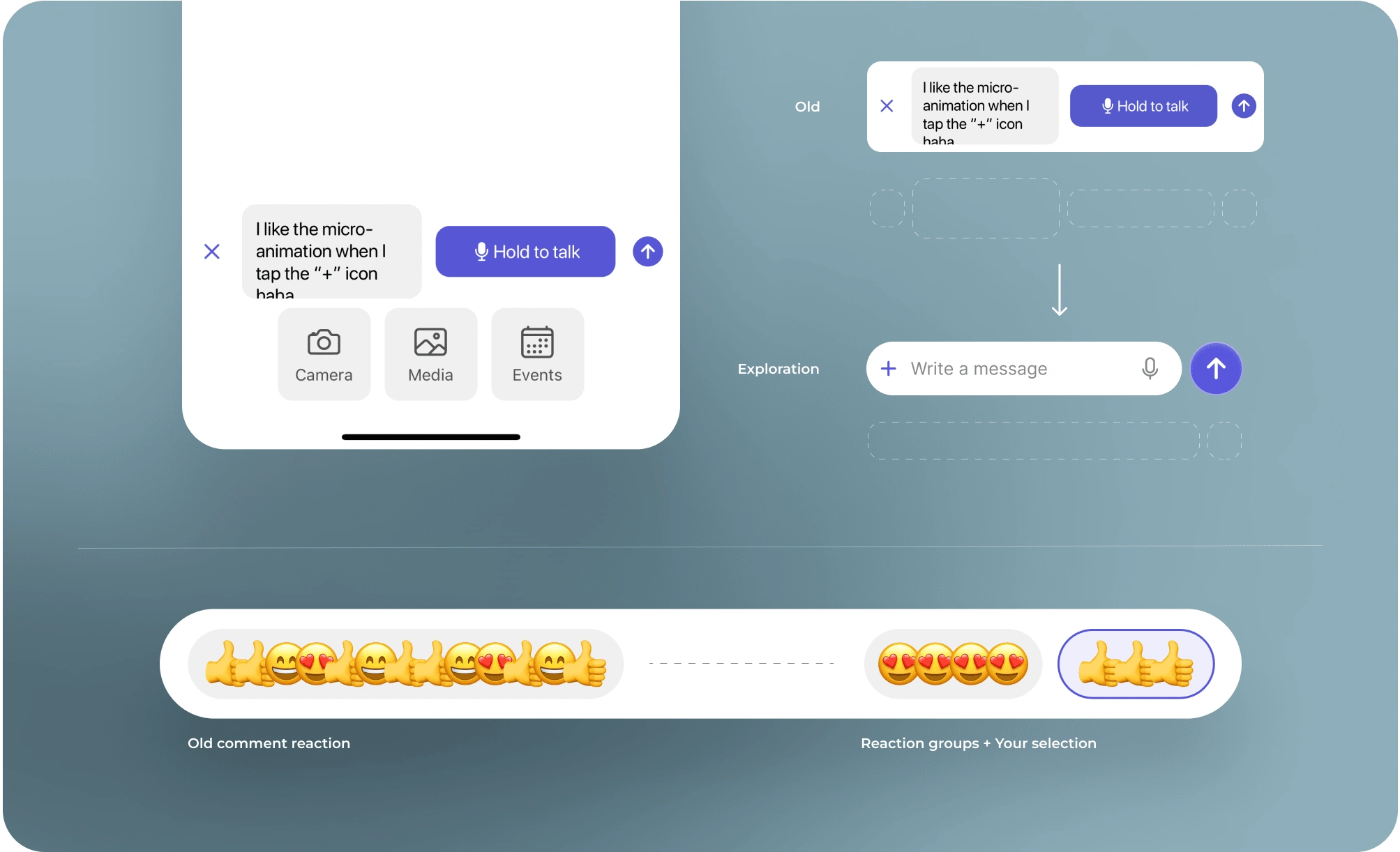
Feature Explorations
The send button is too small, so we’re going to scale it up for better visibility and to improve visual harmony.
The "+" button for adding media will also be placed inside the text field. This way, we create a sense of space and reinforce that users can type long messages without issues. In short, you can see the difference in shape and hierarchy between the two versions: one with poor visual organization and another that’s much simpler and more functional.
Another key feature: Message reactions.
The idea behind emojis is to show multiple reactions at once without using numbers like Slack or Discord. The goal is to make chats feel dynamic and joyful.
The current design feels too chaotic. Alternating and overlapping emojis makes everything unclear, not scalable, and discourages users from using them as CTAs—meaning they don’t naturally think, "I want to add that emoji too".
How do I fix this? By grouping emojis to organize them better. What do we gain?:
· Each emoji has its own group, improving visual hierarchy.
· Tapping a group lets you add a new reaction.
· Emojis you’ve added turn purple, making them easily distinguishable.
A unique feature in Tribe: Trivia
But that’s not the only thing I changed—several elements needed to be rethought.
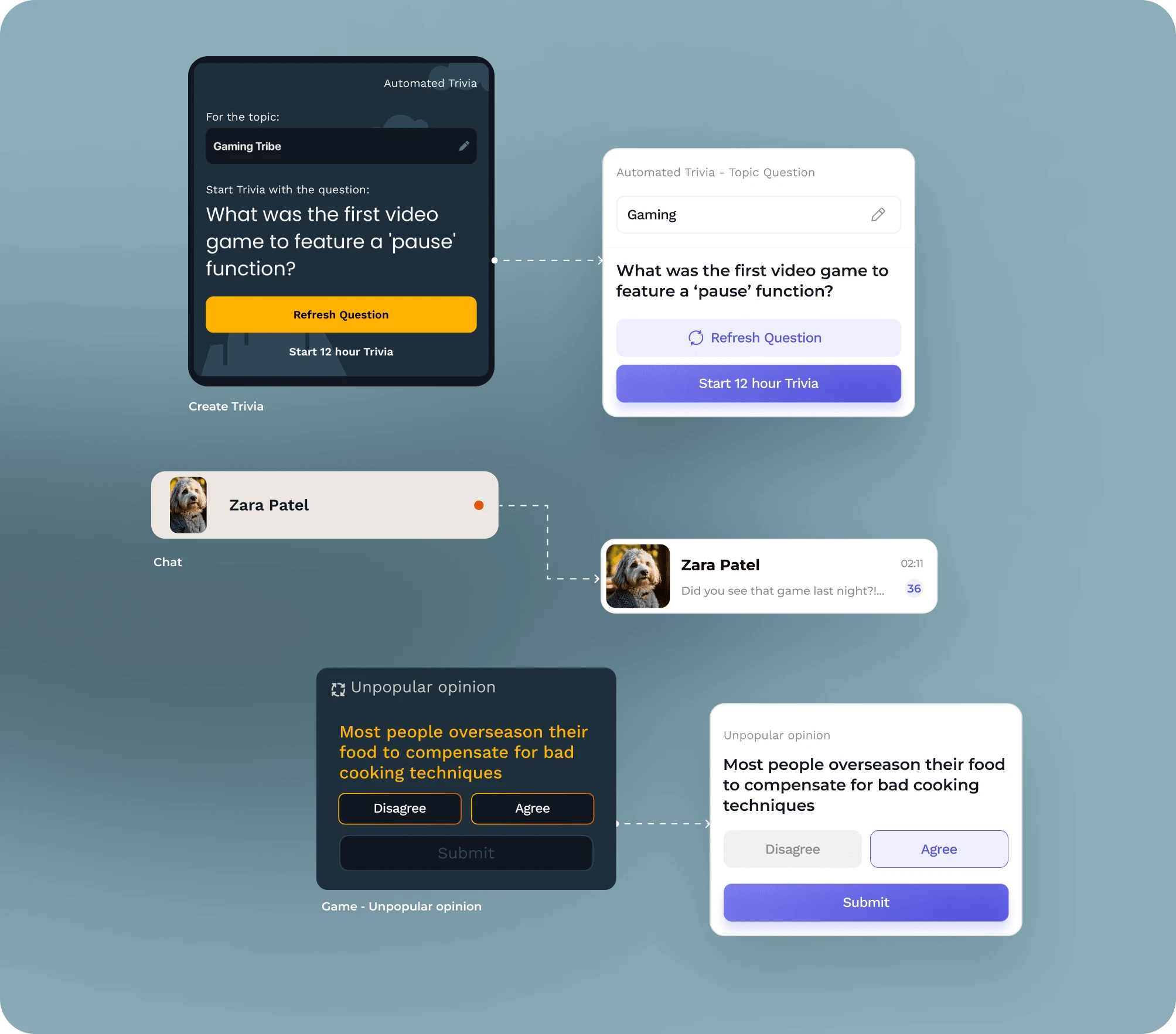
Improving features
Tribe uses mini-games when a group becomes inactive to boost engagement, and Trivia is by far the most important and popular one. However, the current design is quite confusing (something our users have pointed out).
The main CTA is “Start 12-hour Trivia,” but it feels secondary—meanwhile, “Refresh Question” looks like the primary action when it really shouldn’t be. The background doodles don’t add any real value, so they had to go. I also added icons to improve the clarity of each button and made the buttons themselves more obvious.
Another crucial element: The chats
Right now, in the chat card, the avatar shape being used is unnatural for a messaging app—especially when placed inside a rectangle. Also, key information is missing, like the last message sent or the timestamp. If every other messaging app includes those details… there’s probably a good reason, right?
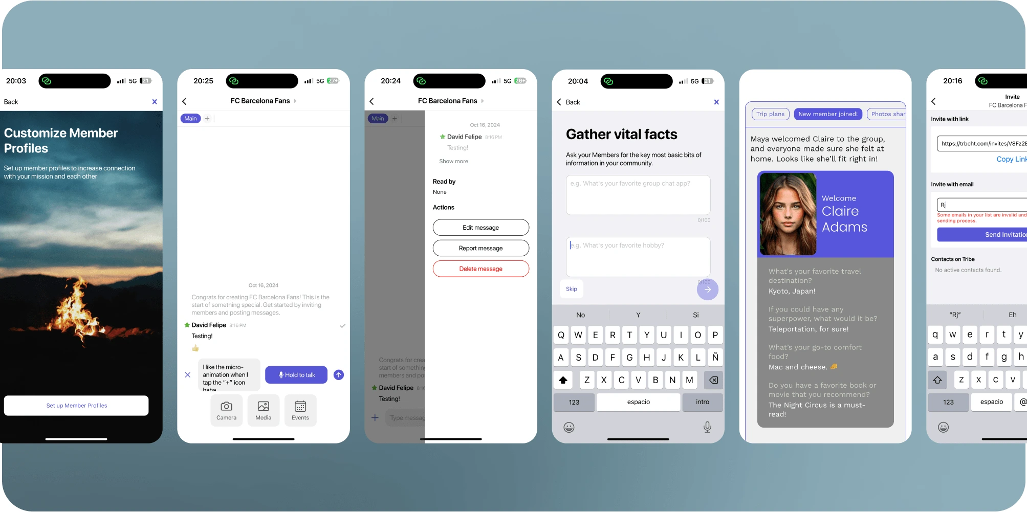
At some point, there were so many inconsistencies that I started creating my own design system from scratch—new colors, new shapes, new icons, new UI elements, and an overall fresh look.
Tribe was in serious need of a glow-up.
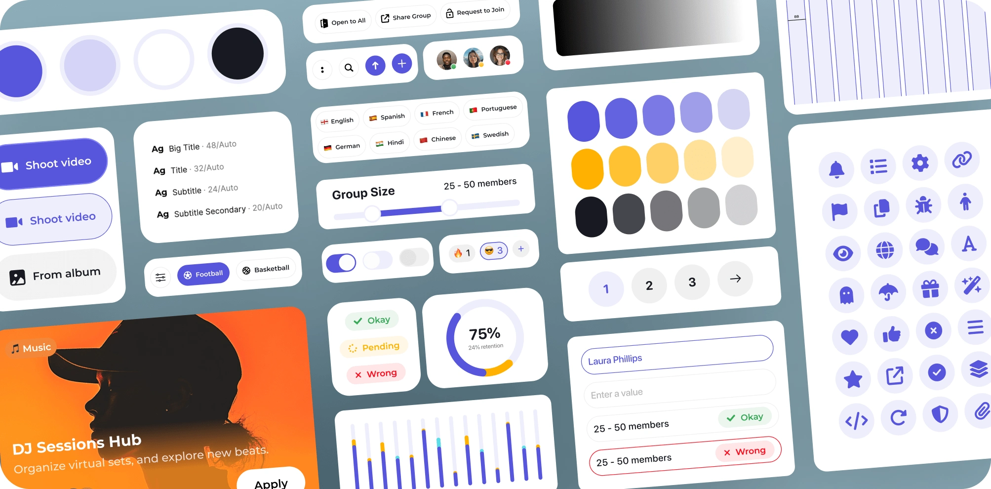
New Design System
Alright, David, this is looking great… but we want to see examples. How about some before & after shots? Buckle up, because here they come!
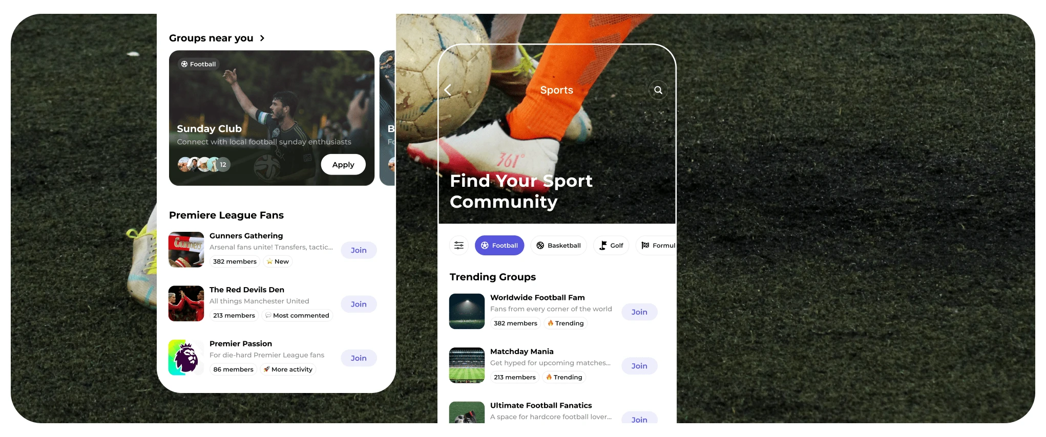
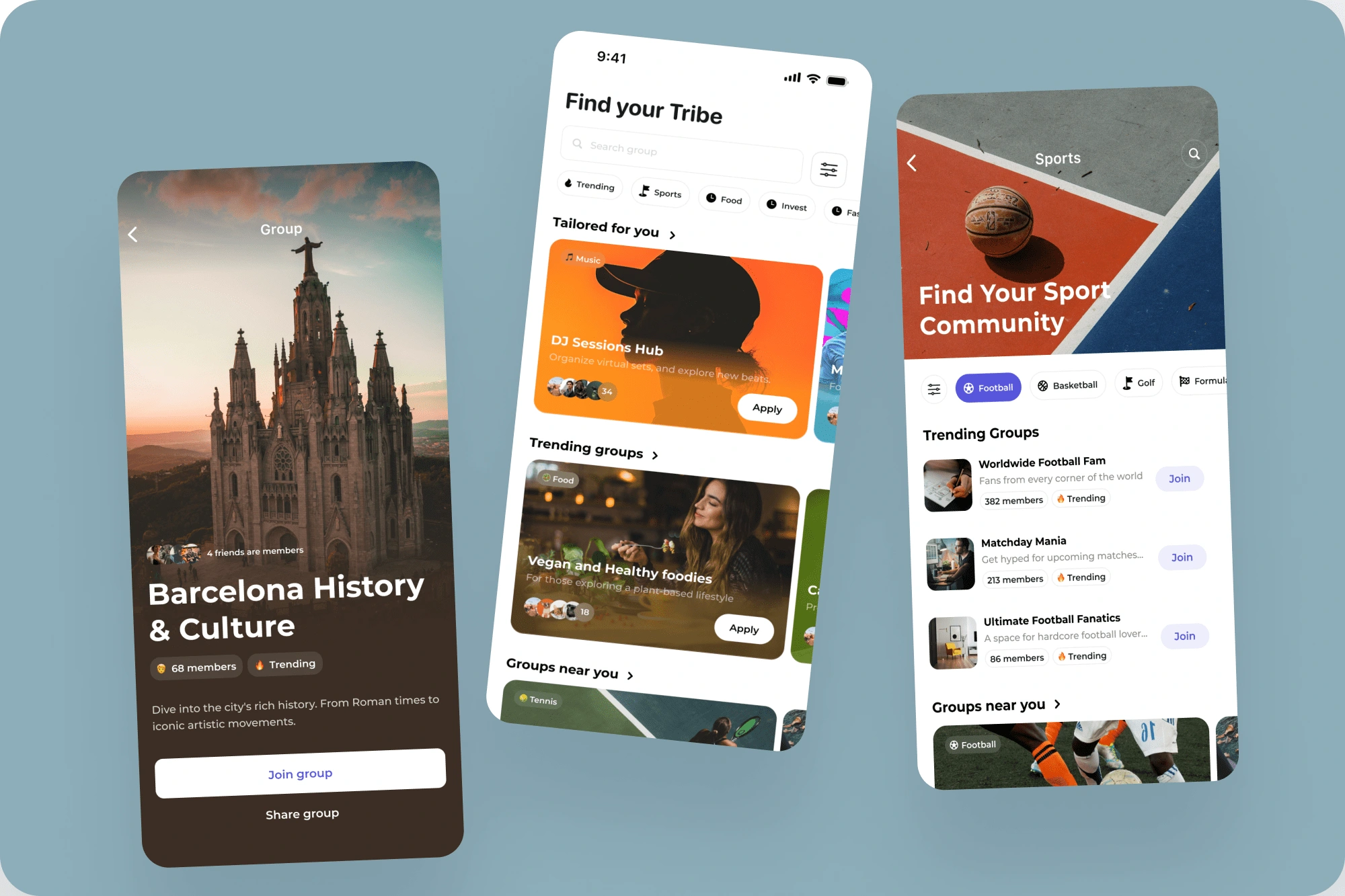
Discover Page: One of the most crucial screens.
This is where users explore and find new Tribes (groups). Initially, the PM’s idea was to keep it super simple—just a search bar, Google-style, where users would type what they were looking for.
But here’s the thing: users don’t want to think—they want to discover! They want to browse, get recommendations, and stumble upon interesting groups without effort. Netflix does this brilliantly, curating content so users don’t have to search manually.
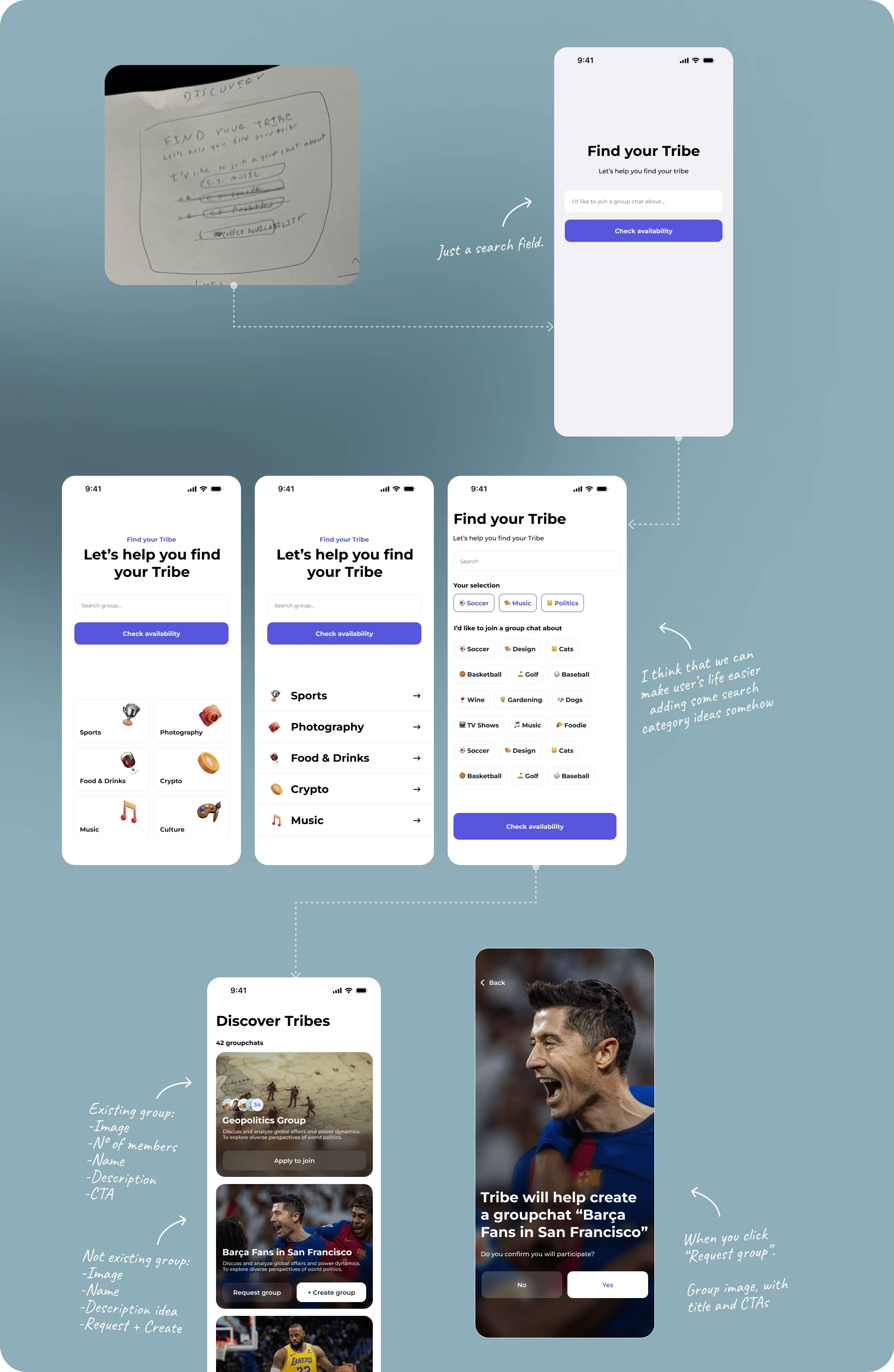
Here’s a glimpse into the creative process: The founder would send me sketches of what he had in mind. I’d design exactly what he asked for—because, let’s be honest, ideas always seem perfect in our heads. But once you see them on the screen, reality kicks in.
With that design in place, I added elements that I believed would enhance the experience—like filters. Over time, the idea evolved into showcasing the most relevant groups upfront, so users could focus entirely on discovering instead of searching.
Progression
So, after some prototypes and calls, I took that idea and redesigned the Discover page:
✅ Kept the search bar, but made it secondary.
✅ Introduced personalized group recommendations powered by an algorithm.
✅ Added generic filters (topics, trending, etc.) + advanced filters (group size, location, recency).
✅ Created a visual hierarchy similar to the App Store, where groups appear as you scroll.
The result? A frictionless, engaging experience that makes discovering new Tribes effortless. 🚀
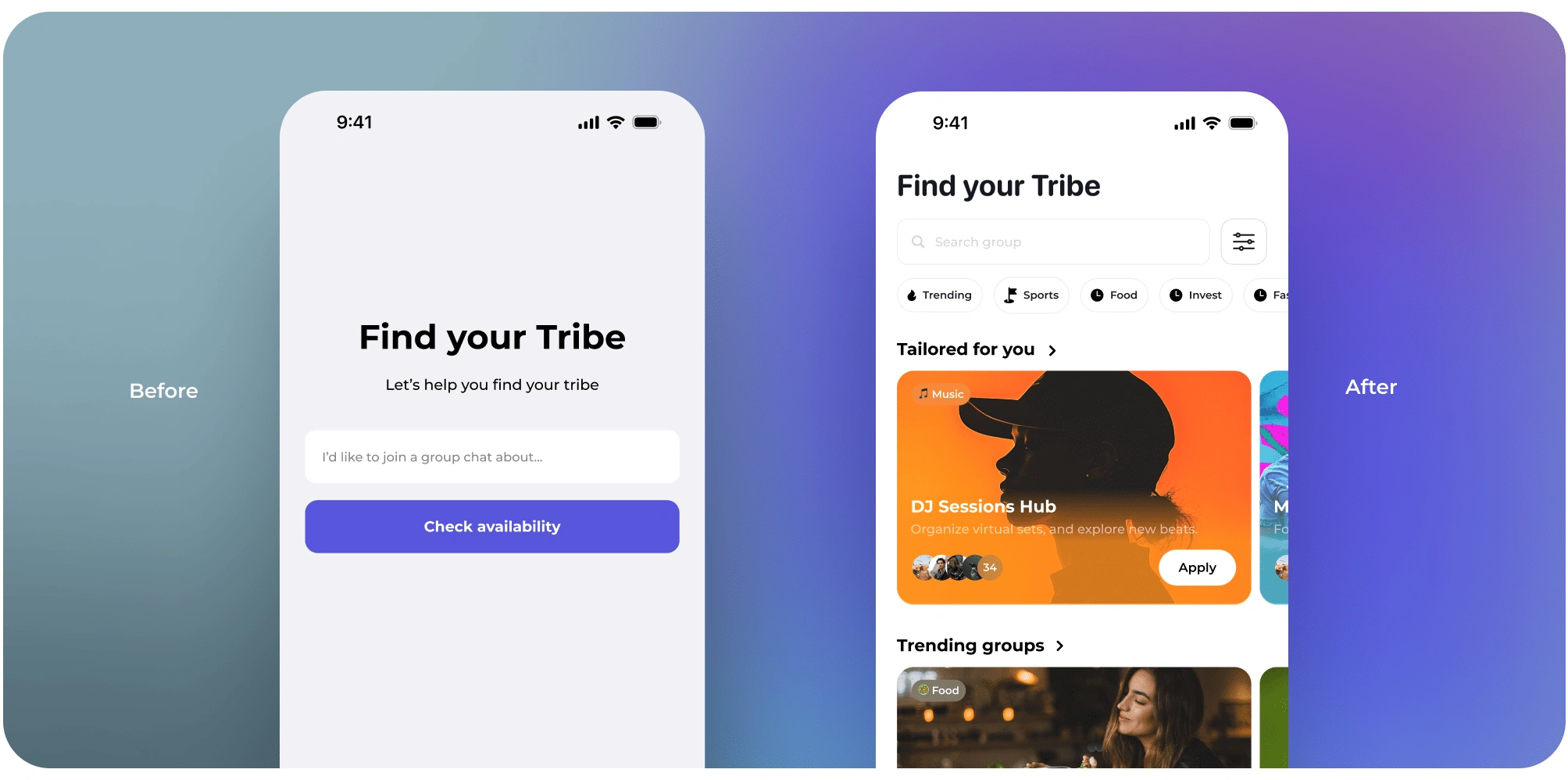
Discover Tribes: Before - After
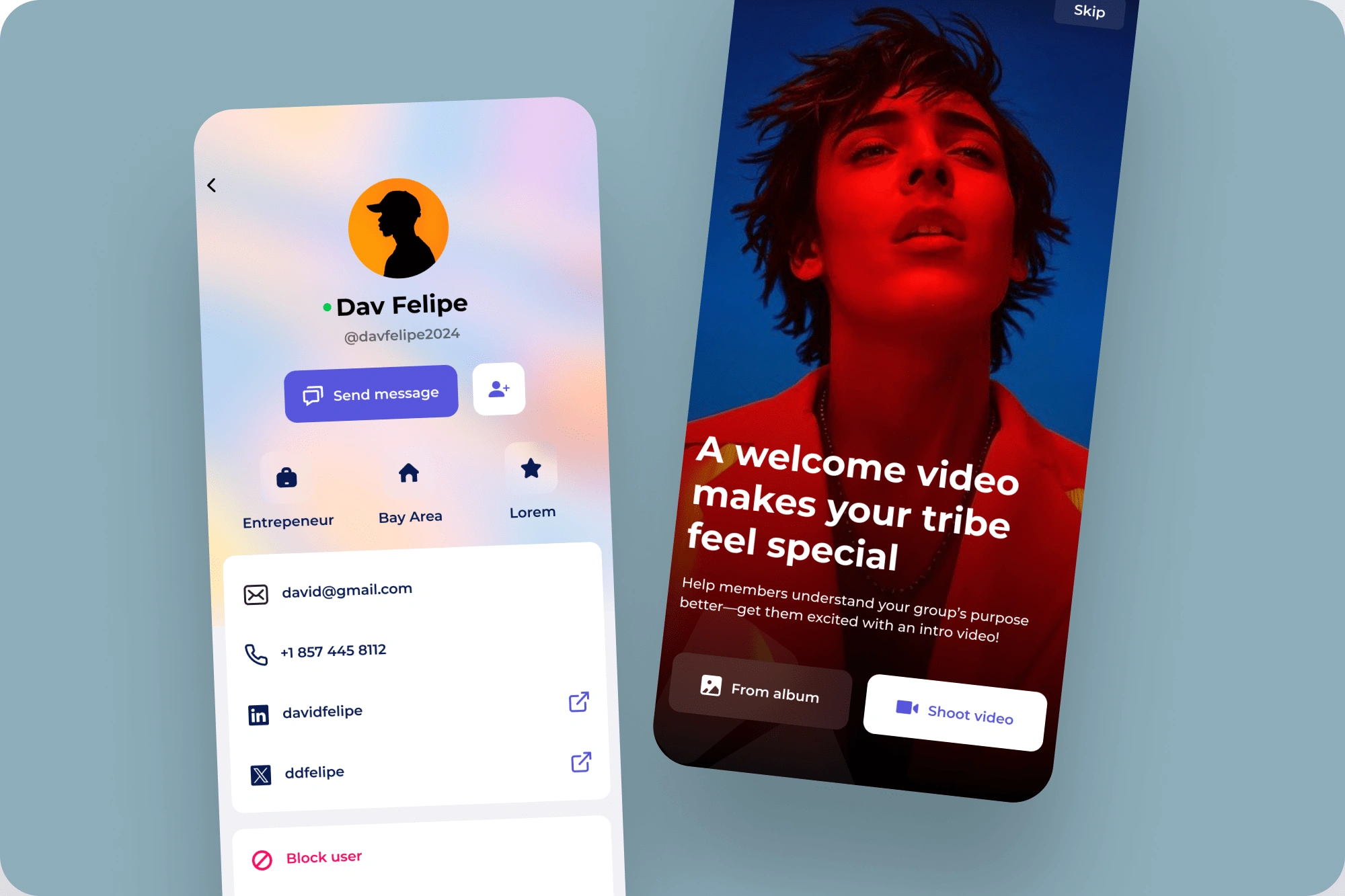
Profile and Tribes: First Impressions Matter
The profile screen is what other users see when they visit your profile inside a group.
The idea behind Tribe is that each group has its own profile, so if it's a football group, you can have a picture of yourself at a stadium, instead of that awkward selfie from 2017. Since our users are obsessed with their topics, we don’t see much friction in asking them to spend 30 seconds editing their profile per group.
I want images to play a key role in groups and profiles. That way, every page feels unique and more personal—because let’s be honest, nobody wants their profile to look like a government form.
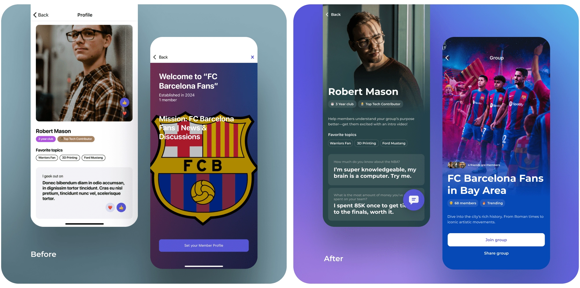
Your Profile and Tribe Welcome page, Before-After
Now, let’s talk about how it was:
❗That massive profile image? Taking up way too much space without actually adding value to the design.
❗The colors? A mix that wasn't really doing anything.
❗The layout? A bit of "where am I supposed to look" situation.
So, I fixed it. Cleaner design, better hierarchy, and—most importantly—a permanent button to message Robert anytime. (You’re welcome, Robert.) And honestly? Robert even looks hotter in the new design.
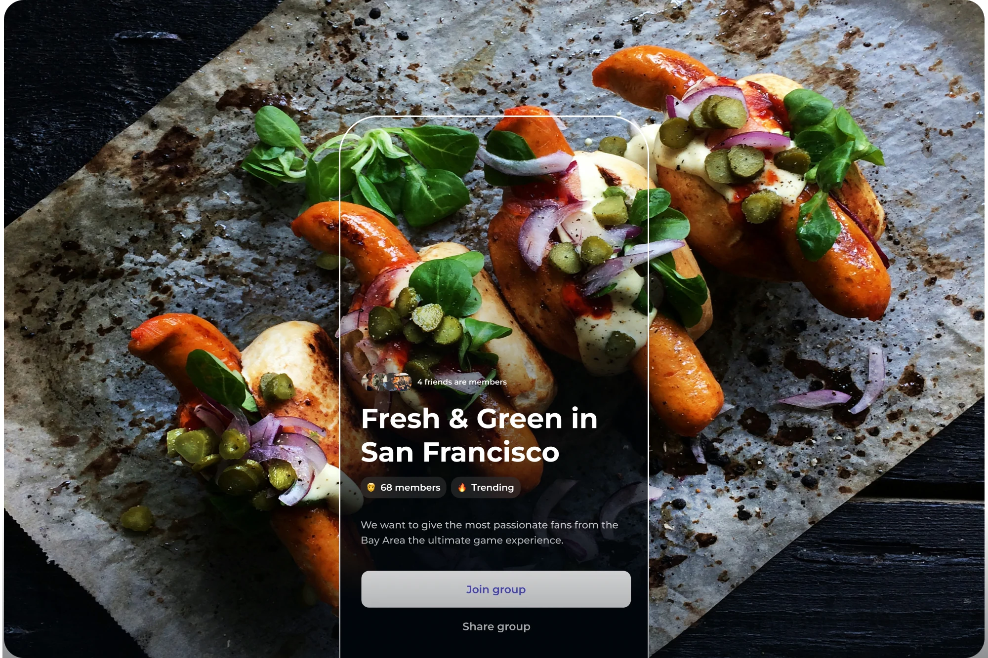
And now, in the Join a Tribe screen (the one you see before applying to a group), I went full cinematic mode. The background adapts to the group’s image, making every page feel unique and giving you that “okay, this looks legit” moment."
But David, "what if the image is white? Won’t that mess up the contrast?"
First of all, great question. Second, no worries—our super-smart algorithm automatically generates a darker gradient to keep everything readable.
In short: Better design, better vibes, and Robert finally getting the recognition he deserves. 🎉
50 Members? No Problem. 50 Hours of Scrolling? Fixed.
And what about data-heavy screens? They’re usually a usability nightmare. How did you handle them?
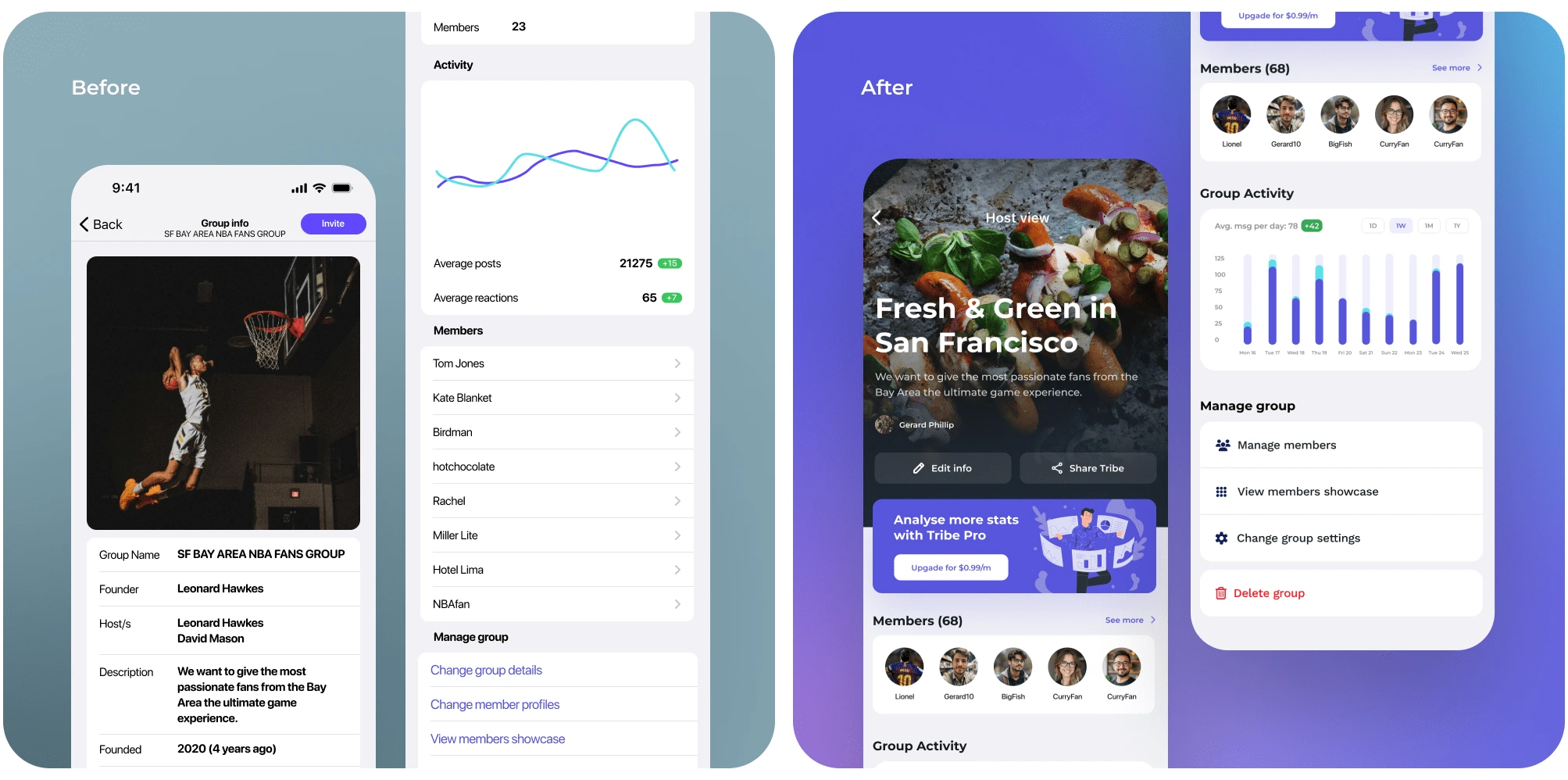
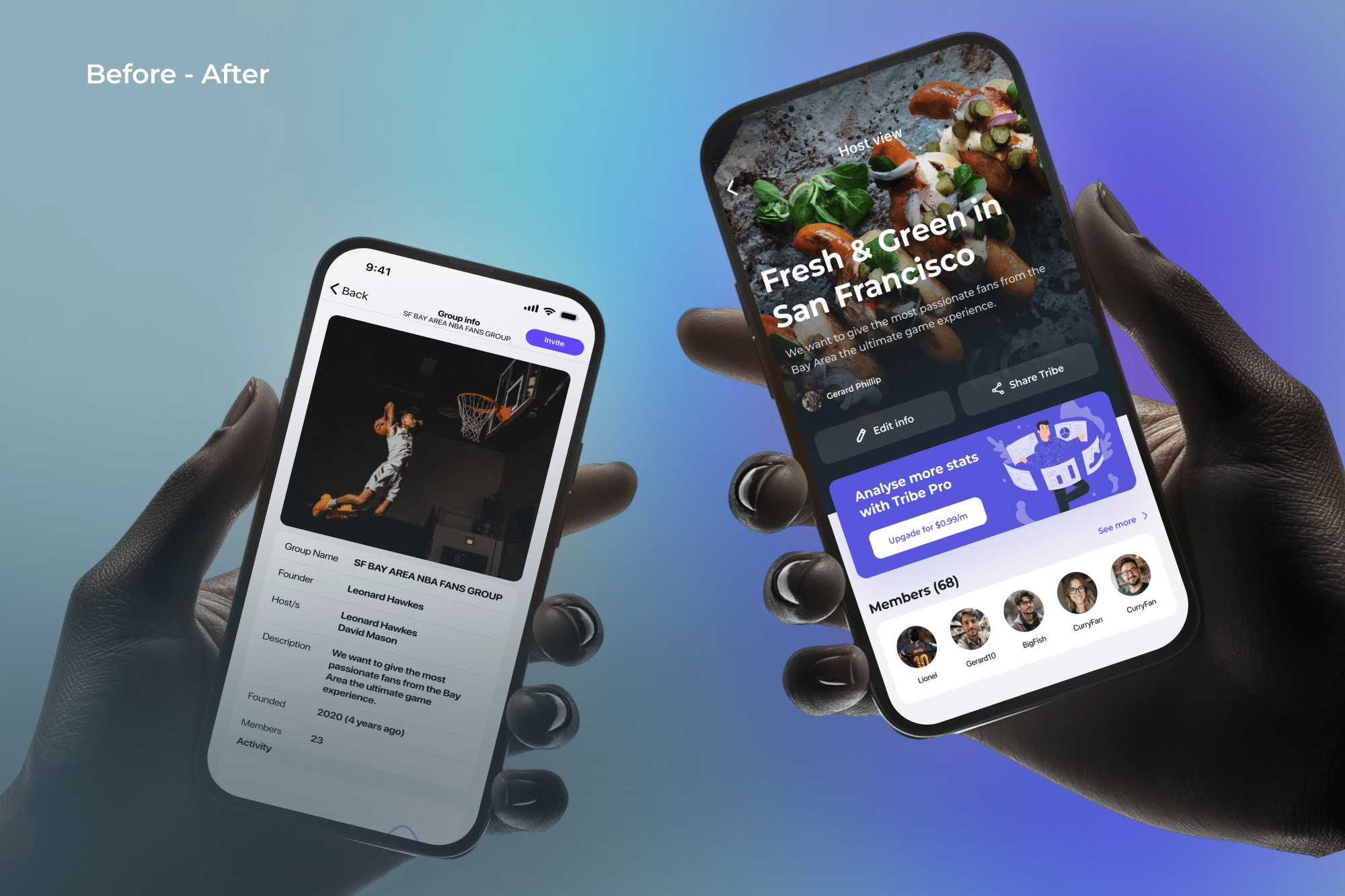
Host Tribe View: Before-After
Super easy. The design system follows clear guidelines that ensure every screen looks good, no matter how much data it holds.
This is the group host’s screen, where they can see members, track activity, access settings… you know, all the important stuff.
But the current design? Not great. The image doesn’t integrate well, and there’s basically an endless scroll just to reach the management options. If there were 50 members, you’d need an entire afternoon just to scroll through them.
I fixed this by adding a dedicated “Members” section, where a “See more” button takes you to a separate page with the full list. No need to cram everything into the main screen. I also improved the activity graph by adding time filters and reorganized the Manage Group options to create a clearer hierarchy.
Much better. 🚀
🎉 The Grand Finale: Tribe 2.0 is Here!
After 100+ screens (yes, I counted) and countless iterations, Tribe now feels like a whole new product. I redesigned everything—from onboarding and profiles to host views, in-app games, and even the group creation flow. Every corner of the app got a fresh coat of UX magic.
But beyond the visuals, the impact is real:
🚀 Clarity wins – Users were initially confused about some features (especially the games), but now we see more and more people engaging with them.
📈 Engagement boost – The redesigned Discover page makes it easier to find groups, leading to an increase in user participation.
🎮 Gamification success – Interactive elements like labels and challenges are making groups more dynamic.
This wasn’t just a UI refresh; it was about creating a better experience from the ground up. Now, Tribe truly feels like the platform it was meant to be—a place where passionate people can connect effortlessly.
And with that… drops mic 🎤💥
Like this project
Posted Mar 19, 2025
Tribe is where small, private communities come together to chat about the things they love—but the design? Yeah… it needed some help. That’s where I jumped in.
Likes
0
Views
19
Timeline
Oct 1, 2024 - Mar 19, 2025