Someone else’s Pants I Branding for a Creative Agency
/
We are a young and rebellious creative agency that thrives on adaptability. To demonstrate our versatility, we developed four distinct styles—each showcasing a unique visual approach. Whether it’s playful surrealism, bold minimalism, or experimental typography, we embrace every challenge with the same mission: to make ideas fit like a tailored pair of pants... even if they’re not ours.
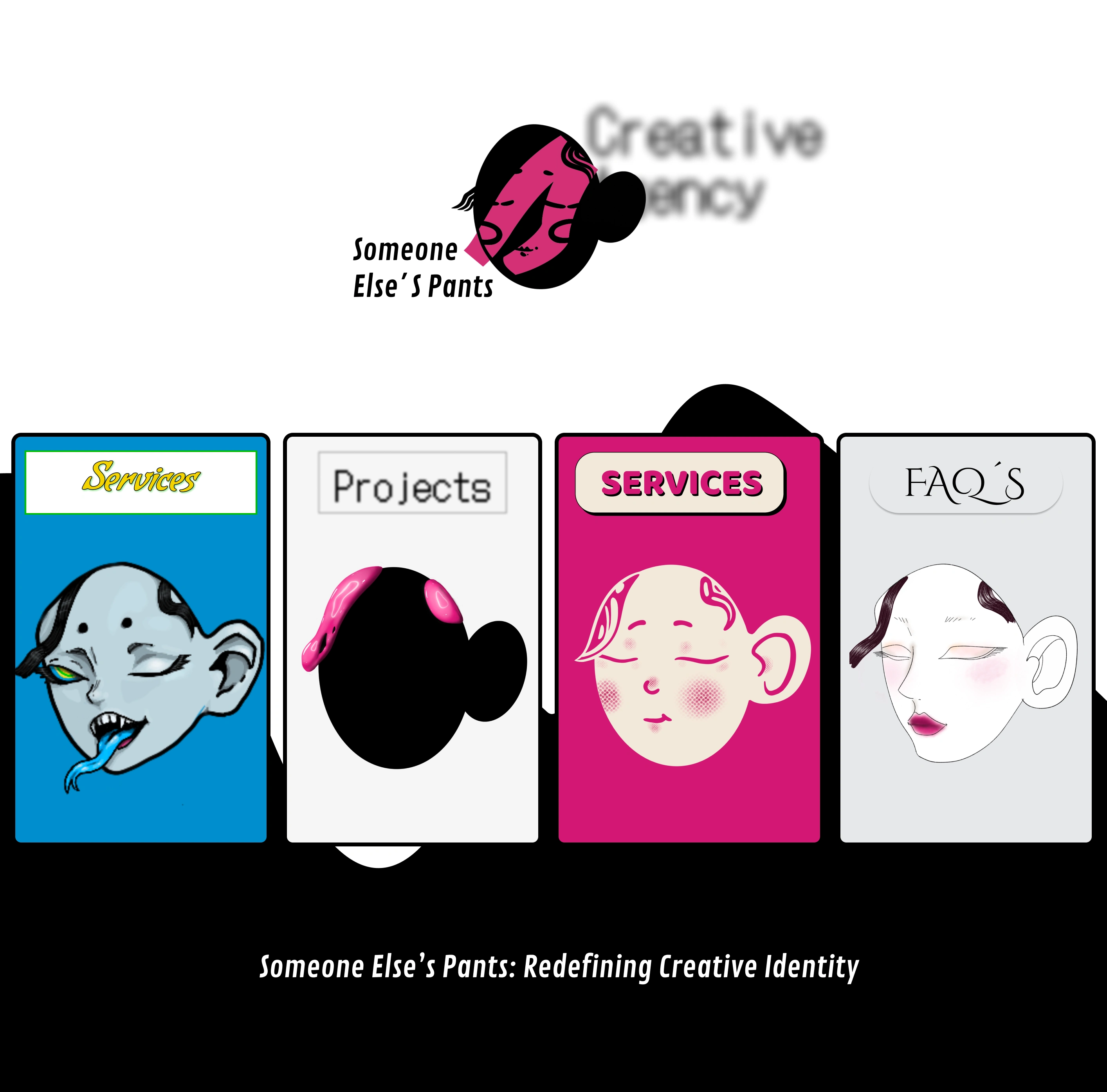
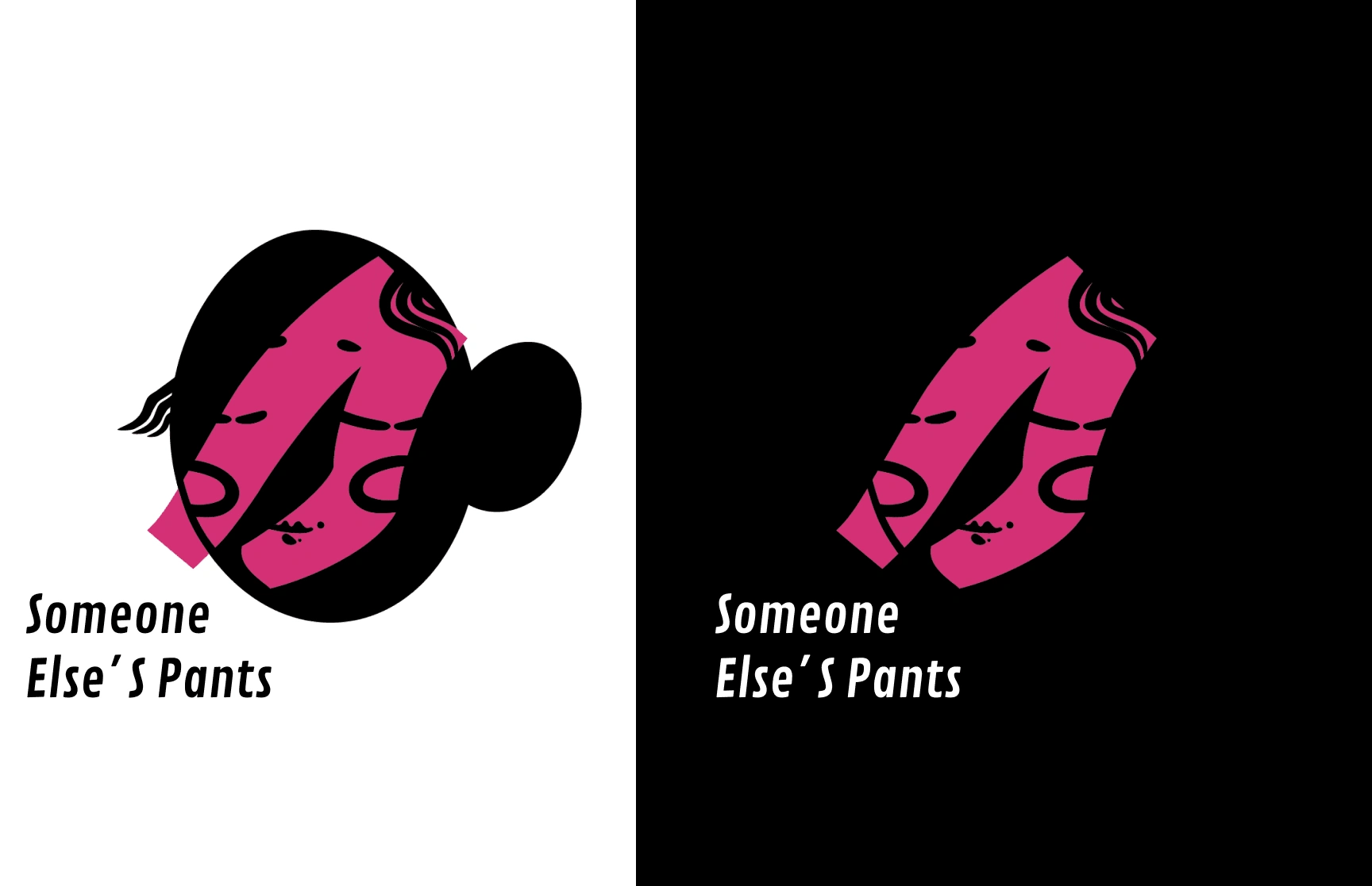
At Someone Else’s Pants, we embrace the uncomfortable, the unpredictable, and the unconventional. This logo is a visual reminder that stepping into someone else’s world—awkward as it may be—sparks the most creative solutions.
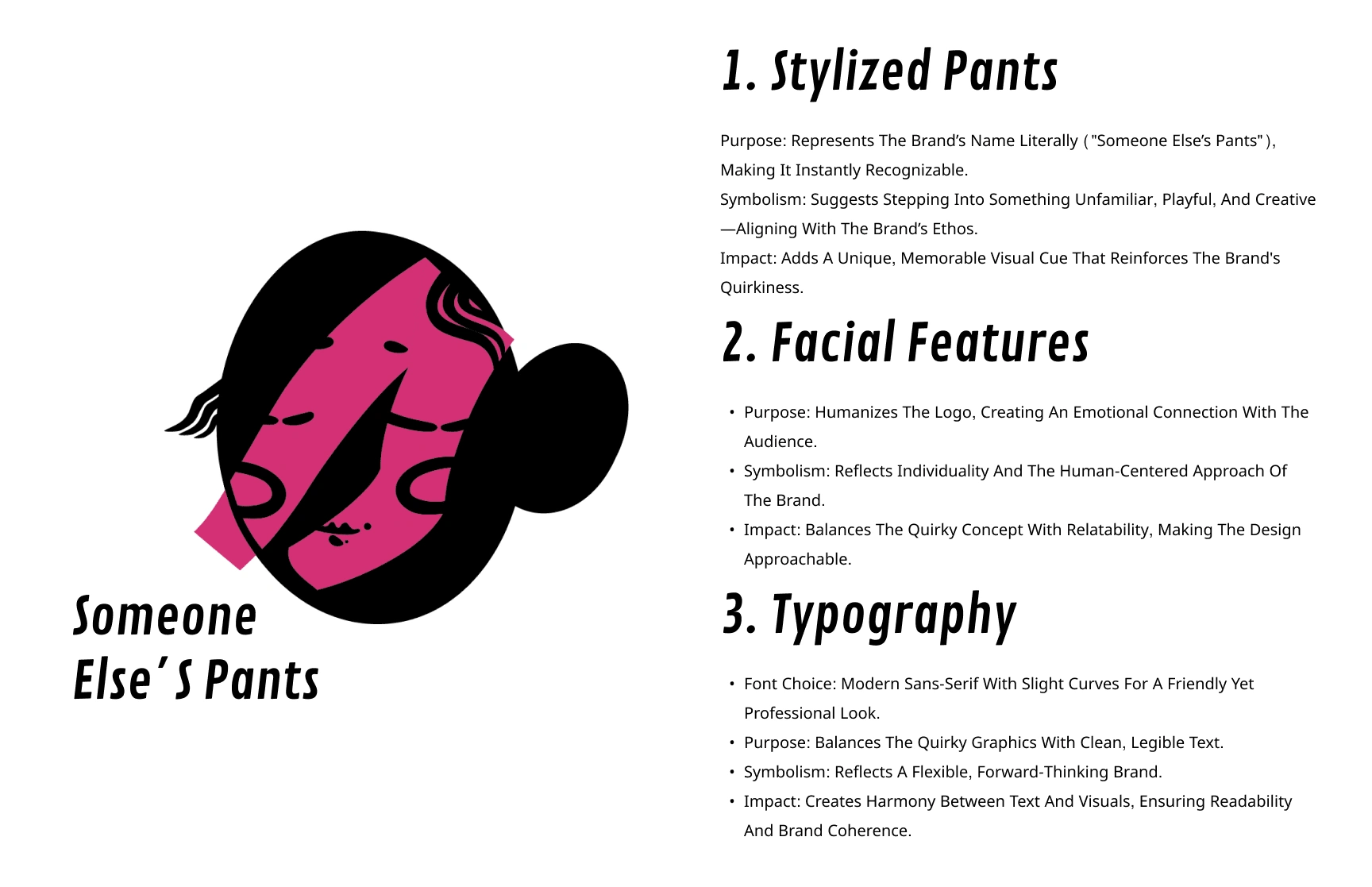
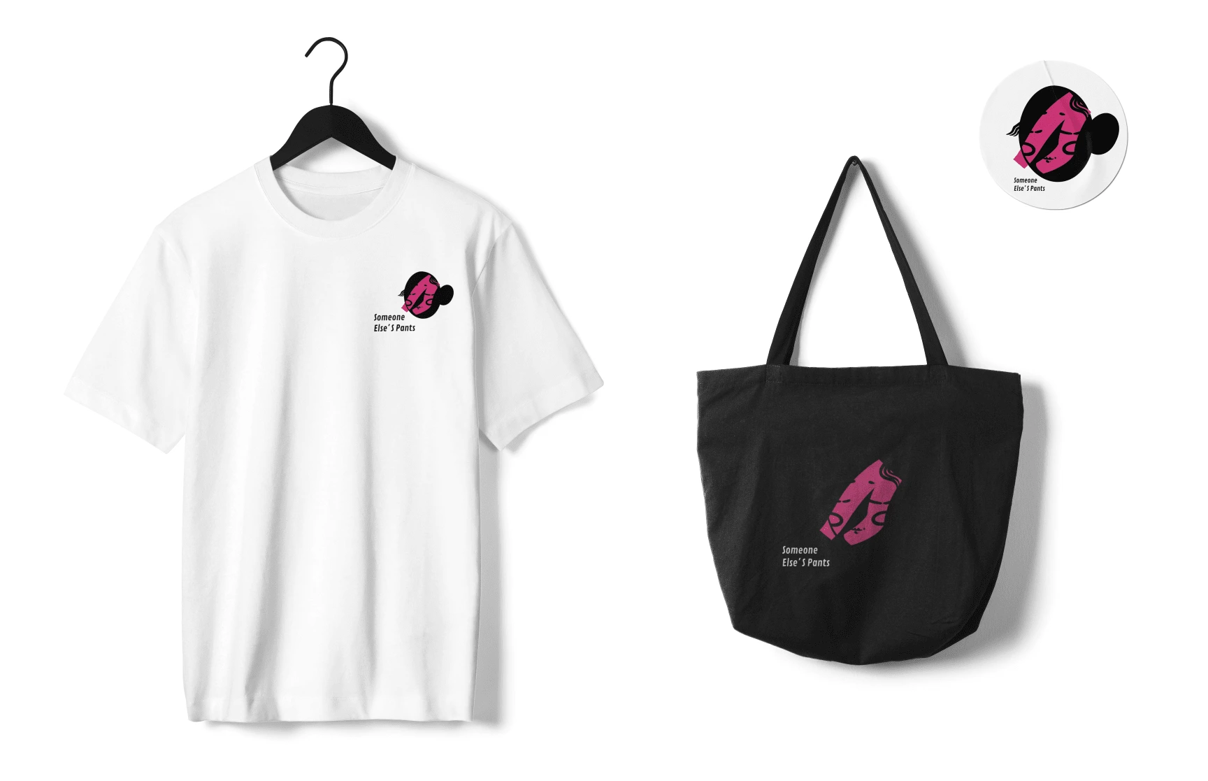
Where design is less about fitting in and more about standing out—loudly, boldly, and unapologetically.
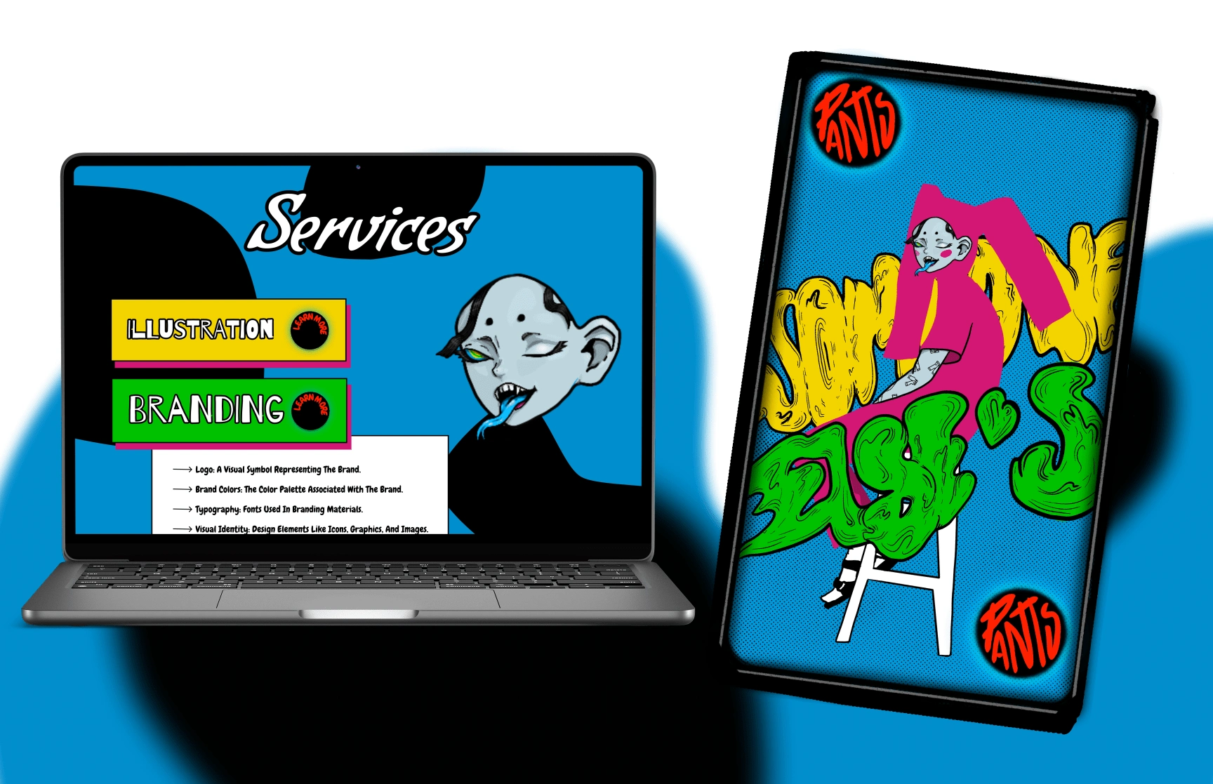
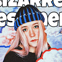
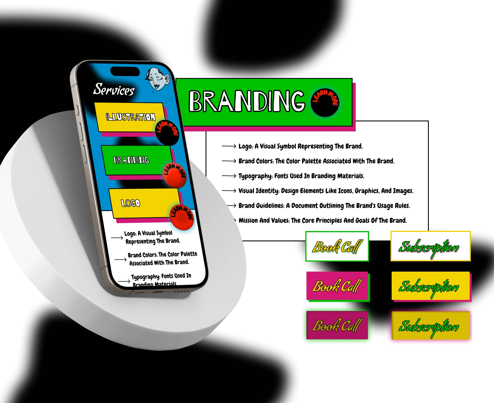
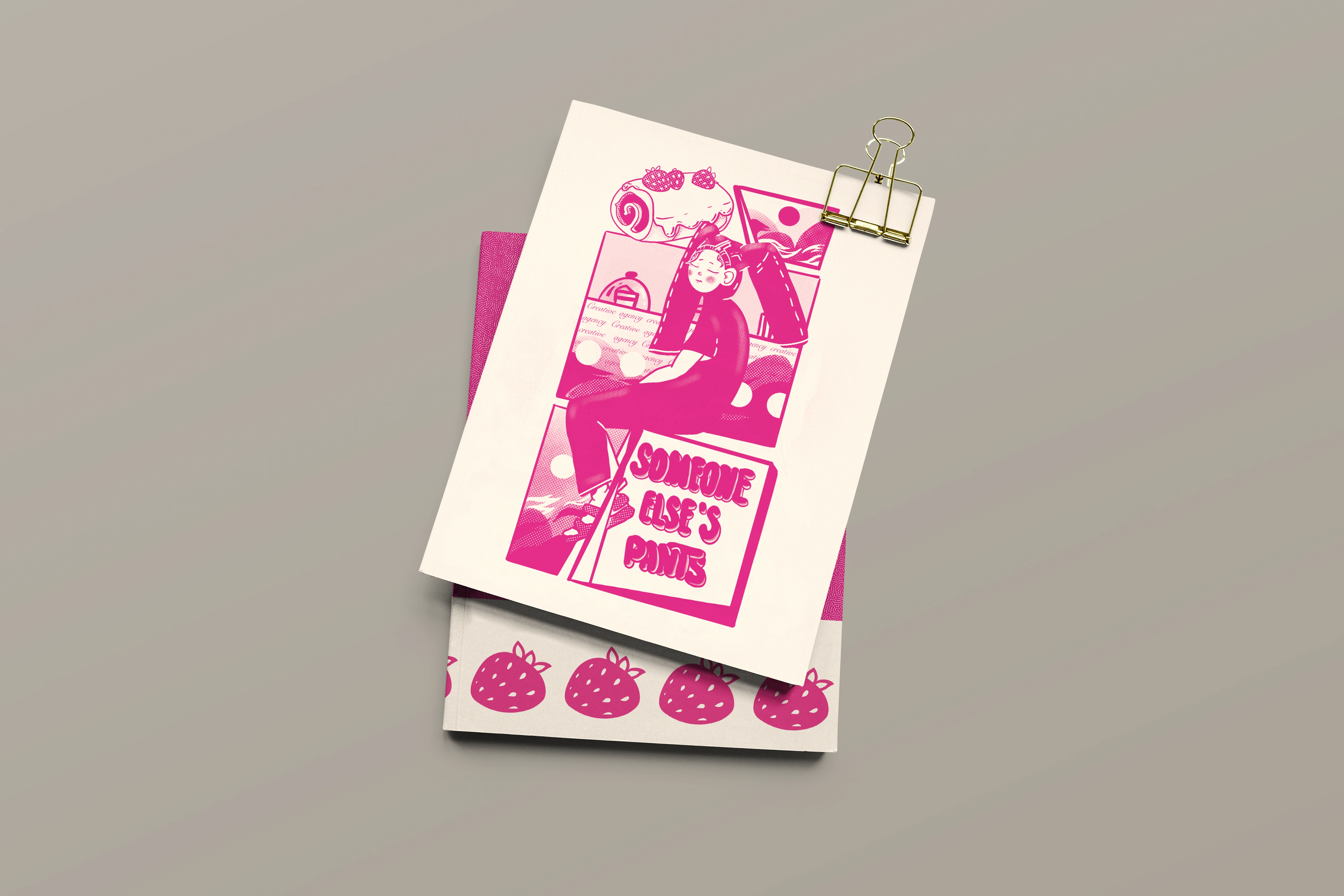
Pix Punk Comic Style is a bold and rebellious art style that combines pixel art with punk aesthetics. It features:
• Pixelated designs: Retro-inspired visuals with sharp edges and vibrant colors.
• Punk elements: Gritty textures, edgy themes, and chaotic compositions.
• Comic influence: Speech bubbles, action lines, and dynamic layouts for storytelling.
Details:
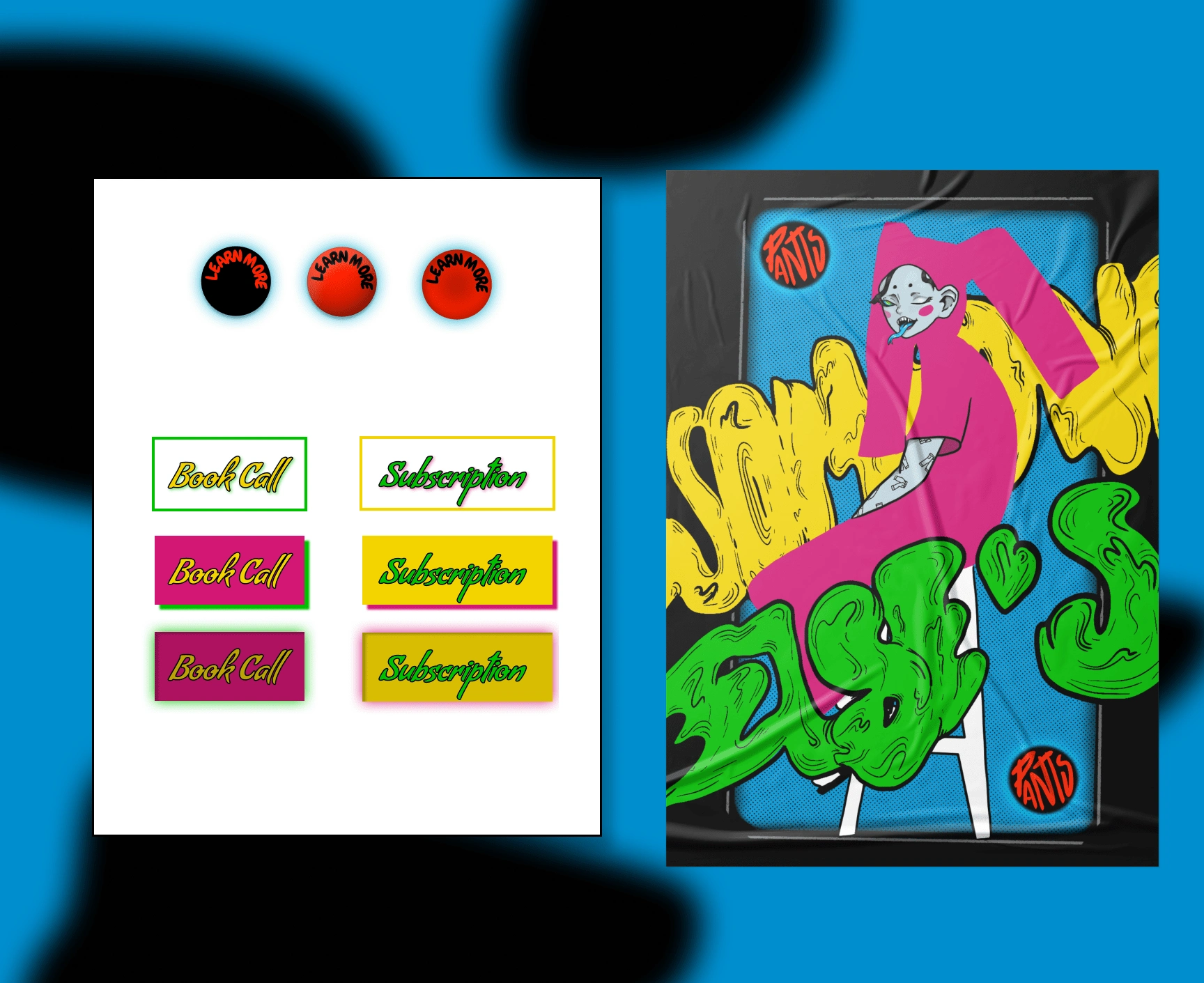
Buttons :
Playful punk-inspired gradients (black-red, red-orange) with bold typography for maximum visibility.
The circular format emphasizes action, like an unapologetic invitation to dive deeper into the absurd.
"Book Call" and "Subscription" Buttons:
Dual-layered neon designs scream urgency and creativity.
Contrasting color palettes (pink-yellow, green-yellow) reflect versatility and adaptability to different styles.
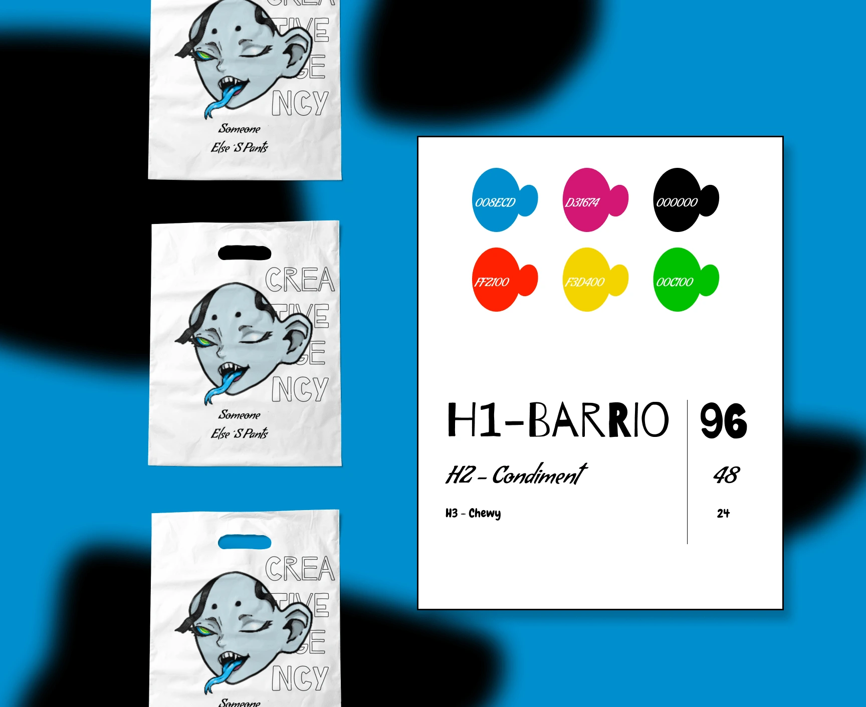
Color Palette:
Vibrant, high-energy colors like blue (#008ECD) and pink (#D31674) paired with grounding black ensure versatility and punch.
These choices reflect the agency’s personality: colorful, rebellious, and daring.
Typography:
H1 "Barrio": A bold, slightly rough font that feels hand-drawn, aligning with the agency’s raw authenticity.
H2 "Condiment": Adds a playful flair for subheadings, keeping the tone light and engaging.
H3 "Chewy": Perfect for details and captions, it rounds off the style with a fun twist.
Fluid Pop Art: A Fusion of Movement and Boldness
Explanation:
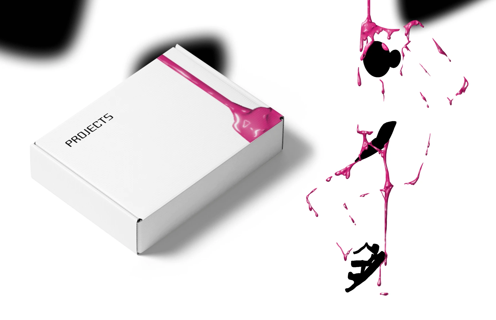
Fluid Pop Art is a contemporary style that blends the vibrant colors and bold aesthetics of classic Pop Art with the organic, dynamic forms of fluid art. This style breaks away from the rigid, structured visuals of traditional Pop Art by introducing flowing shapes, glossy textures, and a sense of movement that feels alive and evolving.
Key characteristics include:
Bright, saturated colors: Often inspired by the playful palettes of Pop Art.
Organic, fluid shapes: Representing the movement and unpredictability of liquid forms.
Glossy or shiny textures: Giving a modern, high-tech finish.
A mix of abstraction and recognizability: Some elements might be abstract, while others are clearly inspired by real-world objects or icons
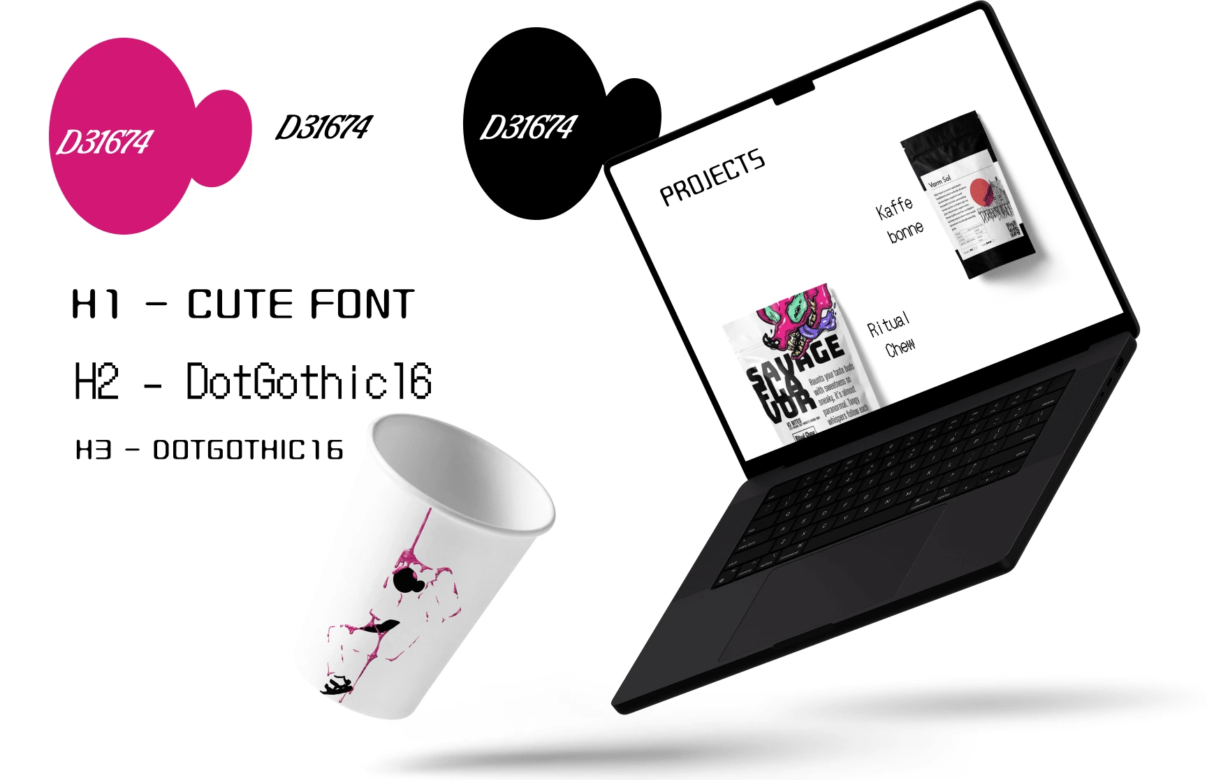
Branding is more than colors and fonts; it’s a language. Here’s how 'Someone Else’s Pants' translates rebellion into design clarity.
Presentation for Retro Pop-Art Design
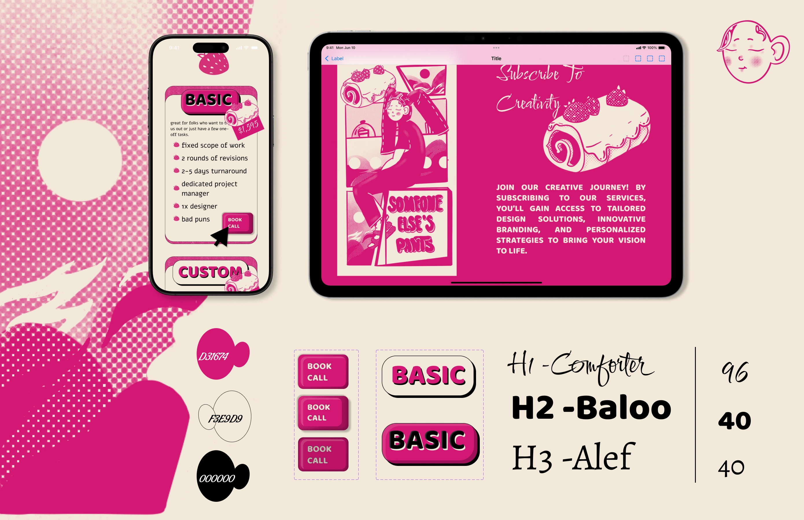
Step into a candy-coated world of creativity with our retro pop-art-inspired style. Bold, ironic, and unapologetically fun, this design language takes cues from mid-20th-century comics and advertising to bring an energetic and playful tone to branding and UX.
Color Palette:
Pink (#D31674): A bold, fun color that drives the pop-art theme and grabs attention.
Cream (#F3E9D9): A soft background tone to let the vibrant elements shine without overwhelming.
Black (#000000): Provides grounding and contrast, ensuring clarity and legibility.
Typography:
H1 "Comforter": A playful script font that feels welcoming and retro. Perfect for headlines that demand attention.
H2 "Baloo": Chunky and modern, it complements the pop-art style while maintaining readability.
H3 "Alef": Simple and clean, ensuring that supporting text doesn’t compete with the bold visuals.
Buttons:
Rounded edges and 3D effects give the buttons a tactile, comic-inspired feel.
The layered design adds depth, mimicking the speech bubble aesthetic common in vintage comics.
The vibrant pink maintains consistency with the overall color scheme, ensuring buttons remain the focal point of interaction.
Surrealism with elements
of Japanese painting
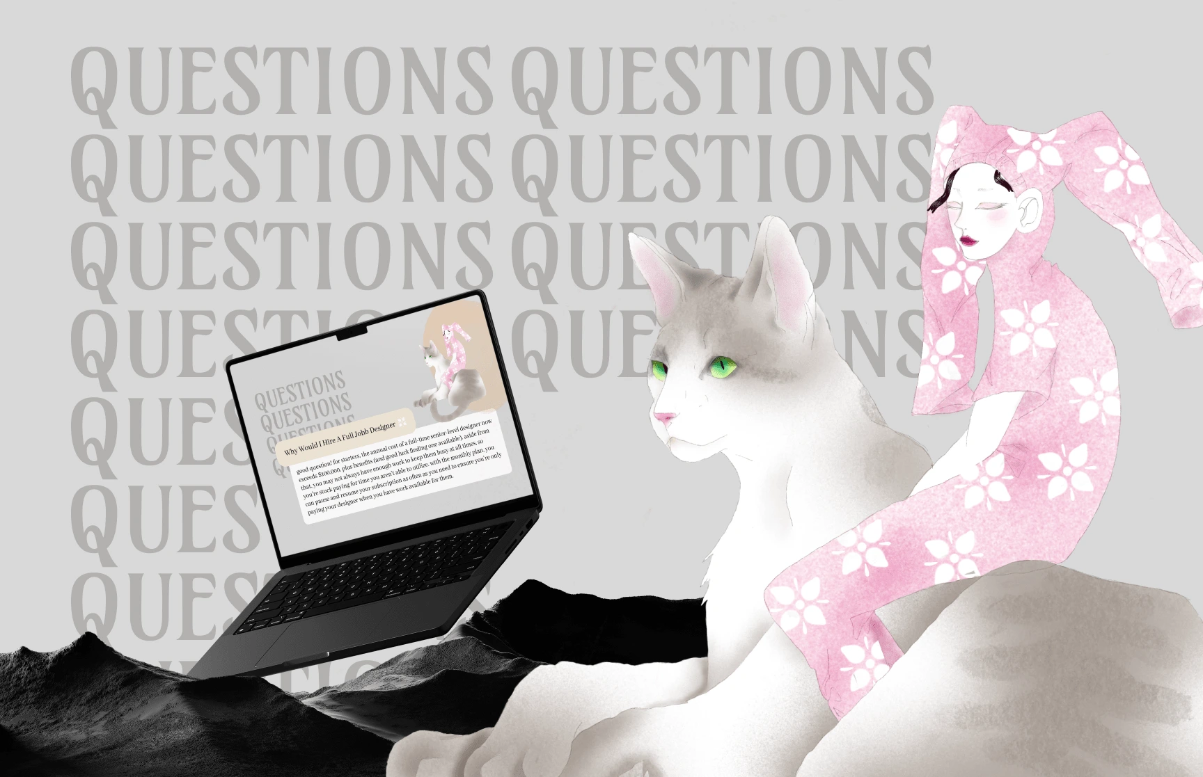
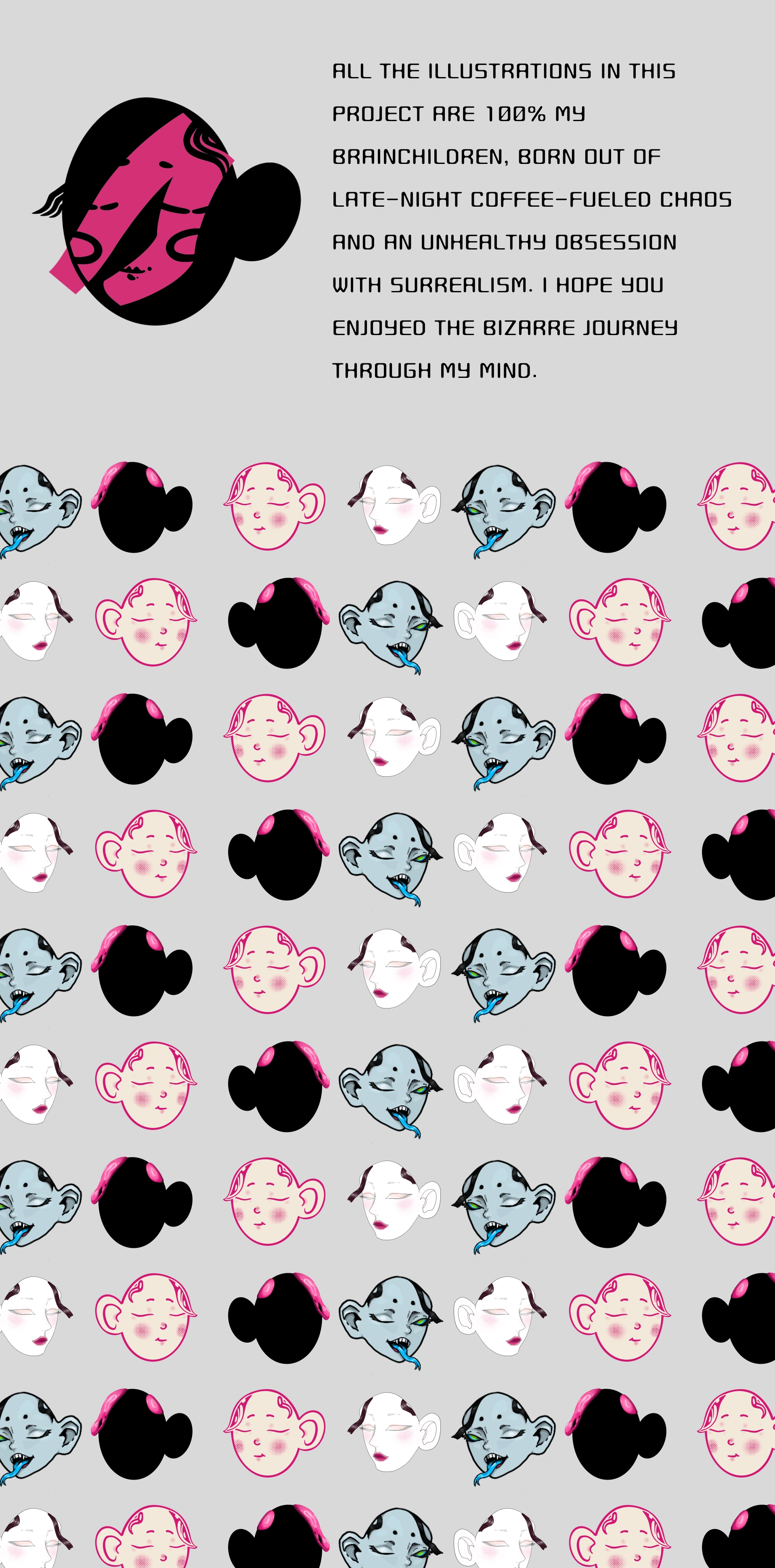
Influence of Japanese Painting (Nihonga): Clean and soft forms. Simplicity and minimalism in the color palette. Composition emphasizing balance and negative space.
Surrealistic Elements: Unrealistic combinations of characters and objects. A focus on fantasy and interpretation.
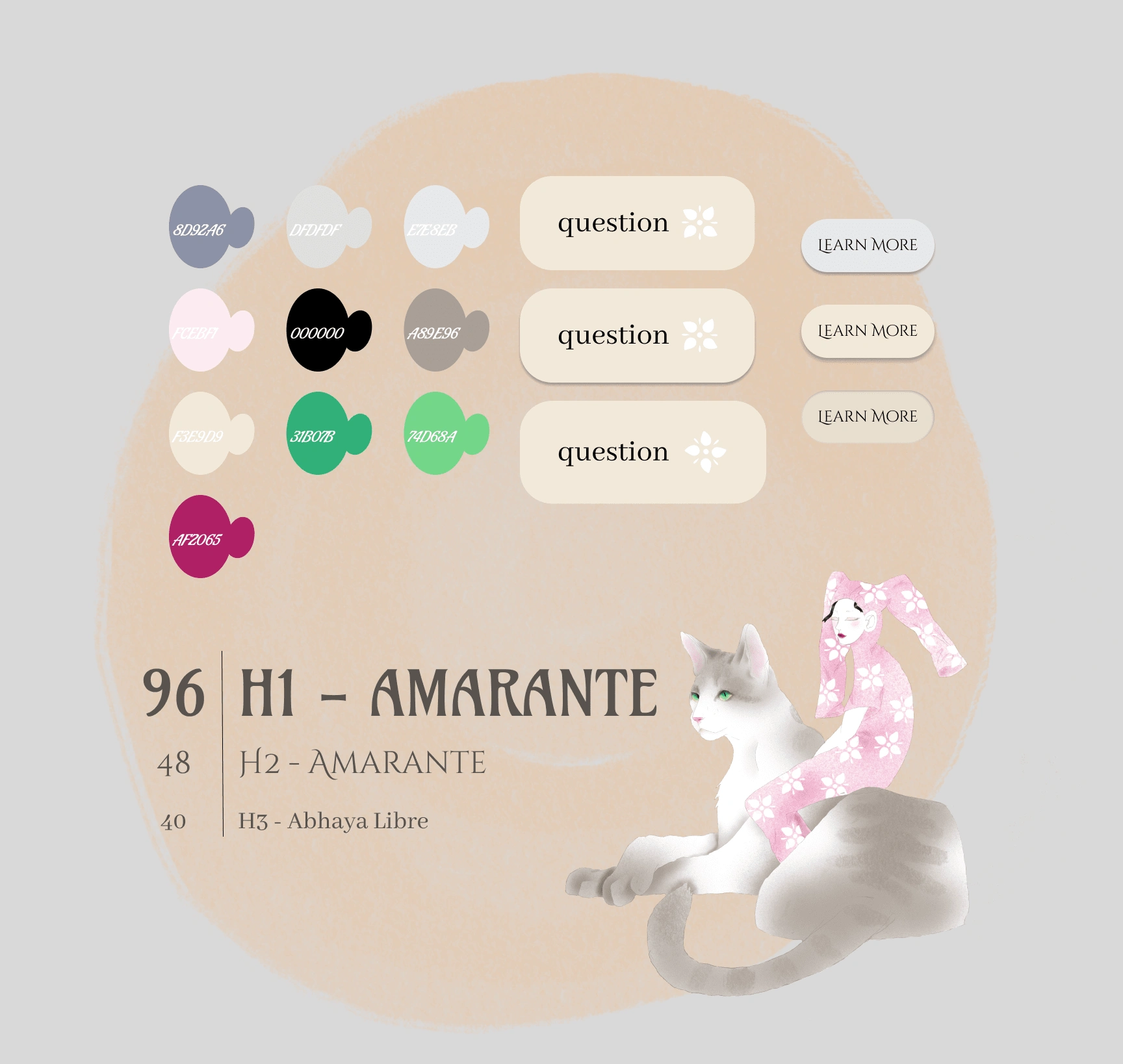
Visual Elements
Typography:
H1 "Amarante": A serif font with a classic elegance, matching the simplicity and tradition of Japanese painting. Perfect for headers that demand subtle authority.
H2 "Amarante": A smaller variation to maintain consistency in tone.
H3 "Abhaya Libre": Clean and modern, providing balance for supporting text without overshadowing the primary design elements.
Color Palette Primary Tones:
Soft neutrals (#F3E9D9, #E5E5E5) provide a calm base that evokes harmony.
Subtle greys and taupes (#8D8A86, #A89E96) ground the visuals in tradition.
Accent Colors:
Green (#31B08B): Adds a fresh touch, symbolizing nature and renewal.
Pink (#FFCEFF): Softly playful, highlighting the surreal elements.
Buttons:
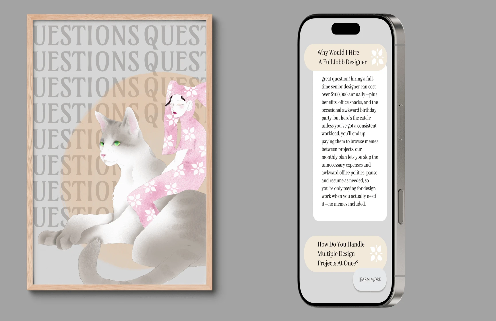
Designed with rounded edges and soft, cream tones to blend seamlessly with the Nihonga-inspired background.
Flower iconography ties to the Japanese aesthetic, while the “Learn More” label adds a functional yet elegant call to action.
Like this project
Posted Nov 7, 2024
A playful and distinctive brand identity for a creative agency that blends quirky characters with Japanese-inspired art, standing out with bold, whimsical style
Likes
0
Views
17
