Branding for small coffee brand
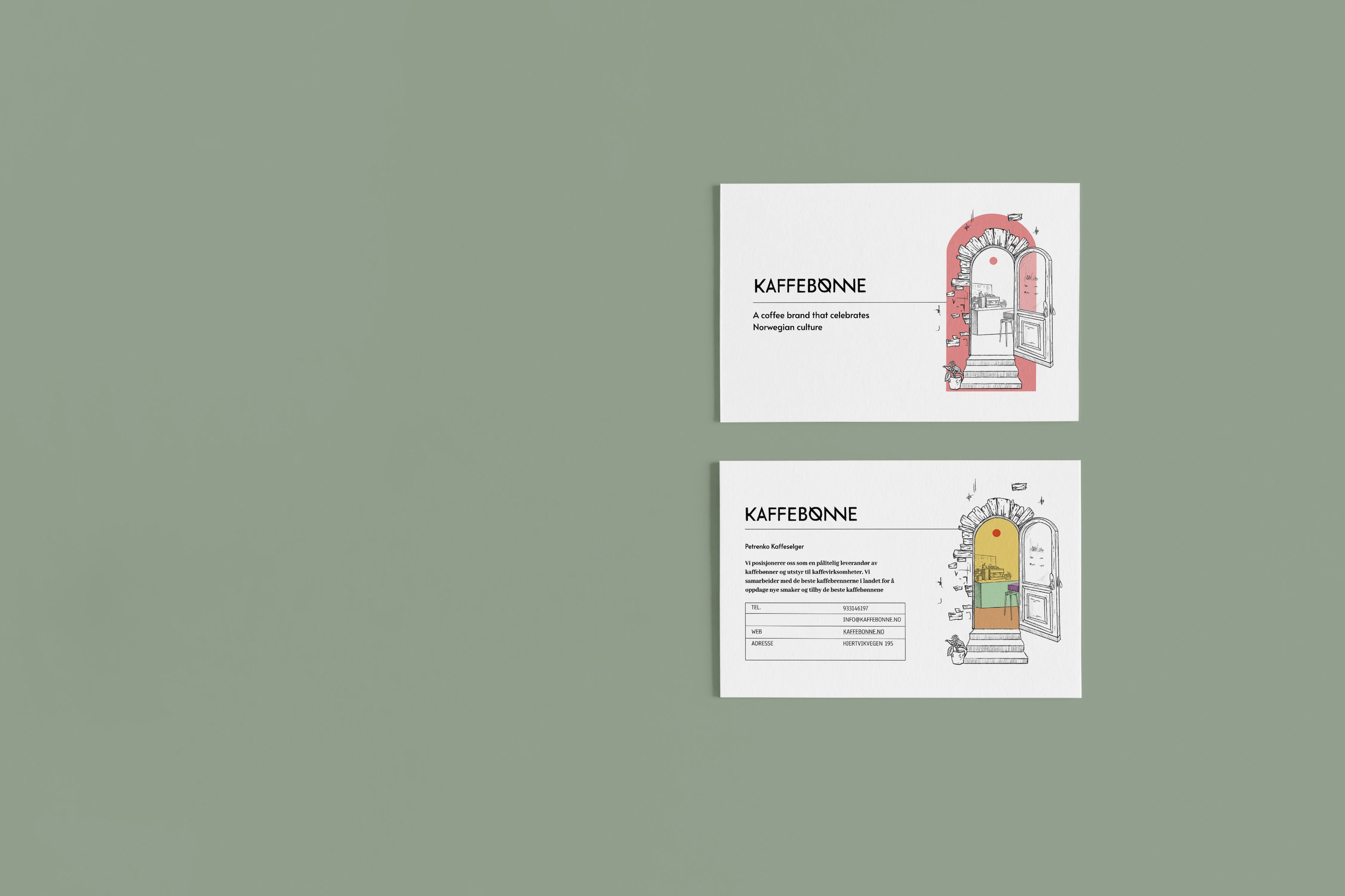
In the heart of Norway, where the majestic fjords meet the vibrant pulse of urban life, a dream began to brew. This is the story of a small coffee brand born from the passion and resilience of an entrepreneurial spirit who embarked on a journey of immigration, seeking a new beginning in a foreign land.
The challenge
With the aroma of freshly roasted beans and the warmth of community in mind, the task was clear: to craft a design that not only speaks to the heart but also captures the essence of this unique coffee experience. The challenge was to penetrate the competitive coffee market with limited resources, yet the vision was boundless
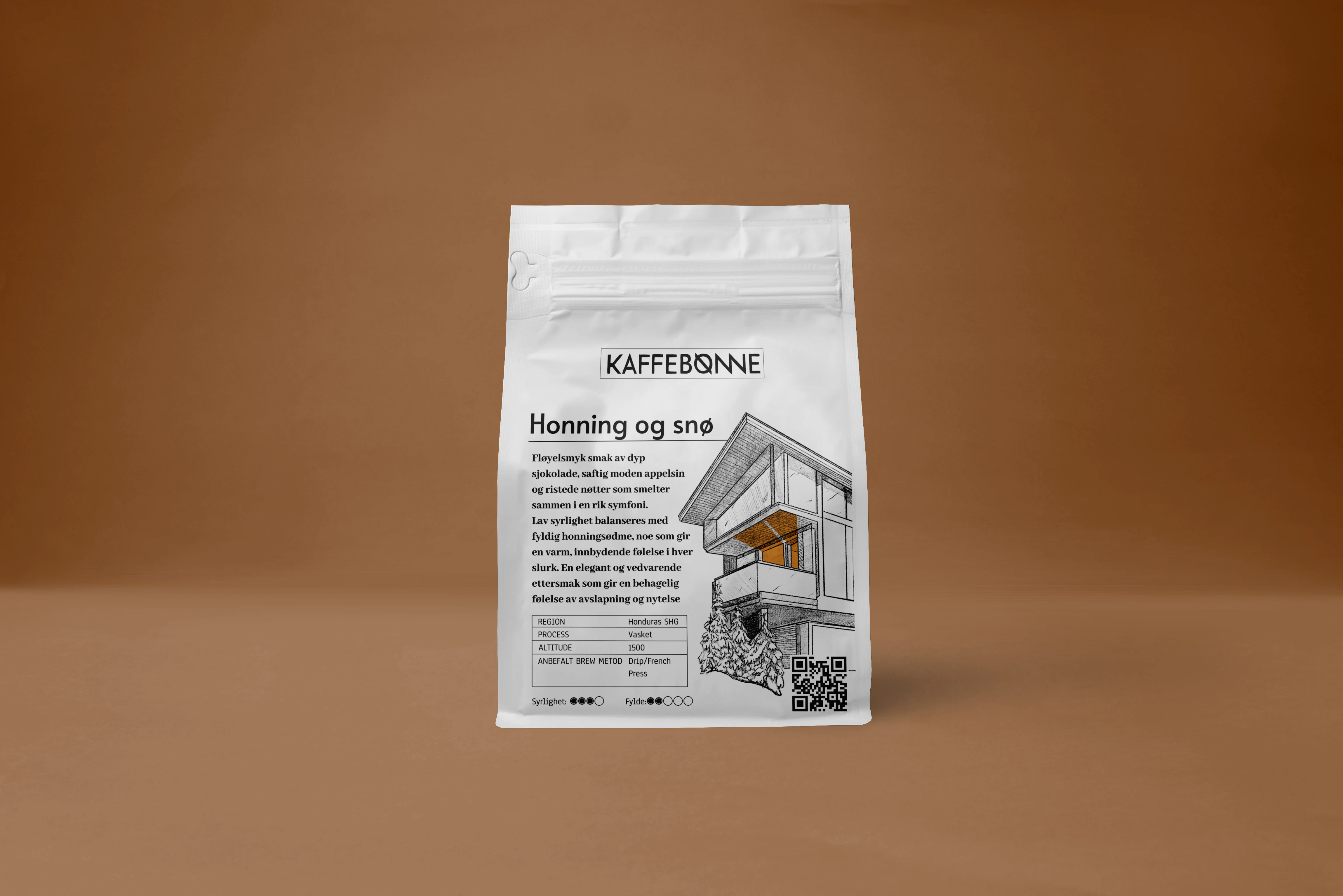
And So Houses
Came to Be...
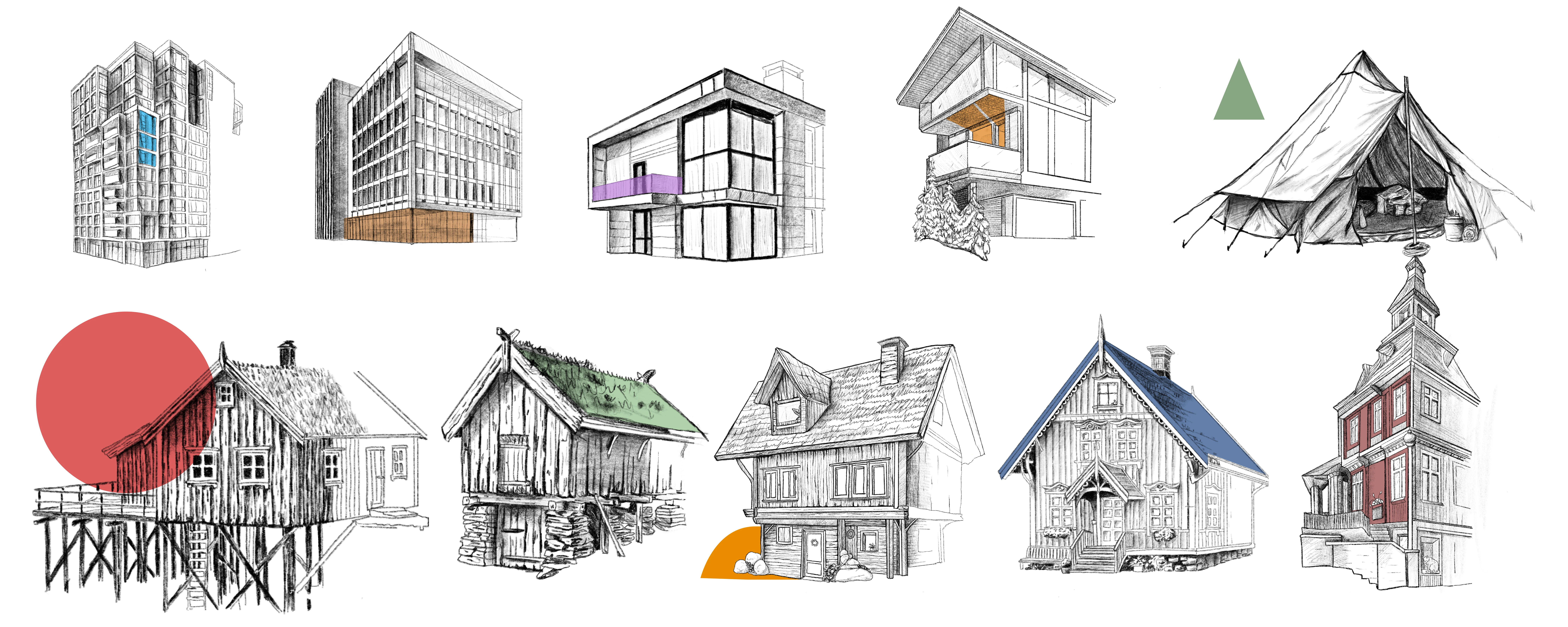
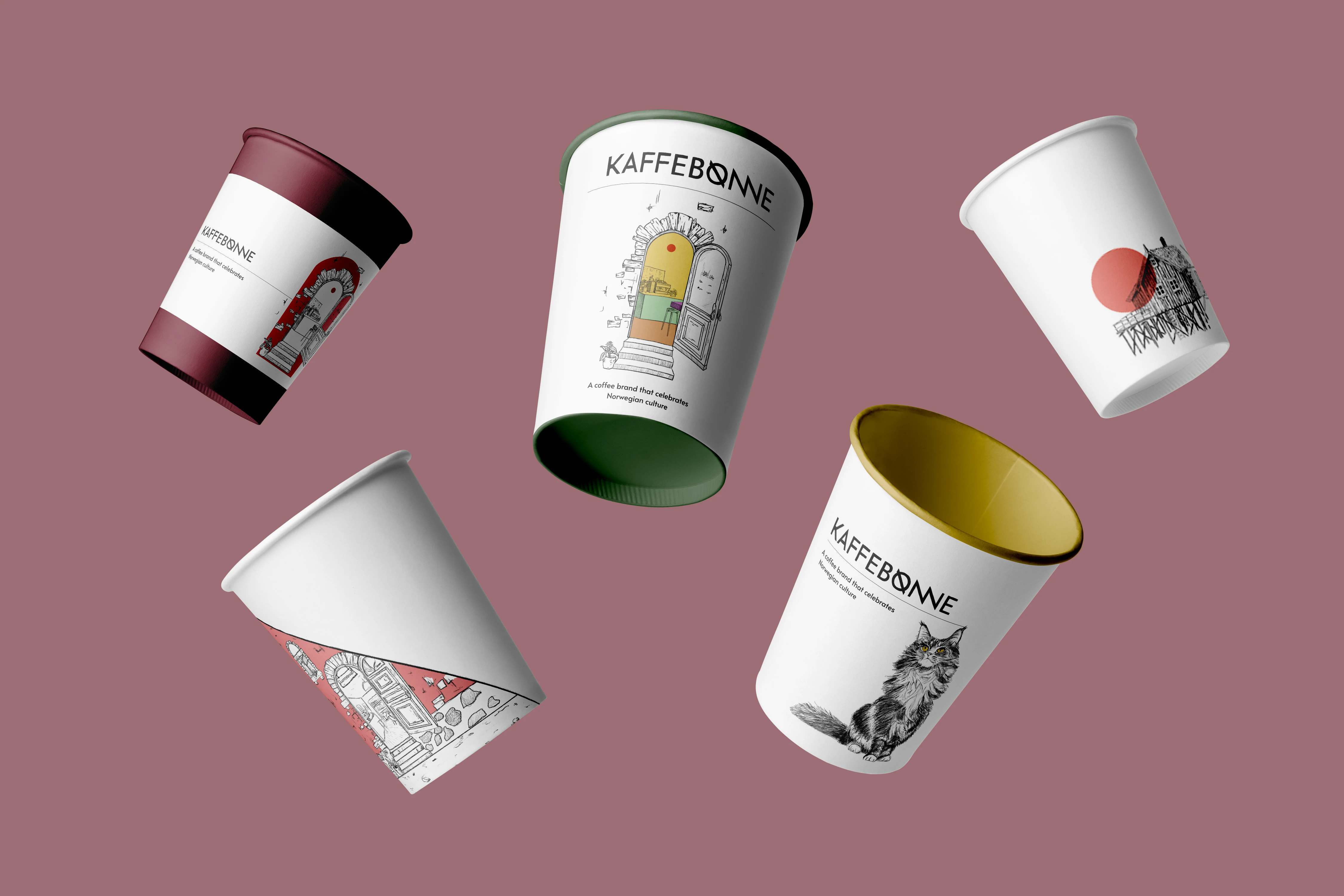
A decision was made to incorporate Norwegian architecture into the design, but what do houses have to do with it?
Memorability through Visual Imagery
People remember real objects better, especially those connected to their culture and environment. Images of Norwegian houses make the product feel closer and more familiar to Norwegian consumers. This helps forge an emotional connection and enhances brand loyalty
Cultural Identification
Highlighting Norwegian architecture and culture evokes feelings of home and national pride in consumers. This strengthens the bond with the brand, making it more appealing in the local market
Uniqueness and Recognizability
Unlike abstract elements or simple color schemes, illustrations of real houses make the packaging stand out on shelves among competitors. This aids consumers in quickly finding and identifying the product, especially if they have tried and enjoyed it before
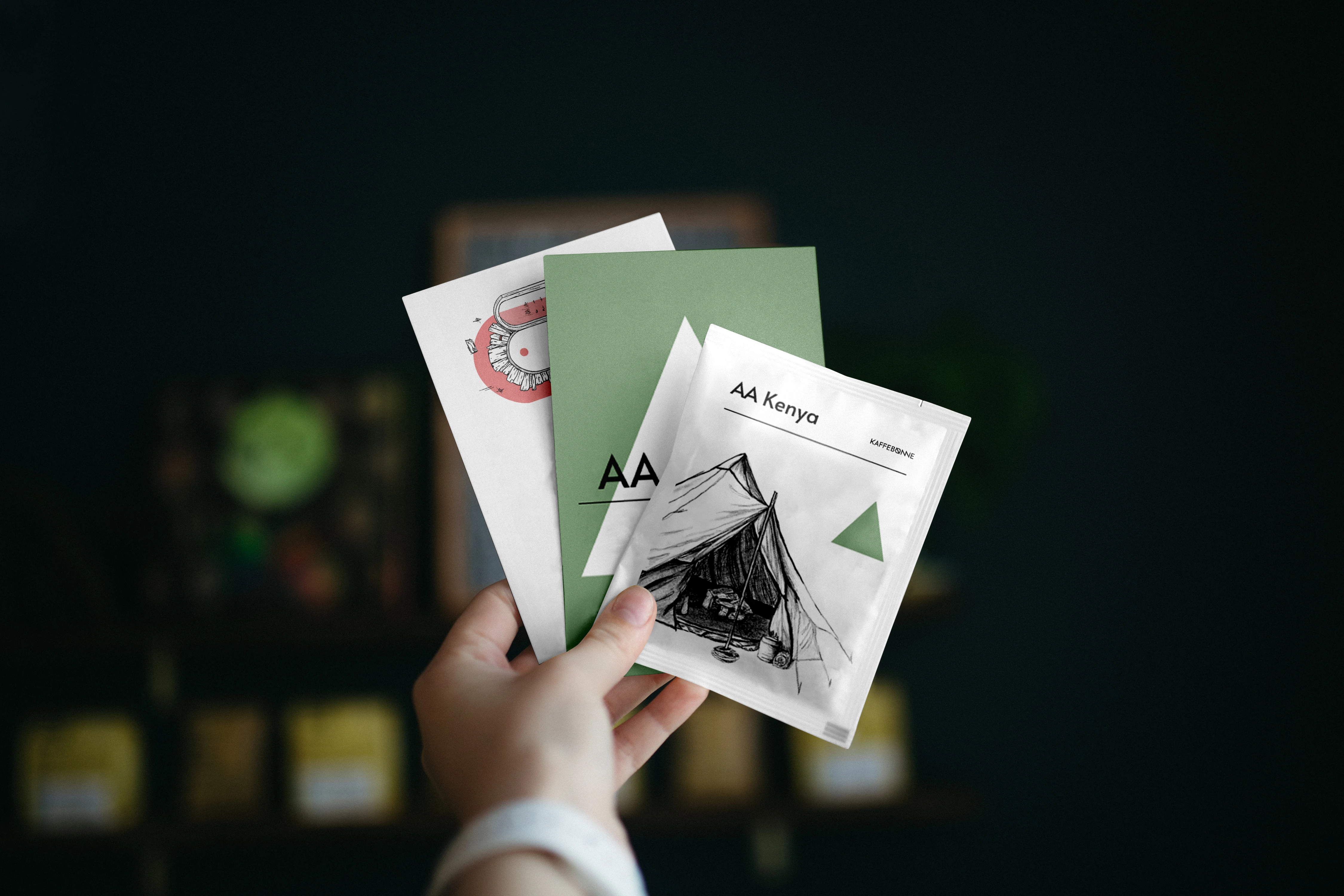
To much words.....
Rich Flavor Descriptions
Rich Flavor Descriptions: We also chose to use rich descriptions of flavors, inspired by specialty coffee design winners like Hasbean. Such descriptions create a more appealing image of the product than a simple list of descriptors. They evoke emotional responses and associations with familiar things rather than abstract places that most people have never seen
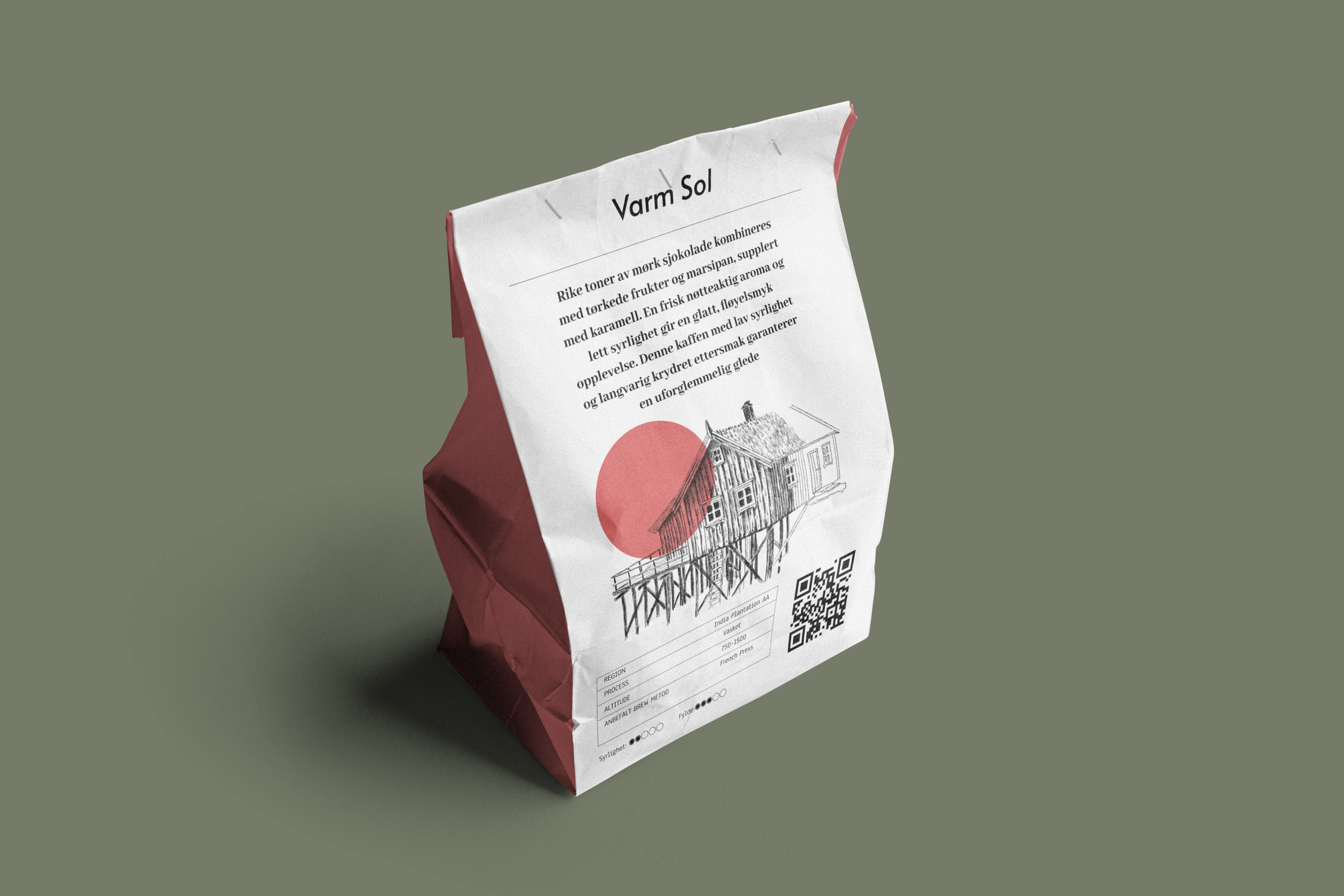
Titles and Names for Flavors
We used titles and names for flavors reminiscent of book titles. This creates emotional responses and associations with familiar concepts, making the product more attractive and memorable for consumers
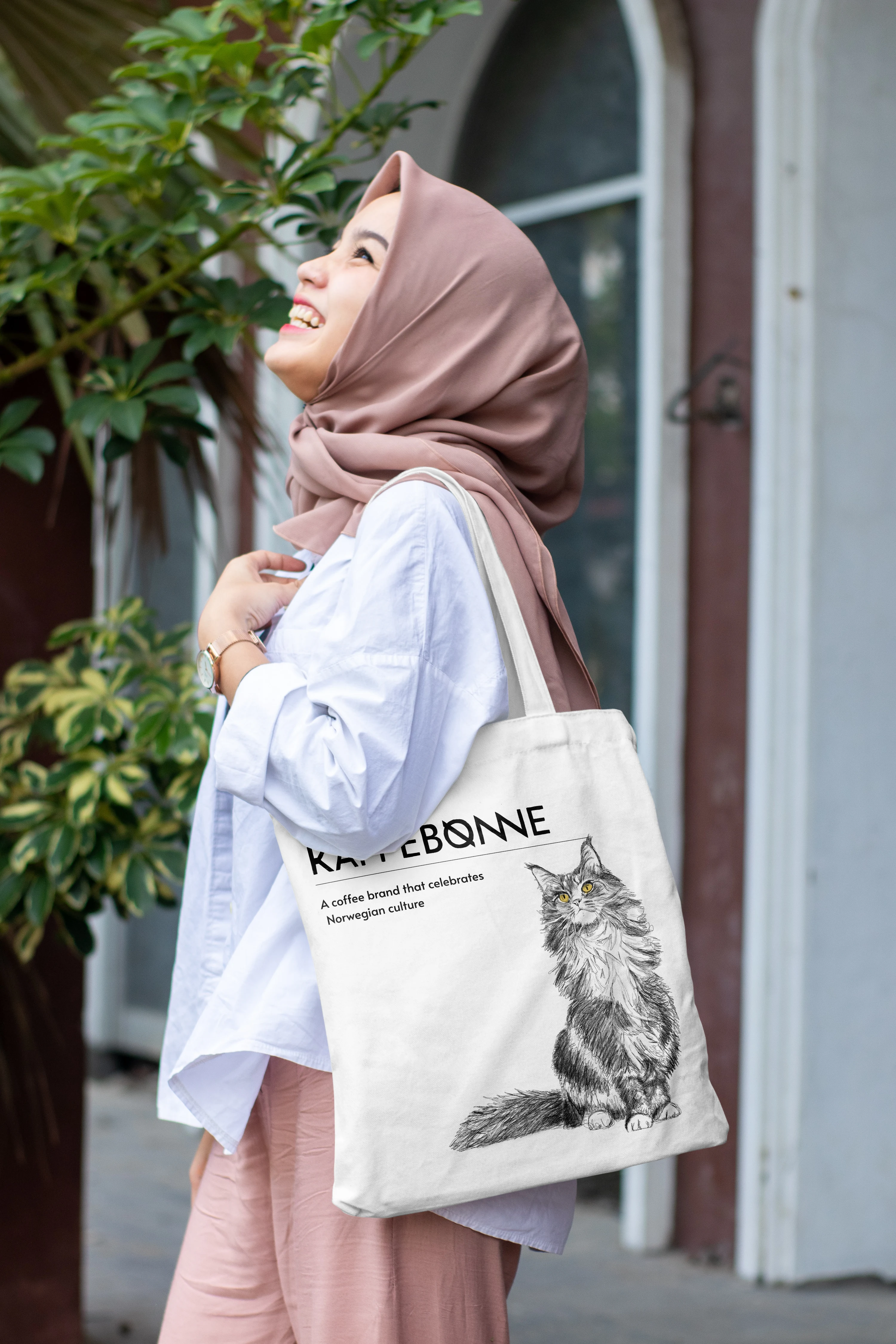
In other products, such as tote bags and more, we used excerpts from a poem by the Norwegian writer Henrik Ibsen that celebrates the beauty of Norway’s nature
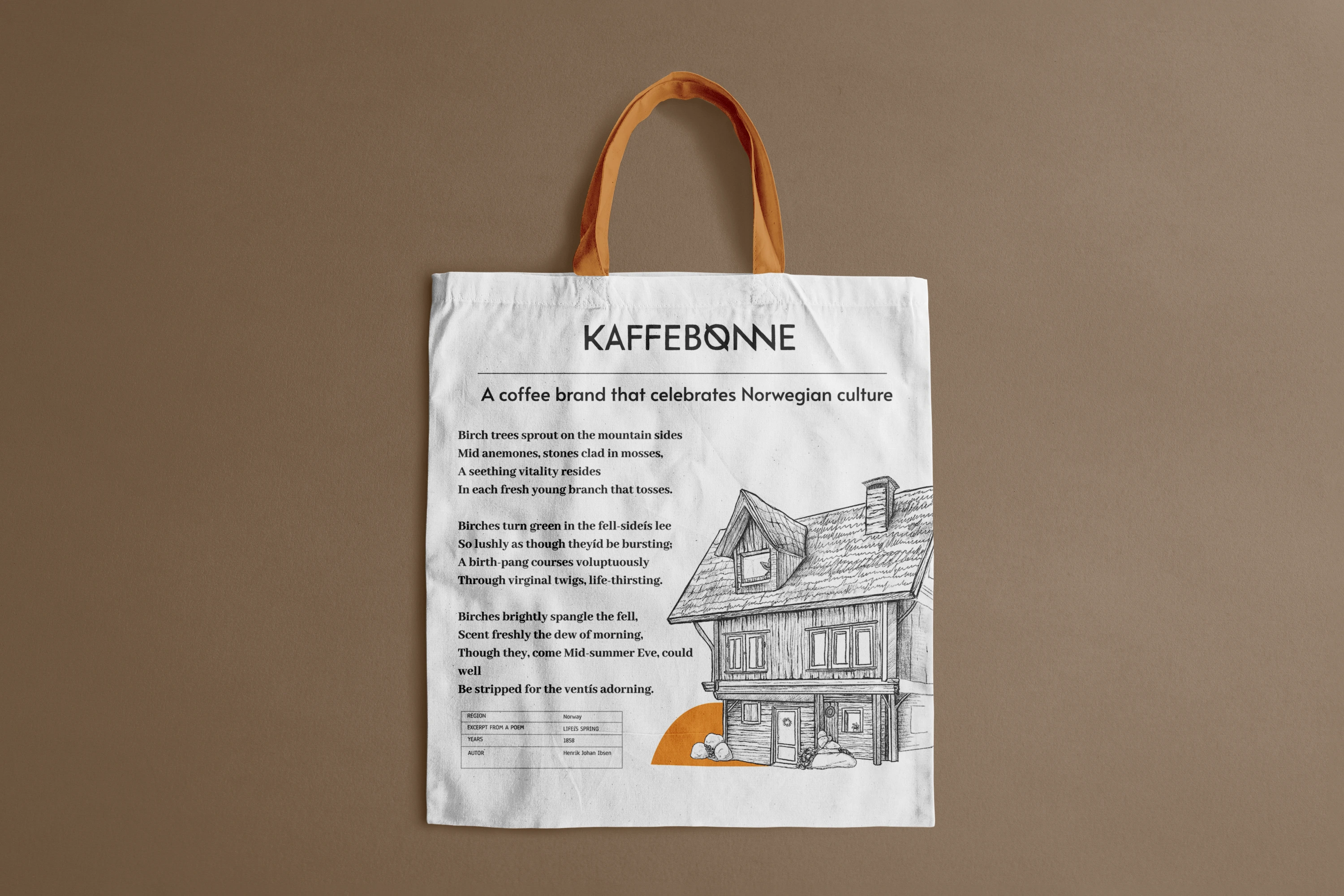
Cultural Significance: Using Ibsen’s poetry connects your product to Norway’s rich literary heritage, making it appealing to both locals and international audiences who value cultural authenticity.
Emotional Connection: Ibsen’s vivid descriptions of nature evoke a sense of pride and nostalgia for Norway’s landscapes, resonating with customers who appreciate the natural world.
Unique Selling Point: Integrating meaningful literary art into products adds depth, setting your brand apart from competitors by offering a blend of culture and functionality.
Broader Appeal: The use of poetry transforms everyday items, like tote bags, into storytelling tools that attract customers interested in art, literature, and sustainability.
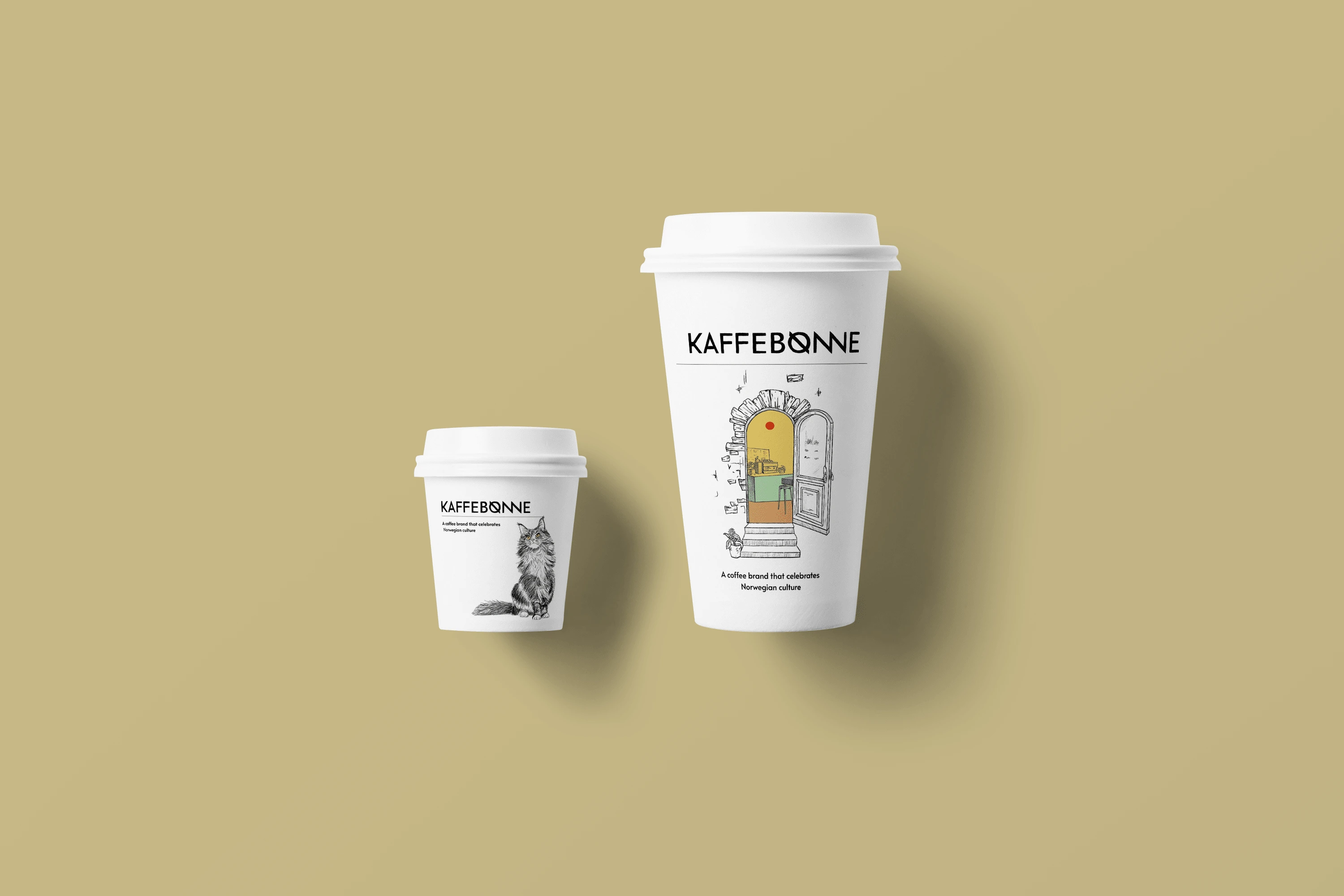
Utilizing Norwegian houses in coffee packaging design is a justified and effective approach. It helps create a recognizable and memorable brand that stands out among competitors and evokes positive associations in consumers. This approach will work particularly well in the Norwegian market, where consumers highly value quality, authenticity, and cultural connections
Like this project
Posted Nov 7, 2024
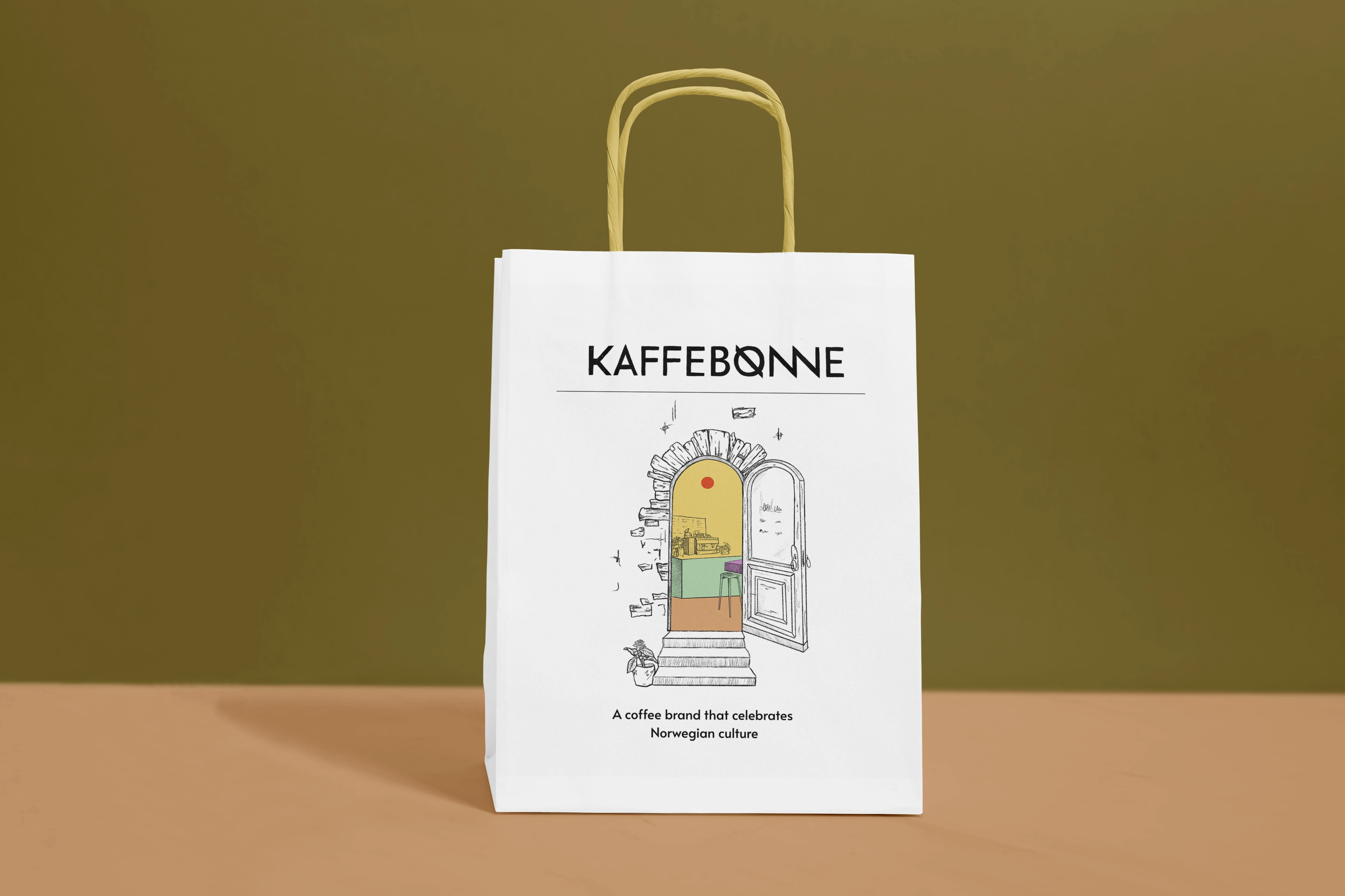
Developed a cohesive brand identity for a coffee company, including logo design, hand-drawn illustrations, packaging, and copywriting. Inspired by loc

