User Engagement growth through navigation redesign
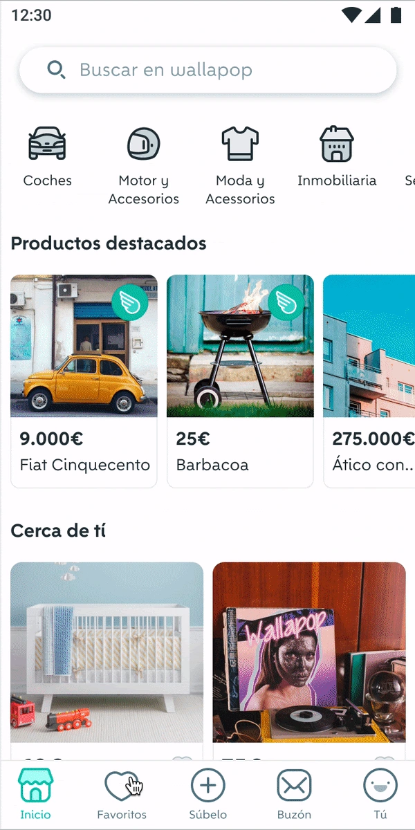
App navigation after the redesign
As a Senior Product Manager at Wallapop one of the major projects I led was the redesign of the app’s information architecture and navigation to improve user experience. The specific goals were to boost core feature usage and increase user stickiness.
Internally, my objective was to create a scalable IA that would allow product teams to add features without compromising the user journey.
Wallapop is the leading marketplace for buying and selling used goods in Spain, Italy and Portugal. It has more than 20 million monthly active users and over 100 million items.
Phases:
Research & Audit – I partnered with the UX researcher and Product Designer and started with user research, analyzing navigation challenges and key user flows for both buyers and sellers. I used tree testing, card sorting, and competitive analysis to gather insights and benchmark against industry leaders.
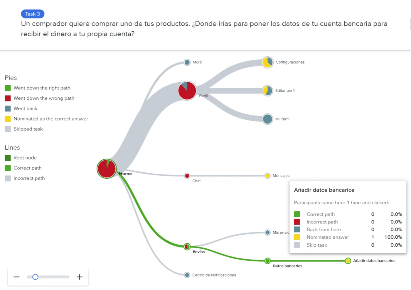
Conceptualization & Technical Scope – After presenting findings to my team, Platform leads, and leadership to get their early feedback, we agreed on a navigation design, incorporating feedback from prototypes and aligning with development on technical requirements.
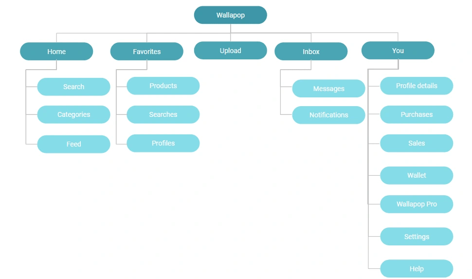
Wallapop app new Information Architecture (1st and 2nd level)
Success Metrics – I established success metrics, focusing on conversion rates for meaningful actions within the app, task completion, and User Stickiness.
Launch Strategy – I executed a phased rollout (internal testing, followed by beta testing, and finally AB testing) to reduce risks. In parallel I prepared a plan for the CS team and my own team on how to handle user feedback and potential bugs. I also worked with the content team for the in-app explanatory messages, and the Help Center articles,
Results:
More users were using the core app sections like the Feed, Favorite items, and Saved searches, and we saw an uplift in the Buying and Selling funnels:
+37% increase in users favoriting items
+6% in conversion to favorite searches
+7.4% in purchases with delivery, resulting in a 3% increase in revenue.
Stickiness and retention of different user cohorts also improved:
Wallapop buyers and sellers were using the apps more frequently, measured by DAU/MAU (Daily to Monthly Users ratio): +1,8% DAU/MAU
and had higher engagement: +2,2% buyer stickiness,+5,3% seller stickiness.
Usability improved, with an 80% task success rate, and app reviews reflected positive user sentiment.
Internally, the redesign set a scalable foundation, allowing teams to integrate new features more cohesively.
Learnings:
Balancing a complex redesign with fast iteration was challenging but achievable. Despite the huge change that a redesign brings, usually generating disagreement from users and a decrease in metrics, this one was a success.
This project underscored:
the value of parallelizing tasks
doing Multiple rounds of user testing and a variety of tests
and securing early stakeholder buy-in to drive impactful results.
Read all the details: https://www.mindtheproduct.com/a-case-study-how-to-produce-a-winning-app-redesign/
Like this project
Posted Nov 14, 2024
Achieved double-digit Engagement metrics by redesigning the navigation and Information Architecture of Wallapop's native iOS & Android app
Likes
0
Views
11
Clients
Wallapop

