Interactive Power BI Dashboard
Ankit Akash Kalita
Interactive Power BI Dashboard for Global Renewable Energy Usage Insights
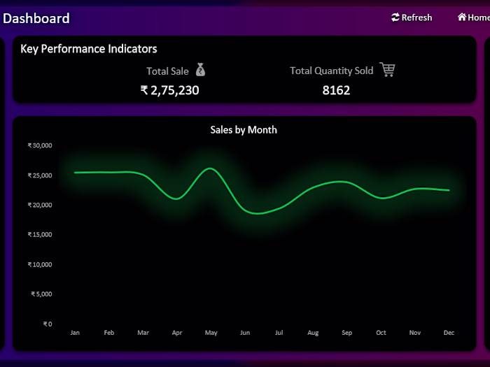
I developed a Power BI dashboard to explore and visualize trends in global renewable energy usage across various dimensions such as geography, income level, energy source, and cost savings. The project involved analyzing a structured dataset and transforming it into an interactive report that presents key insights through dynamic visuals and KPIs. This dashboard highlights my ability to leverage Power BI for turning complex datasets into accessible and actionable visual analytics.
Objectives:
• Analyze global renewable energy adoption patterns and usage trends.
• Build a fully interactive Power BI dashboard using KPIs, slicers, and visuals to communicate key insights effectively.
Methodology:
• Performed data cleaning and transformation to prepare the dataset for analysis.
• Created calculated measures and columns using DAX for key metrics.
• Designed a visually appealing dark-themed dashboard layout to enhance clarity and engagement.
• Included interactive slicers to enable customized analysis.
• Used a combination of map visuals, pie/donut charts, line graphs, bar charts, and KPI cards for comprehensive data representation.
• Ensured performance and user-friendliness with consistent formatting and intuitive visual arrangement.
Results:
• Created an interactive Power BI dashboard.
• Provided actionable insights through dynamic visuals.
• Demonstrated effective use of Power BI's modeling and visualization capabilities.
Like this project
Posted Aug 14, 2025
Developed a Power BI dashboard for global renewable energy insights.
Likes
0
Views
2