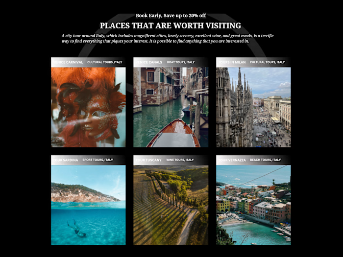
Minimalist High-Fashion Photography Web Experience

Arty Web Design


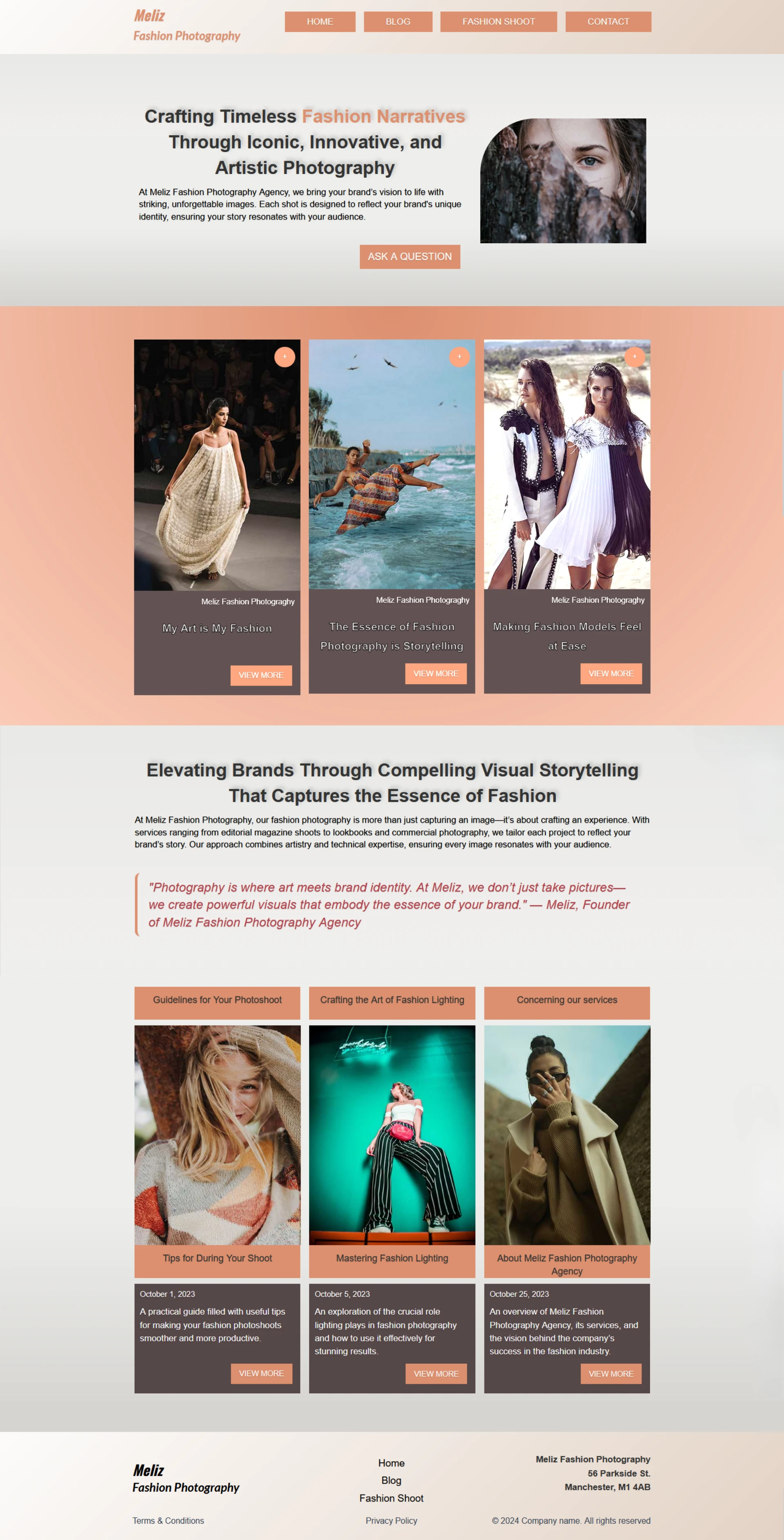

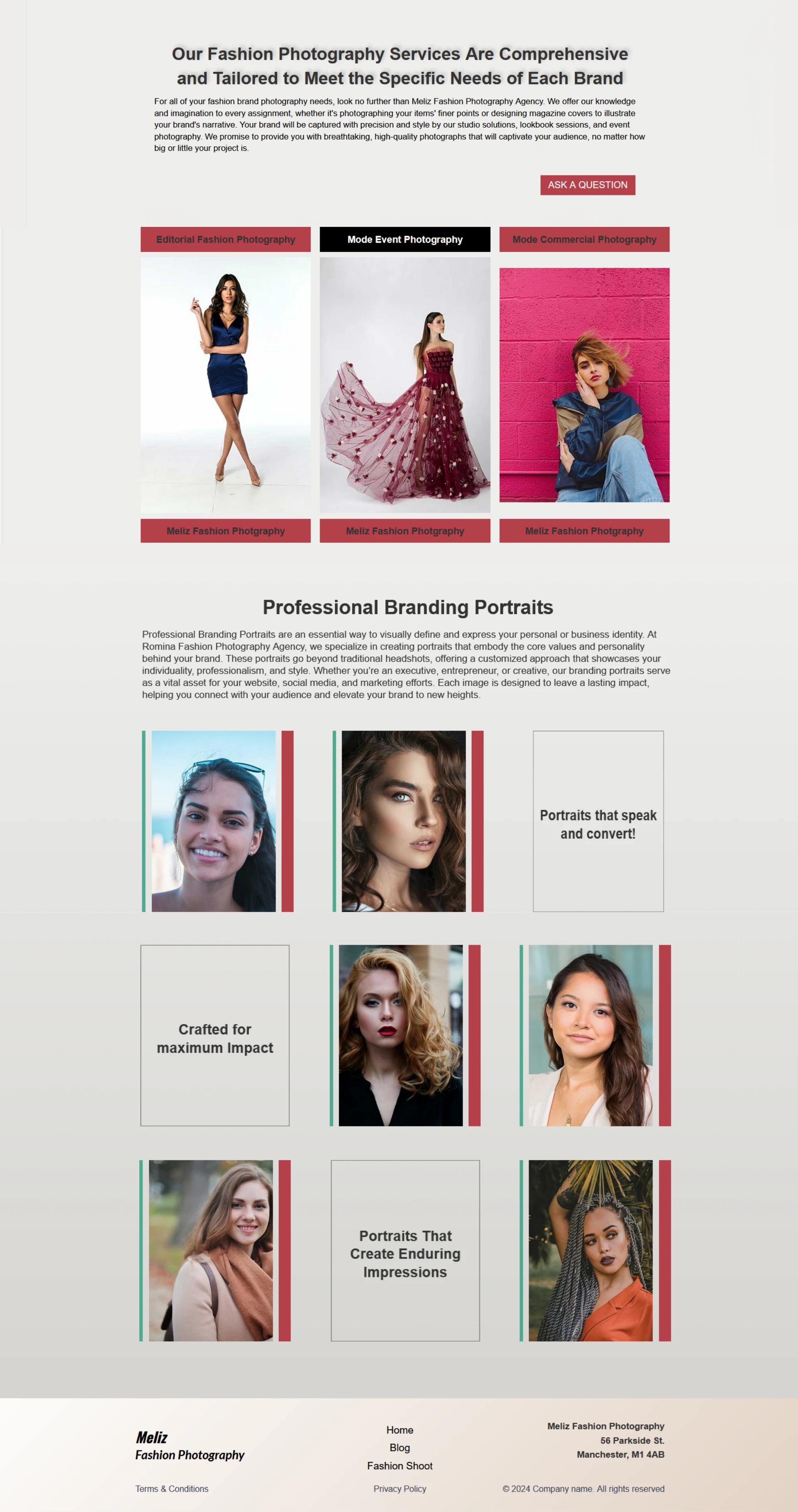
Minimalist High-Fashion Photography Web Experience
This website delivers an intuitive experience by pairing a familiar layout with fluid responsiveness. Following Jakob’s Law, the minimal navigation reduces cognitive load, while strategically placed CTAs guide users along a predictable path toward deeper engagement. Built on Webflow, the design is fully adaptive, ensuring seamless text scaling and optimal touch-target sizes across desktop, tablet, and mobile devices.
User Interface (UI) Design Aspects
Color Palette: The site utilizes a minimalist, monochromatic-leaning color scheme—predominantly using neutral background spaces paired with stark white typography. This high-contrast pairing is a common pattern in design portfolios because it ensures text is legible and keeps the focus entirely on the colorful visuals of the case studies.
Typography: The site employs a clean, modern Arial typeface. Bold weights are heavily utilized for headings to grab immediate attention, while regular or lighter weights are reserved for descriptive body text. This establishes a strong visual contrast.
Visual Hierarchy: The layout uses scale and size variations to guide the eye. Larger-than-life typography is positioned in the hero sections (e.g., introduction text), drawing immediate attention to who the designer is, followed by smaller metadata and project tags.
Micro-interactions and Motion UI: Immersive interactions are a key pillar of this interface. Hover states on cards, smooth scrolling transitions, and interactive text triggers are applied to give the static web layout a dynamic, high-end feel.
Grid Layout & Alignment: The site aligns with modern web standards by utilizing a structured grid system. Blocks of text and imagery are compartmentalized tightly, leaving generous amounts of negative space (whitespace) around them to prevent visual clutter.
User Experience (UX) Design Aspects
Navigation Structure: The layout relies on a clean, minimal navigation bar, often containing traditional core links. This adheres to Jakob’s Law, which states that users prefer your site to work the same way as all the other sites they already know, reducing cognitive load.
Call-to-Action (CTA) Strategy: CTAs are placed intentionally after introduction blocks and at the bottom of pages . They are clearly distinguished from secondary text, giving users a predictable behavioral path to explore deeper pages or get in touch.
Webflow Framework Responsiveness: The architecture uses Webflow's fluid responsiveness engine, so elements resize and re-stack adaptively on different viewports (desktop, tablet, and mobile), keeping text scalable and button touch target sizes appropriate for mobile devices.
🚀 Available for freelance projects. Click the "Message" button on my profile to get in touch directly through the Contra platform. 🎯
Like this project
Posted Aug 15, 2026
Created a minimalist web experience for a high-fashion photography site using Webflow's responsive design.
Likes
0
Views
10