Website Redesign for Creative Agency

Arty Web Design


Redefining the Digital Presence of a Creative Agency
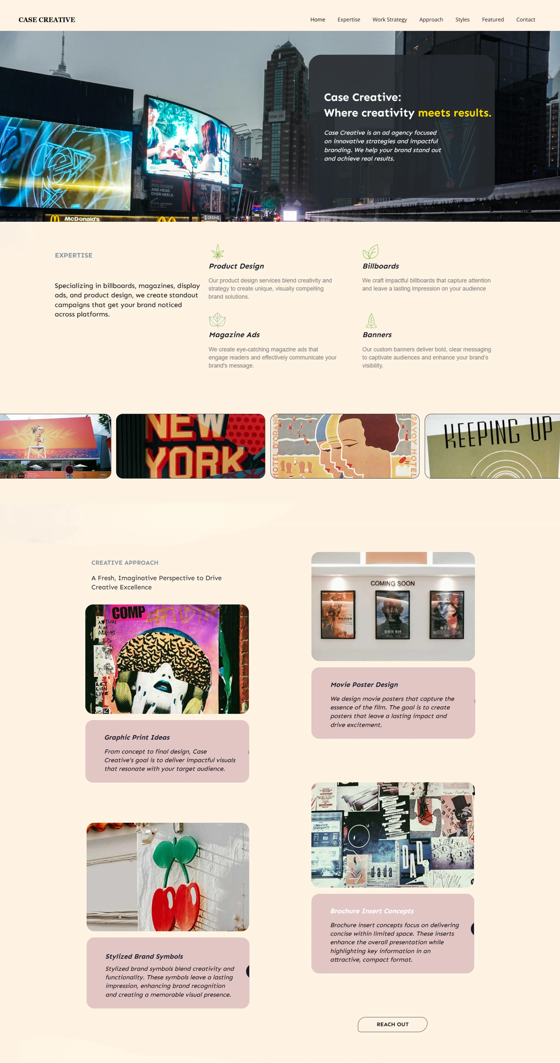
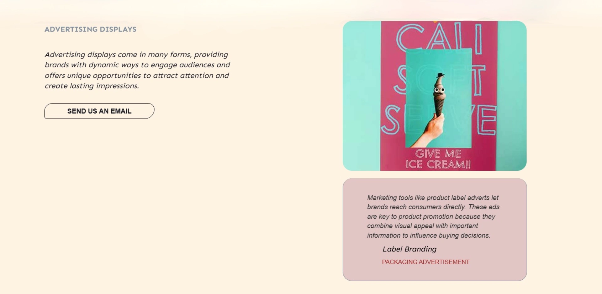
The website is positioned as a creative advertising and branding agency specializing in traditional and physical media, as well as brand layout solutions. Core Offerings: Product design, billboard ads, magazine layouts, custom banners, movie posters, brochure inserts, and branded packaging.
The tone is straightforward, professional, and outcome-oriented, heavily focusing on phrases like "where creativity meets results," "impactful branding," and "lasting impressions."
User Interface (UI) Design Style
The aesthetic of the website leans heavily into a modern, structured, corporate creative agency vibe typical of premium Webflow design systems.
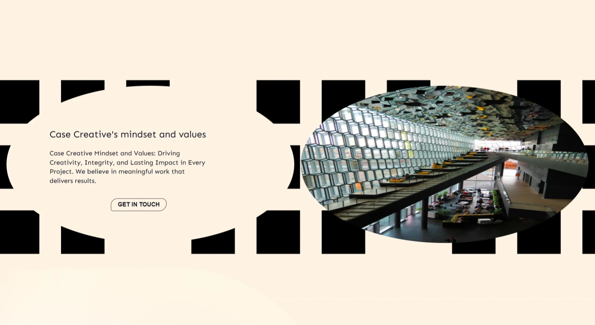
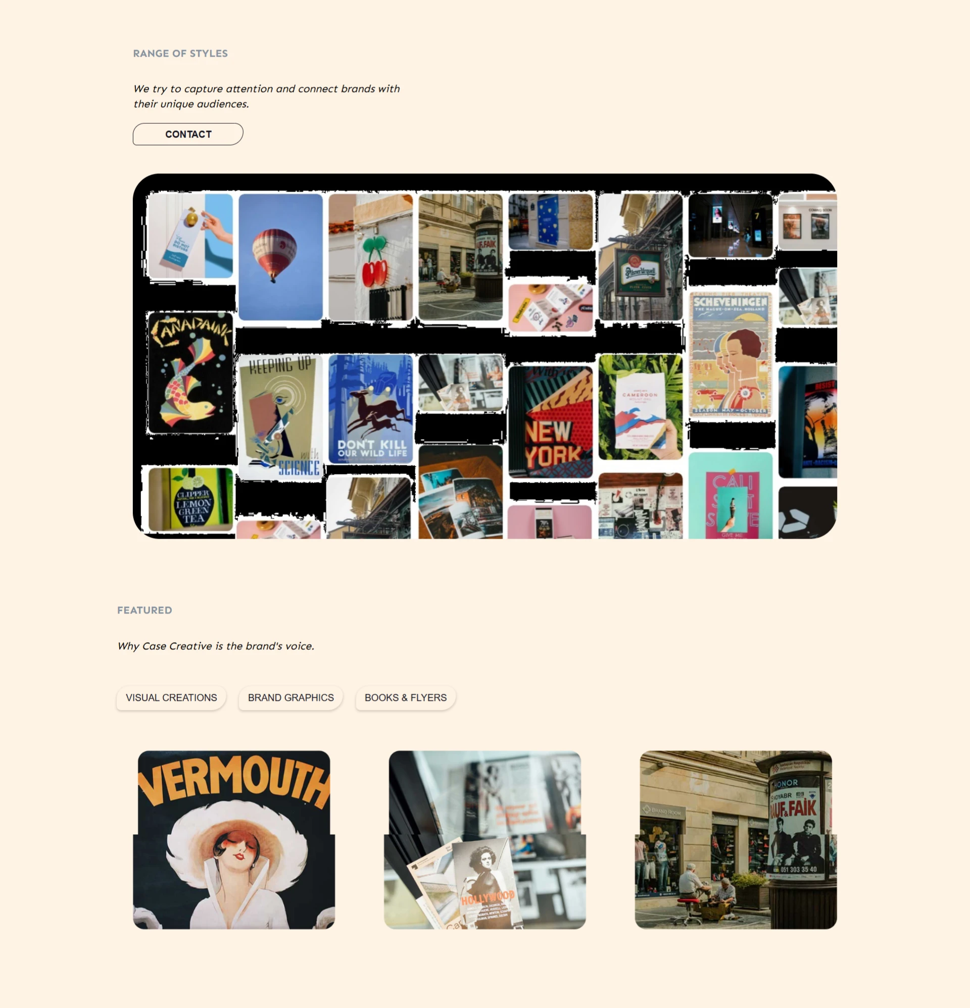
Layout & Structure: It utilizes a section-based, single-page scroll layout (or heavily anchored multi-section layout). It makes great use of grid systems and asymmetric spacing to showcase different portfolios of work, which is common for design agencies to show they understand spatial balance.
Typography: Bold, clean sans-serif typography dominates the headers to create an impactful hierarchy. Sub-headers and paragraph texts are kept highly legible to ensure information is easy to digest.
Color Palette: The design relies on a relatively clean, minimalist background canvas (likely high-contrast dark or stark white sections, common in portfolio sites) to let the colorful creative assets (like movie posters or product packaging) stand out as the main focus.
Use of Elements: Clean cards, numerical stepping (01, 02, 03 for work strategy), and stylized borders or dividers help partition the information neatly.
User Experience (UX) Design
From a functionality and usability standpoint, the website covers the fundamental pillars of an agency site but has a specific user flow.
Information Architecture (Navigation): The navigation menu clearly maps out the agency’s pipeline: Home ➔ Expertise ➔ Work Strategy ➔ Approach ➔ Styles ➔ Featured ➔ Contact.
This sequence tells a chronological story to a potential client, moving them from "What we do" to "How we think," "What we’ve made," and finally, "How to hire us."
The use of numbered lists for the "Work Strategy" reduces cognitive load, allowing users to understand the agency's process in seconds.
Interaction Design (Micro-interactions): Because Webflow hosts the site, it likely uses subtle scroll animations, hover effects on portfolio items, and smooth transitions. These micro-interactions are crucial for creative agencies because they demonstrate technical competency and keep the user engaged.
Call to Action (CTA) & Conversion: The user flow culminates in a dedicated lead-generation form ("Let's talk business"). The fields are kept minimal (name, email, and message) to minimize friction and maximize completion rates.
🚀 Available for freelance projects. Click the "Message" button on my profile to get in touch directly through the Contra platform. 🎯
Like this project
Posted Aug 15, 2026
The website is positioned as a creative advertising Core Offerings: Product design, billboard ads, magazine layouts, custom banners, and branded packaging.