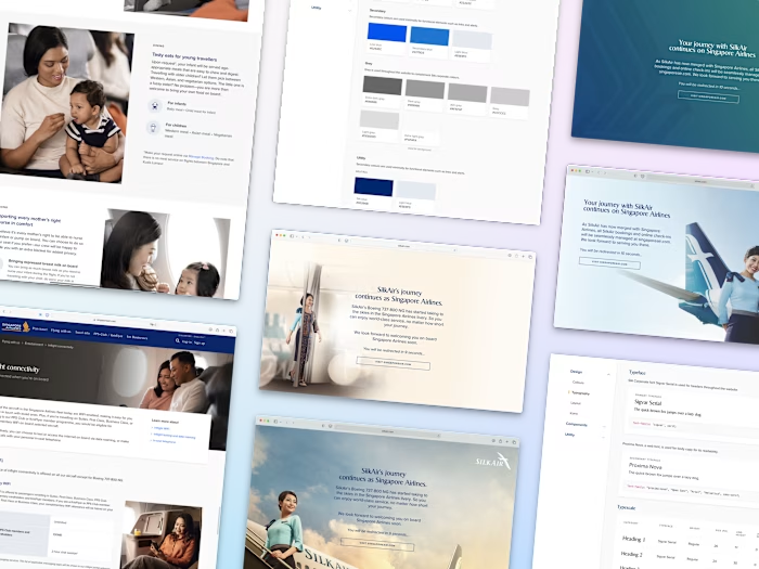
Millennium & Copthorne Hotels
Shermin Ng
Background
Team
Account Director, Project Manager, UI/UX Designer
My role
UX/UI designer
Redesigned existing pages and created new pages
Revamped booking flow to improve user experience
Liaise with stakeholders to present concepts
Ensured handover to developers went smoothly
Existing styling
Typefaces and colours were predetermined by their brand book. As these guidelines are relatively new, a handful of the redesigned pages were still using the old brand guidelines (different secondary colours and typefaces).
MyMillennium Dashboard
The existing dashboard had an outdated design (as compared to the rest of the site), did not have a proper information hierarchy, and did not distinguish between the two membership tiers, Member and Prestige. The client wanted Prestige to stand out and give their users a feel of grandeur and luxury.
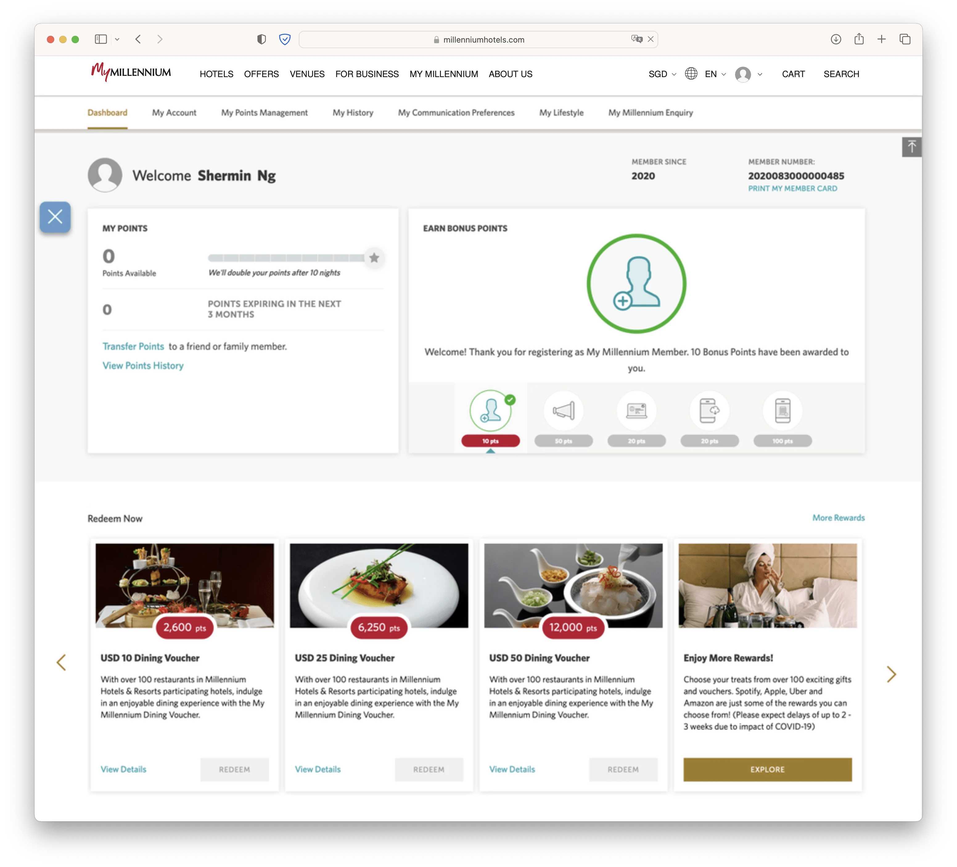
Old dashboard
The solution
Redesigning the dashboard to include and show relevant information in a clearer manner, and ensuring the Prestige tier looks like the step up it is from the Member tier. Additional information include current tier and next tier (where applicable) benefits. *This was done before typefaces were updated in guidelines. Typefaces used: Didot and Futura
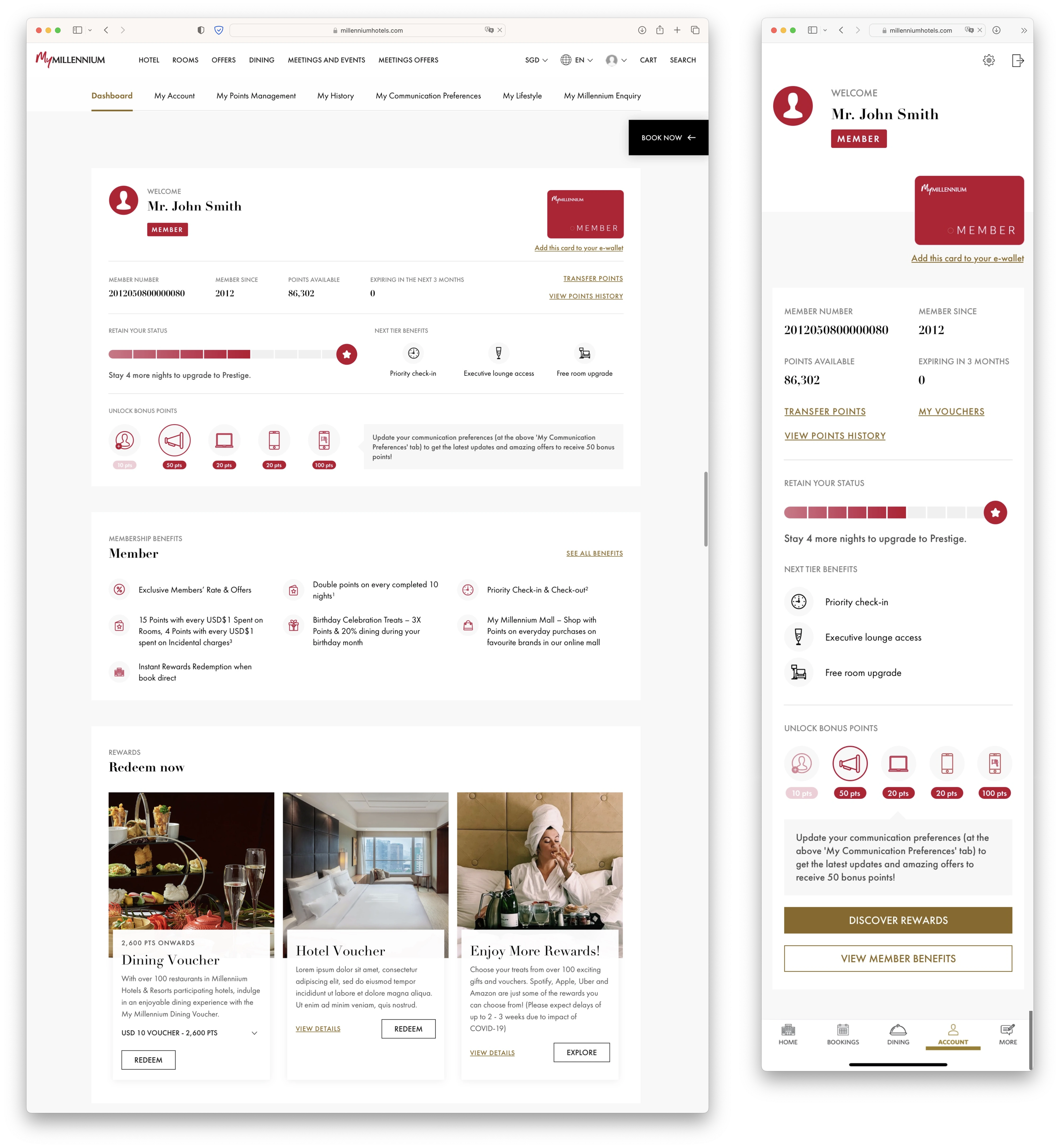
New dashboard - Member
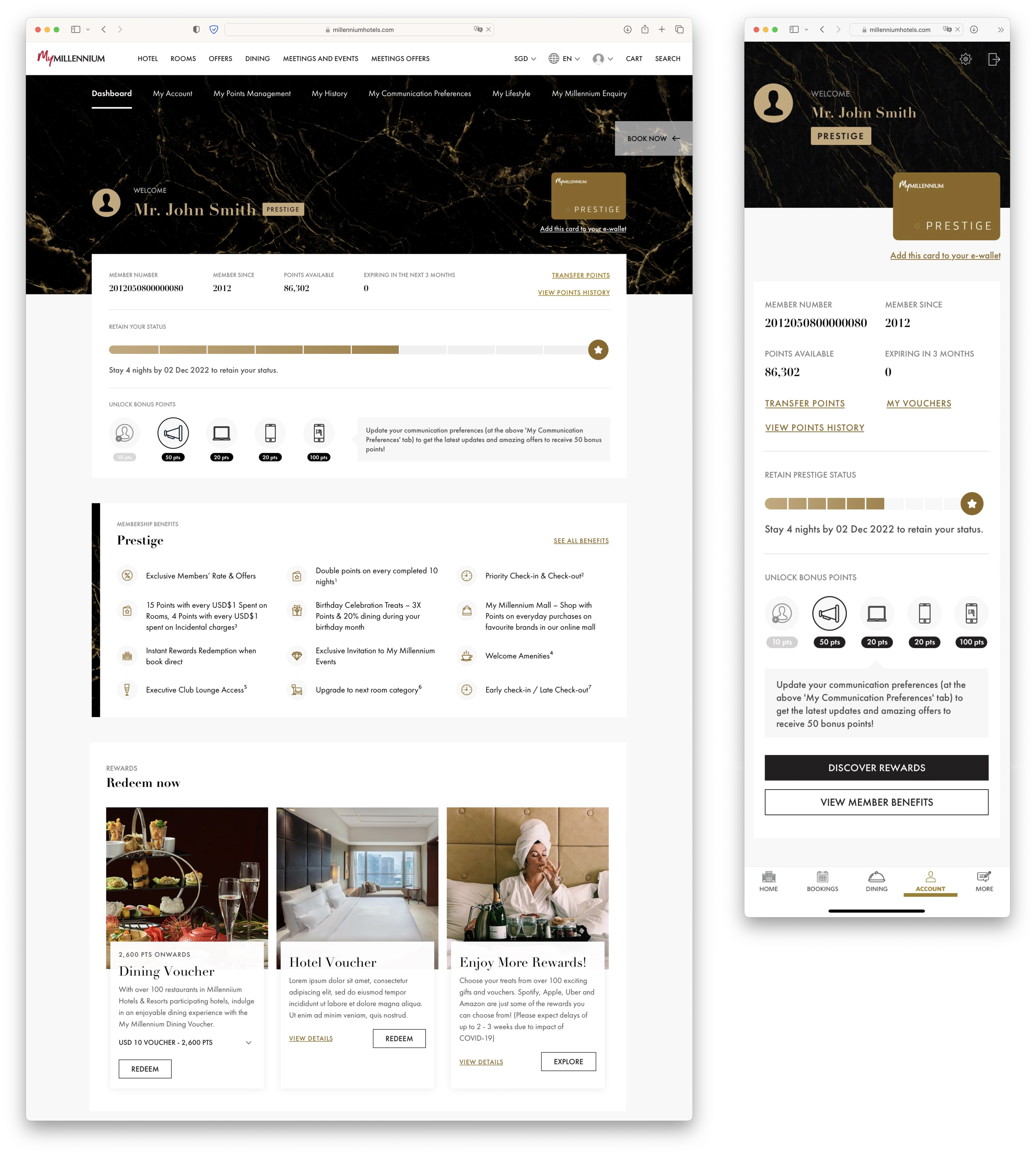
New dashboard - Prestige
About Us Page
The previous design was clunky and wordy, making it unappealing to users. Furthermore, it had outdated information that either had to be refreshed or entirely removed.
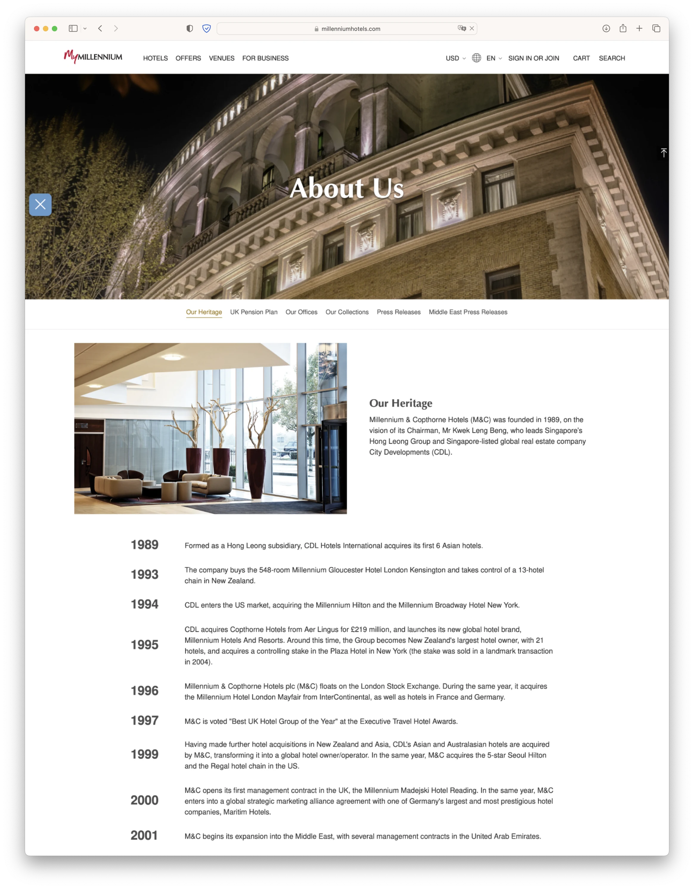
Old About Us Page
The solution
The page is simplified into a one page scroll as opposed to a multi-tab page. The content is updated with a modern design that has plenty of images to keep a user's attention. Visit live site
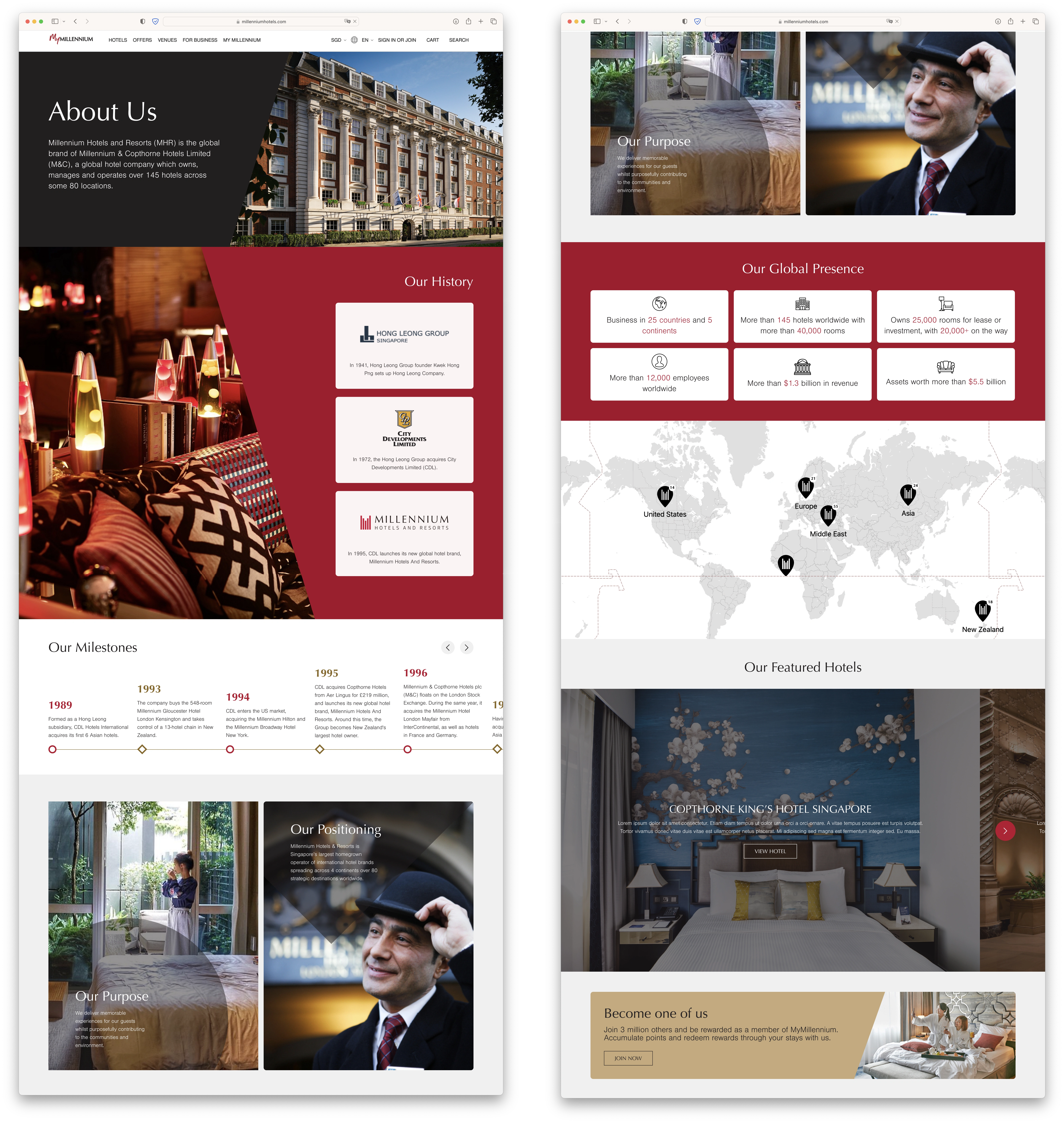
New About Us Page
Like this project
Posted Oct 16, 2023
A myriad of projects for one of Asia's most prominent hotel chains—ranging from designing new and old static pages, to revamping dashboards and booking flows.
Likes
0
Views
11
Clients
MullenLowe Group

![[Case Study] Mandai Wildlife Reserve](https://media.contra.com/image/upload/c_fill,w_700/pmc5mxmzefoszuey9wta.avif)