Built with Framer
Senior Care Website Design and Build for SilverStay
kenechukwu Eneh
SilverStay: Full Framer build for a senior care company that needed to earn trust before it could sell a service.
Most families searching for senior care support land on websites that feel like insurance portals — cold, clinical, and built around services instead of people, Silverstay fixes that.
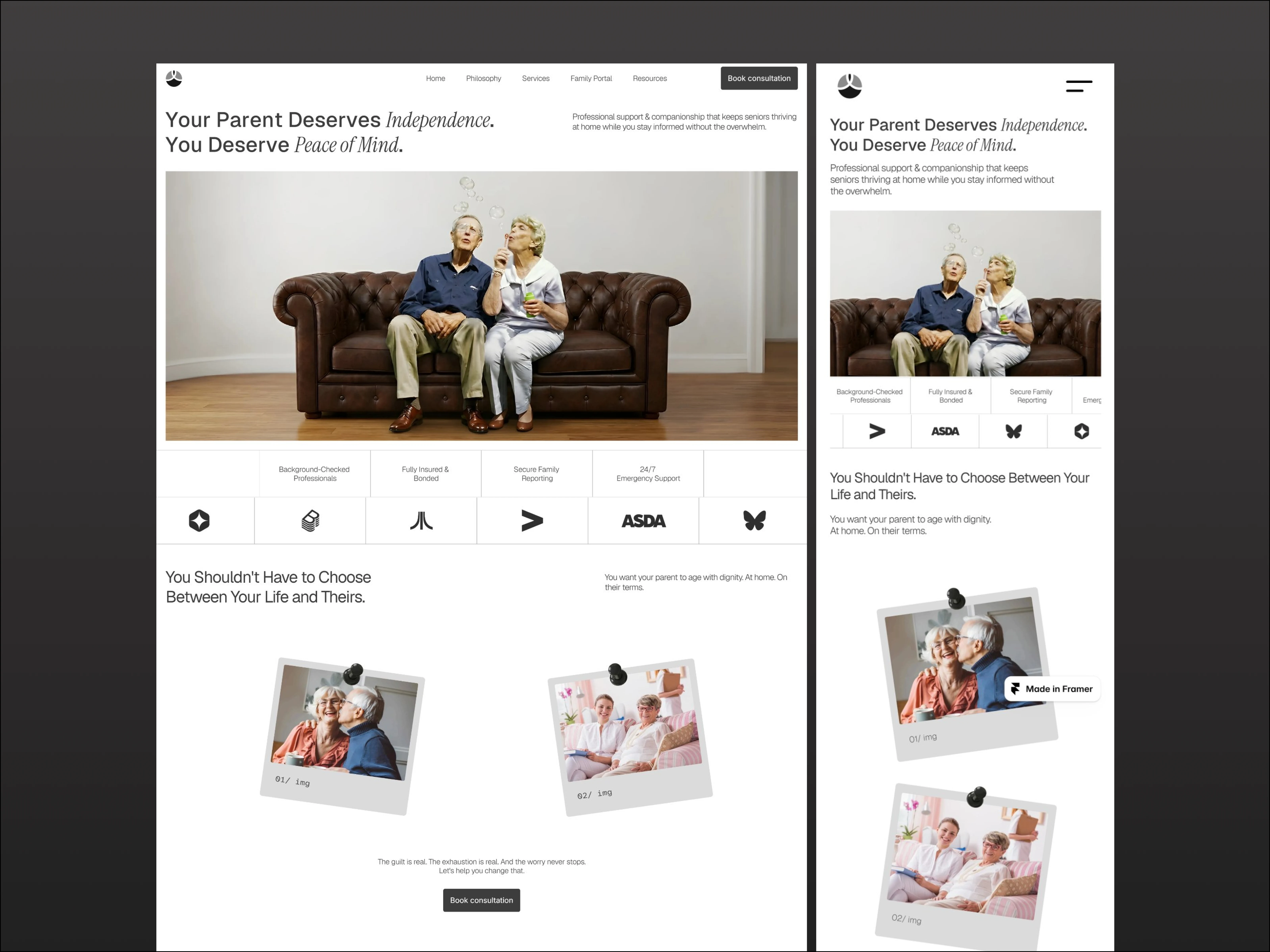
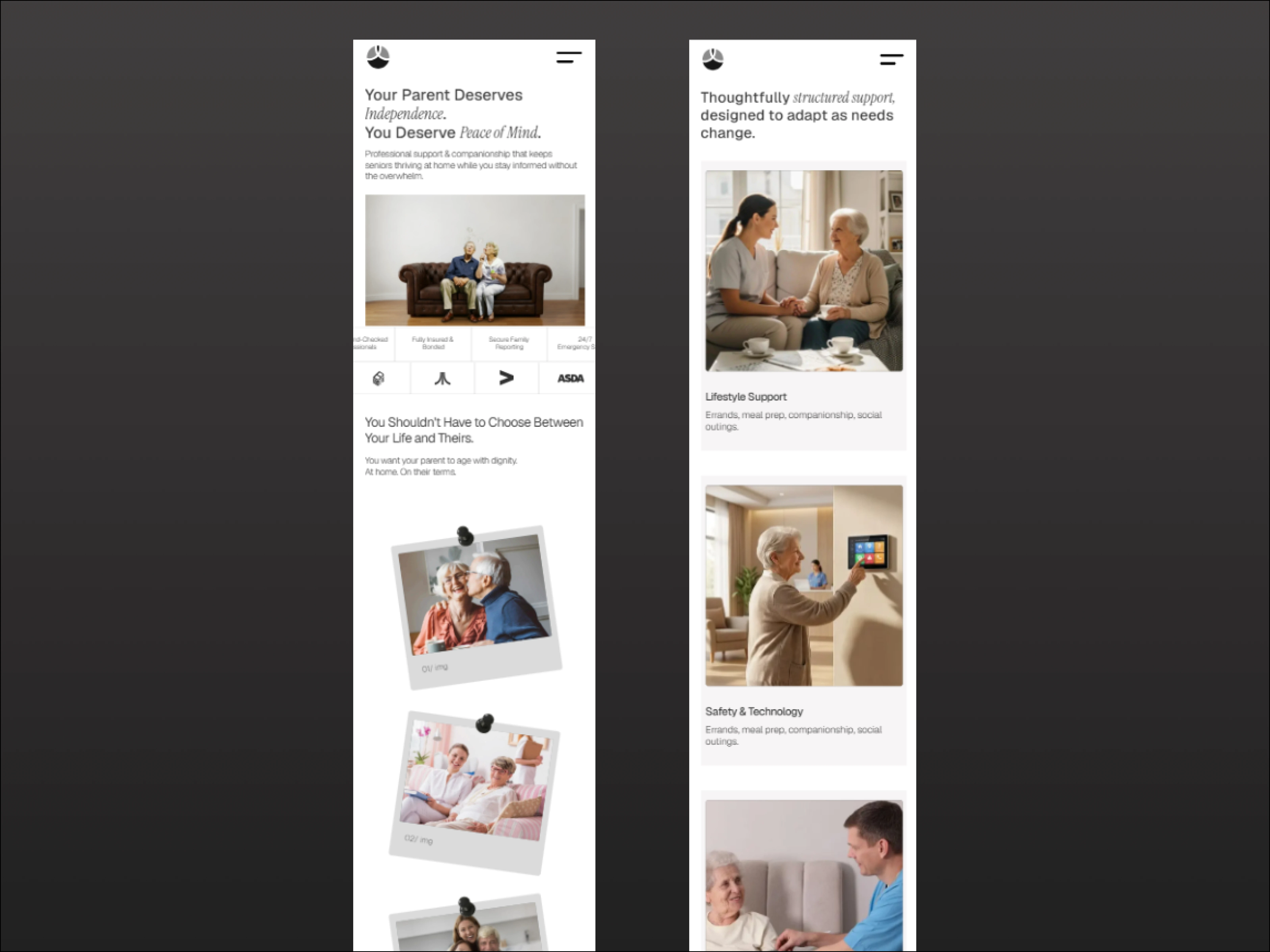
Homepage
SilverStay is a senior home care brand serving families navigating one of the hardest decisions they'll make, the website was optimized and structured to reach an adult child who's been holding everything together alone, make them feel understood in the first 10 seconds, and turn that emotional connection into a booked consultation.
I handled the project end-to-end — information architecture, copy, visual design, and the full Framer build. The work started with understanding who was actually reading the page and what they needed to feel before they'd take any action. Everything else followed from that.
Homepage
What I delivered:
This was a full-scope project. I handled everything — information architecture, copy strategy, visual design, and the complete Framer build including CMS setup.
The copy came first. Before any layouts were touched, I mapped the emotional journey of the actual user: the guilt, the exhaustion, the fear of making the wrong call. Every page was structured around that. Hero sections lead with how the reader feels, not what the service offers. Trust signals are placed exactly where hesitation lives — not buried in a footer. The CTA never pressures. It offers clarity.
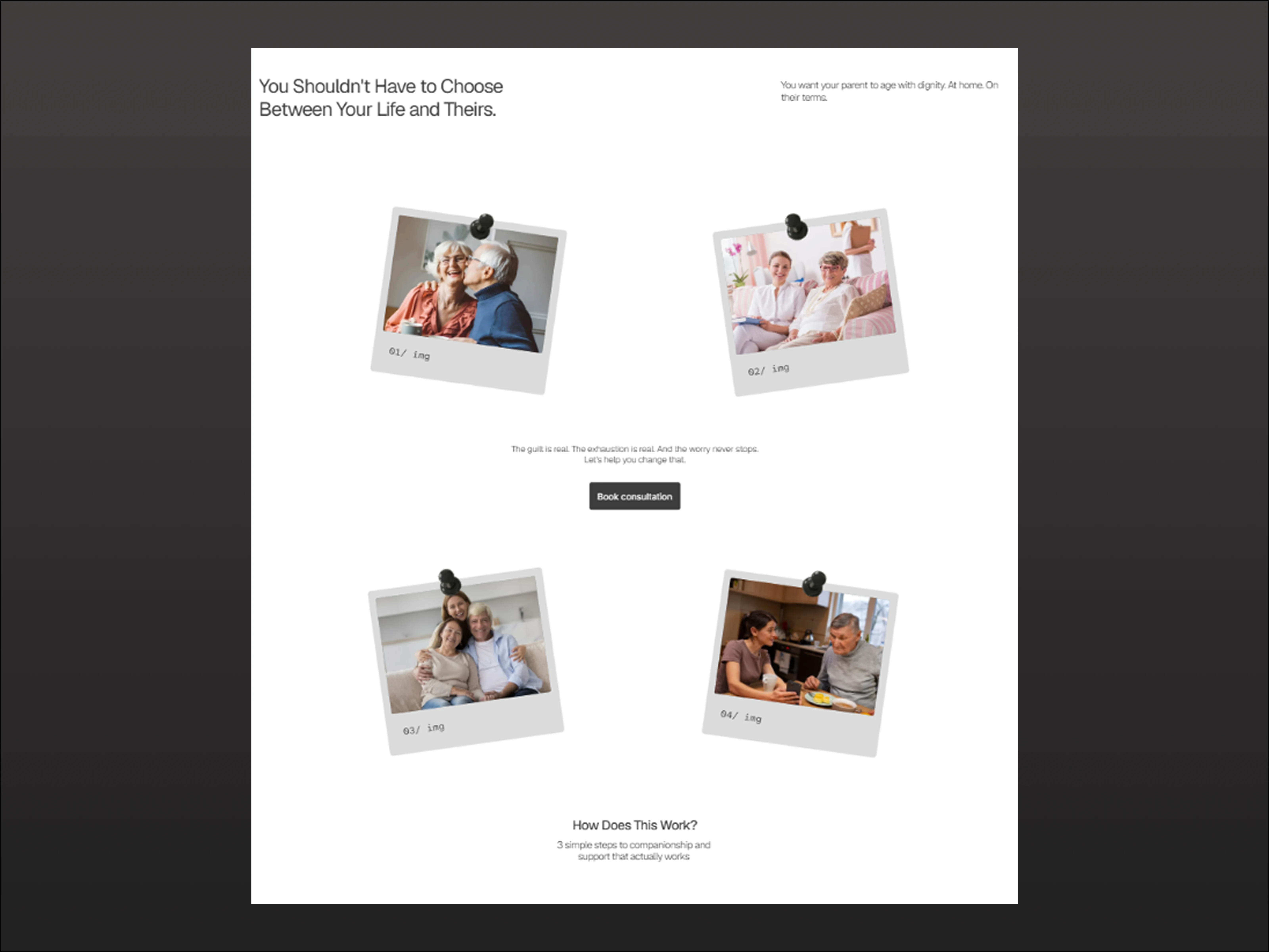
The design followed the copy's logic. Visual hierarchy guides a reader who's scanning while anxious. The before/after section on the homepage doesn't compare features — it compares emotional states. The vetting cycle animation makes safety feel systematic and real, not just claimed.
The Framer build made it permanent. The Resources sections run on CMS — the client publishes new content, updates team profiles, and manages care guides without touching a developer. The site is fully theirs.
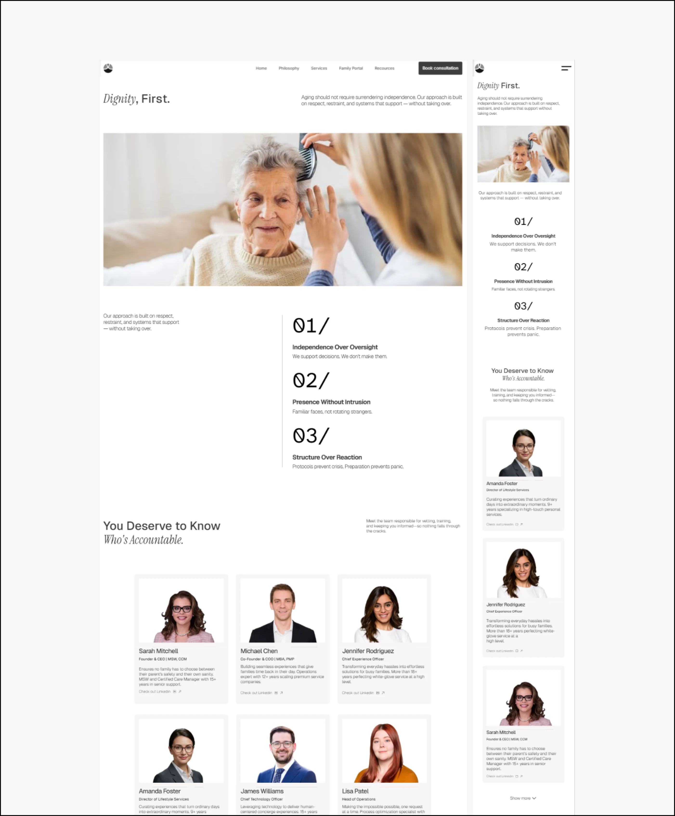
Philosophy page
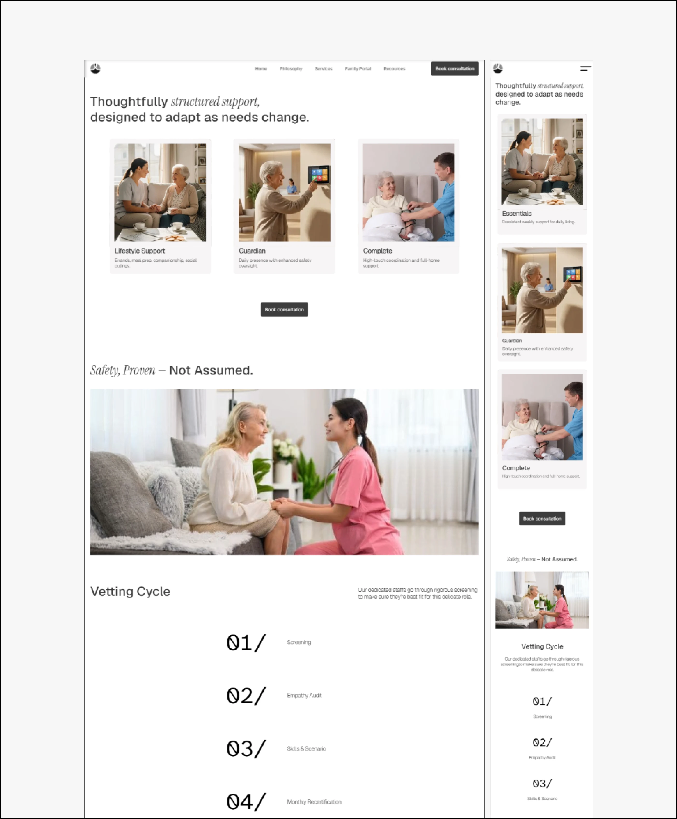
Services page
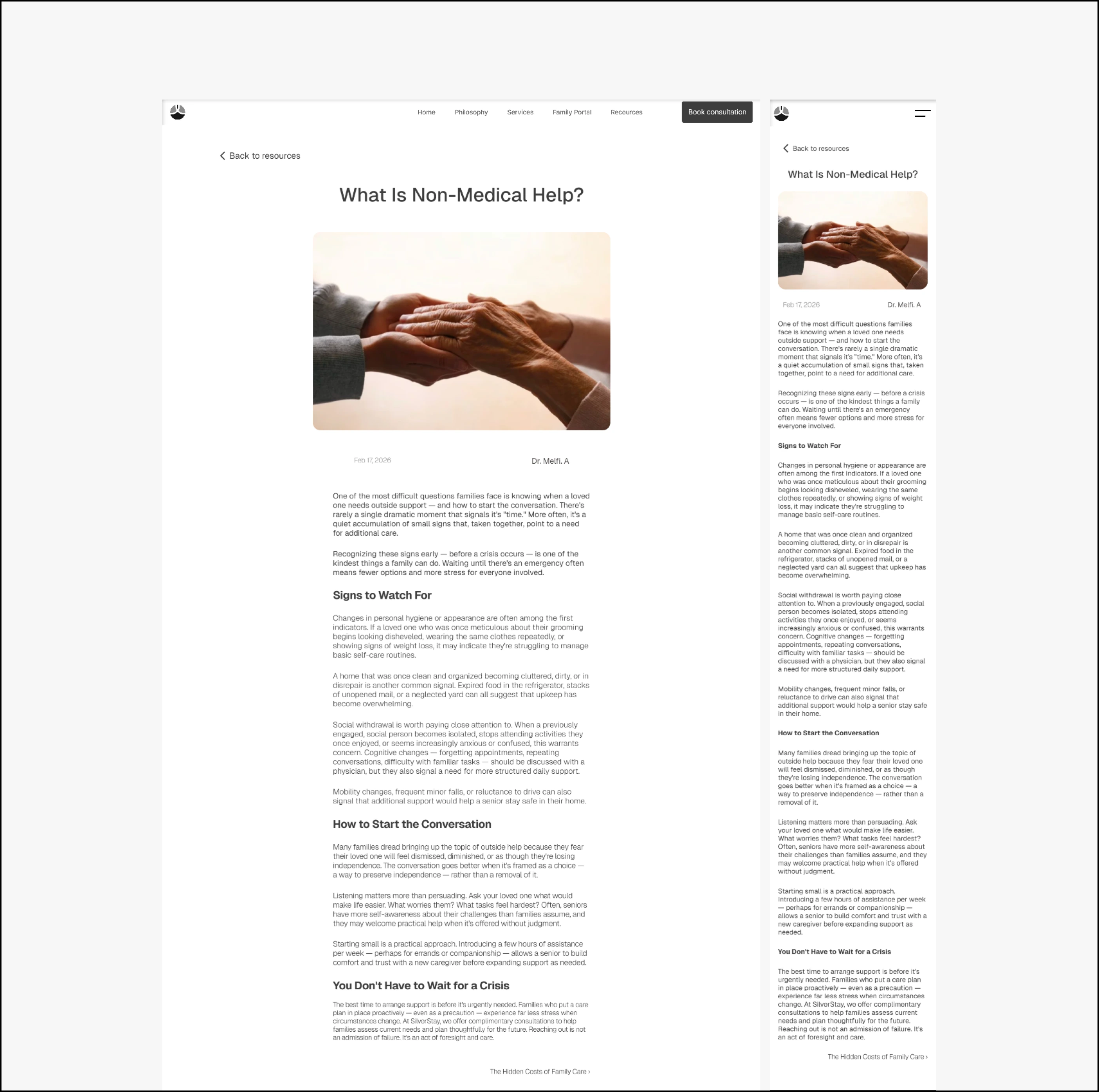
Blog Article
The decisions that mattered
The biggest design decision wasn't visual — it was structural. Most care sites bury the emotional hook under service descriptions. I flipped it.
The second decision was the CTA philosophy. This audience is making a high-stakes choice about someone they love. Urgency language kills trust with them. Every CTA on the site uses clarity language instead — "Book a consultation", not "Act now". That restraint is deliberate and it matches exactly what this user needs to feel safe enough to take the next step.
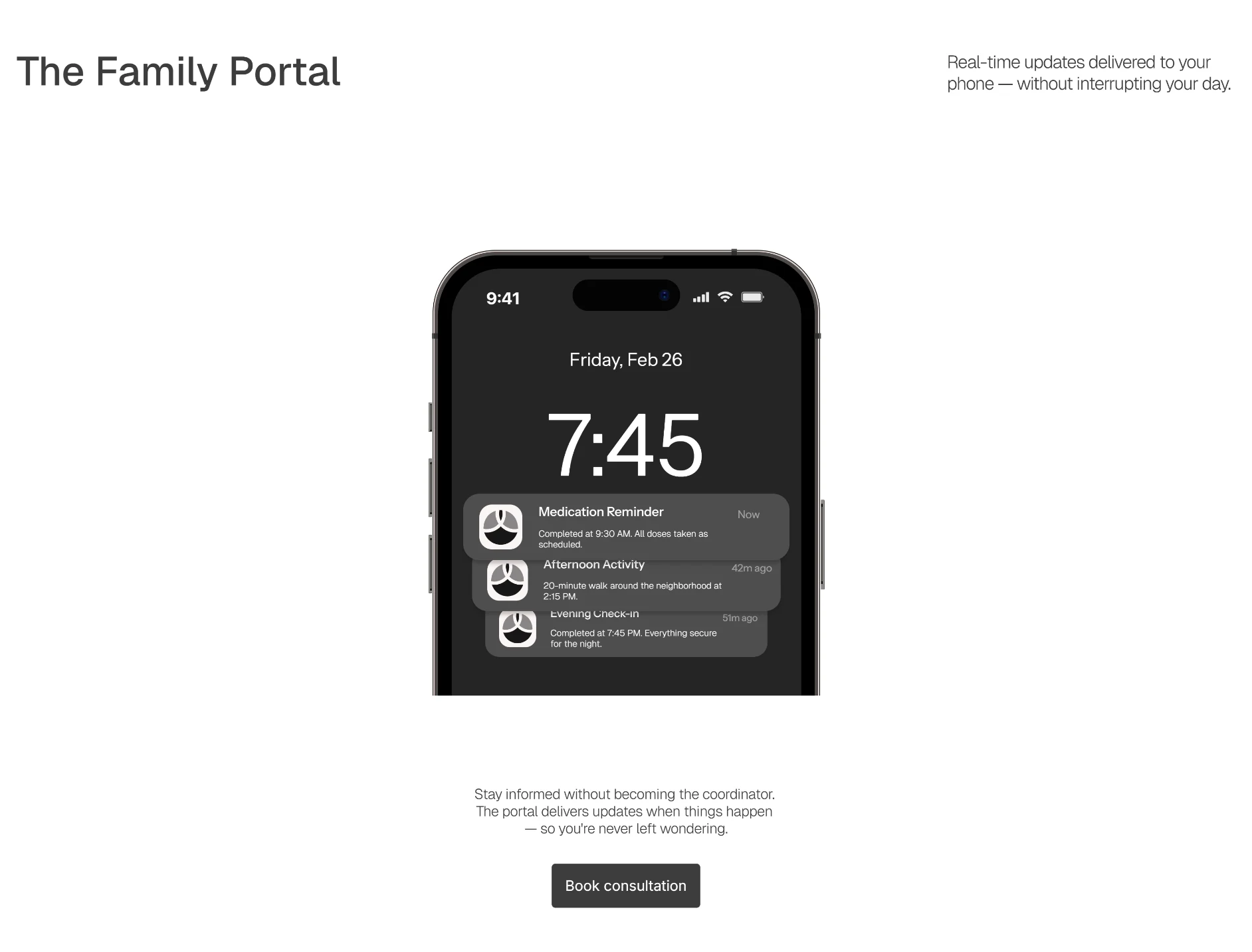
Family portal page
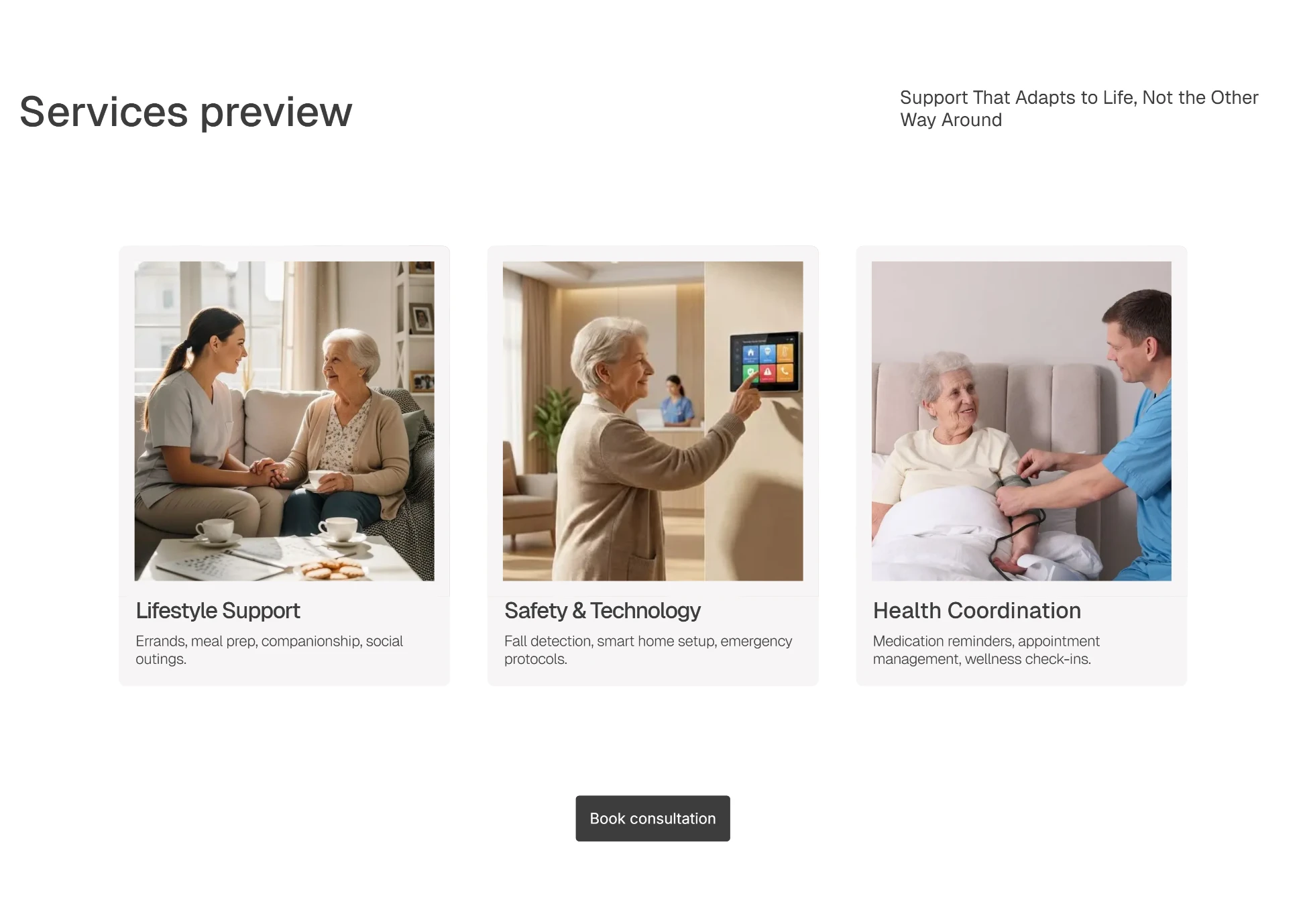
services section
Results
5 pages designed and built in Framer plus CMS blog article
Full responsive for all major screen sizes
97% Performance measured from googles speed insights
Delivered in 2 weeks faster than expected
The consultation button is the only CTA on every page. No competing links. No decision fatigue. One path forward, consistently. Families who land on this site know what to do next — and more importantly, they feel ready to do it.
What this shows
A founder hiring a designer doesn't just want someone who can make things look good. They want someone who thinks about the business problem first — who understands that a website is a revenue tool and designs it accordingly.
This project is evidence of that. The copy, the structure, the visual design, and the build all serve the same goal: convert visitors to paying customers.
Like this project
Posted Mar 29, 2026
Designed and Developed a user-centric care agency website for SilverStay using Framer, focusing on emotional connection and conversion.