HR & Workforce Management SaaS Landing page Design

Kaushal Bodar


The Challenge
HR platforms can feel complex and overwhelming.
The goal was to create a landing page that makes a feature-rich workforce platform feel simple, modern, and easy to understand—while clearly communicating its value to potential customers.
The Approach
I built the experience around a simple flow:
Understand → Explore → Evaluate → Convert
The design uses strong hierarchy, product visuals, modular cards, and focused messaging to guide users through the platform without information overload.
Key Highlights
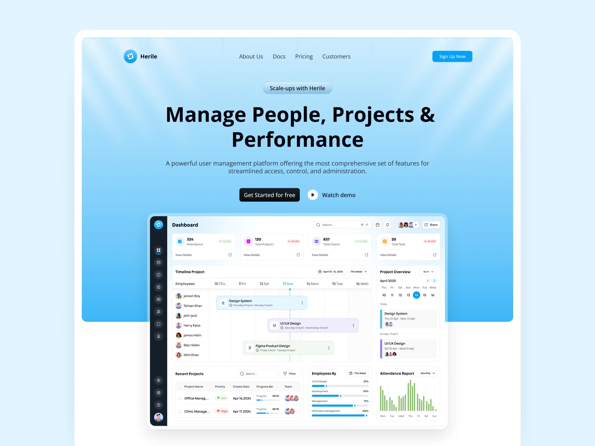
Product-First Hero
Manage People, Projects & Performance
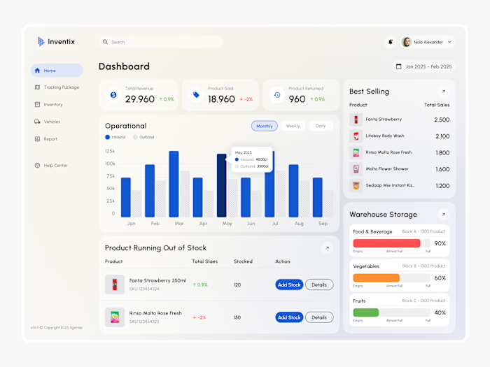
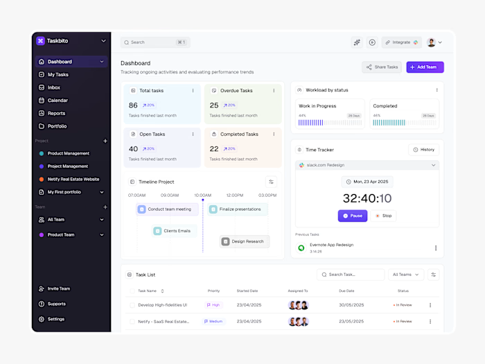
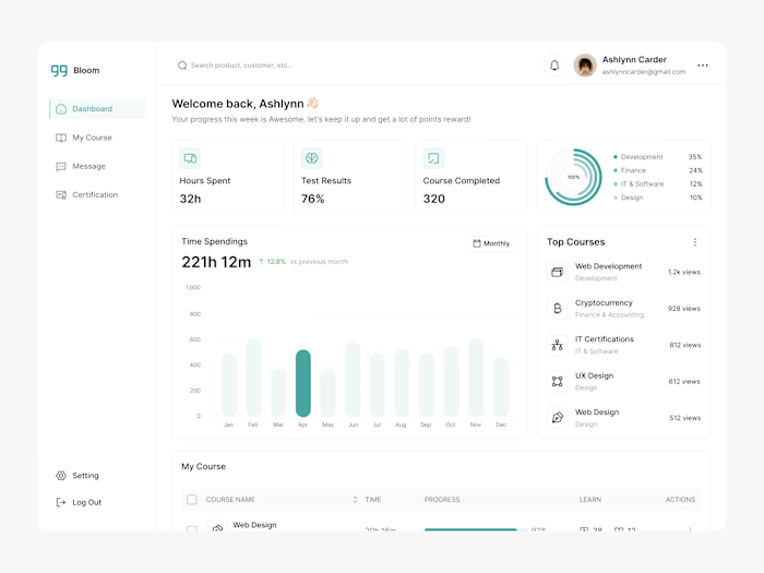
The actual dashboard takes center stage, instantly showing users what the product does instead of relying on generic marketing visuals.
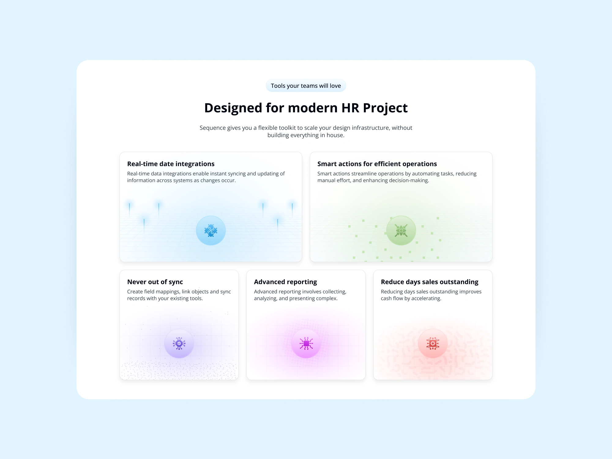
Feature Storytelling
Complex capabilities are broken into visual feature cards with lightweight illustrations, gradients, and product UI elements.
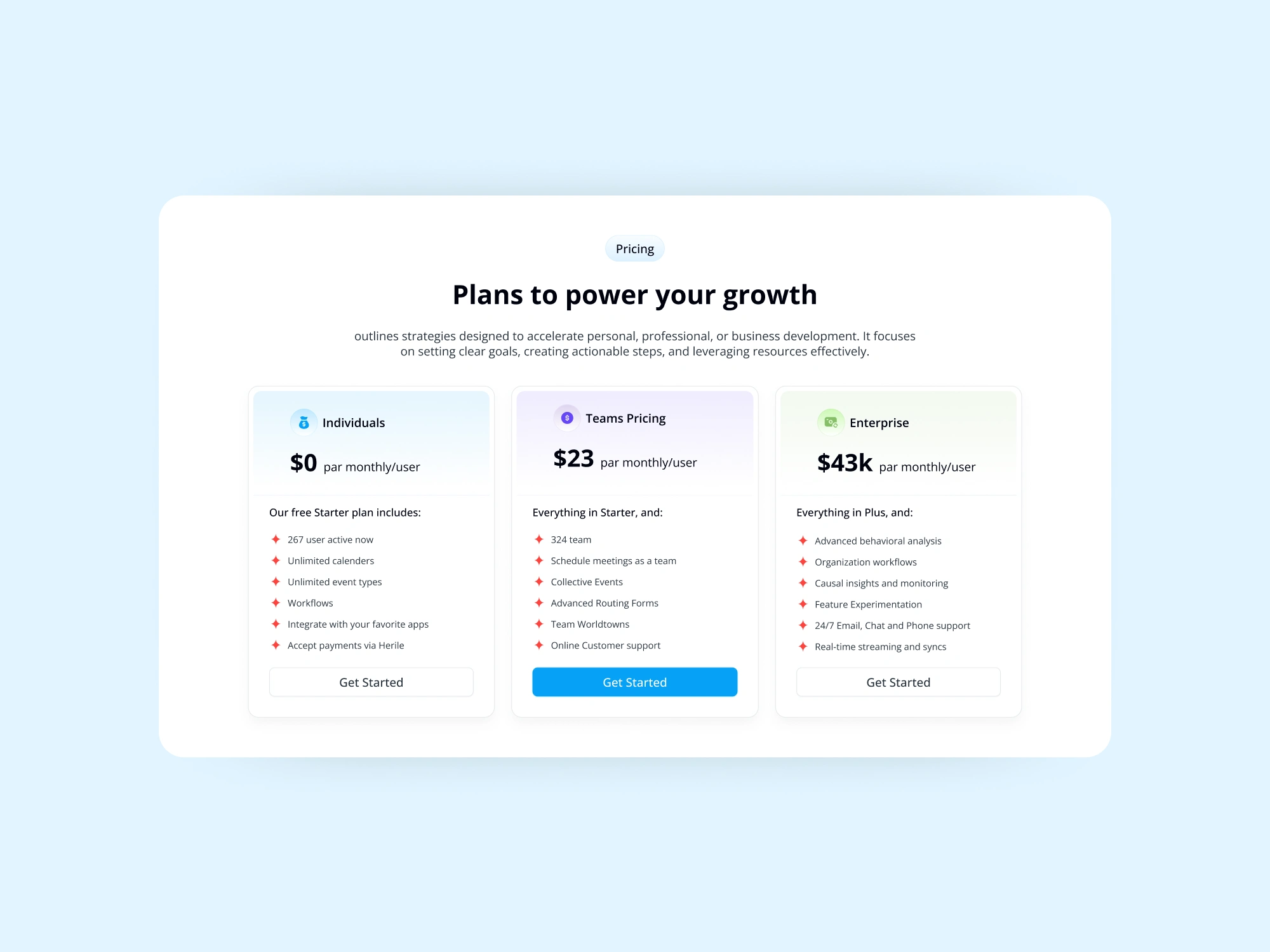
Clear Pricing
A simple Individuals → Teams → Enterprise structure makes plan comparison quick and easy.
Scalable Design System
Reusable cards, buttons, typography, icons, spacing, and visual patterns create a consistent foundation for future marketing pages.
Visual Direction
A clean SaaS aesthetic built around:
Soft blue gradients · Bold typography · Minimal cards · Subtle shadows · Product-led visuals
The result is a balance between enterprise credibility and approachable modern design.
Outcome
A focused landing page that turns a complex HR platform into a clear, visual, and conversion-ready SaaS experience.
The design helps users quickly understand the product, explore its capabilities, compare plans, and take action.
My Role
UI/UX Design · UX Structure · Visual Design · Product Visualization · Design System
Like this project
Posted Oct 8, 2026
Designed a landing page simplifying a complex HR platform for better user engagement.