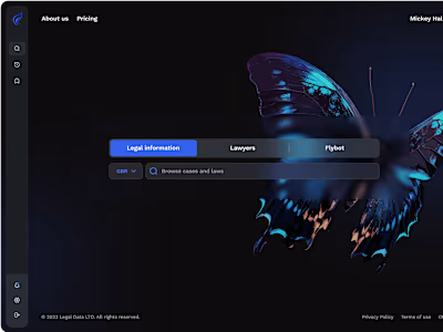
Legal Data Design System
Legal Data Design System
ROLE: UI/UX Designer
PERIOD: May 2023 - Jan 2024
COMPANY: Legal Data Ltd.
Brief
In this case study, I am excited to share my experience of developing a design system from the ground up for Legal Data Ltd.
The system played a crucial role in establishing consistent design standards across our products, providing a scalable solution for future projects. Moreover, it was aimed at streamlining the onboarding process for new designers and developers joining our team.
My contribution
I led the development of a comprehensive design system from scratch, serving both current and prospective products. This encompassed thorough research into existing web systems, in-depth study of pertinent literature, formulation of precise guidelines, and the setting up of diverse components and design patterns.
Why we needed a design system
Developing and maintaining a design system demands significant time investment. However, given our plans to introduce additional products, potentially with distinct brand stylings, the necessity of having such a system cannot be overstated. Its implementation is indispensable as it will save us time, money, and resources down the line.
Benefits of a design system:
Scalability: It can grow with our needs
Consistency: Keeps designs consistent across projects, making work more efficient
Single source of truth: Acts as a reliable reference for both designers and developers, reducing the time spent on communication and handing off new designs
Ease of updates: Changes are easy to make, with the use of design tokens guaranteeing the consistent application of changes throughout the system
Objective:
Develop a comprehensive and scalable design system, incorporating all components from our previous simplistic and unstructured system. Each component will use design tokens for consistency and be well-documented. All components need to comply with the WCAG 2.1 AA accessibility standards.
Research
For a better understanding of what I'm talking about next, I need to familiarize you with the concept of design tokens first.
Design tokens are essentially variables that store specific details such as colors, fonts, spacing, border sizes, and other design elements commonly used in UI design.
Consider them as customizable CSS variables that we establish during the design process. The unique aspect of design tokens is that they're not limited to web development; they can also be applied across various types of platforms.

I initiated the process by reviewing the components present in our previous system, aiming to define the elements necessary for the new one.
Subsequently, I conducted a comprehensive literature review to gain insights on developing a robust and scalable design system. I explored various design systems accessible on the web.
The goals of the research:
Understanding the framework of existing design systems.
Exploring the utilization and organization of design tokens by others.
Gaining insights into the methodologies applied by others in component construction.
Objective:
The task presented some challenges as I sought to optimize the utilization of design tokens within our system. Each design system I investigated presented its distinctive approach to applying and organizing tokens.
Furthermore, I noted that many online design systems demonstrated deficiencies in component construction. They appeared to be tailored primarily for inexperienced designers and conceptual design rather than practical application in product development.
Overview of the system
Foundations
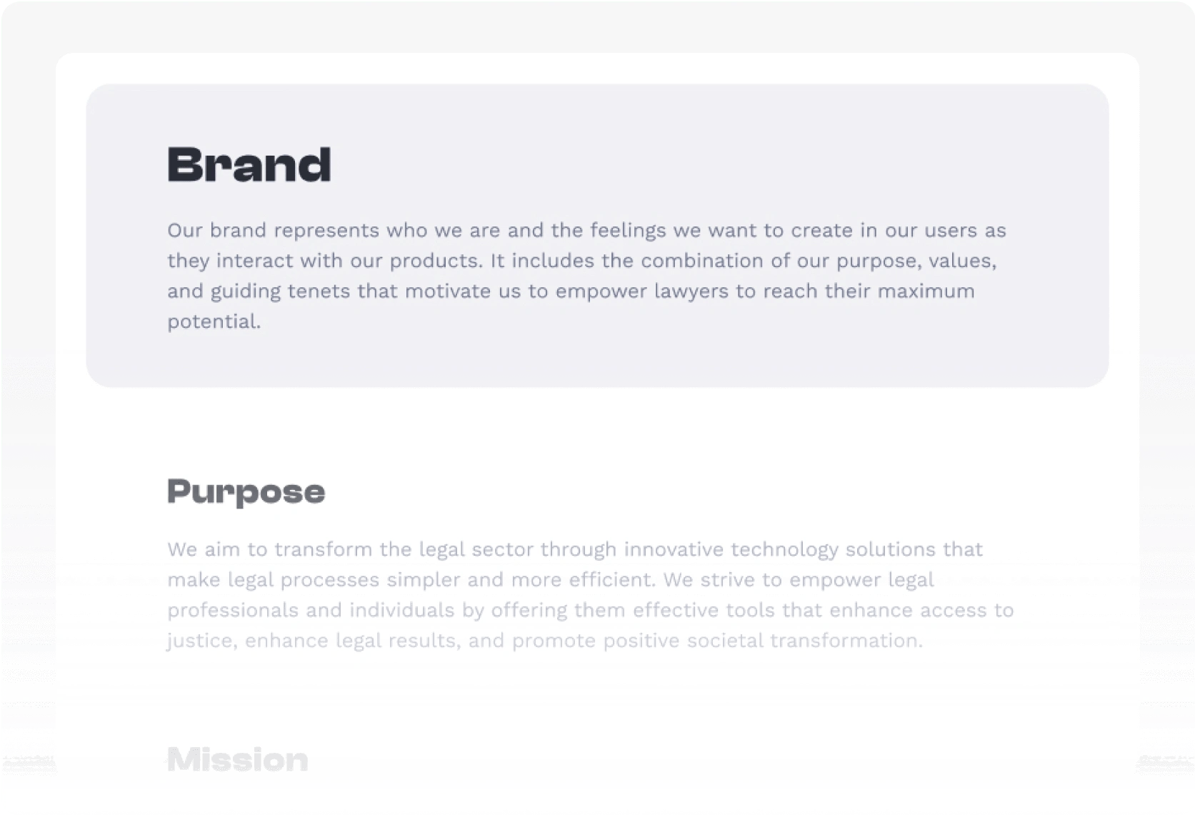
Brand guidelines:
In collaboration with the marketing team, I developed brand guidelines delineating the company's purpose, mission, vision, and values.
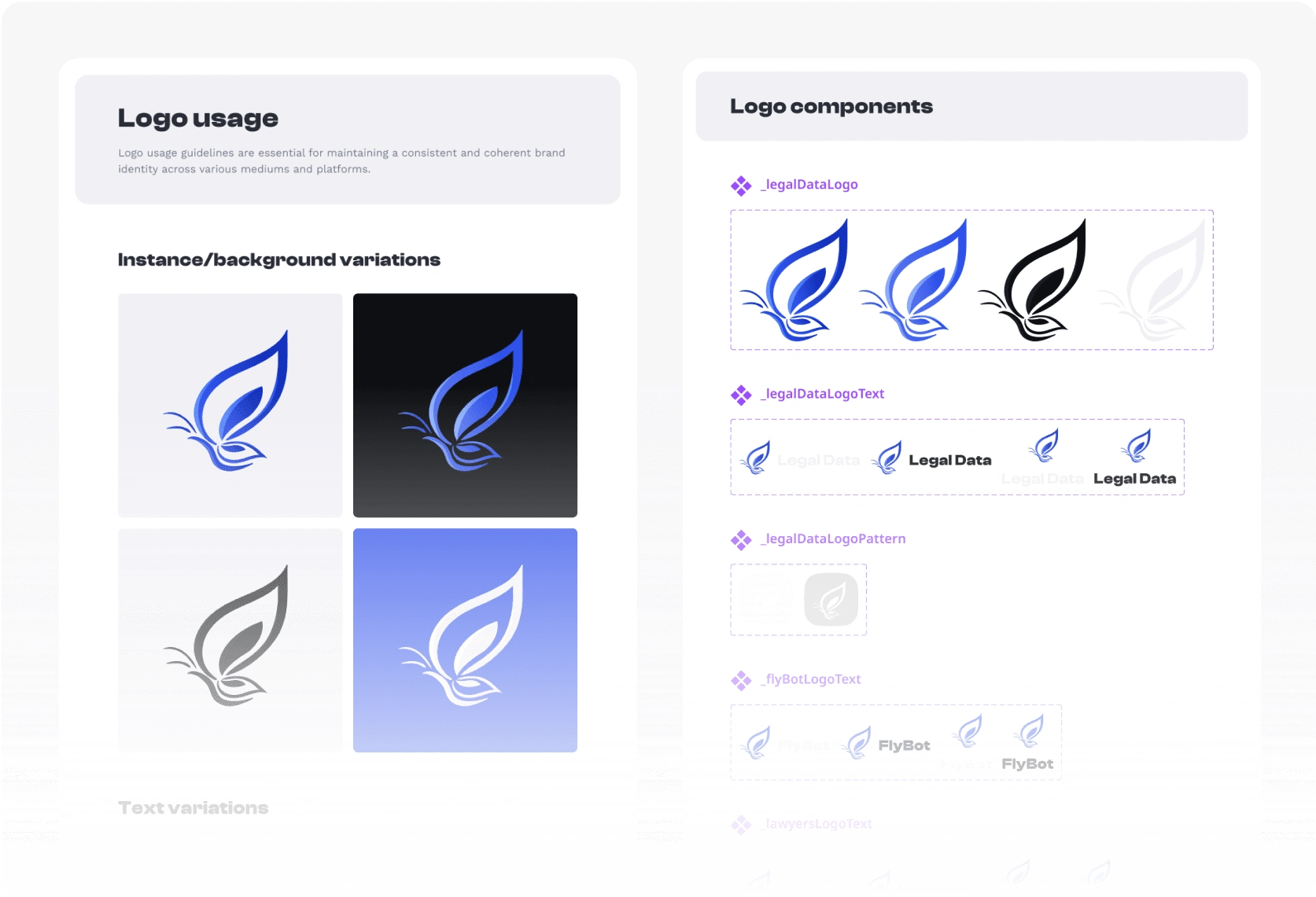
Logo usage:
This section provides detailed instructions for the appropriate usage of the company's logo, ensuring consistency across different applications and iterations.
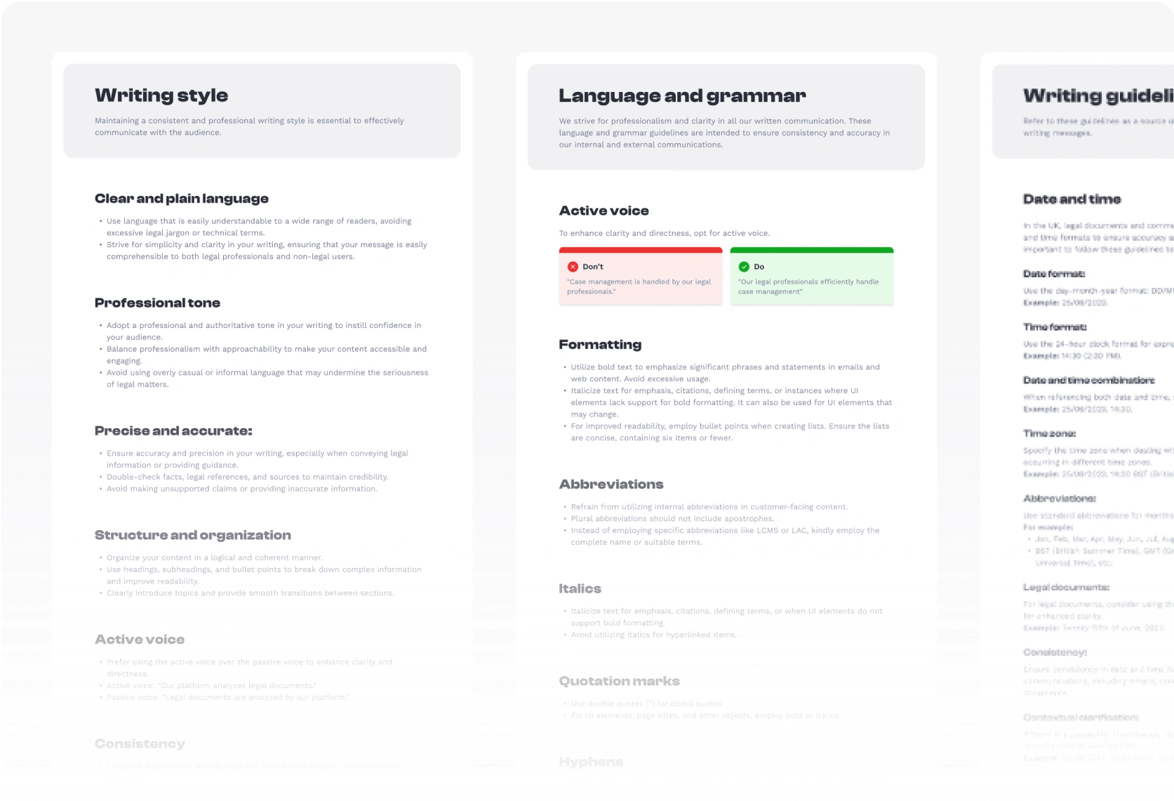
Content guidelines:
Guiding principles for content creation are outlined here, encompassing directives for writing text content and basic rules of UX writing.
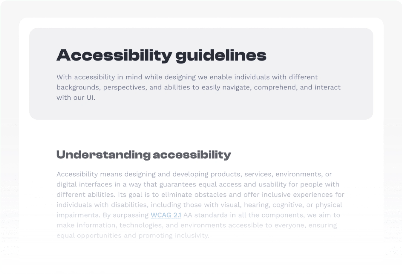
Accessibility guidelines:
This page offers fundamental information about accessibility, featuring links to external resources for learning more about the topic.
Style guide
Before discussing styles, let's delve into the concept of design tokens.
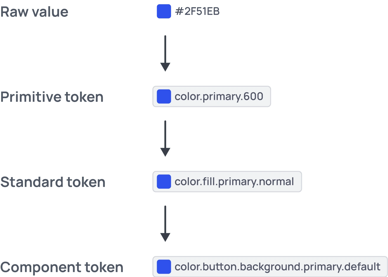
The token framework I chose consists of three levels:
The first level comprises primitive tokens, which encapsulate raw values.
The second level encompasses standard tokens, which inherit primitive tokens. These standards, for example, segregate colors for distinct design functions such as fill, border, and text properties.
The third level comprises component-specific tokens. These tokens inherit properties from the preceding level and are utilized to assign variables to specific components.
I initiated the creation of design tokens using the TokenStudio plugin. However, shortly thereafter, Figma introduced its "Local variables" update. Recognizing the advantages of this feature, I decided to switch to using Figma's built-in functionality.
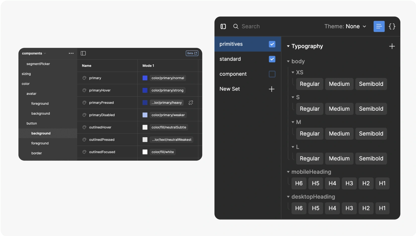
The style guide covers various sections:
Typography
Color
Spacing
Iconography
Elevation
Radius
Grids and layouts
Each section of the style guide features a comprehensive table detailing different styles, accompanied by guidelines on their effective utilization.

Components
In designing components, I opted for the nested components mechanic due to its ability to provide maximum flexibility in configuration.
The three-level nesting approach:
Master components: These serve as the foundational blueprint for a component, containing all potential elements.
Style components: These components nest a master component and apply specific styling.
Variants: Nested within style components, variants cover different use cases.
This methodology was selected because it facilitates the application of changes at different levels, which can then be implemented globally or tailored to specific areas of the system. For example, when creating a new product featuring buttons with different corner radii and brand colors, this process streamlines considerably. By simply creating new primitive tokens for colors, incorporating them into a new theme for standard tokens, adjusting inherited radius tokens in the new theme as necessary, and then applying the theme to the style components, we ensure consistency and efficiency in updating and customizing components to meet distinct design requirements across various contexts or products.
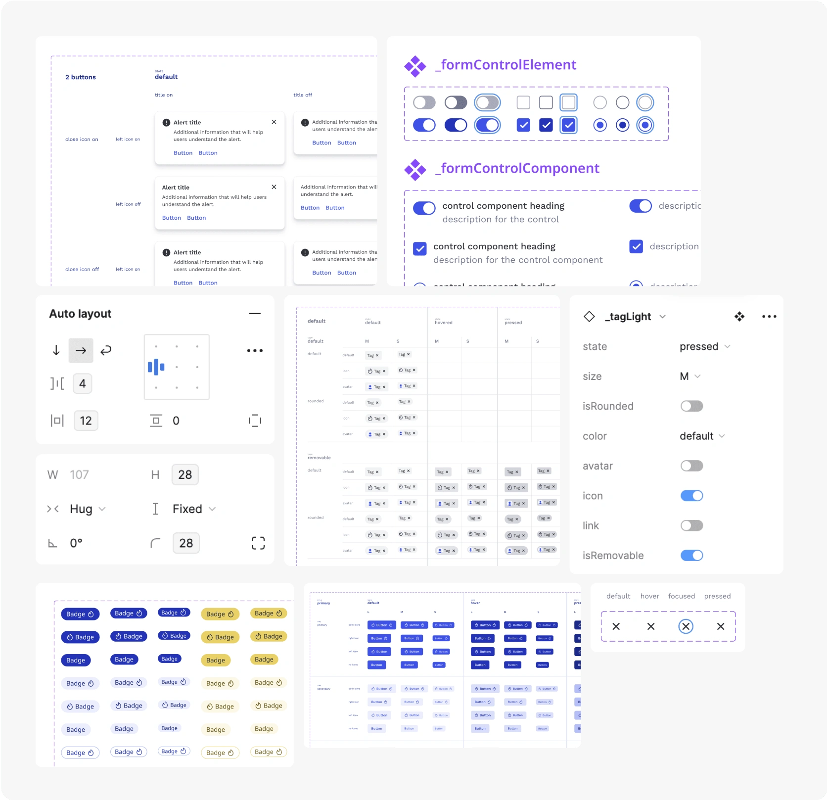
By using basic components within other components, we can build patterns and complete pages with ease.

Next steps
The next phase will entail translating all designed components into code. Furthermore, transferring all documentation onto a website will enhance accessibility and convenience for other team members.
Learnings &Takeaways
Although this was my second experience in building such a system, I acquired valuable insights throughout the process by applying various techniques and methods. This project provided me with extensive experience in constructing UI components, testing them, and ensuring compliance with accessibility standards.
Like this project
Posted Mar 13, 2024
Creating a design system from scratch for Legal Data Ltd
Likes
0
Views
0


