Healthcare Website: High-Fidelity UX/UI Mockup
Mariah Donica
Overview
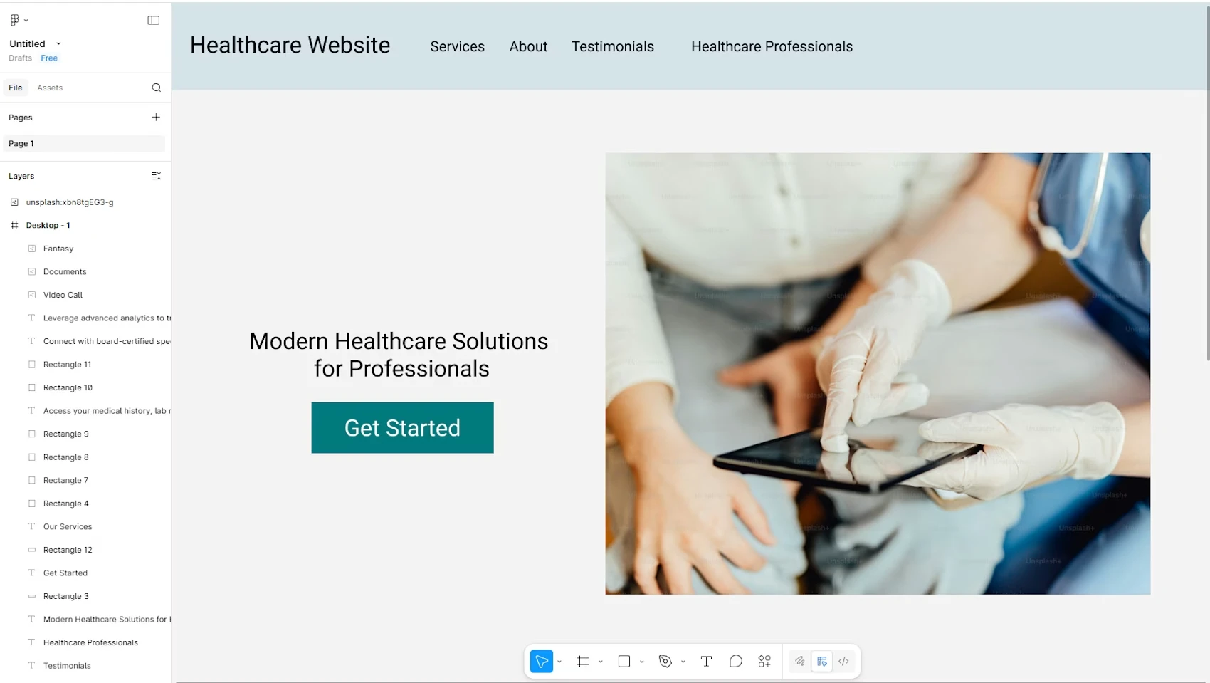
A high-fidelity mockup for a healthcare website, designed with a focus on accessibility, clarity, and trust. The goal was to create a clean, professional interface that makes it easy for patients to find information, book appointments, and navigate services without friction.
The Problem
Healthcare websites are often cluttered, confusing, and hard to navigate, especially for older or less tech-savvy users. Patients need to find critical information fast, and the design needs to feel trustworthy from the first click.
What I Designed
A clean, modern layout with clear visual hierarchy and intuitive navigation
Service pages structured for quick scanning with prominent calls to action
Responsive design that adapts smoothly across desktop, tablet, and mobile
Accessible color contrast and typography choices for readability
A cohesive visual system that balances professionalism with warmth
Design Process
I started with wireframes to map out the information architecture, then moved into high-fidelity mockups in Figma. Every design decision was filtered through two questions: can the user find what they need in under 10 seconds, and does this feel like a place they can trust with their health?
Key Takeaway
Healthcare design is a masterclass in restraint. The temptation is to pack in every service, testimonial, and credential. The real skill is knowing what to leave out so the important stuff actually lands.
Like this project
Posted May 19, 2026
A high-fidelity healthcare website mockup designed for clarity, accessibility, and trust, built with Figma and frontend knowledge to create a responsive, patient-friendly experience.
Likes
0
Views
4