How I Built a Portfolio That Doesn't Look Like One
Jijo Maitra
How I Built a Portfolio That Doesn't Look Like One
jijo.fyi, a personal case study
Five years. That's how long my portfolio had been sitting still, untouched, quietly embarrassing me every time I thought about it.
A lot had changed in those five years. I had co-founded and eventually shut down an AI legal company, something that took everything I had, and then some. When it was over, I found myself sitting with a strange kind of silence. The kind that asks uncomfortable questions. Am I still a designer? Do I still have it?
I needed to prove it to myself. Not to clients. Not to anyone watching. Just to me. So I decided to rebuild from scratch.
The Constraint That Changed Everything
The brief I gave myself was simple and immediately terrifying: design a portfolio that doesn't look like a portfolio.
No grids of project thumbnails. No "Hi, I'm a designer" hero text. No neat sections labeled "About" and "Work" sitting quietly in a nav bar. I wanted to build a space where the box doesn't exist. Where someone could land and feel something before they even read a word.
I had one problem though. I didn't know how to code. It turned out, with AI-assisted coding and Framer, that was the least of my obstacles.
Free. Airy. Dream.
Every project I start begins with three words. This one started with: Free. Airy. Dream.
I sat with those words for a while. What does it actually mean to feel free? For me, it always comes back to nature. To hiking. To standing at the edge of a forest with the air moving around you. To that specific quality of light when you're near the sea.
So I asked myself: what if your working desk was sitting in the middle of a grassland, right at the bay of the ocean? Wind coming at you. Sky enormous above. Flowers at your feet. What would it feel like to sit there?
That was the feeling I wanted someone to have the moment they landed on my site.
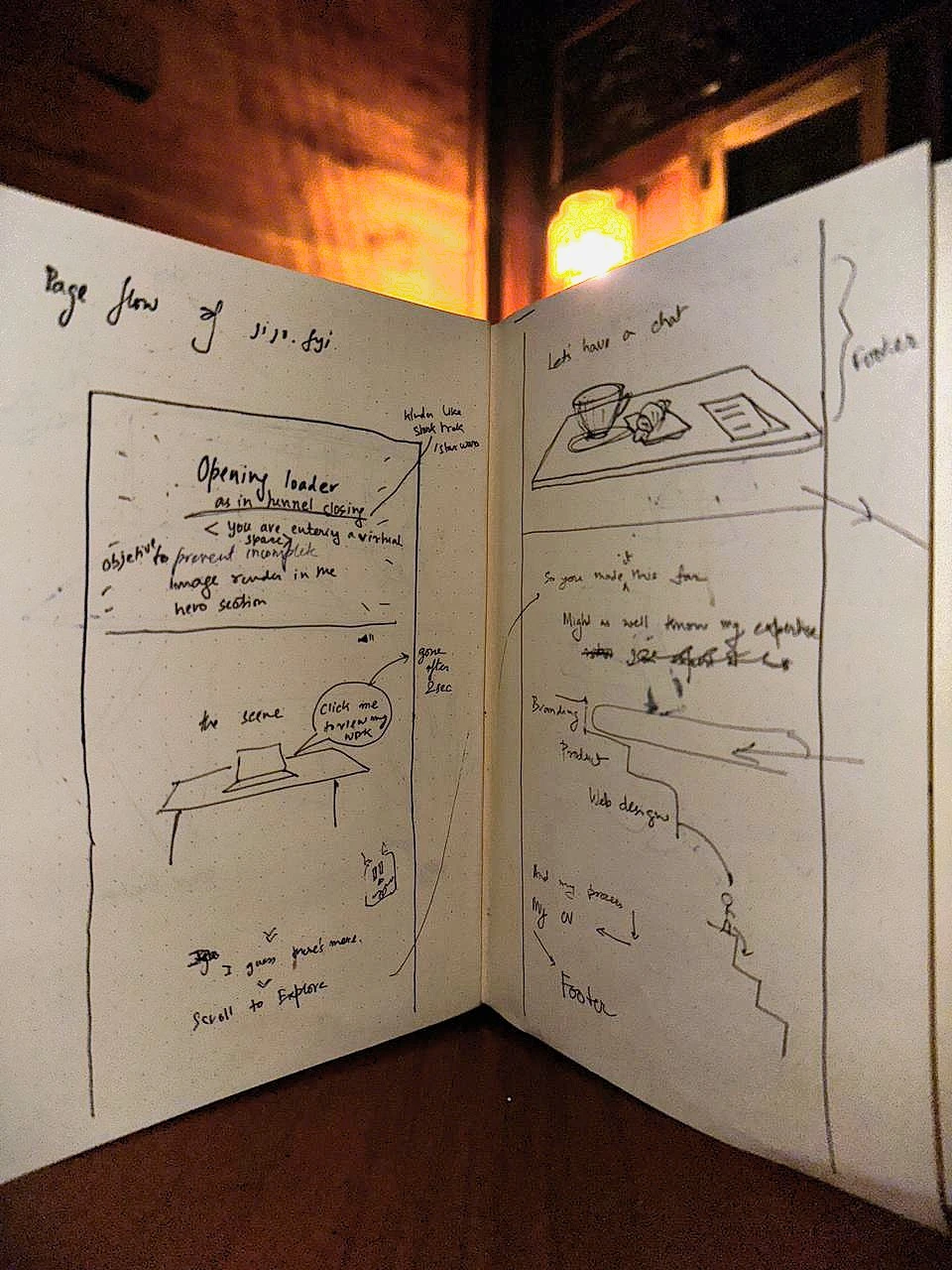
The whole idea started here, a sketchbook open under warm light, mapping page flow in pencil.
Building the World
Once the feeling was clear, I had to build it. Physically build it, in Blender.
I'm a multidisciplinary designer. I design furniture, web interfaces, graphics, illustrations, and I shoot photography. So the objects on the desk weren't random. I placed a laptop, a scaled furniture model, a pen tablet, a notebook, a Fujifilm camera. Each one is something I actually do. Each one is a quiet invitation to click.
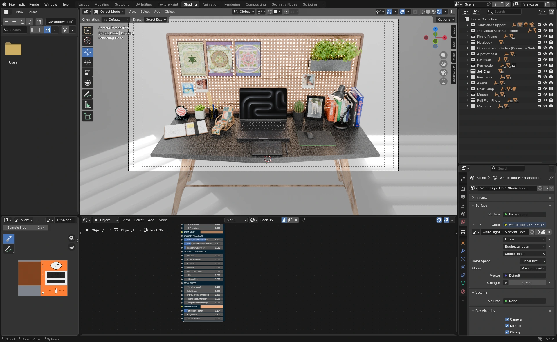
Hundreds of hours compressed into a single Blender viewport.
The entry into the site mattered too. I wanted the loading experience to feel like passing through clouds. A tunnel motion, drifting through softness, and then landing. Like arriving somewhere, instead of just opening a tab.
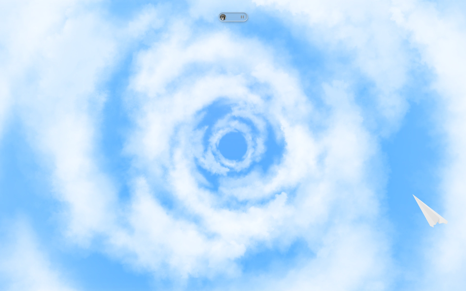
The cloud that greets you before the world appears.
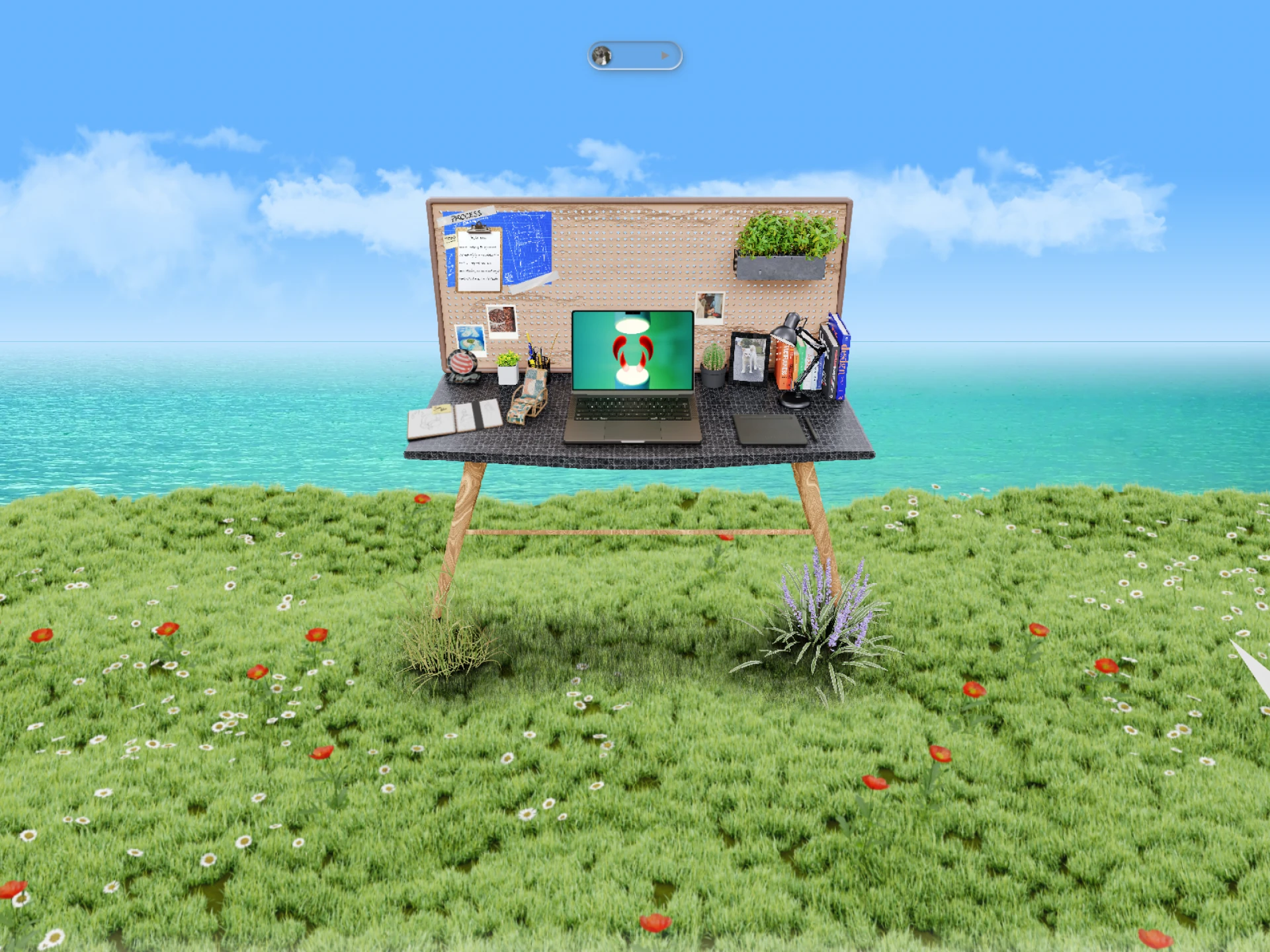
A desk at the edge of the world, where grassland meets sea and the wind never stops.
When the World Needs Windows
A blank open space is beautiful. It's also not a portfolio.
I'd designed this serene, open 3D environment and then faced the obvious question: how do people actually see the work in here? The answer was to borrow something familiar: the macOS desktop. I built a functional macOS-style interface directly in the browser. Click an icon, a window opens. Everyone knows how to use a desktop. It's muscle memory. It required no explanation.
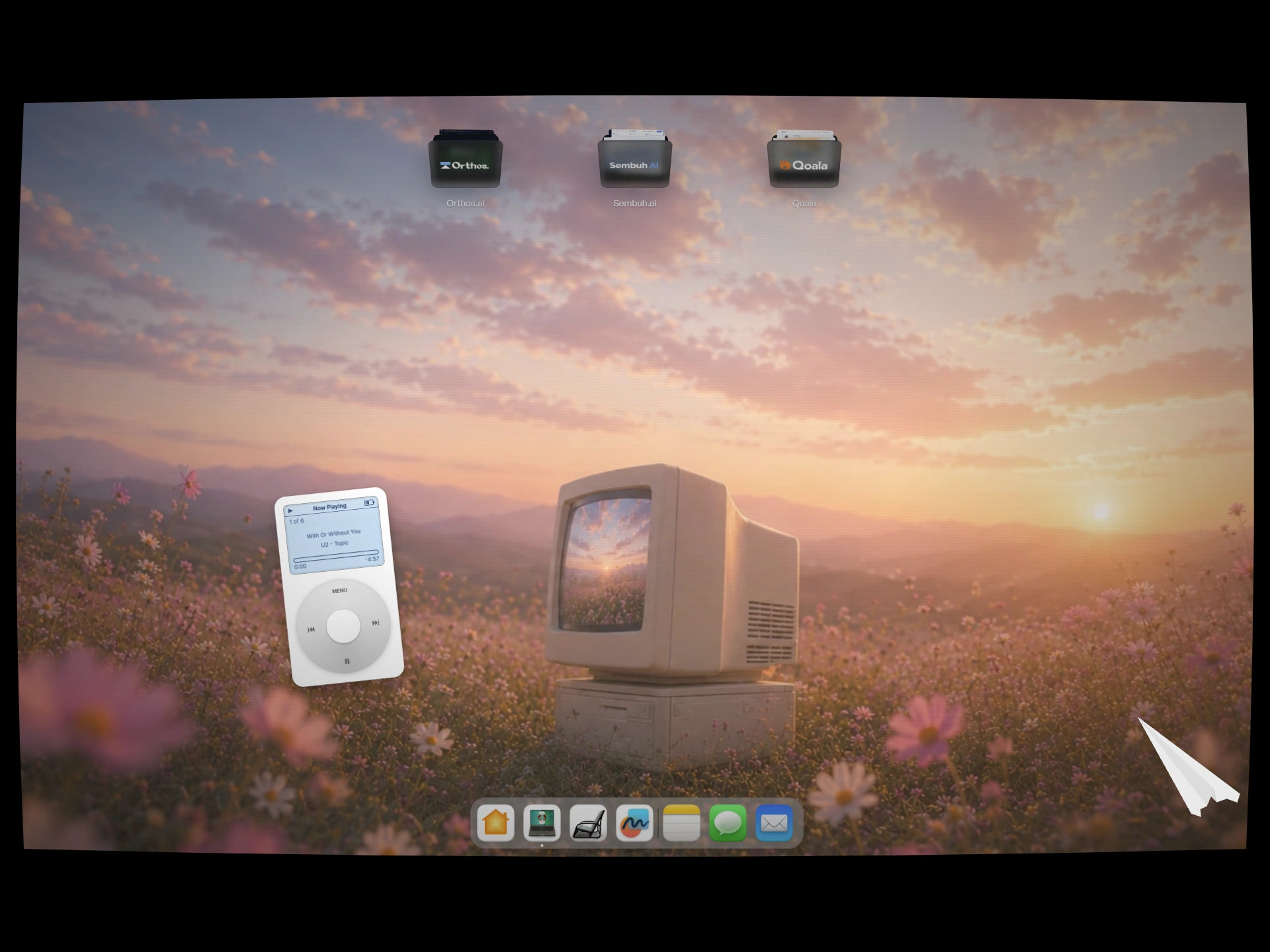
A fully functional macOS desktop, living inside a browser. Icons, dock, and all.
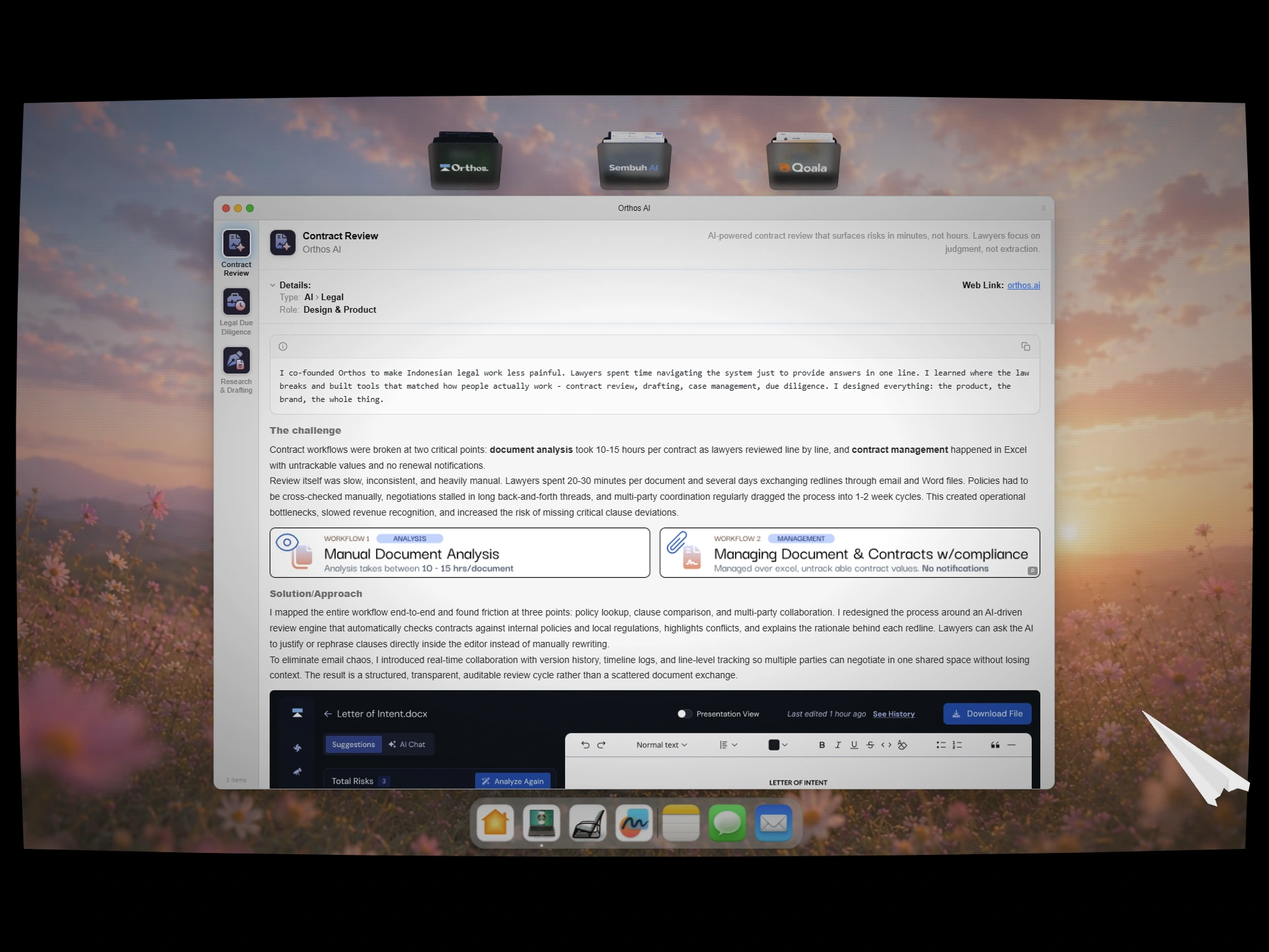
Finder-style case study viewer to showcase my past work.
For photography and illustration, I needed something that could hold a lot of work without feeling heavy. The solution was an image gallery arranged in the shape of a heart, floating across a cloud-filled sky. Hundreds of images scattered like they arrived there on their own.
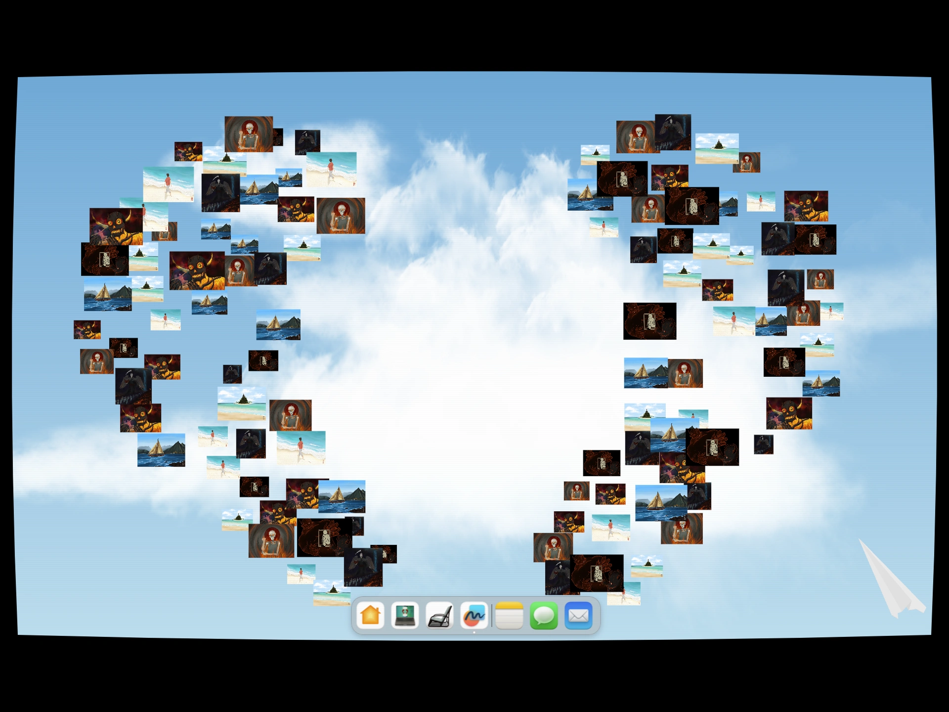
Photography and illustration, arranged into my logo and scattered across the sky.
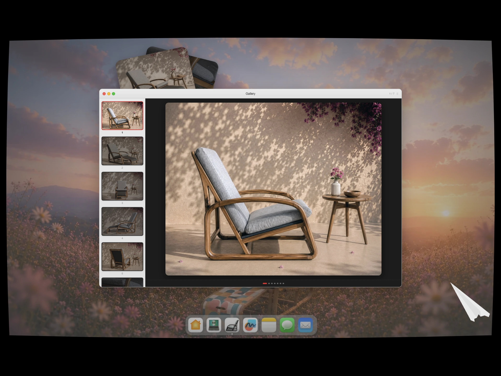
Furniture designs inside a custom photo viewer.
The Process Has to Live Somewhere
At some point I had to be honest with myself: this is a portfolio, not an art exhibition. Beautiful environments are great, but a client needs to understand how I think.
That meant adding a process section. But instead of a bland numbered list, I replaced the artwork on the desk with a blueprint, the kind you'd pin to a workshop wall. Five steps: Assemble, Architect, Assert, Assess, Iterate. The whole section is scroll-animated, each step revealing itself with the right image alongside it.
A lot of time went into getting those CSS animations right. More than I'd like to admit.
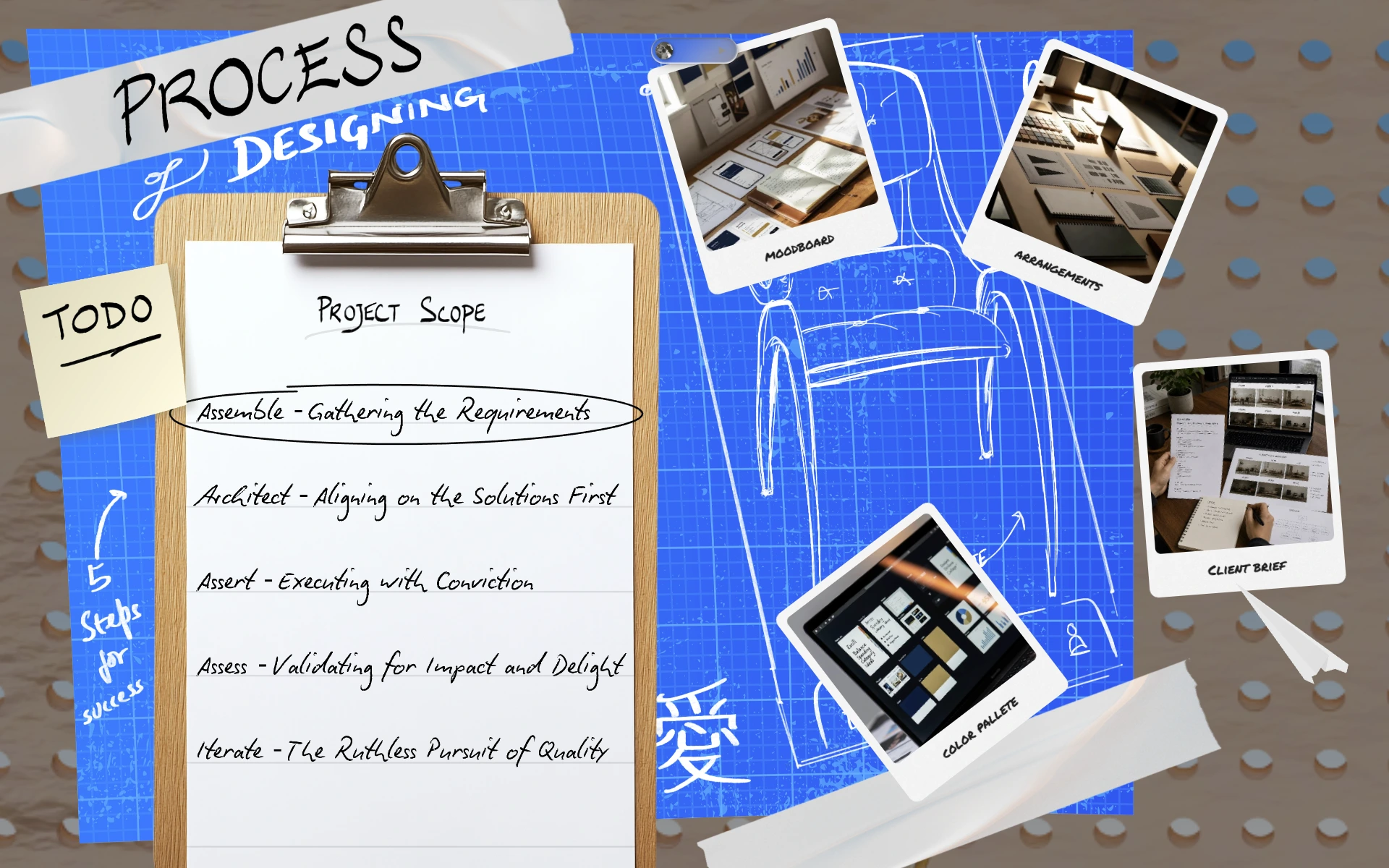
Five steps pinned to a blueprint board, the honest version of how every project actually gets made.
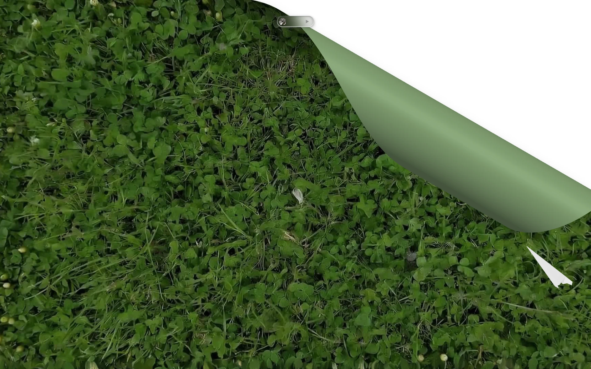
The Paper That Peels Back
Introducing myself with a block of text felt wrong. I wanted the "About" section to feel like an event.
So I built one: a sheet of paper, textured like grass on top, that peels back as you scroll. Underneath is a table, a book, a quiet interior scene. The whole unwrap animation is done in WebGL, because there was simply no way to pull that off with CSS alone. The paper has weight. It resists. It yields.
The moment the grass peels back and something underneath begins to breathe.
The book sitting on that table is pure CSS, and I'm quietly proud of that. It flips. It scales. You can add as many pages as you want. I designed it with scalability in mind: images beside the text, custom covers, any number of pages. Alongside it, bees drift across the screen in random paths and flowers bloom on scroll. I wanted the scene to feel alive, not like a static page dressed up to look living, but something that actually moves with you.
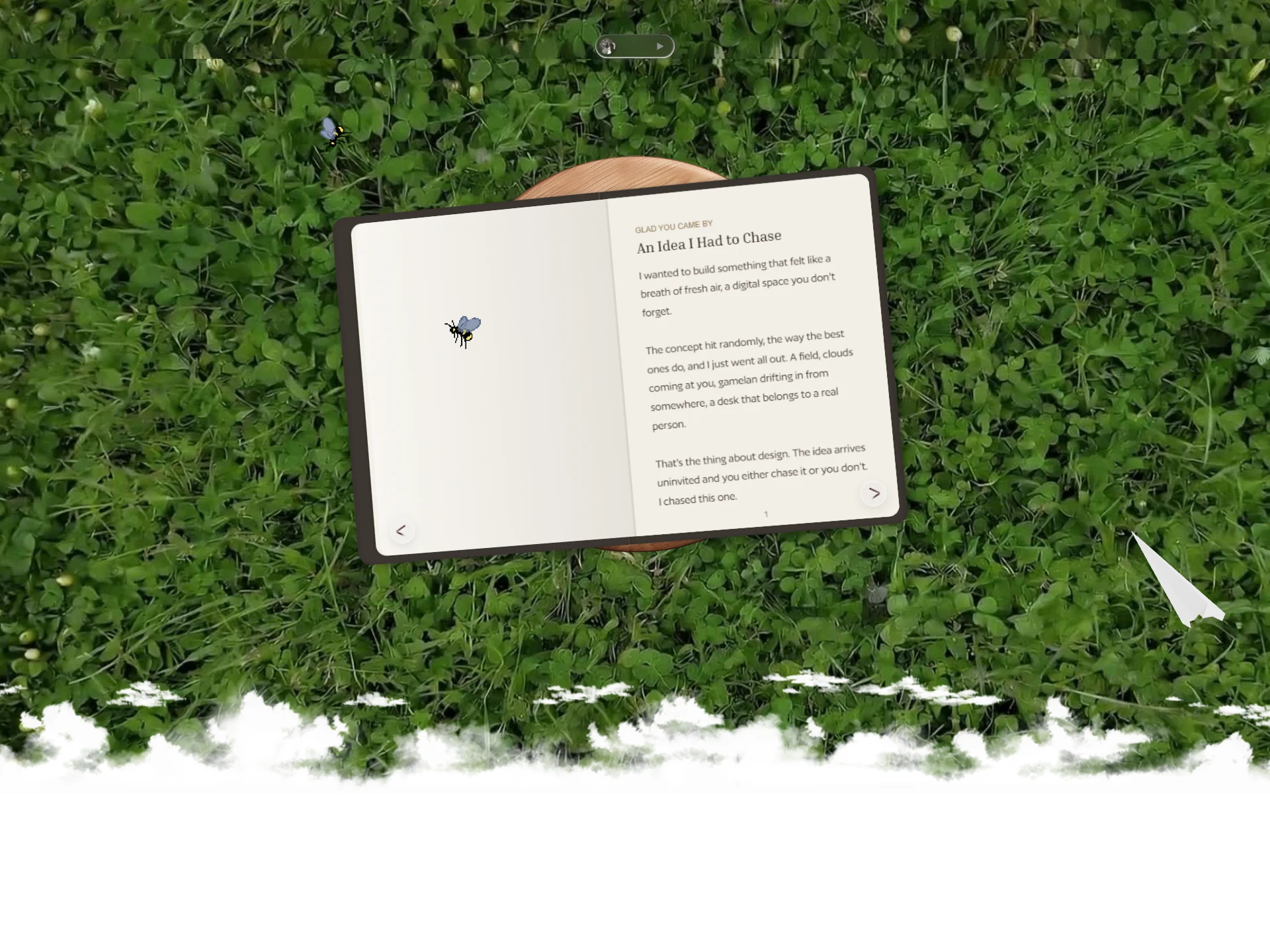
An open book on grass, with a bee mid-flight and pages you can actually turn.
The Coffee Scene
Now it was time to show the work. And I may have overdone the transition into it.
I built a full 3D coffee scene: two lattes, two croissants, a handwritten note asking "shall we team up?", rendered in Three.js and embedded directly in the site. It rotates 60 degrees as you scroll through it. I told myself it was to make the transition feel cinematic. Really, I just couldn't stop.
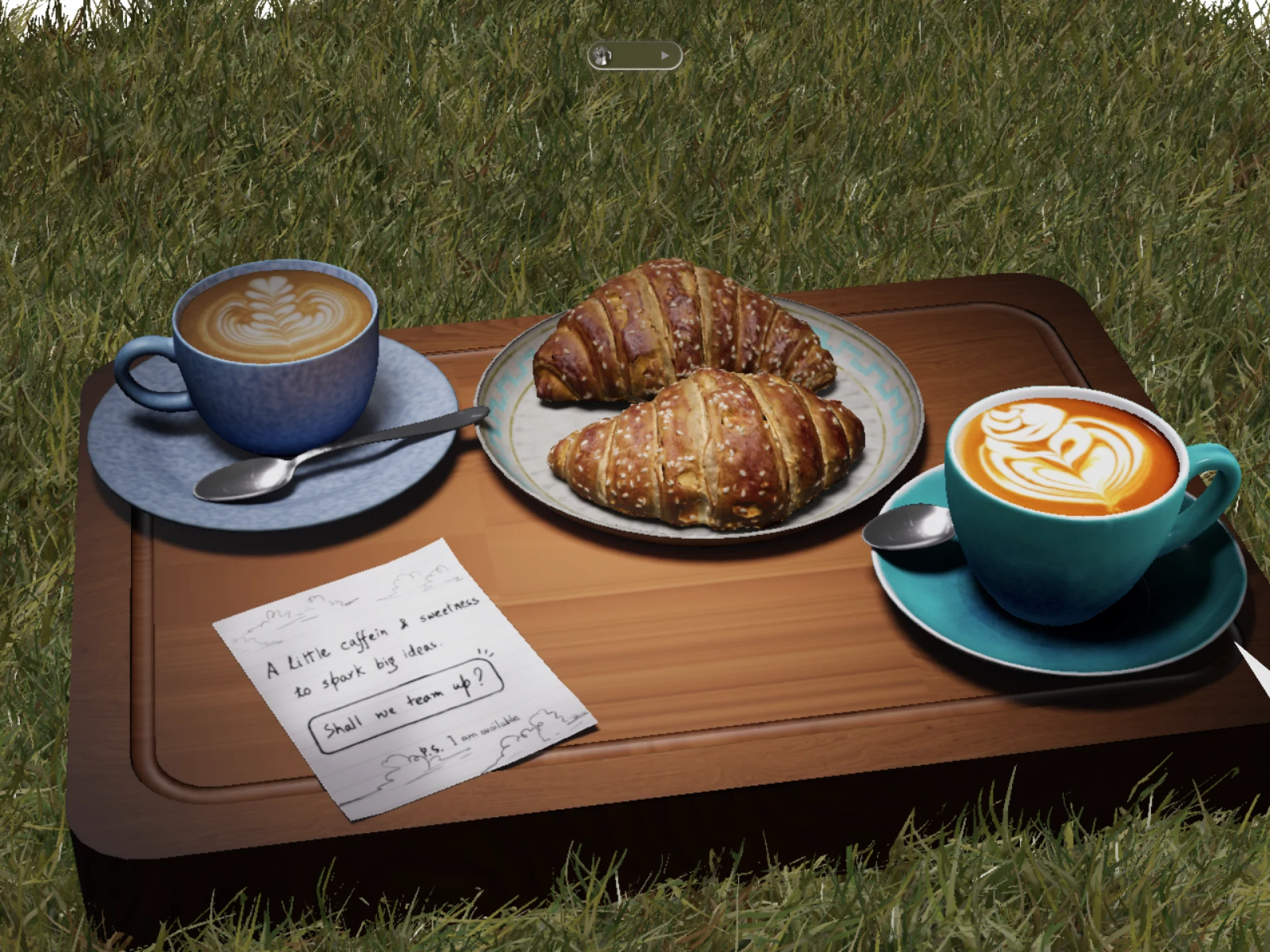
Two coffees, two croissants, and a note asking "shall we team up?" Rendered in full 3D, grounded in grass.
The Cloth Banner
One of the last things I added was a cloth banner. It has actual simulated mass. Hover over it and it repels. Drag it and it stretches. Click it and it takes you to cal.com to book a call.
I built this because I wanted even the call-to-action to have texture. Most banners sit there, flat and ignored. This one pushes back.
A banner that resists you. Hover it, drag it, feel the weight before you click.
The Footer That Got Out of Hand
I set no timeline for the footer. That was probably a mistake, and also exactly the right call.
In the background, volumetric clouds expand and contract like something actually breathing. My logo, a 3D model with a jijo.fyi watermark made using pretext, sits at the center. For contact, I designed tear-off paper strips, the kind you'd see pinned to a corkboard at a coffee shop. Each one is an interactable link.
And then there's the paper plane. A 3D model that unfolds, literally unfolds, into a contact form.
The footer that refused to be boring: clouds, a 3D logo, tear-off contact strips, and a paper plane waiting to become a conversation.
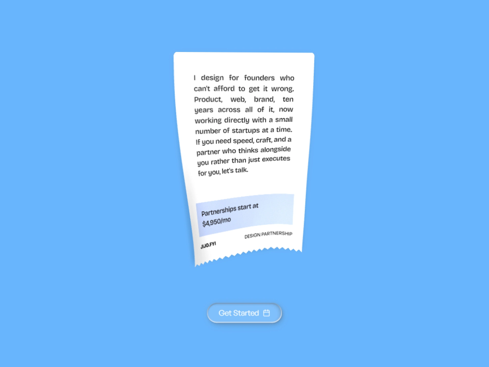
The last thing you read, and hopefully the thing that sticks.
What This Was Really About
This project was never really about the portfolio. It was about whether I still had the nerve to build something that mattered to me, without a client brief, without a deadline, without anyone telling me it was good enough.
Every interaction on this site, the cloth that stretches, the paper that peels, the book that flips, the coffee that rotates, was a deliberate choice to make someone feel something. To make the web feel like a place you can touch.
If it worked, you already know. You can feel it at jijo.fyi.
Like this project
Posted May 20, 2026
Designed an interactive portfolio website with unique visual experiences using Blender, Framer, and WebGL.