Modular Brand & Website System for a Last-Mile SaaS Leader

Petra Smolčić


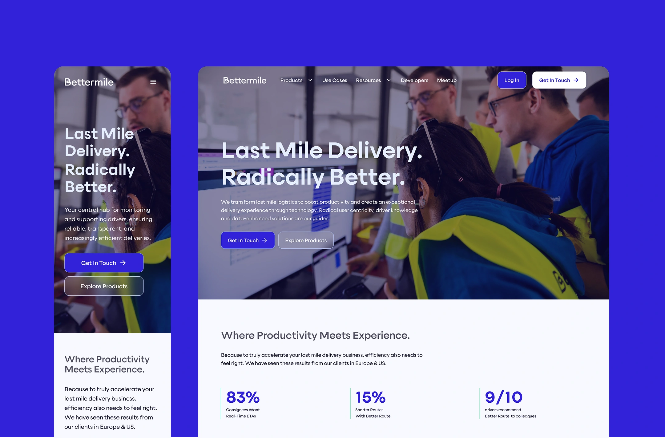
Bettermile started as a corporate innovation lab and has since evolved into an internationally operating SaaS provider for last-mile solutions. They wanted their website and identity to reflect that.
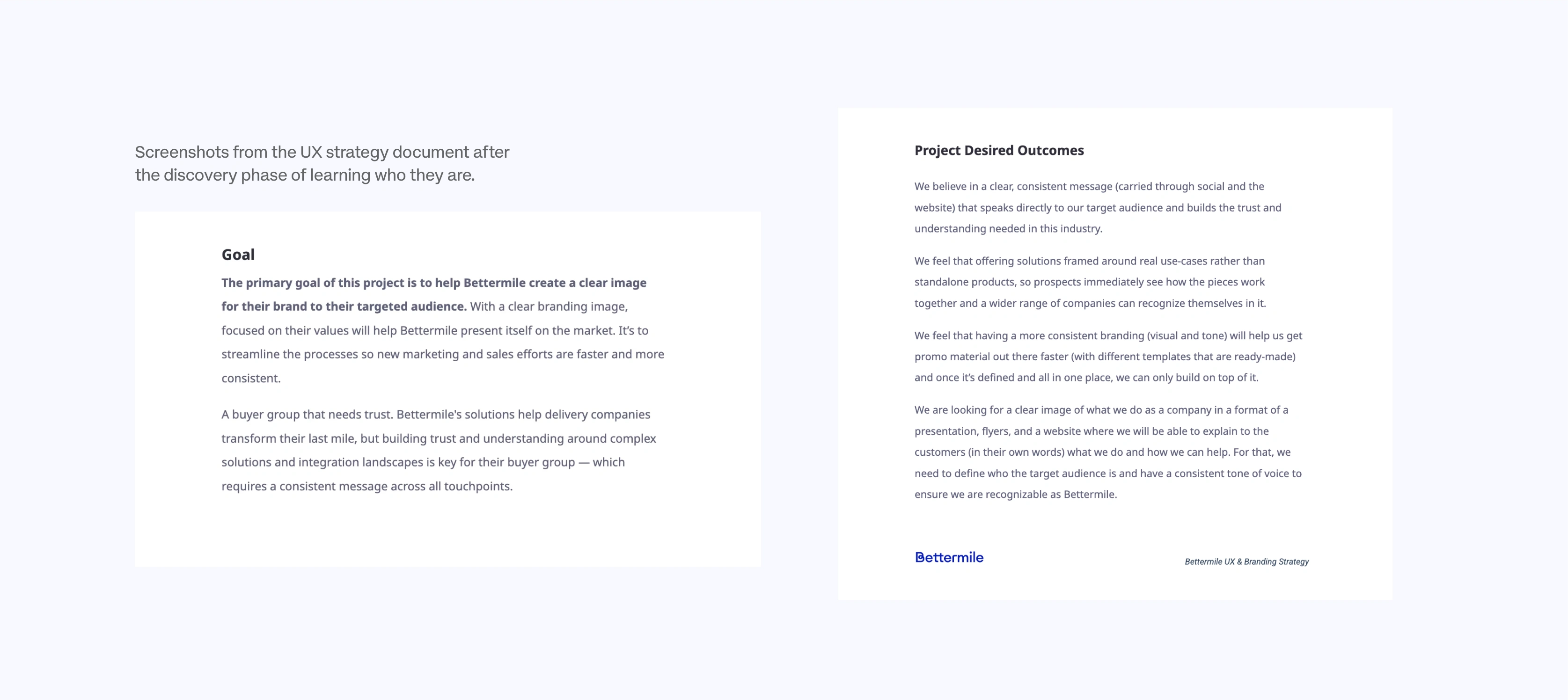
Screenshots from the UX strategy document after the discover phase of learning who they are
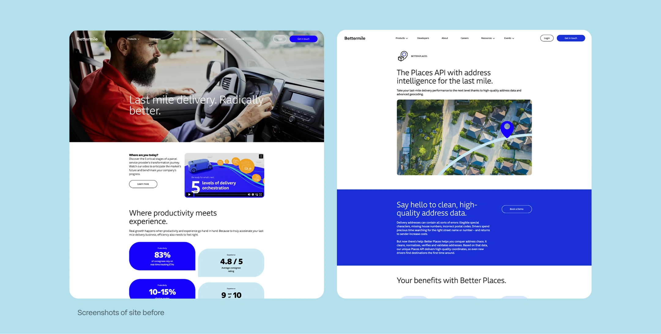
Screenshots of the site before – a lot of great content but bit inconsistent, without a clear goal
The passion Bettermile's team has for last-mile logistics is contagious. My job wasn't to reinvent who they are, it was to give their website and brand the structure to finally presents them as industry leaders they are.
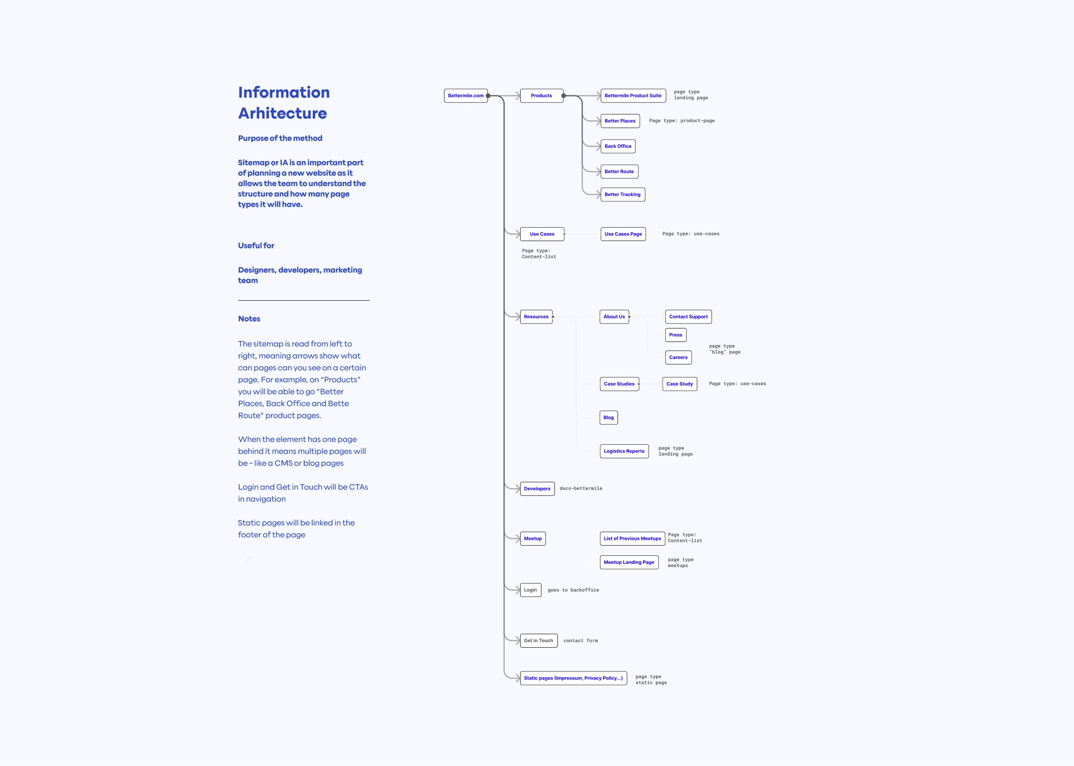
Information architecture – exercise to plan the new website's structure, new page types to allow scalability and fast building of new pages
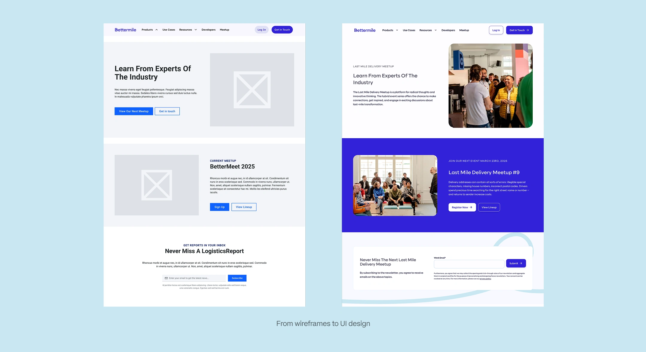
Wireframes + final UI
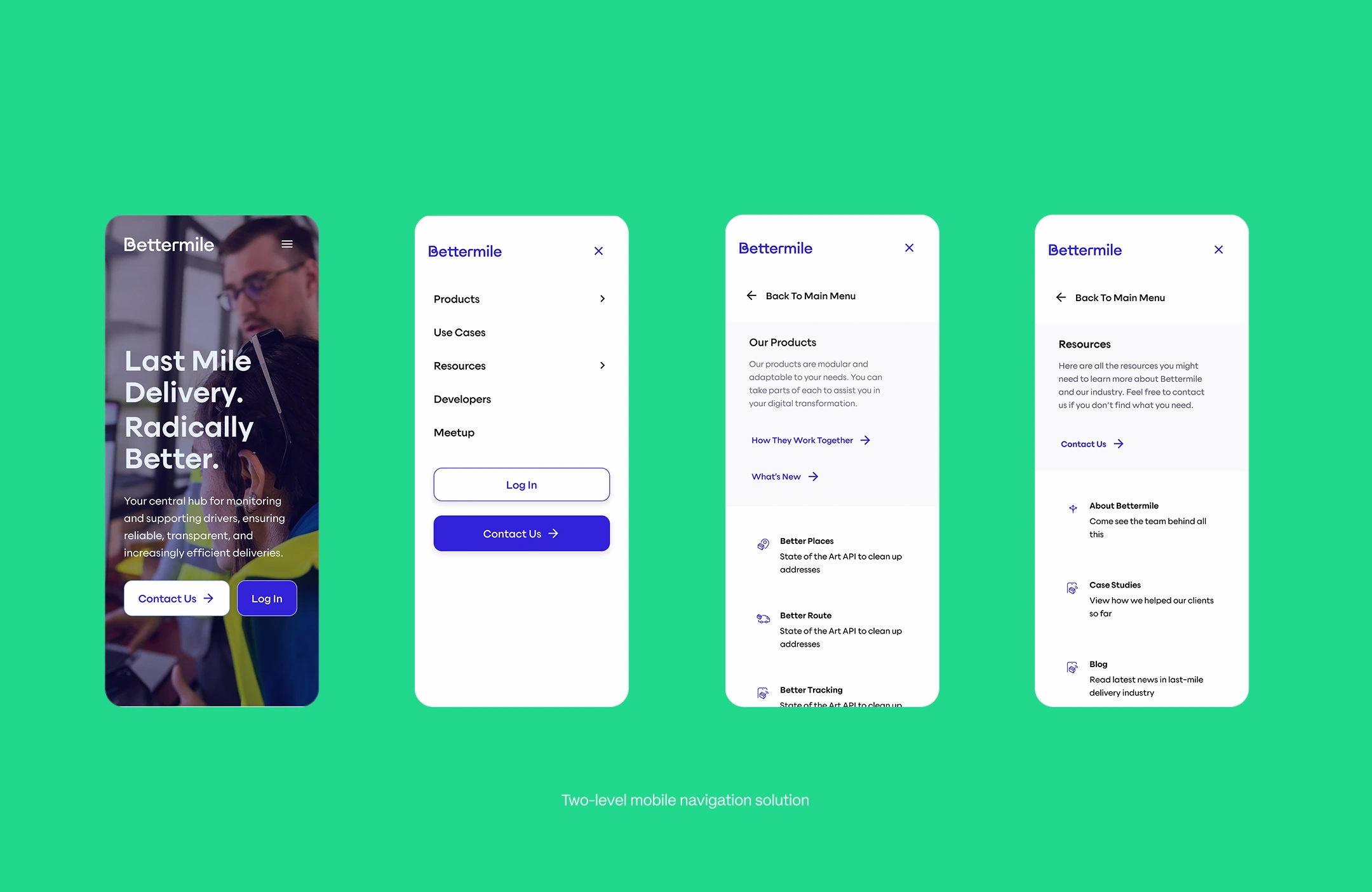
Design solution for the two level mobile navigation
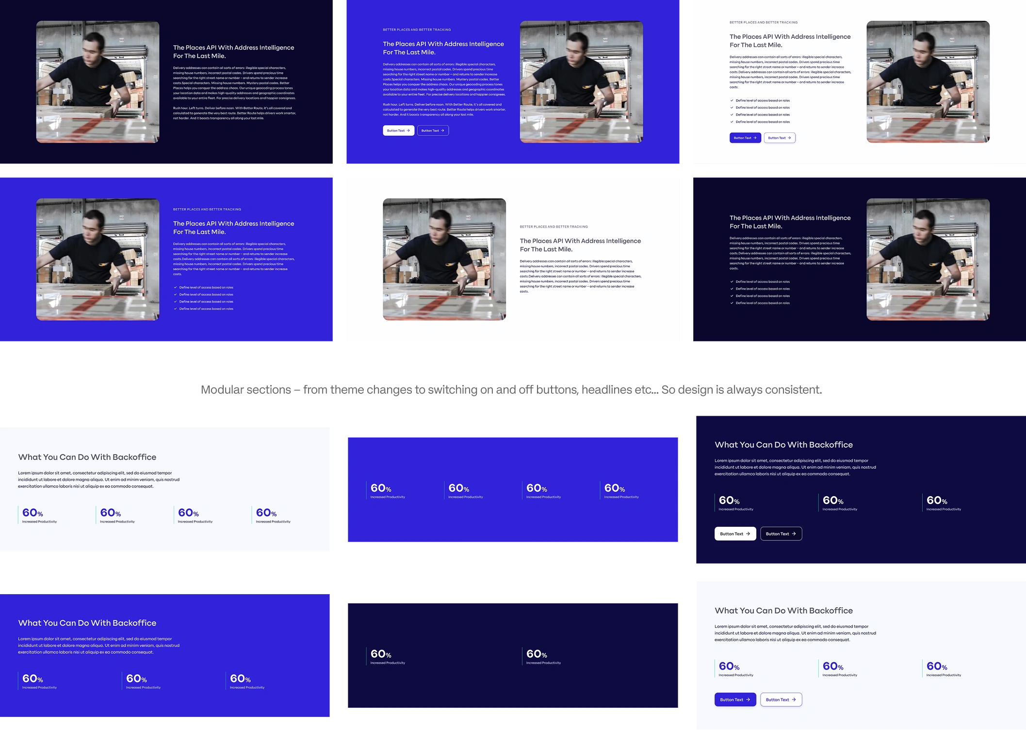
Modularity is big part of who Bettermile is, so my goal was to give them website they can easily update themselves thought defined page types and flexible page sections.
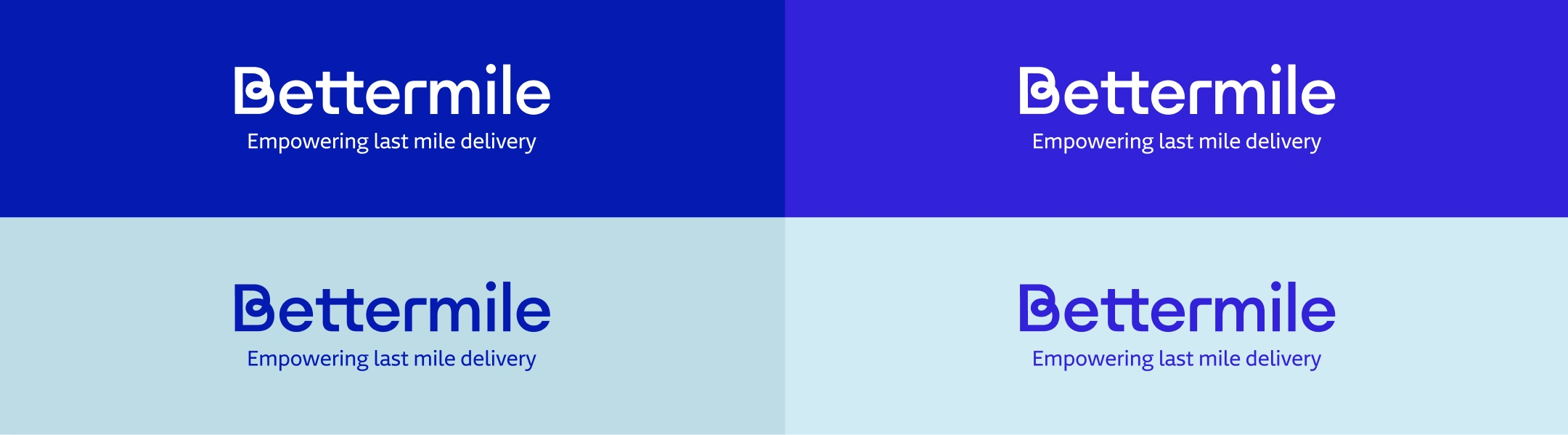
Together with the refresh of the website, we redefined the branding representing who Bettermile is today, making it more modern and tighter. New vibrant colors, new fonts, improved brand.
On the left – colors before, a bit too corporate. On the right – new vibrant colors, more representing tech and energy
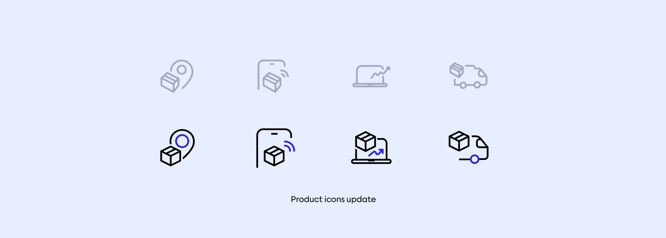
Icons update – made them consistent with the box and brand blue color accent
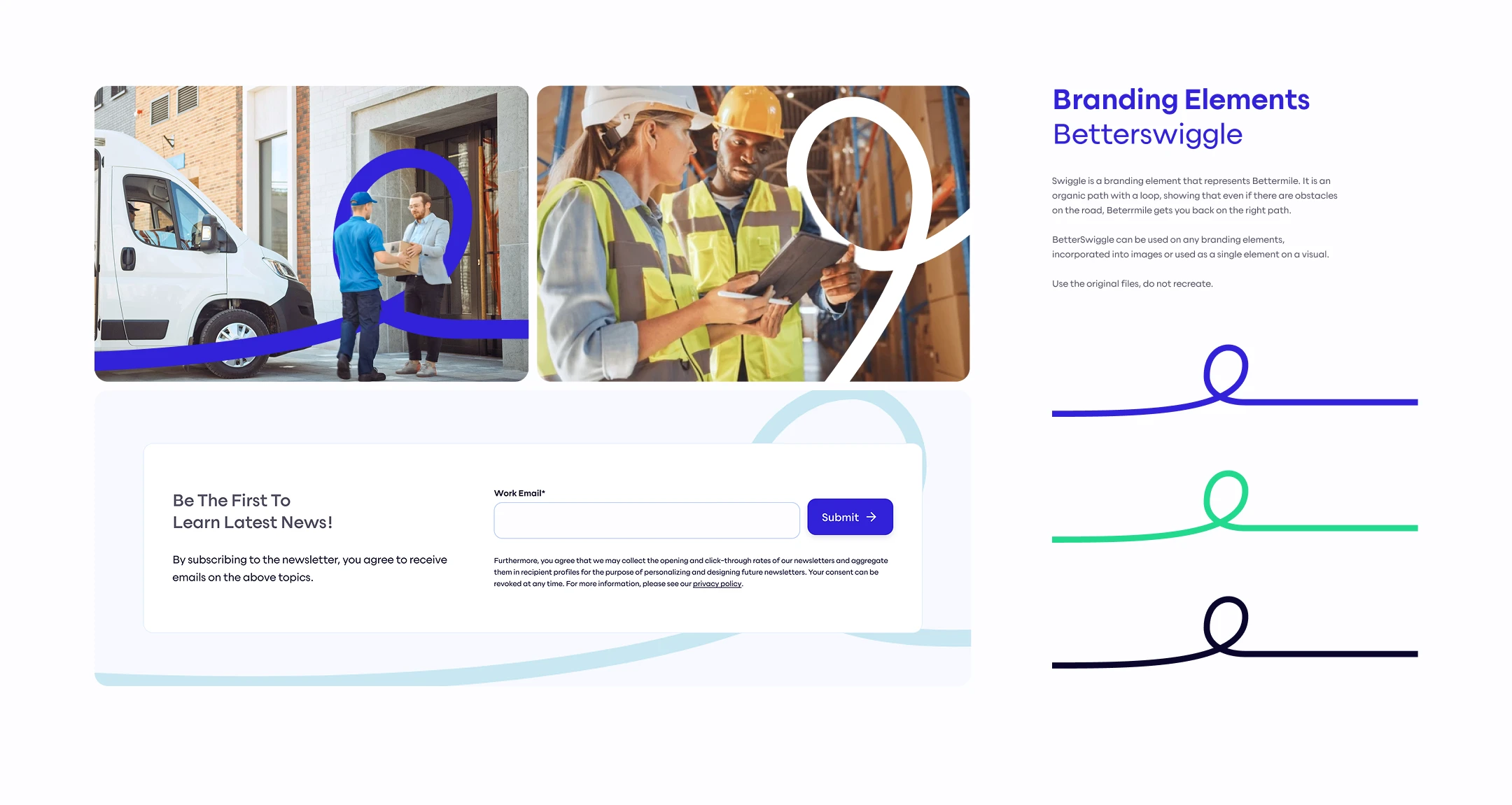
Betterswiggle – an element they've been using here and there turned into a recognisable element, showing iterations, roads and path
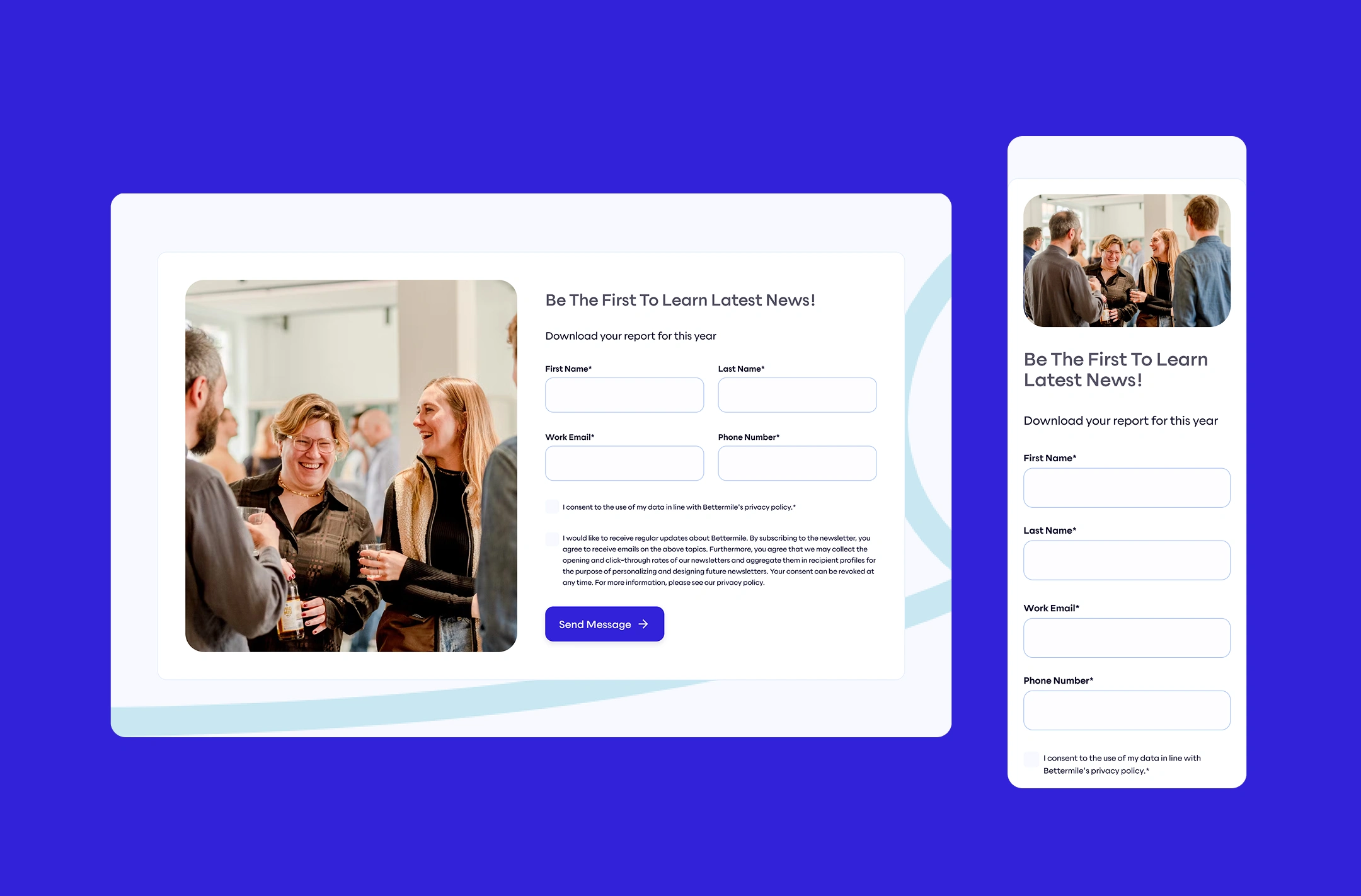
form section – desktop & resonsive
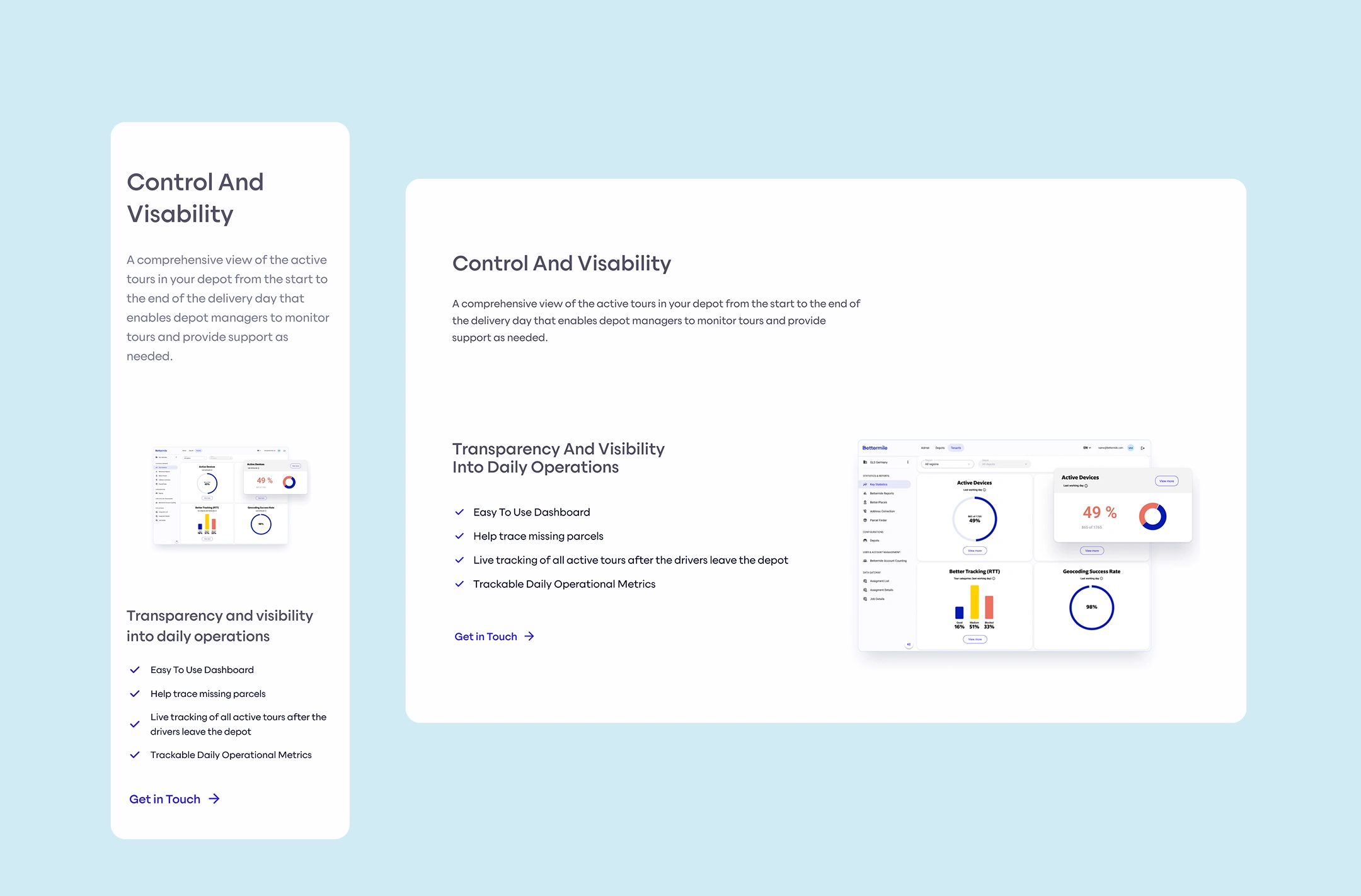
Adaptable text + image section with links, lists and additional title section
Like this project
Posted Jul 16, 2026
Redesign of Bettermile's website and branding to reflect their leader status in last-mile solutions.
Likes
2
Views
16
Clients
Bettermile