Nature-Inspired Logo Design for Earthwise Services
Kris Kulaftakis

OVERVIEW
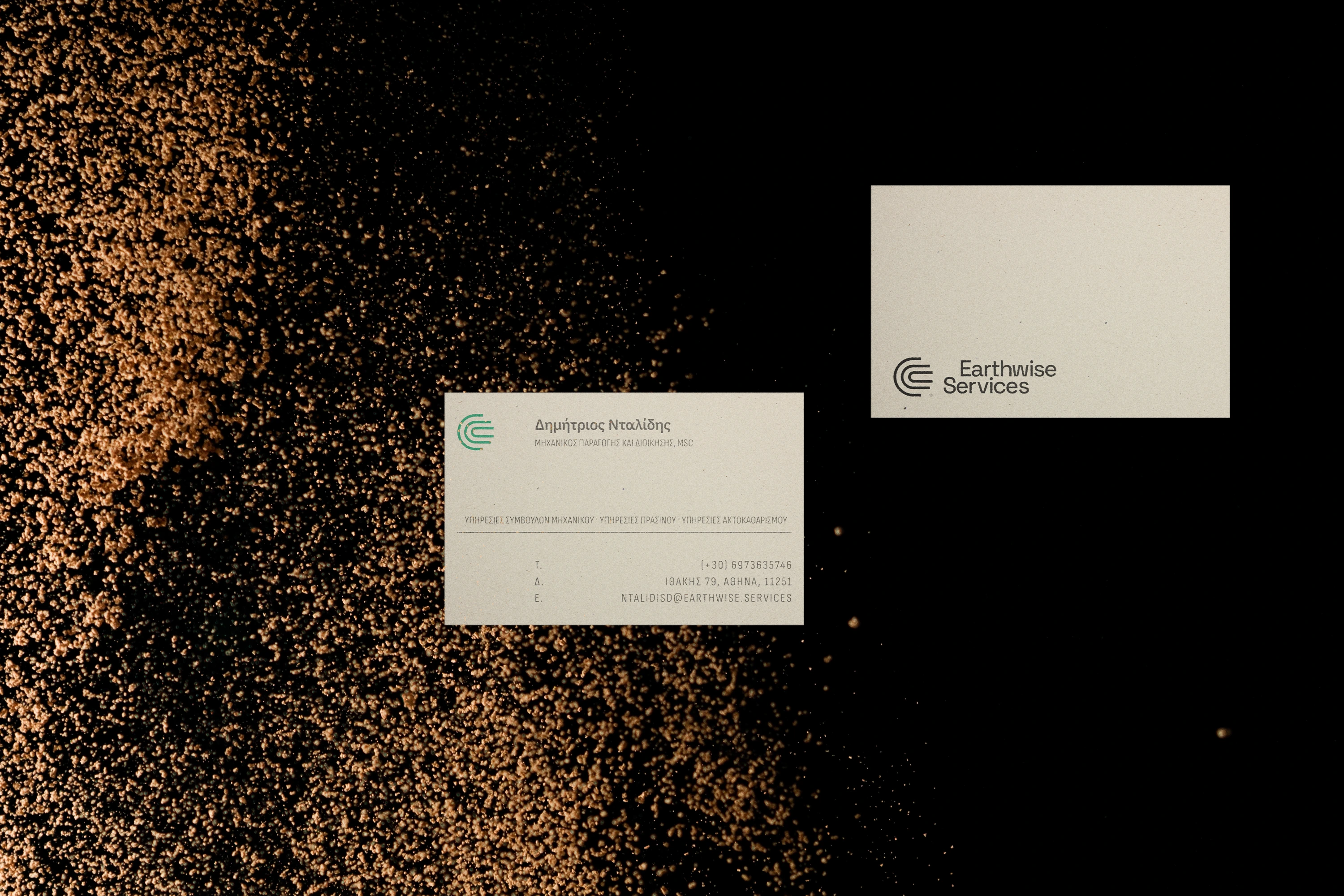
Earthwise Services is a small landscaping business in Athens. They required a new logo that would help position them as reliable partners to public sector organisations and private companies alike.
THE IDEA
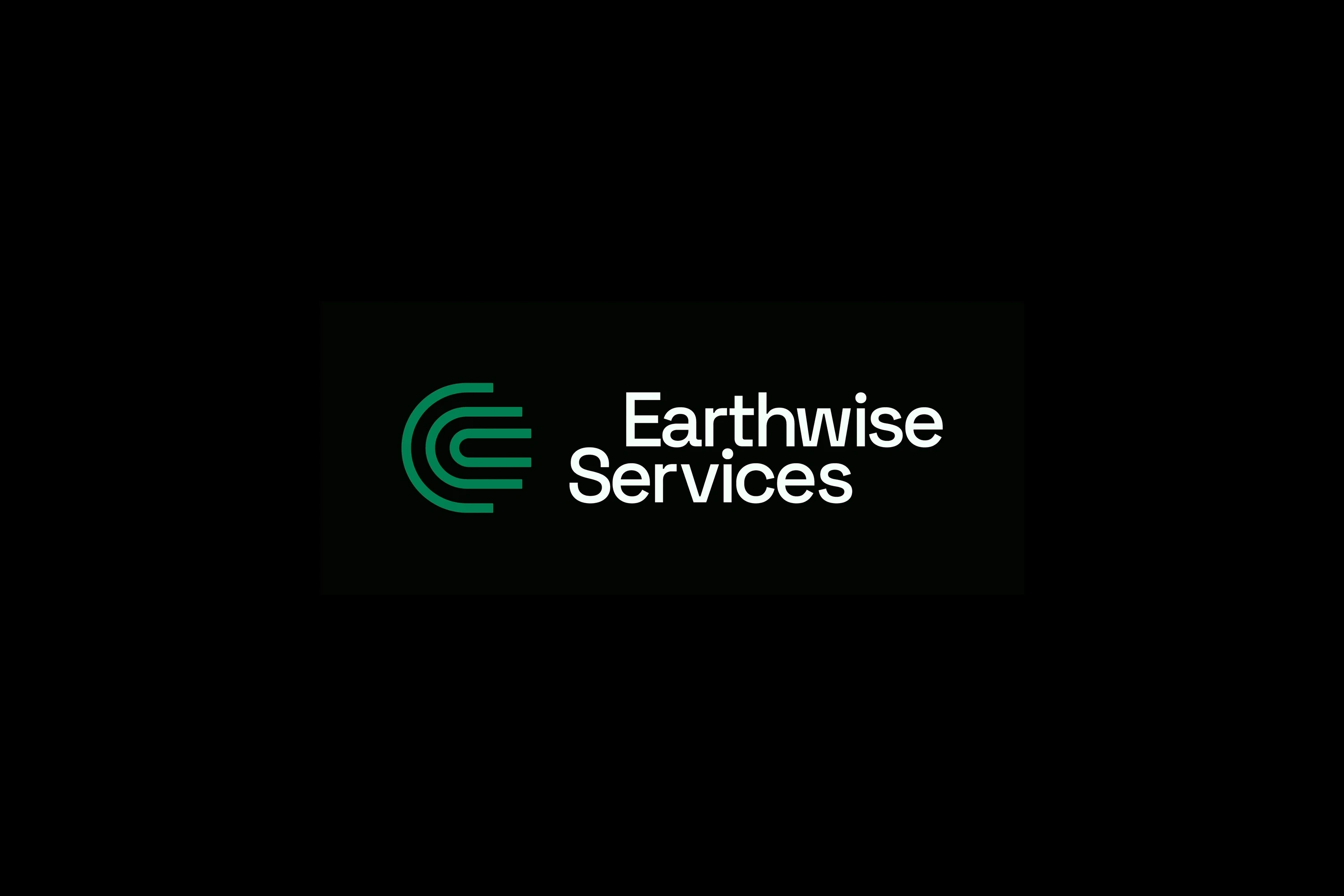
This logo draws inspiration from natural patterns like fingerprint ridges, sand dunes and tree rings, as well as the topographical maps, which inform the landscape design process.
These emanating, organic forms symbolically represent the company’s full range of activities while emphasizing the human touch on the environment and the responsibility that comes with it.
The mark itself subtly references both the letter “e” and the Earth, reinforcing themes of nature and sustainability.
IBM Plex Sans was chosen for its balance between technical precision and human warmth, aligning with the company’s ethos. The typographic lockup of the logo was off set for optical balance and to aid recallability in cases where the icon is absent.


Like this project
Posted Jun 11, 2025
Designed a nature-inspired logo for a small landscaping company in Athens.