Beeminder Redesign
Josh Pitzalis
This post was originally published on the Beeminder Blog.
In April this year I began working with the Beeminder team to redesign their interface. Over three months, I tracked a total of a 167 hours towards the project. But let’s start at the very beginning.
Why a Redesign?
It took me a little while to understand Beeminder when I first started using it. Once I figured it out, it became indispensable. I started and followed through on new habits, projects, and routines more successfully than I ever had before. My friends liked the idea of Beeminder, or at least found it interesting enough to try, but most of them couldn’t understand how to use it. I got in touch with Beeminder to ask if they planned to redesign the site, because I had some ideas. To make sure this wasn’t just my friends, I bought some remote user testing credits to see how strangers handled the interface. I asked the testers to sign up and commit to two different goals and then change their commitment for one of them. None of the participants were able to complete the tasks in the 20 minutes allotted. This convinced me that Beeminder was too focused on people who were already familiar with the idea of Quantified Self and commitment contracts. I wanted to make it easier for anyone (like my friends) to start using Beeminder. It turned out my timing was perfect because the Beeminder founders felt the same way and liked the idea of working with someone who already understood Beeminder.
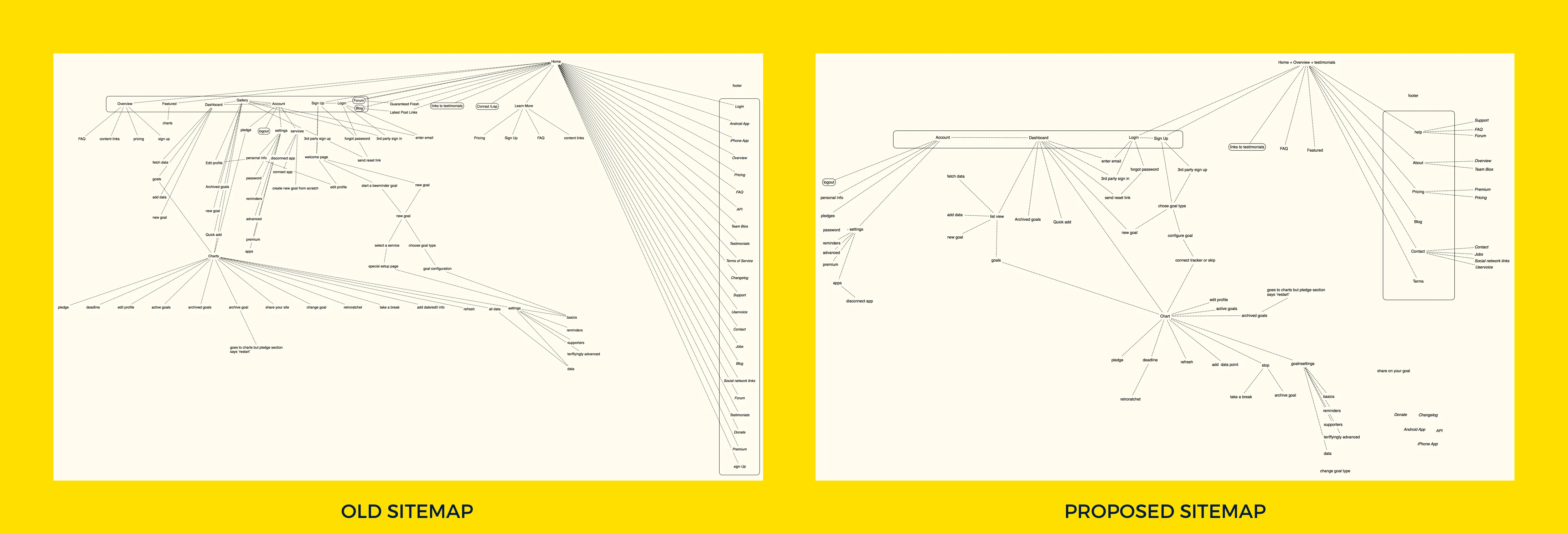
The Sitemap
Beeminder is a complex application and there were a lot of bits that needed to be gathered before the project began. We collected concerns, jobs to be done, and problems to avoid and began sorting them by the type of users they pertained to. The existing sitemap listed out 211 pages. Many of these pages overlapped and a lot of similar functions spread across multiple pages were consolidated.
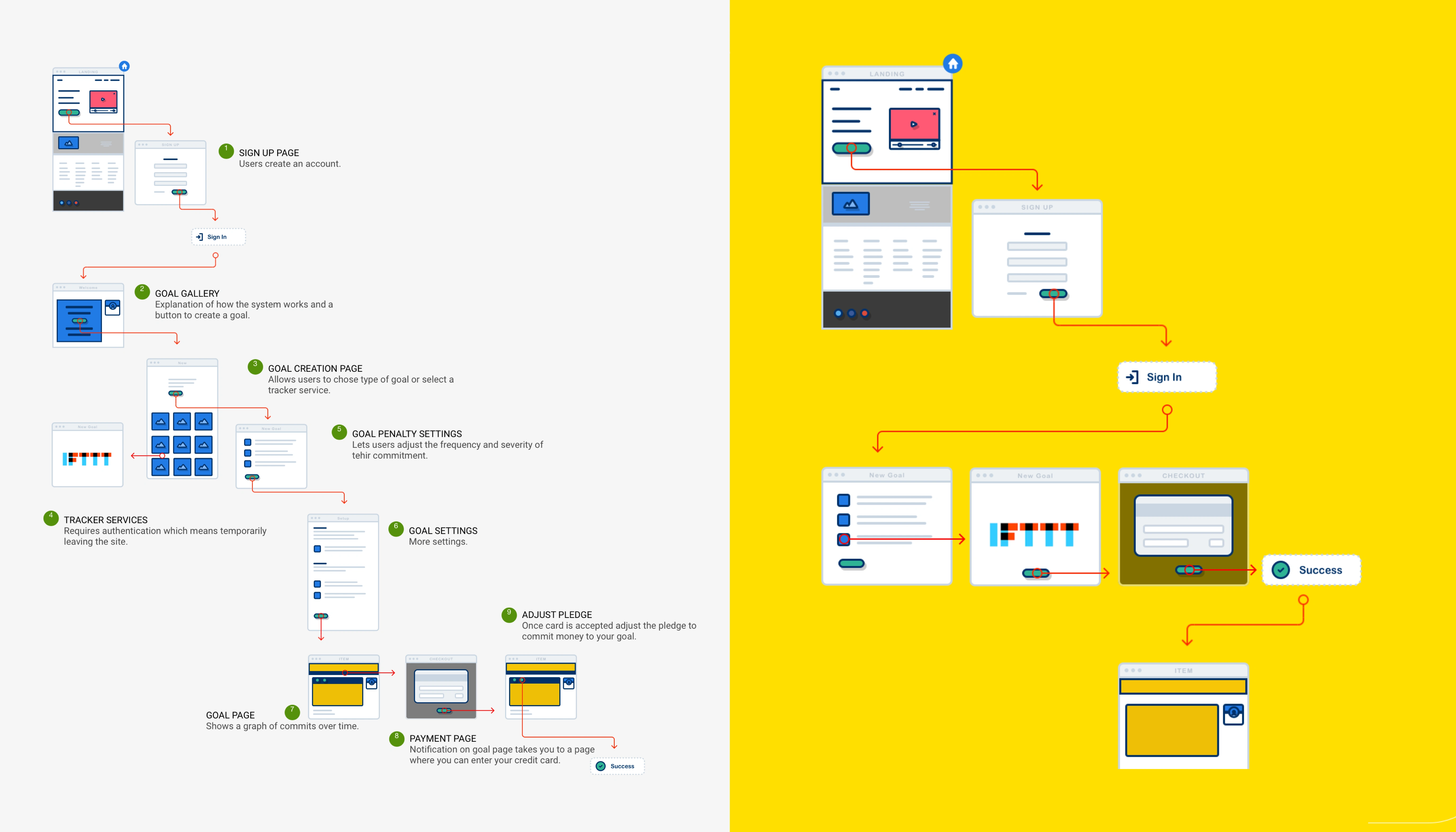
We focused on building flowcharts that linked the most critical functions first. For example, this is an early flowchart that connects signing up to starting your first goal:
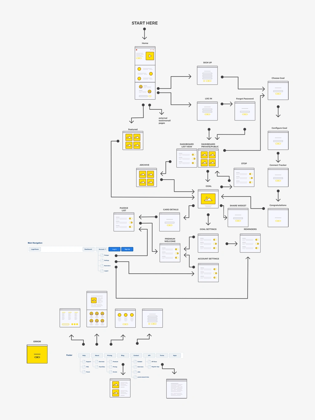
We worked outward until I had all the functions mapped and each of the sequences interlinked. This was our first working draft:
Once we had an overview of how everything was going to fit together we began to lay out the most important elements for each of the screens. We started with mobile screens. The lack of digital real estate forced us to only focus on the essential elements for each screen:
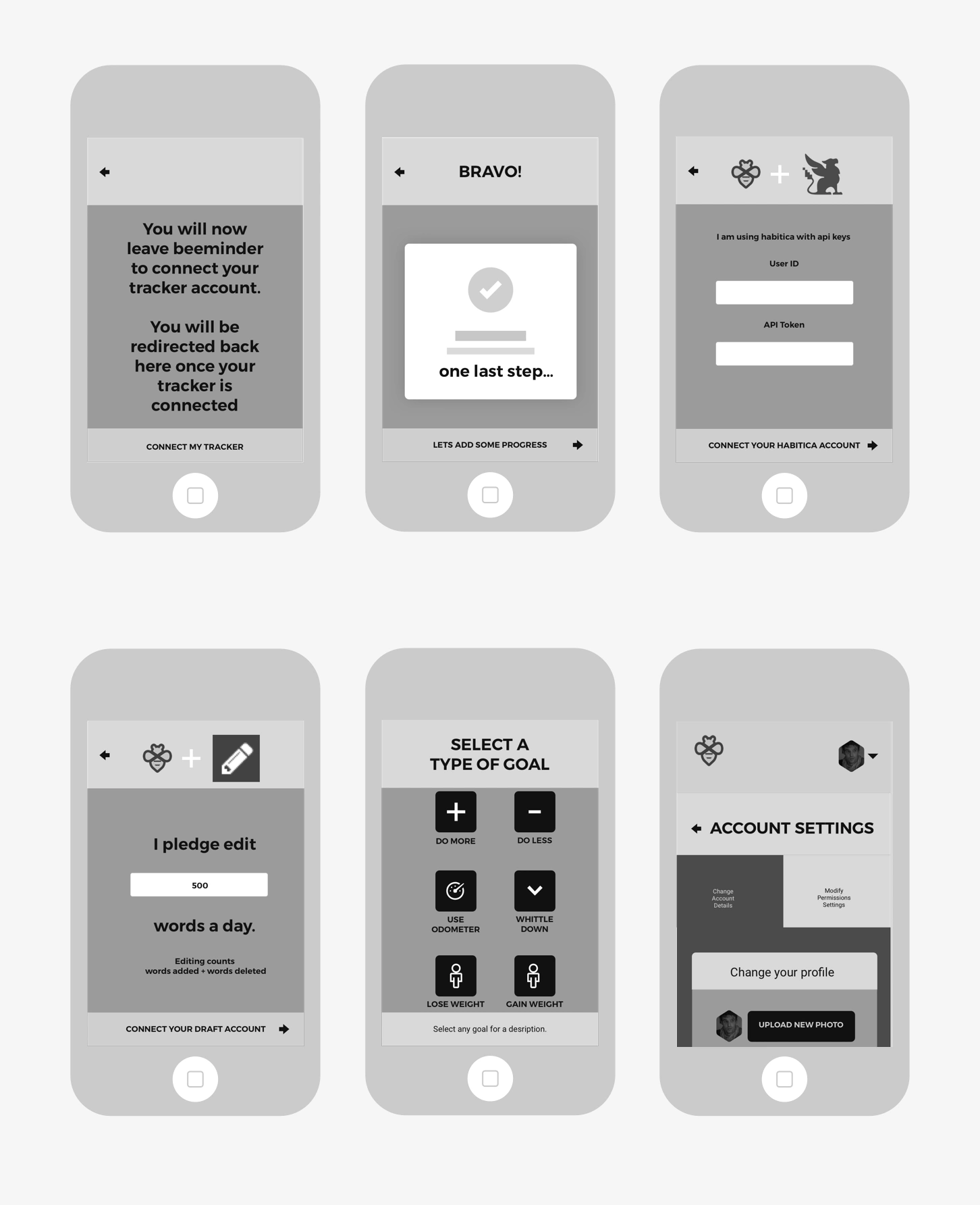
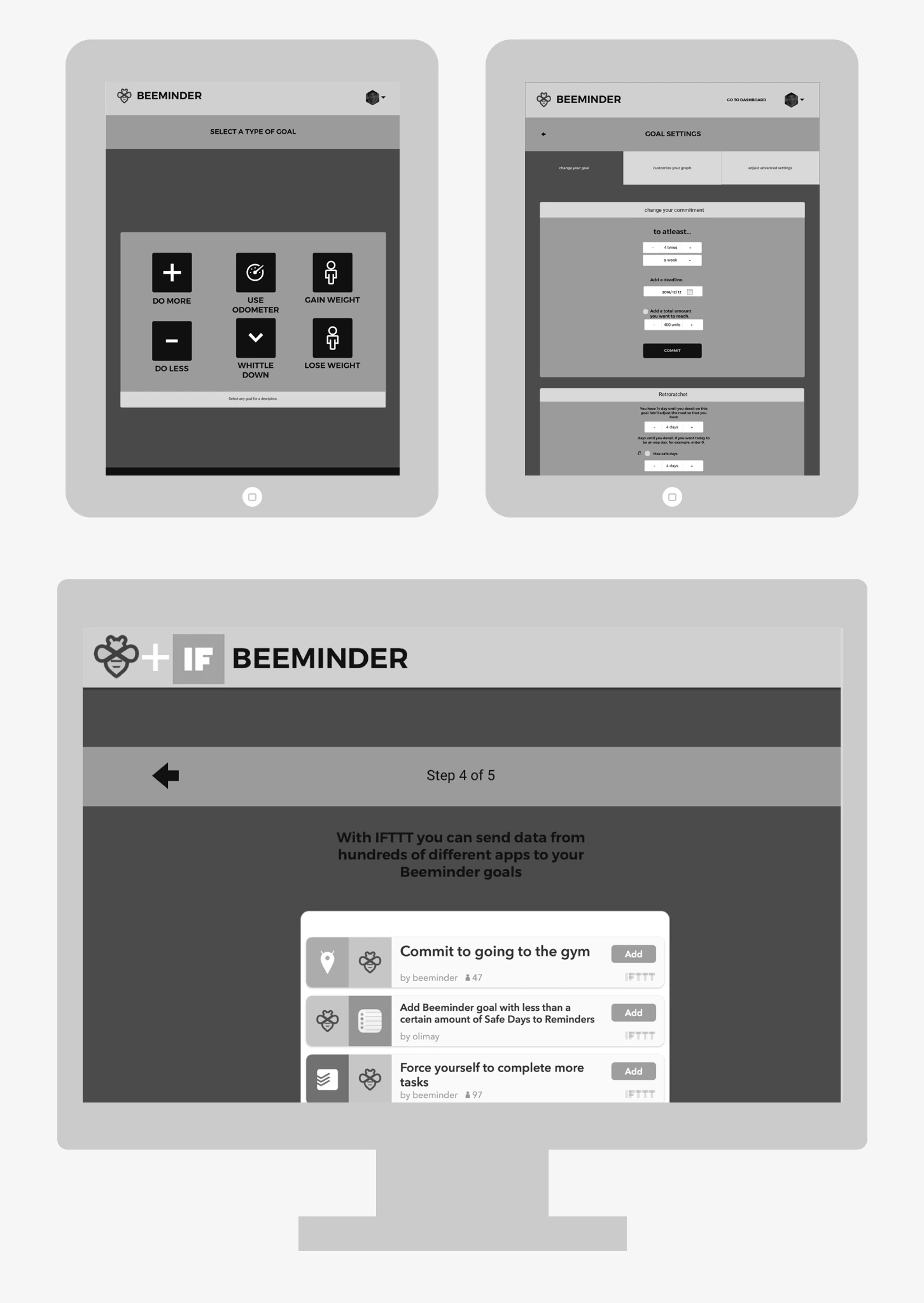
The wireframes were not supposed to look good, they were just meant to work. We stitched them together to create a low-fidelity prototype so we could see how well the new signup process worked with real people. Each time we showed the prototype to a new user they were asked to complete three tasks. There was significant variance in the age and occupational background of these early testers so I only changed something if 3 people brought it up. This process went on for about two weeks until people could finish all their tasks without any problems or questions. With the mobile wireframes stabilised, we progressed to wireframing the screens for tablet and desktop resolutions:
Most of what you see on a screen is type. Type is in the content, navigation, on buttons, in headings, and everywhere else. Given how much space words occupy, we worked on selecting the typefaces before we got involved in designing the individual components. The display font we selected is Trueno Semi Bold. We wanted a typeface that was indistinguishable from the old logo typeface. Of all the options shortlisted, Trueno letterforms had the most space inside the letters, making it the most readable. The display typeface was for headers, titles and buttons. At first we paired it with Roboto Regular as a body typeface. We needed something that matched the display font but was also legible at small sizes and in large blocks of text:
Eventually we moved to Source Sans for the body. We didn’t want to use a third typeface to bridge the two fonts so we went with Source Sans pro so that we could use the body font in ALL CAPS as a third font.
With the wireframes and typography in place we began focusing on designing the smallest and most common components on every page. Starting with the smallest bits first helped establish visual rules that we could then follow for the rest of the design.
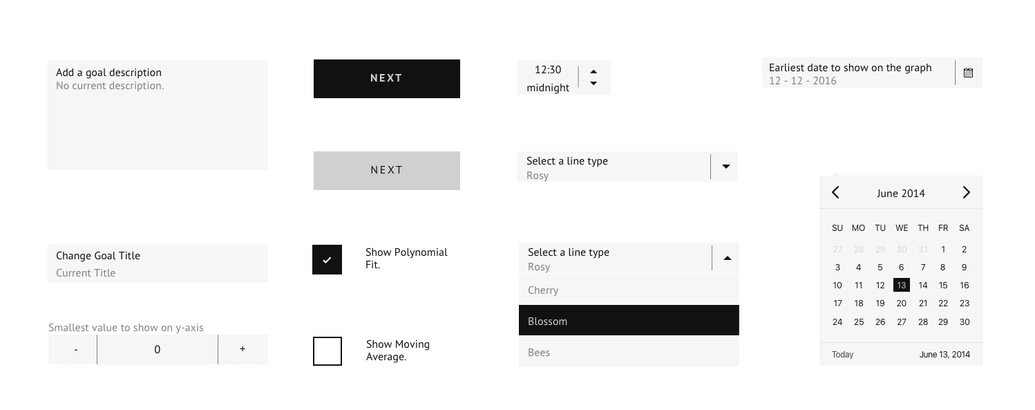
For example, setting the margin spaces on the smallest components decided things like spacing patterns when the components came together to form larger chunks. We drew on examples of how other applications in the system solved equivalent problems. We needed elements that behaved the same to look the same. At the same time it was important for elements that behaved differently to appear different and be inconsistent. In most cases we followed conventions to prevent unnecessary confusion. We tried to keep Beeminder’s nerdy, data-centric aesthetic while adding a touch of sporty to the mix. Sporty because of the 2 out of 6 goals types, and 8 out 21 integrations, are fitness related.
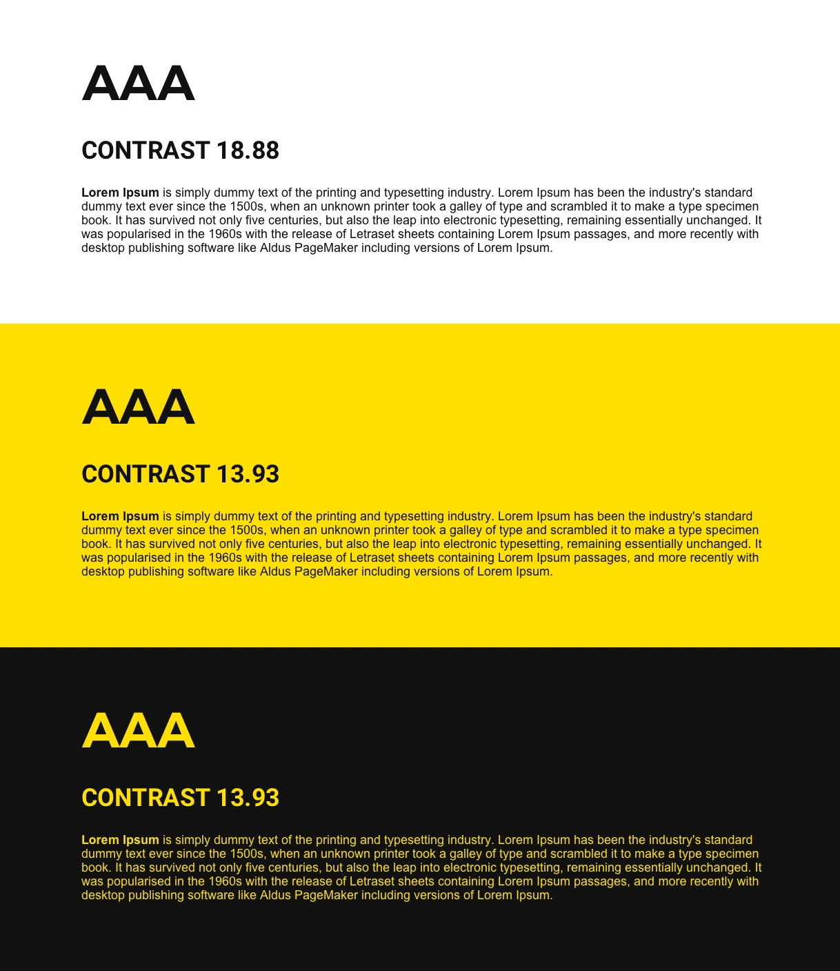
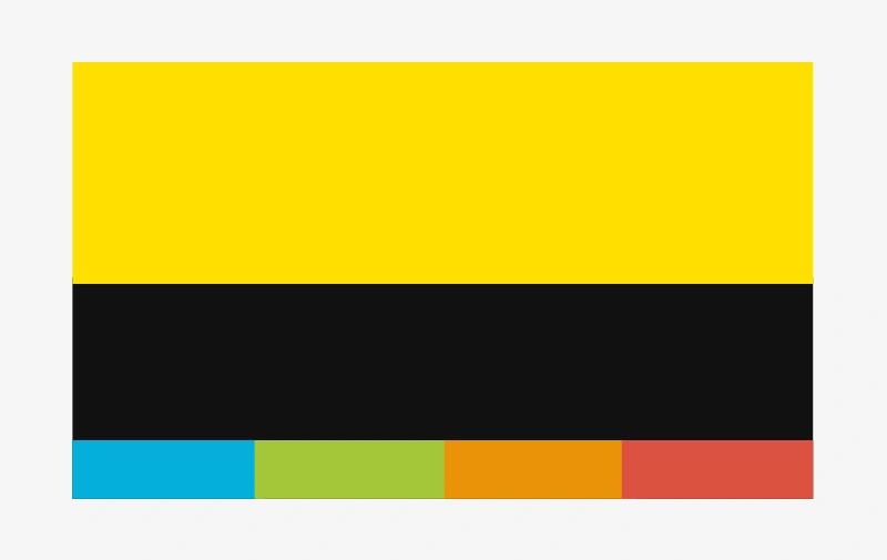
Up till this point we were relying on proximity and contrast to distinguish elements. Designing everything in grayscale meant that we could now use colour as a tool to draw attention to the most important parts of a page. We used a high contrast yellow and black for the typeface. Beeminder is an application that takes your money if you don’t get things done. This is serious and it’s important that the interface doesn’t try and hide this. One approach was to limit the interface to two colours. Orange for alerts and a single yellow hue at different intensities to indicate the severity of a goal. We also tried the existing 4 colour palette but adjusted it so that the colours were more accessible for the colour blind.
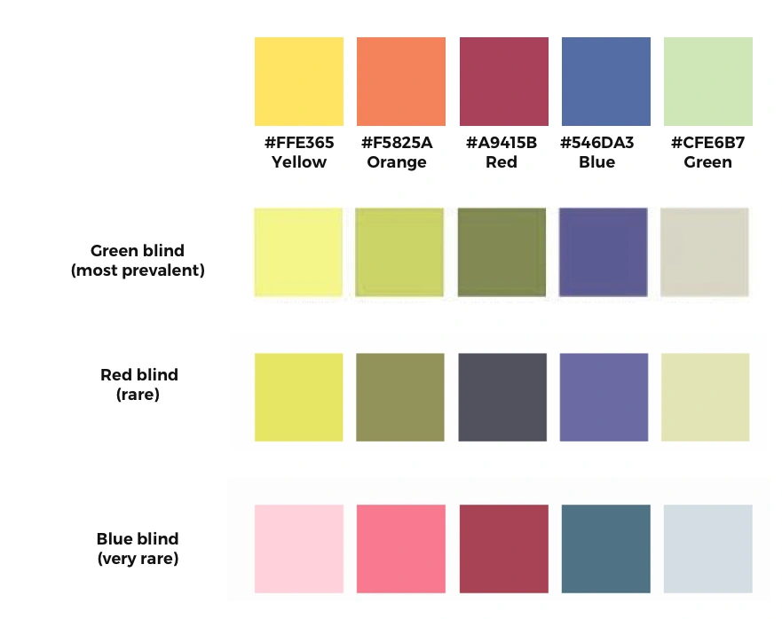
In the end we balanced the existing palette so that the colours complemented the high contrast yellow and black used for the typeface.
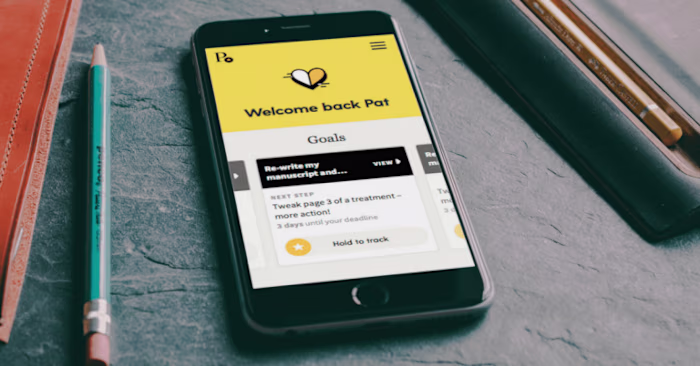
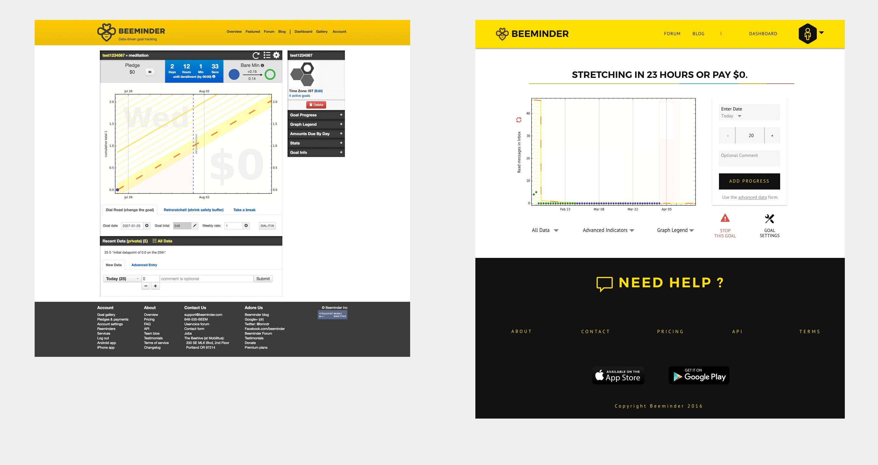
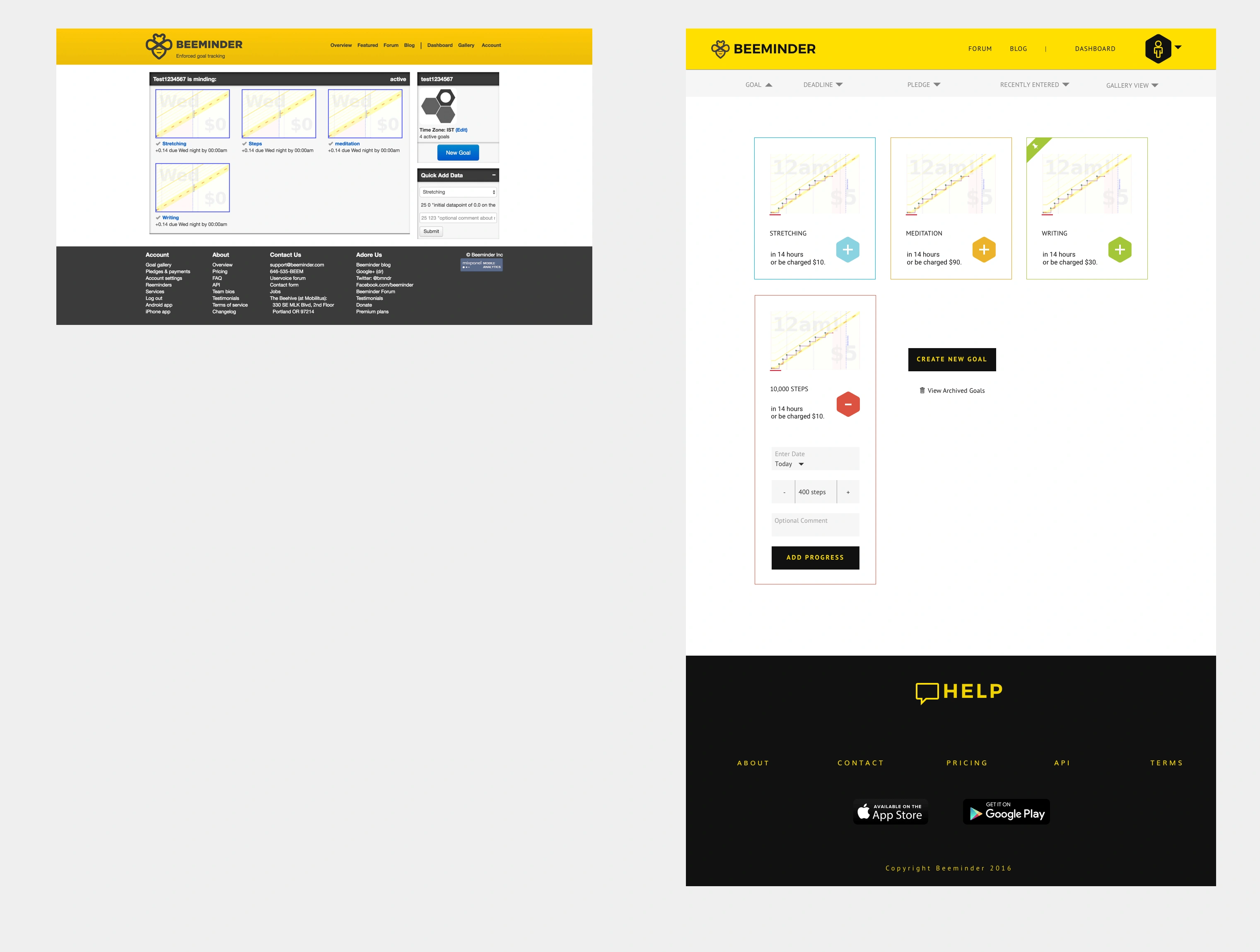
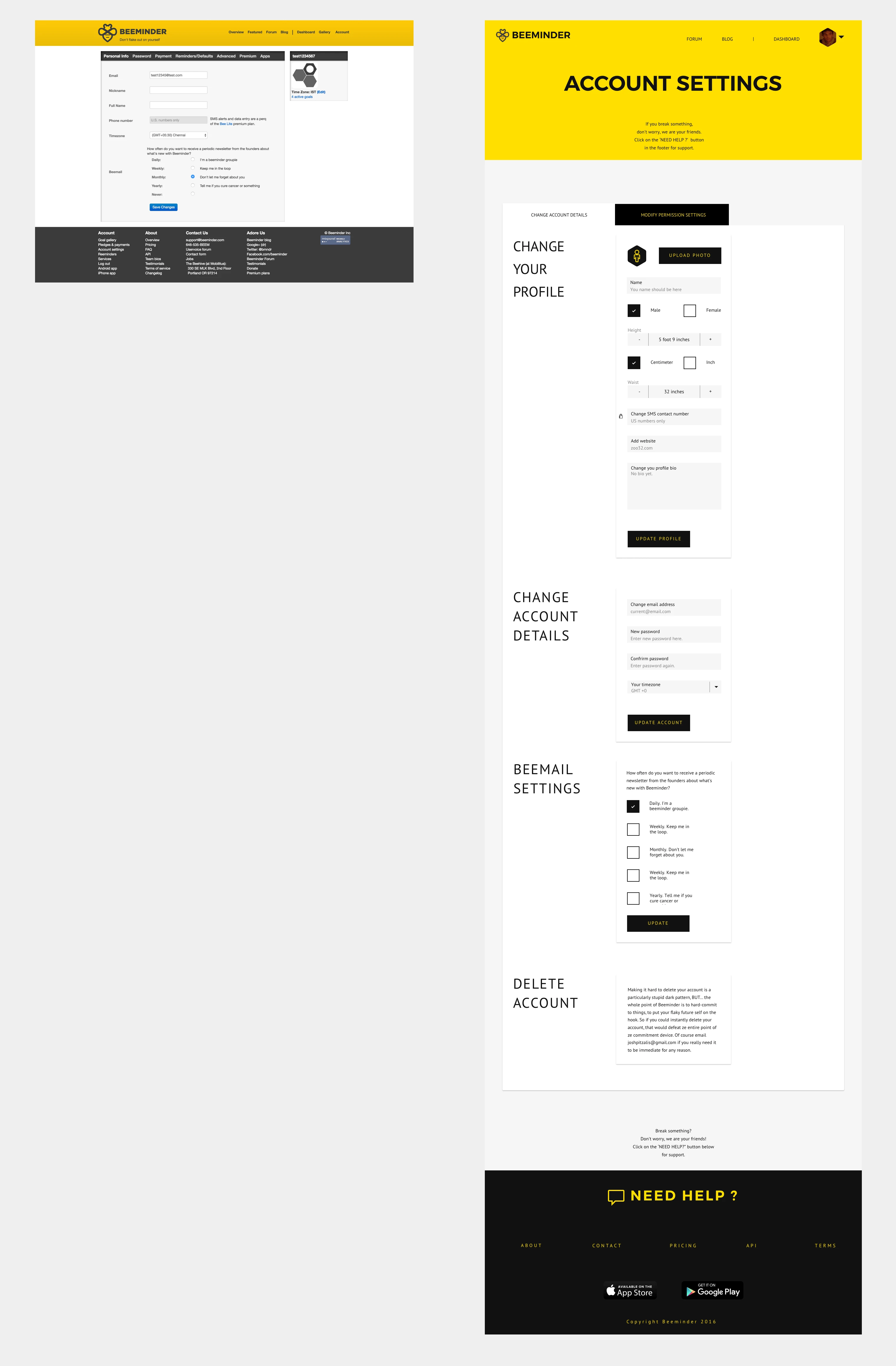
With the wireframes set, the typography decided, the components designed and the colour in place the last step was to finalise each of the 70+ webpages. Initially there were three types of screens. The first were the main screens. Dashboard and goal pages, where people spend most of their time.
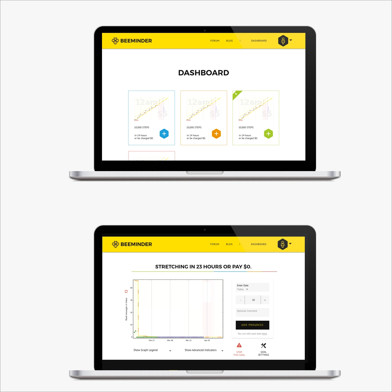
Then there were the transition screens. Anything that is part of a process. Signing up, setting up a goal, connecting your card, etc.
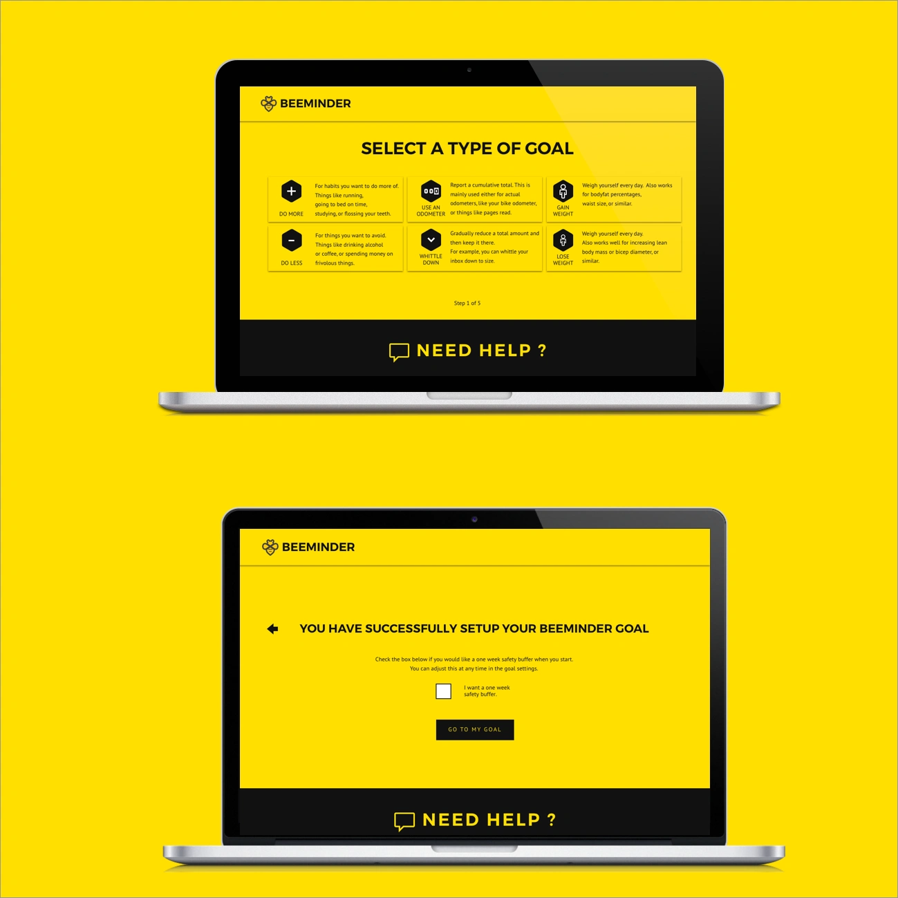
The idea was to make these pages jarring. They represent being in the middle of a process and the point was to either move forwards or backwards, but not hang around. The last type of screen is any kind of setting screen.
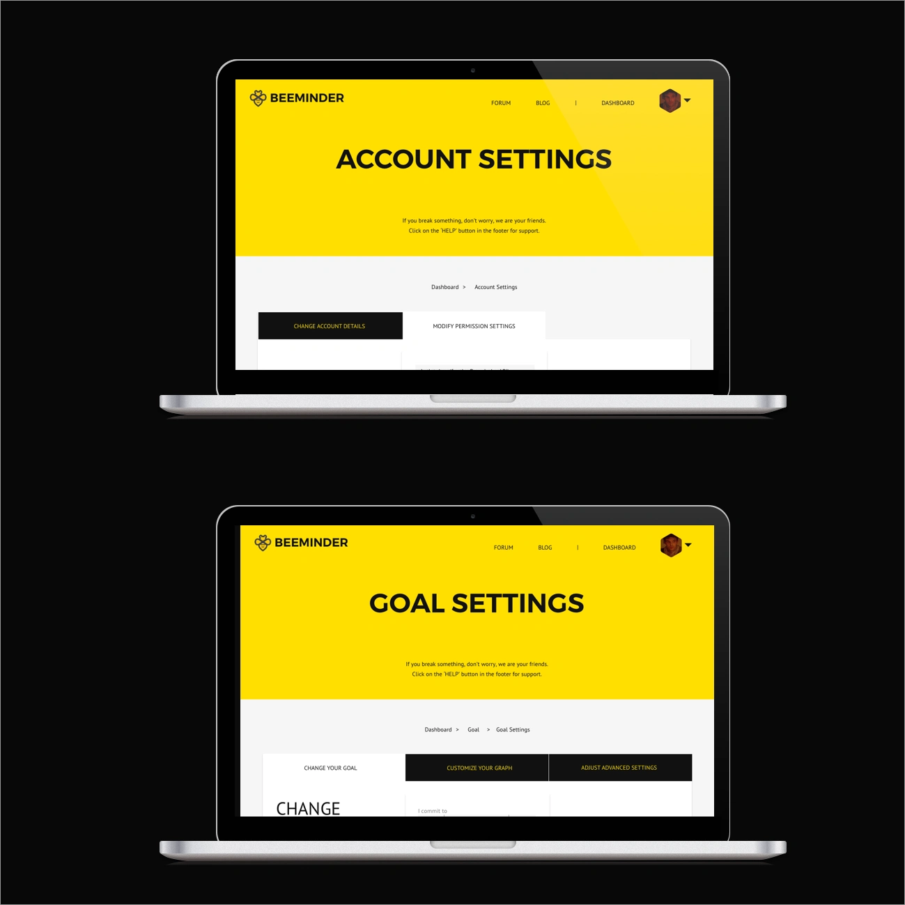
People spend more and more time on settings pages as they transition from beginners to regular users. The idea was to make things much easier on the eyes than transition screens but still distinguish them from the main pages.
Design as an Error Correcting Process
At this point we started testing the new designs on existing users. We needed to understand how the changes affected usability for Beeminder power users. Testing the new design with existing users led to a huge round of changes. For example, the dashboard and gallery pages had been merged into a single dashboard. This new dashboard looked a lot like the gallery but it became clear that there was a preference for the table layout from the the old dashboard. Another major change was that the goal setup process focused on the purpose of the goal before it asked you about integrations. This made it easier for beginners to design goals without being overwhelmed by all the third party integrations. For existing users this meant too much hand holding, so we moved the integrations page to the front of the process. These changes necessitated a new round of user tests since all the tests up to this point were invalidated. We no longer knew how difficult the new setup process was for newbees. Rather than testing the site as a mockup, we began coding the designs and decided to run the next round of tests on an early build of the actual platform.
Final Designs
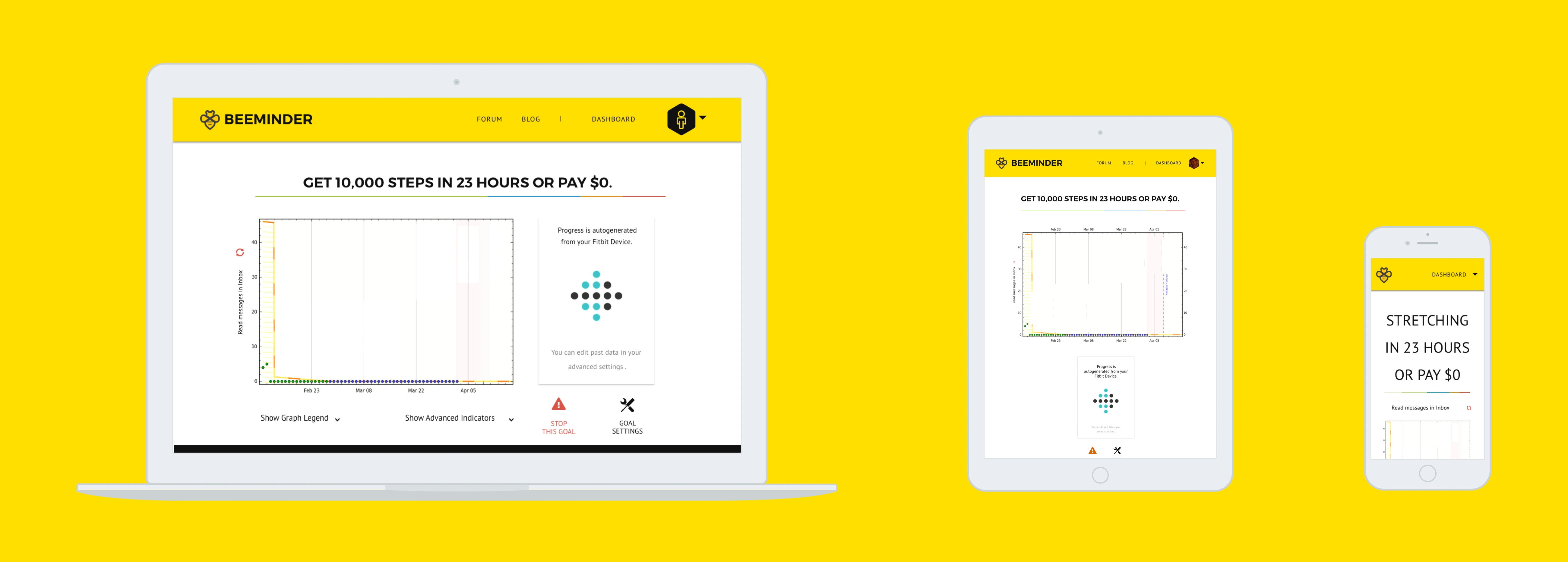
Below are some of the final design compared to their original screens.
As a web designer, I am horrible at justifying design choices and formulating persuasive arguments for why something should be done a certain way. My approach so far has largely been based on the unsupported belief that good design should speak for itself. As a web designer it is my responsibility to be able to explain basic principles of design and then communicate the benefits of using them. I have to outline how and where these principles have been implemented and then connect the benefits back to the larger goals for the project. This process takes a huge amount of time to do. However, if a few extra hours of clear communication prevents something from being designed by committee then it will save everyone a lot more time and money redoing the work. It is therefore my responsibility as a web designer to prevent it from happening. Another thing I learned is that I should have designed a pattern library. Beeminder added lots of new features and changed their entire pricing structure in the time that it was being redesigned. Now I have committed to shipping an HTML and CSS UI library of all the components with any design work I do. This way my clients have all the blocks to rearrange and build new elements as they need to. This was by far the most interesting design project I have worked on so and I am incredibly grateful to the Beeminder team for giving me the opportunity. I would also like to thank everyone who took the time to test the interface as it was being designed. Your feedback was essential, and I appreciate your help.
Like this project
Posted Aug 4, 2025
Redesigned Beeminder's 211-page interface over 3 months.
Likes
0
Views
8