This one got really good
Vinit Deshwal
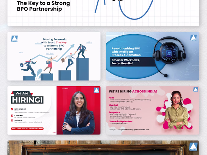
This one got really good feedback from the client.
The brief was about trust and long-term partnerships, so I wanted the visual to carry that message without needing a wall of text. The handshake felt like the right anchor, but I didn't want it to look like every other corporate handshake graphic out there. So I went with halftone illustration and those flowing lines to give it some energy.
Sometimes the simple concepts hit the hardest. Its all about figuring out the user experience at last.
Like this project
Posted Feb 14, 2026
This one got really good feedback from the client. The brief was about trust and long-term partnerships, so I wanted the visual to carry that message without...
Likes
0
Views
4