Using Figma for Design Handoff 🤝
The Contra product design adopted the following page template to ensure a clean and consistent handoff with the rest of our team members.
Separate handoff page
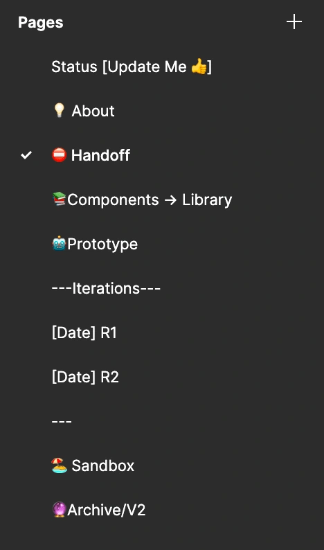
Within our project template, we have a dedicated page for designs that are to be handed off. By keeping them in a separate page, other team members know exactly where to look for finalized designs.
Handoff page status
We use the following emojis to portray the status of the designs in the handoff page. We add them to the sidebar so anyone can understand what stage we're at at a first glance.
✍️ Handoff page is in progress
⛔️ On hold/not ready
✅ Ready for development
🚢 Shipped
Handoff page setup
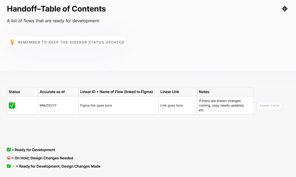
Table of Contents/Flow Headers
We use a table of contents to outline all of the flows and their associated Linear task (what we use to manage projects) that are in the handoff page. This allows for easy searching and allows for broader understanding.

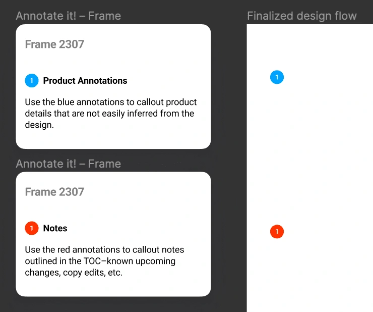
Annotate It! Figma plugin to annotate designs
💙 Blue should be used for product annotations–to callout details that are not easily inferred from the design
❤️ Red should be used for additional notes that the engineers should be aware of and are outlined in the table of contents–known upcoming changes, copy edits, etc.
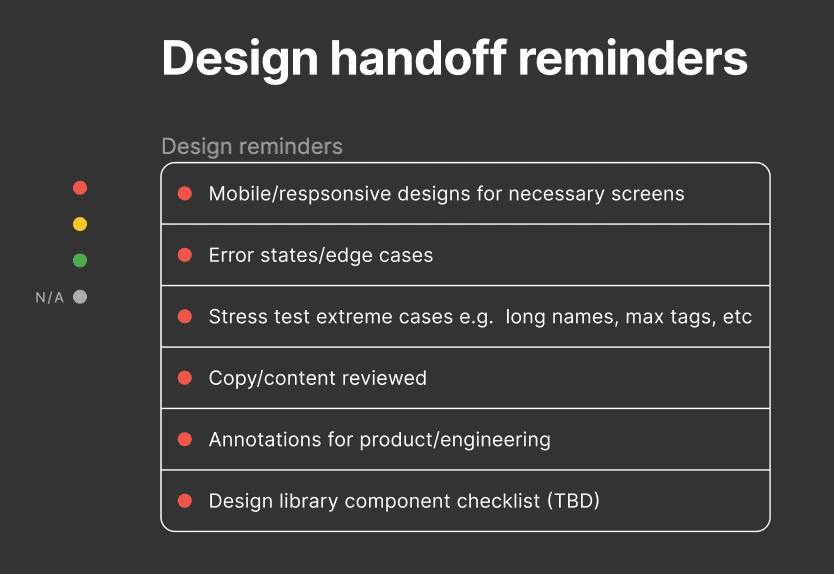
Design handoff reminders
We use the following table as a helpful to guide to remember any states that can easily be forgotten 🤝
And that's everything in our Figma handoff page! This set up has allowed us to cut down on handoff time and keep our process consistent and clean.
Like this project
Posted Oct 6, 2022
How the product design team at Contra uses Figma to handoff projects to engineers


