Hip Pop Hooray | Gelato, Popsicles & ice cream Logo

VISENGINEER


Brand concept (EN):
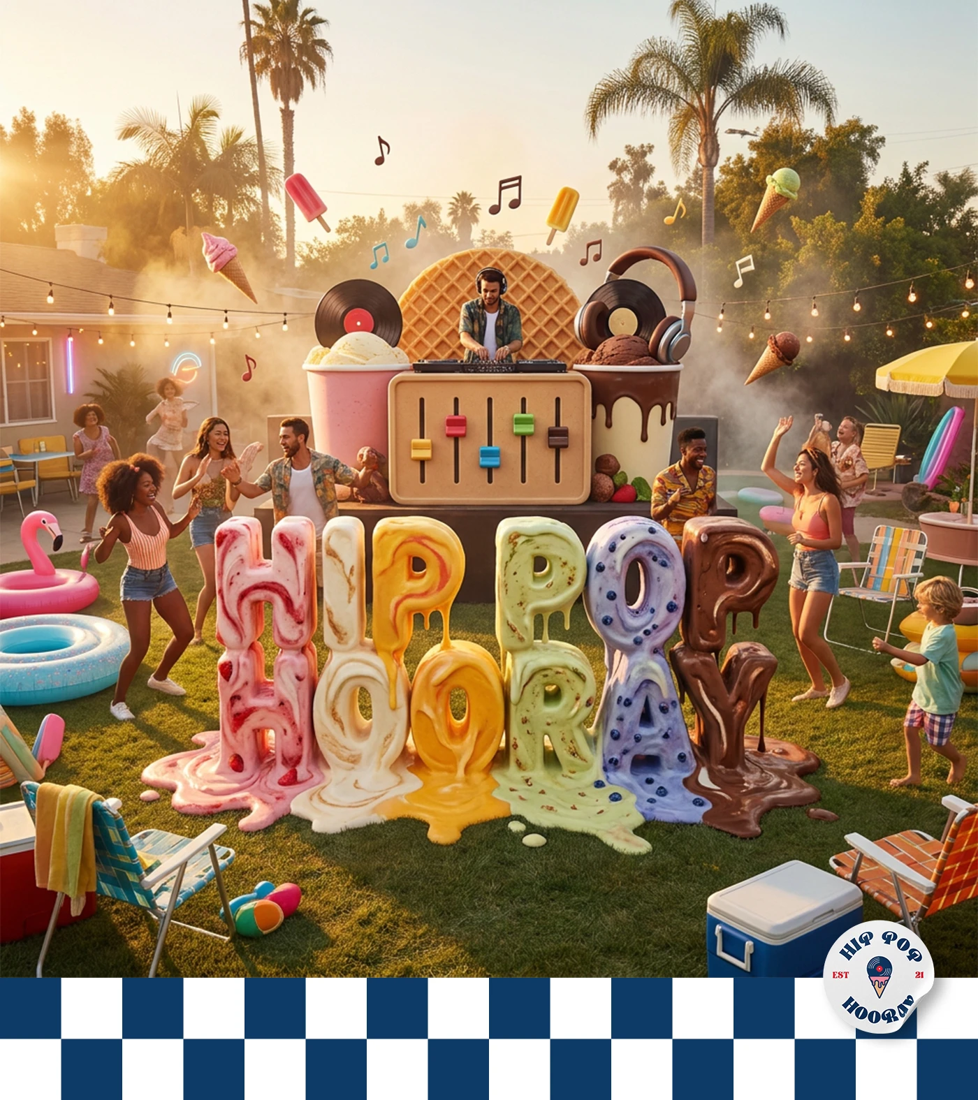
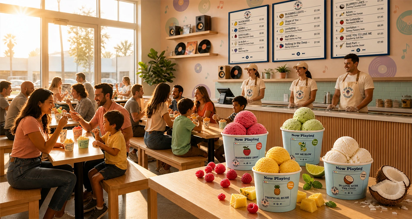
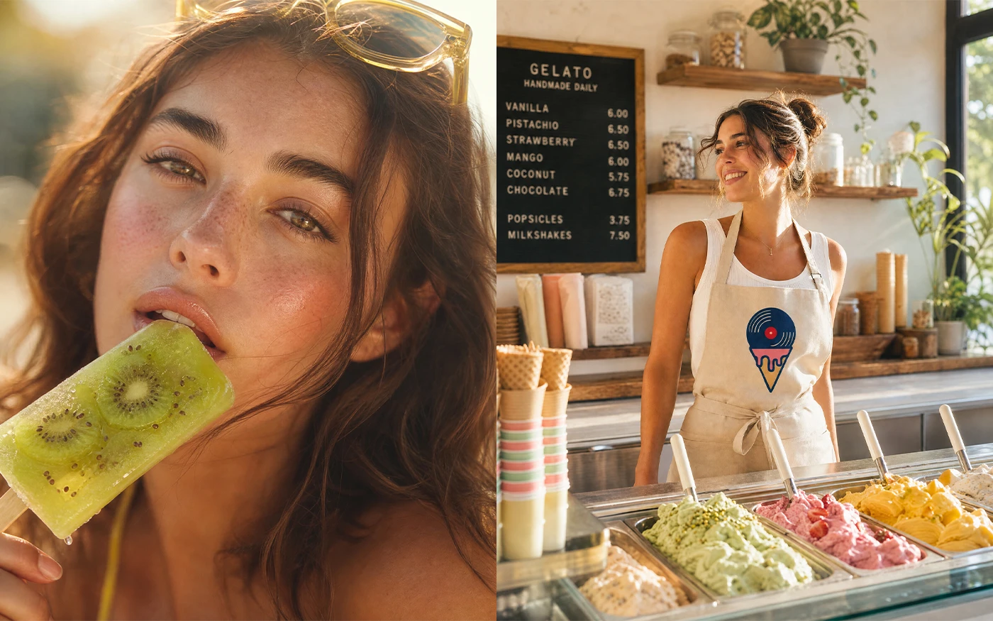
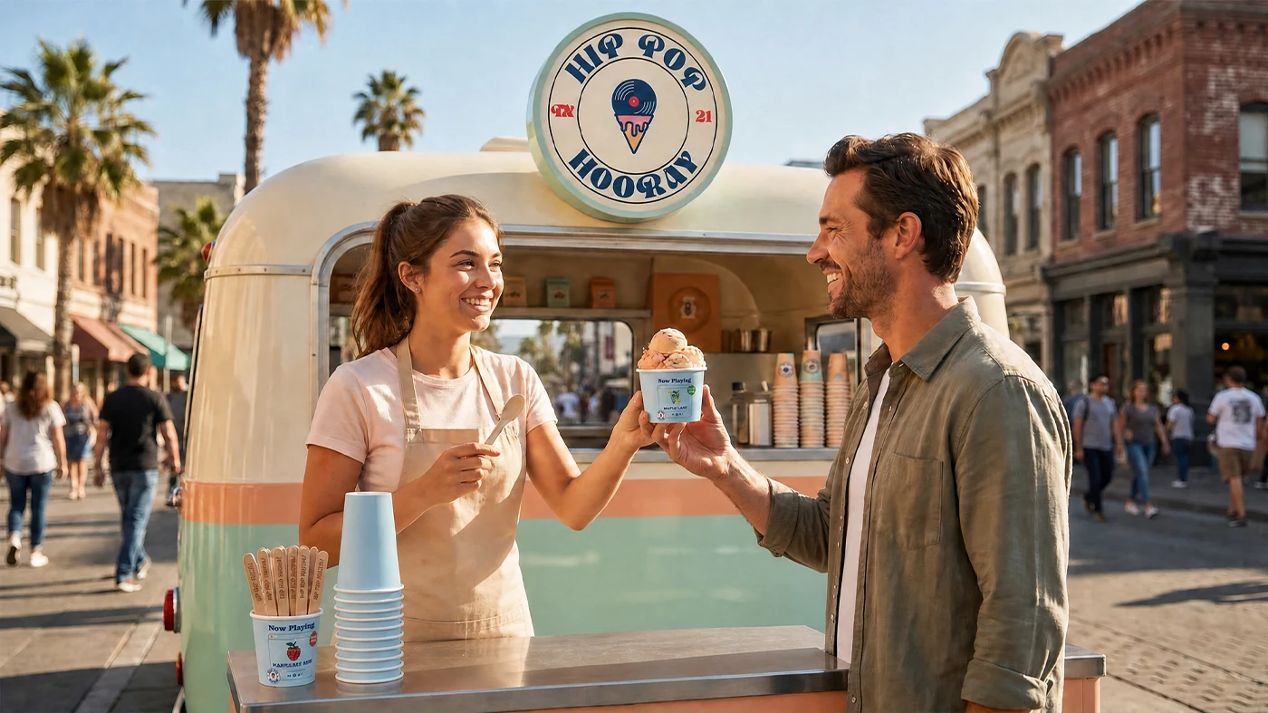
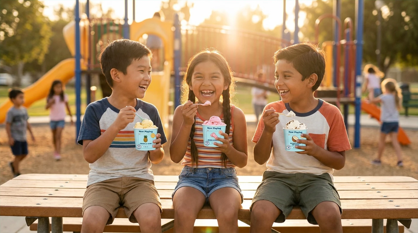
Hip Pop Hooray is a brand that fuses the electric energy of 90s hip-hop with the nostalgic joy of summer treats. It’s a place where family, rhythm, and flavor collide vibrant popsicles, artisanal gelatos, all set to iconic beats. Each visit is a multisensory escape, where a curated 90s playlist amplifies every bite, making each scoop a memory, every visit a celebration.
Concepto de Marca (ES):
Hip Pop Hooray es una marca que fusiona la energía eléctrica del hip-hop de los años 90 con la alegría nostálgica de los dulces de verano. Es un lugar donde la familia, el ritmo y el sabor se encuentran: paletas vibrantes, gelatos artesanales, todo ambientado con ritmos icónicos. Cada visita es una escapada sensorial, donde una playlist de los 90 acompaña cada bocado, haciendo de cada sabor un recuerdo y de cada visita una celebración.
Conceito de Marca (PT):
Hip Pop Hooray é uma marca que funde a energia elétrica do hip-hop dos anos 90 com a alegria nostálgica das guloseimas de verão. É um lugar onde a família, o ritmo e o sabor se encontram picolés vibrantes, gelatos artesanais, tudo ambientado com ritmos icônicos. Cada visita é uma escapada sensorial, onde uma playlist dos anos 90 amplifica cada sabor, tornando cada mordida uma memória e cada visita uma celebração.
Marken Konzept (DE):
Hip Pop Hooray ist eine Marke, die die elektrische Energie des Hip-Hops der 90er mit der nostalgischen Freude an Sommerleckereien verbindet. Es ist ein Ort, an dem Familie, Rhythmus und Geschmack sich treffen: lebhafte Popsicles, handgemachte Gelatos, alles untermalt von ikonischen Beats. Jeder Besuch ist eine sinnliche Flucht, bei der eine 90er-Playlist jeden Bissen verstärkt, sodass jeder Geschmack eine Erinnerung wird und jeder Besuch eine Feier.
Concept de Marque (FR):
Hip Pop Hooray est une marque qui fusionne l’énergie électrique du hip-hop des années 90 avec la joie nostalgique des douceurs estivales. C’est un lieu où la famille, le rythme et le goût se rencontrent : des glaces vibrantes, des gelatos artisanaux, le tout sur fond de rythmes emblématiques. Chaque visite est une échappée sensorielle, où une playlist des années 90 amplifie chaque bouchée, faisant de chaque goût un souvenir et de chaque visite une célébration.
Logo idea:
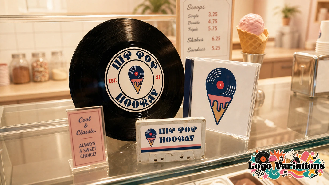
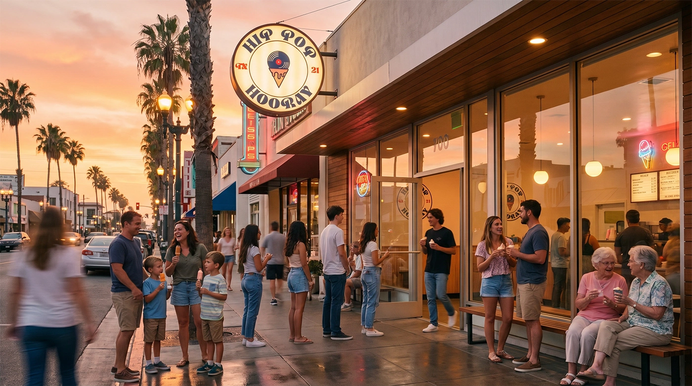
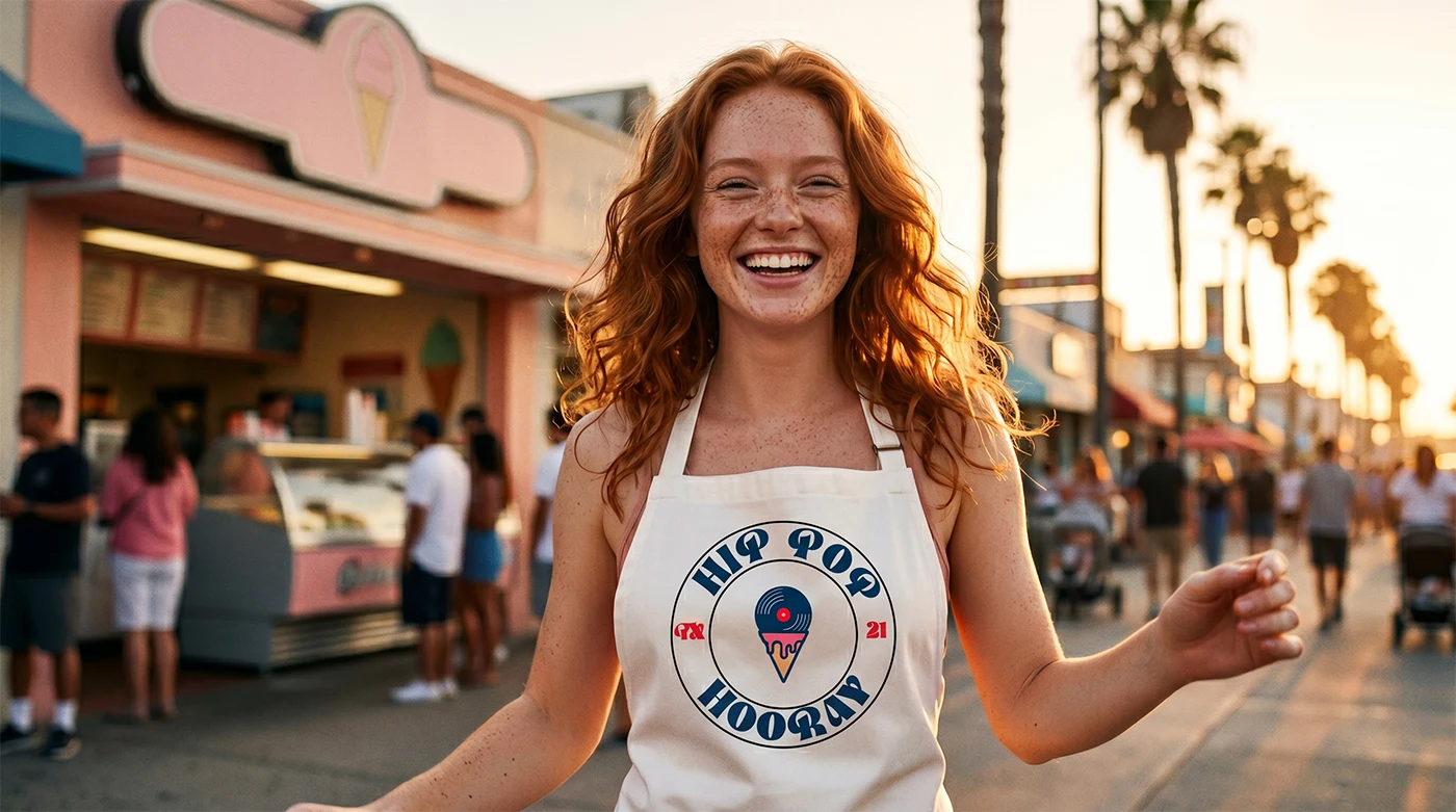
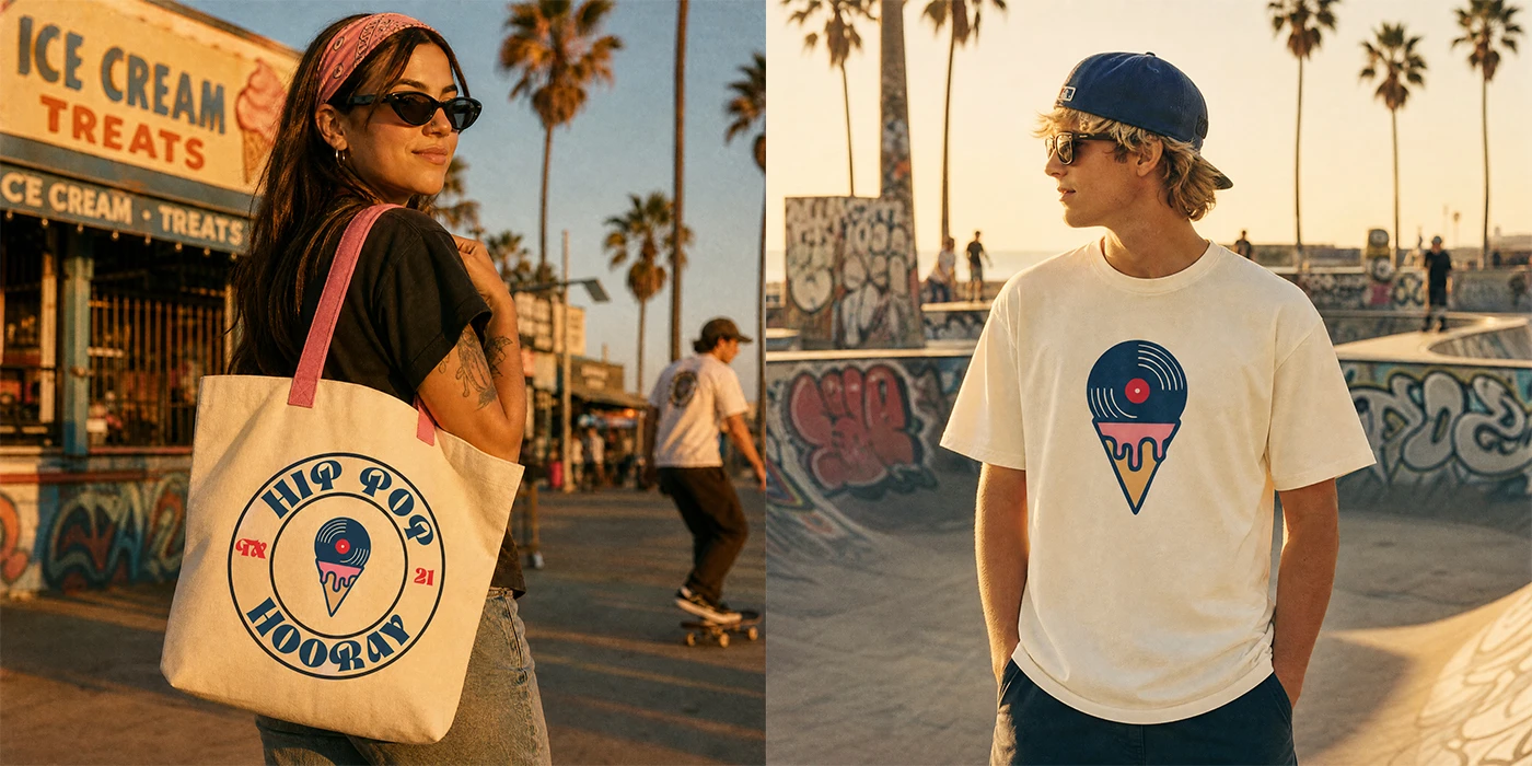
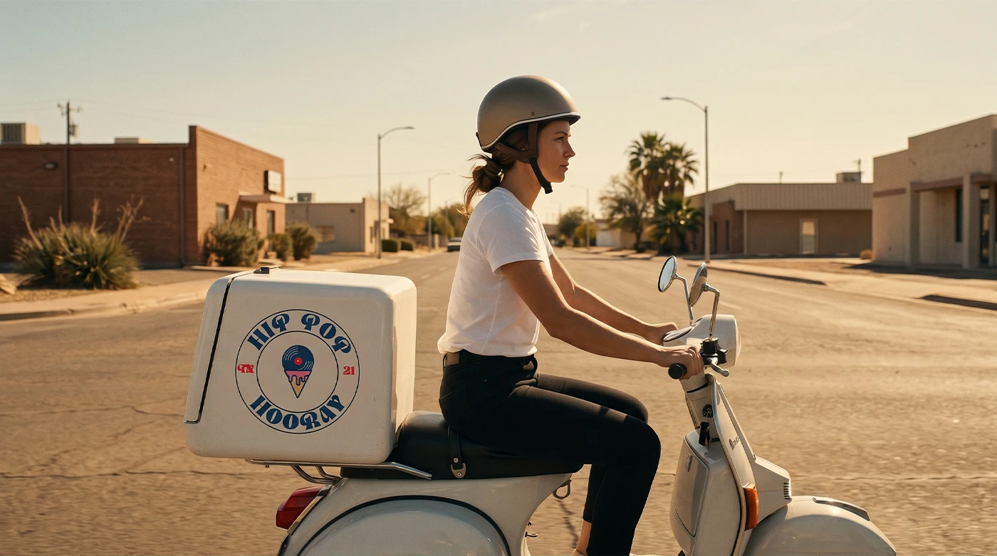
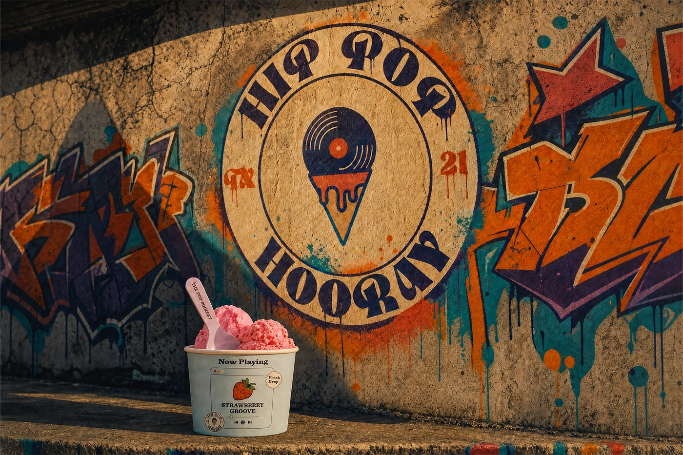
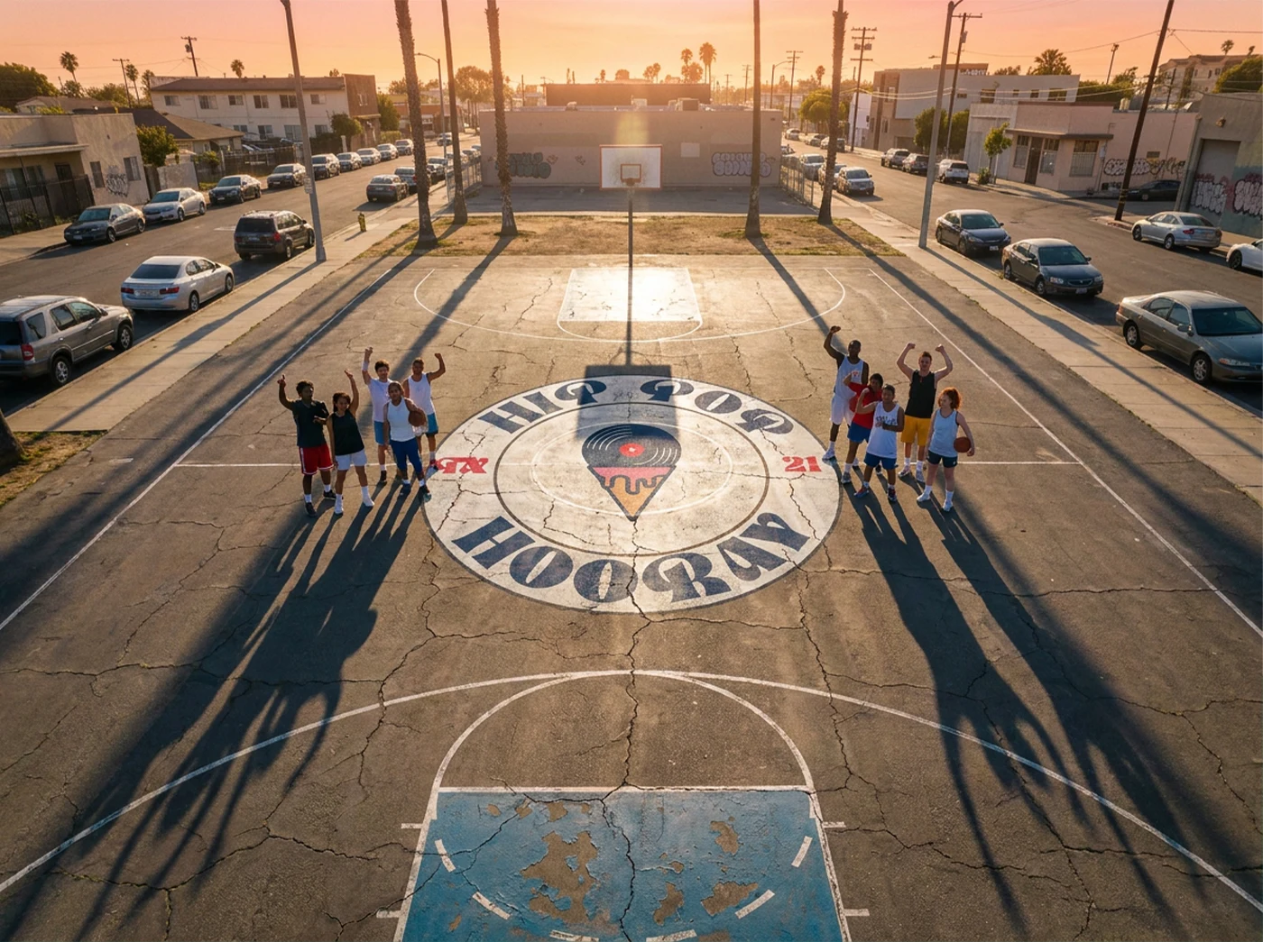
The logo is a fusion of hip-hop culture and frozen desserts, combining two core elements into a single memorable mark. The vinyl record references the golden era of hip-hop often known as "wax" within the culture bringing a sense of nostalgia, authenticity, and musical heritage, while the ice cream cone directly represents the brand's offerings, including gelato, popsicles, and ice cream. The intentionally imperfect forms add character and reinforce a handcrafted, authentic feel, introducing a subtle retro aesthetic that naturally complements the brand concept and creates a distinctive identity rooted in both culture and product.
Hip pop hooray Vibe:
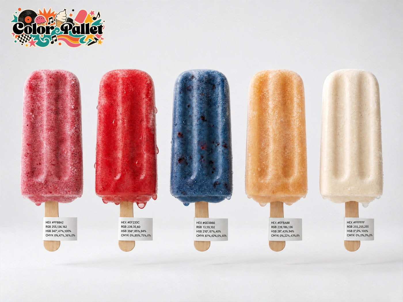
The color palette balances the energetic spirit of hip-hop culture with the playful nature of frozen desserts. The vibrant pink and red tones bring a sense of movement, creativity, and self-expression, while the deep blue adds contrast, confidence, and a timeless connection to classic hip-hop aesthetics. Soft cream and off-white hues introduce warmth and reference the smooth, creamy textures of gelato and ice cream, creating a friendly and approachable feel. Together, these colors create a nostalgic yet contemporary visual language that reinforces the brand's fusion of music, culture, and frozen treats.
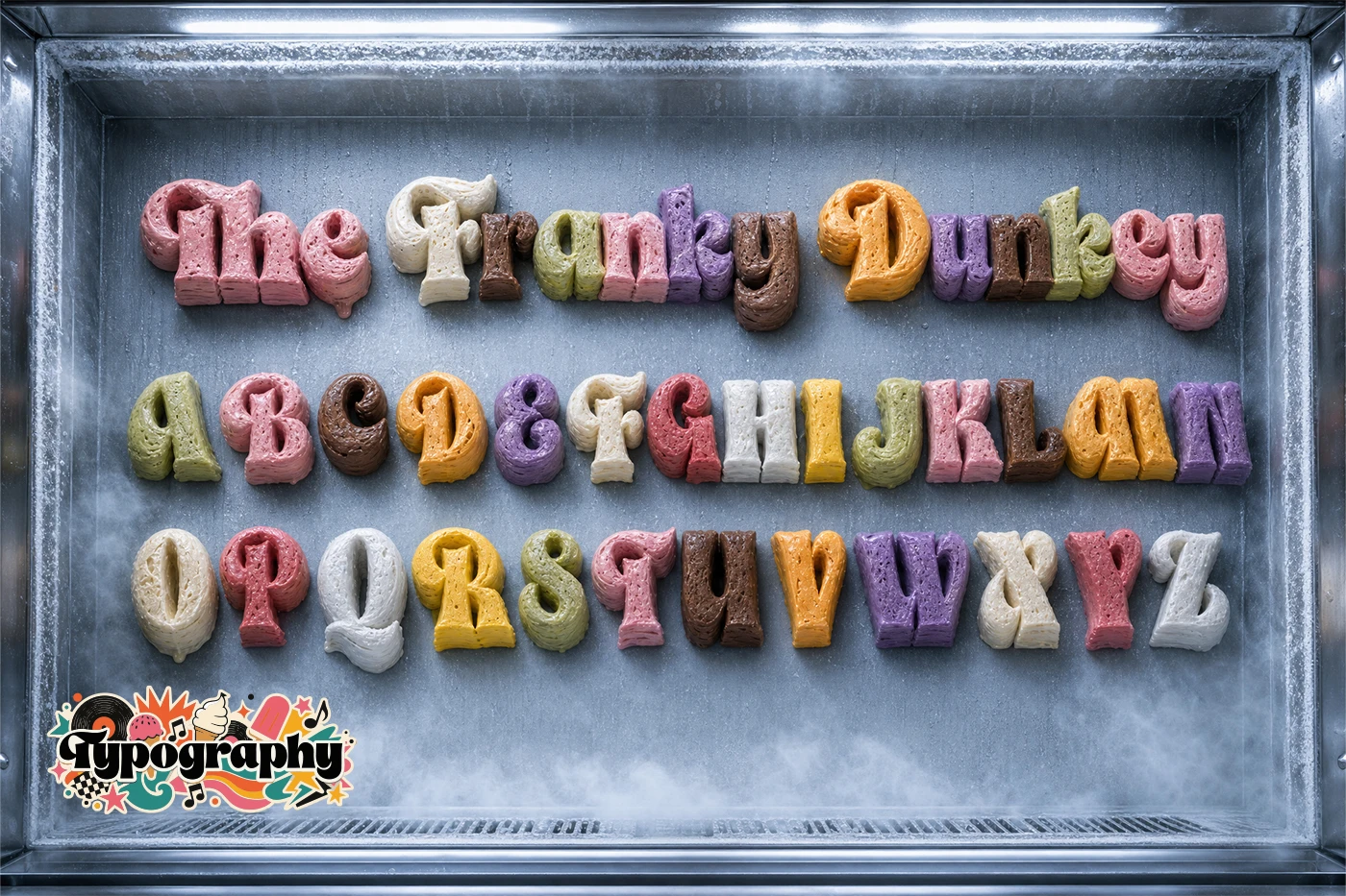
Typeface:
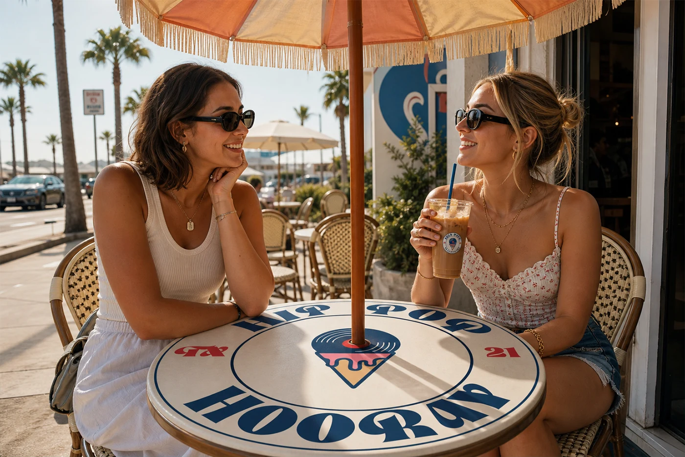
The Funky Dunky typeface was selected for its playful, expressive, and retro-inspired character, making it a natural extension of the brand identity. Its bold curves, exaggerated forms, and handcrafted imperfections echo the authenticity found in classic hip-hop culture while capturing the fun and indulgent nature of frozen desserts. To further reinforce this connection, the typeface is presented as sculpted ice cream, transforming the typography into a direct representation of the product itself. This approach creates a stronger visual association with the brand, making the identity feel more immersive, memorable, and uniquely tied to the experience of gelato, popsicles, and ice cream.
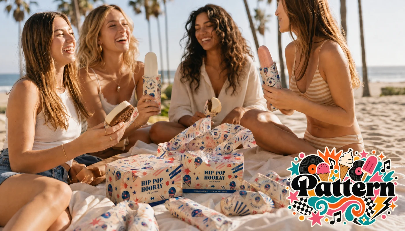
Pattern:
The custom pattern was created to extend the brand beyond its logo, transforming everyday packaging into a recognizable and memorable brand experience. Inspired by the playful energy, creativity, and social nature of enjoying frozen desserts, it introduces a sense of movement and personality across popsicle wrappers, ice cream sandwich packaging, tissue paper, and other brand touchpoints. By repeating consistently throughout the identity, the pattern strengthens visual recognition, enhances shelf presence, and creates a cohesive system that feels vibrant, immersive, and uniquely connected to the fun and indulgent world of gelato, popsicles, and ice cream.
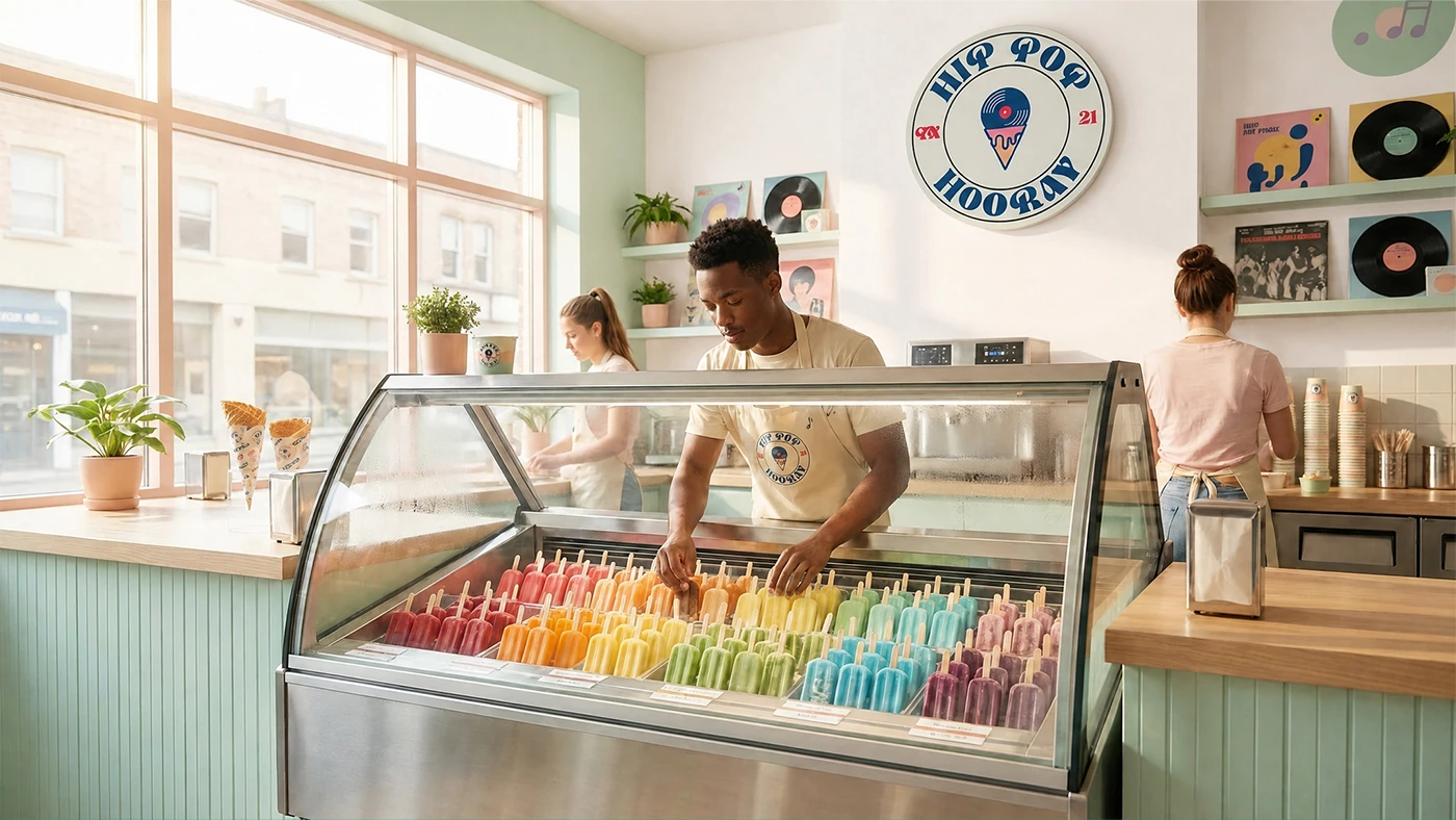
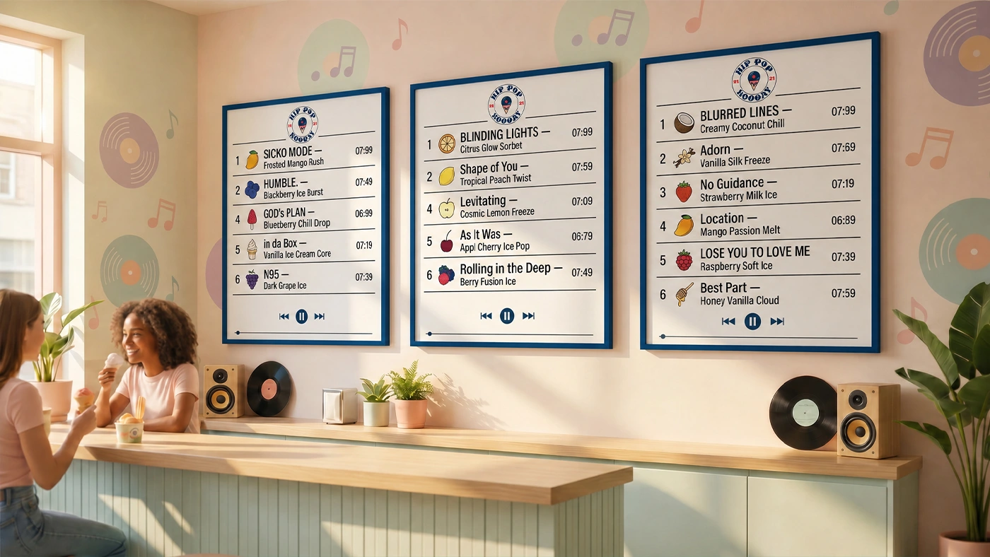
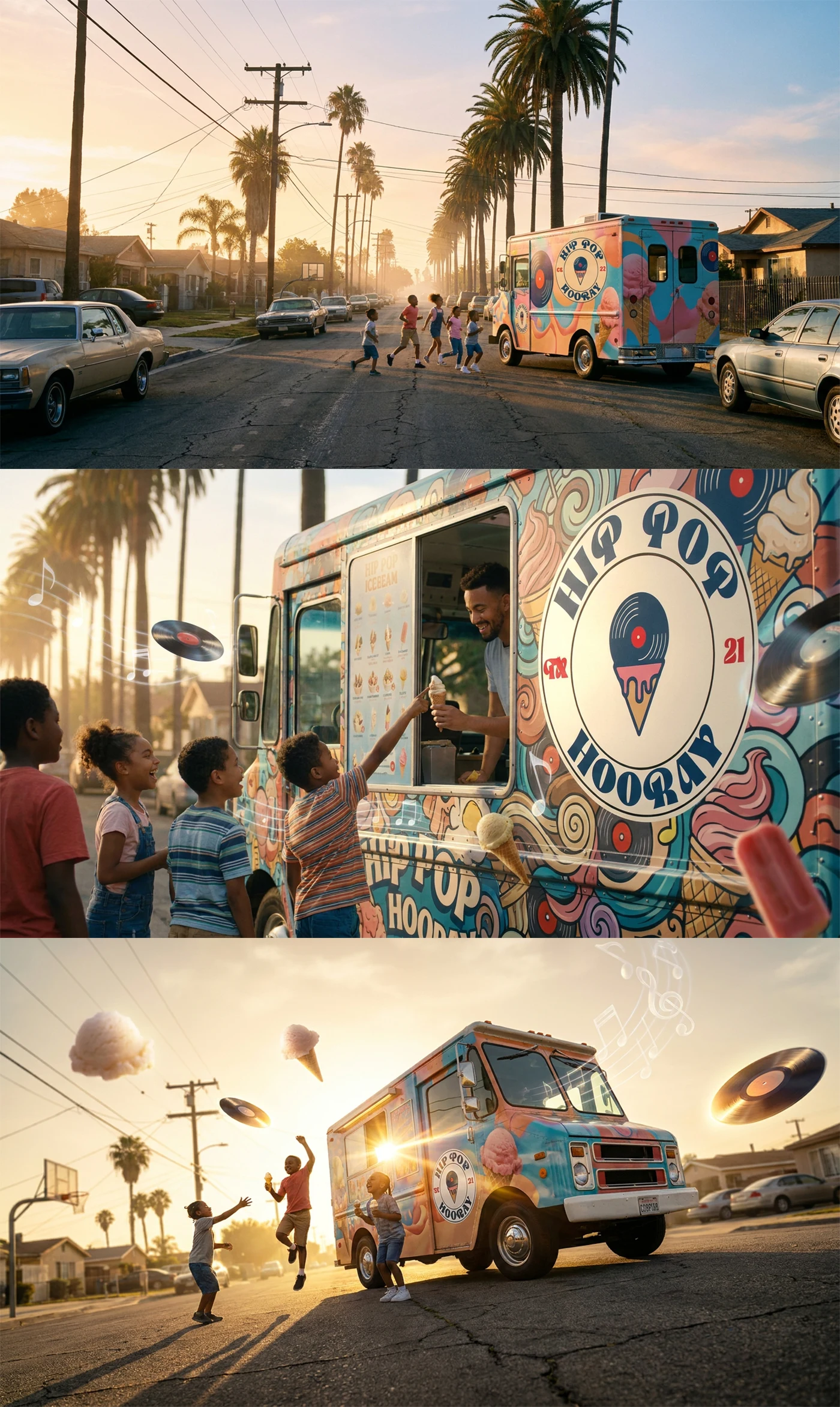
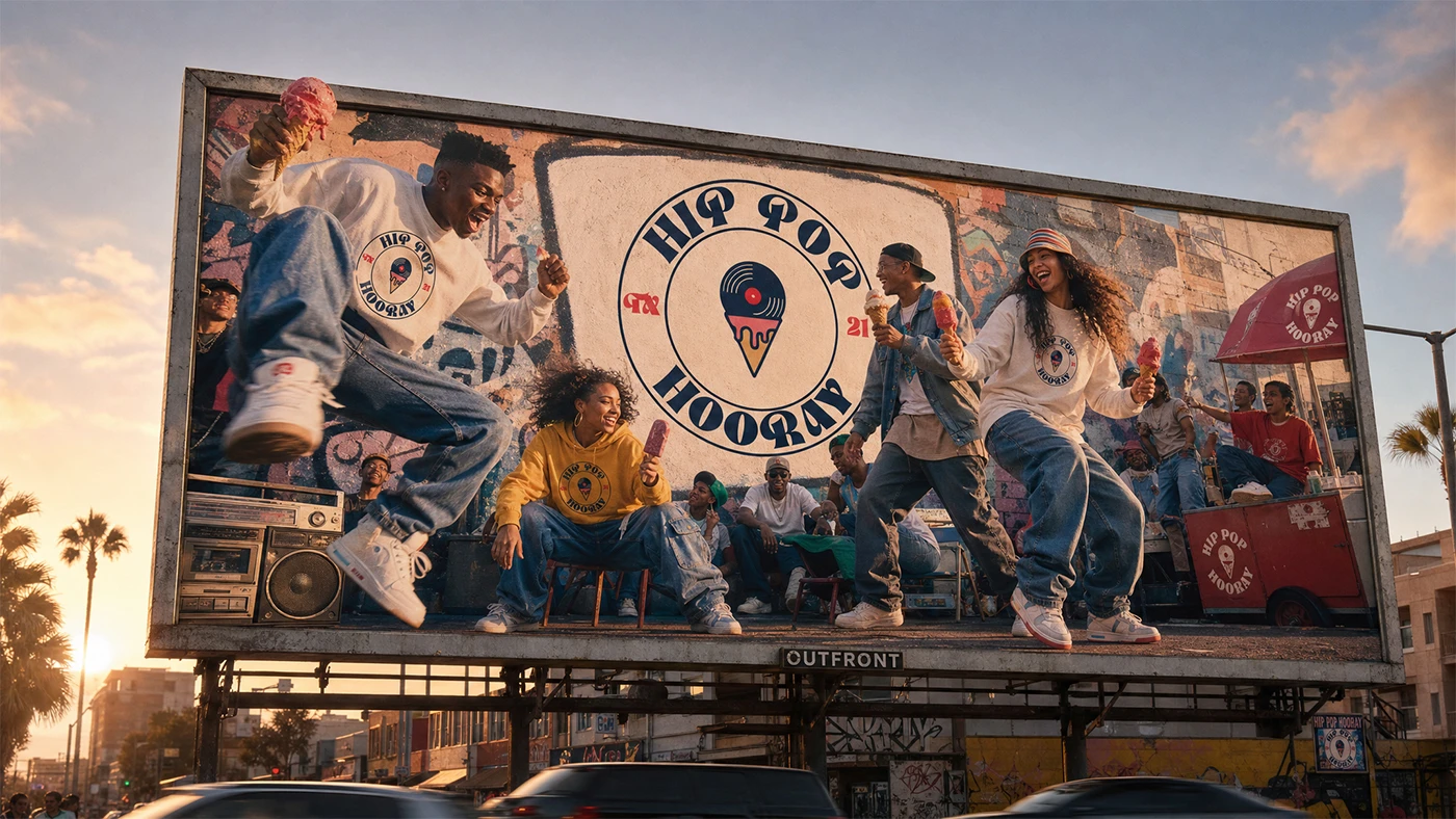
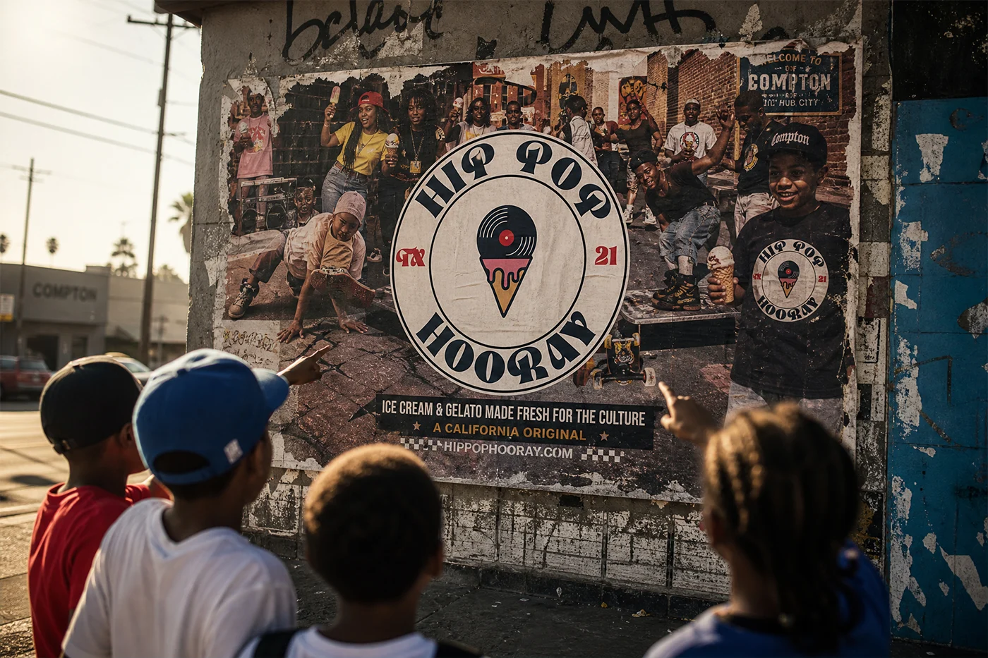
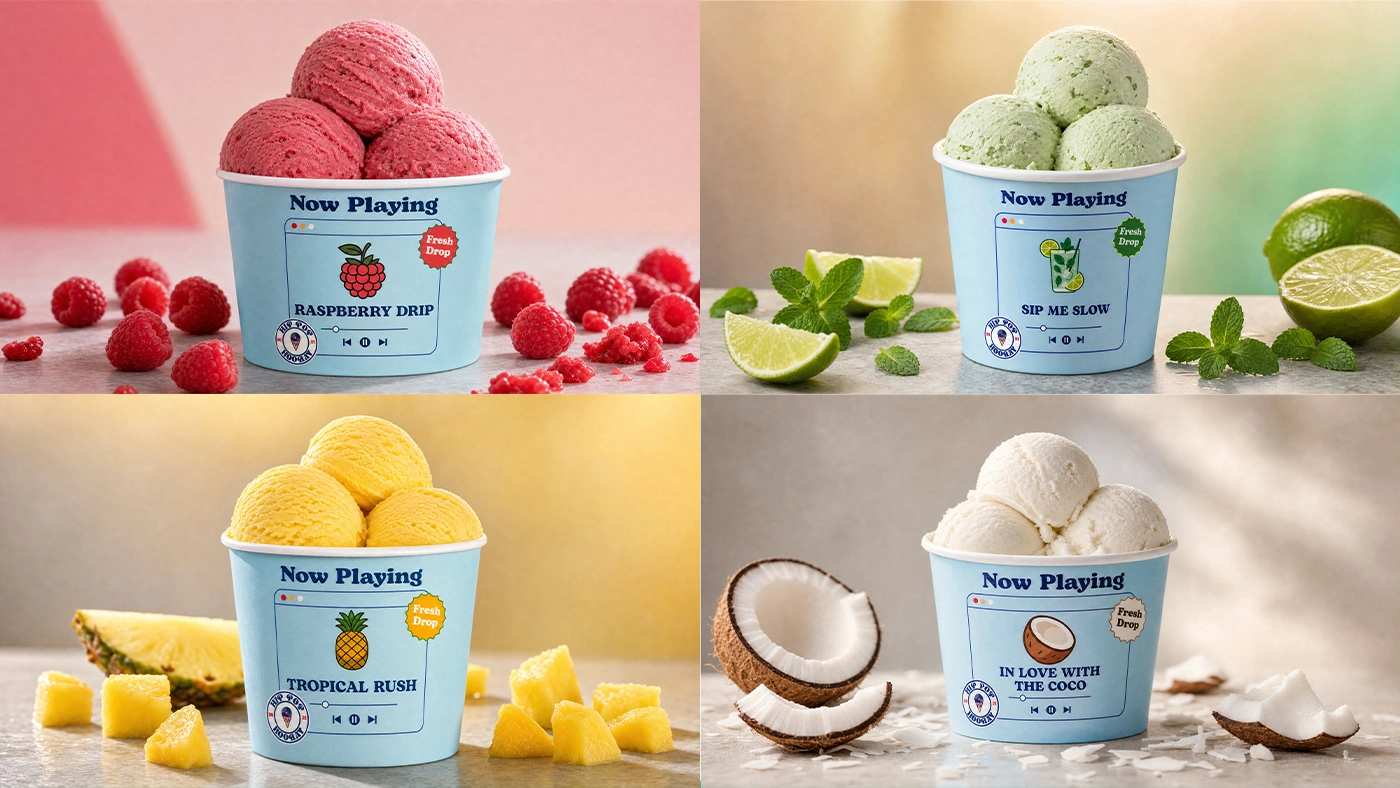
Hip Pop Hooray is a gelato, popsicle, and ice cream brand currently in development. This logo and visual identity is the foundation an early step in crafting a bold, playful brand that’s ready to grow. follow HipPopHooray
If you’re ready to make your brand hit like a classic beat,
with a design that moves and stays on repeat
let’s connect, and I’ll craft a visual identity that’s sharp, fresh, and built to last.
Like this project
Posted Jun 14, 2026
Hip Pop Hooray is a visual exploration that merges rhythm, typography, and pattern into a structured design system.