Lamba Energy │Consulting firm logo design

VISENGINEER



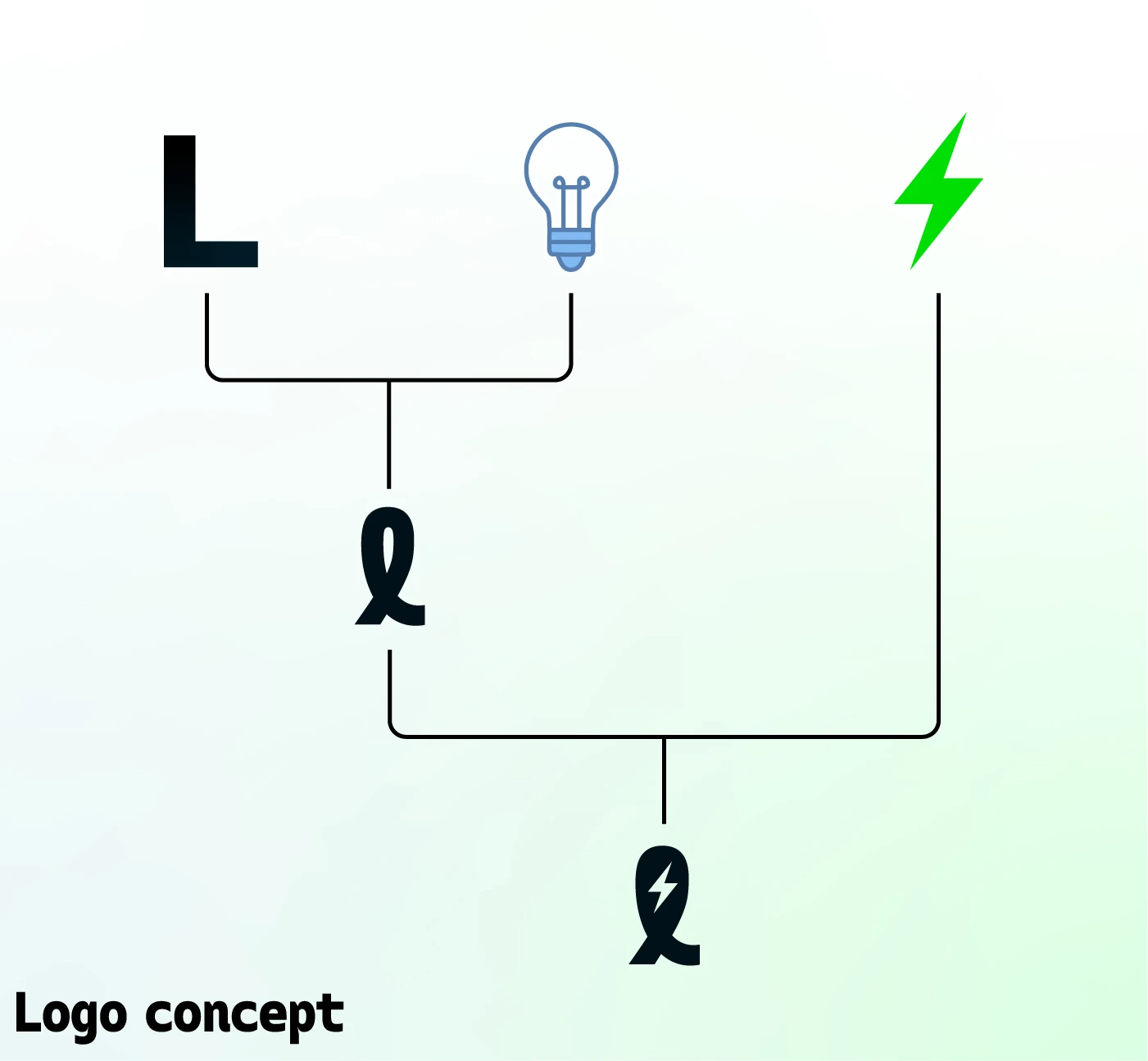
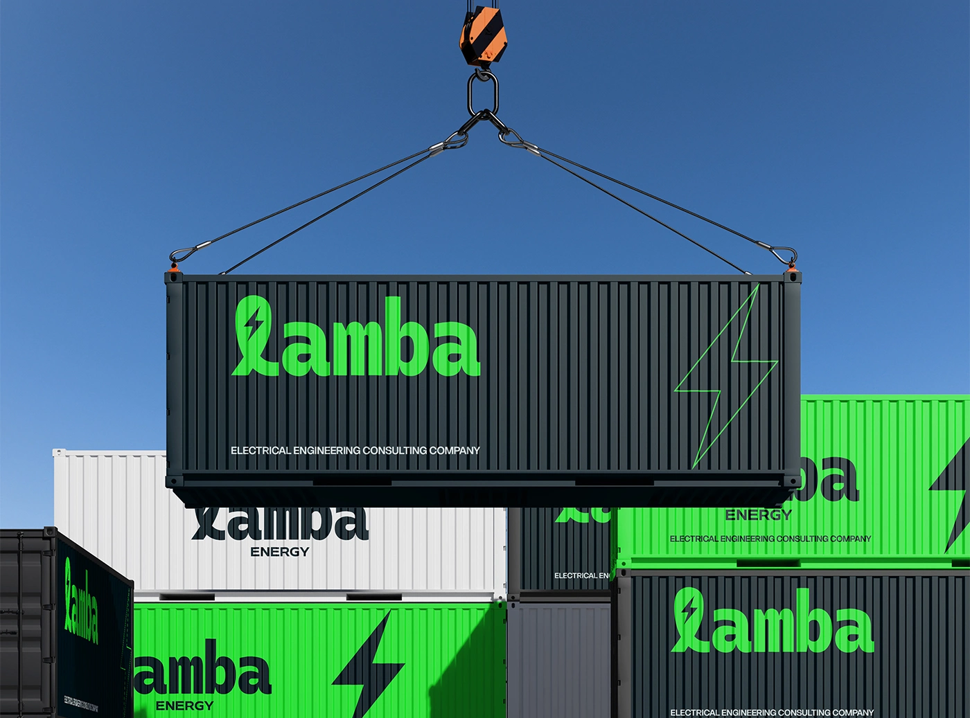
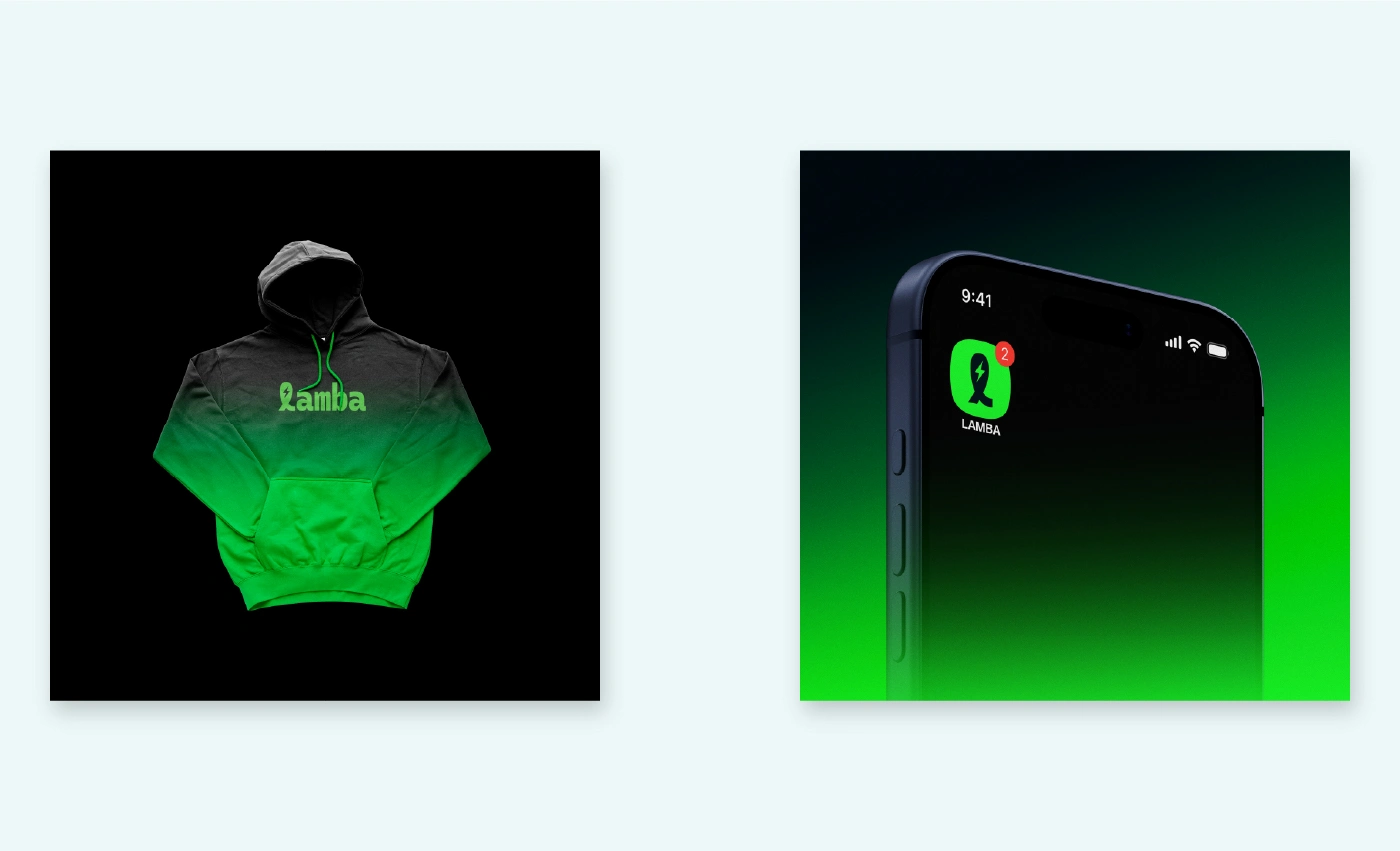
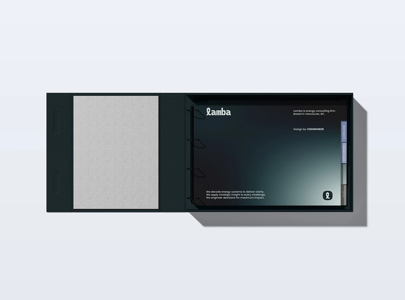
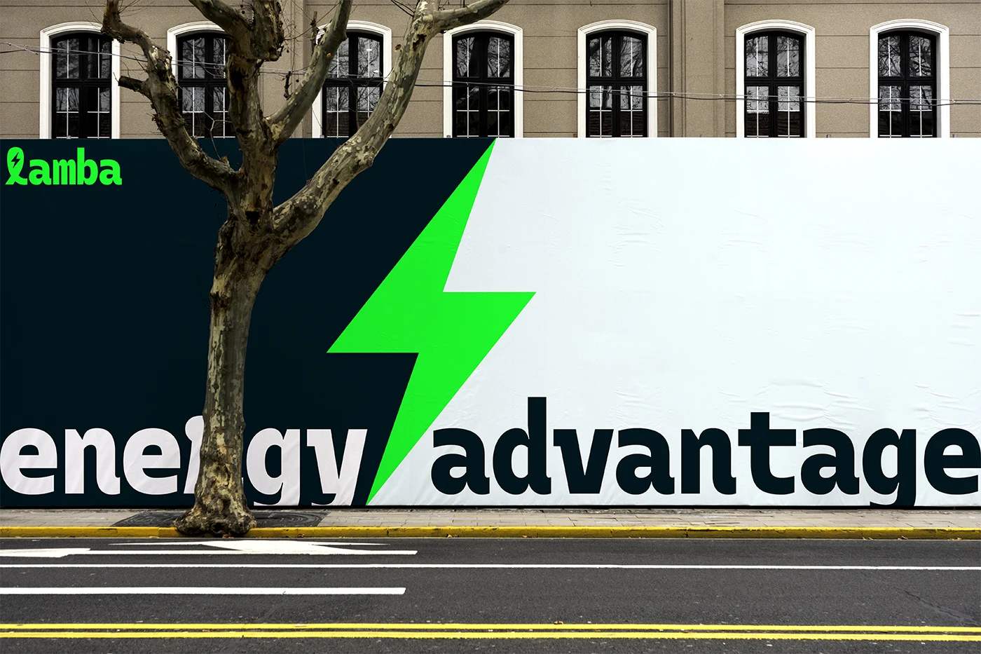
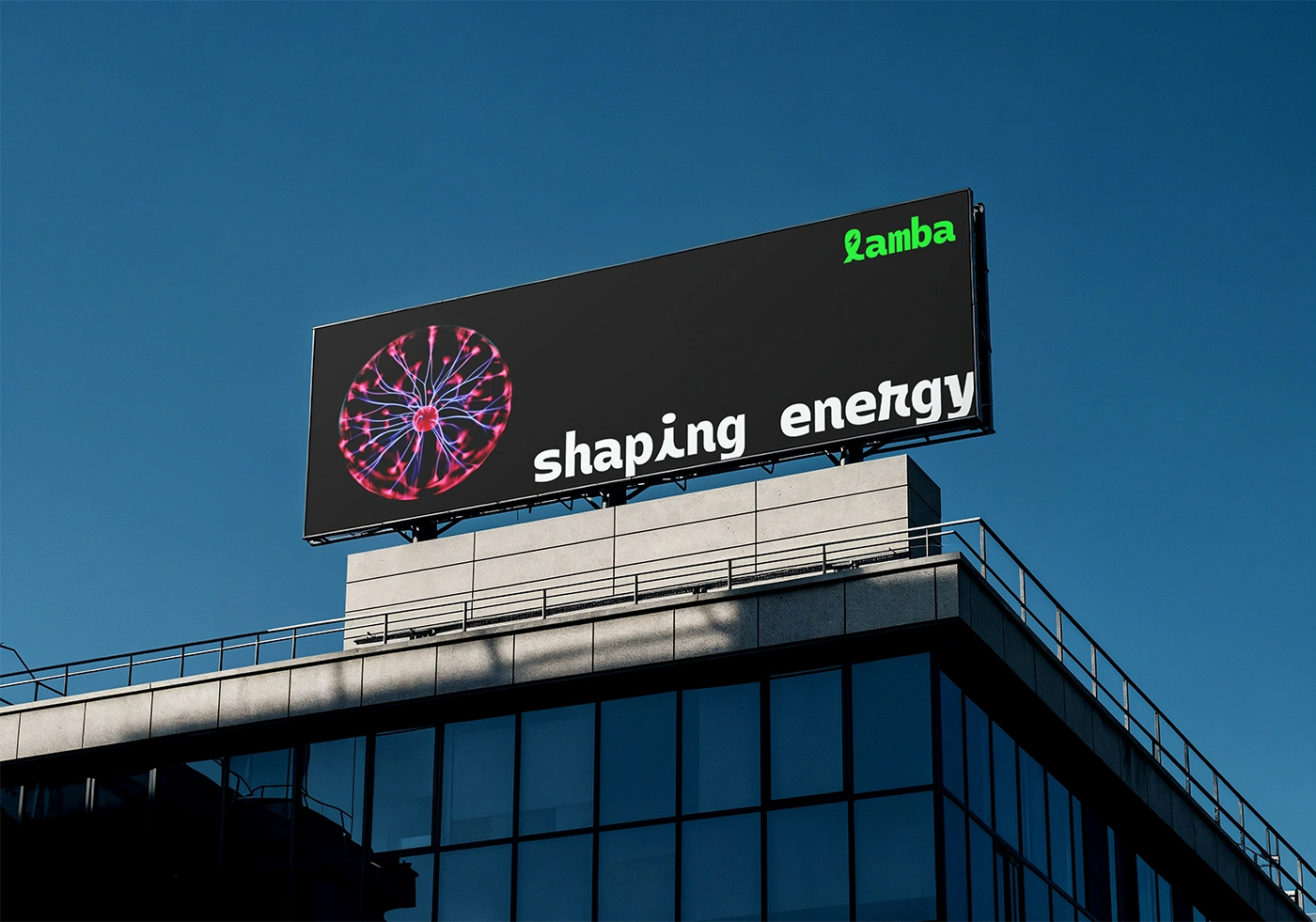
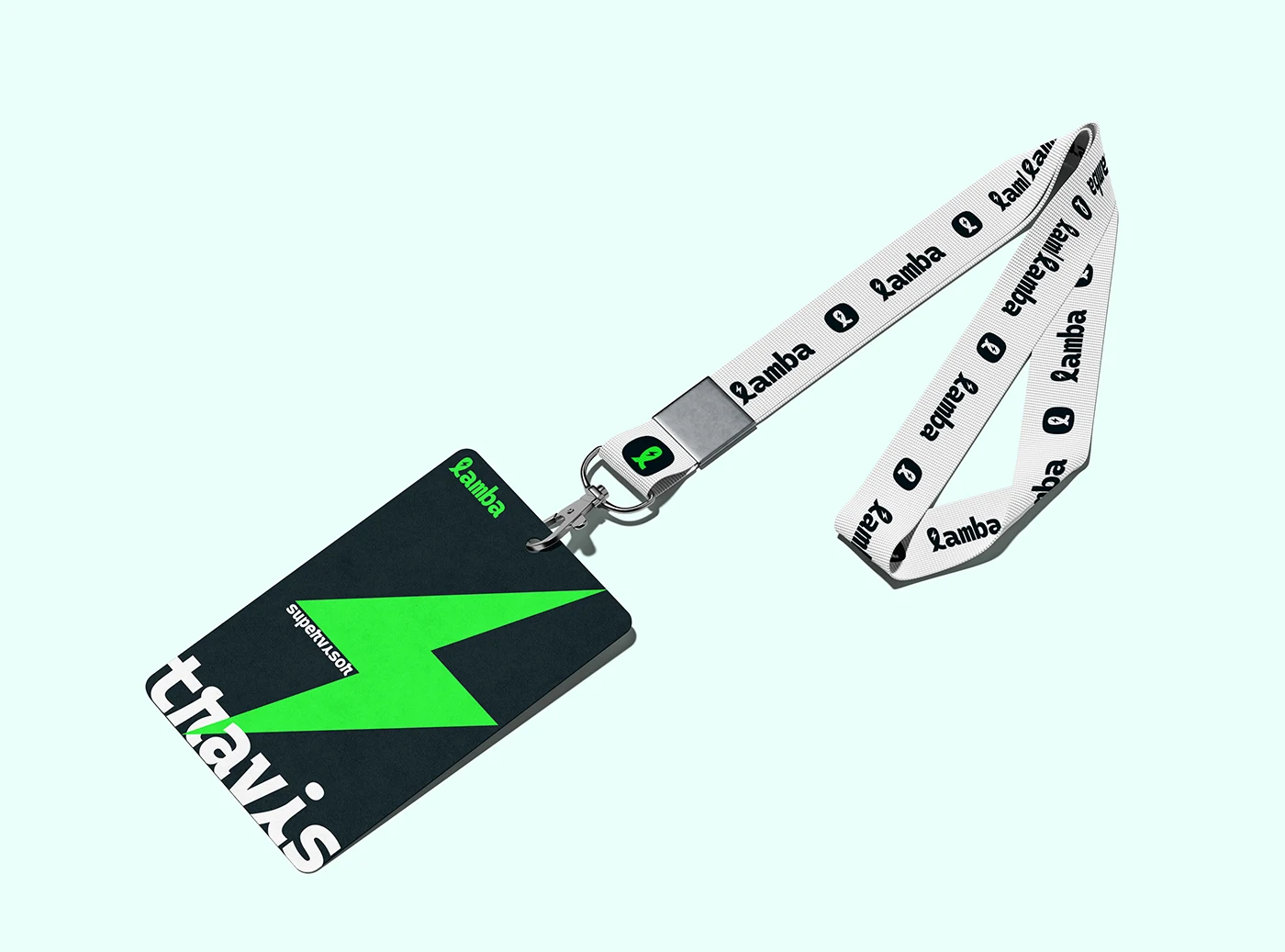
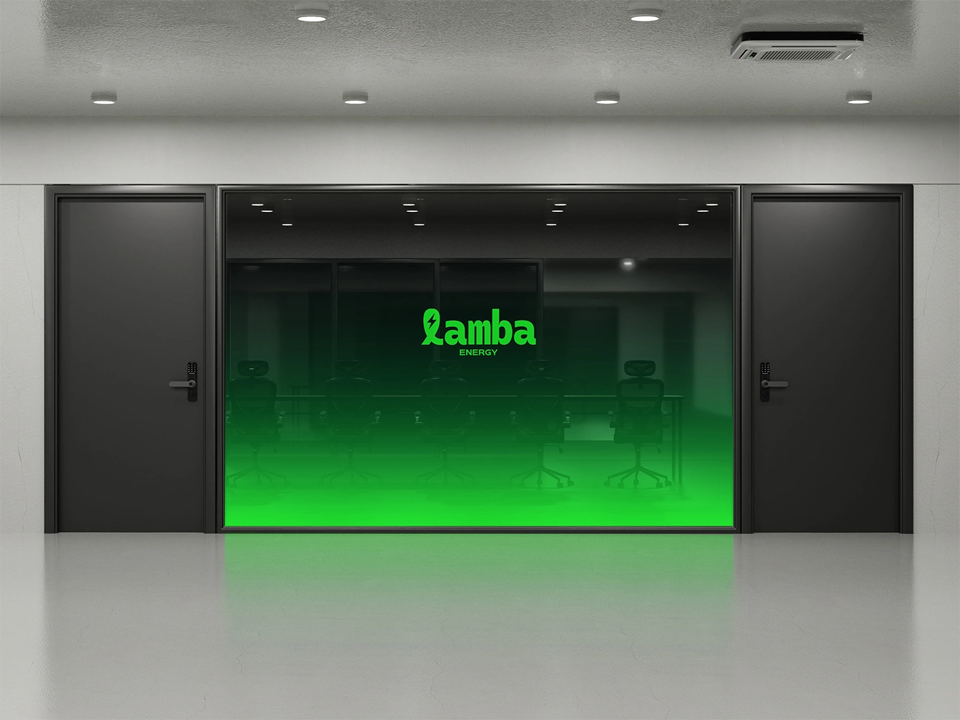
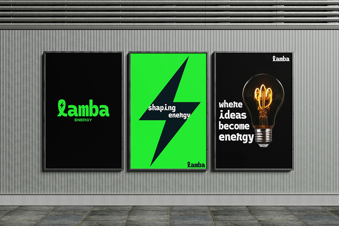
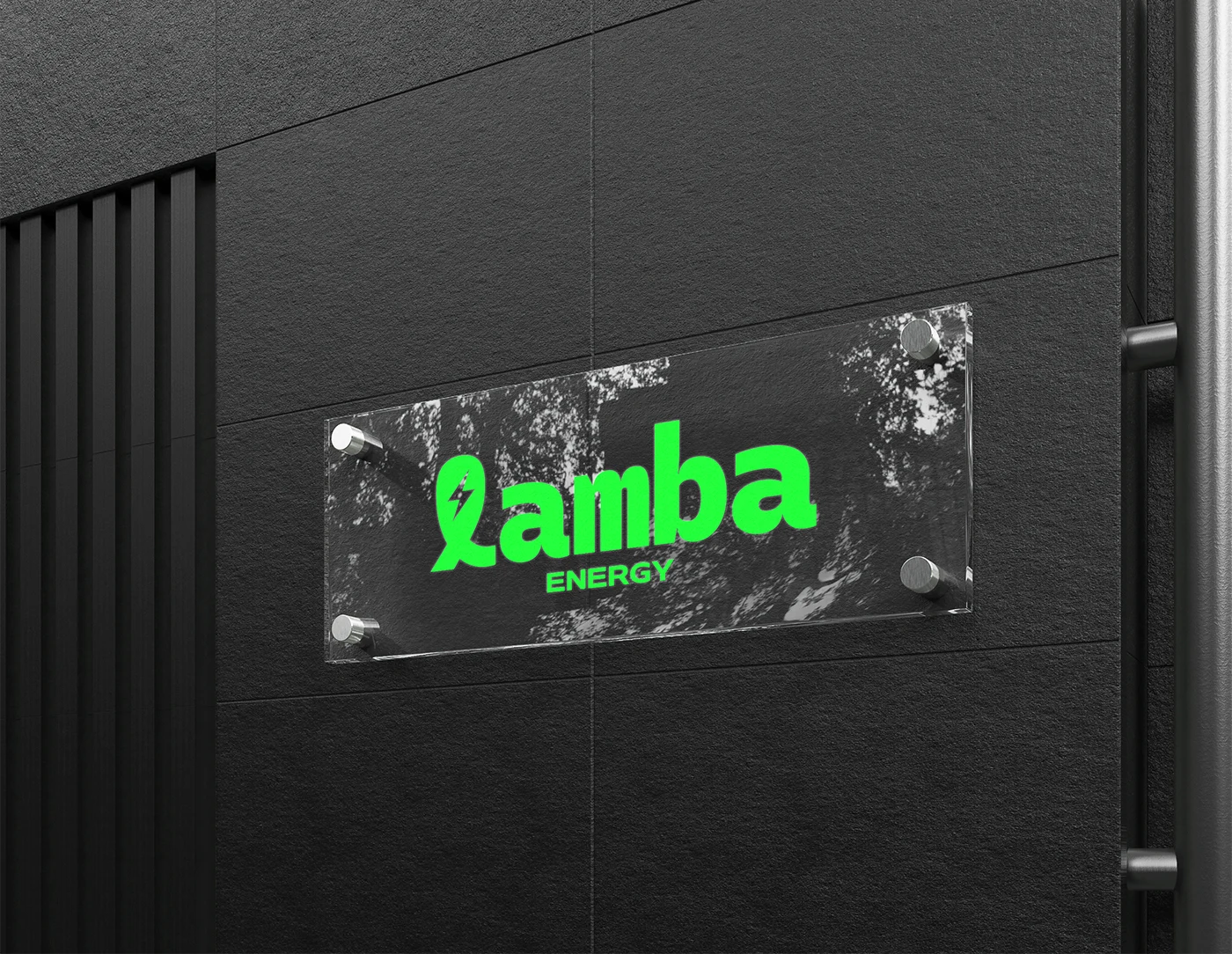
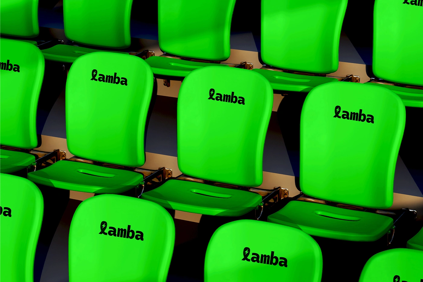
As the designer behind this identity, my goal was to distill the complex nature of energy consulting into a singular, high-impact mark that balances technical precision with environmental stewardship. By integrating a sharp, negative-space lightning bolt within a continuous ribbon-like loop, I’ve created a visual metaphor for the "infinite efficiency" and circular sustainability that modern firms strive for. The bold, rounded container grounds the symbol, giving it a tech-forward, app-ready presence that feels both approachable and authoritative in Vancouver’s competitive green-tech landscape. This isn't just a logo; it’s a strategic asset designed to signal reliability, innovation, and a commitment to the renewable transition, ensuring the brand stands out to high-value B2B clients as a leader in the energy evolution.



If this made sense, we can build yours.

Like this project
Posted Jun 14, 2026