Immigration Guide Landing Page Design
Yana S.
Immigration Guide Landing Page: a new income stream for independent agents
A landing page for an immigration consultant who turned her expertise into a self-published guide, helping people relocate to Argentina without expensive legal fees. The page sells the guide, builds trust in the author's credentials, and upsells a personal consultation for those who need hands-on support.
My role
My goal was to design every section around one outcome — getting the visitor to purchase before they leave. I placed credibility markers in the hero to establish trust immediately, brought social proof in early and kept it recurring, and structured the "Why this guide is unique" section to handle skepticism before it becomes a reason to leave. The pricing section was designed to frame the consultation as a natural next step, not an upsell.
I chose a clean, institutional blue palette: a deliberate decision for a product asking people to make a life-changing choice based on a stranger's advice. Authority had to be felt before it was read.
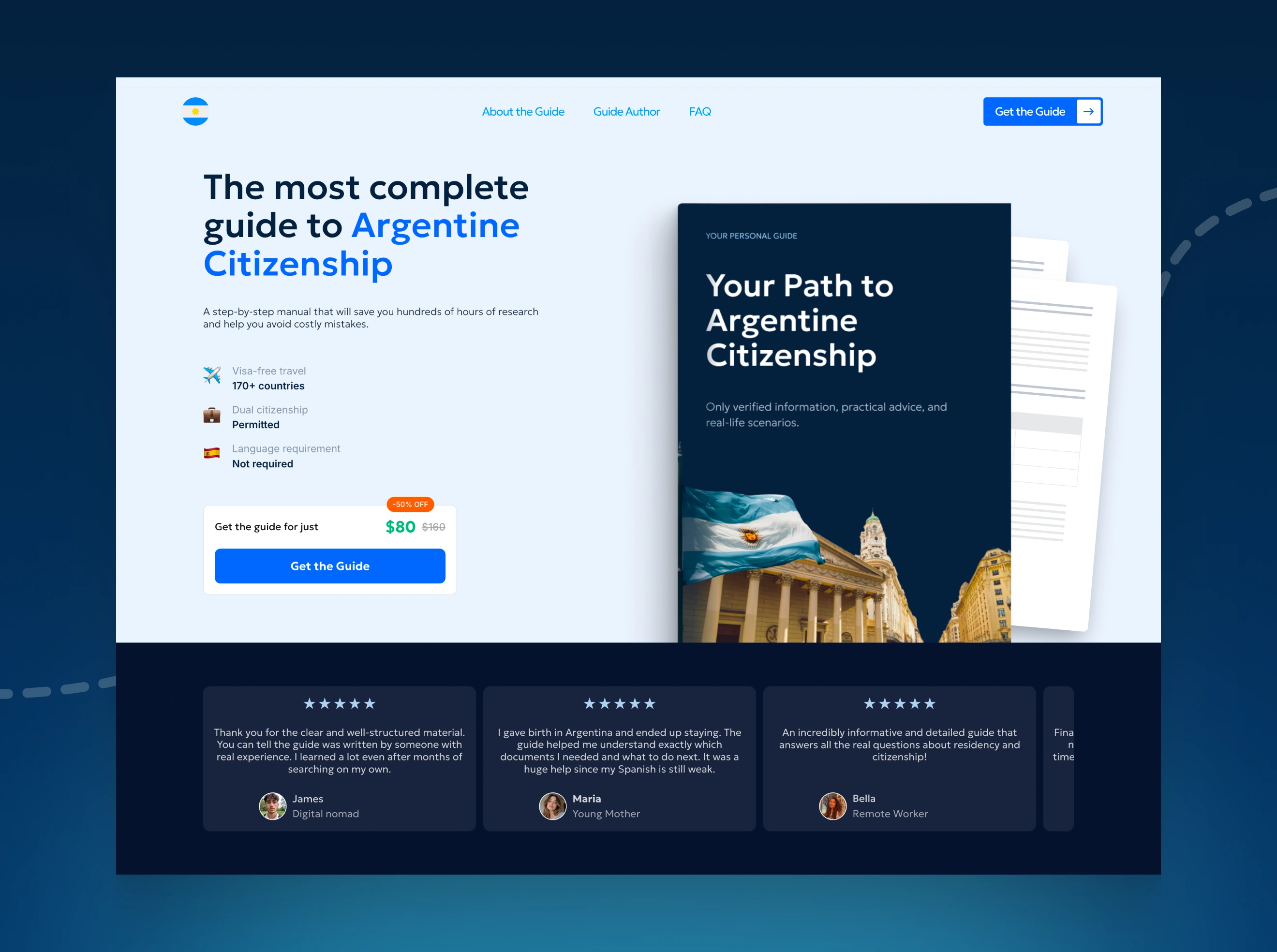
Hero section
Hero + Social proof
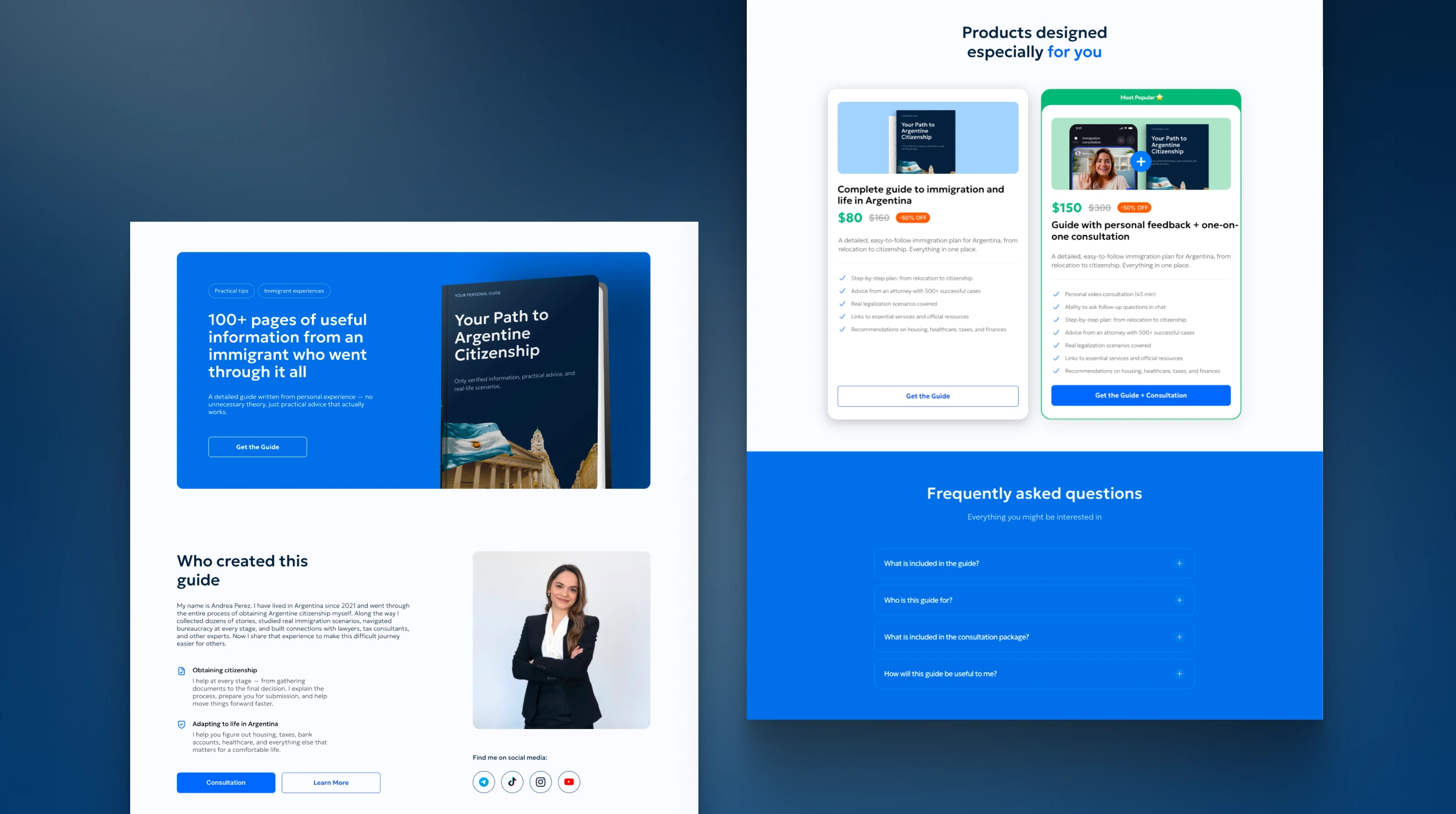
The hero leads with authority: "The most complete guide to Argentine Citizenship" establishes credibility before anything else. The three markers below answer the buyer's first questions before they think to ask, and the price block removes the "how much is it?" objection without making them scroll.
The book mockup makes the product tangible. A digital guide is an intangible purchase, rendering it as a physical object builds perceived value instantly.
Testimonials scroll as a continuous ticker: more than five reviews in rotation, covering different personas and life situations. The format keeps the section alive without adding length to the page, and ensures every visitor finds a voice that speaks to their specific situation.
Features section
Features section: "Why this guide is unique?"
Three cards, three objections handled. Each card pairs a visual with a real-use-case quote and topic tags, keeping the content specific without overwhelming the reader.
The structure is deliberate: step-by-step plan first (what you get), real scenarios second (does it apply to me), practical tips third (will it actually save me time). That order mirrors how a skeptical buyer thinks before purchasing.
The topic tags: digital nomads, through childbirth, passive income, for students - do the persona matching quietly. No need for a separate "who is this for" explanation, the tags let every visitor self-identify within the section itself.
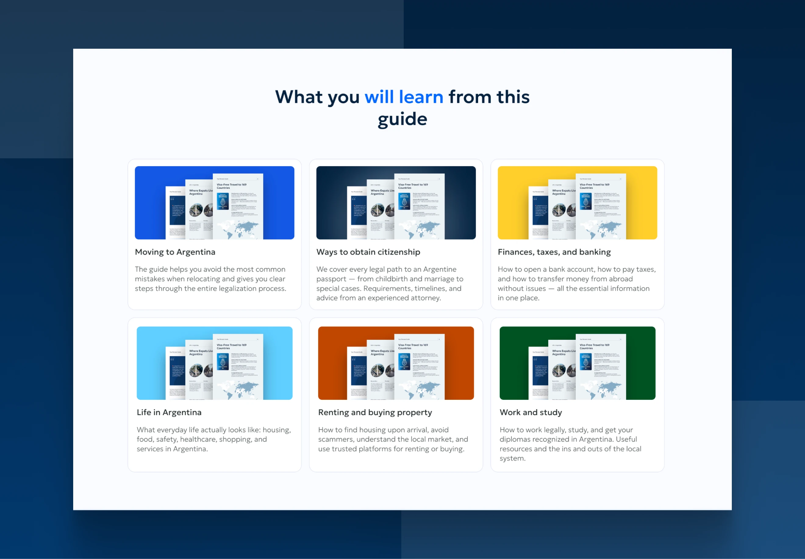
Content overview
Content overview: "What you will learn"
Each card shows a preview of the actual guide pages, which does two things at once: it proves the content exists and makes the purchase feel concrete rather than abstract.
The grid covers the full scope of relocation: citizenship, finances, housing, work, daily life. The buyer can immediately map their personal situation to a chapter. No one needs to wonder "but does it cover X?" by the time they've scanned this section.
The color-coded thumbnails add visual variety without breaking the clean layout. Each card feels like its own chapter, which mirrors how the guide itself is structured — modular, practical, and easy to navigate.
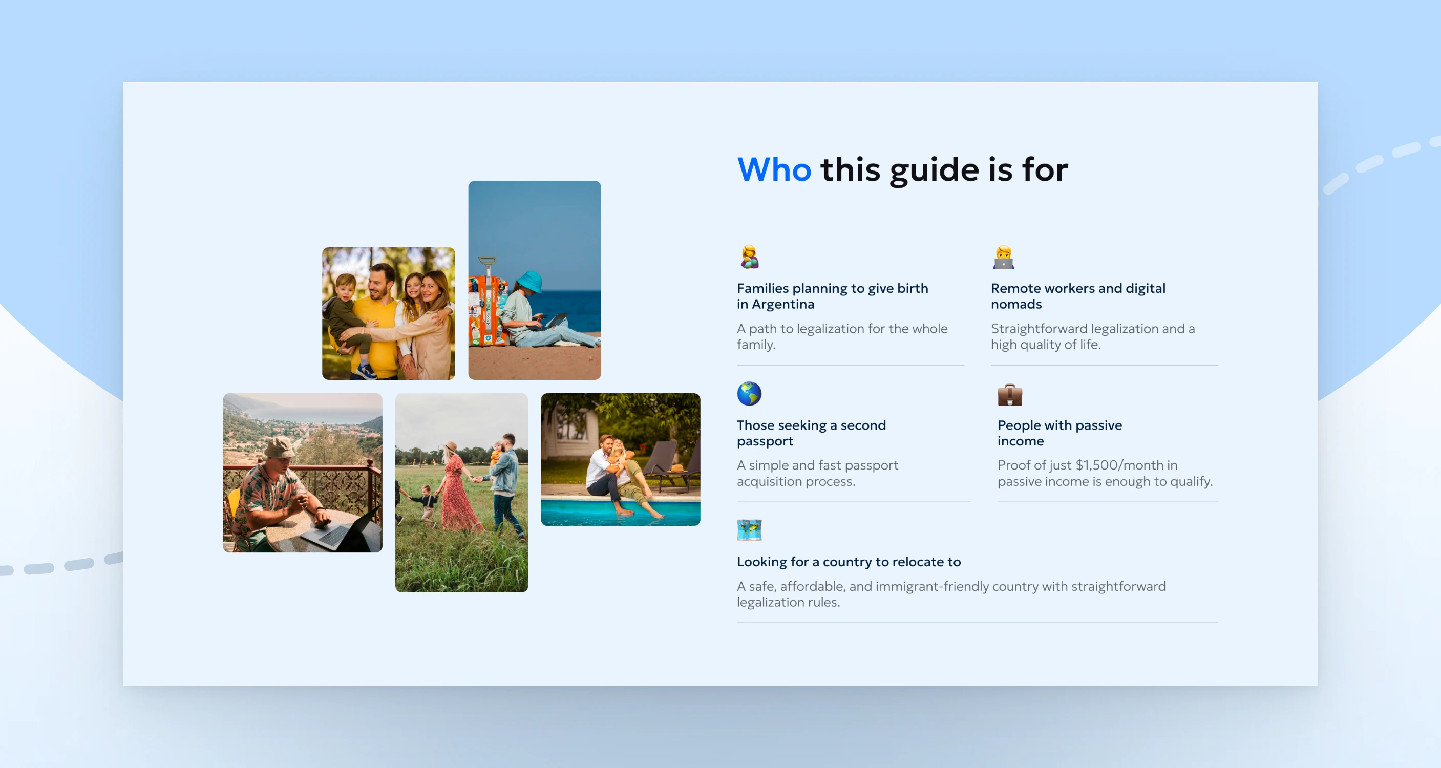
Audience section: "Who this guide is for"
The photo collage on the left is the real strength of this section. Real people in real situations: a family, a digital nomad, a couple make the personas feel lived-in rather than invented.
The two-column grid keeps the layout tight and scannable. Five items could easily feel like a wall of text, the split structure lets the eye move quickly and find the relevant entry without reading everything.
Author block, Mid-page CTA, Pricing & FAQ
The author section puts a real person behind the product: name, photo, personal story, and specific areas of expertise. For a guide built on trust, this is non-negotiable. The mid-page CTA banner reinforces the core value prop one more time before the pricing section, catching anyone who was still on the fence.
Pricing is structured as a clear choice between two options: the guide alone or the guide with a personal consultation. The "Most Popular" badge on the premium tier nudges the visitor toward the higher-value purchase without pressure. Two options is intentional enough to upsell, not enough to cause decision fatigue.
The FAQ closes with a blue background that visually signals "this is the final stretch", objections handled, purchase ready.
Final CTA & Footer
Final CTA & Footer
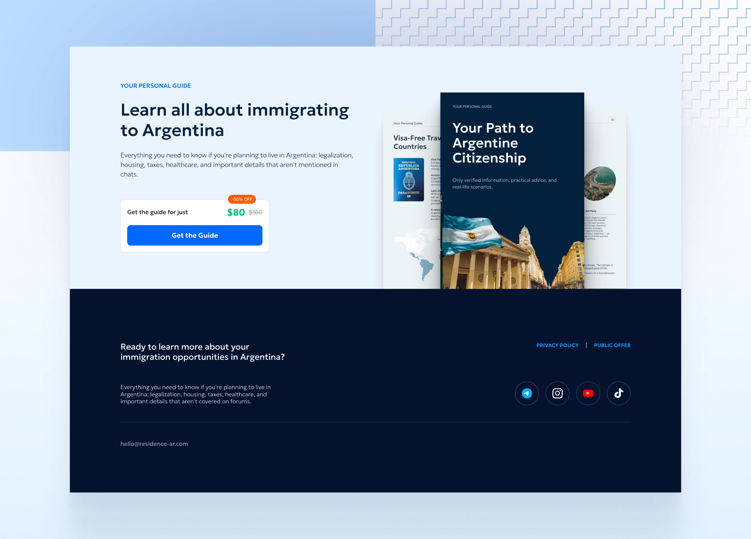
The final CTA repeats the hero's core offer same headline logic, same price block, same button. For anyone who read the entire page and still hasn't purchased, this is the last nudge. No new information, just a clean second chance to convert.
The book mockup reappears here too, now showing interior pages alongside the cover. It reinforces what the buyer is actually getting right at the moment of decision.
The footer closes on the same dark navy, keeping the visual tone serious and trustworthy to the very end. Social links, policy pages, and a contact email are all present without cluttering. Simple, professional, complete.
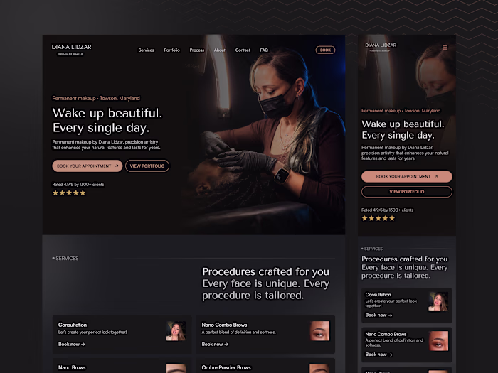
Mobile version
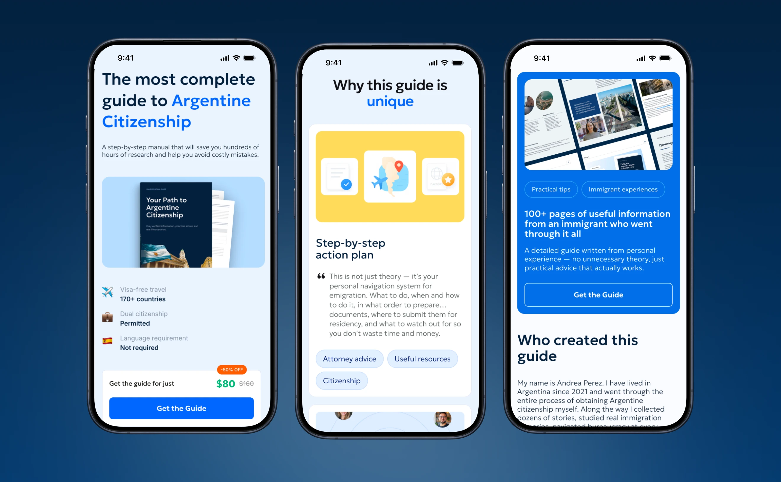
The layout adapts cleanly to mobile without losing hierarchy or conversion intent. The headline, credibility markers, and price block stack in the right order, nothing gets buried or reordered. Each section becomes a single focused screen, which actually makes the content easier to absorb than on desktop.
The CTA button stays full-width and prominent throughout. On mobile, thumb reach and button size matter as much as copy this gets both right.

Open to new projects
If you need a clean, strategic website built in Framer. Reach out and let's see what we can build together.
Like this project
Posted Jun 7, 2026
Created a strategic landing page to sell an immigration guide to potential Argentinean expats.
Likes
1
Views
2