AI Nutrition App Landing Page Design
Yana S.
AI Nutrition Landing page
AI Nutrition Landing page: from visitor to quiz taker
A landing page for an AI-powered app that helps users eat healthier through personalized meal plans, calorie tracking, recipe suggestions, and food analysis by photo. The page has one job: turn visitors into app users by getting them to start a quiz.
I designed every section around that single outcome. The hero and features build trust, the FAQ removes hesitation, and the quiz entry is frictionless by design — a photo tap instead of a form field.
Micro-animations make the product feel alive without stealing focus. The color palette is energetic but controlled, harder to pull off in health and wellness than it looks.
Every decision is strategic, not just aesthetic.
Hero section
Hero section
The opening leads with a conversational tone: "Hi 👋 I'm Nutriapp", which immediately humanizes the product. For a nutrition coach app, trust and approachability are everything, and this framing establishes both in one line.
The phone mockup on the right reinforces it: the chat interface is animated, showing a live conversation unfolding in real time. It answers "what does this actually look like?" before the user even asks and makes the AI feel alive, not like a static screenshot.
Features section
Features section: "What can Nutri App do?"
Four cards, four benefits, each with a visual and a short label. The color-coded cards (yellow, coral, blue, purple) add energy without feeling chaotic, and the icons reinforce the message before the user reads a word. This section exists to qualify interest, not to close.
Four is the sweet spot. Fewer feels thin; more creates scroll fatigue. The color variety breaks the monotony of a white-heavy page without compromising the clean aesthetic.
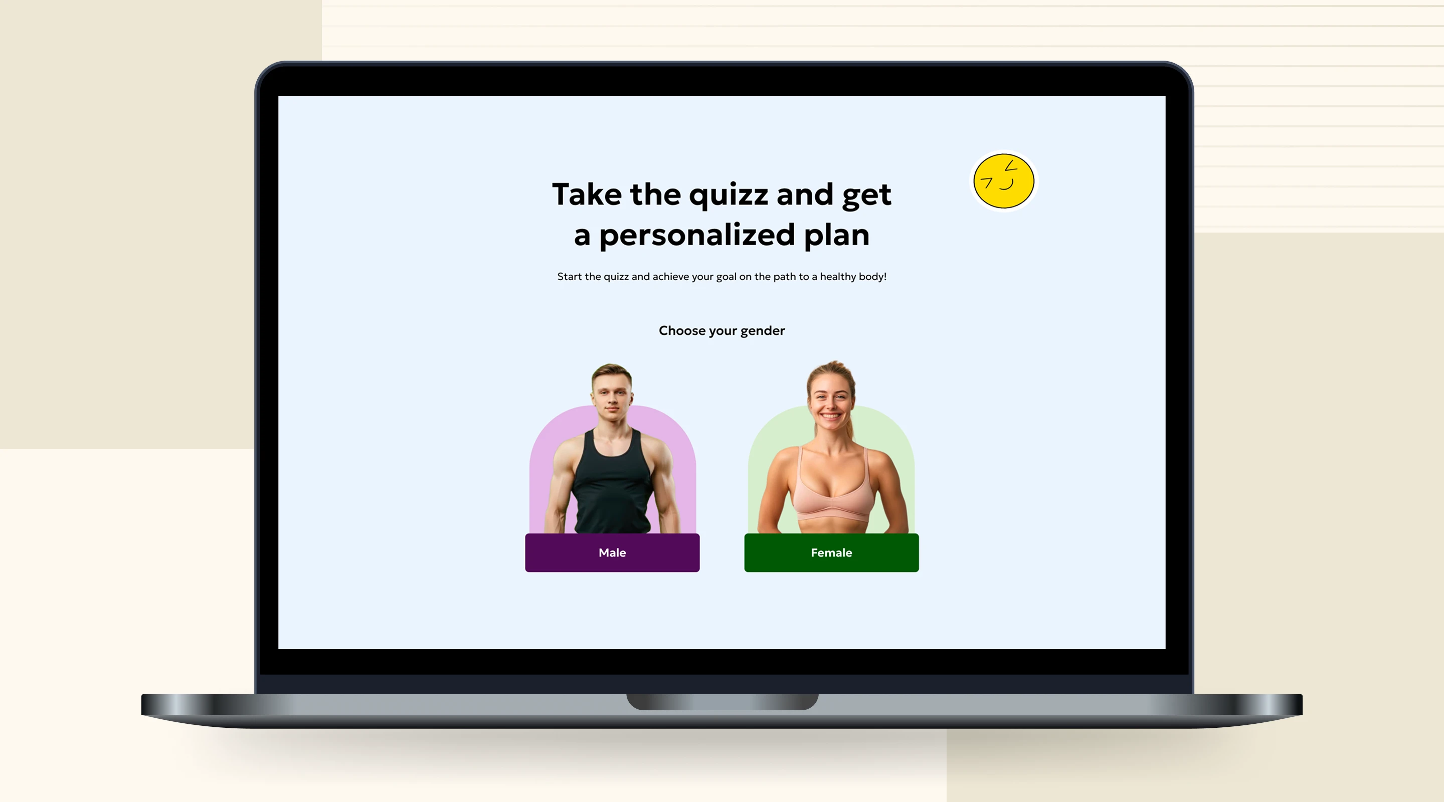
Quiz section
Quiz section : "Take the quiz"
This is the hero of the page, the entire landing exists to get users here. The gender selection UI (Male / Female with photos) is smart because it makes the first step feel personal and visual rather than form-like. Starting a quiz with a photo choice feels like a game, not a signup. The light blue background also visually separates this section from the rest of the page, signaling "this is where you act."
Why it's a good decision: The biggest conversion killer in quiz funnels is friction at step one. By making the first input a tap on a photo instead of filling a field, the perceived effort drops dramatically. Users are already "in" before they realize they started.
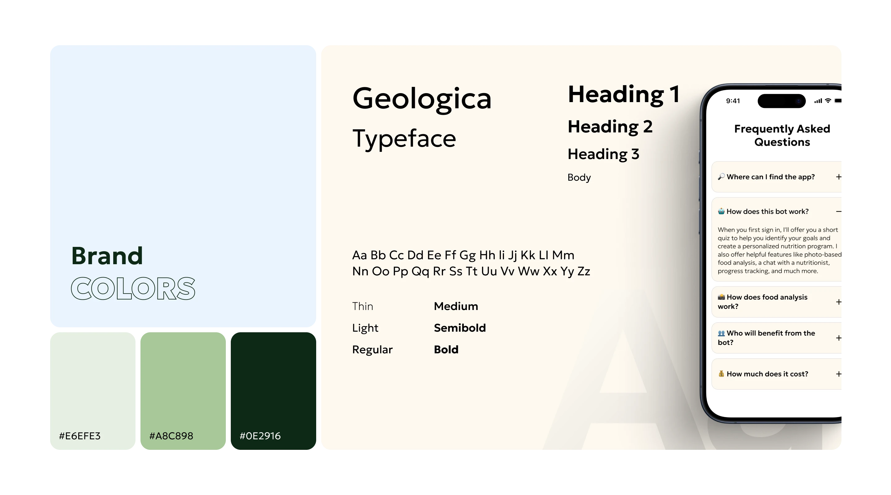
Colors & Typography
Colors & Typography
The palette is built on three greens: a pale mint, a muted sage, a deep forest and a warm off-white background. The progression from light to dark creates natural hierarchy without relying on harsh contrast. Green was the right call for a nutrition app: it signals health and freshness without feeling clinical or cold.
Geologica carries the entire typographic system. It's a geometric sans-serif with enough warmth to feel approachable, and enough structure to stay readable at small sizes.
Social proof + final CTA
Social proof + final CTA
Testimonials above the final "Launch the App" button is a classic but effective close. Real user quotes handle the last objections — does this actually work? is it worth it? — right before the final push. The striped decorative element and bold "Get your personalized meal plan" headline add visual energy at a moment when the page could otherwise feel like it's winding down.
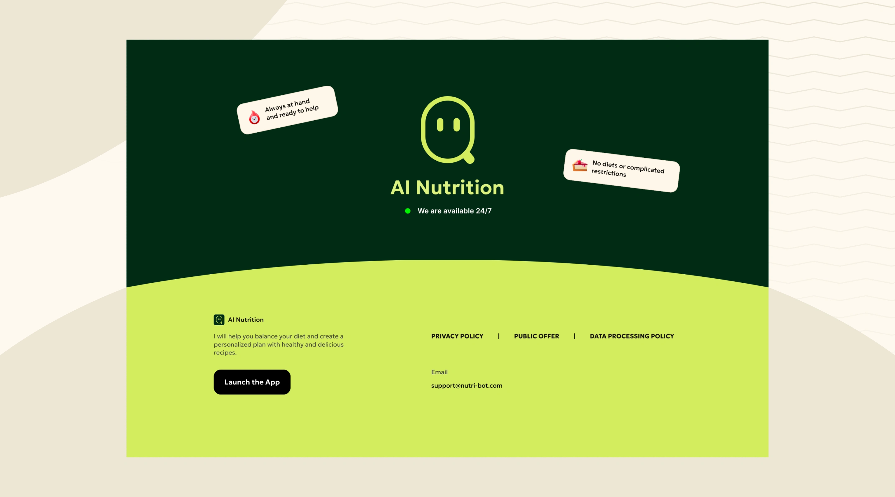
Footer
Footer
The footer flips the palette, deep forest green into lime, creating a strong visual close that feels intentional. The logo, availability note, and policy links are all present without cluttering.
The two floating badges handle last-minute objections without adding a whole section. They appear with a single jump animation enough to catch the eye.
The repeated CTA at the bottom consistently captures the 5–10% of users who scroll all the way through before deciding. Low effort to add, real impact on conversion.
Open to new projects
If you need a clean, strategic website built in Framer. Reach out and let's see what we can build together.
Like this project
Posted May 14, 2026
Designed a conversion-focused landing page for an AI nutrition app with the main goal - to encourage the user to take a quiz.
Likes
1
Views
1
Timeline
Mar 6, 2026 - Mar 19, 2026