Permanent Makeup Studio Website Design
Yana S.
Diana Lidzar: Permanent Makeup Studio Website
A three-page website for a permanent makeup studio in Towson, Maryland: Home, Services, and Portfolio. The site's job is simple: build enough trust for a first-time client to book a procedure that involves needles near their face.
I designed every section around that trust-building goal. The dark, editorial art direction signals precision and luxury rather than a typical beauty salon feel. Real before-and-after photography carries the Portfolio section, the Process breaks down exactly what happens at each step to remove fear, and the Reviews and stats in the About section reinforce credibility at every scroll.
My role
I led the project end to end: concept, art direction, copywriting, UI design, and Framer development across all three pages, including the booking flow, location section, and FAQ designed to handle the most common client concerns before they ever reach out.
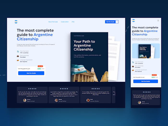
Hero section
Hero section
The headline sells the outcome, not the procedure: "Wake up beautiful. Every single day." For a service that involves real apprehension, that framing matters before anything else.
The photo does the trust-building work. A real, in-progress procedure shot answers the unspoken question every first-time client has: what does this actually look like?
The rose gold primary button against the outlined secondary creates clear priority book now or browse first. Rating and client count sit quietly below, reinforcing trust without shouting.
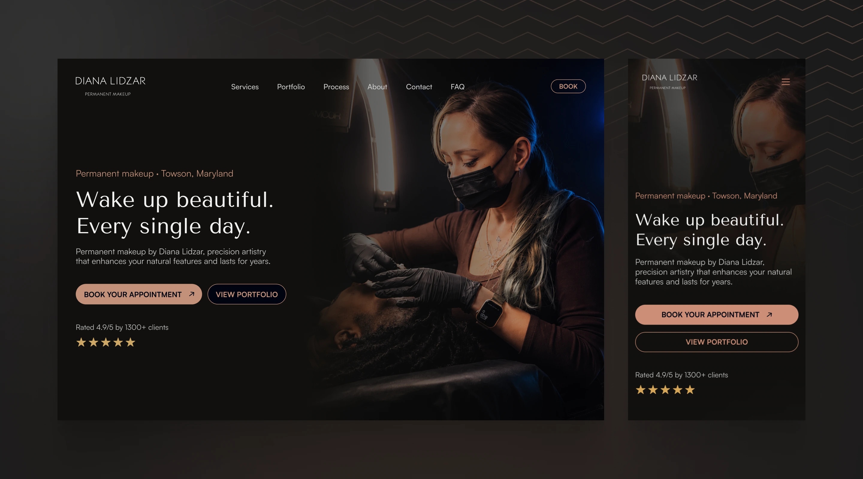
Services
Services section
Four cards, not eleven, the homepage shows a curated preview, not the full menu. "Consultation" leads the grid intentionally, positioning the first step before any procedure card, which lowers the barrier for someone still deciding.
Each card pairs a tight close-up photo with the procedure name and a one-line outcome, not a technical description. The photo does the convincing; the text just labels it. "See all" routes to the dedicated Services page for anyone ready to go deeper, keeping the homepage focused while still giving the full range a proper home.
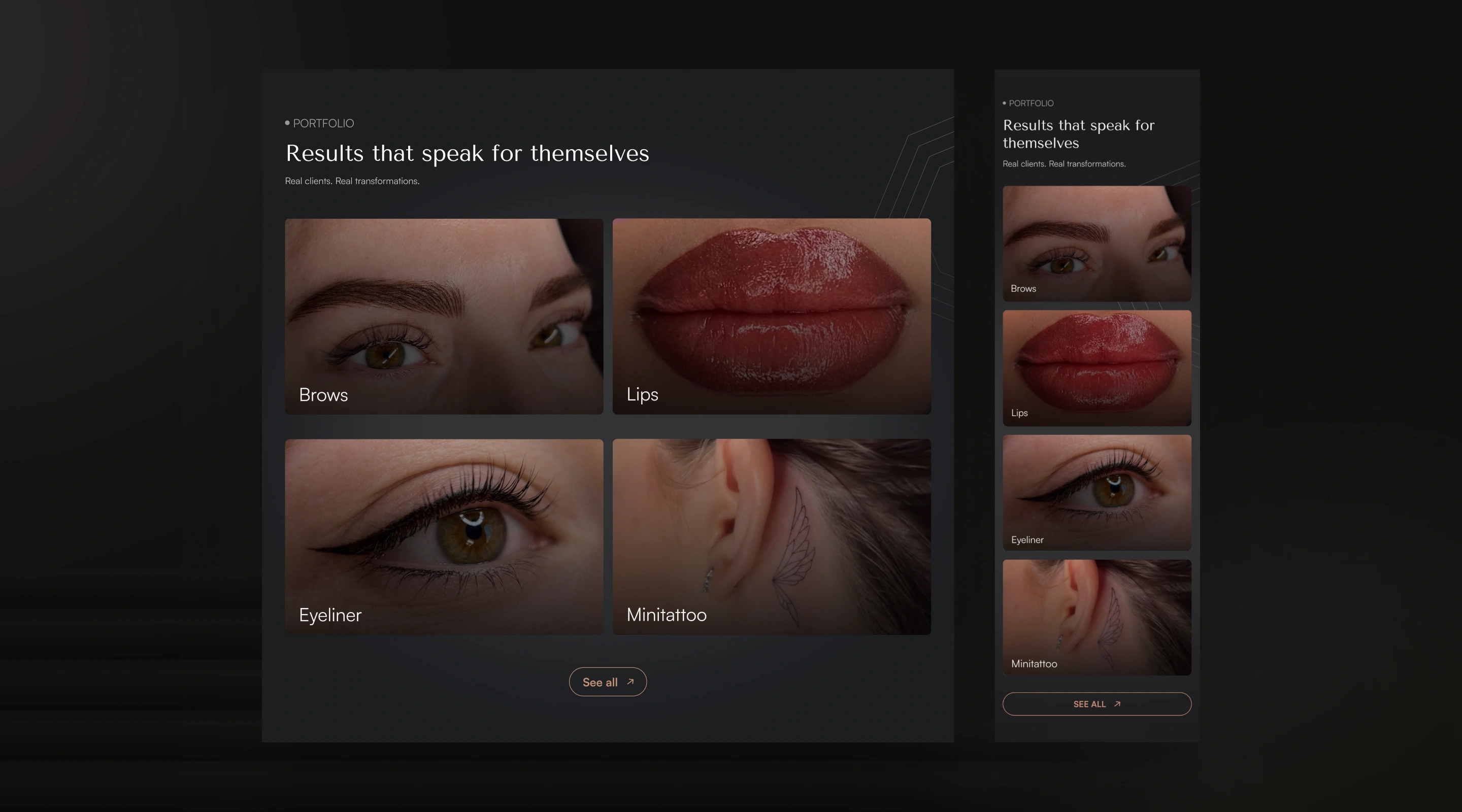
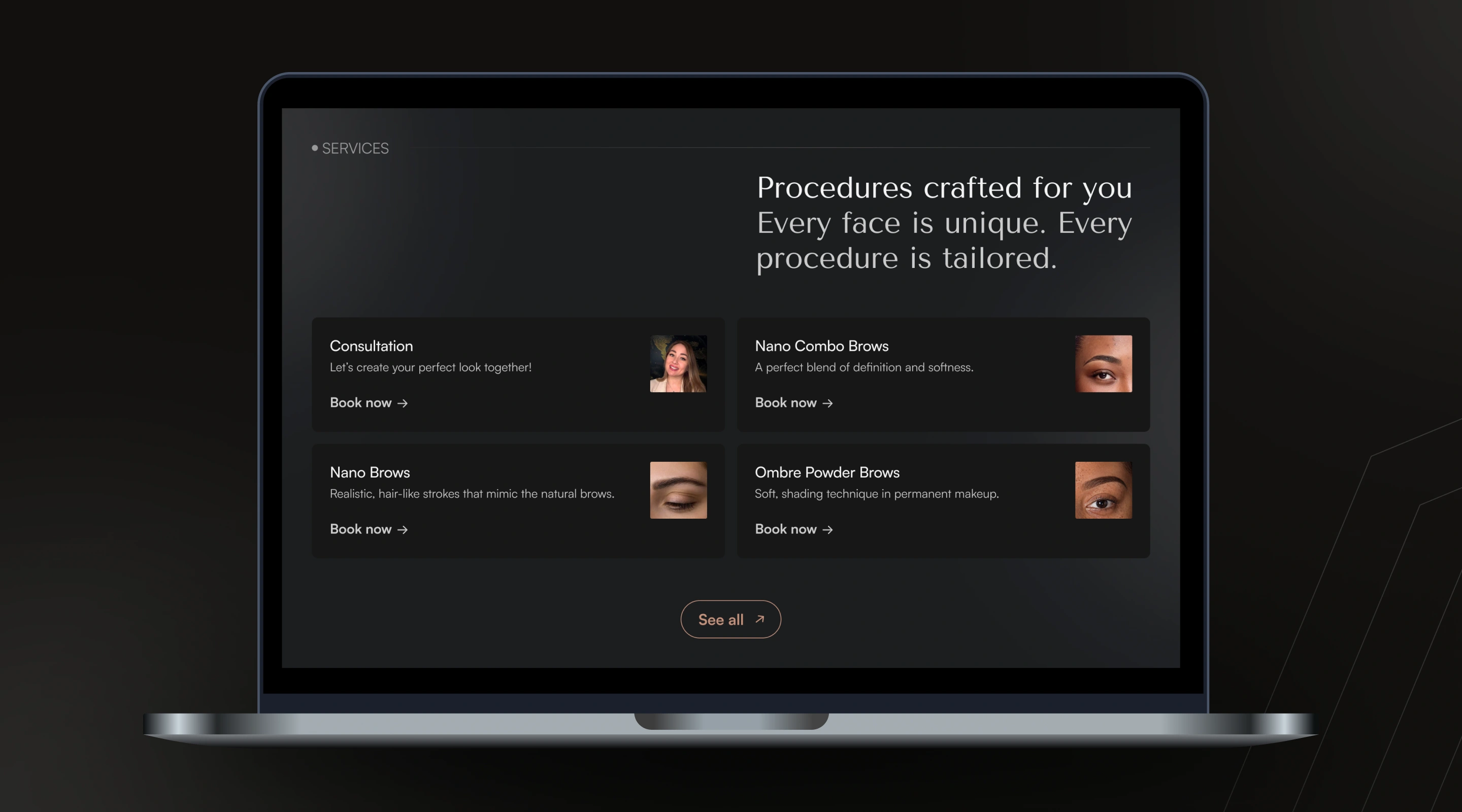
Portfolio
Portfolio section
The 2x2 grid lets the work speak for itself, no captions explaining technique, no before/after sliders, just tight close-up photography with a single category label. For a procedure this physical, the photo is the proof; anything more would just get in the way.
On mobile, the grid stacks into a single column without losing impact. Each photo still gets full width, so the detail and quality of the work stays visible rather than shrinking into a cramped thumbnail.
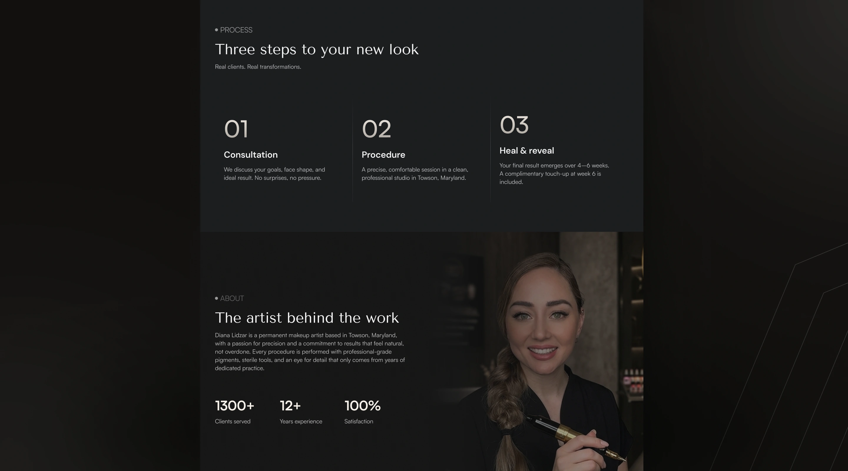
Process and About
Process section
Three steps, vertical dividers, oversized numbers: the structure mirrors the simplicity it's describing. Each step answers a different fear: what happens, will it be comfortable, when do I see results. By the time a visitor reads "no surprises, no pressure" in step one, the anxiety the section is designed to defuse is already easing.
About section
A direct portrait puts a real person behind the precision. The three stats (1300+, 12+, 100%) sit right beneath the bio, turning a personal introduction into a credibility check in the same breath. For a procedure this intimate, knowing who's holding the tool matters as much as what the tool does.
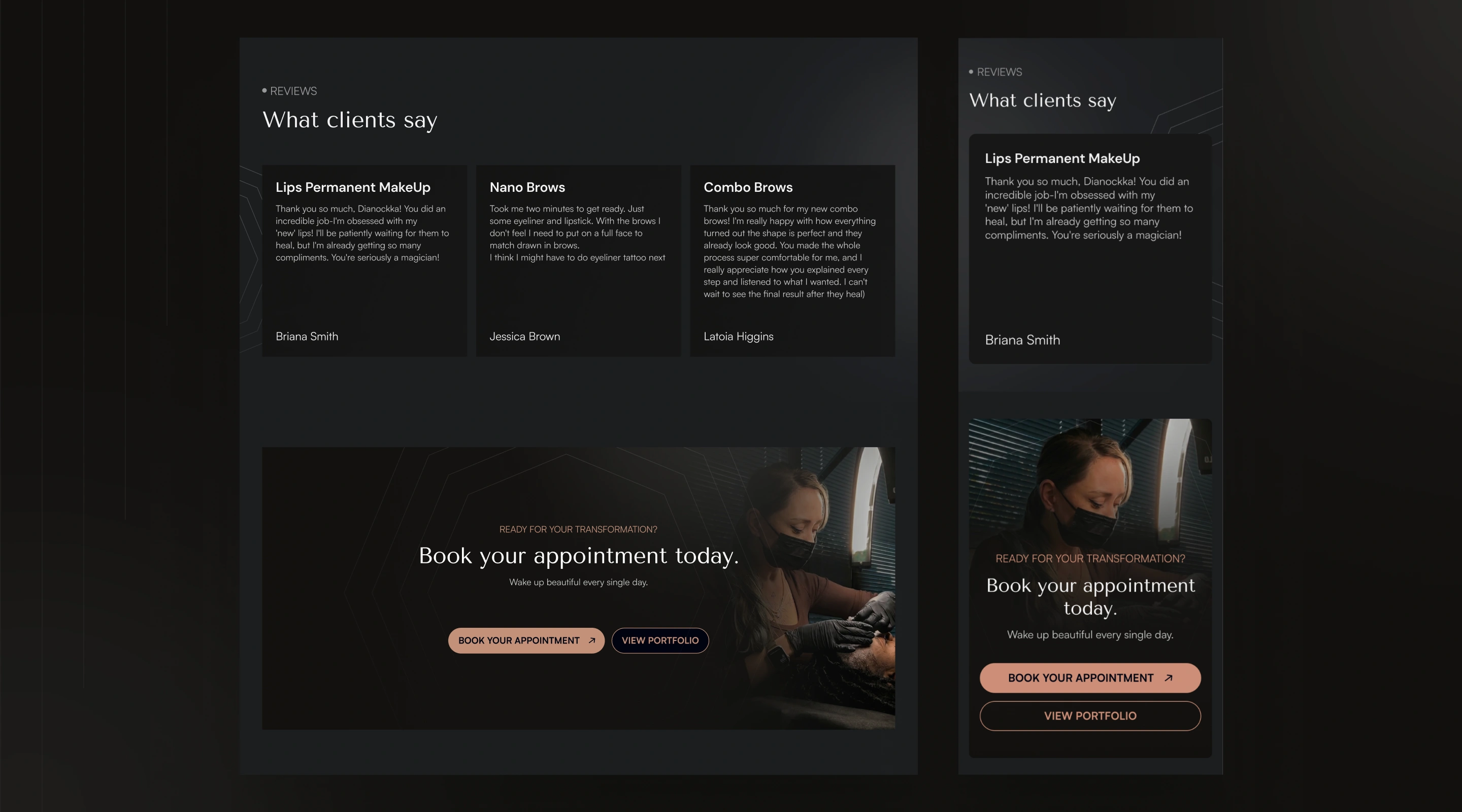
Testimonials and CTA
Reviews + Final CTA
Real client quotes, organized by procedure, with first names attached, specific enough to feel genuine, not polished into generic five-star fluff. The mention of healing timelines and real reactions adds a layer of authenticity that scripted testimonials never have.
The final CTA repeats the hero's photo and button structure on purpose: same image style, same two-button hierarchy, same headline tone. A visitor who scrolled the entire page and is finally ready to act shouldn't have to relearn a new layout; they should recognize exactly what to do.

Open to new projects
If you need a clean, strategic website built in Framer. Reach out and let's see what we can build together.
Like this project
Posted Jun 21, 2026
Designed a trust-building website for a permanent makeup studio.
Likes
3
Views
5