PACHENTRO / Brand Identity
Pachentro
( visual Identity )
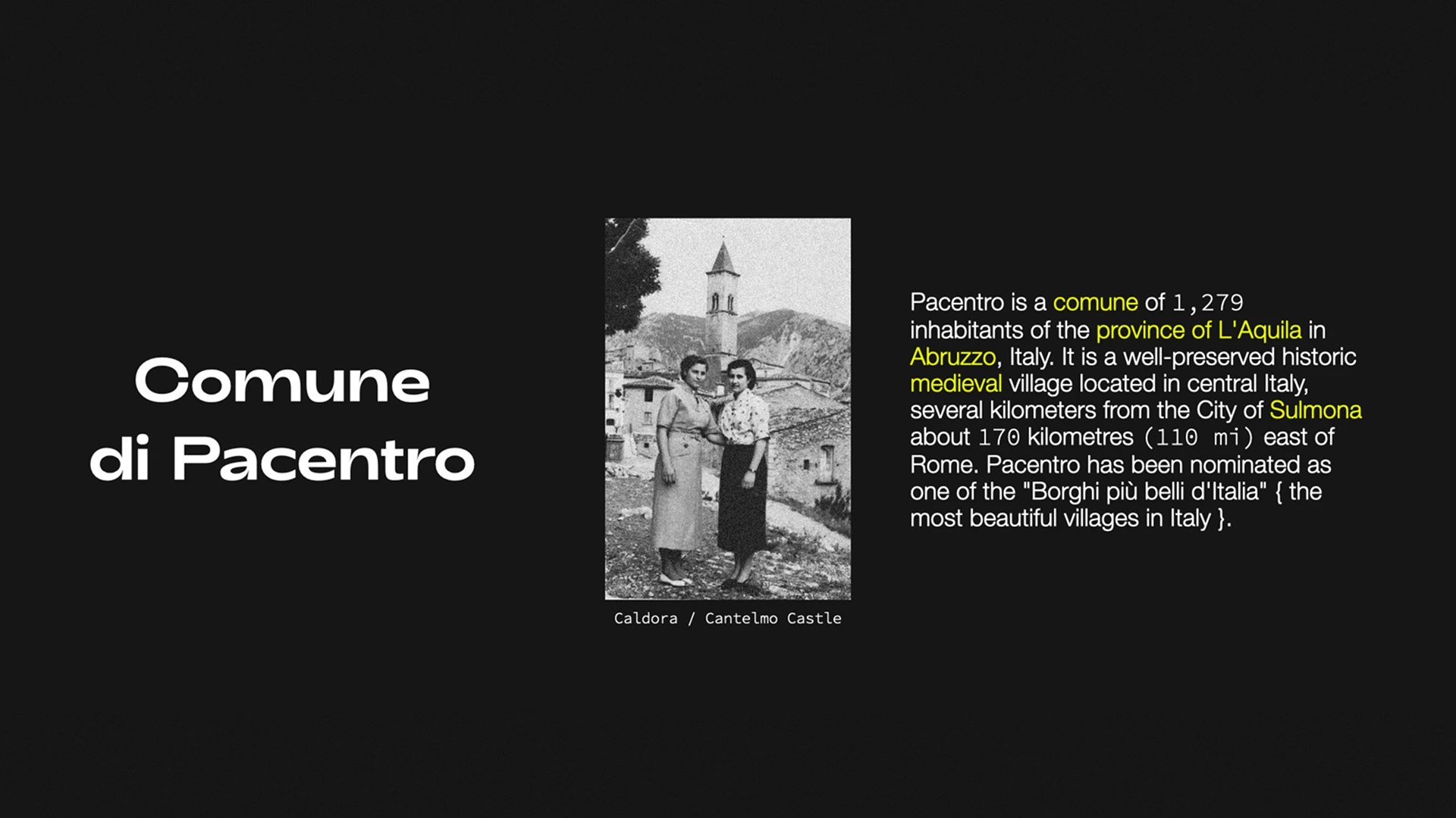
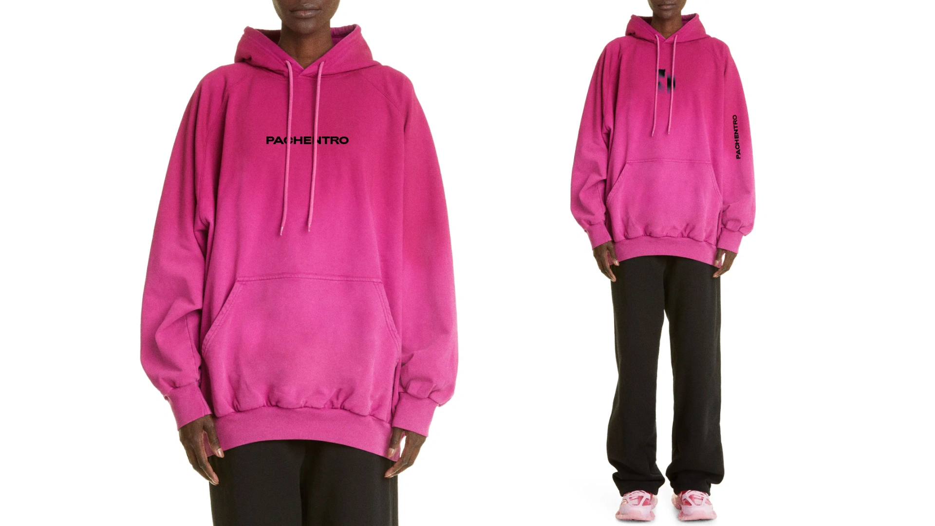
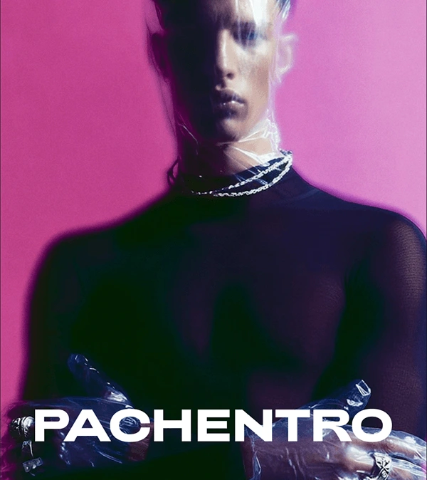
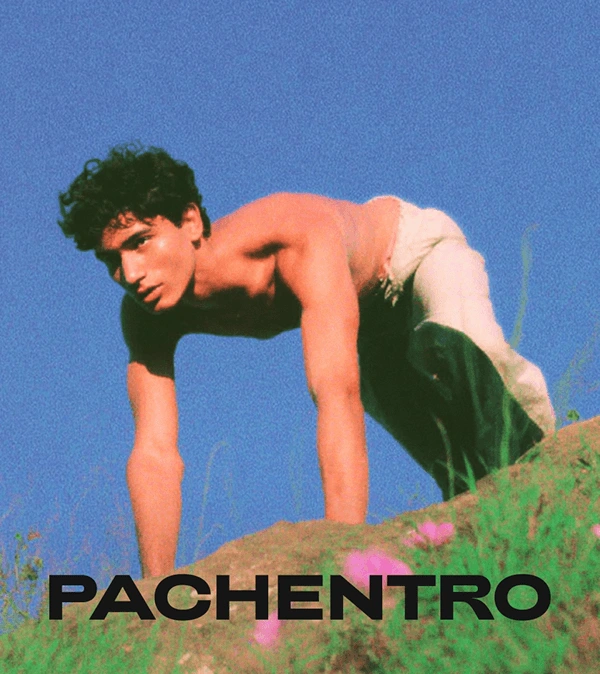
Inspired by a quiet town in the heart of Italy, PACHENTRO is a clothing brand rooted in the aesthetics of slow living and elevated simplicity. The name echoes ease, confidence, and timeless cool — think vintage photos
of Princess Diana in sweatshirts, or the effortless looks of Hailey Bieber and Kendall Jenner off duty. Blending nostalgic charm with a modern, graphic approach, PACHENTRO reimagines Italian heritage through a new
lens — bold, minimal, and consciously relaxed.

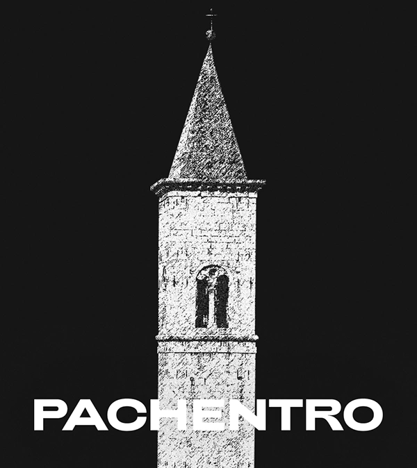
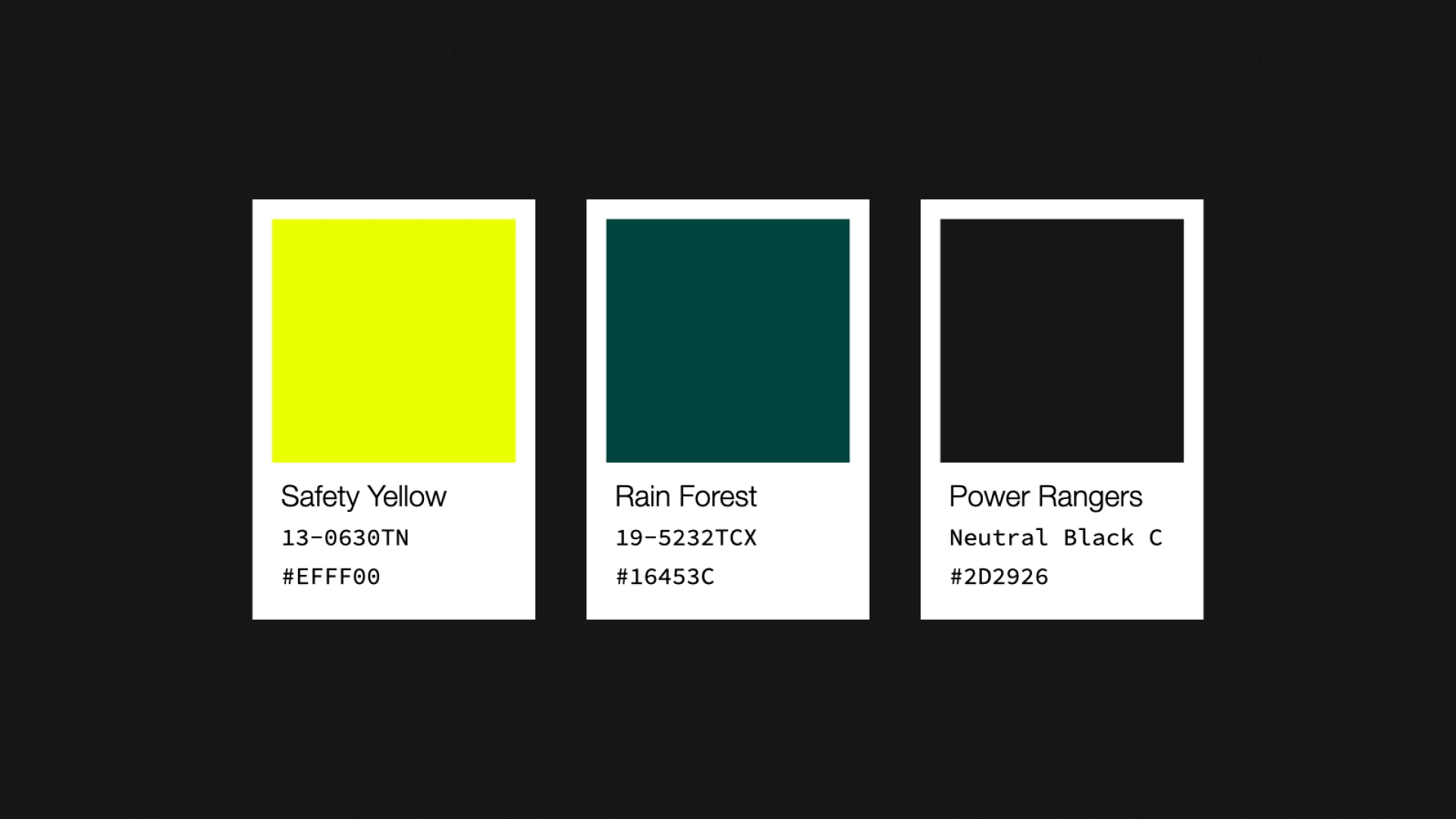
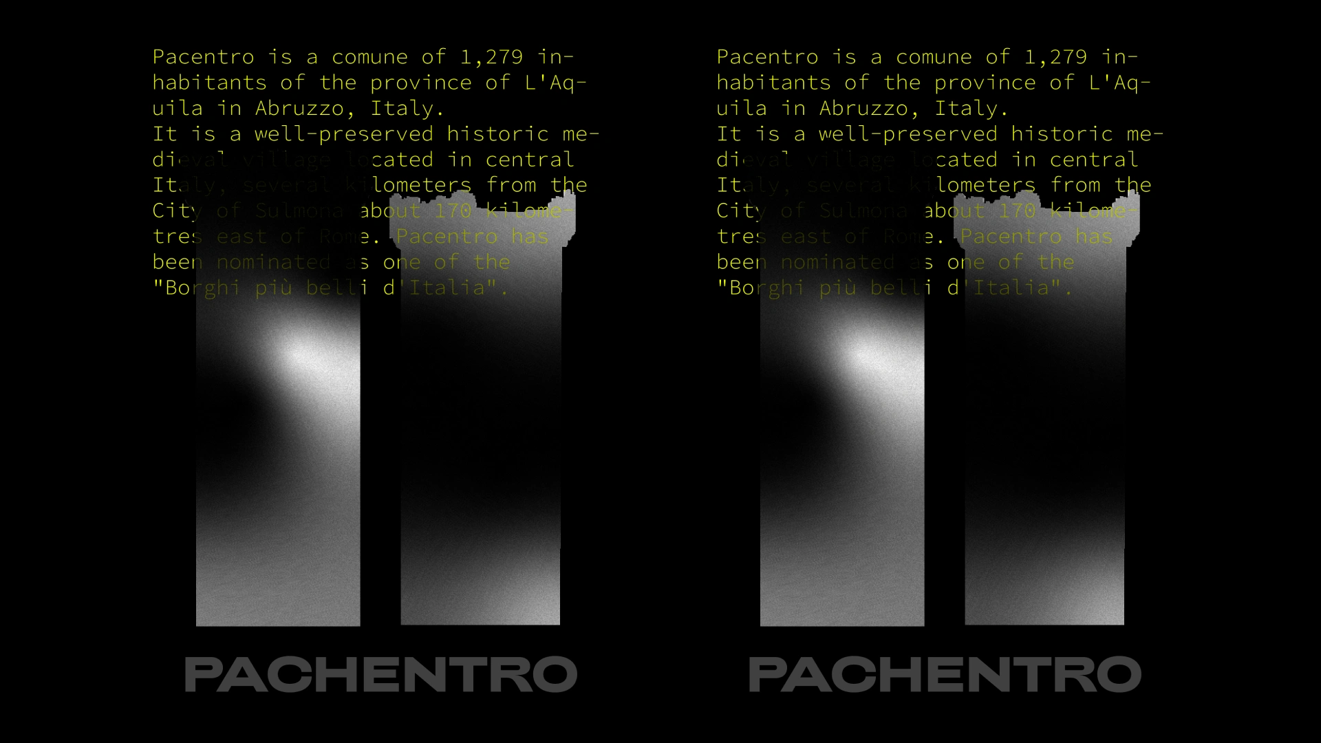
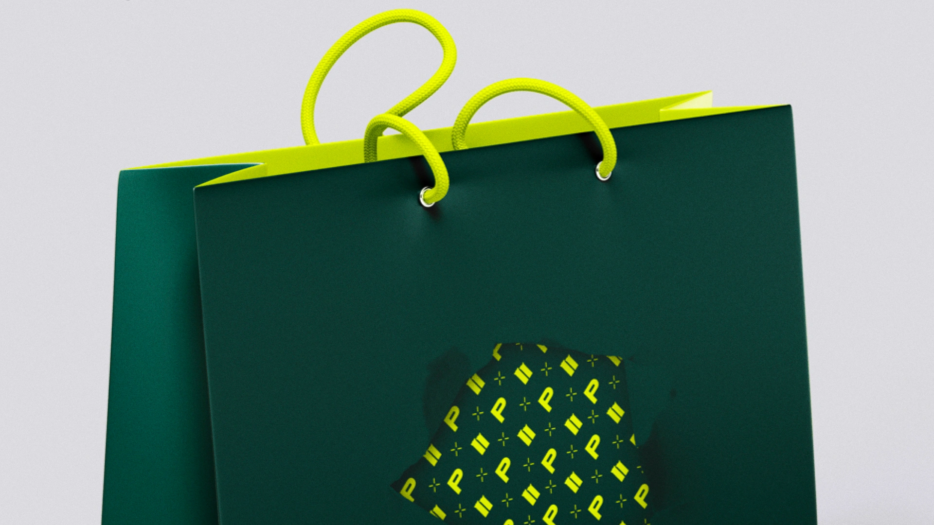
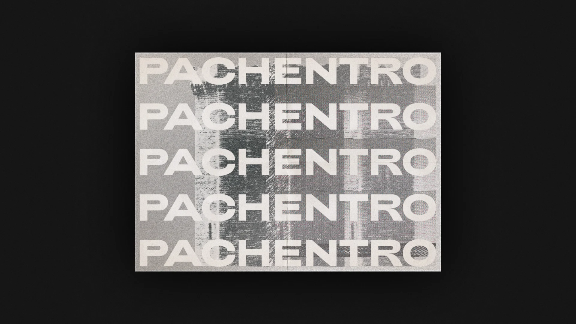
The identity draws inspiration from the town’s most iconic feature — three medieval towers rising like a fortress above the hills of Abruzzo. This architectural silhouette becomes a graphic motif across visuals and packaging, symbolizing strength, continuity, and a quiet kind of majesty. The contrast of black-and-white serenity with vibrant neon accents reflects the dual nature of the brand: rooted in tradition, designed for today.
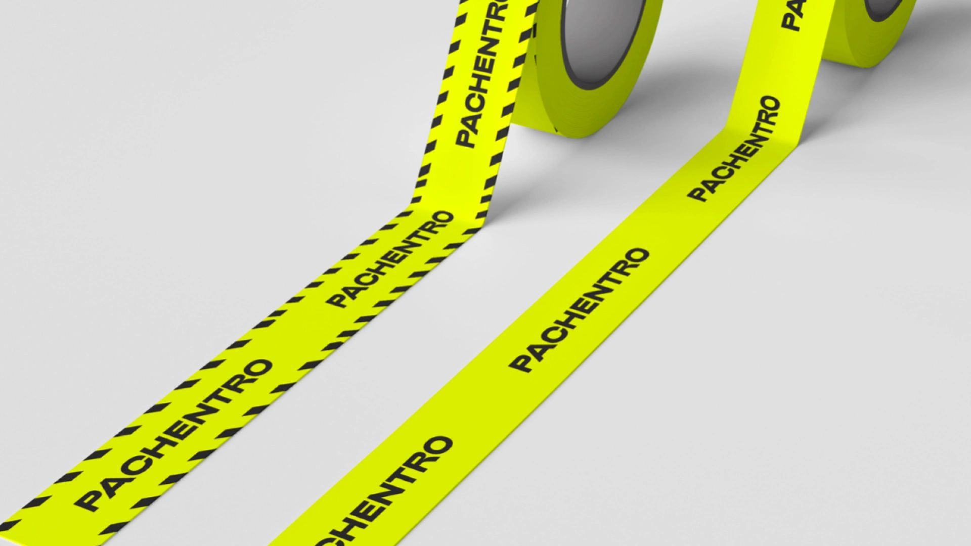
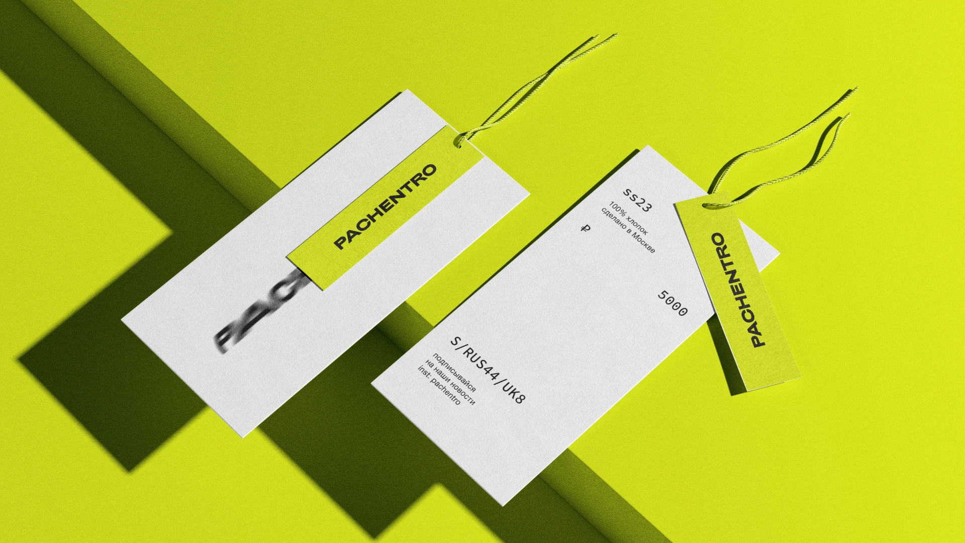
Every tag, bag, and tape is a part of the system — sharp, cohesive, and never average.


Ready to kick off, restart, or make it happen?
Let’s turn up the heat
heatbureau.com
Like this project
Posted Jan 10, 2026
Concept & Branding for Pachentro — a contemporary apparel brand.


