
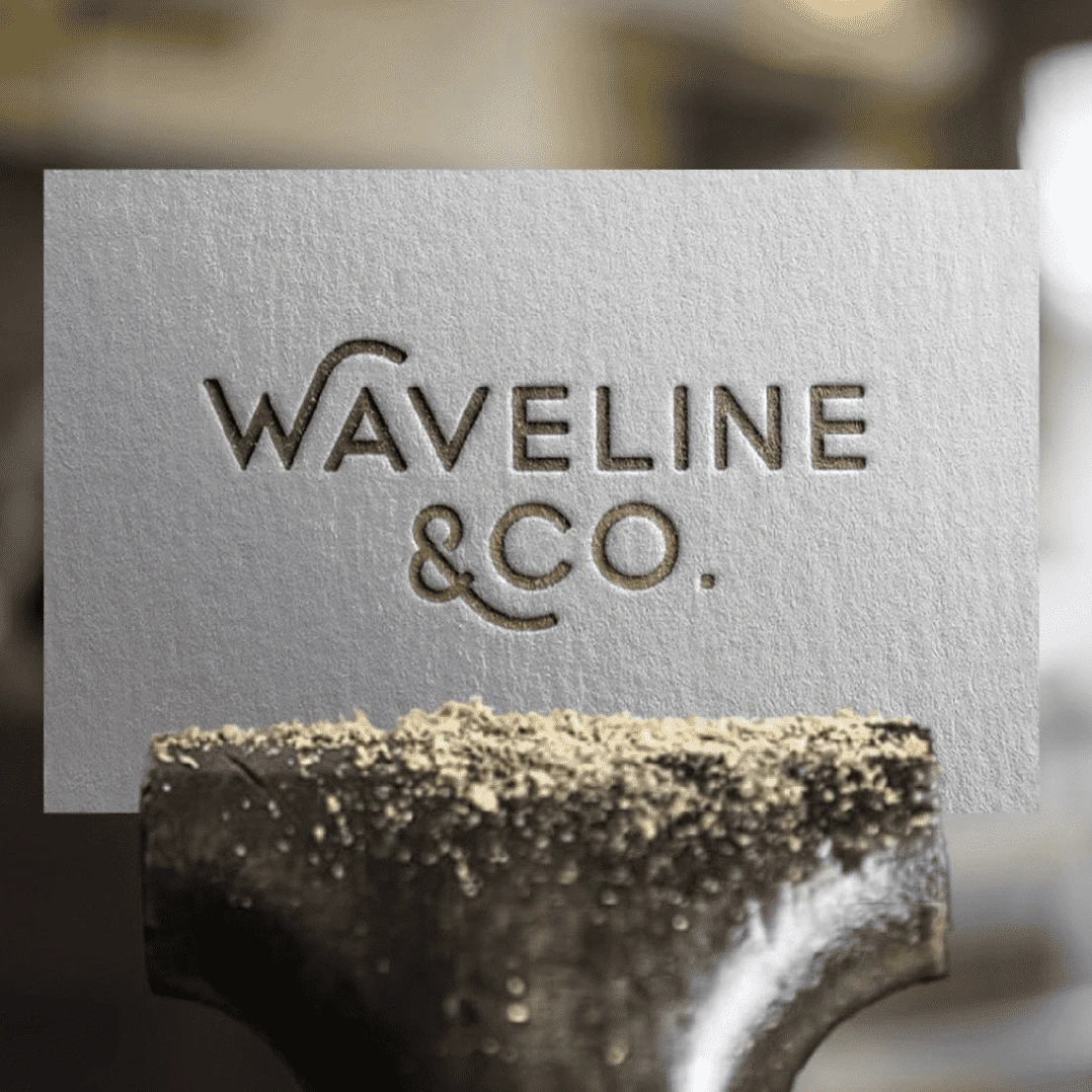
A hardware haven nestled in the heart of Western Australia’s picturesque countryside, near the iconic Wave Landmark. Rooted in the Australian outback, their brand embodies simplicity and functionality, offering a hardware shopping experience surrounded by the breathtaking landscapes that inspire.
Project Brief:
• Wave Shaped Land Mark
• Countryside
• Texture
Deliverables:
• Logo
• Typography Suite
• Colour Scheme
• Business Cards
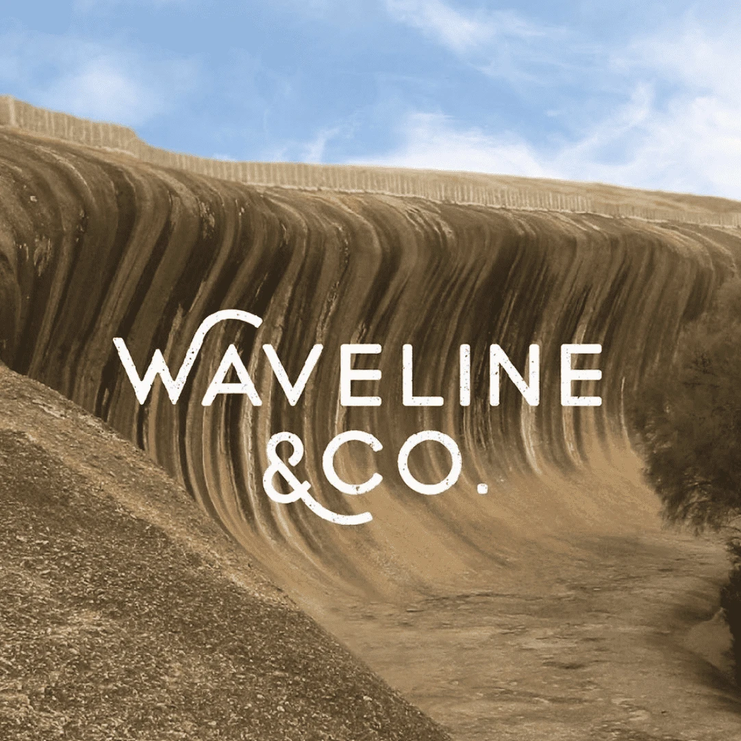
Design Notes:
• Brand colours reflect the warmth of the Australian outback, creating a harmonious palette that mirrors the rugged beauty of the countryside location.
• The logo encapsulates the essence of the hardware store with a subtle nod to the nearby Wave Landmark. The W and the ‘&’ sign intricately replicate a curve in this iconic landmark, becoming a distinctive shape that resonates throughout the brand.
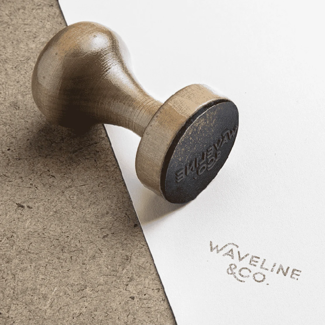
• Texture to evoke a sense of durability and ruggedness, mirroring the sturdiness of the hardware they provide.
0 likes · 6 views · Jul 31, 2025
Created a brand identity for Hardware Haven inspired by the Australian outback.
Timeline
Jul 7, 2020 - Jul 14, 2020


