Almost Fine: A Vibrant Identity for Independent Media
Jere Diberto

Almost Fine: Designing a Dual-Toned Identity for Independent Media & Artists
Overview and Core Mission:
The Client: Almost Fine is a media company dedicated to supporting independent artists and helping them realize their diverse creative projects.
Core Values: The brand's identity is built on being friendly, minimalist, and inclusive, encouraging its community to discover, educate, and embrace change.
The Identity Solution: A Twist on the Universal 'OK' Symbol
I developed an identity system that visually navigates the space between perfection and reality, using design to convey openness and creativity:
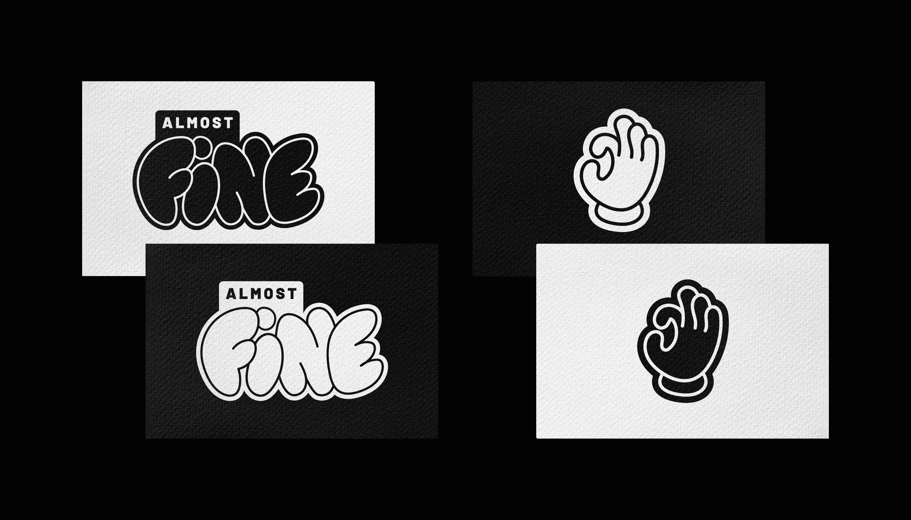
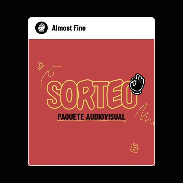
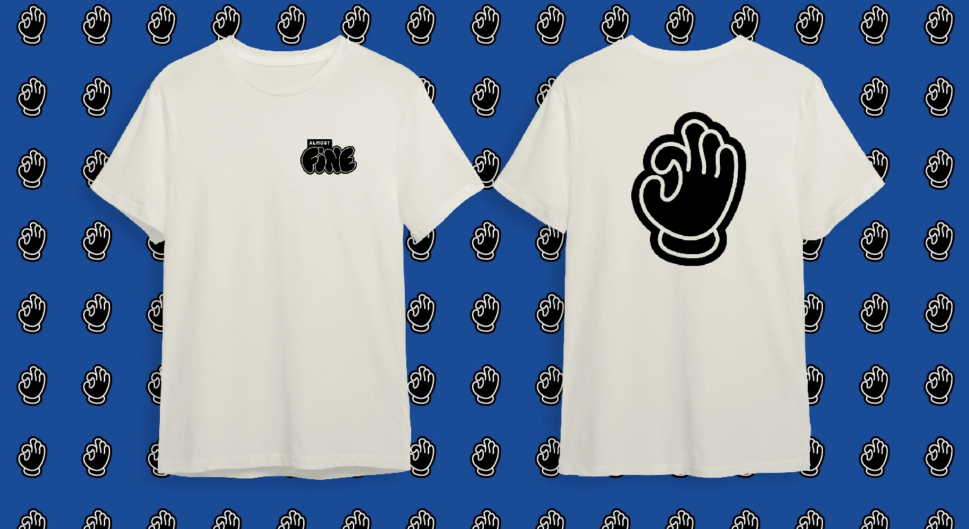
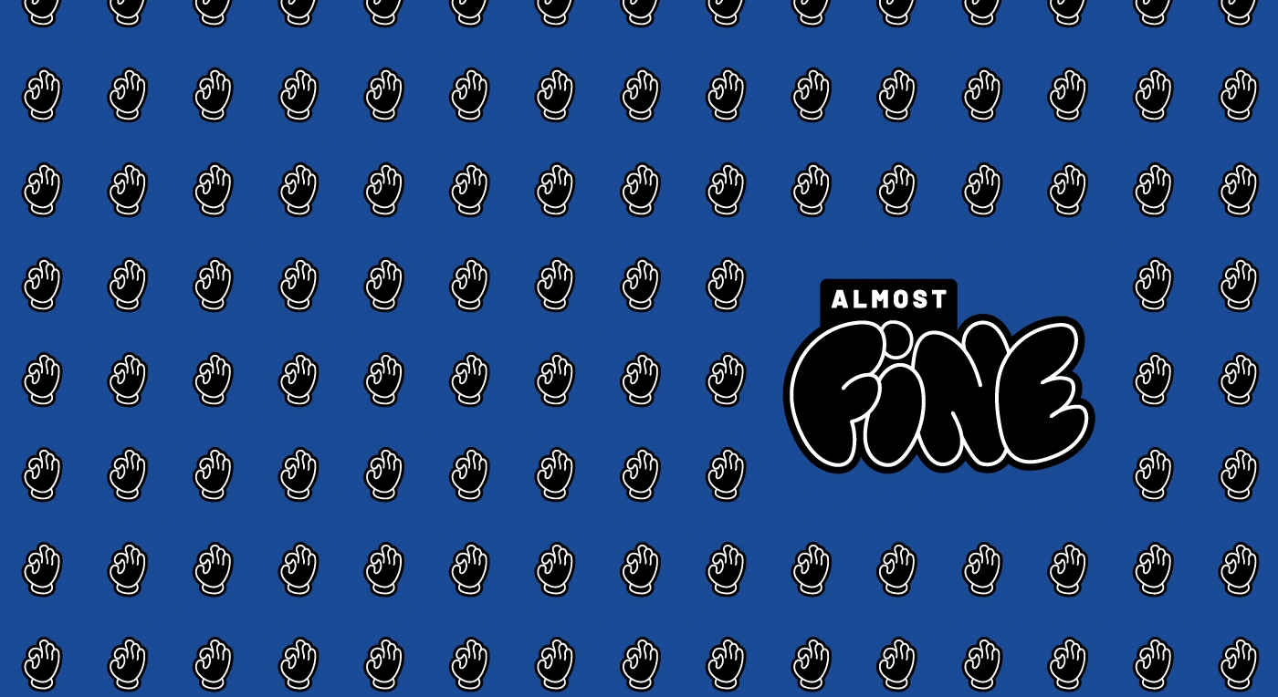
The Logo Concept: The primary logo features a stylized hand gesture, mimicking the universal 'OK' symbol (👌). The fingertips do not quite touch, subtly communicating the brand's name: "Almost Fine." This design is both friendly and honest, referencing Sign Language to underscore the company's commitment to inclusion.
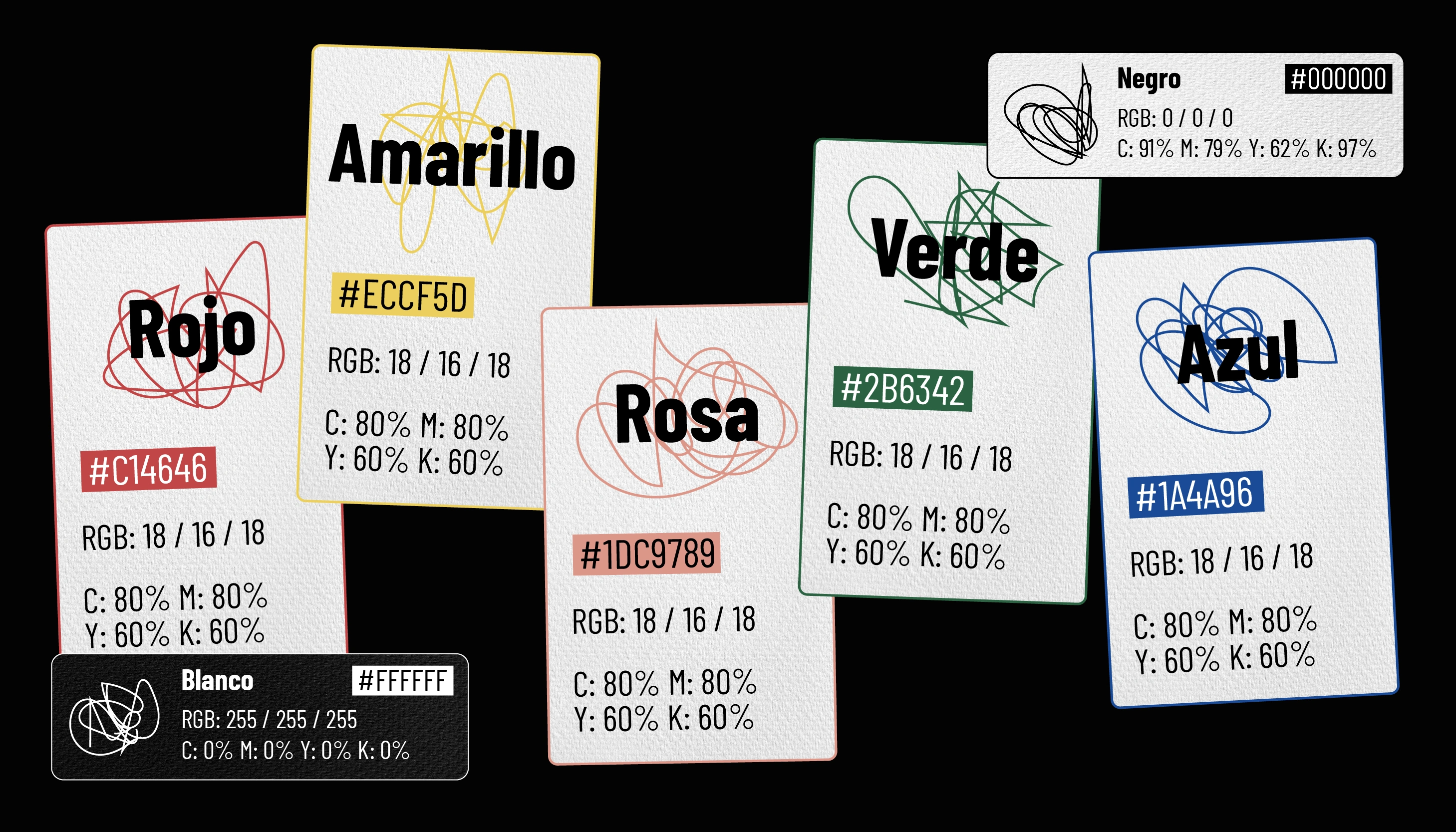
The Dual-Tone Palette: The color strategy is intentionally dynamic and dualistic. A foundational black palette ensures the brand feels modern, adult, and professional. This is energized by a secondary palette of vibrant, almost childlike colors (including bright blues, pinks, yellows, greens, and reds) that communicate creativity, fun, and approachability.
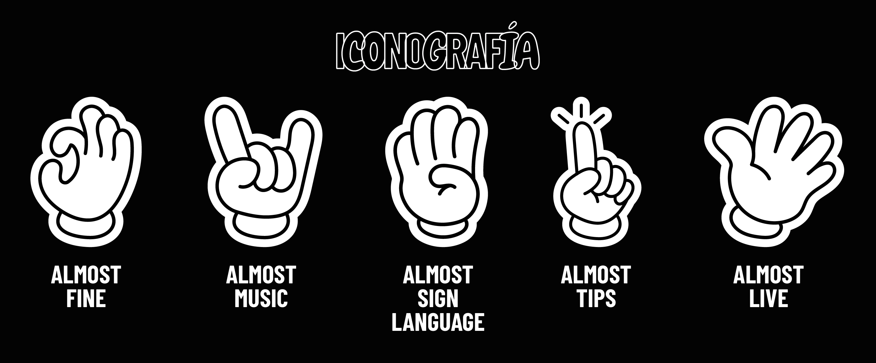
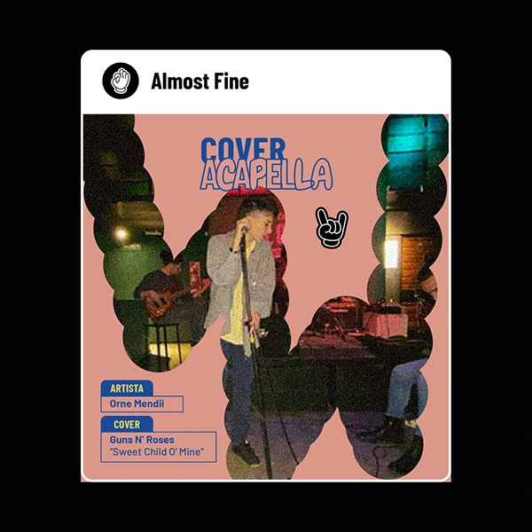
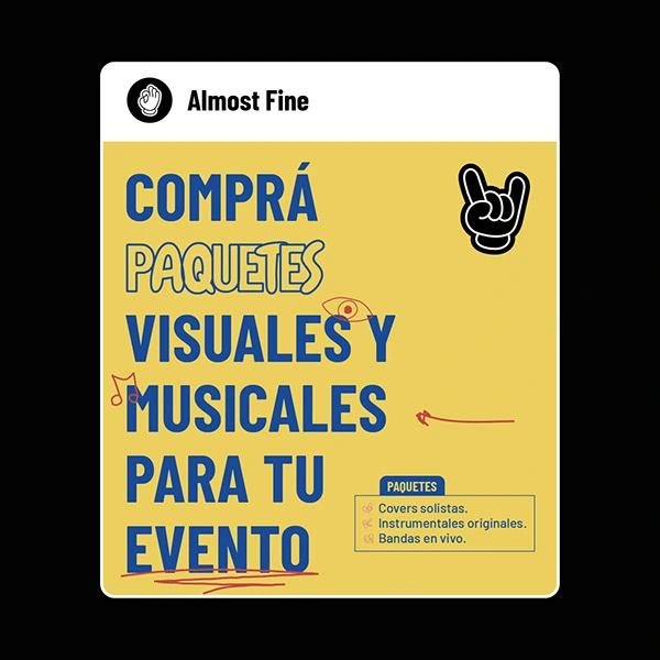
Iconic Hand System: To organize the media company's diverse content categories, I designed a specialized set of hand-gesture icons. Each icon represents a different content area, maintaining brand consistency while making navigation intuitive.
Visual Toolkit and Application
To ensure the identity was immediately functional and cohesive across all media:
Vintage Style Filter: I created a custom Photoshop filter to apply a consistent vintage aesthetic to all imagery, giving the brand's photography a unified, nostalgic, and high-quality feel.
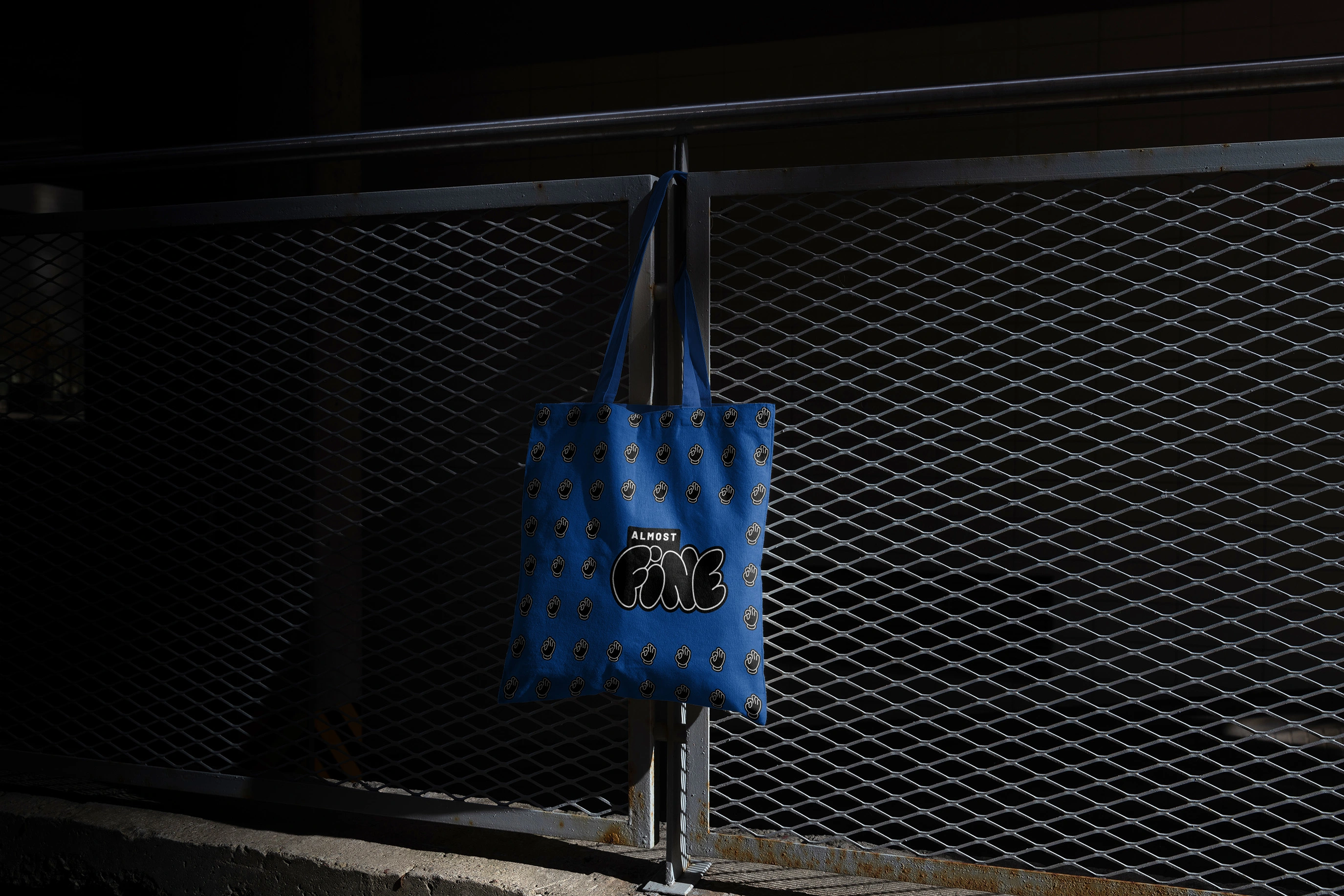
Visual Tiling Pattern: A dynamic pattern/tiling system was designed to be applied across various formats, adding visual texture and depth to backgrounds and digital assets.
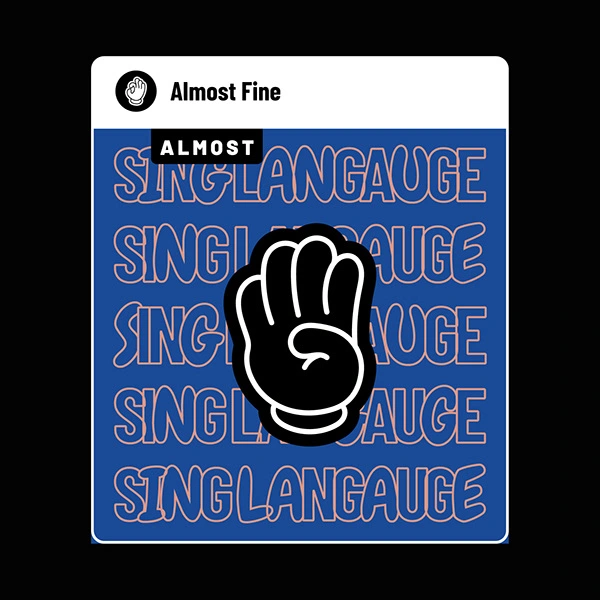
Social Media Application: I created a series of social media posts to demonstrate the brand in action, showcasing how the logo, colors, and pattern integrate to create compelling content.
Gracias por mirar
Te invito a seguirme en instagram
Like this project
Posted Oct 24, 2025
Created a dynamic identity blending the 'OK' symbol with vibrant colors to reflect inclusivity and creativity.