Tessaly: SaaS brand identity, logo system and guidelines

Vincent L. Anderson

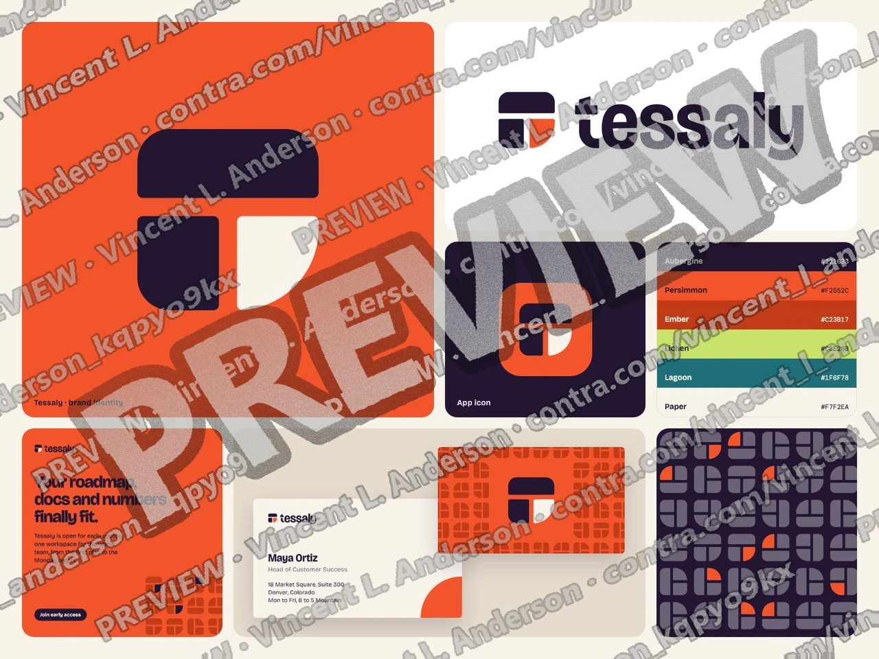
Tessaly is a brand identity for a SaaS workspace, built on one idea: everything fits. The name comes from tessellate, and the mark is one square tile cut along a T-shaped seam into three pieces that lock together, the last one in Persimmon with a fully rounded corner. The custom wordmark in Bricolage Grotesque carries the same seam through its t. Warm Persimmon and deep Aubergine on Paper set it apart from the blue most SaaS brands default to, and a pattern made from the tile runs through the app, the app icon, the website, email, social posts, a business card and a letterhead. This is a demo I made for one listing's brief, with a fictional name and illustrative content. It includes 3 rejected directions with reasons, 4 logo versions in 5 colorways with clear space, minimum sizes and 8 misuse rules, a 9-color palette whose 16 approved text pairings pass WCAG AA, an 11-style type scale, a 14-page guidelines PDF, 10 mockups and 86 final files for digital and print, including layered SVGs and design tokens ready for Figma.
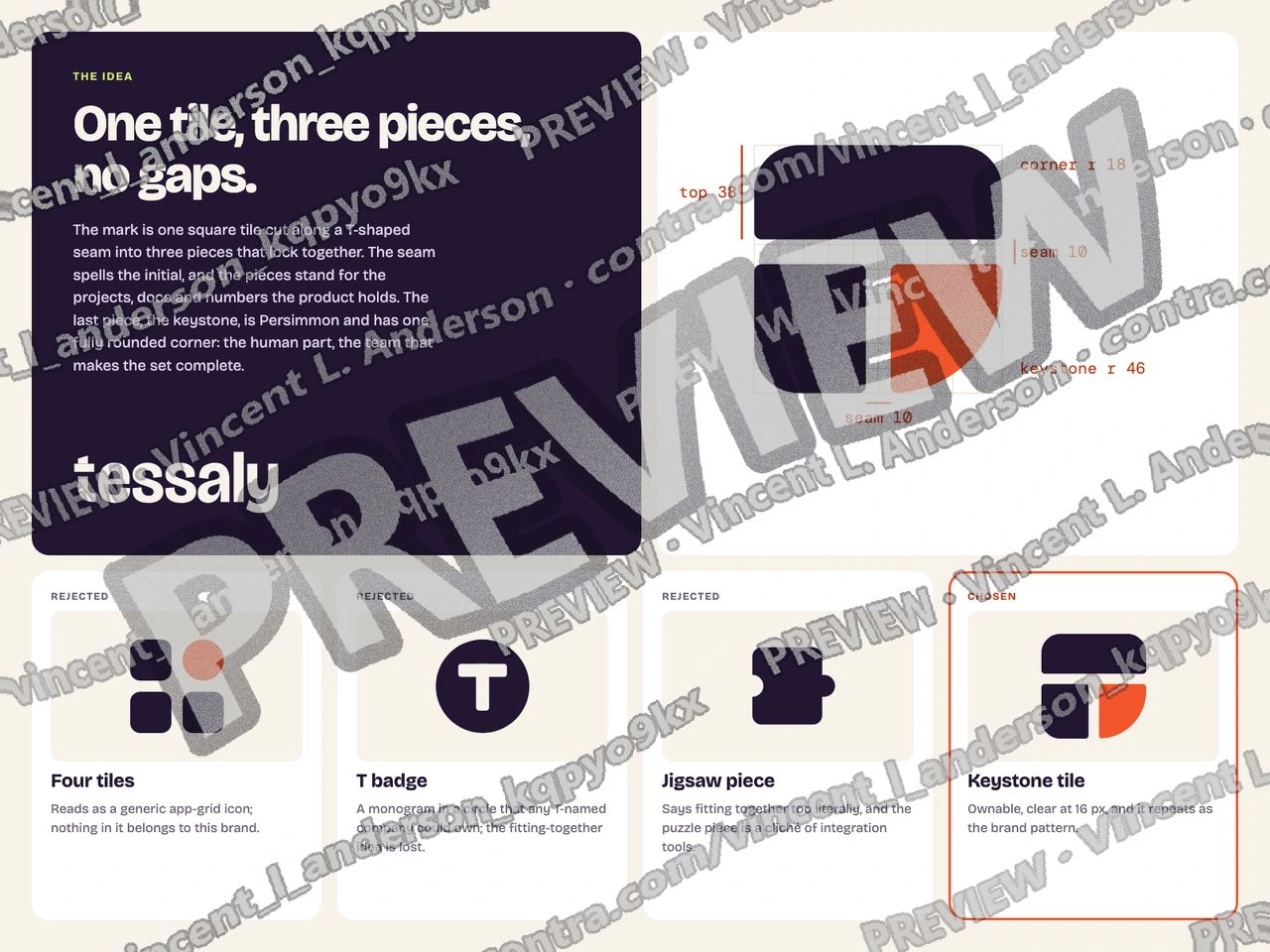
Concept and exploration: why the name and the tile, the category conventions Tessaly avoids, and three rejected directions with reasons
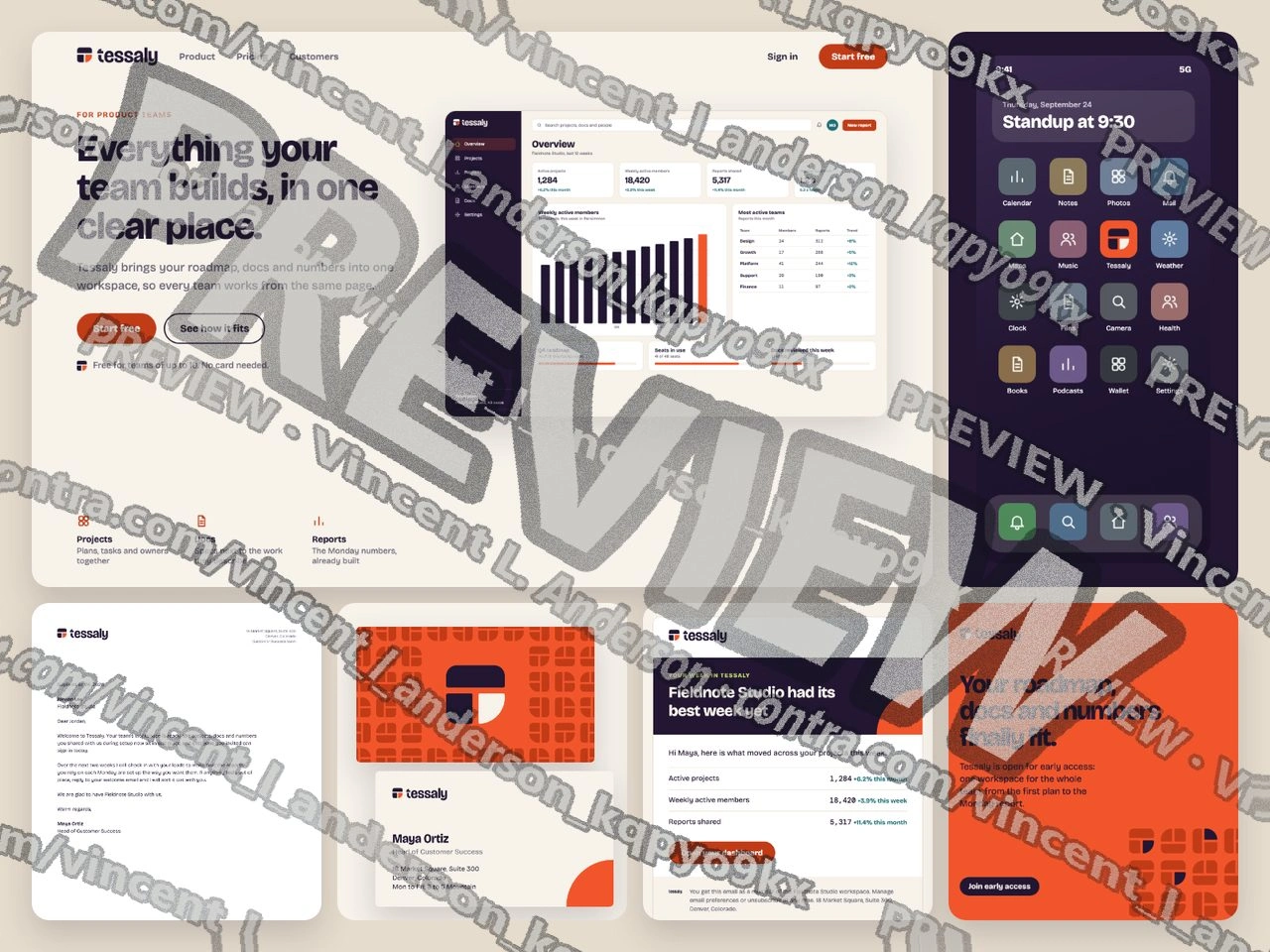
Applications: the identity across the app, website, email, social, business card and letterhead
Guidelines pages, animated: concept, logo, color, type, pattern and use
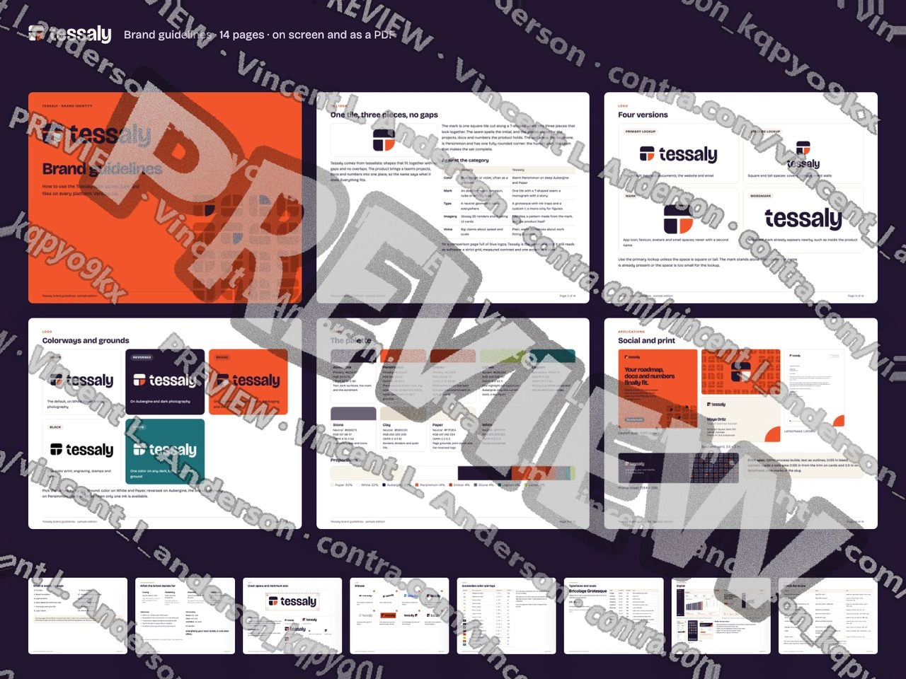
The 14-page brand guidelines document
A watermarked contact sheet with the full file list is linked from this page; the complete file pack is delivered on contract.
Like this project
Posted Sep 24, 2026
Tessaly, a SaaS brand identity built on one idea: everything fits. A tile mark with a T-shaped seam, a custom wordmark, a warm Persimmon and Aubergine palette, type, a 14-page guidelines PDF, 10 mockups and a full file pack for digital, print and Figma.
Likes
0
Views
2