weDev
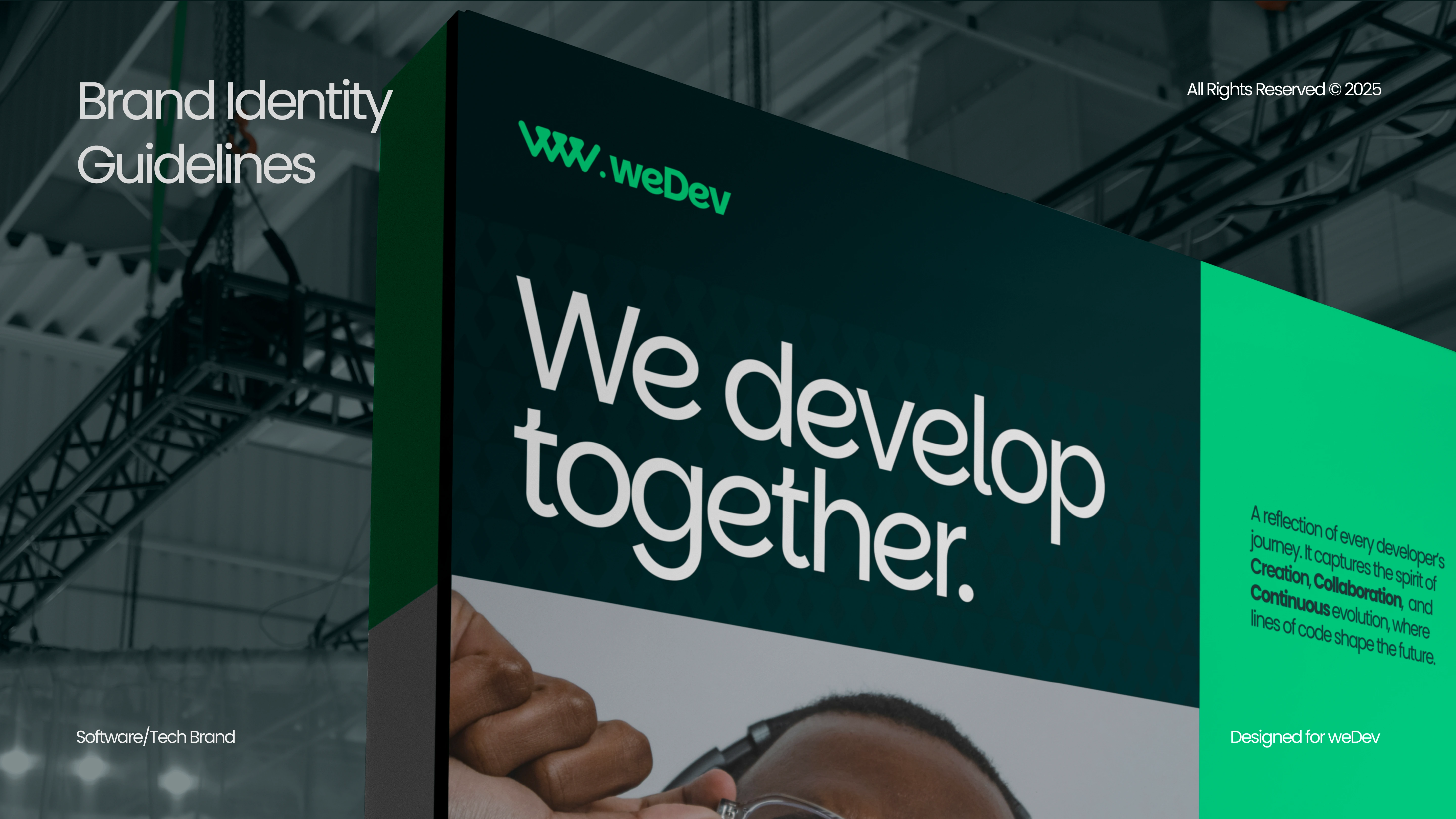
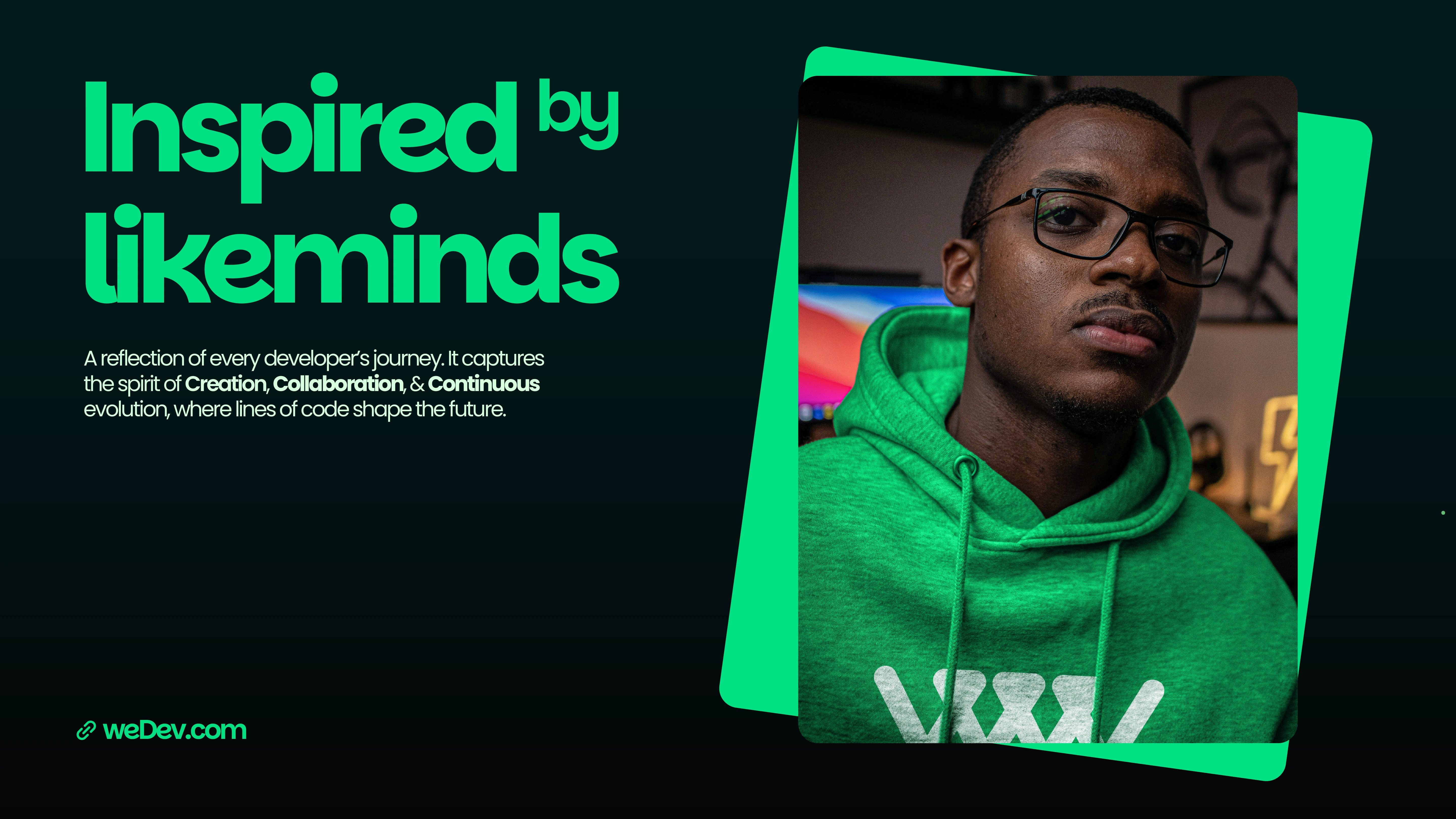
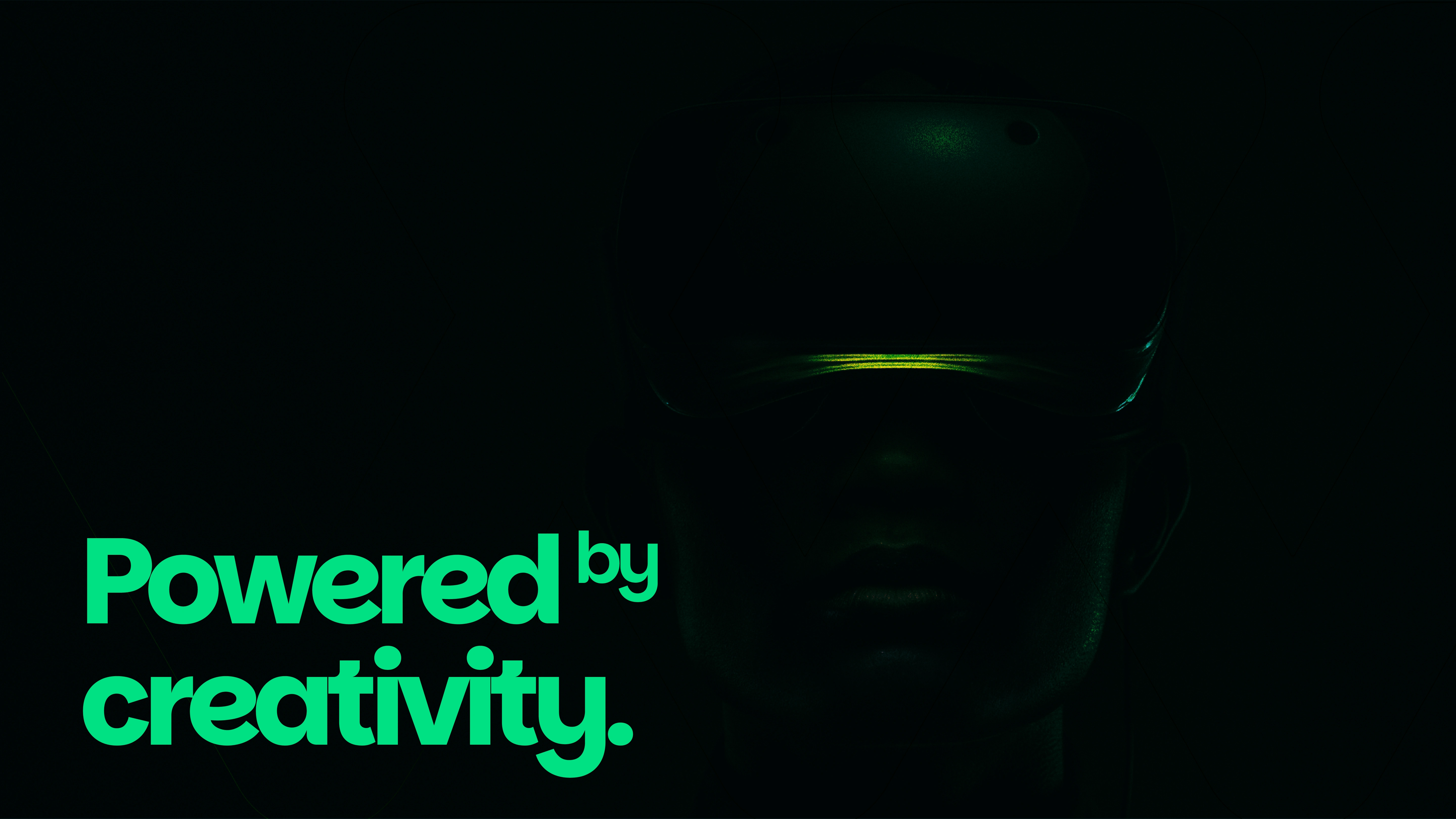
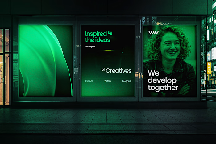
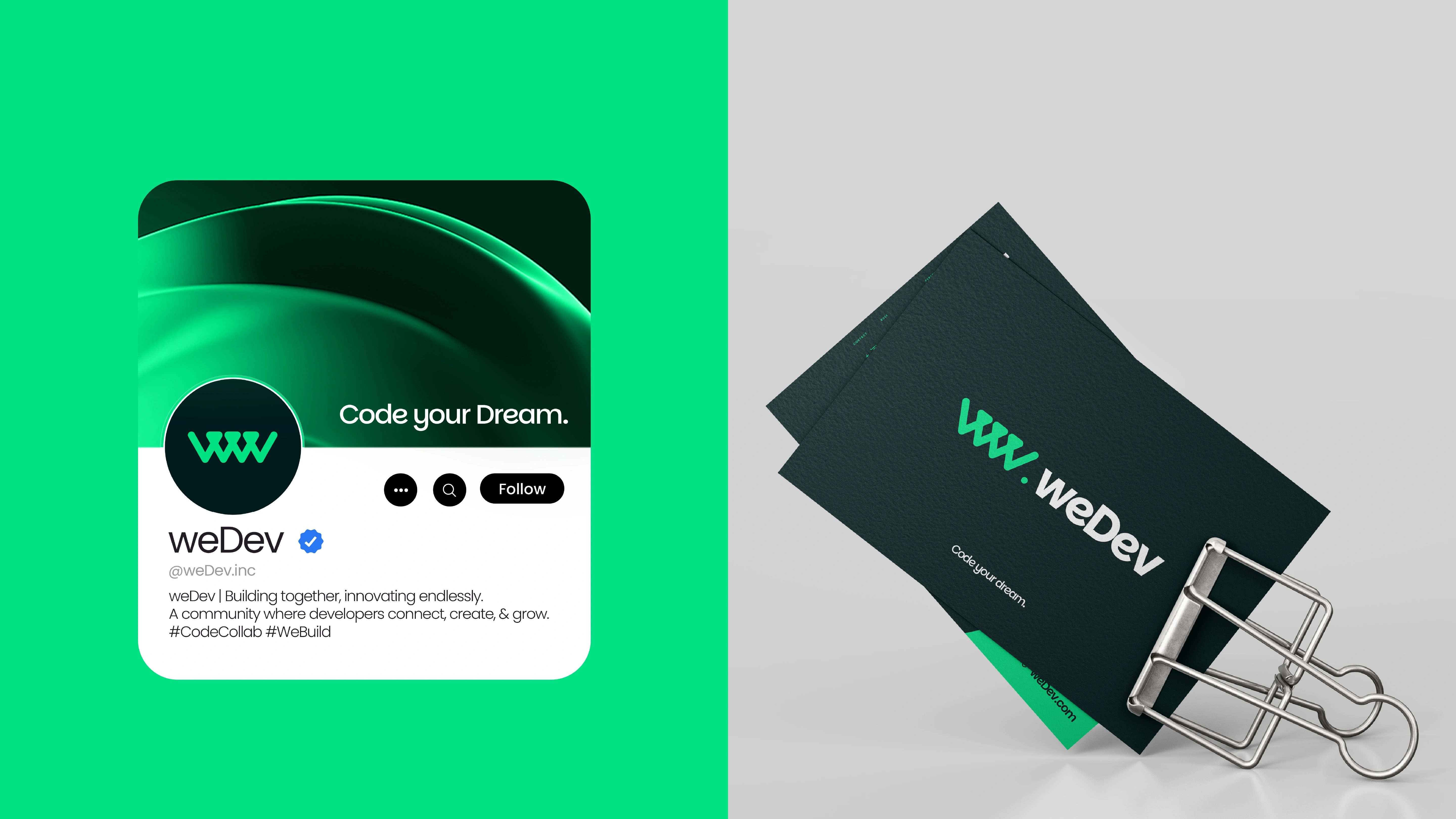
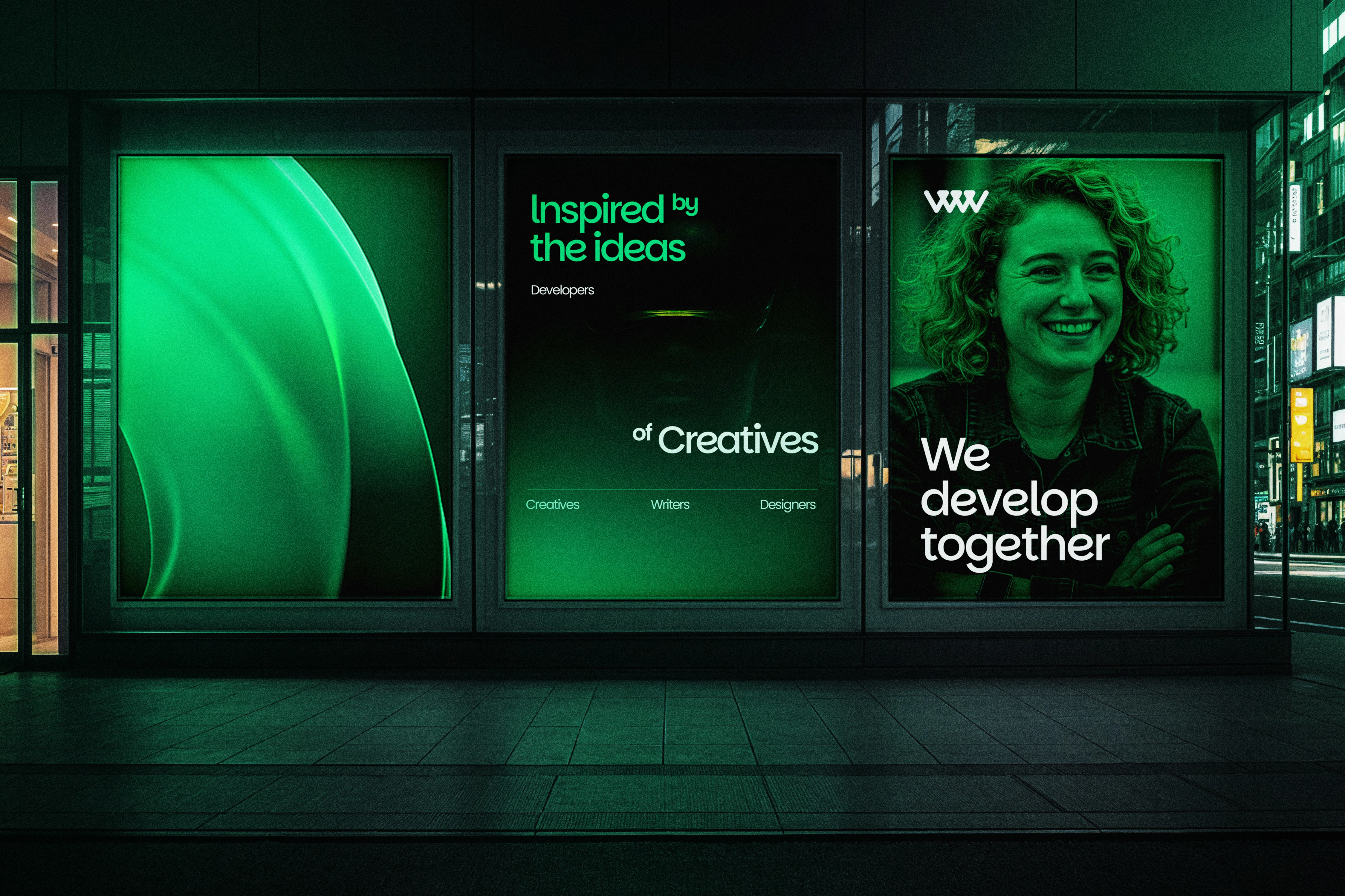
In a world where ideas are limitless and execution is key, weDev was birthed — a home for tech enthusiasts to create through collaboration and grow through iteration. It reflects every techie’s journey, all of the bold first steps, late-night breakthroughs, bugs, fixes, and the ever-present drive to evolve and create magic.
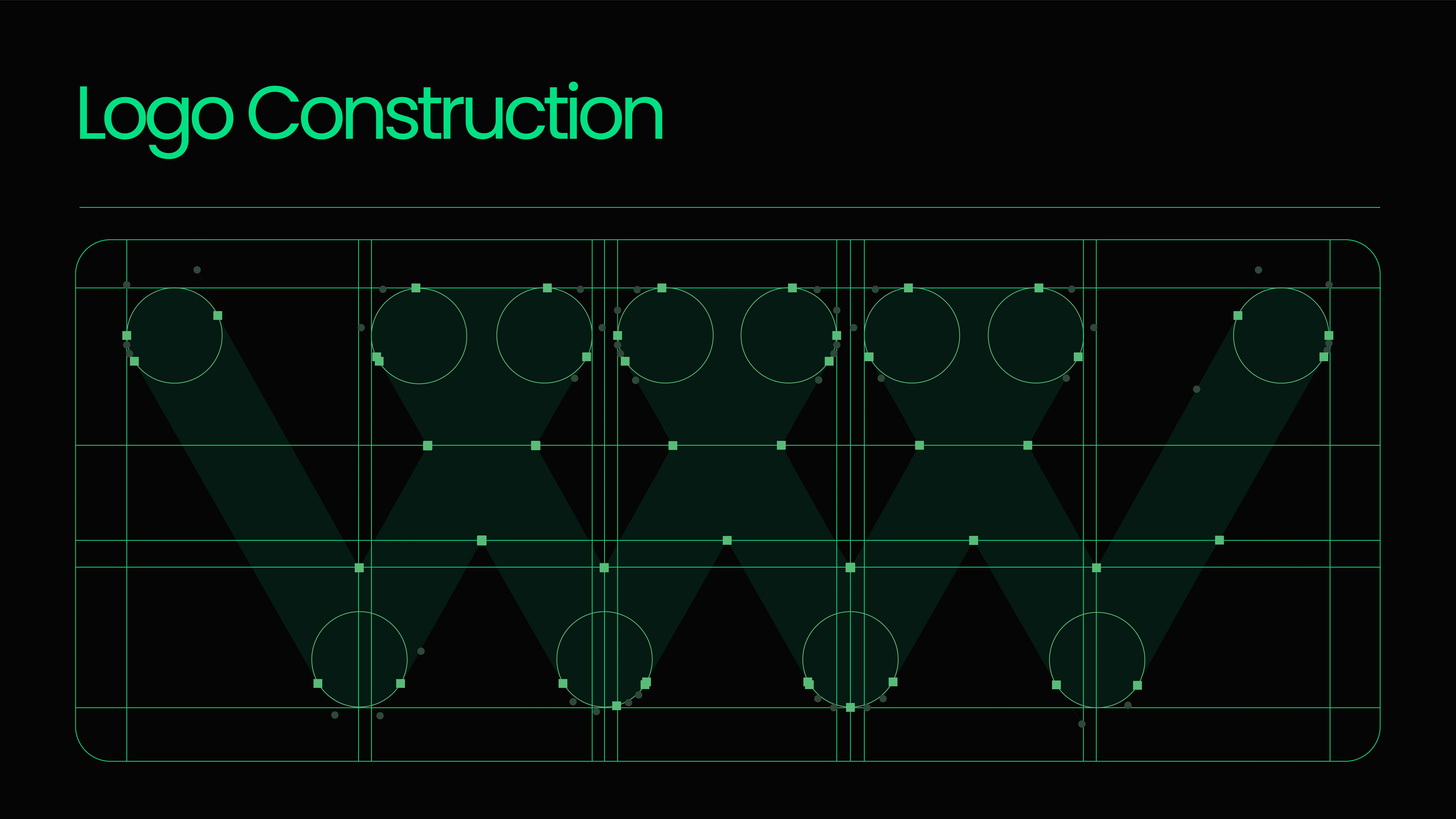
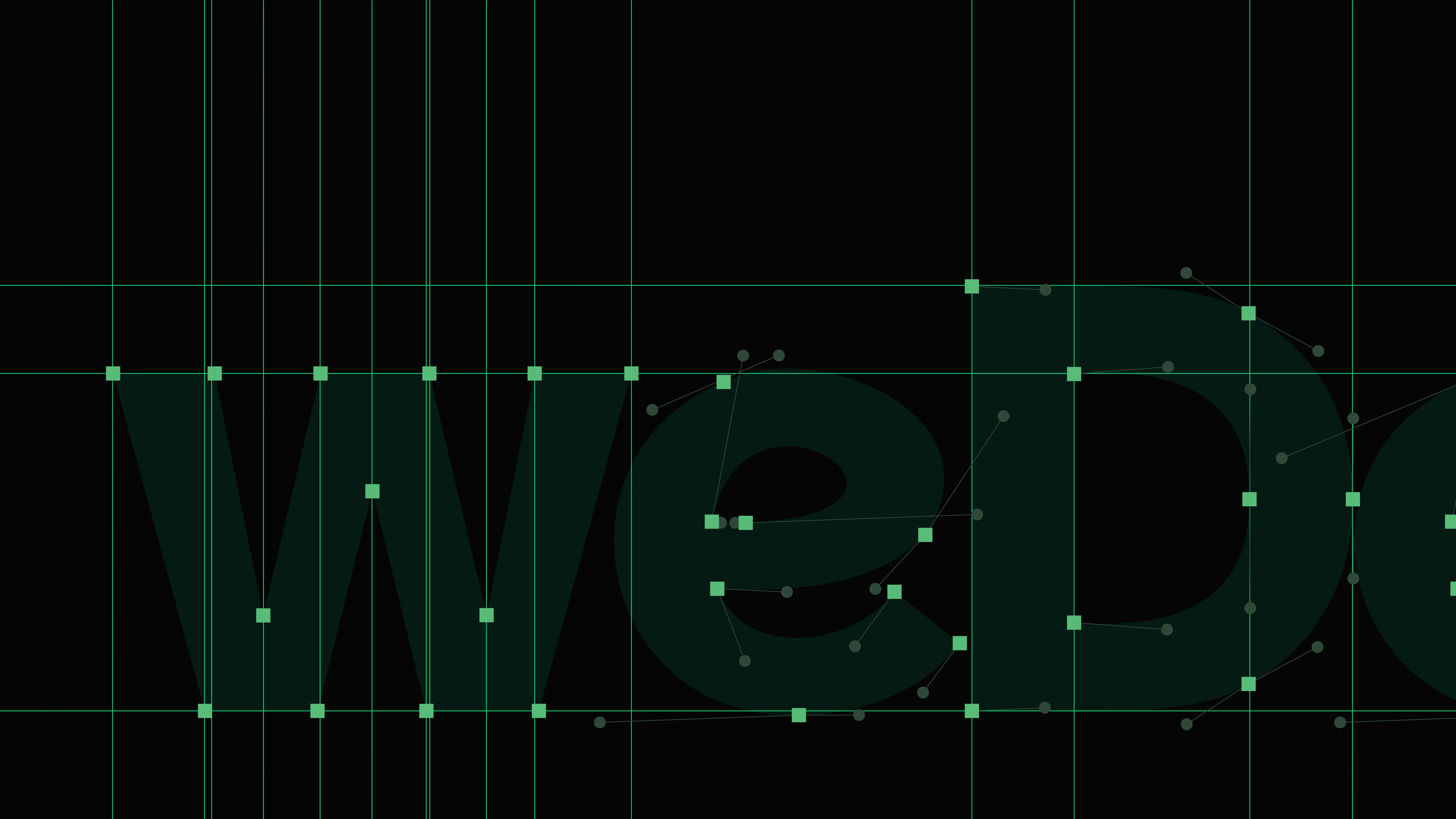
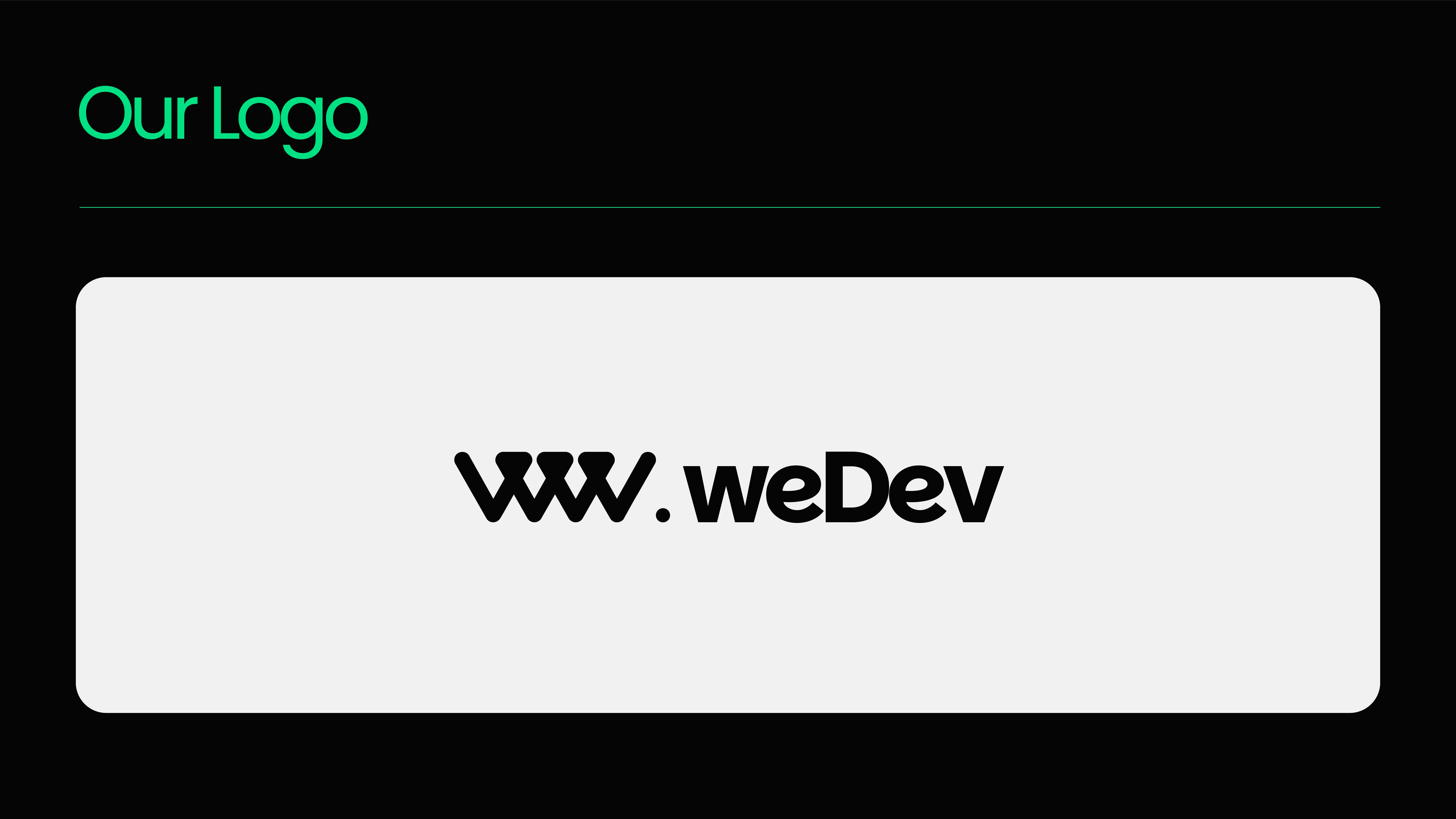
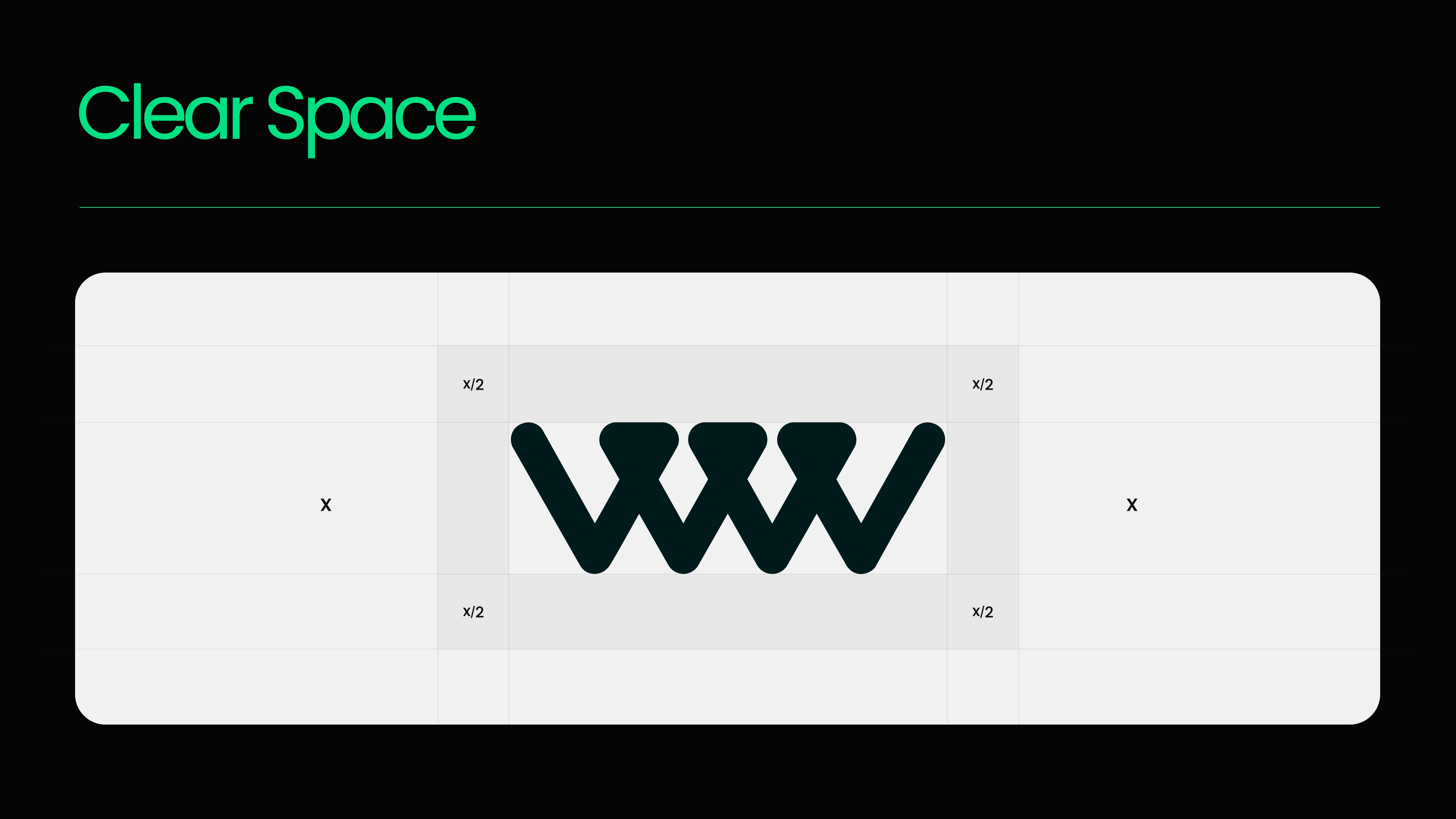
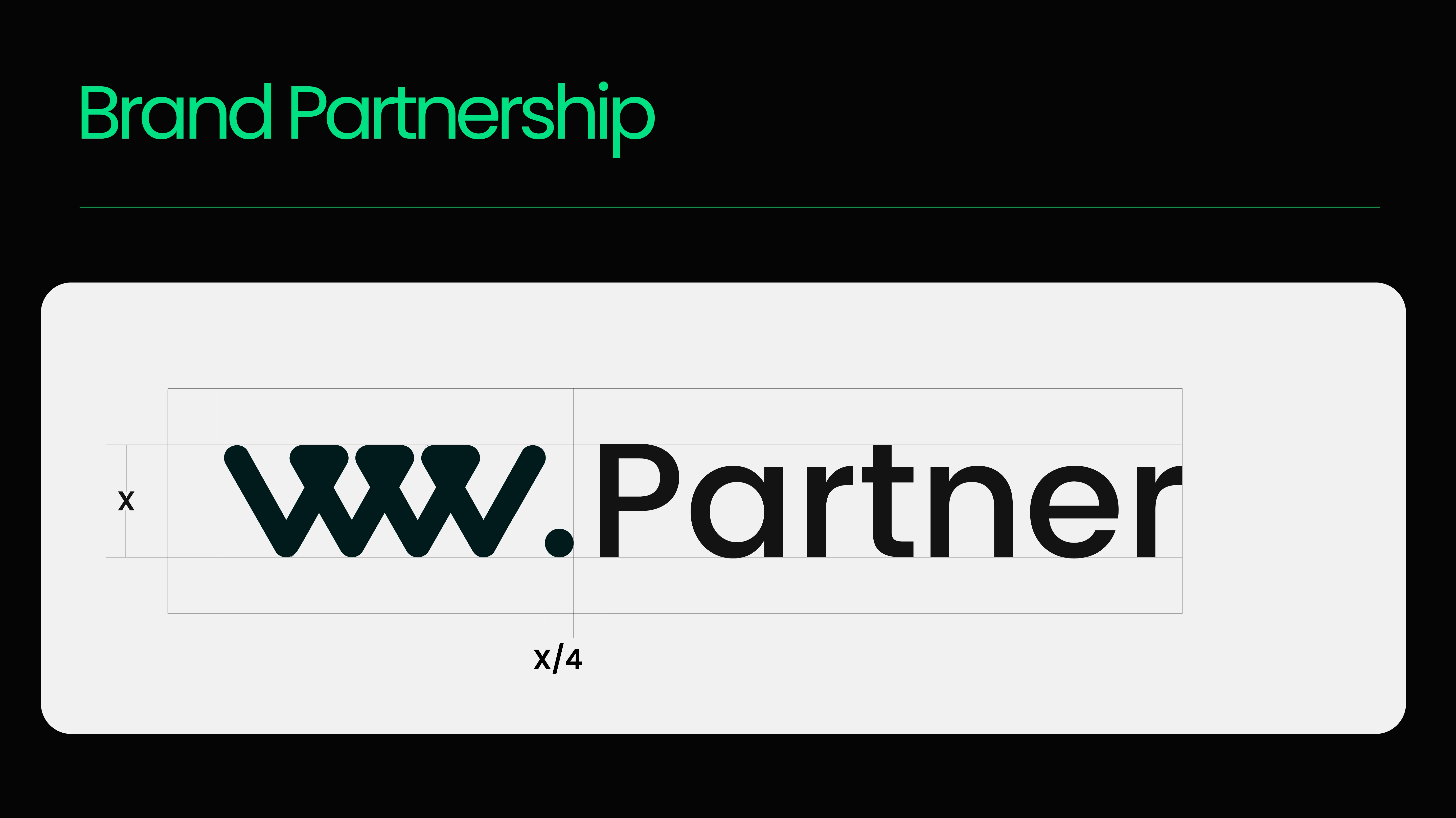
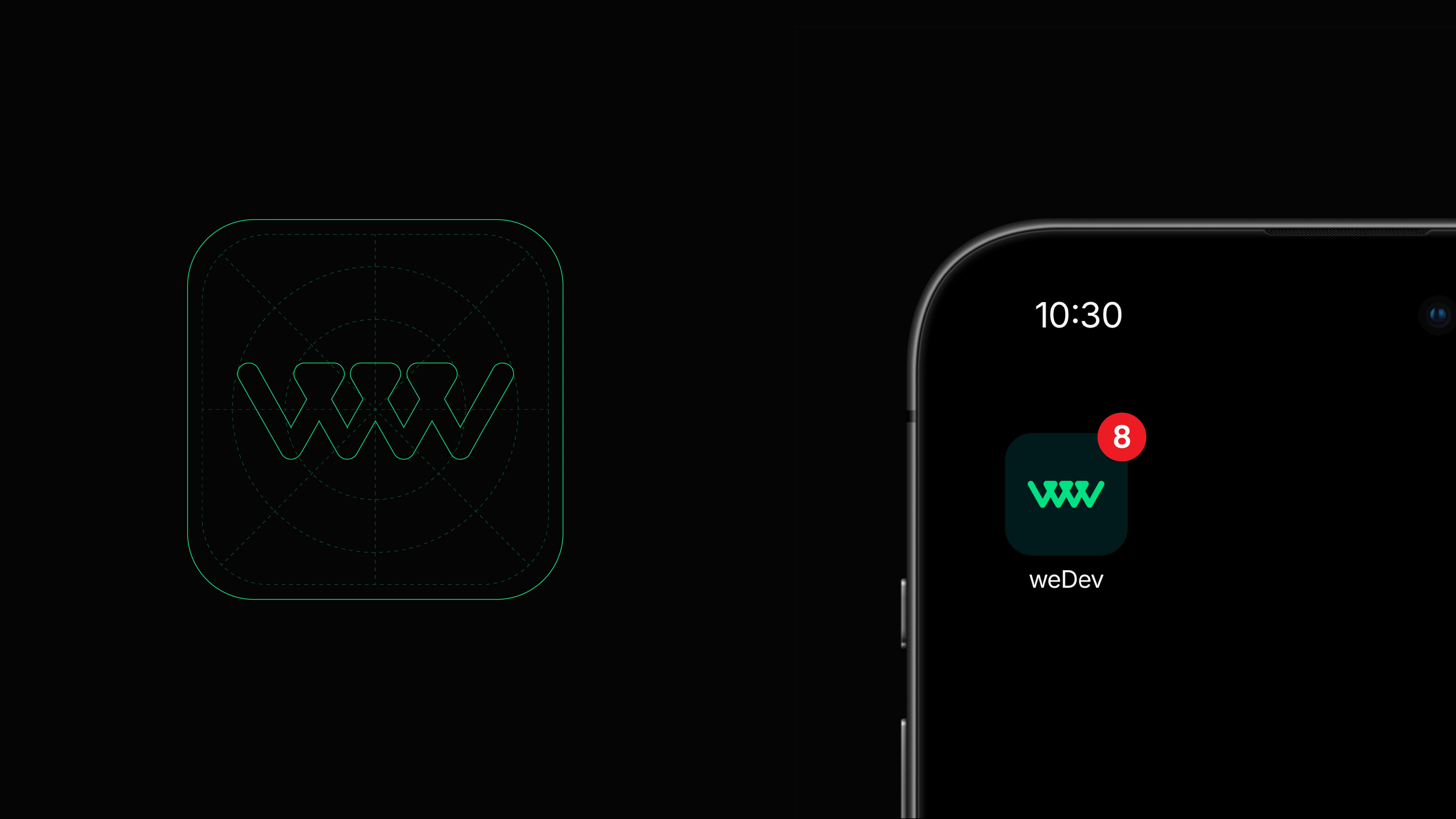
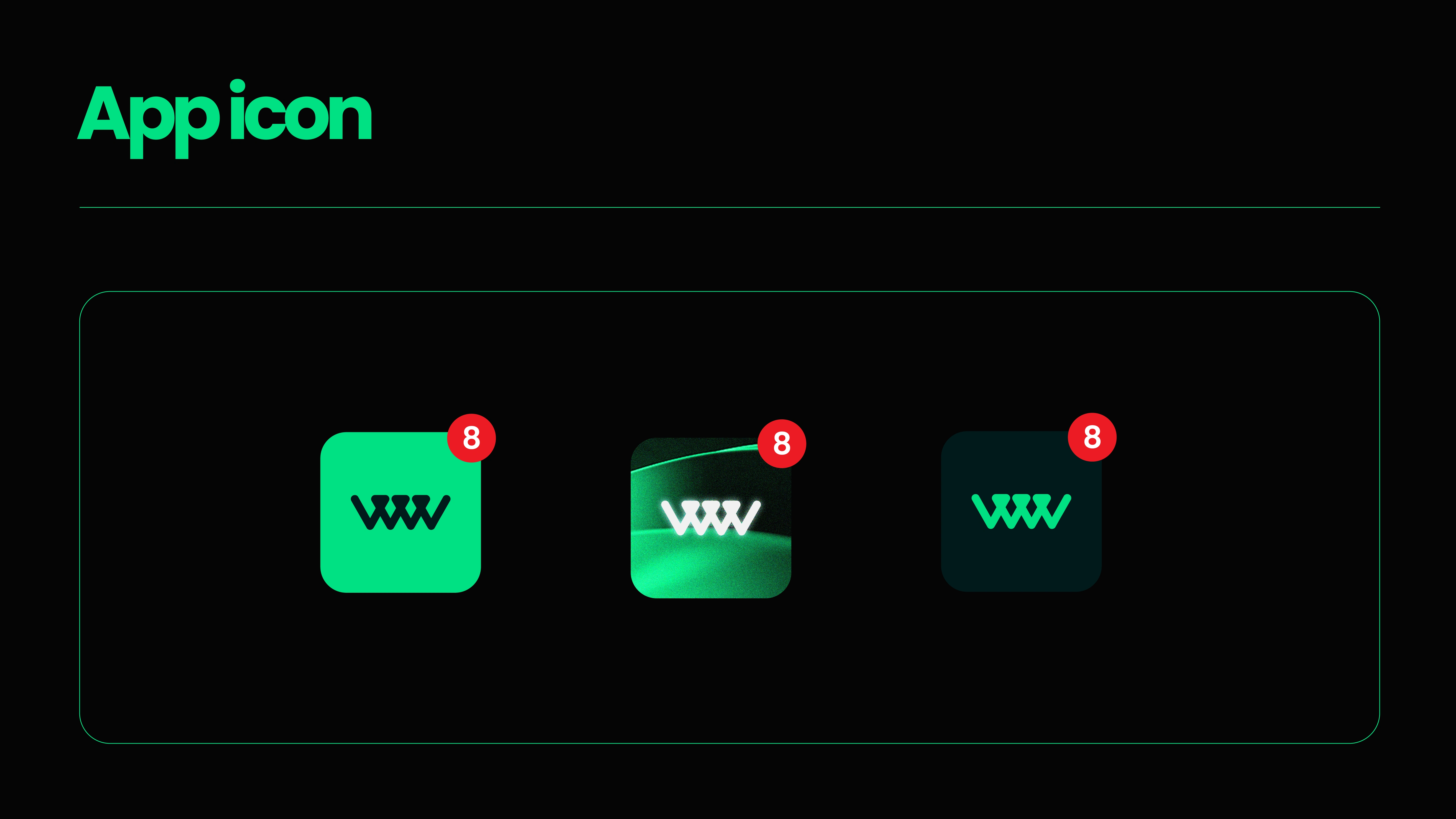
Think weDev when you think platform, think weDev when you think tools, think weDev when you think community support, because whether you are building, learning, or simply contributing, weDev can meet your needs. Our logo tells our story. Elements of code, inversion, and community merge to form this brand that is more than a brand. Builders, thinkers, and creators call us home. We are a space where passion meets precision, turning vision into reality. Here, we do not just write code — we code your dream!
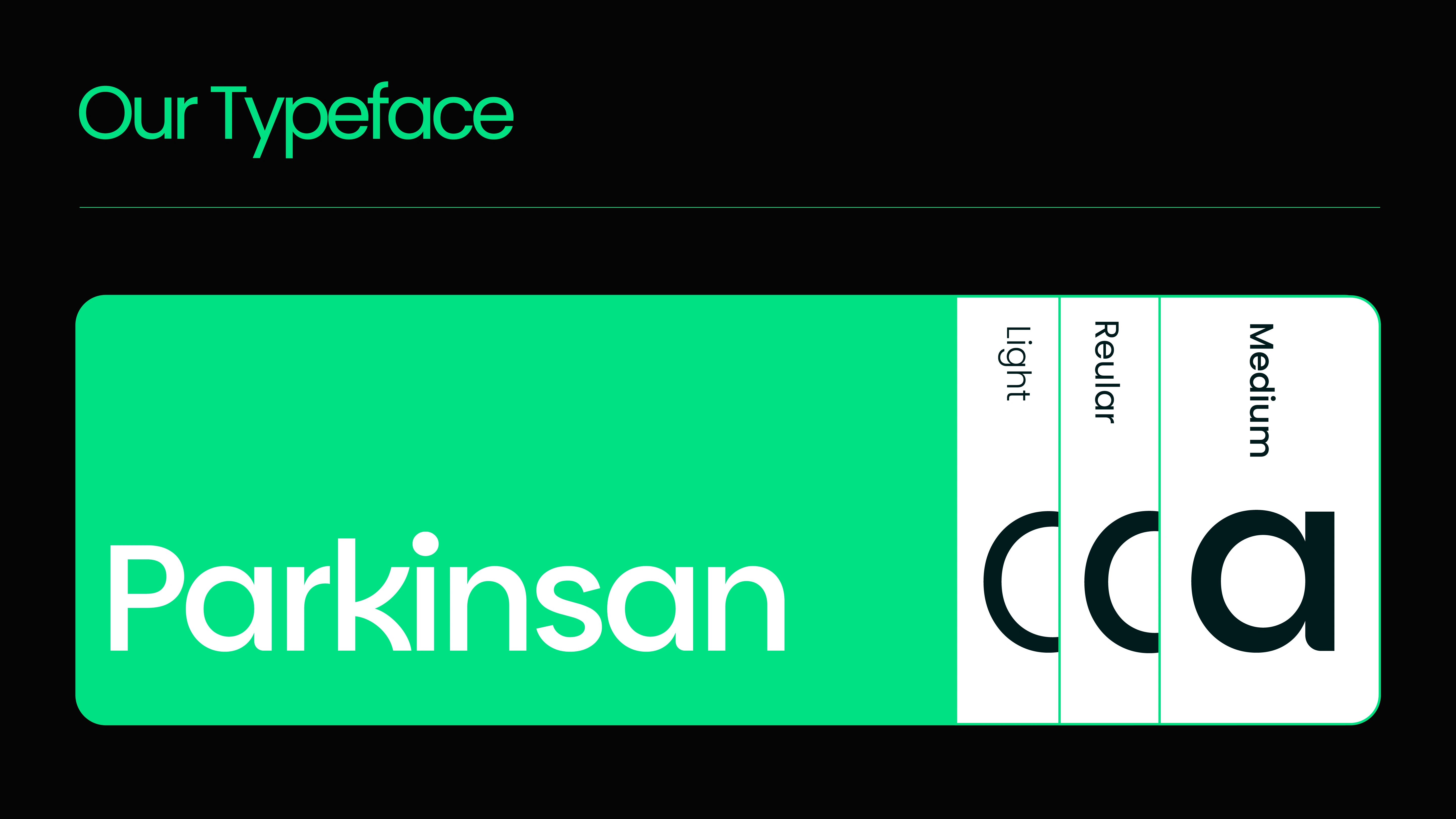
Parkinsans is the signature headline typeface of weDev-crafted to express boldness, clarity, and the human touch at the heart of every developer's journey. It brings personality and presence to our brand voice, making every headline feel purposeful and alive.
Weight and Usage
Bold is our primary headline weight-used for main headers and subheads across brand materials. Black is reserved for special use cases: short punchy headers, key callouts, or moments where a stronger contrast is needed to define content hierarchy.
To maintain typographic clarity and consistency, always set ligatures to "off."This prevents characters like "fl" or "fi" from joining into stylized connections-keeping our headlines clean, modern, and highly readable
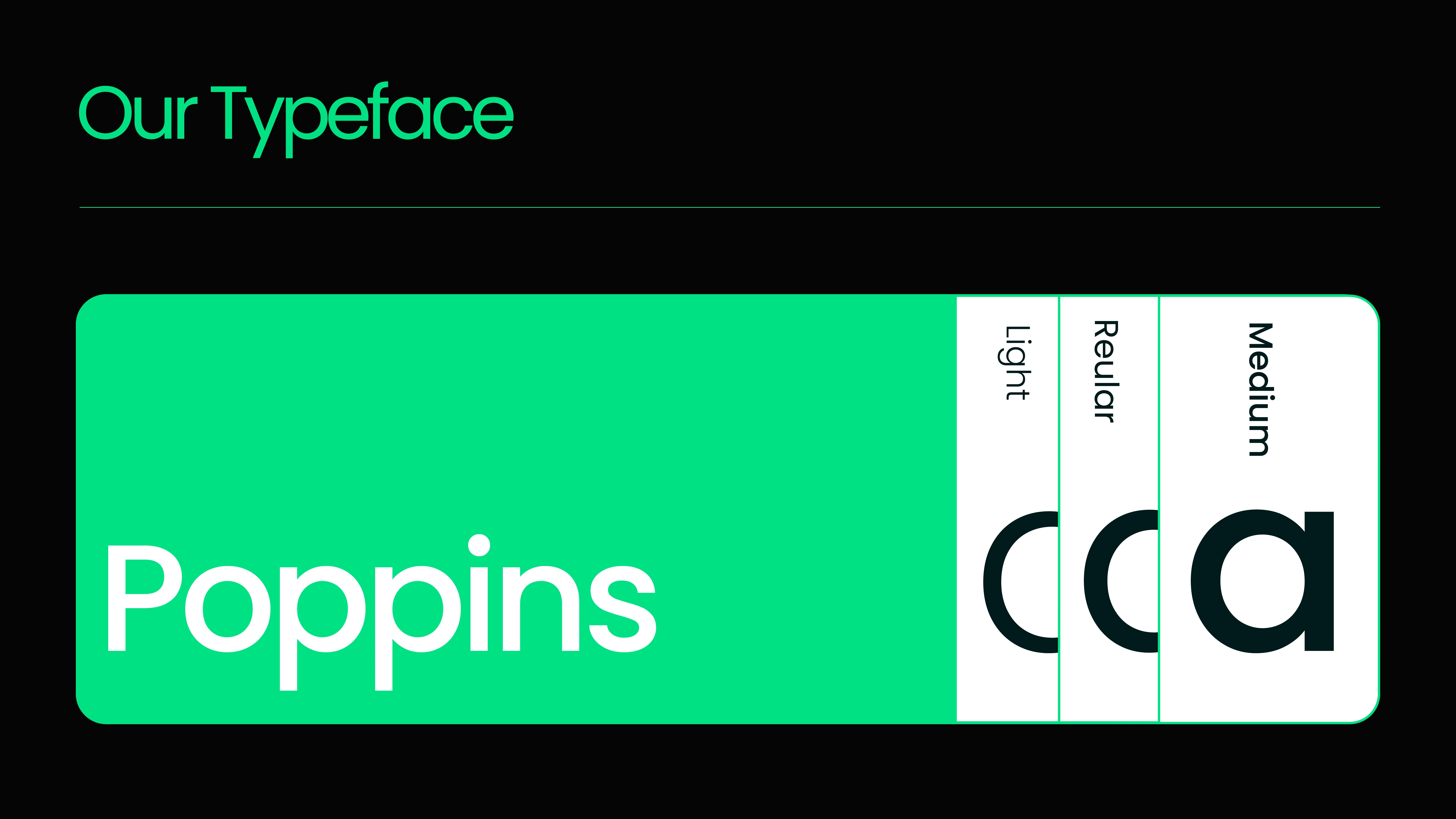
Poppins is the official body typeface of weDev, chosen for its clean geometry, modern clarity, and global accessibility. Designed to support both Latin and Devanagari scripts, Poppins reflects the inter-national spirit of the weDev community-diverse, inclusive, and forward-thinking.
Weights & Usage
Light, Book, Medium: Ideal for body text, paragraphs, captions, and interface elements.
Bold: Used sparingly for emphasis within content—never to overpower headlines.
Legibility
Poppins delivers a balanced reading experience. Its geometric precision and generous x-height create a smooth visual flow, while optical corrections keep it comfortable on the eyes—even at smaller sizes.
Tone & Feel
Modern, accessible, and open—Poppins complements the boldness of Parkinsans with a grounded, clean voice. It brings structure to ideas and supports the developer mindset of clarity, logic, and simplicity.
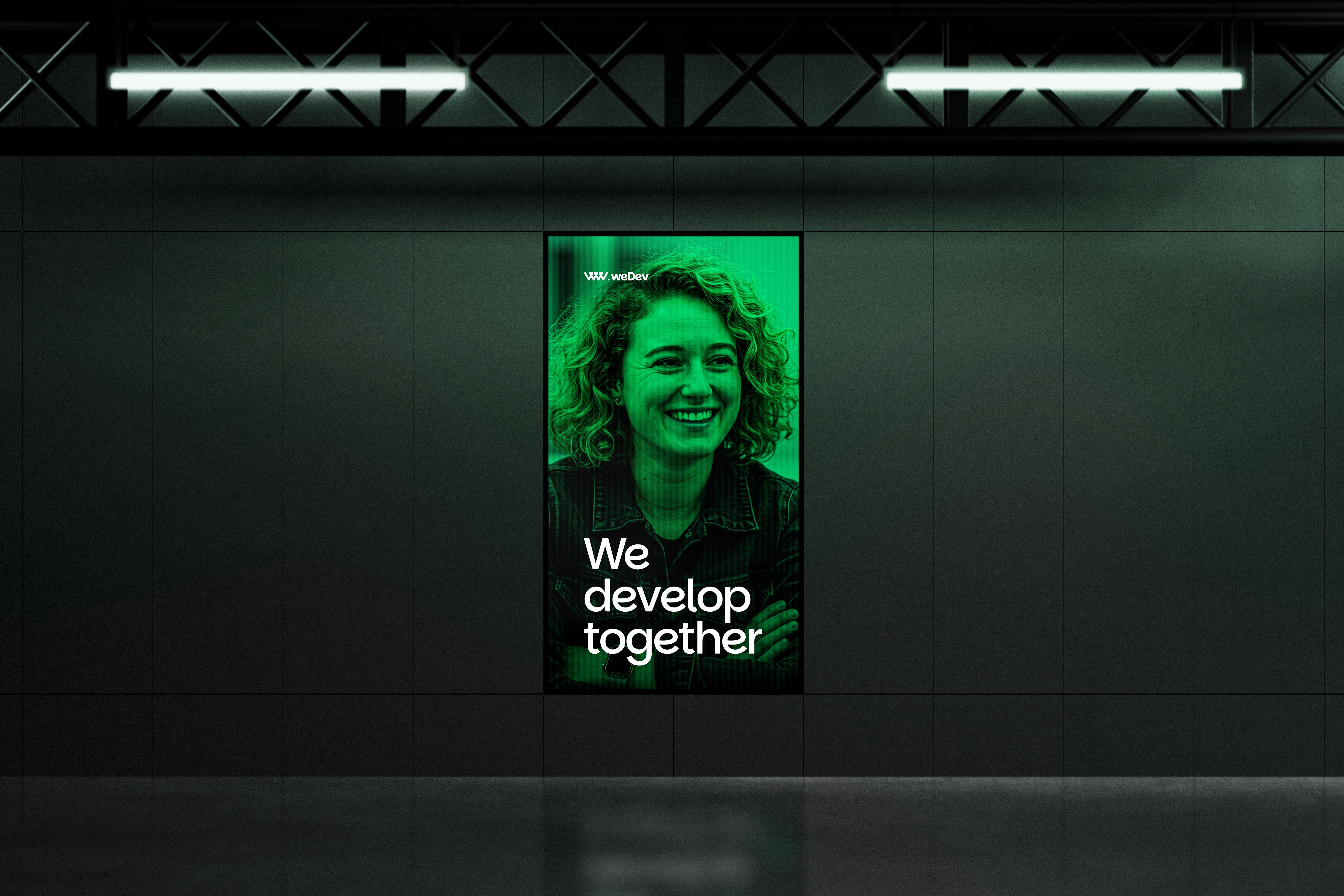
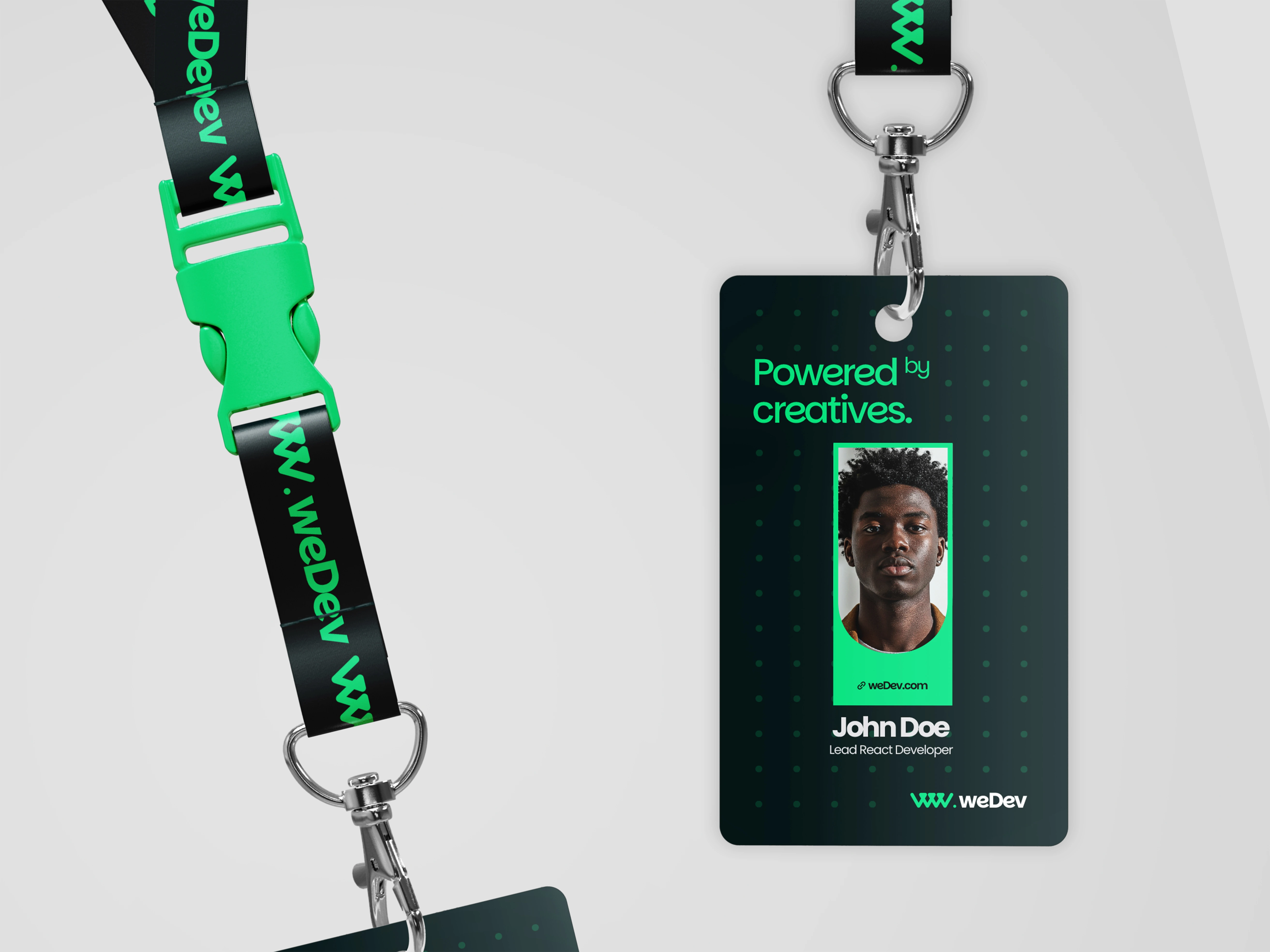
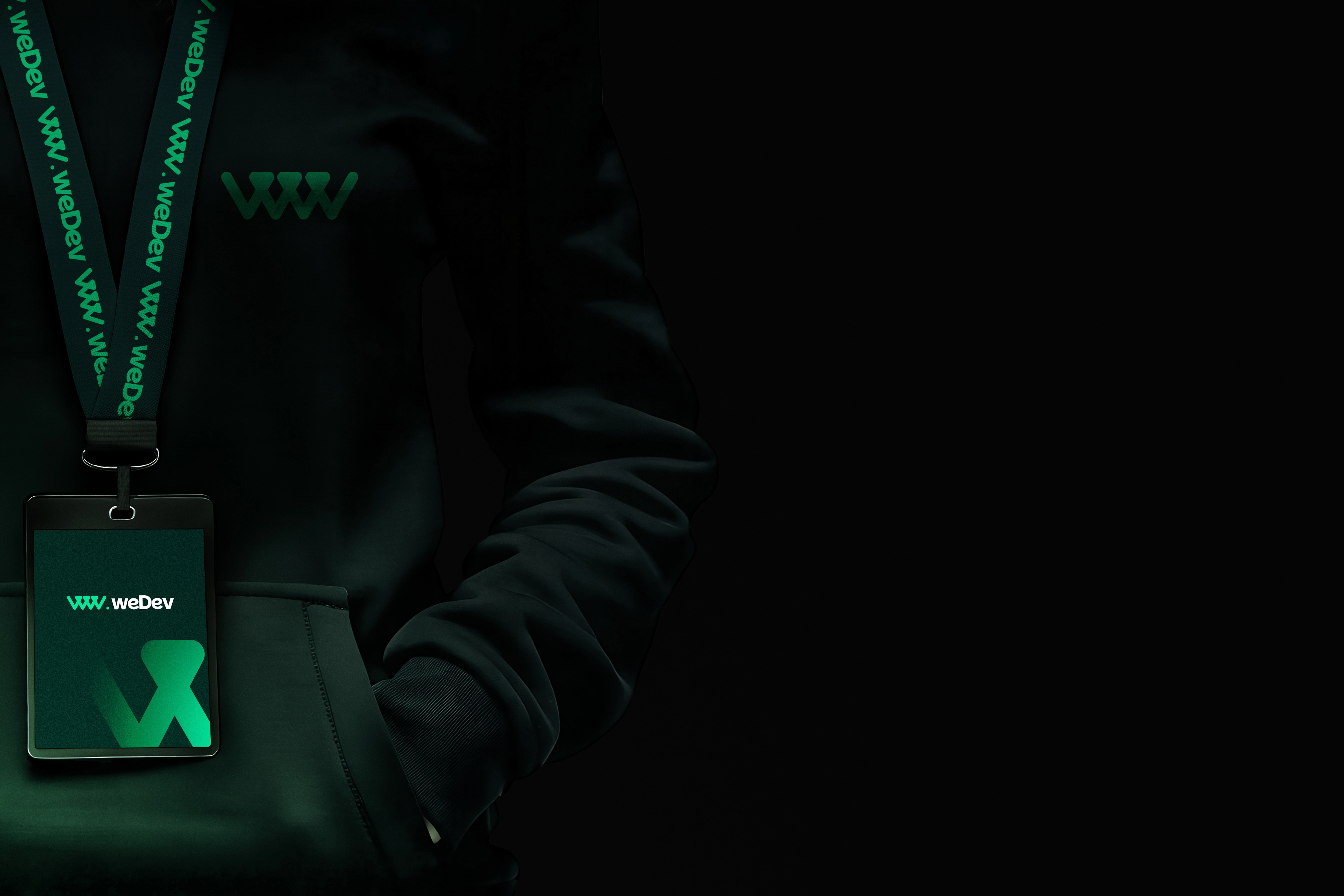

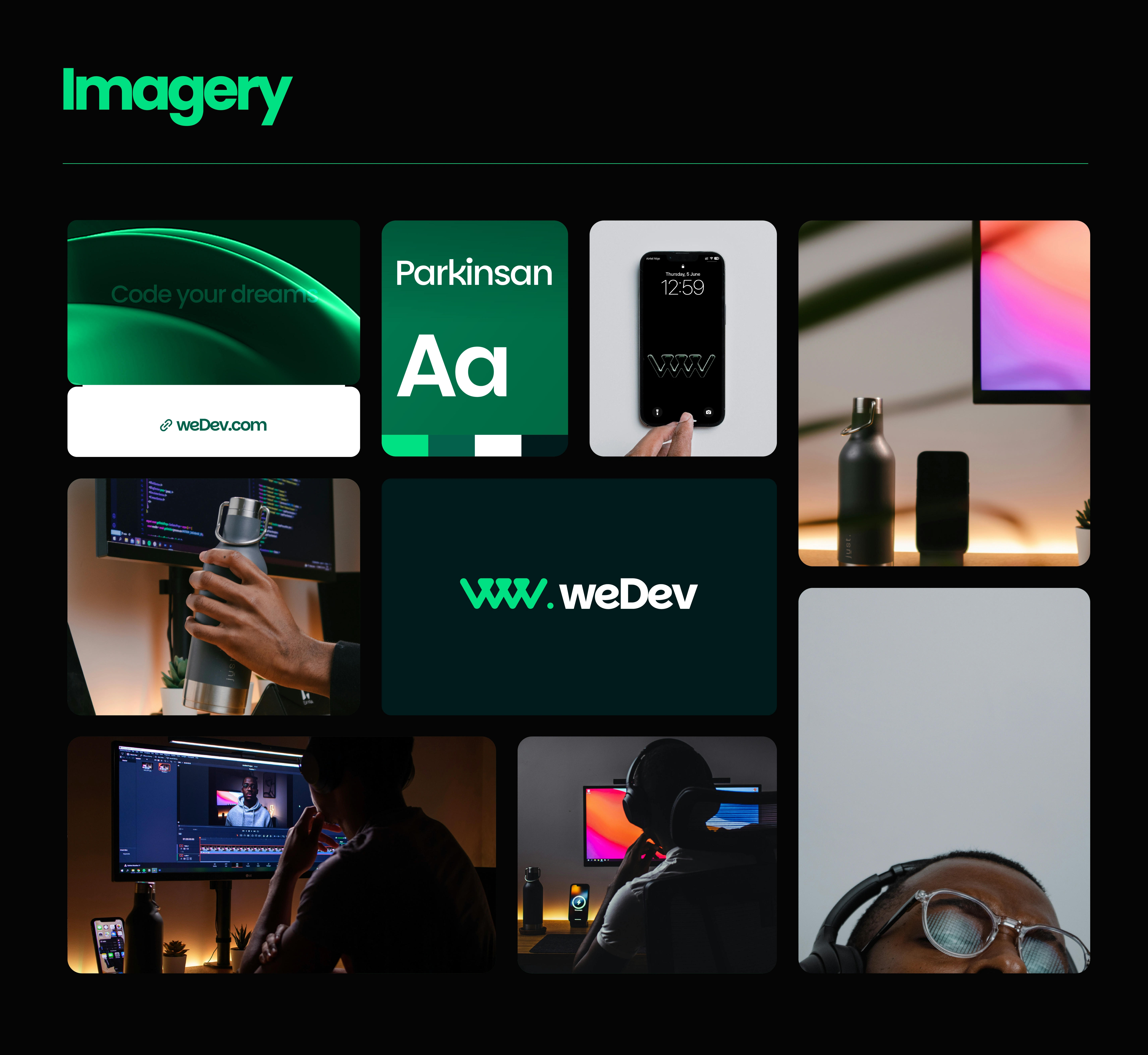
Images by Nubelson Fernandes on Unsplash
Like this project
Posted Oct 7, 2025
weDev is a creative tech collective uniting developers, designers, strategists, and builders from all fields to co-create sustainable, impactful products.


