Built with Framer
065 Reworks: Redesigning Creative Businesses' Websites
Kai Chong
065 Reworks – Adept Berlin
Less Text, More Intention
This redesign reimagines the hero and pricing sections of Adept Berlin – stripping copy back to the essentials and letting brand-aligned visuals do the heavy lifting. Each section is anchored by a single, focused CTA, creating a clean and purposeful user journey that feels both aspirational and effortless.
© Imagery from Death to Stock. Select copy adapted from Adept Berlin.
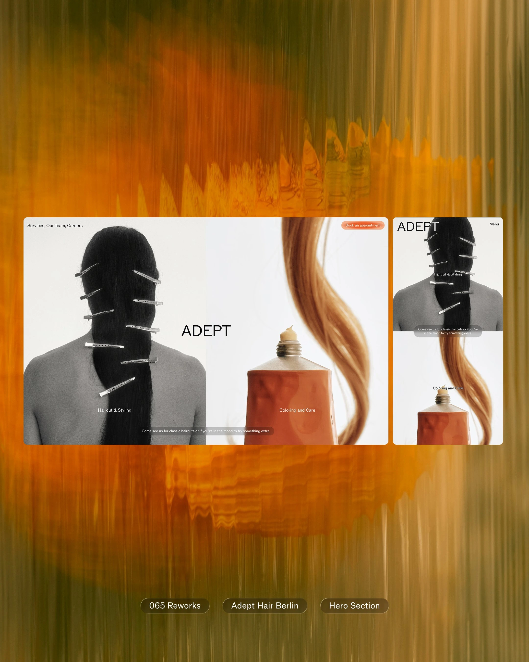
Adept Berlin – Hero Section Redesign

Mobile ver. of Pricing Section
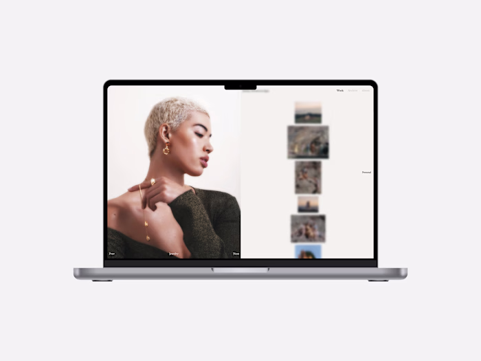
065 Reworks – Ante Berlin
Refining the Users’ Shopping Experience
This redesign refines the shopping experience of Ante Berlin’s website by making core products more accessible. A simplified structure, focused hierarchy, and contemporary UI design bring clarity and ease — aligning the user journey more closely with the brand’s visual language and creative universe.
© Imagery from Death to Stock and Ante Berlin. Select copy adapted from Ante Berlin.
Ante Berlin Homepage Redesign
Ante Berlin Product Page Redesign
065 Reworks – Petersen Architekten
Transforming the Homepage to a Brand Story Canvas
The goal of redesigning Petersen Architekten’s homepage is to communicate the value proposition, brand values of the architecture studio in a clear and concise manner. Highlighted Call-to-Actions are used to direct users to explore the brand story of the studio further, while at the same time, already giving them a clear sense of what Petersen Architekten does and stands for.
© Imagery from Death to Stock and Petersen Architekten. Select copy by me and ChatGPT.
Petersen Architekten Homepage Redesign
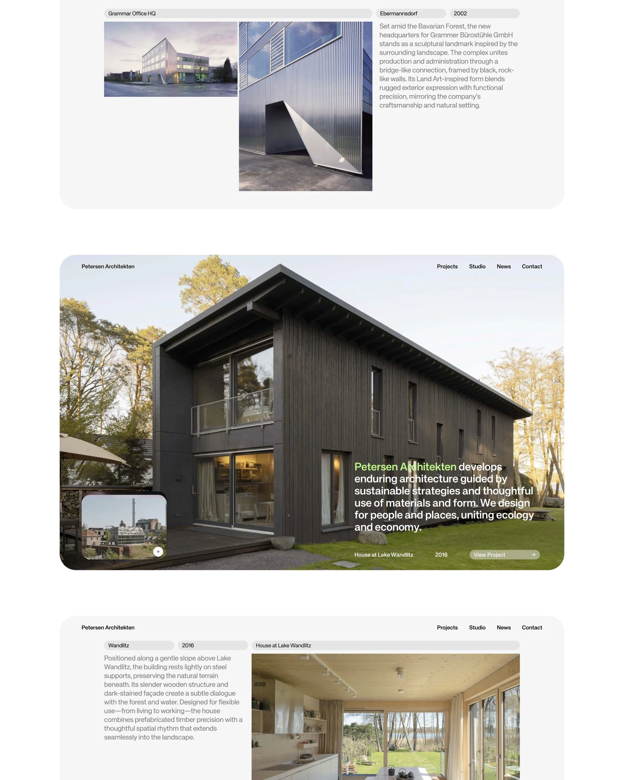
Overview of Sections #1
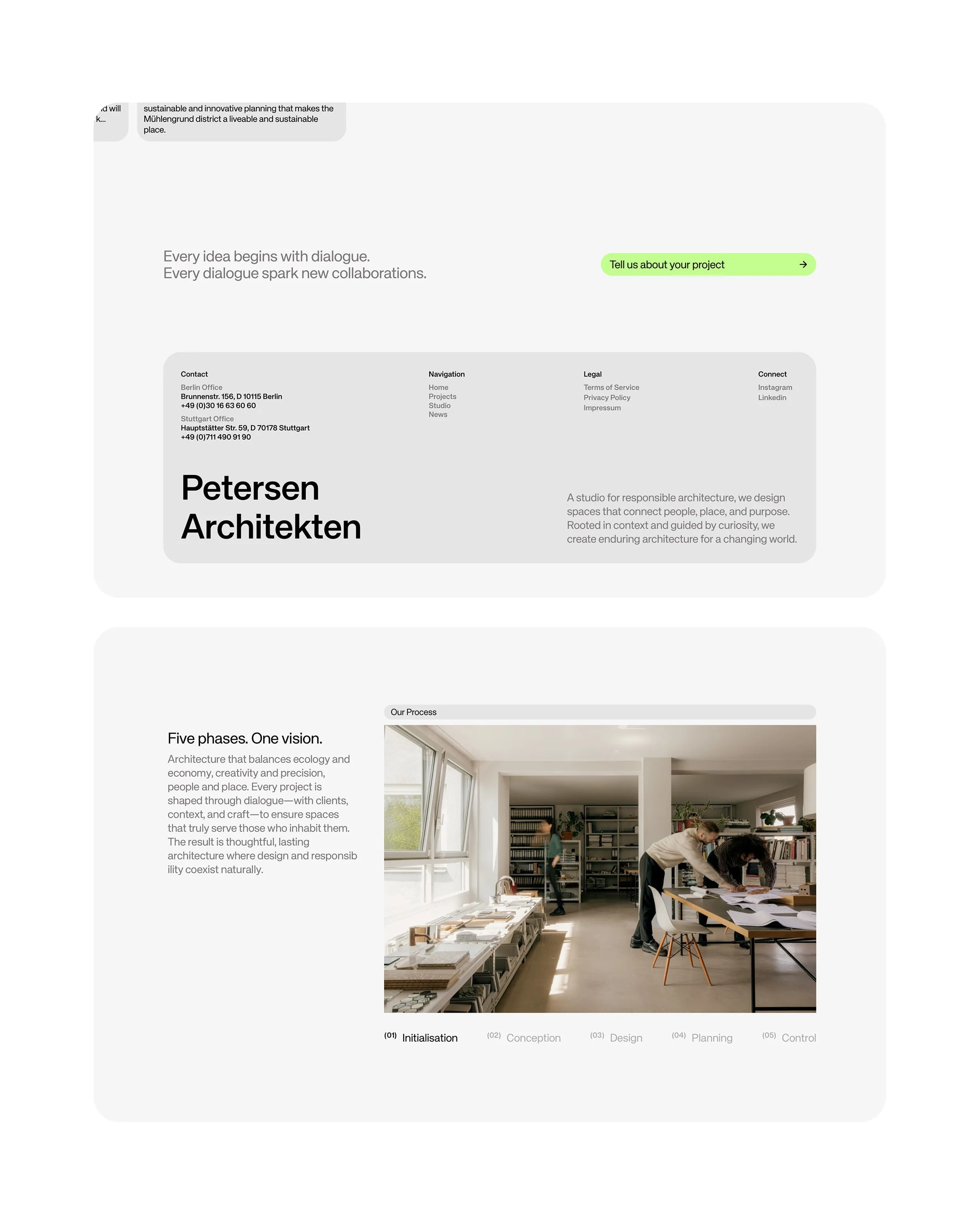
Overview of Sections #2
Like this project
Posted Oct 8, 2025
A design exploration rethinking how creative brands can express their identity through smarter, more intentional websites. All prototypes designed in Framer.
Likes
13
Views
117
Timeline
Sep 15, 2025 - Ongoing