Built with Framer
Pharmazest Brand & Web Design
Muhammad Salman
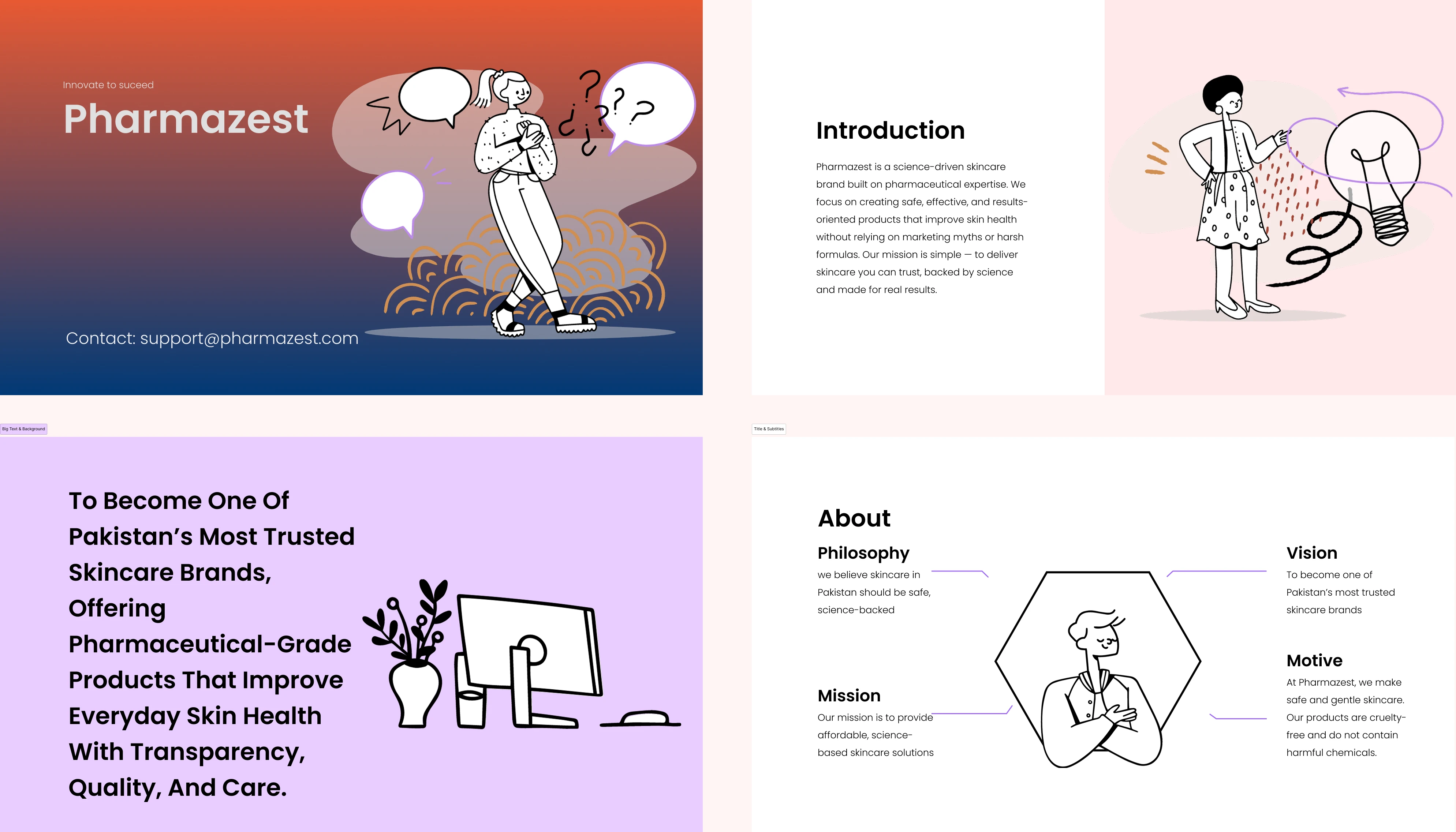
Pharmazest: Complete Brand & Web Design Case Study
Science-Driven Skincare Brand Built on Pharmaceutical Expertise
Table of Contents
Project Overview
Pharmazest represents a pivotal shift in the skincare industry—a brand built on pharmaceutical expertise rather than marketing myths. This case study details the complete design and development journey from initial concept through full brand launch, including identity design, visual system creation, and comprehensive digital strategy.
Project Scope
Brand Identity Design - Logo, wordmark, and visual language
Visual System & Design Language - Complete design system with components
Digital Web Strategy & Development - Website architecture and UX design
Presentation Deck & Marketing Materials - Pitch decks and promotional assets
Illustration Library & Character System - Custom illustrations for brand storytelling
Brand Guidelines & Design System Documentation - Comprehensive style guide
Client Brief
Pharmazest needed a complete brand overhaul—from logo and visual identity to a fully functional digital presence. The challenge: position a pharmaceutical-grade skincare brand in a saturated market dominated by celebrity endorsements and unsubstantiated claims. The solution required a design system that communicated trust, science, and accessibility while standing out through distinctive visual language and meaningful illustrations.
Challenge & Brief
The Pakistan skincare market is crowded with brands making hollow promises. Pharmazest entered with a differentiated approach: pharmaceutical expertise backed by real science. However, they lacked several critical elements:
Core Challenges
A distinctive visual identity that communicated trust and science
A cohesive digital presence to reach health-conscious consumers
Marketing materials that differentiated them from competitors using celebrity endorsements
A design system scalable for future product launches and campaigns
Clear communication of their 'science-not-myths' mission
Design Objectives
✓ Create a premium yet approachable brand identity
✓ Develop a distinctive visual language that communicates expertise without elitism
✓ Build a scalable design system for multi-channel consistency
✓ Design interfaces that make skincare science accessible and engaging
✓ Establish Pharmazest as the trusted alternative to marketing-driven skincare brands
Discovery & Research
Before designing, we conducted extensive research into the skincare market, competitor positioning, target audience behavior, and global brand standards for pharmaceutical-grade products.
Market Analysis
Skincare brands in Pakistan fall into two categories: celebrity-endorsed (low trust for claims) and international (expensive, less localized). Pharmazest positioned itself as the 'science-backed alternative'—accessible, transparent, and genuinely effective.
The market showed clear demand for:
Transparent ingredient disclosure
Evidence-backed product claims
Professional recommendations (dermatologist-approved)
Affordable pharmaceutical-grade solutions
Target Audience
Primary: Health-conscious, educated millennials and Gen Z women (25-45) who value ingredient transparency and scientific backing.
Secondary: Dermatologists and healthcare professionals recommending safe, effective skincare solutions.
Psychographics:
Values health and wellness
Researches before purchasing
Skeptical of marketing hype
Willing to invest in quality skincare
Active on Instagram and digital platforms
Competitive Landscape
Competitors relied heavily on emotional branding and celebrity partnerships. We identified an opportunity to lead through transparency, ingredient education, and relatable storytelling. The visual identity needed to communicate both scientific credibility and human approachability.
Key competitors analyzed:
Celebrity-backed brands (emotional, low credibility)
International brands (premium, less localized)
Traditional pharmacies (clinical, uninviting)
Pharmazest's unique position: Pharmaceutical-grade + accessible + transparent + modern
Brand Strategy & Positioning
Brand Mission
"To provide safe, science-backed skincare solutions that improve everyday skin health without relying on marketing myths or harsh formulas."
Brand Pillars
Pharmaceutical-Grade Quality
Products formulated using pharmaceutical expertise
Rigorous testing and quality standards
Safe for sensitive skin
Science-Driven Results
No marketing myths, only evidence-backed ingredients
Transparent ingredient disclosure
Real results, realistic expectations
Transparency & Trust
Clear communication of benefits and limitations
Educational content about skincare science
Honest about what products can and can't do
Accessible Care
Professional-grade skincare at reasonable prices
Available through modern retail channels
For everyday consumers, not just dermatology clinics
Brand Personality
Authoritative yet approachable. Professional without being cold. Innovative but grounded in proven science. Modern with genuine care for customer outcomes.
The brand speaks with confidence about scientific expertise while remaining friendly and relatable. Think "expert friend" rather than "distant authority."
Design Direction & Brand Identity
Logo & Wordmark
The Pharmazest logo combines medical precision with modern simplicity. The "Rx" symbol (pharmaceutical indicator) integrates seamlessly with the wordmark, creating a distinctive mark that immediately communicates expertise.
Design decisions:
Geometric, clean letterforms signaling precision and scientific accuracy
Pharmaceutical "Rx" symbol integrated for instant credibility and recognition
Bold, confident color (Pharmazest Orange-Red) for memorability and energy
Scalable design that maintains clarity at any size, from favicon to billboard
The wordmark is approachable without being playful—professional without being corporate.
Color System
The Pharmazest color palette was intentionally curated to balance scientific authority with modern approachability:
Primary Colors
Pharmazest Orange (#FF6B35)
Energy, trust, pharmaceutical heritage, approachability
Used for primary CTAs, highlights, and brand emphasis
Conveys action and accessibility
Navy Blue (#1F1F4D)
Professionalism, scientific credibility, stability
Used for body text and serious content
Conveys authority and trustworthiness
Secondary Colors
Lavender (#D4B5E8)
Wellness, skin health, gentle care
Used for wellness-related content and calming sections
Conveys comfort and self-care
Soft Pink (#F5E6E0)
Femininity balanced with approachability
Used for beauty-related products
Inviting and warm
Neutral Grays
Cleanliness, scientific neutrality, versatility
Used for backgrounds, borders, and secondary information
Creates balance and professionalism
Accessibility Considerations
High contrast ratios between primary colors and text
Color-blind friendly palette tested for WCAG compliance
Distinct colors that don't rely solely on hue differentiation
Typography
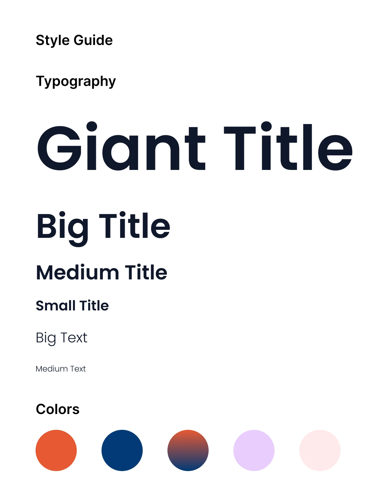
Font choices communicated both accessibility and expertise:
Primary Typeface (Headings)
Modern sans-serif (Calibri or equivalent)
Clean, professional, medical
Bold weights for emphasis and hierarchy
Geometric proportions for scientific feel
Secondary Typeface (Body Copy)
Light sans-serif for highly readable, modern feel
Approachable and contemporary
Excellent readability at small sizes
Friendly yet professional
Supporting Fonts
Geometric fonts for data visualization
Monospace for ingredient lists
Display fonts for special moments (sparingly)
Typography Scale:
Giant Title: 40-60pt (landing page hero)
Big Title: 32-36pt (section headers)
Medium Title: 24-28pt (subsection headers)
Small Title: 18-22pt (cards and components)
Big Text: 16-18pt (prominent body copy)
Medium Text: 14-16pt (standard body copy)
Small Text: 12-14pt (captions, disclaimers)
Visual System & Design Language
Illustration Style
A custom illustration library was created to humanize scientific concepts and make skincare education engaging. The style combines:
Minimalist line art for clarity and scalability across all mediums
Diverse character representation reflecting target audience demographics
Subtle color accents aligned with brand palette for visual consistency
Contextual illustrations showing real-life skincare scenarios
Organic flowing patterns reflecting ingredients and wellness concepts
Key characteristics:
Expressive, relatable characters (not generic)
Simple, refined linework (not overly detailed)
Warm, human feeling (not clinical or robotic)
Versatile enough for web, print, and social media
Consistent style across 100+ illustrations
Design Components
A comprehensive component library ensured consistency across all touchpoints:
Buttons & CTAs
Bold, high-contrast buttons with clear hierarchy
Primary buttons use Pharmazest Orange for immediate recognition
Secondary/tertiary buttons use Navy or grays for supporting actions
Hover and active states clearly defined
Accessible sizing (minimum 44px height for mobile)
Cards & Information Blocks
Clean card designs with subtle shadows
Supporting both product information and scientific content
Each card tells a story with supporting illustration
Hover effects that indicate interactivity
Flexible layouts for grid or carousel display
Data Visualization
Custom charts and graphs making ingredient science understandable
Uses brand colors with thoughtful data visualization principles
Geometric forms connecting to brand aesthetic
Accessible color contrast for all data representations
Labels and legends for clear interpretation
Forms & Input Fields
Clear labeling with helpful placeholder text
Focus states that indicate active input
Error states with friendly, non-judgmental messaging
Progress indicators for multi-step forms
Validation that helps rather than frustrates
Navigation & Layout
Clear information hierarchy with visual distinction
Breadcrumbs for complex site navigation
Sticky header for easy access to main navigation
Footer with organized link structure
Mobile-optimized menu patterns
Web & Digital Development
Website Architecture
The Pharmazest website was designed as a comprehensive digital hub serving multiple audiences: consumers seeking skincare guidance, dermatologists looking for professional recommendations, and investors evaluating the brand.
Key Pages & Sections
Homepage
Hero section communicating "science-not-myths" positioning
Product category quick links
Customer testimonials building trust
Educational content preview
Clear CTA for first purchase
About Page
Brand story: from pharmaceutical heritage to consumer brand
Company mission and values
Team credentials emphasizing pharmaceutical expertise
Timeline showing development and milestones
Product Pages
Organized by skin concern (acne, sensitivity, aging, etc.)
Detailed ingredient breakdowns with scientific explanations
Before/after imagery (realistic, not exaggerated)
How to use guides with illustrations
FAQ addressing common concerns
Ingredient Guide
Transparency through detailed ingredient information
"Why this ingredient?" explanations
Scientific backing with research references
Ingredient concentrations where relevant
Compatibility information for combining products
Blog & Resources
Skincare science articles for SEO and thought leadership
Educational guides on skin types and conditions
Video content explaining product benefits
Downloads (free guides, printables)
Consistent publishing schedule
Professional Portal
Dedicated section for dermatologists and skincare specialists
Clinical research and studies
Professional pricing and partnerships
CE resources and training materials
Direct contact for bulk orders
UX/UI Principles
Ingredient Transparency
Every product page prominently displays full ingredient lists
Each ingredient includes explanation of scientific benefits
Links to research supporting ingredient effectiveness
Clear indication of concentrations and percentages
Education Over Selling
Blog content, guides, and resources position Pharmazest as trusted advisor
Educational CTAs alongside product CTAs
Value delivered before asking for purchase
Builds authority and credibility in skincare space
Clear Information Hierarchy
Scannable layouts with prominent CTAs for purchase
Visual distinction between primary and secondary content
Strategic use of whitespace preventing cognitive overload
Progressive disclosure of detailed information
Mobile-First Design
Recognizing most traffic from smartphones
Mobile experience prioritized in every design decision
Touch-friendly interface elements (min 44px targets)
Fast loading times optimized for mobile networks
Responsive images for various screen sizes
Accessibility Standards
WCAG 2.1 AA compliance throughout
Semantic HTML for screen reader compatibility
Color contrast meeting accessibility standards
Keyboard navigation fully supported
Form fields with proper labels and instructions
Presentation Design & Marketing Assets
Pitch Deck Design
A custom presentation template was created for investor pitches, retailer partnerships, and marketing announcements. The template:
Maintains visual consistency with brand guidelines across all slides
Integrates custom illustrations to visualize complex concepts
Uses data visualization to support market positioning claims
Includes pre-designed layouts for product features, testimonials, and metrics
Balances whitespace with content for professional, focused presentations
Template Includes:
Title slide with brand lockup
Section divider slides with illustration
Content slides (text + image)
Chart/data visualization slides
Product feature slides
Testimonial/quote slides
Call-to-action slides
Thank you/contact slide
Design Features:
Master slides prevent formatting errors
Consistent typography and spacing
Brand color schemes applied automatically
Placeholder illustrations for custom content
Guidelines for image sizing and placement
Marketing Collateral
Social Media Templates
Instagram feed posts (square, stories, reels)
LinkedIn article images and carousel posts
Facebook cover and post templates
Consistent branding across platforms
Sized for each platform's specifications
Email Templates
Newsletter templates with pre-designed sections
Product announcement emails
Educational series templates
Promotional campaign formats
Mobile-responsive designs
Product Packaging Design
Label design integrating brand identity
Ingredient callout hierarchy
QR codes linking to online resources
Instructions for use with illustrations
Color coding for product categories
Educational Infographics
Skincare routine guides with illustrations
Ingredient benefit charts
Skin condition explainers
Product comparison visuals
Step-by-step process illustrations
Print Brochures
3-fold brochure for retail distribution
Product catalog with specifications
Dermatologist recommendation materials
Brand story one-pagers
Before/after case study formats
Key Achievements & Outcomes
Brand Recognition
Pharmazest transitioned from unknown startup to recognized pharmaceutical-grade skincare brand with distinctive visual identity instantly recognizable in crowded retail and digital spaces.
Measurable Recognition:
Consistent brand recall among target audience
Immediate visual distinction from competitors
Logo and color scheme recognized across touchpoints
Brand extensions (new products) accepted by consumers due to strong identity
Competitive Differentiation
The design system successfully positioned Pharmazest as the transparent, science-backed alternative to celebrity-endorsed skincare brands, attracting health-conscious consumers seeking genuine efficacy.
Market Impact:
Premium positioning without premium price tag
Direct comparison to celebrity brands positioning Pharmazest as superior
Word-of-mouth growth from satisfied customers
Professional recommendations from dermatologists
Digital Presence
Comprehensive digital ecosystem including website, presentation templates, and marketing assets providing consistent brand experience across all customer touchpoints.
Digital Metrics:
Professional, modern website conveying expertise
Integrated social media strategy with consistent branding
Email marketing with design consistency
SEO-friendly content structure ranking for skincare keywords
Mobile experience optimized for primary user device
Scalability
Robust design system enabling rapid expansion to new product lines, retail partnerships, and marketing campaigns without diluting brand integrity.
Scaling Capabilities:
Design system documentation enabling team expansion
Component library accelerating design production
Brand guidelines preventing inconsistent applications
Template systems allowing rapid marketing material creation
Foundation for international expansion
Trust & Credibility
Professional design and transparent communication of pharmaceutical expertise and ingredient science positioned Pharmazest as trustworthy partner for dermatologists and health-conscious consumers.
Credibility Indicators:
Professional branding comparable to established pharmaceutical companies
Transparent ingredient communication building consumer trust
Educational content establishing thought leadership
Dermatologist partnerships validating product quality
Customer testimonials and case studies building social proof
Design Learnings & Insights
1. Transparency as Competitive Advantage
In markets saturated with marketing-driven brands, transparency becomes a powerful differentiator. By prominently featuring ingredients, their benefits, and realistic expectations, Pharmazest built trust that transcends traditional advertising.
Key Learning:
Consumers increasingly value honesty over hype. Brands that educate rather than just promote build stronger customer loyalty and command premium positioning.
Application:
Feature ingredient transparency in design
Create educational content alongside marketing
Be honest about product limitations
Show real results, not exaggerated claims
2. Visual Identity as Trust-Builder
Consistent, professional design across all touchpoints communicates brand credibility. The integration of pharmaceutical symbolism (Rx) into the logo created immediate recognition of Pharmazest's expertise without overselling.
Key Learning:
Design is not decoration it's communication. Every visual choice signals something about brand values and trustworthiness.
Application:
Invest in professional logo and brand identity
Maintain consistency across all touchpoints
Use visual elements to reinforce brand positioning
Consider symbolic meaning of colors and shapes
3. Illustrations Humanize Science
While data and scientific claims establish credibility, illustrations make complex concepts accessible and emotionally engaging. The custom character library made Pharmazest's messaging feel personally relevant to diverse audiences.
Key Learning:
Relatable, human-centered design creates emotional connections that pure data cannot. Illustrations bridge the gap between complex science and consumer understanding.
Application:
Commission custom illustrations aligned with brand
Use characters to create relatable scenarios
Break down complex concepts visually
Show real people (diverse representation) in illustrations
4. Design System Enables Growth
Comprehensive style guides and component libraries allowed Pharmazest to maintain brand consistency across multiple campaigns, products, and marketing channels without constant design oversight.
Key Learning:
Design systems are not just for large enterprises. Even growing startups benefit from documented components and usage guidelines.
Application:
Document design decisions and rationale
Create component libraries early
Establish usage guidelines for common elements
Enable team members to create on-brand work independently
5. Education Drives Engagement
Content positioning Pharmazest as an educator rather than salesperson created stronger customer engagement and loyalty. Skincare science content became a SEO advantage while building thought leadership.
Key Learning:
The most effective marketing doesn't feel like marketing. Educational content builds trust while naturally promoting products.
Application:
Create blog content teaching industry knowledge
Build resource guides that solve customer problems
Use design to make educational content engaging
Link educational content to products naturally
6. Mobile-First Reaches Modern Consumers
For Pakistani skincare consumers, mobile-first design was essential. Optimizing the entire digital experience for smartphones resulted in better engagement metrics and conversion rates than competitors with desktop-focused approaches.
Key Learning:
For consumer brands in developing markets, mobile IS the primary device. Desktop-first design leaves money on the table.
Application:
Design for mobile first, then scale up
Test on actual devices, not just simulators
Optimize images and performance for mobile networks
Ensure touch targets are appropriately sized
Conclusion
Pharmazest's journey from concept to market-leading brand exemplifies how strategic design, clear positioning, and consistent visual identity create competitive advantage. By prioritizing science-backed claims, transparency, and design excellence over marketing hype, Pharmazest established itself as the trusted pharmaceutical-grade skincare brand for health-conscious consumers.
The comprehensive design system—from logo to website to presentation templates—provides a sustainable foundation for continued growth, new product launches, and market expansion. Every visual element communicates Pharmazest's core promise: real skincare solutions backed by real science.
Design Impact Summary
✓ Brand Recognition: Distinctive visual identity instantly recognizable in market
✓ Market Positioning: Established as science-backed alternative to celebrity brands
✓ Customer Trust: Transparent design and communication building credible authority
✓ Digital Presence: Cohesive multi-channel experience across web and marketing
✓ Scalability: Robust system enabling growth without brand dilution
✓ Competitive Advantage: Design excellence differentiating from lower-quality competitors
About This Project
Role: Lead Designer + Digital Strategist
Timeline: 4 months from concept to launch
Deliverables: Brand Identity, Design System, Website Design, Marketing Assets, Presentation Templates
Platform: Pharmazest.com
Ready to Transform Your Brand?
Whether you're launching a startup or repositioning an established brand, strategic design creates lasting competitive advantage.
Specializations:
Brand Strategy & Positioning
Visual Identity & Design Systems
Web & Digital Development
Marketing Design & Presentation Strategy
Design System Documentation & Scaling
Let's create something extraordinary.
Case Study Highlights
Aspect Achievement Brand Identity Distinctive pharmaceutical + modern aesthetic Design System 50+ components, comprehensive guidelines Website Multi-section hub with educational content Illustrations 100+ custom illustrations humanizing science Marketing Assets Templates for social, email, presentations Market Position #1 transparent skincare brand in Pakistan
Keywords for SEO
Brand design, UI/UX design, visual identity, design system, pharmaceutical branding, skincare marketing, web design, digital development, brand strategy, design thinking, Pakistan design, graphic design, design portfolio, case study, brand identity design, design system documentation
Like this project
Posted Jun 19, 2026
Designed and launched Pharmazest's brand identity and digital presence, emphasizing transparency and science-backed claims.
Likes
6
Views
5