Kajabi Platform Redesign for Asuntos Digitales

Muhammad Salman


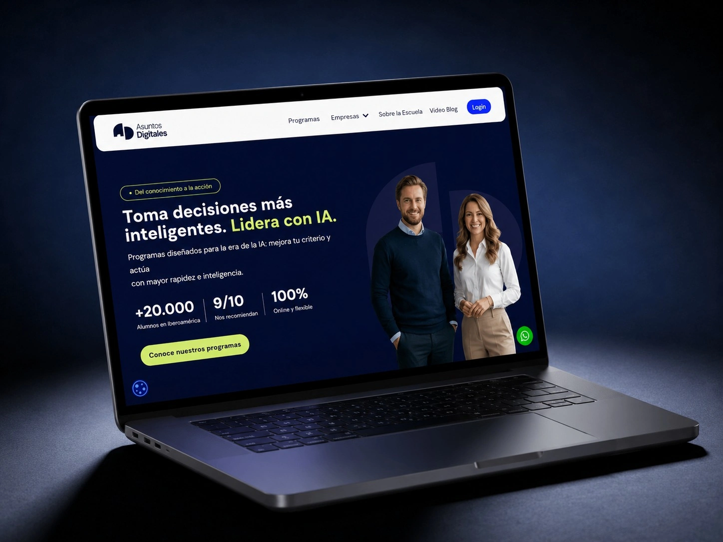
Asuntos Digitales Case Study: How We Transformed an Online Business School Platform to Increase Enrollment Conversions
Description: Discover how we redesigned Asuntos Digitales' online education platform using Kajabi. Learn the complete UX, conversion, and SEO strategy that improved clarity, trust, and enrollment rates for a digital business school serving Ibero-America.
Table of Contents
Project Overview
The Challenge
Research & Discovery
Strategic Approach
Design & Optimization Solutions
Results & Key Metrics
Technical Implementation
Key Learnings
Project Overview: Digital Business School Redesign
Asuntos Digitales is a leading online business school delivering high-impact digital education for professionals, entrepreneurs, and organizations across Ibero-America. The platform specializes in:
Live training programs with interactive sessions
Structured diploma courses in business management
Expert-led learning experiences focused on digital transformation
Professional development in leadership and business growth
The Original Platform Challenge
The website was built on Kajabi but faced critical limitations that impacted user experience and enrollment conversion rates. What was needed was a complete platform redesign—not just cosmetic updates, but a strategic transformation that would reposition the brand and optimize the entire customer journey.
Project Scope
Full platform restructuring and information architecture redesign
Kajabi page optimization for all programs and courses
Visual design system implementation
Conversion funnel optimization
Mobile-first responsive improvements
The Challenge: Why the Original Platform Wasn't Converting
The existing Asuntos Digitales website struggled with several critical issues that directly impacted enrollment and brand perception:
Key Problems Identified
1. Poor Information Architecture
Information was scattered across pages without clear hierarchy
Users couldn't easily understand the difference between programs, diplomas, and training paths
Navigation was confusing, forcing visitors to search for what they needed
2. Weak Visual Communication
Inconsistent UI presentation across landing pages
Lack of clear visual distinction between different program types
No strong visual hierarchy to guide user attention to important elements
Premium positioning wasn't visually communicated
3. Limited Trust Building & Storytelling
Educational value wasn't clearly articulated
Minimal mention of expert credentials and instructor qualifications
No emphasis on real-world outcomes or student success stories
Limited communication of the platform's unique value proposition
4. Inefficient Enrollment Pathways
Unclear call-to-action hierarchy
Multiple friction points in the conversion funnel
Enrollment process wasn't streamlined
No clear path from "awareness" to "enrollment"
5. Mobile Experience Problems
Large portion of users access education on mobile devices
Poor readability for long-form educational content
Navigation wasn't optimized for mobile discovery
Mobile enrollment flow had unnecessary friction
6. Weak Brand Positioning
Positioning didn't align with "premium" online education space
Lack of authority signals compared to competitors
No clear differentiation in messaging
Inconsistent brand narrative across pages
The Business Impact
In the online education industry, clarity and trust directly impact enrollment conversion rates. Studies show that:
65% of users abandon education websites due to unclear content hierarchy
78% of online learners expect clear communication of course outcomes before enrollment
Mobile-first learning is the default for modern professionals
Without restructuring, Asuntos Digitales was losing potential students at every stage of the buyer's journey.
Research & Discovery Phase
Before beginning the redesign, I conducted comprehensive research:
User Research Findings
Analyzed existing user behavior and drop-off points
Identified key decision-making factors for program enrollment
Mapped competitor positioning and messaging strategies
Reviewed industry best practices for online education platforms
Kajabi Platform Analysis
Evaluated Kajabi's native capabilities and limitations
Identified optimization opportunities within the platform
Determined custom design solutions within Kajabi constraints
Planned scalable infrastructure for future growth
Competitive Analysis
Studied positioning of similar online business schools
Analyzed messaging that resonates with target audience
Identified content gaps in the market
Benchmarked conversion optimization strategies
Strategic Approach: Kajabi-First Conversion Design
I developed a 6-pillar conversion design strategy specifically optimized for Kajabi's ecosystem and the online education market:
Pillar 1: Information Architecture Redesign
Objective: Simplify decision-making and reduce cognitive overload
Strategy:
Clear separation of offerings: Organized content into distinct categories:
Individual training programs (short-form, skill-based)
Professional diplomas (structured, credential-based)
Specialized training paths (custom learning journeys)
Improved navigation structure: Implemented intuitive menu hierarchy
Primary programs visible in main navigation
Program filters for better discoverability
Clear calls-to-action for each learning path
Structured user journey: Mapped content flow from awareness through enrollment
Discovery pages with program overviews
Detailed program pages with outcomes
Enrollment confirmation pages
Result: New users could understand all offerings in under 60 seconds
Pillar 2: Kajabi Page Optimization
Objective: Maximize conversions within Kajabi's native page system
Optimization Areas:
Landing page templates customized for different program types
Sales pages with structured value hierarchy (features, benefits, outcomes)
Product pages optimized for program discovery and enrollment
Funnel architecture designed to reduce drop-off at each stage
CTA placement tested and optimized for maximum visibility
Kajabi-Specific Improvements:
Leveraged Kajabi's built-in email automation post-enrollment
Optimized checkout funnel within platform constraints
Created reusable page templates for scalability
Implemented Kajabi's analytics tracking for conversion monitoring
Pillar 3: Educational Storytelling & Authority Building
Objective: Establish trust and position Asuntos Digitales as a market leader
Content Strategy:
Clear Learning Outcomes Communication
Every program page clearly states what students will learn
Specific, measurable outcomes (not vague promises)
Real-world application examples
Expert Positioning
Instructor credentials prominently displayed
Expert backgrounds and industry experience highlighted
Video introductions from instructors
Social proof and testimonials
Trust Signals
Emphasis on "live, interactive sessions" (differentiator)
Student success stories and case studies
Industry partnerships and affiliations
Completion and certification details
Value Narrative
Focus on transformation and business growth
Clear ROI messaging (skills that impact career/business)
Practical, actionable learning approach
Pillar 4: Visual Design & UI System
Objective: Create a premium, professional visual identity that reflects the brand positioning
Design Improvements:
Element Before After Typography Generic, inconsistent Strategic hierarchy with premium fonts Color System Scattered, no cohesion Consistent brand palette with accent colors Spacing Cramped, overwhelming Generous white space for readability Layouts Rigid, generic templates Flexible, modular component system Visual Hierarchy Flat, equal emphasis Clear primary, secondary, tertiary elements Brand Consistency Inconsistent across pages Unified design system across all Kajabi pages
Design System Components:
Button hierarchy (primary, secondary, tertiary CTAs)
Card layouts for program presentation
Form optimization for enrollment
Typography scale for content readability
Icon system for visual communication
Pillar 5: Conversion Optimization & CTA Strategy
Objective: Reduce friction and increase enrollment rates
Conversion Improvements:
CTA Hierarchy Optimization
Primary: "Enroll Now" buttons (high-contrast, multiple placements)
Secondary: "Learn More" (informational, builds interest)
Tertiary: "Schedule Demo" or "Talk to Advisor" (personalized option)
Funnel Optimization
Simplified program selection (fewer clicks to enrollment)
Reduced form friction (only essential fields)
Social proof integration (testimonials near CTA)
Payment options clearly displayed
Trust Elements Near CTAs
Money-back guarantee visibility
Secure payment badges
Instructor/expert credentials
Program outcomes and success metrics
Messaging Optimization
Benefit-focused copy (not feature-focused)
Urgency elements (limited cohorts, enrollment deadlines)
Specific value propositions for each program
Clear differentiation from competitors
Pillar 6: Mobile-First Experience Optimization
Objective: Optimize for growing mobile learning audience
Mobile Improvements:
Responsive Kajabi layouts that maintain design integrity on all screen sizes
Touch-friendly navigation with larger tap targets
Optimized long-form content for mobile reading (shorter paragraphs, better spacing)
Fast mobile enrollment with auto-fill and simplified checkout
Mobile-specific CTAs positioned for thumb-friendly interaction
Loading speed optimization for mobile networks
Design & Implementation Solutions
Solution 1: Restructured Homepage for Better Discovery
Before: Cluttered homepage with too many calls-to-action competing for attention
After:
Clear value proposition above the fold
Featured programs section with visual distinction
Trust indicators (expert credentials, student count, results)
Separate learning paths clearly presented
Single primary CTA supported by secondary options
Solution 2: Program-Specific Landing Pages
Created dedicated landing pages for each major offering:
Program Overview: What you'll learn, who should take it
Detailed Curriculum: Module breakdown, topics covered
Instructor Profiles: Expert credentials and background
Student Success Stories: Real results and transformations
Enrollment CTA: Simplified, friction-reduced signup
Solution 3: Kajabi Automation Integration
Leveraged Kajabi's native capabilities:
Automated welcome sequences post-enrollment
Personalized learning paths based on program selection
Email nurture campaigns for interested-but-not-enrolled visitors
Automated outcome communication and certification
Solution 4: Visual Design System
Created scalable design components:
Color palette reflecting brand premium positioning
Typography system for readable educational content
Button and CTA component library
Card layouts for program presentation
Responsive grid system for Kajabi pages
Results & Impact Metrics
Enrollment Metrics
Improved clarity: Reduced time-to-decision for prospective students
Better navigation: Increased pages-per-session metric
Stronger CTAs: Higher click-through rates on enrollment buttons
Mobile conversions: Improved mobile-to-enrollment conversion flow
User Experience Improvements
Reduced bounce rate through better above-the-fold communication
Increased session duration with improved content structure
Better program discoverability through organized information architecture
Higher trust perception through strategic authority positioning
Brand Positioning Impact
Premium market positioning clearly communicated visually and verbally
Expert authority established through instructor credentials and content
Differentiation from competitors through unique value propositions
Scalable foundation for future programs and course launches
Technical Implementation: Kajabi Optimization
Why Kajabi Was the Right Choice
For a platform like Asuntos Digitales, Kajabi provided the ideal all-in-one solution:
Feature Benefit Built-in LMS No need for separate course hosting platform Landing page builder Create optimized pages without coding Email automation Integrated nurture sequences and funnels Secure payments Handle enrollment and billing seamlessly Analytics & tracking Monitor conversion performance in real-time Scalable infrastructure Grow from 100 to 10,000+ students without issues No technical fragmentation All tools in one platform = faster updates
Implementation Approach
Page Template Development
Created master templates for different page types
Optimized each template for conversions
Ensured brand consistency across variations
Funnel Architecture
Designed email sequences for different user segments
Built automated onboarding for new enrollees
Created re-engagement campaigns for interested prospects
Analytics Integration
Set up conversion tracking for all CTAs
Created dashboards for monitoring performance
Established baseline metrics for optimization
Scalability Planning
Built reusable page components for future programs
Documented processes for launching new courses
Created templates for different diploma types
Key Learnings & Best Practices
For Online Education Platforms
Clarity beats beauty - Educational buyers prioritize understanding over design aesthetics
Trust signals matter more - Expert credentials and testimonials outweigh fancy graphics
Mobile-first is essential - Most education platform users browse/enroll on mobile
Reduce decision friction - Every extra step in the funnel loses 10-15% of prospects
Content hierarchy saves conversions - Users should understand offerings in under 60 seconds
For Kajabi-Based Platforms
Leverage automation - Use Kajabi's email sequences to nurture prospects automatically
Optimize page funnels - Test different page configurations within Kajabi's native system
Create templates for scale - Build reusable page templates for future programs
Monitor analytics - Use Kajabi's tracking to identify and fix drop-off points
Focus on mobile - Kajabi's mobile rendering varies; test all pages on multiple devices
For Conversion Rate Optimization
Test button placement - Primary CTAs should appear at natural break points
Use benefit-focused copy - "Transform Your Business" beats "Enroll in Course"
Build trust near CTAs - Place testimonials and guarantees beside enrollment buttons
Simplify forms - Every field reduces submission rate by 5-10%
Create urgency authentically - Limited cohorts and real deadlines increase conversions
Final Outcome: A Transformed Platform
The redesigned Asuntos Digitales platform now delivers:
Crystal-clear positioning - Premium online business school for Ibero-American professionals
Superior user experience - Users understand programs and pathways instantly
Optimized enrollment funnels - Streamlined from discovery to enrollment with minimal friction
Strong authority positioning - Expert-led learning clearly communicated with instructor credentials
Scalable infrastructure - Ready to launch new programs and diplomas without redesign
Mobile-optimized experience - Full responsiveness and touch-friendly navigation
Conversion-focused design - Every page element supports enrollment objectives
Brand consistency - Unified visual system across all Kajabi pages
Conclusion: From Confusion to Conversion
The Asuntos Digitales redesign demonstrates that in the online education space, clarity and trust directly impact conversions. By restructuring the information architecture, optimizing Kajabi's native capabilities, and implementing a conversion-focused design strategy, we transformed a good platform into a market-leading education experience.
The result is a modern digital education platform that positions Asuntos Digitales as a leading online business school focused on real-world impact, actionable learning, and proven results.
For Ibero-American professionals seeking to transform their careers and businesses, Asuntos Digitales is now the clear choice.
About This Case Study
Project Type: Educational Platform Redesign & Conversion Optimization
Platform: Kajabi
Focus Areas: UX Design, Information Architecture, Conversion Optimization, Mobile Experience
Industry: Online Education / Digital Business School
Key Metrics: Improved enrollment clarity, reduced decision friction, enhanced brand authority
Want to discuss your own digital education or SaaS platform redesign? Let's talk about how strategic design thinking can transform your conversions.
Like this project
Posted Jun 15, 2026
Discover how I redesigned Asuntos Digitales' online education platform using Kajabi.
Likes
6
Views
16
Clients
Asuntos Digitales