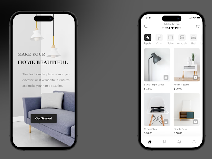
Interior Web design

Furniro Furniture Landing Page – A Modern, Minimalist E-Commerce Experience
💡 Project Overview:
Furniro is a furniture e-commerce landing page designed to deliver a seamless shopping experience with a focus on clean aesthetics, emotional visuals, and intuitive navigation. The layout and design choices aim to balance function and form to drive user engagement and conversions.
🎯 Goals:
Promote a new furniture collection with high visual impact.
Encourage purchases through clear, strong call-to-actions like “Buy Now” and “Show More.”
Highlight product categories and deals with badges like “Sale” and “New.”
Inspire users with lifestyle imagery and social proof via a branded hashtag.
🧩 Page Structure:
Hero Section:
Features a minimal, Scandinavian-style room with soft lighting.
A card UI block presents the new collection with a warm beige CTA button.
Browse the Range:
Showcases 3 key categories: Dining, Living, and Bedroom.
Visual tiles provide easy entry points into product exploration.
Our Products:
A responsive grid layout displays top-selling and featured products.
Each product card includes price, badges (e.g. “25% OFF”), and action buttons: Add to cart, Compare, Quick View.
Room Inspiration:
A curated photo gallery titled “50+ Beautiful Rooms Inspiration”.
Elegant CTA: Explore More invites users to dive deeper into the brand story.
UGC & Social Proof:
The #FurniroFurniture section encourages user-generated content and community engagement.
Real-life photos show how customers style their own spaces with Furniro products.
Footer:
Includes contact information, navigation links, policies, and a newsletter signup field.
Design Language:
Color Palette: Soft neutrals – white, beige, and warm wood tones to evoke calmness and modern comfort.
Typography: Clean sans-serif fonts ensure easy readability and elegance.
Imagery: High-quality, lifestyle-driven, emotionally engaging visuals.
Layout: Clear visual hierarchy, spacious grid system, strong use of white space for a breathable feel.
Responsiveness:
Fully responsive layout that adapts smoothly across desktop, tablet, and mobile devices.
Tools Used: Figma,Unsplash for imagery
📌 Role: UI/UX Designer – responsible for layout design, visual system, content structure, and user journey optimization.

Like this project
Posted Jun 19, 2024
I created a user-friendly interface with clear navigation, visually appealing graphics, and a straightforward ordering process.
Likes
2
Views
16


