Visual Identity Design for Atalef Children's Tours
Aleksandra Khasanova
Logo and visual identity design for Atalef, a brand that organizes guided tours for children in Amsterdam.
Task
To develop a brand identity for a children's product that feels stylish and minimalist — as close to an “adult” aesthetic as possible. The goal was to appeal to the target audience: active, travel-loving parents under 45. Based on the visual identity, I also created social media templates and tour guide layouts.
Solution
Competitor Analysis. Two of the logos were fun but lacked a unique personality — you could easily swap in the word "furniture" and they’d still work. The rest looked stuck in 2010. Standing out won't be difficult.
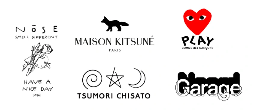
References and Direction. Together with the client, we selected reference logos that felt very stylish and would resonate with modern parents. They strike a balance between clean minimalism and a handcrafted, imperfect charm.
The visual identity had to reflect two sides:
— on one hand, professionalism and reliability of the information and locations;
— on the other, a personal, human approach to each family and authentic, well-thought-out routes.
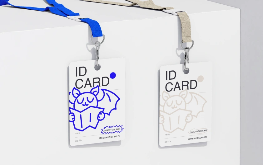
I suggested creating a mascot — the Atalef mouse — since children tend to form strong emotional connections with characters.
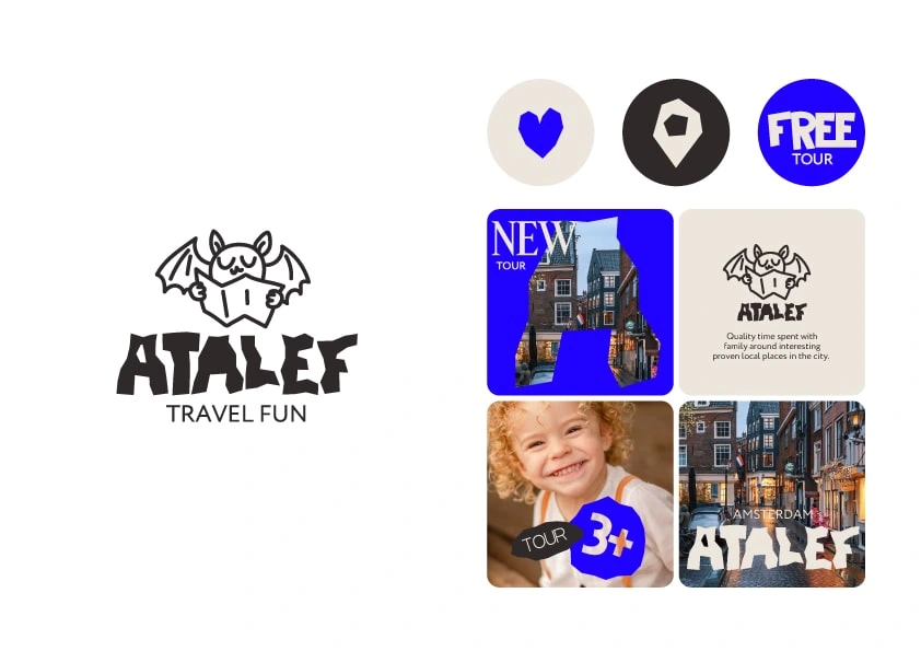
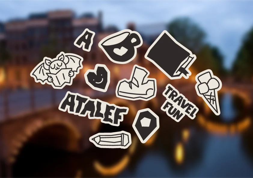
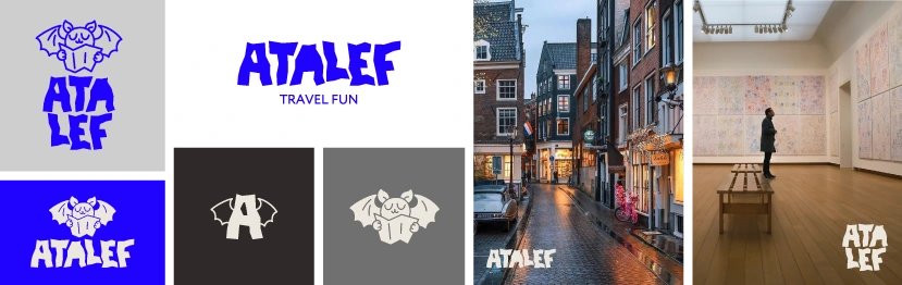
1/ Paper Cutout. The logo is based on contrast: a bold, blocky typeface that looks like it was cut out of paper by a child, paired with a naively drawn, cheerful character. This combination delivers a simple, clear message: we offer fun, meaningful routes and know how to make great memories with kids.
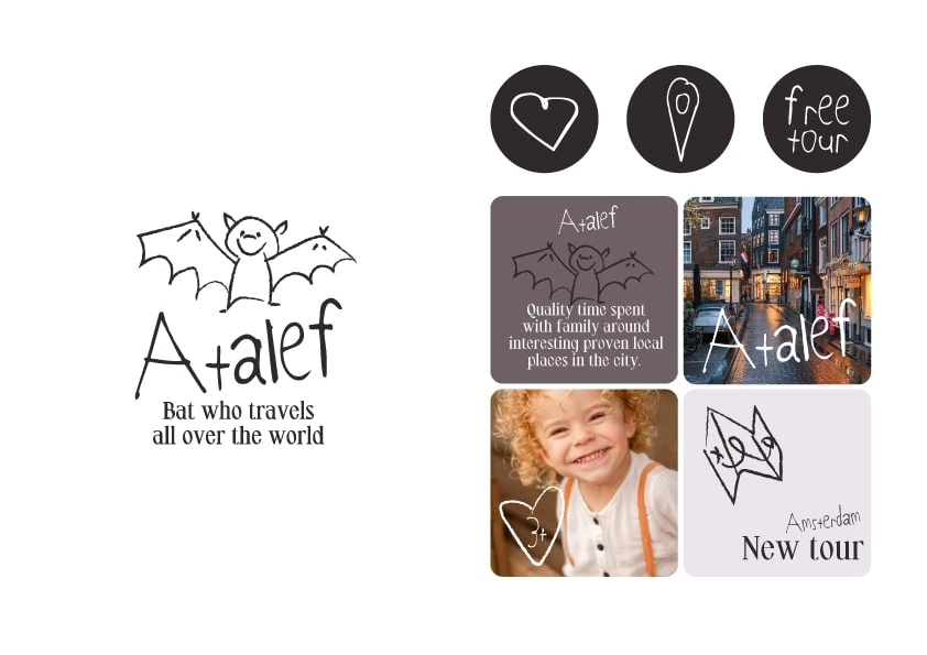
2/ Illustration. The logo grabs attention with its emblem — a childlike drawing of a bat. This playful style is carried through the entire logo. The intricate serif font used in the tagline instantly adds a sense of style and modernity. I see this version in calm tones that won’t overpower the city or the logo itself.
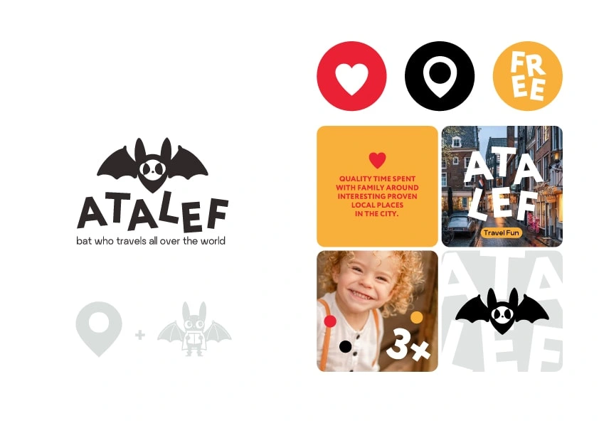
3/ Geo-Mouse. At the core of this logo is a symbol combining a location pin and a bat. To balance out the super cute character, the typeface is kept fairly neutral. Still, to avoid a visual disconnect, the letters have a slight playful bounce to them.
The client chose the first concept.

While working on each element of the identity, it was important to maintain a balance — between playfulness and style, openness and structure. To support that, the brand colors were chosen: classic black and white paired with electric blue.
The visual style is rooted in paper cutouts and naive children’s drawings. These elements are mixed together — and with the brand typeface — to create the entire visual language.
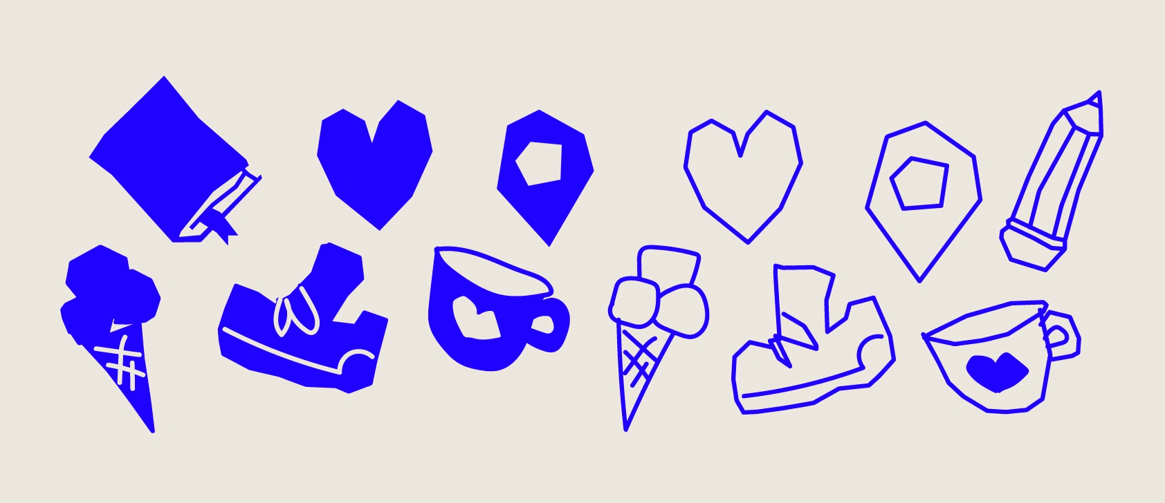
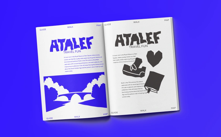
Brand typefaces combined with hand-drawn illustrations used to highlight key accents
A large character illustration paired with hand-drawn elements to highlight key accents
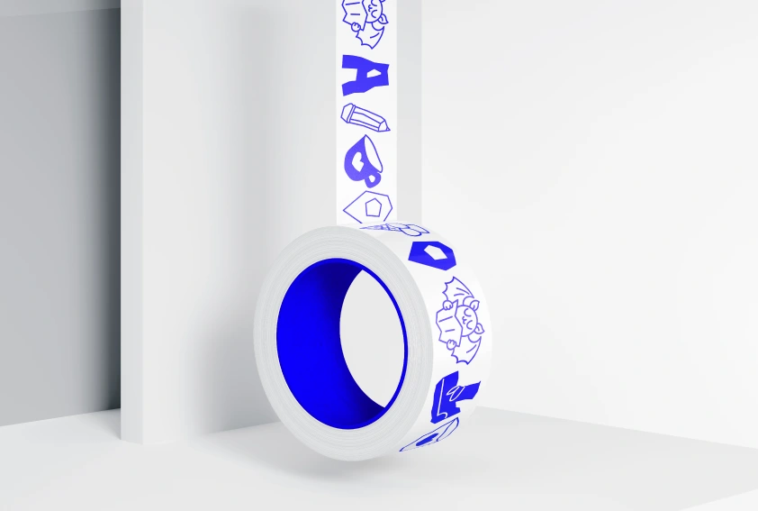
A visual mix of two styles: cut-paper and hand-drawn elements
Cut-paper style illustrations
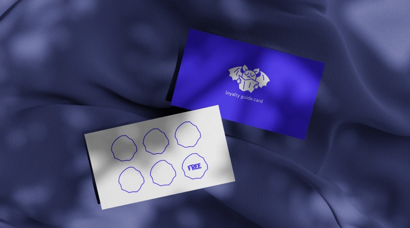
The logo mark and brand panels
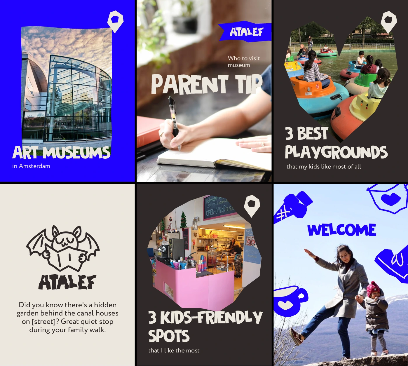
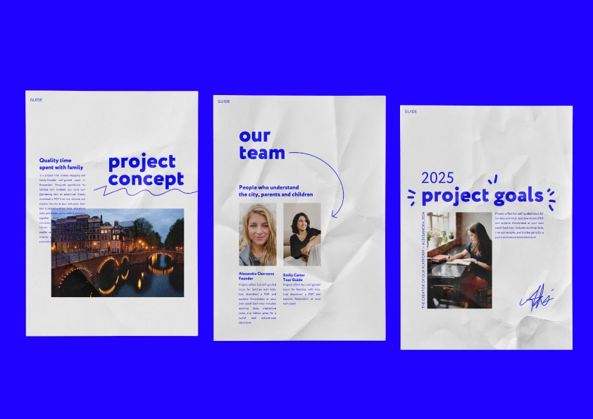
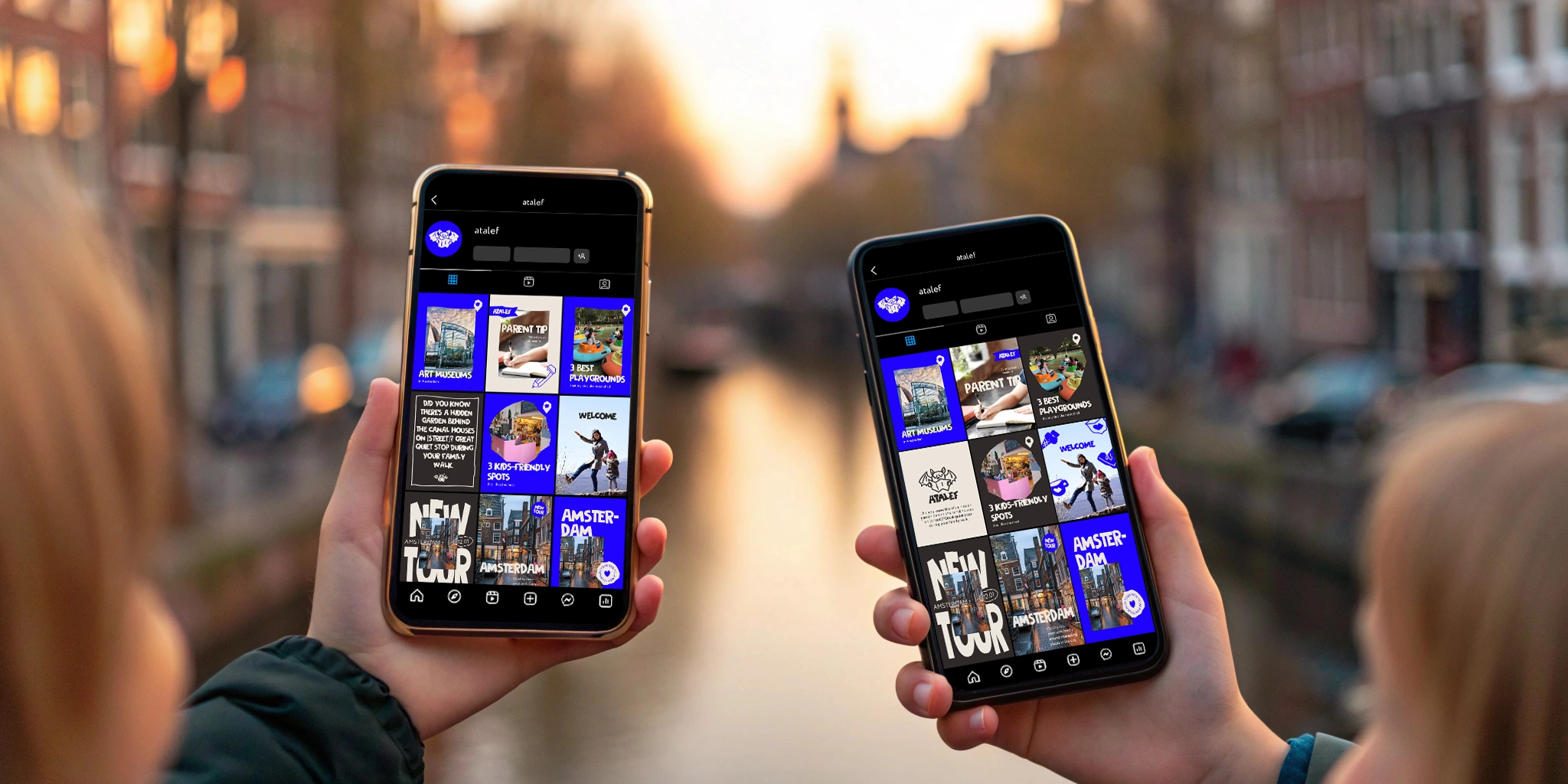
A social media template system was developed. The client provided the main types of planned content, and for each category, the most effective and easy-to-layout templates were created.
The result included four categories:
– messages from the founder
– kids-friendly spots
– useful tips for saving and budgeting
– quotes from Atalef
Result
The result is a stylish, minimalist, yet vibrant visual identity for a children’s product. All supporting materials were also developed. While the product is still new and performance data isn’t available yet, there are a few clear outcomes:
The final style matched exactly what the client envisioned.
The mascot makes the brand stand out clearly among competitors.
Children who have already taken the tour were absolutely thrilled with Atalef.
Like this project
Posted Jul 13, 2025
Designed a stylish, minimalist visual identity for Atalef's children's tours.
Likes
0
Views
12
Timeline
Apr 1, 2025 - Apr 14, 2025
Clients
Atalef