Kaoshi branding project
Samuel Lasisi
Building on a foundation
Kaoshi’s mission is to build the most convenient and affordable platform to help Africans meet their personal and family commitments at home or abroad. They deliver on this mission via Kaoshi Africa and Kaoshi International.
Brand Personalities (Archetypes): Creator + Everyman
Brand Voice: Genuine, Helpful, Clear, Empathy
The Solution
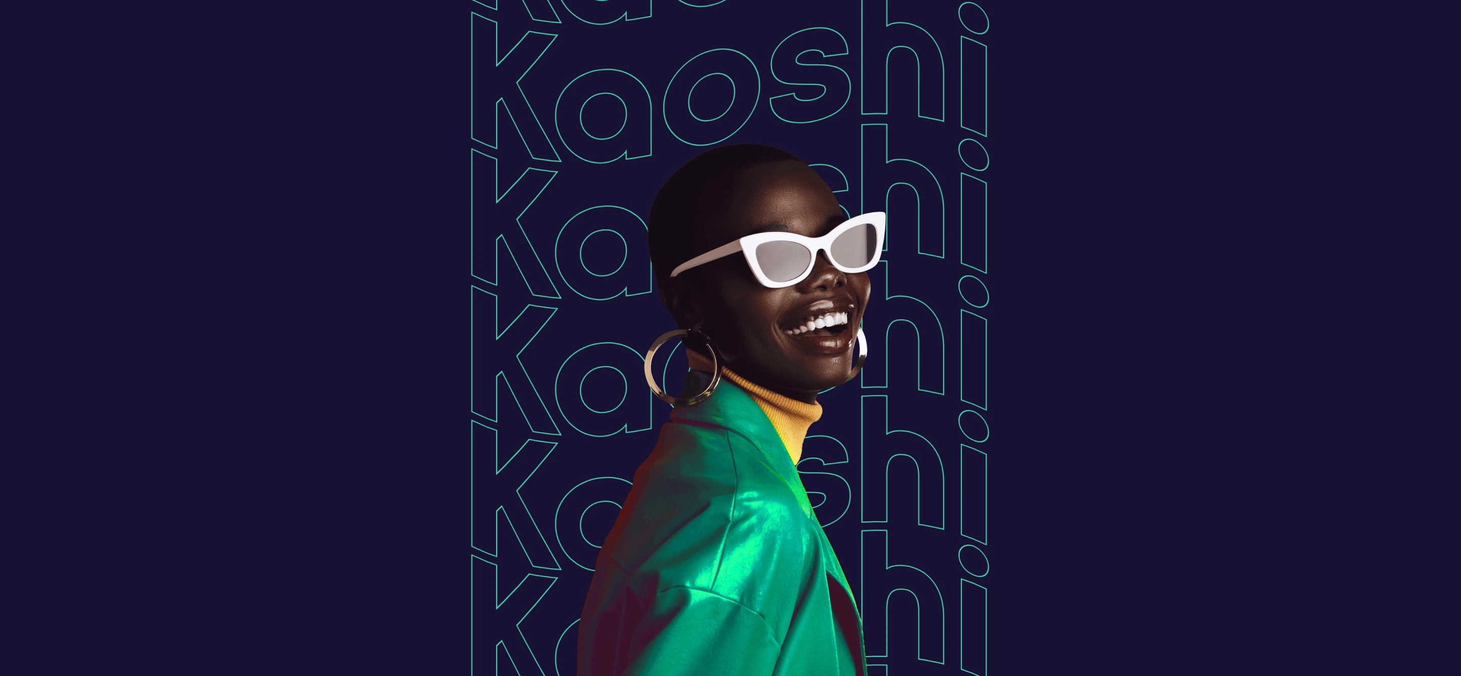
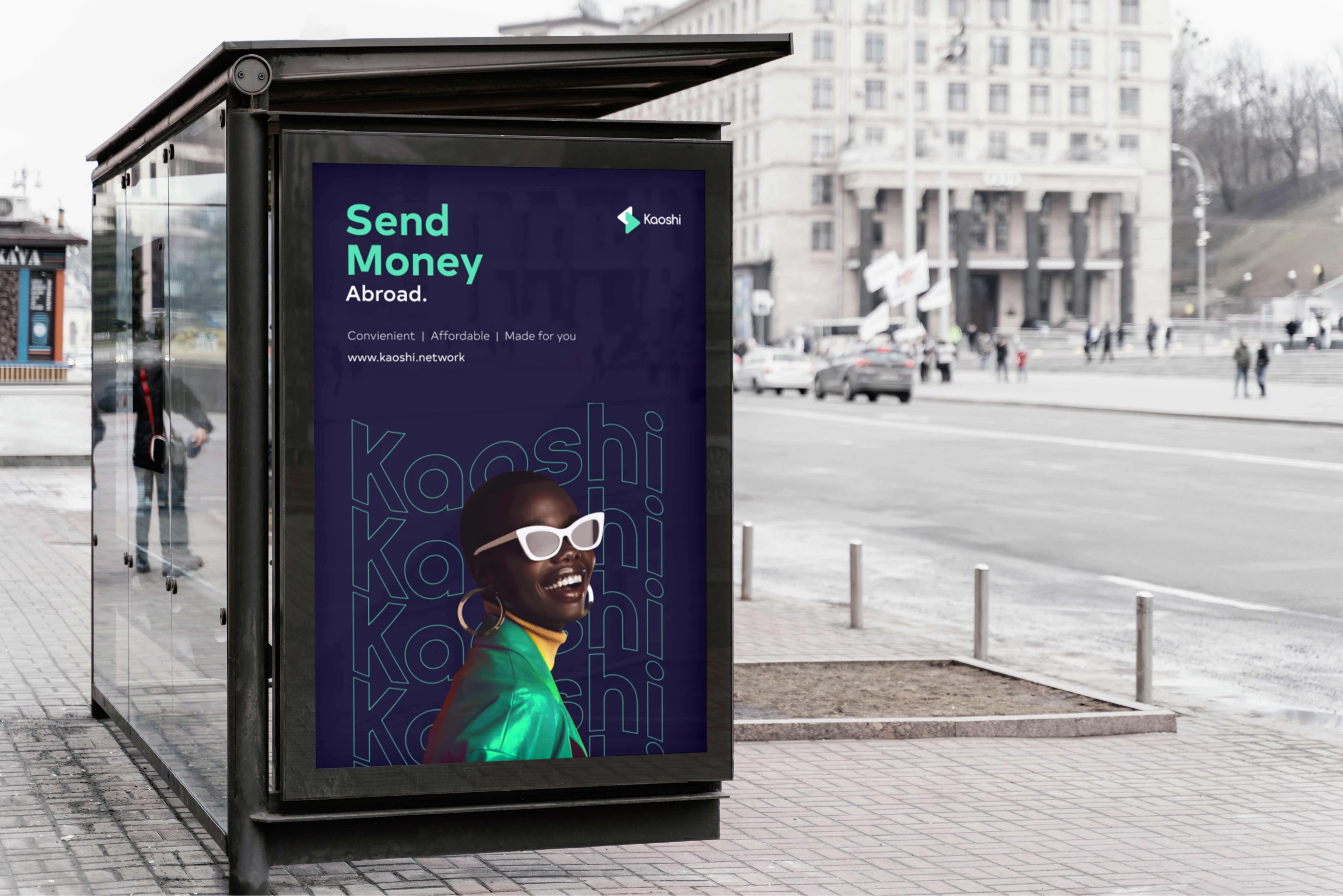
We expressed the brand’s value proposition through a visual identity system that tells the story of simplicity, innovation, and inspiration. Its diverse audience also gave inspiration to a vibrant colour palette.

Bringing you closer
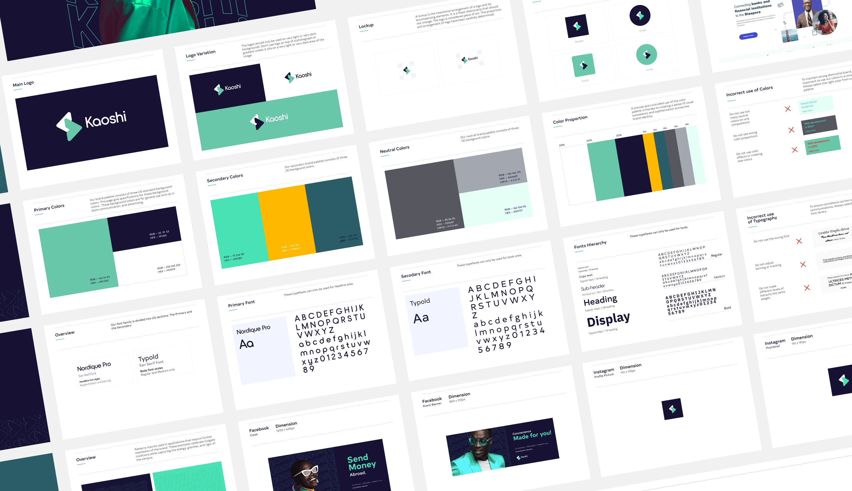
As a financial brand gaining increasing trust, Kaoshi decided against having a drastic logo change and we agreed with the rationale. We focused on finding opportunities that simply made the same logo more meaningful.
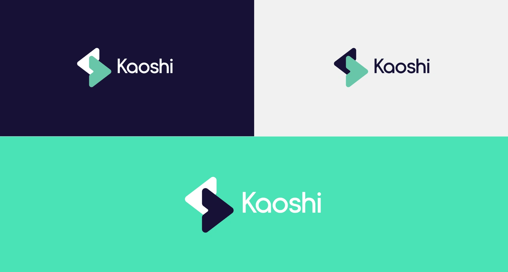
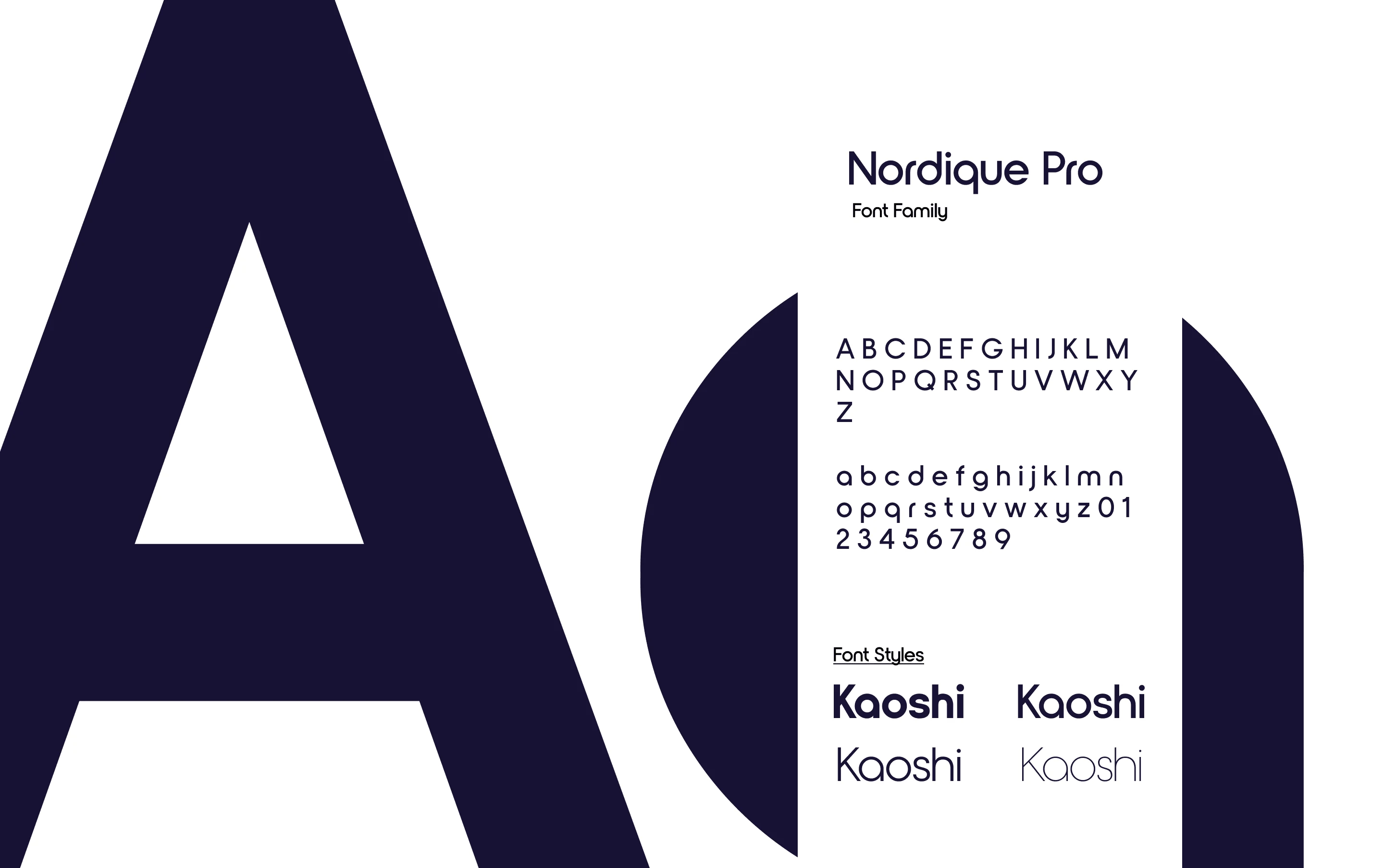
Choosing a typography
Font family: Nordique pro
Inspired by her Swedish and Norwegian heritage, Andrea Leksen created this modern geometric sans serif reminiscent of Scandinavian design and typography. With its tall x-height and thin strokes, Nordique Pro will be best showcased at large sizes, in headlines, and other display uses
Like this project
Posted Feb 13, 2025
I crafted Kaoshi’s brand identity with a focus on simplicity, innovation, and trust. Refining its logo, typography, and visuals to strengthen its presence.
Likes
2
Views
28
Clients

KAOSHI
Kaoshi