Brand Identity for Blescasa Properties Limited
Emmanuel Udeme
Case Study: Brand Identity for Blescasa Properties Limited
📍 Client Overview
Blescasa Properties Limited is a real estate company that specializes in the sale and acquisition of land and properties. Their vision is to be a trusted name in real estate, delivering value, transparency, and security to clients seeking land ownership and investment opportunities.
🎯 Design Objective
The primary goal was to create a bold, modern, and trustworthy brand identity that communicates the company's professionalism, real estate focus, and commitment to excellence. The identity had to stand out in a competitive market while remaining flexible for multiple applications—digital, print, and signage.
💡 Concept Development
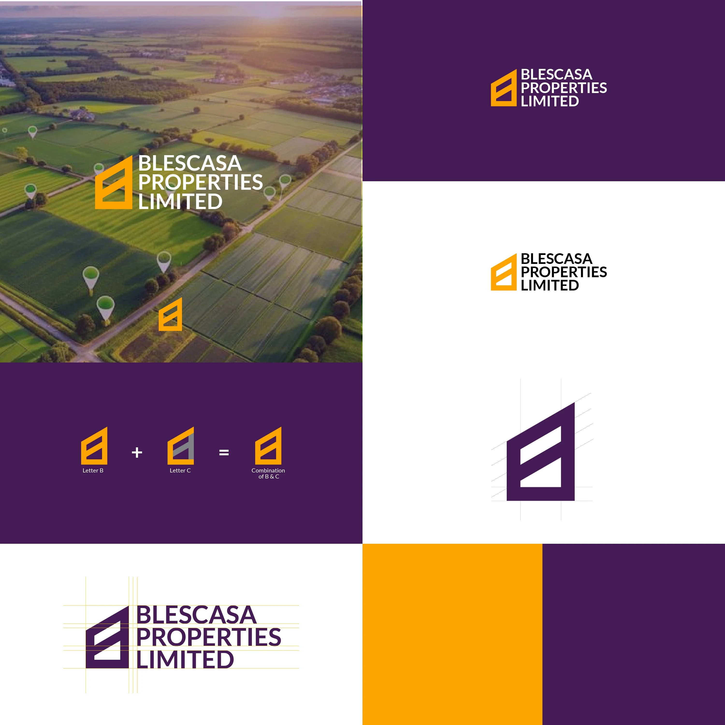
The logo concept development
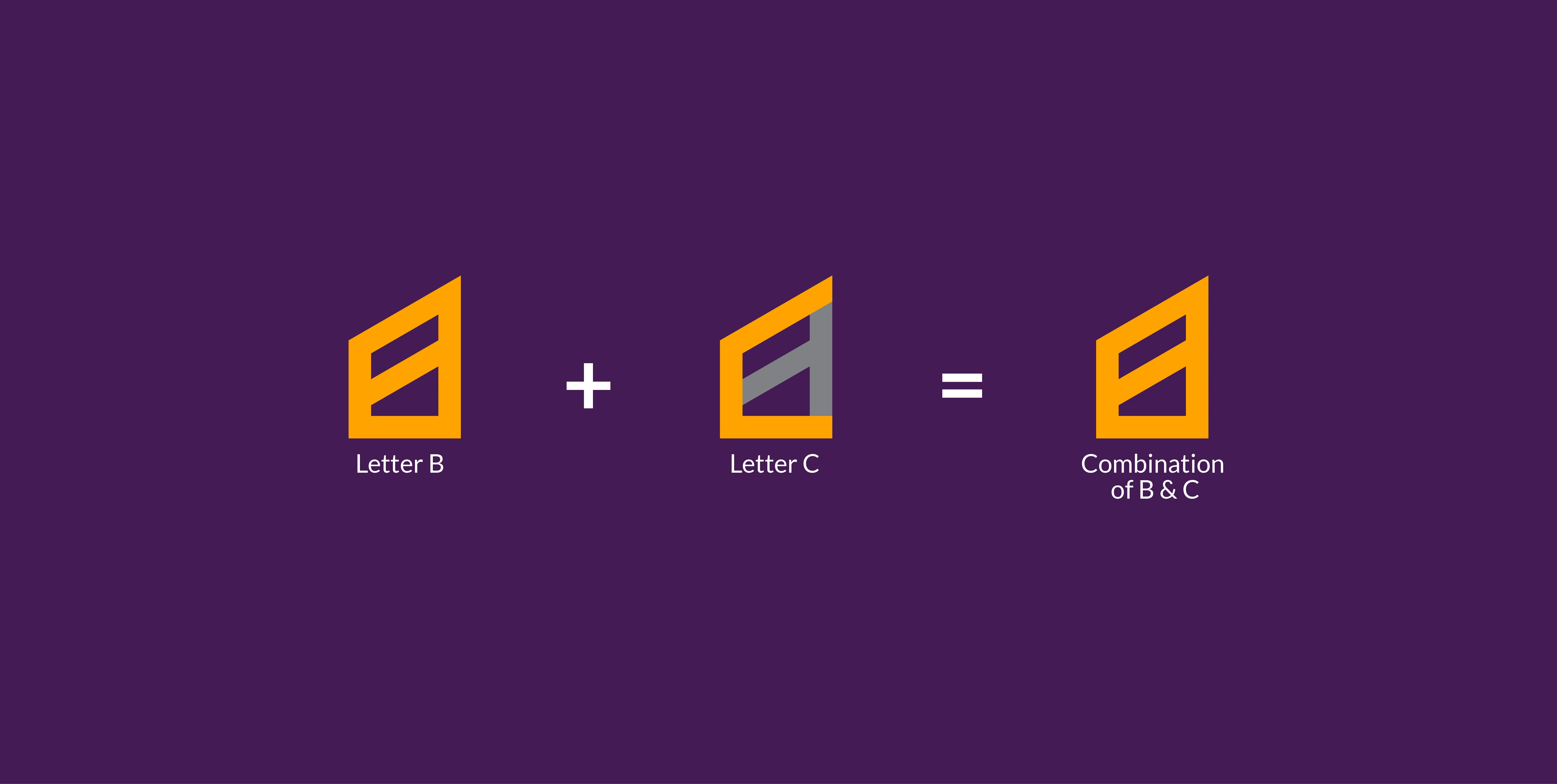
The logo is built around the combination of two letters:
B (from Bles)
C (from Casa)
Together, they form a geometric, monolithic icon that resembles both a structure and an abstract land plot, reinforcing the real estate theme. The upward angular form suggests growth, progress, and stability.
🎨 Color Palette
Color combination
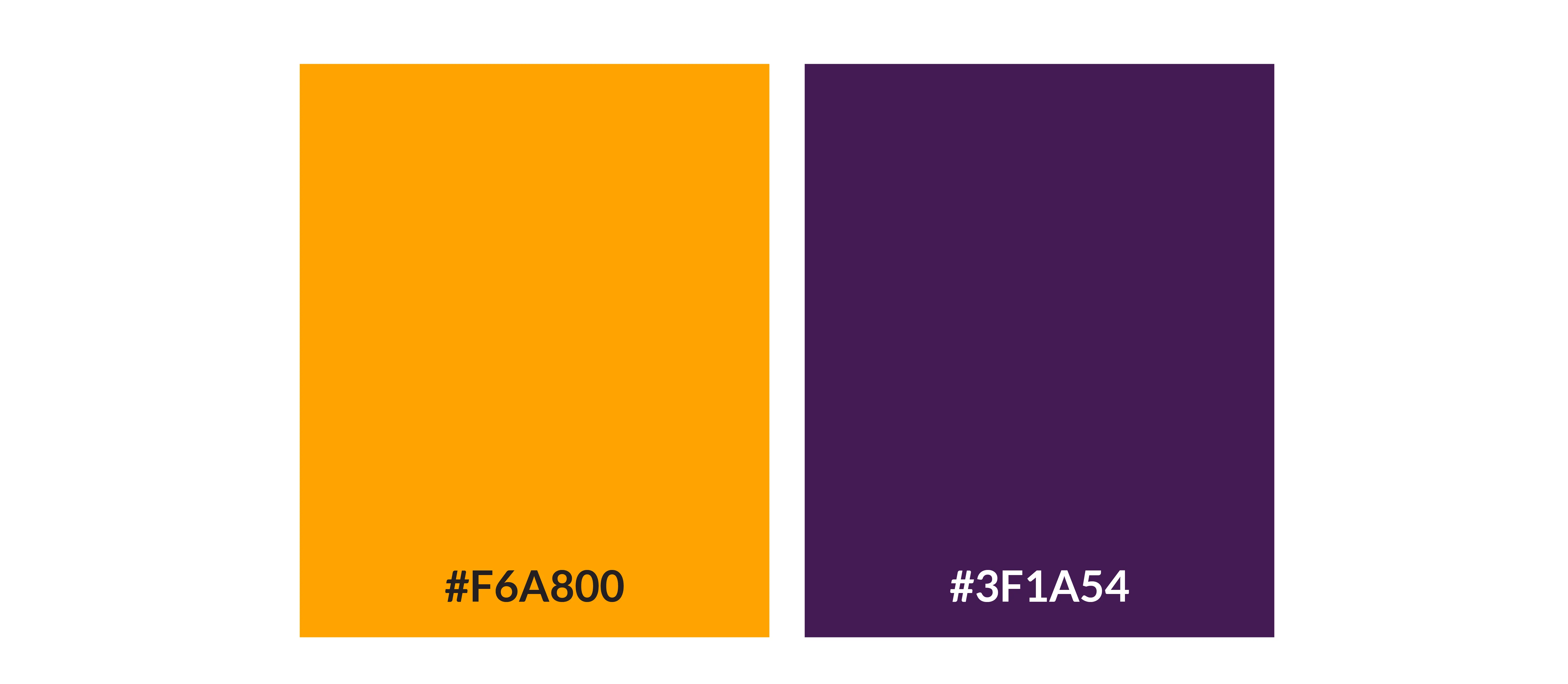
Color for the logo
Royal Purple (#3F1A54): Symbolizes luxury, trust, and professionalism.
Gold/Amber (#F6A800): Adds vibrancy and signals opportunity, wealth, and optimism.
White: Maintains clarity, space, and modernity.
These colors work together to communicate both reliability and aspiration—key values in the real estate industry.
🔠 Typography
Font
Font and Typography
A clean, sans-serif typeface complements the icon for a contemporary look. The type is balanced and readable across all sizes, ensuring scalability in various branding applications.
🔧 Design Process
Research & Discovery: Studied competitors and market trends to position Blescasa uniquely.
Sketching & Exploration: Developed rough letterforms and experimented with abstract shapes.
Logo Construction: Combined B and C with grid precision for structural balance.
Color & Type Selection: Aligned with brand personality—elegant yet strong.
Presentation & Feedback: Delivered mockups and received client approval with minor refinements.
📦 Deliverables
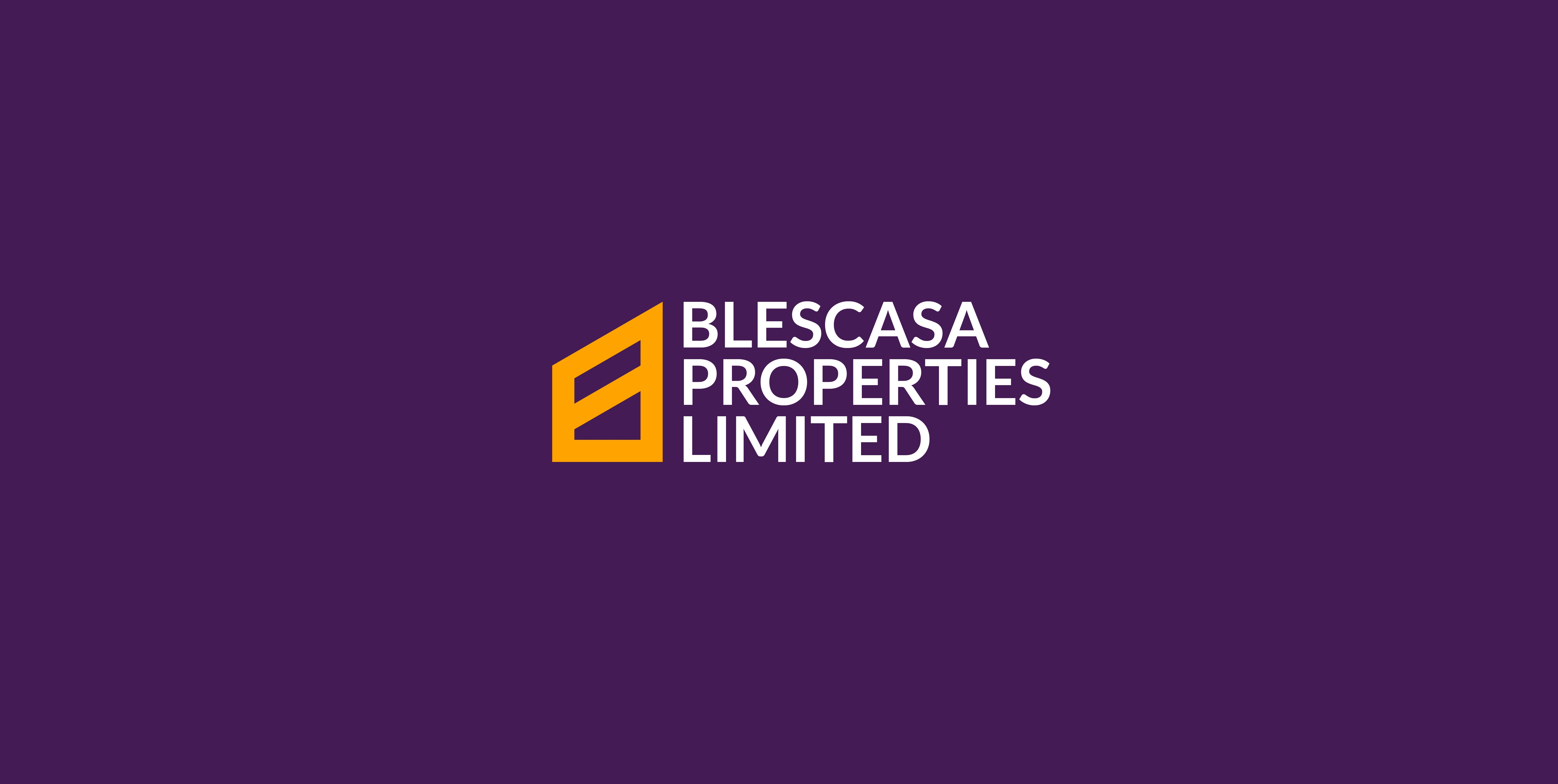
Logo branding
Logo suite (primary, secondary, monogram)
Brand color guide
Grid and safe space specification
Sample applications (mockups)
Flyer

Billboard
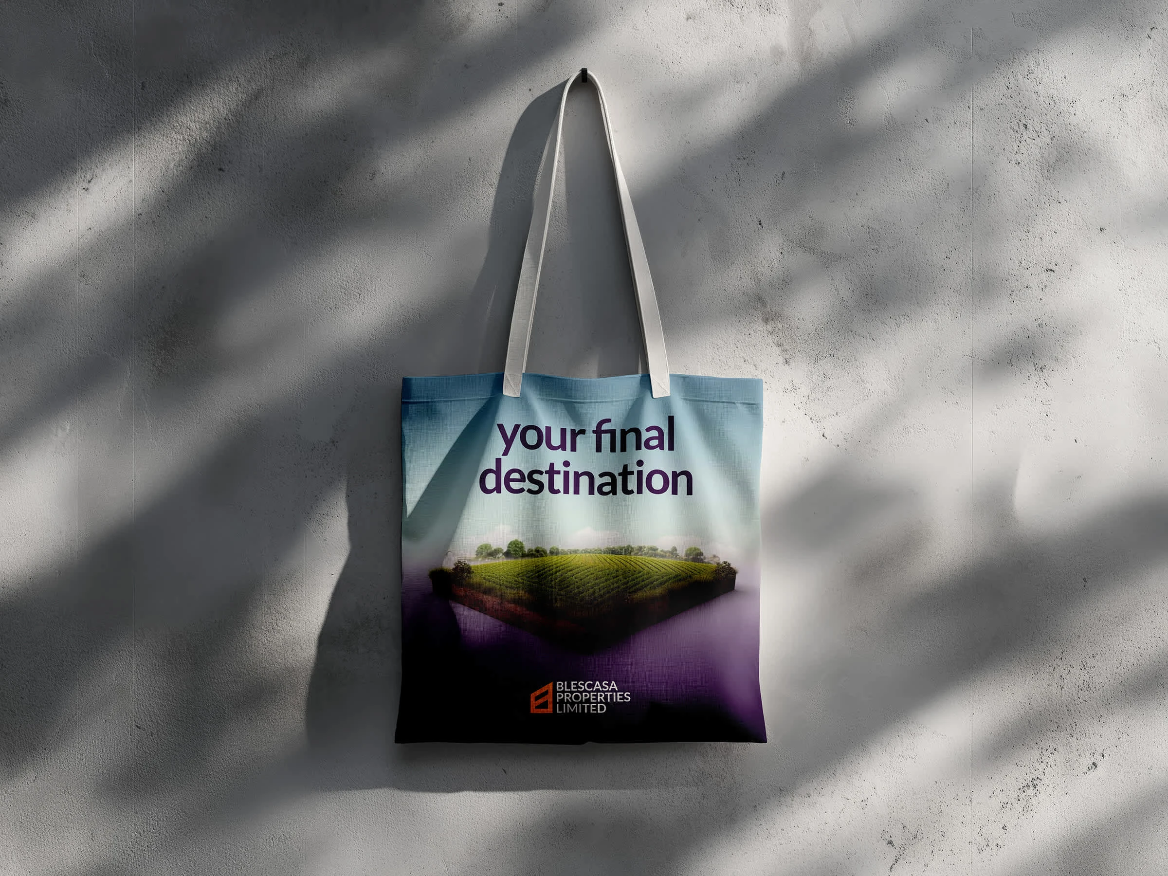
Tote bag
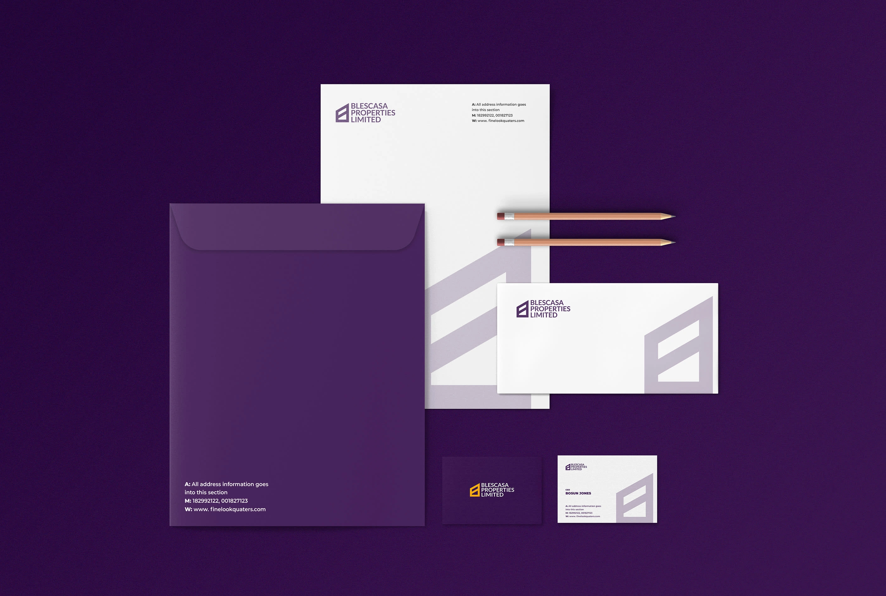
Stationeries
Simple logo Animation
✅ Outcome
The client was thrilled with the final identity, praising its professional look, symbolic meaning, and versatility. The brand now stands out with a clear, confident presence—ready to earn the trust of prospective property buyers.
🧠 Reflection
This project was a balance of minimalism and meaning—focusing on strong shapes and clear communication. It reinforced how simplicity, when done right, can carry powerful brand storytelling.
Like this project
Posted May 18, 2025
Created a bold, modern brand identity for Blescasa Properties Limited.
Likes
1
Views
6
Timeline
May 2, 2025 - May 10, 2025