Built with Lovable
Verdant Spaces - Landscaping Website Redesign

Shubham Ranjan


Project Overview
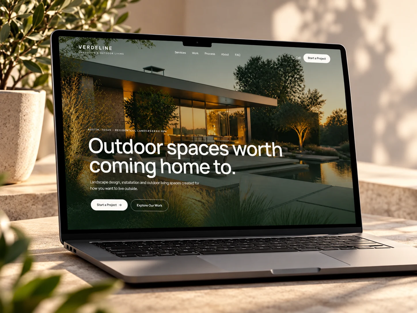
Verdant Spaces is an independent website for a premium landscaping and outdoor-living company.
The idea was to create a digital experience that feels more like the business itself: calm, refined, visual, and focused on how people want to live outdoors, rather than a conventional landscaping website built around a long list of services.
The experience is designed to help prospective clients move from inspiration → understanding → confidence → enquiry.
The Challenge
Landscaping is highly visual, but many landscaping websites lead with service lists and generic company information.
For a homeowner, the more important questions are often:
What could my space become?
Does their style fit what I want?
How do they approach a project?
Can I trust them to actually deliver it?
The goal was to design the website around those questions rather than simply presenting information.
Goals
Make the website visually inspiring from the first screen
Position the company around outdoor living, not simply landscaping services
Let completed work carry more of the story
Create a clear and intuitive project journey
Communicate the design philosophy and process
Build trust without overwhelming visitors with information
Make starting a project feel simple and natural
Create a premium visual identity that reflects high-value outdoor projects
Strategy & UX
The experience was structured around the way a homeowner naturally explores a landscaping project.
Inspiration first
The homepage immediately puts finished outdoor spaces and lifestyle imagery at the center.
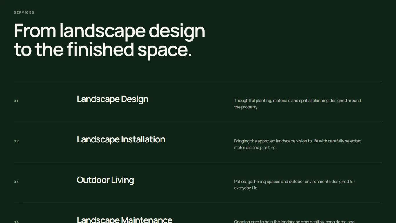
Outcome over service list
Instead of leading with “what we do,” the site focuses on what the client can create and experience.
Project-led storytelling
Large photography and project groupings allow the work to communicate quality visually before asking visitors to read extensive copy.
Process transparency
A simple three-stage process explains how an idea moves from consultation to installation and ongoing care.
Lifestyle positioning
The messaging repeatedly connects landscaping to how people actually use their homes — entertaining, relaxing, gathering and spending time outdoors.
Low-friction enquiry
The contact flow appears after the visitor has had enough context to understand the value of the service, rather than forcing an immediate sales interaction.
Visual Direction
The visual system was intentionally designed to feel premium, warm and architectural.
The direction uses:
deep forest green
warm off-white / natural neutrals
restrained typography
large editorial imagery
generous whitespace
subtle borders and dividers
minimal interface decoration
strong visual rhythm
The design avoids the common landscaping-site aesthetic of excessive green, generic service cards, and overly promotional layouts.
The intention is for the website itself to feel like an extension of the landscape work.
Key Sections
Hero / positioning
Introduces outdoor living as the central value proposition.
“Your yard is more than a yard.”
Reframes the service around lifestyle and experience.
Design → Build → Live
A simple explanation of how the company approaches a project.
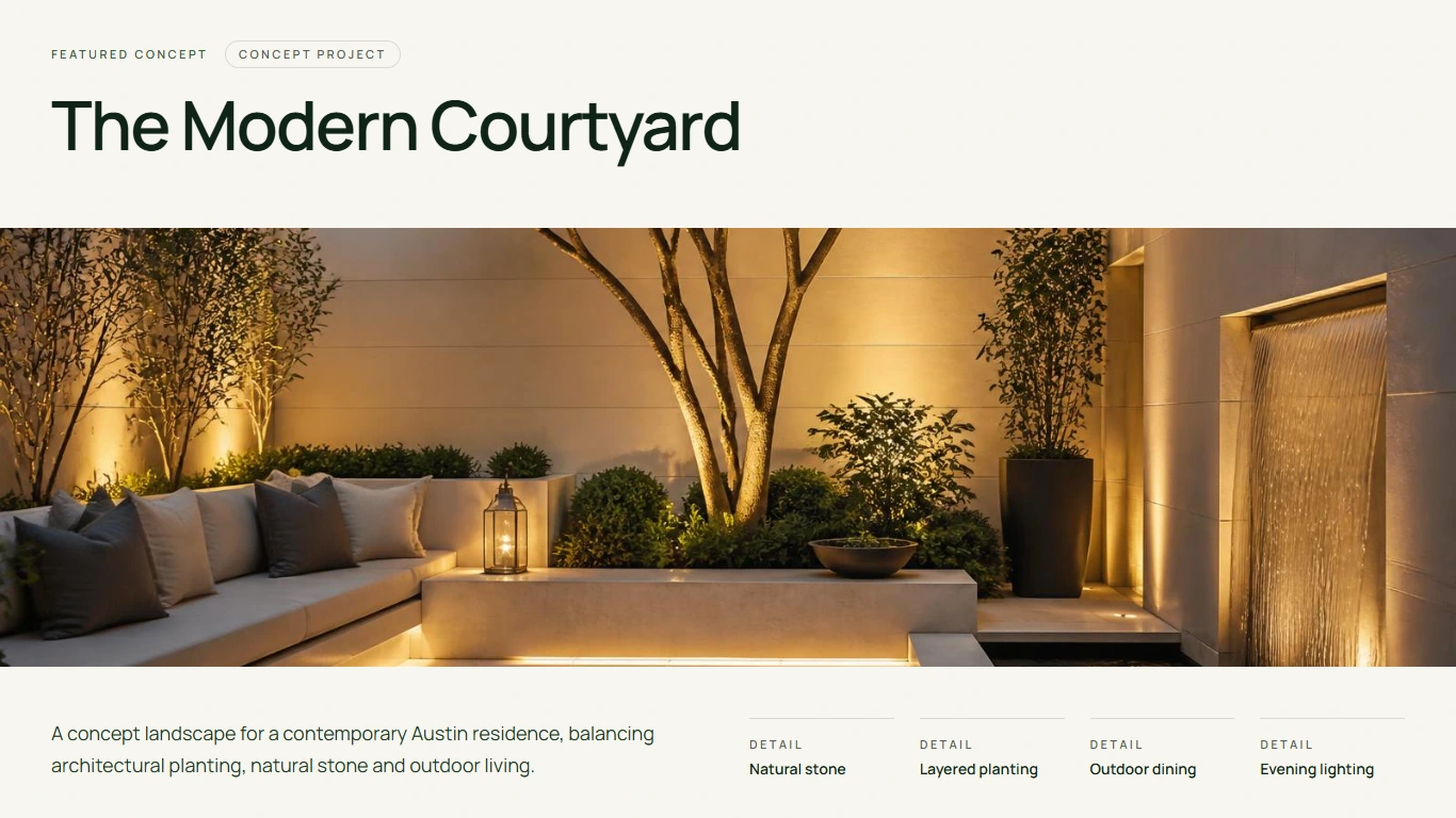
Featured outdoor spaces
Large visual project storytelling designed to create inspiration.
The modern courtyard
A focused example of how a specific outdoor environment can be presented as a lifestyle story.
Project gallery
Multiple project views allow the portfolio to become a major trust-building asset.
Design details
Material, texture and planting details reinforce the design-focused positioning.
How the process works
A transparent journey from initial thinking through execution.
Project enquiry
A simple “Have a space in mind?” interaction gives interested visitors an obvious next step.
FAQ
Handles common questions before the conversation.
Final CTA
Returns to the core proposition: creating an outdoor space that feels like home.
Outcome
The result is a complete responsive website experience built around:
Inspiration → Story → Process → Proof → Confidence → Enquiry
Rather than treating the website as an online service catalogue, the concept uses visual storytelling and UX to sell the experience of the finished space.
The layout is designed to adapt across desktop, tablet and mobile while preserving the visual hierarchy and project imagery.
My Role
Strategy
UX / Information Architecture
UI Design
Visual Direction
Responsive Design
Web Development
Tools
Figma
Lovable
Vercel
Live Website
Like this project
Posted Sep 28, 2026
Created a responsive and visually inspiring website for a premium landscaping company.