Brands Page for SEO & UX
Adriana Fruchter
Brands Page for SEO & UX
Description
Improve the Brands page to create a more engaging user experience while optimizing SEO for search engines.
Goal
Clearly distinguish the submenu as a category filter.
Emphasize the existence of dedicated subpages for each category.
Research
Best Approach for Category Pages: Filters vs. Category Paths
The structure of the Brands page impacts both SEO and user experience. The two main options are:
Option 1: Single Brands Page with Filters (/brands/)
/brands/)A single Brands page where users dynamically filter brands using AJAX or Isotope.js.
SEO Pros & Cons
✅ Faster Performance → One page, no extra loads.
✅ No Duplicate Content Risk → Avoids thin pages.
✅ Higher User Engagement → Instant filtering, better experience.
❌ No Indexable URLs → Filters don’t create unique pages.
❌ Limited Google Crawling → Harder to rank for specific categories.
UX/UI Pros & Cons
✅ Smooth & Interactive → No reloads, seamless browsing.
✅ Ideal for Mobile → Works well with dropdowns & filters.
✅ User-Friendly → Simple and intuitive navigation.
❌ Difficult to Share Specific Categories → No static links.
❌ No Breadcrumbs → Users can’t see category hierarchy.
Option 2: Separate Category Pages (/brands/category/)
/brands/category/)Each category (e.g.,
/brands/skincare/) has its own dedicated page using a custom taxonomy template (taxonomy-brand_category.php).SEO Pros & Cons
✅ Indexable URLs → Google can crawl
/brands/skincare/.
✅ Stronger Internal Linking → Enhances site structure.
✅ Better Keyword Targeting → Allows ranking for specific search queries.
❌ More Pages to Maintain → Requires unique content for each page.
❌ Pagination Issues → Risk of duplicate content if not optimized.UX/UI Pros & Cons
✅ Better for Discovery → Users can land on category pages from Google.
✅ Clear Navigation → Breadcrumbs (
Home > Brands > Skincare).
✅ Ideal for Large Catalogs → Organizes a wide range of brands.
❌ Slower Navigation → Reloads required when switching categories.
❌ More Clicks Needed → Can feel less seamless.Best Recommendation: Hybrid Approach
To combine SEO benefits with a fast UX, we propose a hybrid model:
✔ SEO-Optimized URLs (
/brands/category/) → Ensures indexable category pages.
✔ On-Page Filtering → Allow users to refine results without page reloads.
✔ Breadcrumbs Navigation → Improve usability and structure.Challenges
Balancing SEO indexability with fast filtering.
Avoiding duplicate content while maintaining user engagement.
Implementing efficient filtering without affecting page load speed.
Ongoing Implementation
We are currently working on refining the Brands page layout to make the filtering system more intuitive and accessible.
Design Suggestion to Improve Filters
To enhance clarity, we propose:
A more prominent "Filter by Category" title.
Better visual hierarchy for selected vs. unselected categories.
Adding subtle animations to indicate filtering is applied.
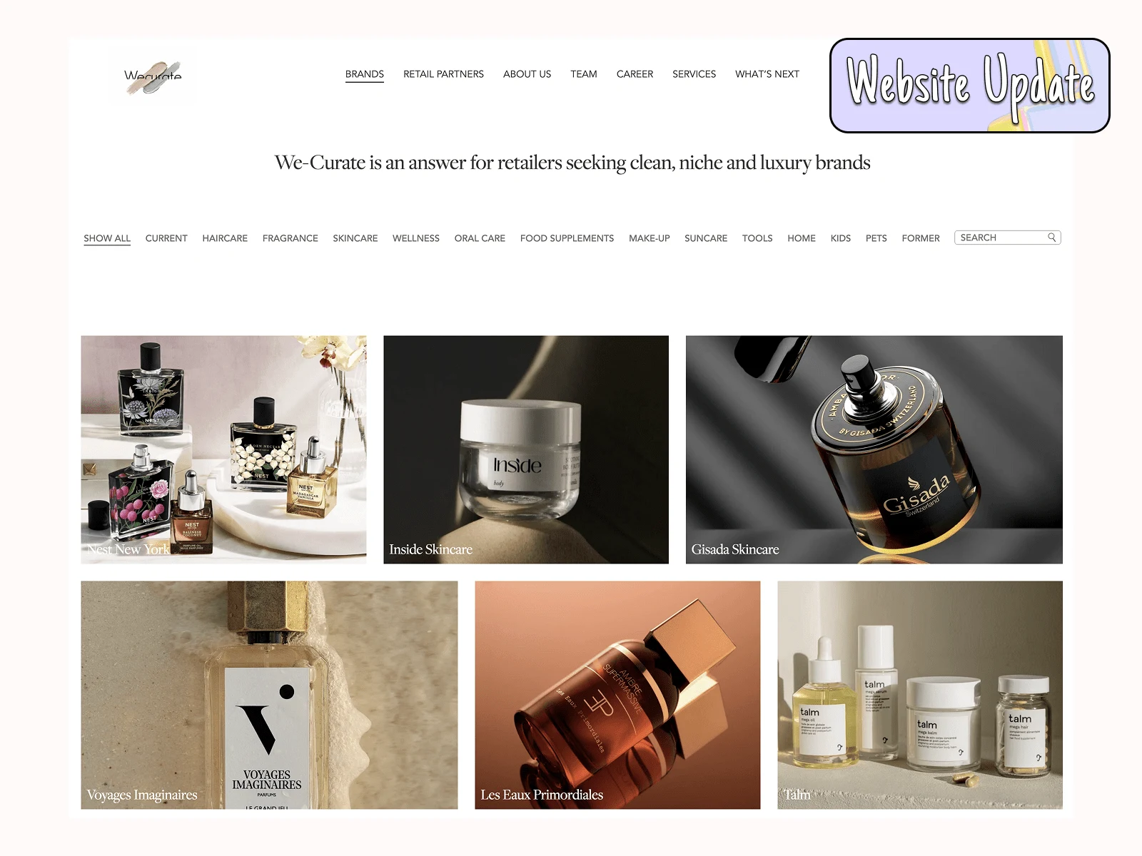
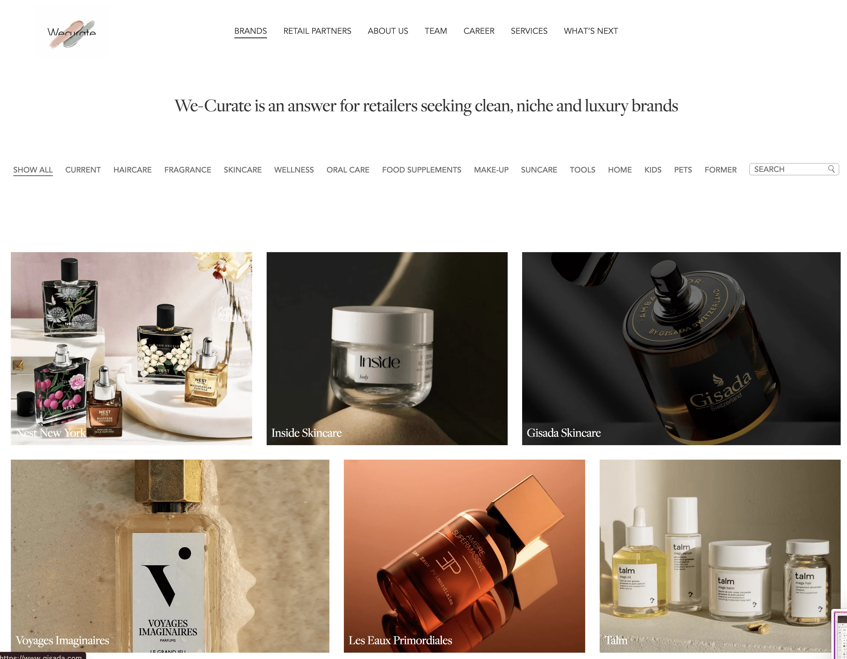
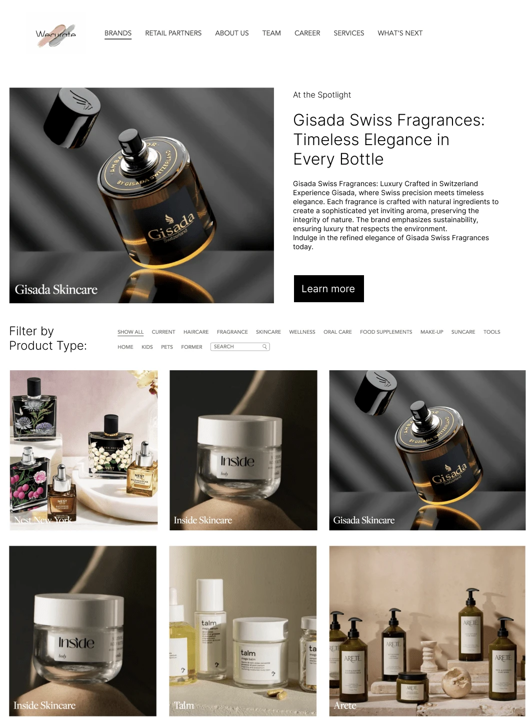
🔹 How It Is Now:
Suggested Design Improvements:
Keep Filters on Top (with Clearer Labeling)
This design keeps the existing top-filter layout but improves usability by adding a clear title:
➡ "Filter by Product Type" at the top of the filters.
Why This Works:
✅ Users are already familiar with this layout.
✅ Keeps the page clean and avoids side clutter.
⚠ Potential Drawbacks:
❌ Filters might still feel secondary and less noticeable.
❌ Users may not immediately recognize it as a category filter.
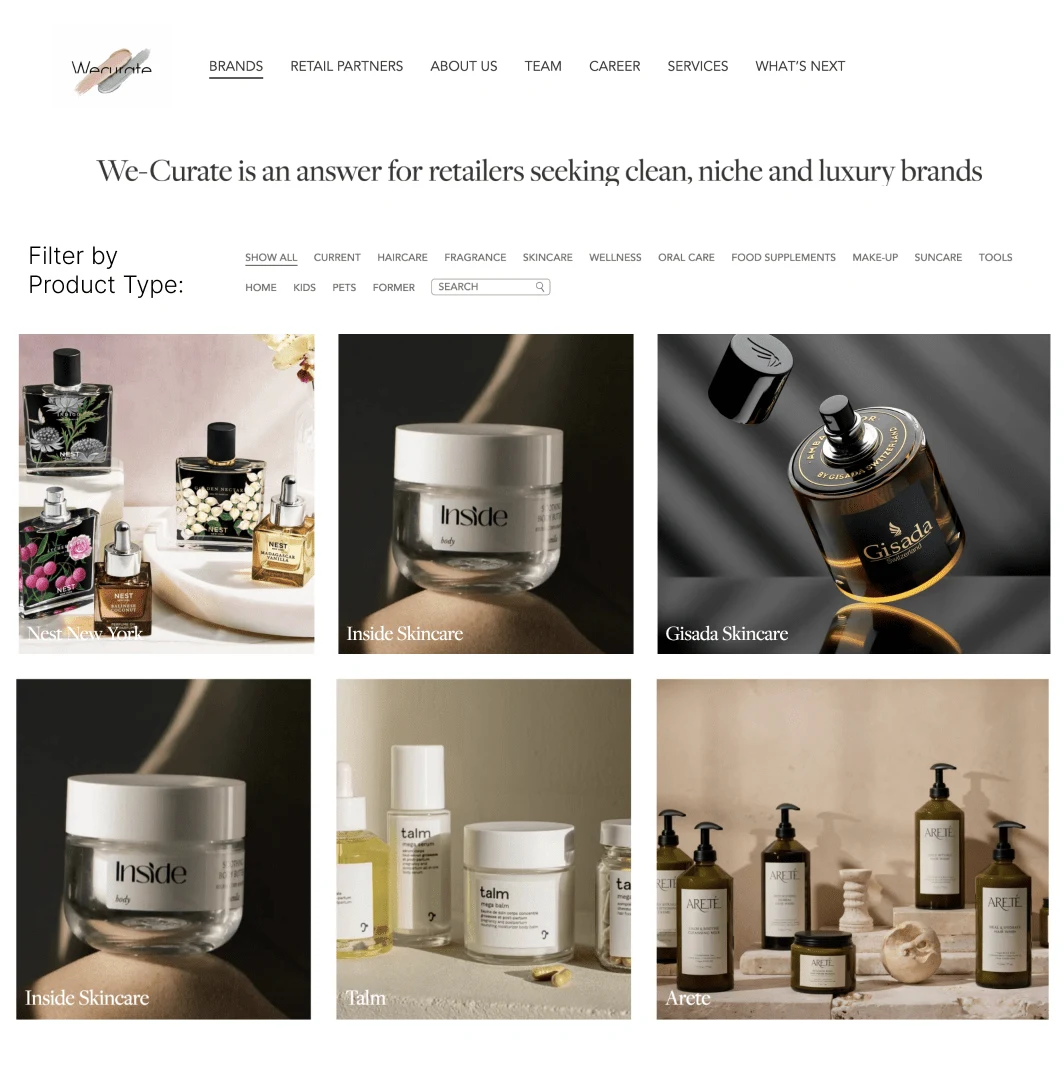
Filters on the Left Sidebar
💡 Description:
This design moves filters to a left-side panel, with a bold title:
➡ "Filter by Categories" for clarity.
Why This Works:
✅ Stronger visual hierarchy → Users can instantly recognize it as a category filter.
✅ Easier navigation → Users can see all filter options at once.
✅ Common UX practice → Familiar layout used in e-commerce and directory-style websites.
⚠ Potential Drawbacks:
❌ Requires more space → Might push content further to the right.
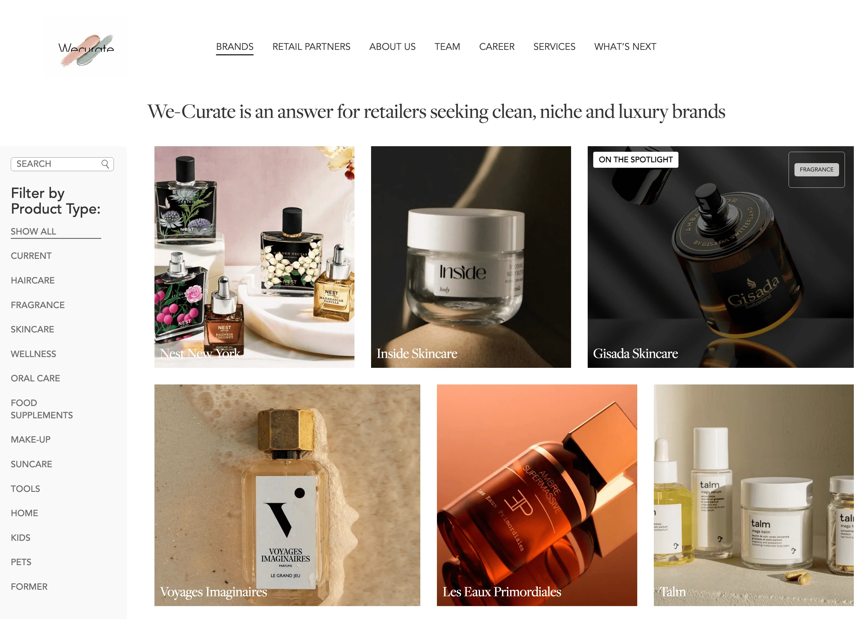
Hero Section with Featured "Current Brands" + Filters Below
This design introduces a Hero Section at the top, featuring a slider showcasing "Current Brands". Below the hero, the layout follows either Option 1 (Top Filters) or Option 2 (Sidebar Filters).
Why This Works:
✅ Highlights priority brands → Gives more visibility to key partners.
✅ Visually engaging → A dynamic hero section improves first impressions.
✅ Allows branding flexibility → Feature selected brands dynamically.
⚠ Potential Drawbacks:
❌ Adds more visual complexity → Requires careful balancing of images & content.
❌ Slower load times → If not optimized, a large slider could impact performance.
Results
🚀 Ongoing Implementation – Monitoring Performance & User Engagement.
Like this project
Posted Mar 19, 2025
Enhancing the Brand's page with clearer filters, better SEO, and improved UX. Exploring top filters, sidebar filters, or a hero section for featured brands.
Likes
1
Views
7
Timeline
Mar 13, 2025 - Mar 21, 2025