Brand Identity Development for Groundup.ai

Anna Grenier de cardenal

Groundup.ai
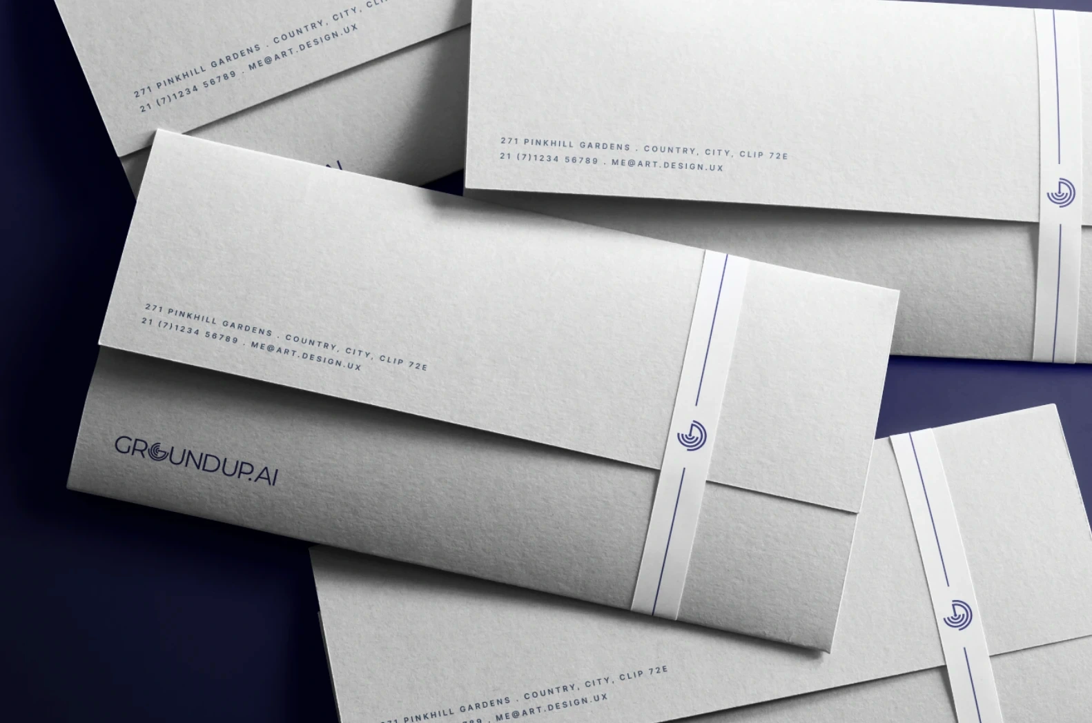
The challenge was to create an identity that could communicate technical expertise, reliability and innovation without feeling overly complex or inaccessible. I developed the brand strategy, logo, colour palette, typography and visual language around the idea of continuous monitoring and intelligent systems working in the background. The custom symbol combines the letter G with concentric lines inspired by signals, sensors and data transmission, while the wider graphic system uses wave patterns, connection points and circuit-inspired elements to represent interconnected machines, real-time insights and predictive intelligence.
Groundup.ai is a Singapore-based technology company developing predictive maintenance solutions for industrial environments. By combining artificial intelligence with real-time data, the platform helps businesses detect potential issues earlier, reduce downtime and move from reactive interventions to more proactive decision-making.



Like this project
Posted Jul 30, 2026
Developed brand identity for Groundup.ai highlighting tech expertise and innovation.