Social Media & Carousel Design Across Brands

Muhammad Asad Khan


The Brief
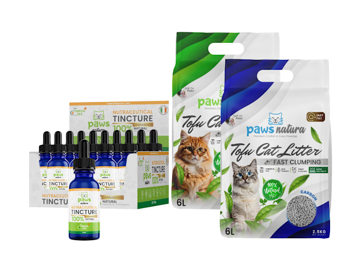
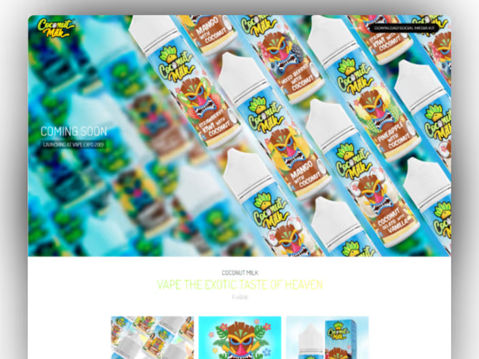
Multiple consumer brands needed scroll-stopping social media content that matched their existing brand identity. The work covered Instagram posts, carousel layouts, and promotional graphics for product launches, seasonal campaigns, and ongoing brand presence.
What I Did
Every post started with the product. I built custom 3D mockups in Cinema 4D, lit and rendered them to match each brand's visual tone, then composited everything in Photoshop. Carousel layouts were assembled in Canva with brand kit consistency across slides.
The mix included:
Product launch announcements with photorealistic 3D renders
Multi-slide carousels breaking down product features and benefits
Promotional posts for seasonal campaigns and new SKU drops
Brand storytelling content pairing product shots with lifestyle context
The Approach
Each brand had its own color palette, typography, and visual language. The goal was never to make posts that "look designed." It was to make content that feels native to the brand while standing out in a feed. That meant matching packaging colors to background gradients, keeping typography hierarchy tight, and letting the 3D mockups do the heavy lifting.
Tools
Adobe Photoshop for compositing and retouching. Cinema 4D for 3D product mockups and renders. Canva for carousel assembly and brand kit management.
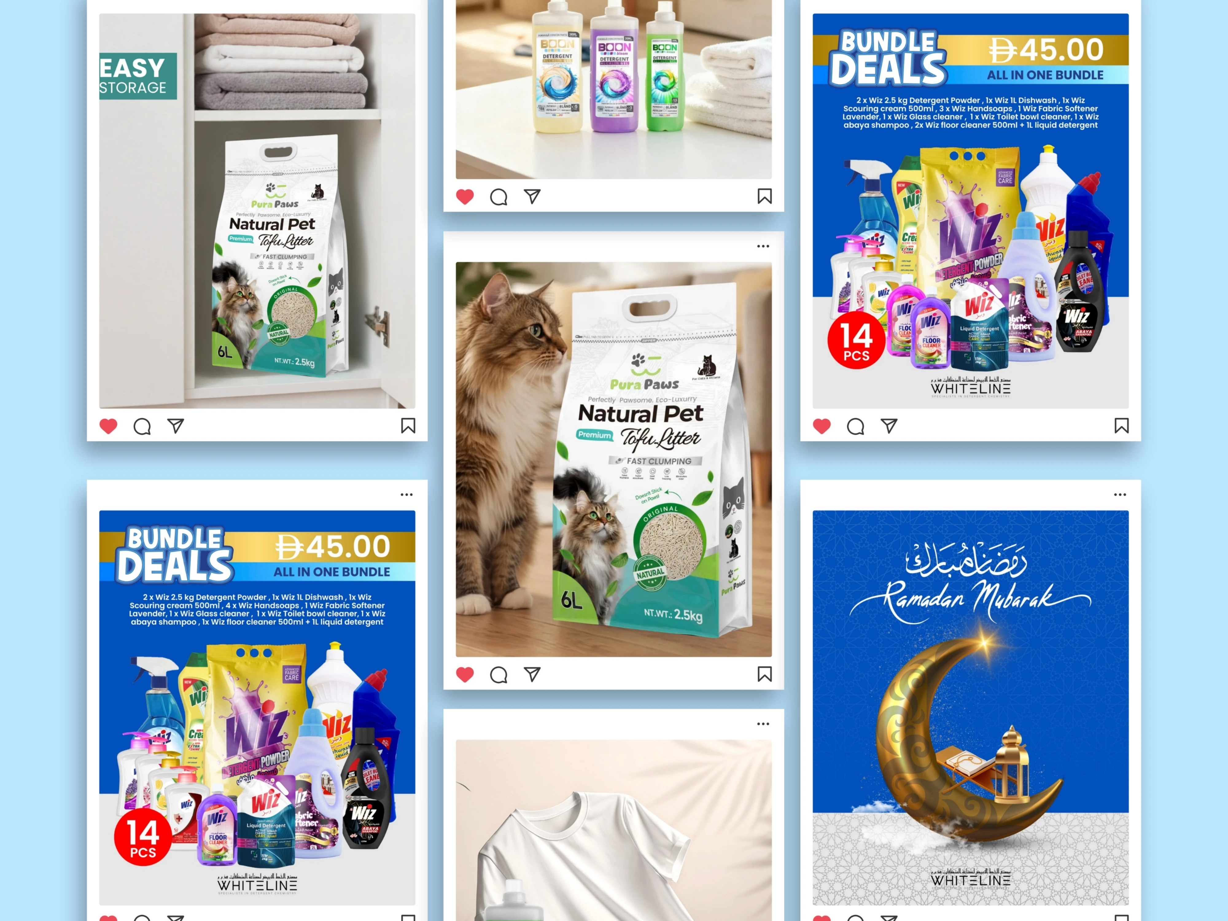
Social Media Post Designs
Like this project
Posted Jul 12, 2026
Social media posts, carousels, and 3D product mockups designed to drive engagement across multiple consumer brands.