Naming and branding a boutique winery.
Adam Kereliuk
Wines that kick.
Full strategy, naming, brand design, packaging, and content for Canter Cellars.
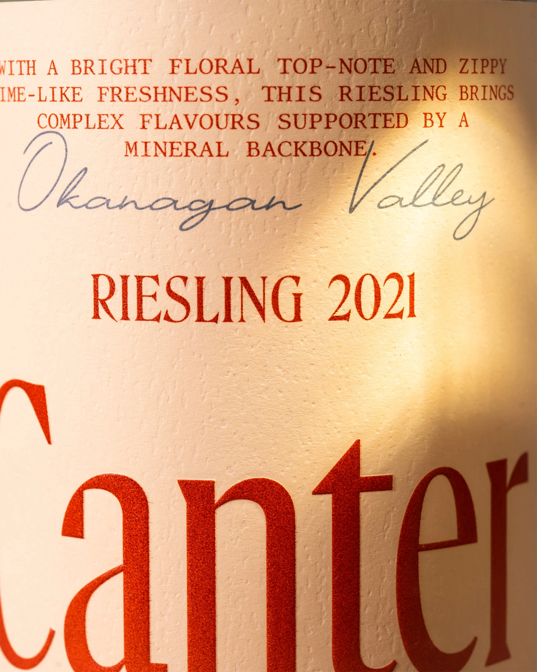
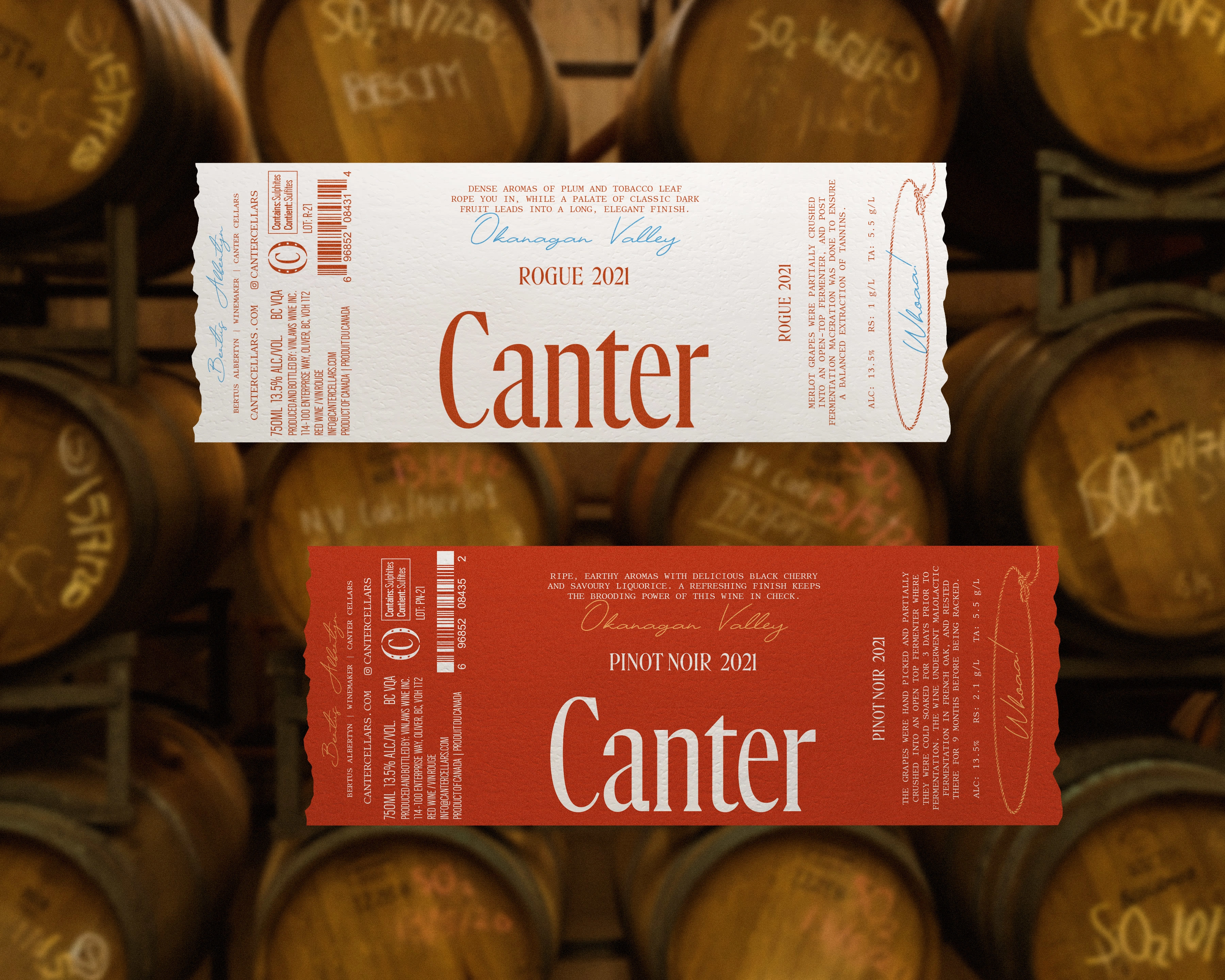
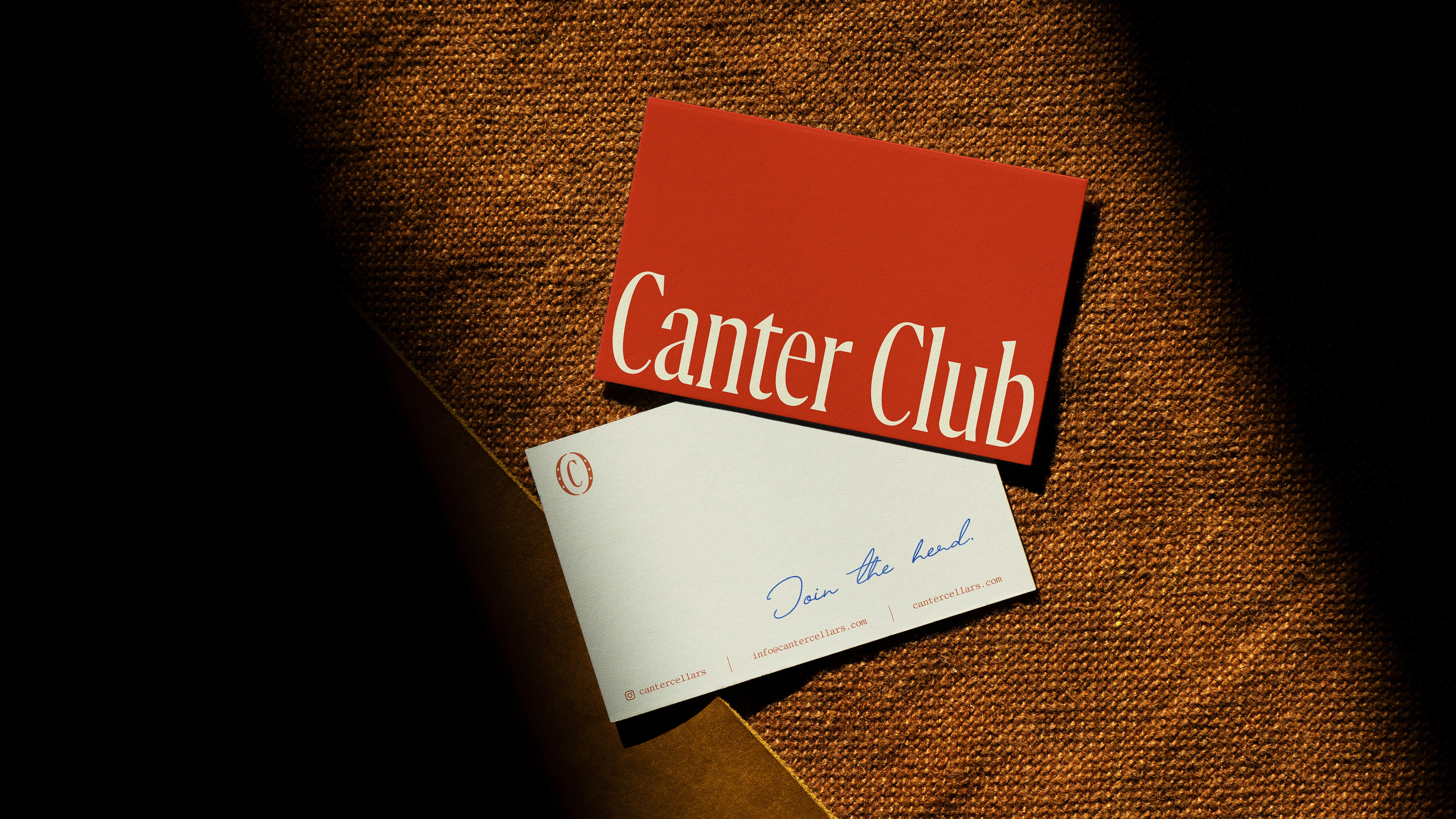
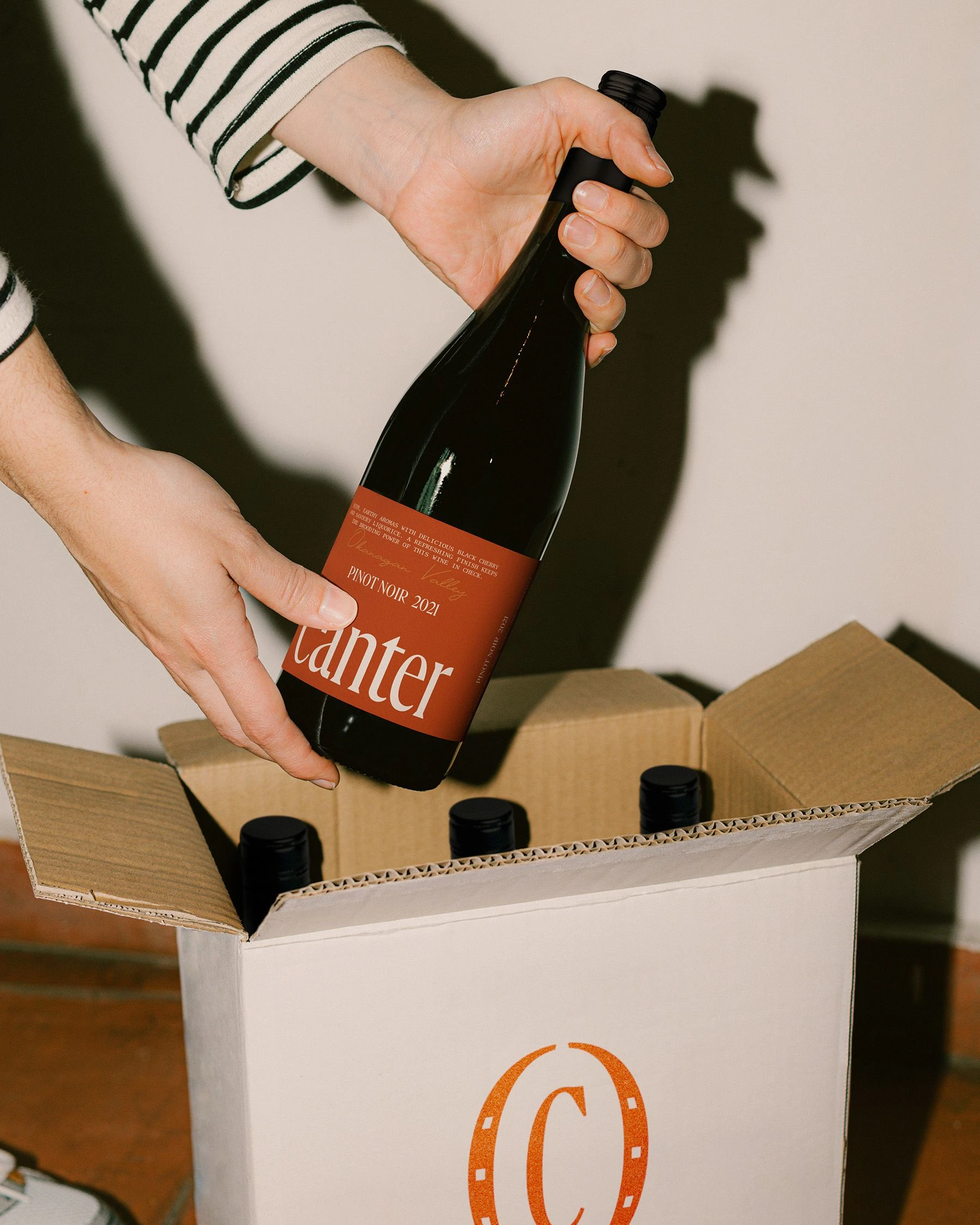
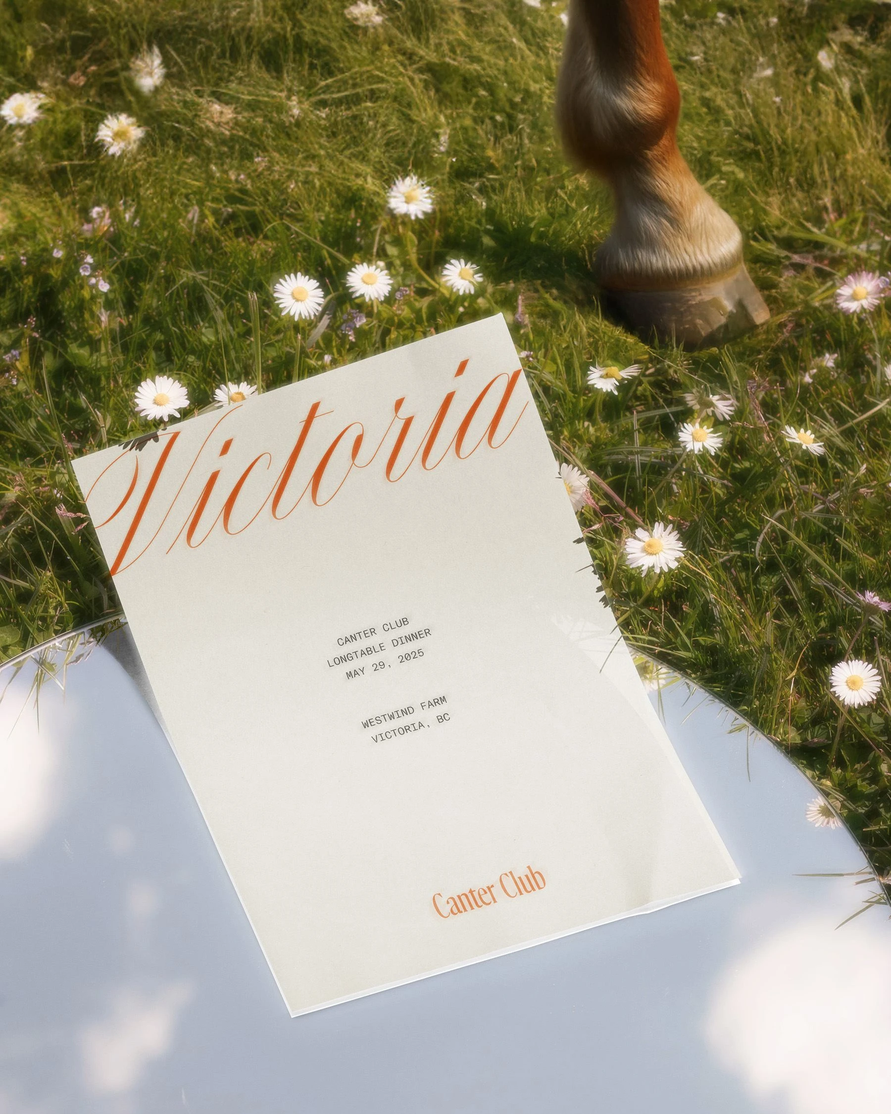
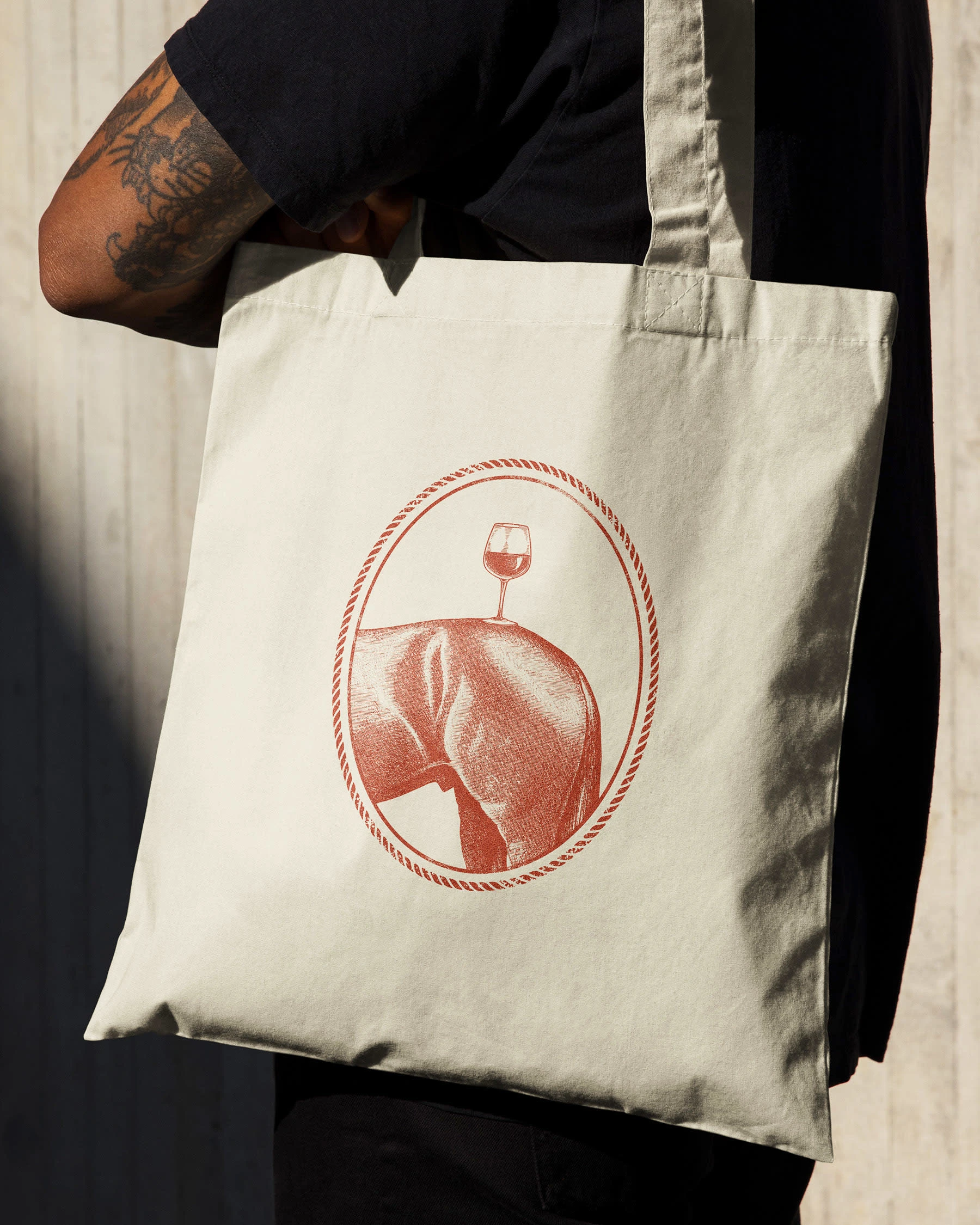
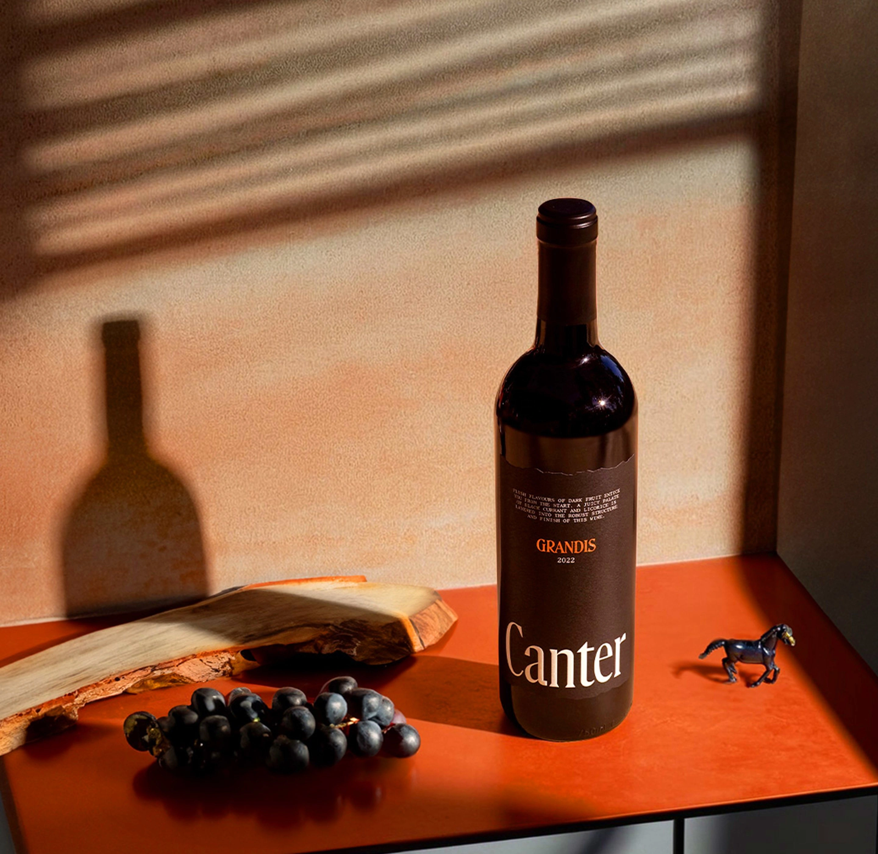
Canter Cellars is a boutique BC winery born from a collaboration between three families, each with a shared history with horses. This connection to the animal world became a symbolic starting point — not for literal translation, but for drawing deeper parallels between the horse and the craft of winemaking: tamed, wild beauty shaped through patience, skill, and instinct.
The project spanned discovery, naming, and visual identity, with a the core challenge to create a brand that nods to its equine roots without leaning into clichés or overshadowing the sophistication of the wine itself.
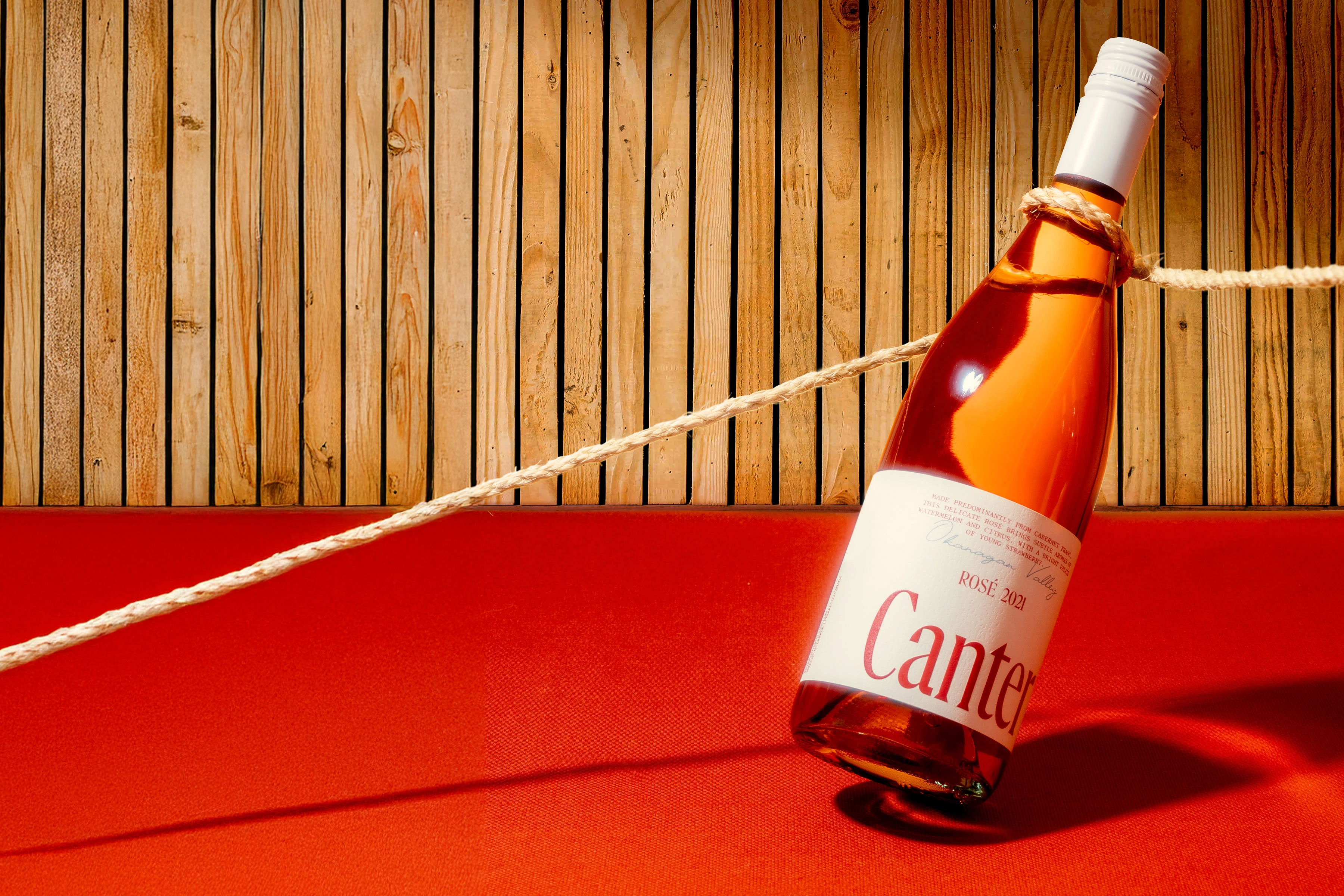
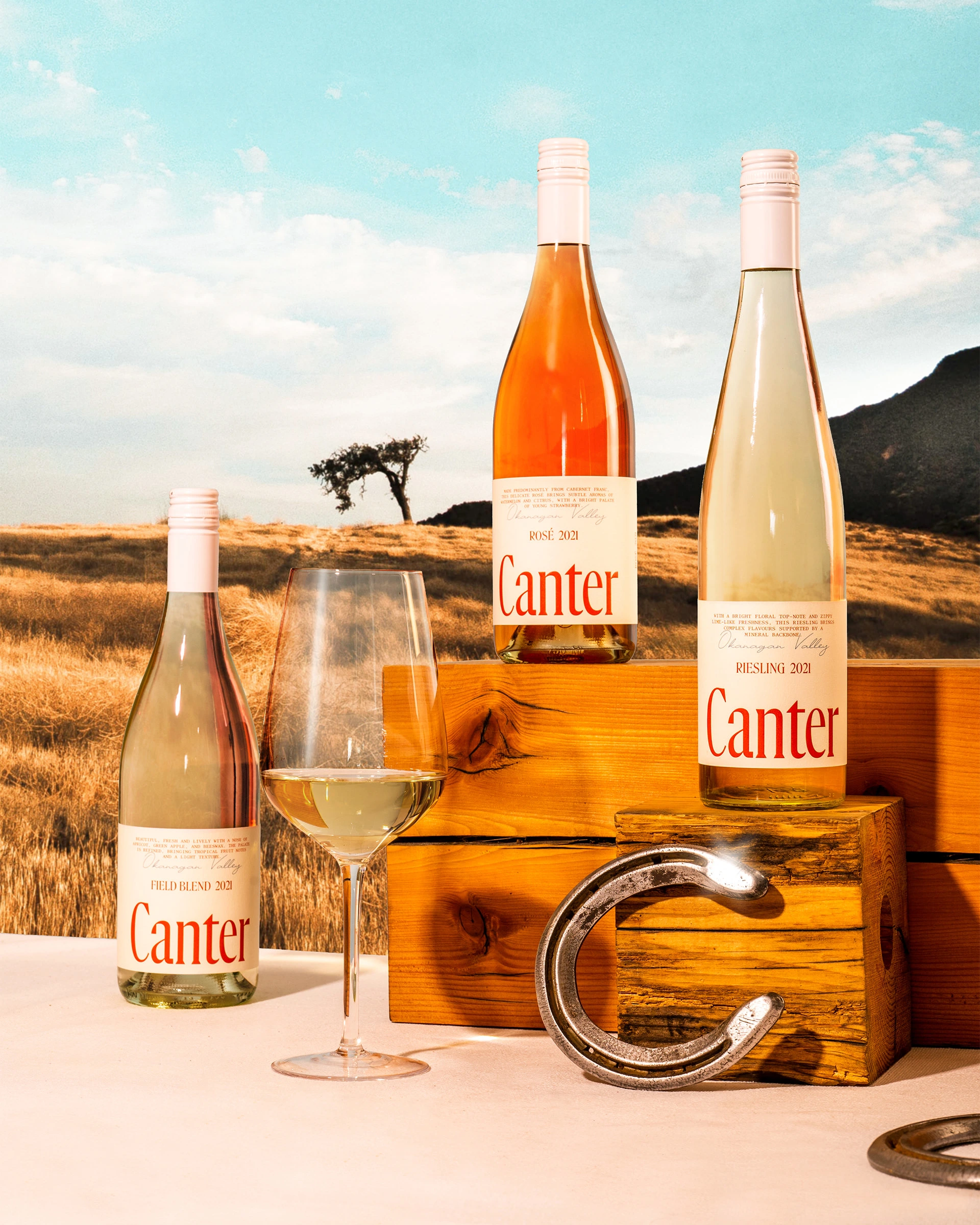
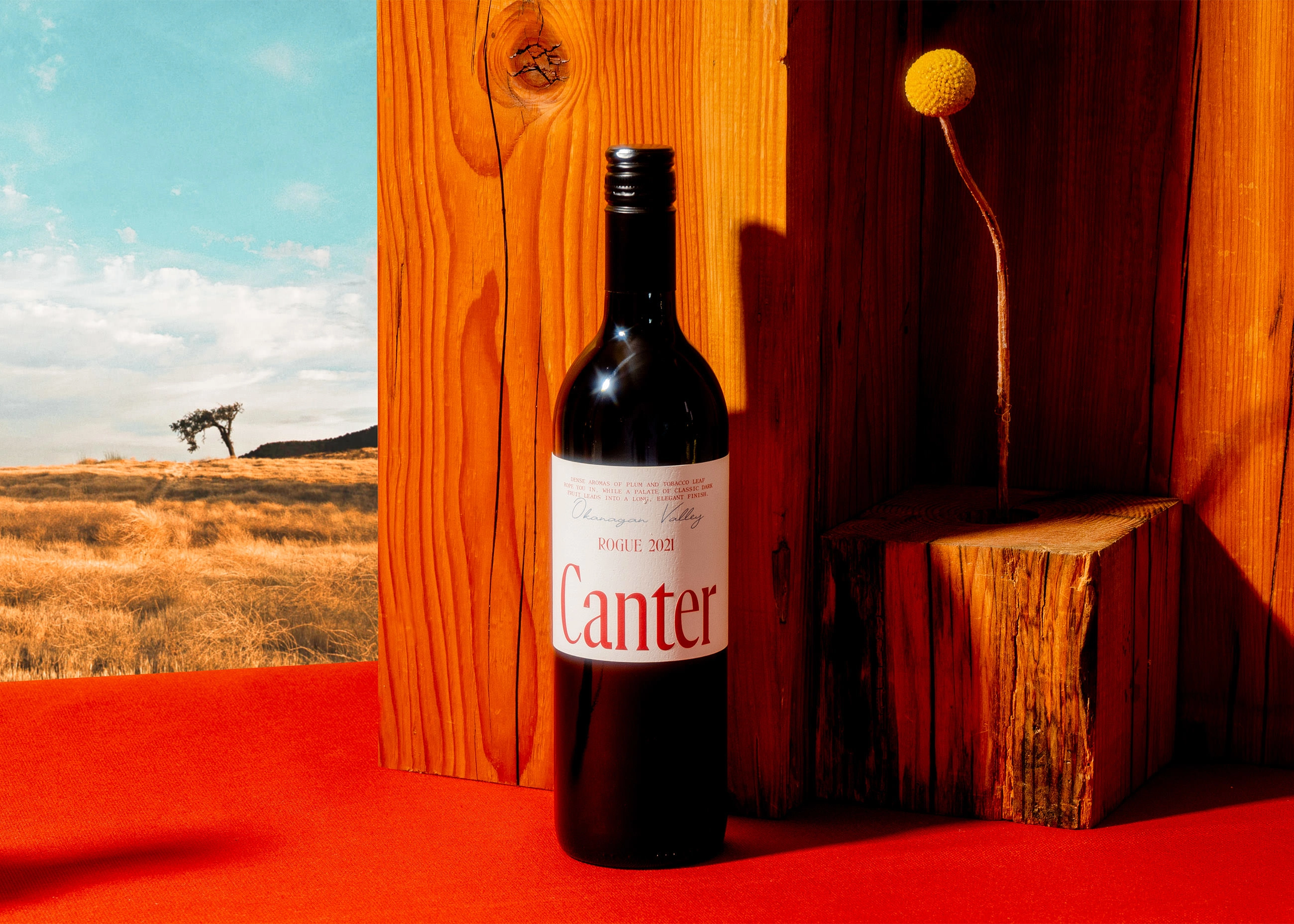
The result is a confident and understated identity anchored in refined typography and a signature red Pantone. Together, these elements create a quiet strength that balance between heritage and elegance — a look that aimed to sit somewhere betweenVogue and the Marlboro Man.


Like this project
Posted Aug 11, 2025
From the ground up – naming, strategy, brand identity, packaging, print, and more for Canter Cellars, a boutique winery with a love for horses.
Likes
15
Views
96
Timeline
Jan 1, 2021 - May 1, 2021