PayOnline - Re-designing a new user experience for an all-in-one
PayOnline - Re-designing a new user experience for an all-in-one mobile wallet
Project Summary
I caused 85% user and client satisfaction for a mobile wallet application by designing a new experience through an intuitive and minimalistic user interface. Here is how I achieved this.
Defining the Problem
The team at PayOnline ( a mobile wallet that allows easy payment of day-to-day online bills) reached out to me about their product—quoting the CEO's words.
"We've not been able to meet our business goals, especially in sales and projected user sign-ups, we think this is because of the poor interface of our app, and users just get lost in our app, at least these are the feedback we've been getting. We lost a business partnership that could have been a big break for us because the business partner felt our app wasn't up to standard and we were not doing very well".
Validating the Problem
I didn't want to assume that the problem was only poor interface, or just banking on the CEO's word without talking to users of this product, I could very well find out more hidden issues. To get more insight here is what I did;
I spoke to the marketing team about the most recurring complaints they've been getting from their users.
I checked the comment section on the app's Google Play download page, and I got a lot of insights from here.
I interviewed 5 of their users about their experience using the app
I did a competitor analysis of some of the mobile wallet apps the users mentioned as great during my interview with them.
The Problem
I needed to have a better understanding of the problem, and validating the problems was very important before I proceeded, now I'm sure I was solving an actual problem, not just some assumptions. Here are the problems I discovered;
The app had a user interface that wasn't visually appealing thus giving users a low-standard perception of the product.
The app had UX writing issues, app content lacked clarity.
The app doesn't follow a familiar app layout, so the learning curve is high. Users just get lost using the app.
The app had UX issues, users complained the app wasn't easy to use
Solving the Problem
Having identified the problem, I started brainstorming solutions to tackle the problem and came up with a plan for usability testing to measure the success of the solutions from the user's end. I quickly came up with my design goals
To design an app that achieved up to 80% user and client satisfaction.
50% increase in app downloads
35% increase in sign-ups
Product Prototype
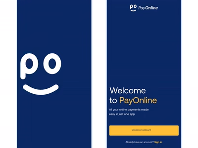
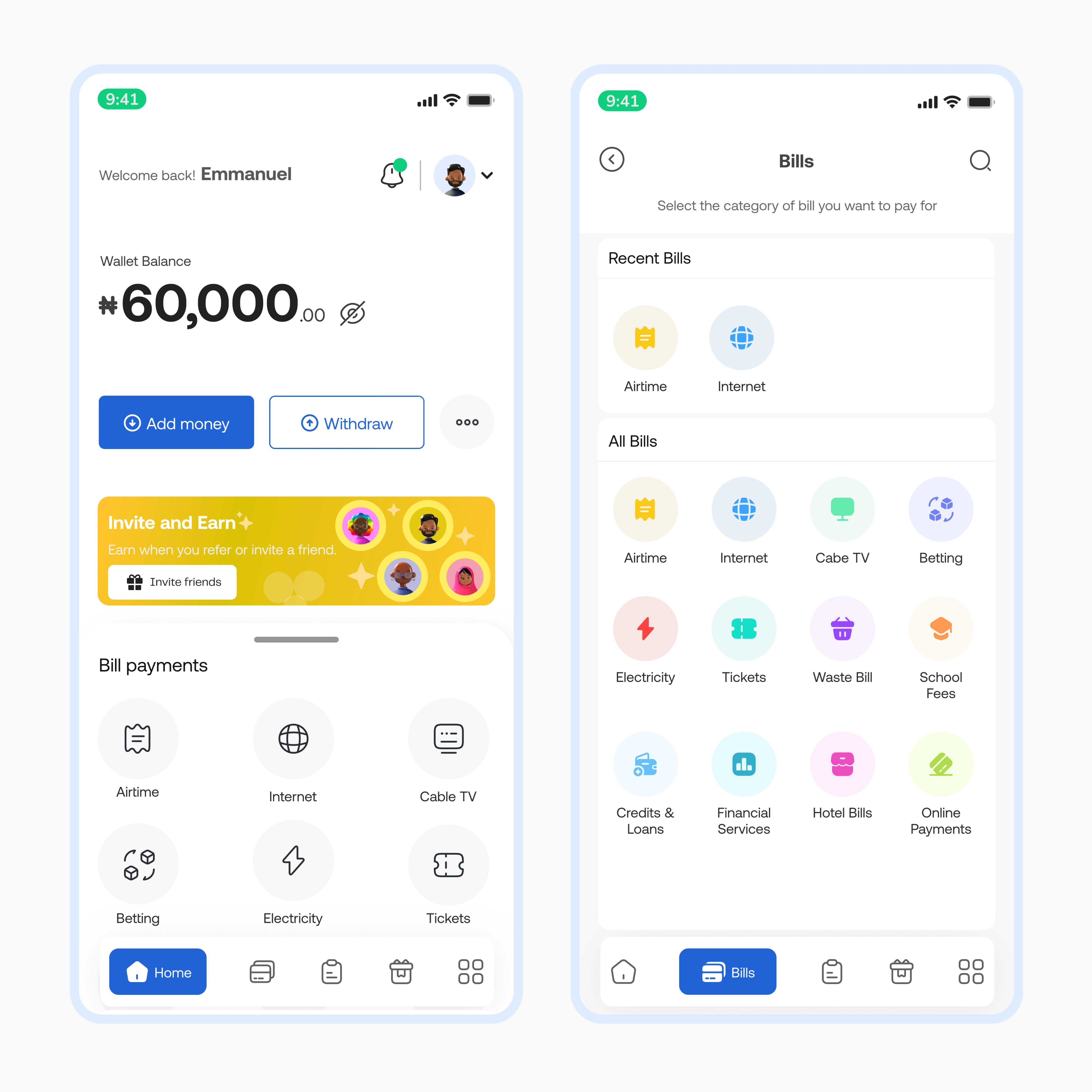
Here is a prototype of the solution I came up with. A clean, modern, and minimalistic design
More Shots from the Project
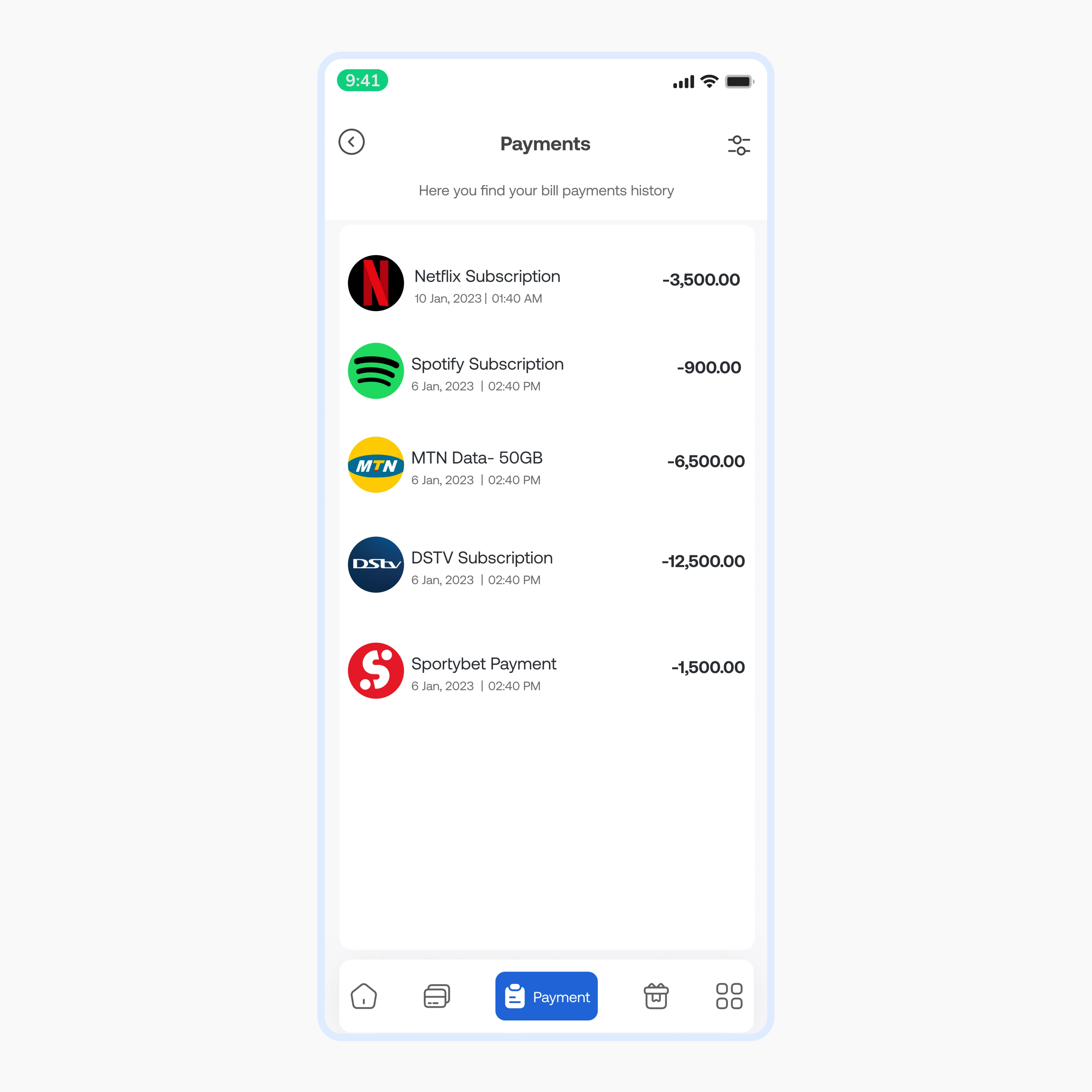
Bill Payment History Page
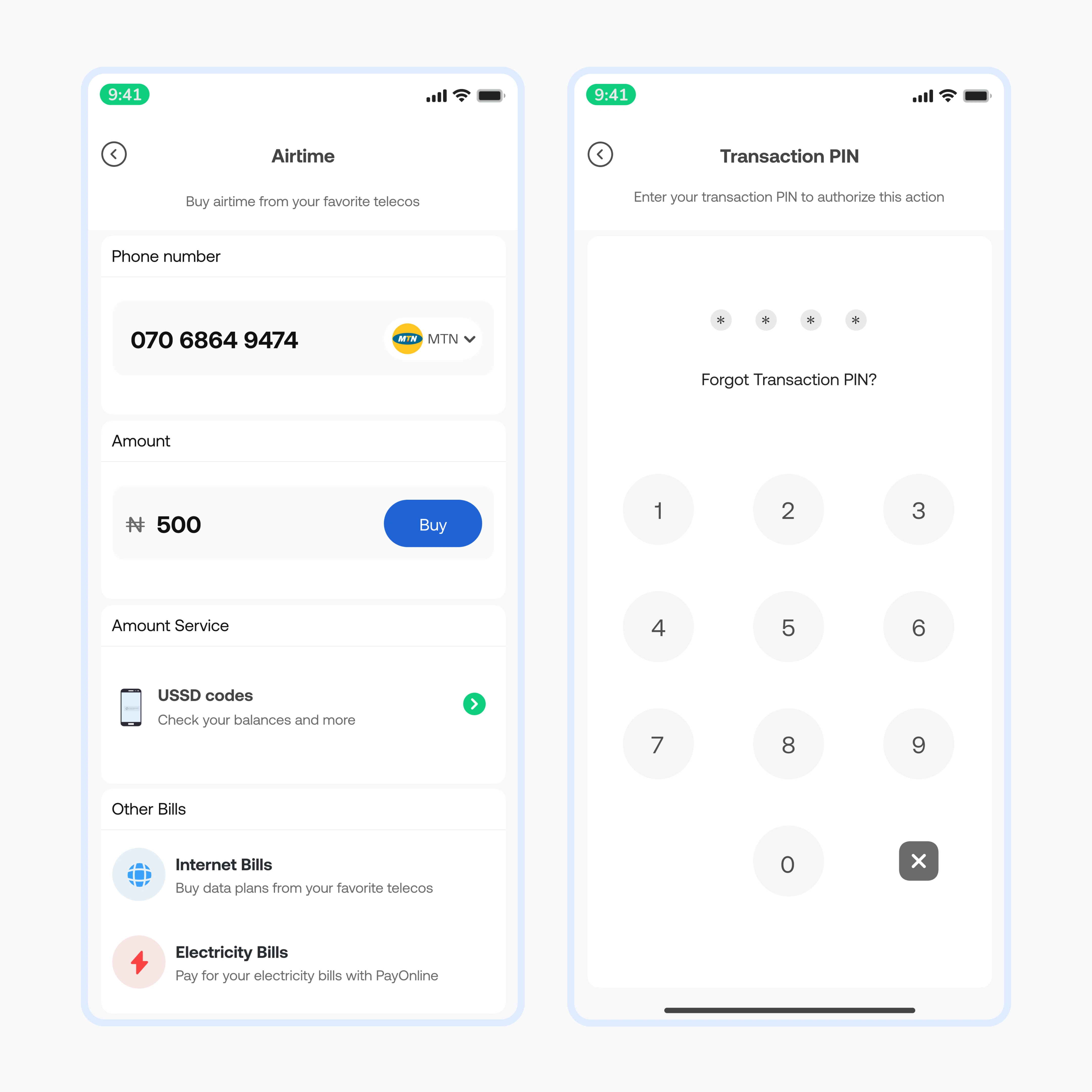
Airtime Purchase page
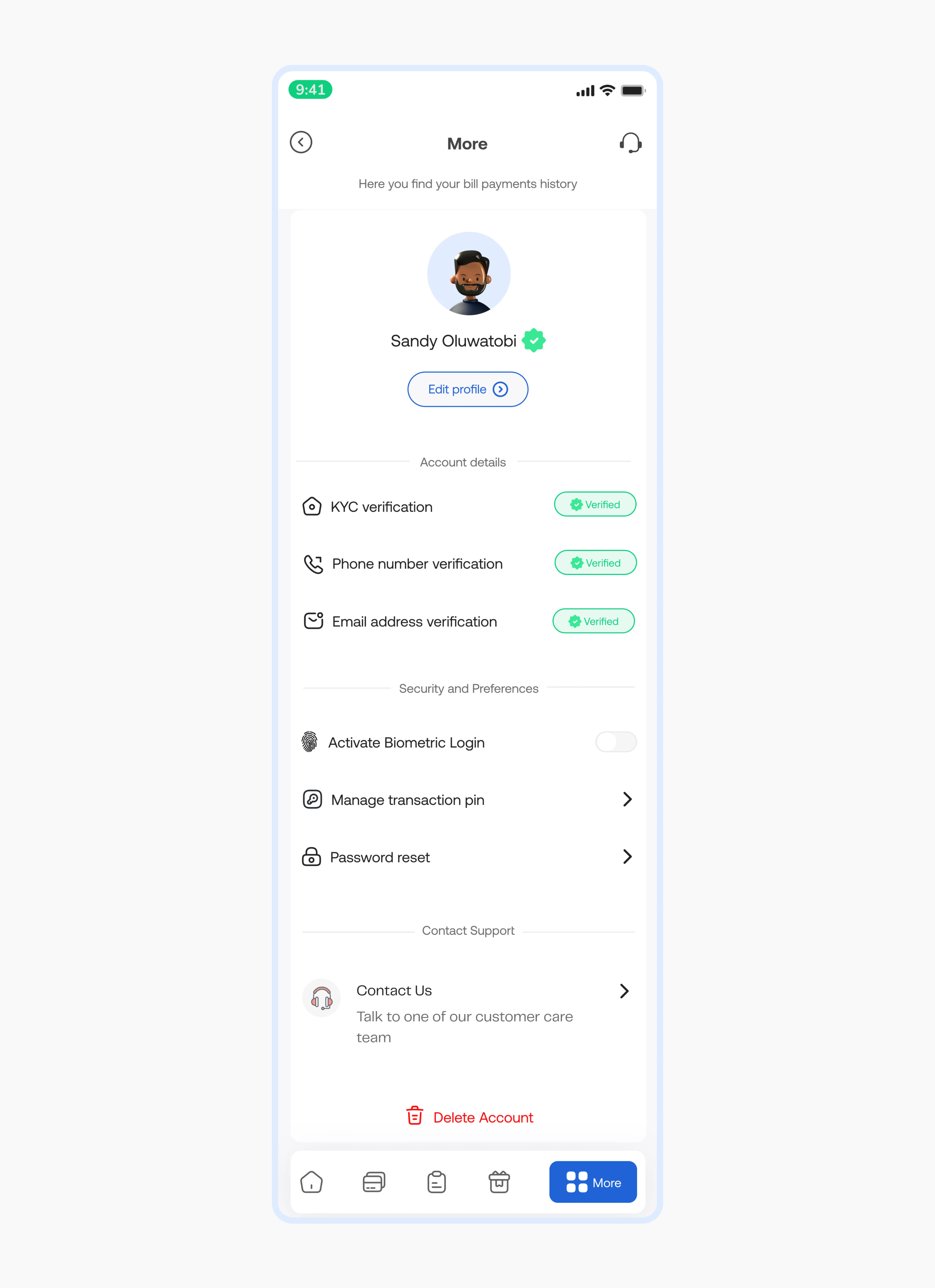
User Details Page
Outcome
I designed an incredible solution. But solutions are only as incredible as their effectiveness in solving the problem they were built to solve.
I was able to achieve the first goal of 80% user satisfaction, average user satisfaction was 85%. As the product moves on to production, the goal is to keep testing to measure outcome and impact and identify areas for improvement.
Thank you for reading.🌟
Like this project
Posted Aug 12, 2024
I caused 85% user and client satisfaction for a mobile wallet application by designing a new experience through an intuitive and minimalistic user interface
Likes
1
Views
3


