Storage unit rental checkout process
Jaka Mušič
Checkout process for short or long term renting of storage spaces/units for German based company STORE ROOM.
The Problem
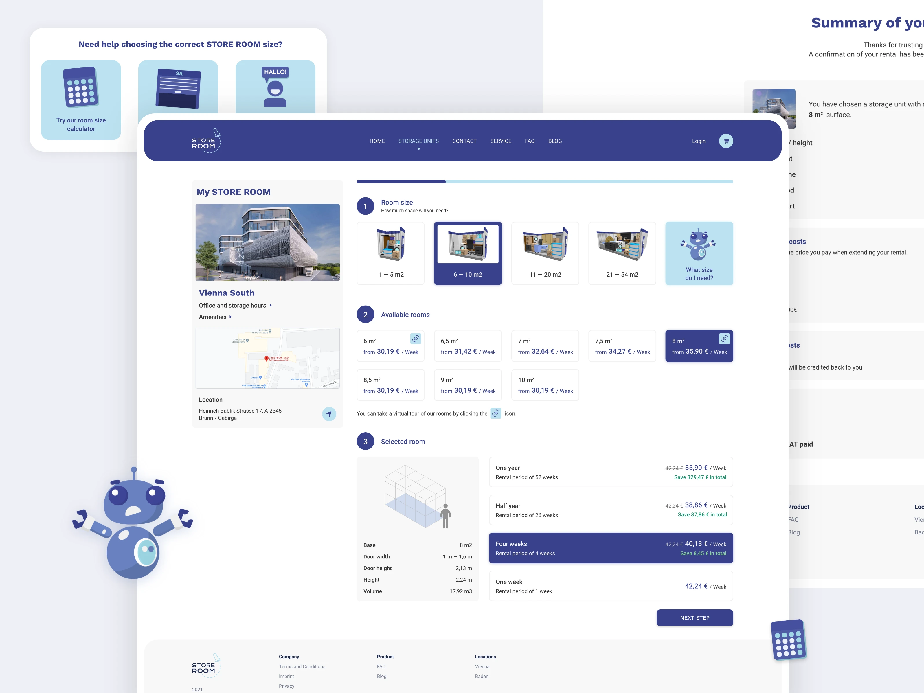
When customers started using the online reservation platform for storage units, the main request the company had been getting was that they need help with choosing what size of the unit they need to select.
Another issue that was reported from the tests was that the process was cluttered and hard to follow and overview.
There was also an accessibility issue, where the prices of a certain unit would only show up on hover.
Design Process
As there were known pains of customers, there were no focus groups or similar tests. We started by imagining a new process that we wanted to split into several steps, so it's easier to follow.
We decided that guided checkout was the correct approach after considering the previous feedback. We prepared some sketches of the desired process.
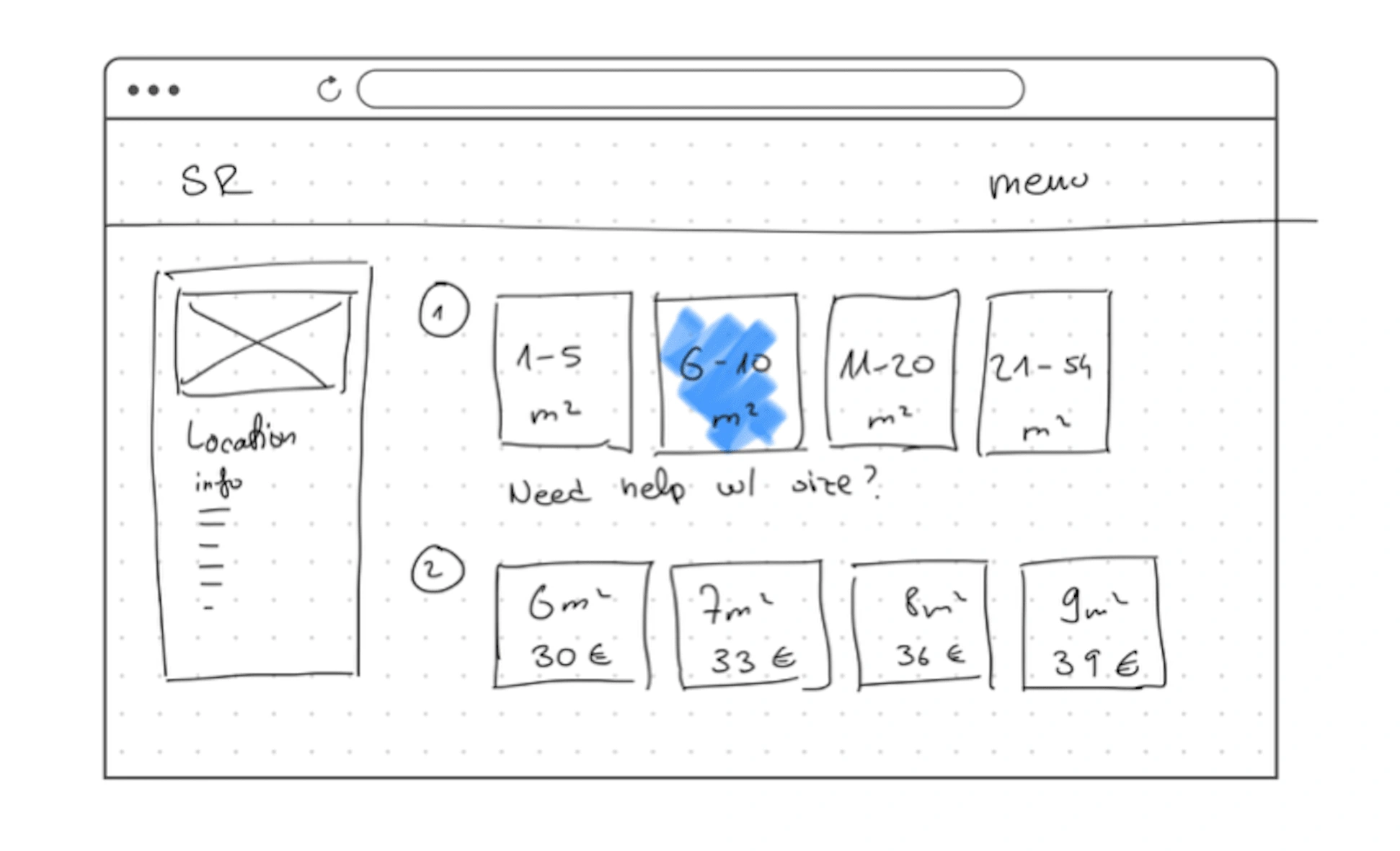
The chosen idea for the new layout
There was already an existing design language, so after wireframes we could go directly to Ul. The language was just slightly improved later, as we noticed some missing guidelines.
We solit the tirst sten into two columns with the first one containina the into about the location and the
rest with into about storage units. we added a calculator that helps you decide which size you need to rent and made it very prominent, so customers notice it. We extracted the prices from the size box into a separate group and displayed more details when a unit is selected.
We added mockups for approximate sizes so potential customers get a better idea of space quicker, but can still use the calculator. We removed the images that were previously used as they were too bland and repetitive and just used it in unit detail box.
We decided to lighten it up a bit for the mockup as it looked more inviting, however this idea was later scraped and the color scheme stayed the same.
Like this project
Posted Jan 23, 2025
An innovative, custom-designed checkout process based on user feedback for renting storage space in Austria.
Likes
0
Views
17